
在本文中,我将展示如何使用递归图 Recurrence Plots 来描述不同类型的时间序列。我们将查看具有500个数据点的各种模拟时间序列。我们可以通过可视化时间序列的递归图并将其与其他已知的不同时间序列的递归图进行比较,从而直观地表征时间序列。
递归图
Recurrence Plots(RP)是一种用于可视化和分析时间序列或动态系统的方法。它将时间序列转化为图形化的表示形式,以便分析时间序列中的重复模式和结构。Recurrence Plots 是非常有用的,尤其是在时间序列数据中存在周期性、重复事件或关联结构时。
Recurrence Plots 的基本原理是测量时间序列中各点之间的相似性。如果两个时间点之间的距离小于某个给定的阈值,就会在 Recurrence Plot 中绘制一个点,表示这两个时间点之间存在重复性。这些点在二维平面上组成了一种图像。
 import numpy as np
 import matplotlib.pyplot as plt

 def recurrence_plot(data, threshold=0.1):
     """
     Generate a recurrence plot from a time series.

     :param data: Time series data
     :param threshold: Threshold to determine recurrence
     :return: Recurrence plot
     """
     # Calculate the distance matrix
     N = len(data)
     distance_matrix = np.zeros((N, N))
     for i in range(N):
         for j in range(N):
             distance_matrix[i, j] = np.abs(data[i] - data[j])

     # Create the recurrence plot
     recurrence_plot = np.where(distance_matrix <= threshold, 1, 0)

     return recurrence_plot
上面的代码创建了一个二进制距离矩阵,如果时间序列i和j的值相差在0.1以内(阈值),则它们的值为1,否则为0。得到的矩阵可以看作是一幅图像。
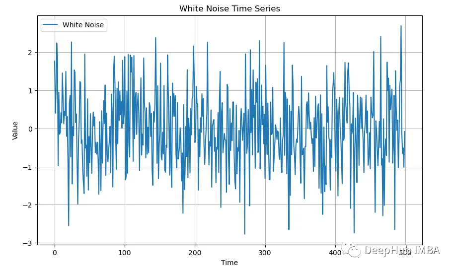
白噪声
接下来我们将可视化白噪声。首先,我们需要创建一系列模拟的白噪声:
 # Set a seed for reproducibility
 np.random.seed(0)

 # Generate 500 data points of white noise
 white_noise = np.random.normal(size=500)

 # Plot the white noise time series
 plt.figure(figsize=(10, 6))
 plt.plot(white_noise, label='White Noise')
 plt.title('White Noise Time Series')
 plt.xlabel('Time')
 plt.ylabel('Value')
 plt.legend()
 plt.grid(True)
 plt.show()
递归图为这种白噪声提供了有趣的可视化效果。对于任何一种白噪声,图看起来都是一样的:
 # Generate and plot the recurrence plot
 recurrence = recurrence_plot(white_noise, threshold=0.1)

 plt.figure(figsize=(8, 8))
 plt.imshow(recurrence, cmap='binary', origin='lower')
 plt.title('Recurrence Plot')
 plt.xlabel('Time')
 plt.ylabel('Time')
 plt.colorbar(label='Recurrence')
 plt.show()
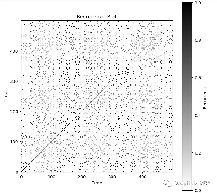
可以直观地看到一个嘈杂的过程。可以看到图中对角线总是黑色的。
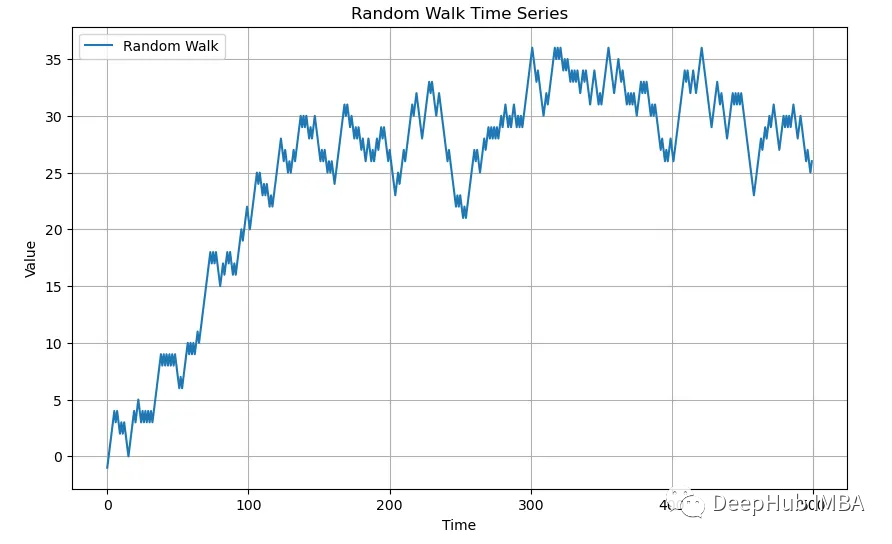
随机游走
接下来让我们看看随机游走(Random Walk)是什么样子的:
 # Generate 500 data points of a random walk
 steps = np.random.choice([-1, 1], size=500) # Generate random steps: -1 or 1
 random_walk = np.cumsum(steps) # Cumulative sum to generate the random walk

 # Plot the random walk time series
 plt.figure(figsize=(10, 6))
 plt.plot(random_walk, label='Random Walk')
 plt.title('Random Walk Time Series')
 plt.xlabel('Time')
 plt.ylabel('Value')
 plt.legend()
 plt.grid(True)
 plt.show()
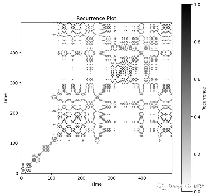
 # Generate and plot the recurrence plot
 recurrence = recurrence_plot(random_walk, threshold=0.1)

 plt.figure(figsize=(8, 8))
 plt.imshow(recurrence, cmap='binary', origin='lower')
 plt.title('Recurrence Plot')
 plt.xlabel('Time')
 plt.ylabel('Time')
 plt.colorbar(label='Recurrence')
 plt.show()
SARIMA
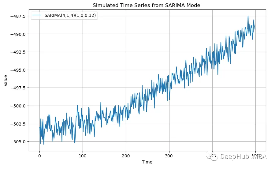
SARIMA(4,1,4)(1,0,0,12)的模拟数据
 from statsmodels.tsa.statespace.sarimax import SARIMAX

 # Define SARIMA parameters
 p, d, q = 4, 1, 4  # Non-seasonal order
 P, D, Q, s = 1, 0, 0, 12  # Seasonal order

 # Simulate data
 model = SARIMAX(np.random.randn(100), order=(p, d, q), seasonal_order=(P, D, Q, s), trend='ct')
 fit = model.fit(disp=False)  # Fit the model to random data to get parameters
 simulated_data = fit.simulate(nsimulations=500)

 # Plot the simulated time series
 plt.figure(figsize=(10, 6))
 plt.plot(simulated_data, label=f'SARIMA({p},{d},{q})({P},{D},{Q},{s})')
 plt.title('Simulated Time Series from SARIMA Model')
 plt.xlabel('Time')
 plt.ylabel('Value')
 plt.legend()
 plt.grid(True)
 plt.show()
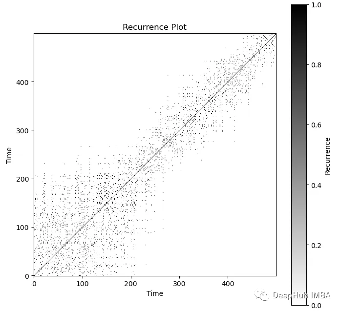
 recurrence = recurrence_plot(simulated_data, threshold=0.1)

 plt.figure(figsize=(8, 8))
 plt.imshow(recurrence, cmap='binary', origin='lower')
 plt.title('Recurrence Plot')
 plt.xlabel('Time')
 plt.ylabel('Time')
 plt.colorbar(label='Recurrence')
 plt.show()
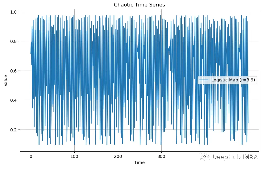
混沌的数据
 def logistic_map(x, r):
     """Logistic map function."""
     return r * x * (1 - x)

 # Initialize parameters
 N = 500         # Number of data points
 r = 3.9         # Parameter r, set to a value that causes chaotic behavior
 x0 = np.random.rand()  # Initial value

 # Generate chaotic time series data
 chaotic_data = [x0]
 for _ in range(1, N):
     x_next = logistic_map(chaotic_data[-1], r)
     chaotic_data.append(x_next)

 # Plot the chaotic time series
 plt.figure(figsize=(10, 6))
 plt.plot(chaotic_data, label=f'Logistic Map (r={r})')
 plt.title('Chaotic Time Series')
 plt.xlabel('Time')
 plt.ylabel('Value')
 plt.legend()
 plt.grid(True)
 plt.show()
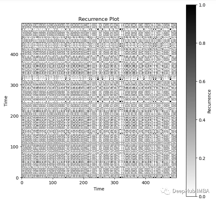
 recurrence = recurrence_plot(chaotic_data, threshold=0.1)

 plt.figure(figsize=(8, 8))
 plt.imshow(recurrence, cmap='binary', origin='lower')
 plt.title('Recurrence Plot')
 plt.xlabel('Time')
 plt.ylabel('Time')
 plt.colorbar(label='Recurrence')
 plt.show()
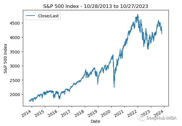
标准普尔500指数
作为最后一个例子,让我们看看从2013年10月28日至2023年10月27日的标准普尔500指数真实数据:
 import pandas as pd

 df = pd.read_csv('standard_and_poors_500_idx.csv', parse_dates=True)
 df['Date'] = pd.to_datetime(df['Date'])
 df.set_index('Date', inplace = True)
 df.drop(columns = ['Open', 'High', 'Low'], inplace = True)

 df.plot()
 plt.title('S&P 500 Index - 10/28/2013 to 10/27/2023')
 plt.ylabel('S&P 500 Index')
 plt.xlabel('Date');
 recurrence = recurrence_plot(df['Close/Last'], threshold=10)

 plt.figure(figsize=(8, 8))
 plt.imshow(recurrence, cmap='binary', origin='lower')
 plt.title('Recurrence Plot')
 plt.xlabel('Time')
 plt.ylabel('Time')
 plt.colorbar(label='Recurrence')
 plt.show()
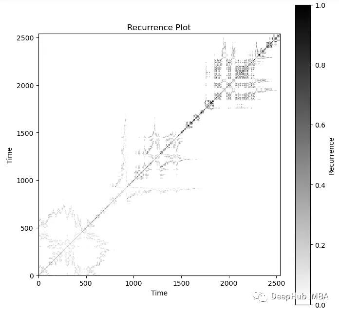
选择合适的相似性阈值是 递归图分析的一个关键步骤。较小的阈值会导致更多的重复模式,而较大的阈值会导致更少的重复模式。阈值的选择通常需要根据数据的特性和分析目标进行调整。
这里我们不得不调整阈值,最终确得到的结果为10,这样可以获得更大的对比度。上面的递归图看起来很像随机游走递归图和无规则的混沌数据的混合体。
总结
在本文中,我们介绍了递归图以及如何使用Python创建递归图。递归图给了我们一种直观表征时间序列图的方法。递归图是一种强大的工具,用于揭示时间序列中的结构和模式,特别适用于那些具有周期性、重复性或复杂结构的数据。通过可视化和特征提取,研究人员可以更好地理解时间序列数据并进行进一步的分析。
从递归图中可以提取各种特征,以用于进一步的分析。这些特征可以包括重复点的分布、Lempel-Ziv复杂度、最长对角线长度等。
递归图在多个领域中得到了广泛应用,包括时间序列分析、振动分析、地震学、生态学、金融分析、生物医学等。它可用于检测周期性、异常事件、相位同步等。
作者:Sam Erickson