
文章目录
听说点进蝈仔帖子的都喜欢点赞加关注~~
官网地址:
https://matplotlib.org/
可以看看docs
官网就相当详细了,可以直接参考官网。
1.安装方法
pip安装:
pip3 install matplotlib -i https://pypi.tuna.tsinghua.edu.cn/simple
conda安装:
conda install matplotlib
测试是否成功:
import numpy as np
from matplotlib import pyplot as plt

x = np.arange(1,11)
y =2* x +5
plt.title("Matplotlib demo")
plt.xlabel("x axis caption")
plt.ylabel("y axis caption")
plt.plot(x,y)
plt.show()
成功出现下图就可以动手改造了。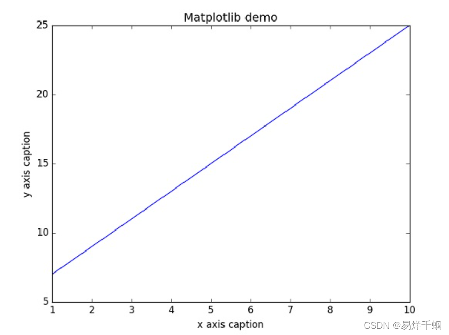
2.用好官网的例子
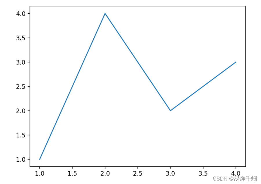
最简单的应用-折线图
fig, ax = plt.subplots()# Create a figure containing a single axes.
ax.plot([1,2,3,4],[1,4,2,3]);# Plot some data on the axes.
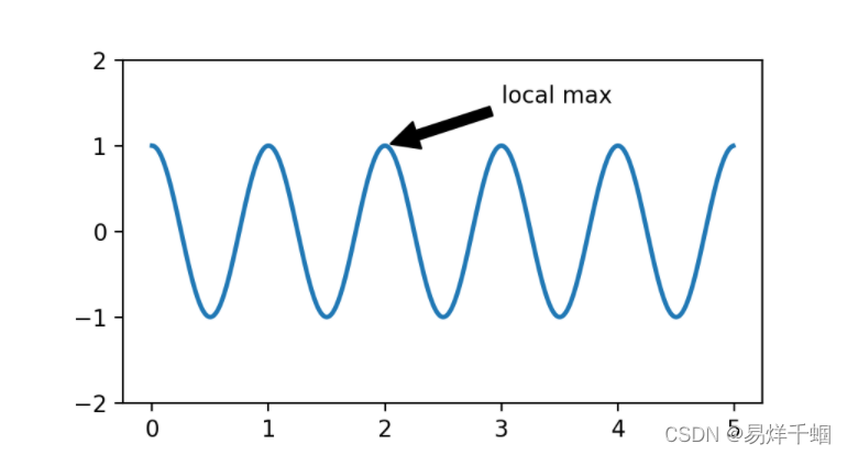
添加注释的方法
fig, ax = plt.subplots(figsize=(5,2.7))

t = np.arange(0.0,5.0,0.01)
s = np.cos(2* np.pi * t)
line,= ax.plot(t, s, lw=2)

ax.annotate('local max', xy=(2,1), xytext=(3,1.5),
            arrowprops=dict(facecolor='black', shrink=0.05))

ax.set_ylim(-2,2);
柱状图-Bar Label
import matplotlib.pyplot as plt
import numpy as np
N =5
menMeans =(20,35,30,35,-27)
womenMeans =(25,32,34,20,-25)
menStd =(2,3,4,1,2)
womenStd =(3,5,2,3,3)
ind = np.arange(N)# the x locations for the groups
width =0.35# the width of the bars: can also be len(x) sequence
fig, ax = plt.subplots()
p1 = ax.bar(ind, menMeans, width, yerr=menStd, label='Men')
p2 = ax.bar(ind, womenMeans, width,
            bottom=menMeans, yerr=womenStd, label='Women')
ax.axhline(0, color='grey', linewidth=0.8)
ax.set_ylabel('Scores')
ax.set_title('Scores by group and gender')
ax.set_xticks(ind, labels=['G1','G2','G3','G4','G5'])
ax.legend()# Label with label_type 'center' instead of the default 'edge'
ax.bar_label(p1, label_type='center')
ax.bar_label(p2, label_type='center')
ax.bar_label(p2)
plt.show()
正常run会出现下图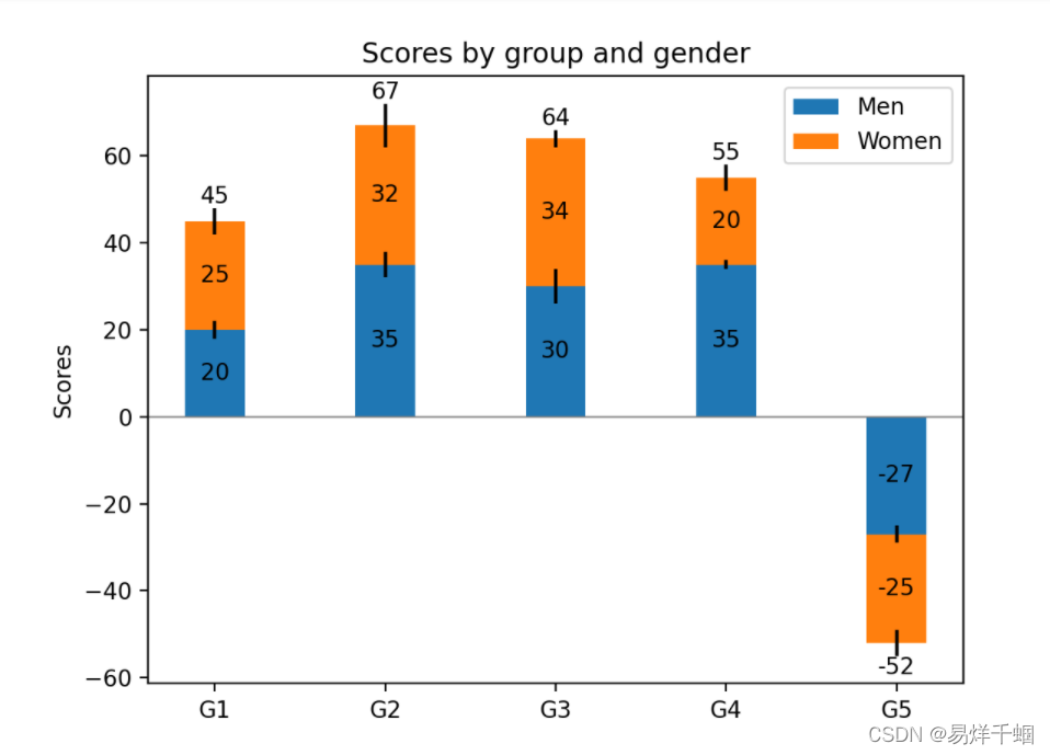
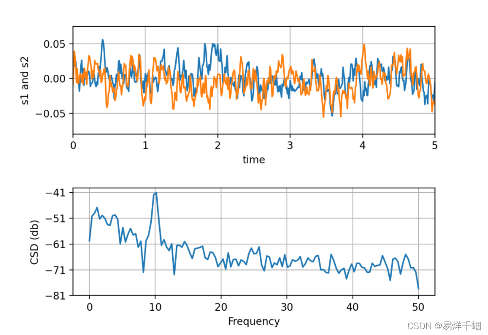
折线图之CSD
计算两个信号的交叉谱密度Compute the cross spectral density of two signals
import numpy as np
import matplotlib.pyplot as plt

fig,(ax1, ax2)= plt.subplots(2,1)# make a little extra space between the subplots
fig.subplots_adjust(hspace=0.5)

dt =0.01
t = np.arange(0,30, dt)# Fixing random state for reproducibility
np.random.seed(19680801)

nse1 = np.random.randn(len(t))# white noise 1
nse2 = np.random.randn(len(t))# white noise 2
r = np.exp(-t /0.05)

cnse1 = np.convolve(nse1, r, mode='same')* dt   # colored noise 1
cnse2 = np.convolve(nse2, r, mode='same')* dt   # colored noise 2# two signals with a coherent part and a random part
s1 =0.01* np.sin(2* np.pi *10* t)+ cnse1
s2 =0.01* np.sin(2* np.pi *10* t)+ cnse2

ax1.plot(t, s1, t, s2)
ax1.set_xlim(0,5)
ax1.set_xlabel('time')
ax1.set_ylabel('s1 and s2')
ax1.grid(True)

cxy, f = ax2.csd(s1, s2,256,1./ dt)
ax2.set_ylabel('CSD (db)')
plt.show()
本文转载自: https://blog.csdn.net/weixin_39490300/article/details/123505946
版权归原作者 易烊千蝈 所有, 如有侵权,请联系我们删除。
版权归原作者 易烊千蝈 所有, 如有侵权,请联系我们删除。