
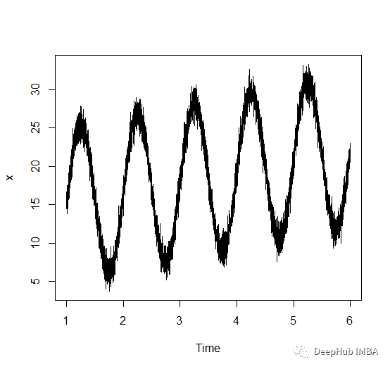
周期是数据中出现重复模式所需的时间长度。更具体地说,它是模式的一个完整周期的持续时间。在这篇文章中,将介绍计算时间序列周期的三种不同方法。
我们使用City of Ottawa 数据集,主要关注的是每天的服务呼叫数量。所以不需要对病房名称进行初始数据处理。Ottawa 数据集在渥太华市提供的数据门户网站上免费提供。
让我们加载2019-2022年的这些数据,并将它们连接起来得到一个df。
 fromgoogle.colabimportdrive
 drive.mount('/content/gdrive')
 importpandasaspd
 importmatplotlib.pyplotasplt
 importseabornassns
 importnumpyasnp

 file_path='/content/gdrive/My Drive/Colab Notebooks/Data/SR-2019.xlsx'
 records2019=pd.read_excel(file_path)#,encoding='utf16')

 file_path='/content/gdrive/My Drive/Colab Notebooks/Data/SR-2020.xlsx'
 records2020=pd.read_excel(file_path)#,encoding='utf16')

 file_path='/content/gdrive/My Drive/Colab Notebooks/Data/2021_Monthly_Service_Requests_EN.xlsx'
 records2021=pd.read_excel(file_path)#,encoding='utf16')

 file_path='/content/gdrive/My Drive/Colab Notebooks/Data/2022_Monthly_Service_Requests.csv'
 records2022=pd.read_csv(file_path)

 records=pd.concat([records2019,records2020,records2021,records2022],axis=0)
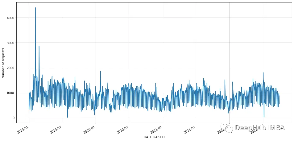
让我们根据服务调用日期聚合这些数据,并得到一个简单的图。
 records["DATE_RAISED"]=pd.to_datetime(records.DATE_RAISED)
 record_by_date=records.groupby("DATE_RAISED")["TYPE"].count().sort_index()
 record_by_date.plot(figsize= (25, 10))
 plt.ylabel('Number of requests')
 plt.grid(visible=True,which='both')
 plt.figure()

 record_by_date.iloc[100:130].plot(figsize= (25, 10))
 plt.ylabel('Number of requests')
 plt.grid(visible=True,which='both')
填充缺失
让我们检查一下我们的数据是否包含了所有的日期。
 start_date=record_by_date.index.min()
 end_date=record_by_date.index.max()

 # create a complete date range for the period of interest
 date_range=pd.date_range(start=start_date, end=end_date, freq='D')

 # compare the date range to the index of the time series
 missing_dates=date_range[~date_range.isin(record_by_date.index)]

 iflen(missing_dates) >0:
     print("Missing dates:", missing_dates)
 else:
     print("No missing dates")
正如所预期的那样,数据缺少一些日期的值。让我们用相邻日期的平均值填充这些值。
 # Reindex to fill missing dates
 idx=pd.date_range(start=record_by_date.index.min(), end=record_by_date.index.max(), freq='D')
 record_by_date=record_by_date.reindex(idx, fill_value=0)

 # Add missing dates with average of surrounding values
 fordateinmissing_dates:
     prev_date=date-pd.DateOffset(days=1)
     next_date=date+pd.DateOffset(days=1)
     prev_val=record_by_date.loc[prev_date] ifprev_dateinrecord_by_date.indexelsenp.nan
     next_val=record_by_date.loc[next_date] ifnext_dateinrecord_by_date.indexelsenp.nan
     avg_val=np.nanmean([prev_val, next_val])
     record_by_date.loc[date] =avg_val
这就是我们要做的所有预处理了,在所有这些步骤之后,我们尝试检测这个时间序列的周期。一般来说,基于假日模式和一般的人类习惯,我们希望在数据中看到七天的周期,我们来看看是不是有这样的结果。
0、目测
最简单的方法就是目测。这是一种主观的方法,而不是一种正式的或统计的方法,所以我把它作为我们列表中的原始方法。
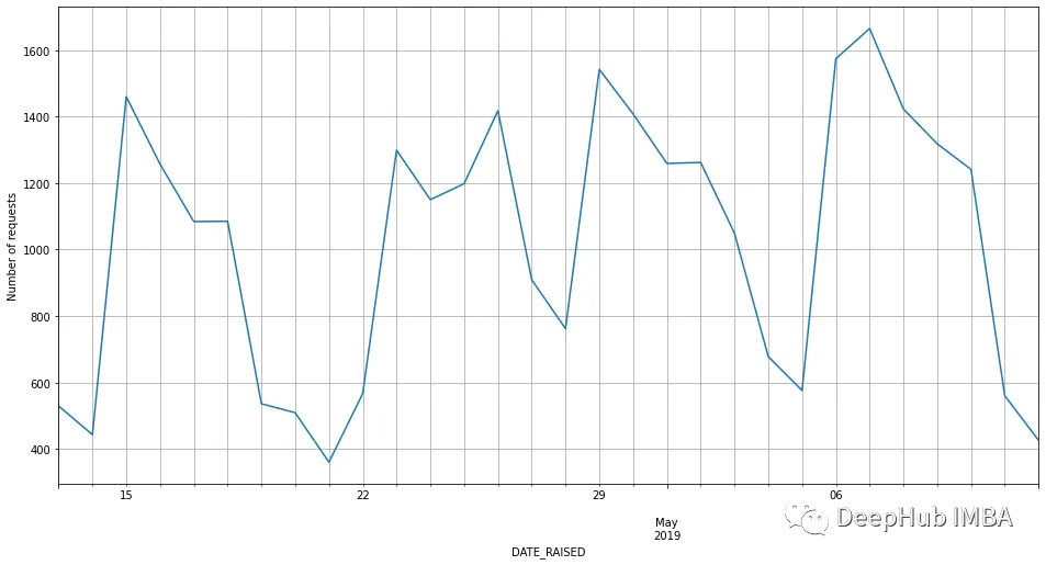
如果我们看一下这张图的放大部分,我们可以看到7天的周期。最低值出现在5月14日、21日和28日。但最高点似乎不遵循这个模式。但在更大的范围内,我们仍然可以说这个数据集的周期是7天。
下面我们来正式的进行分析:
1、自相关分析
我们将绘制时间序列的自相关值。查看acf图中各种滞后值的峰值。与第一个显著峰值对应的滞后可以给出周期的估计。
对于这种情况,我们看看50个滞后值,并使用statmodels包中的方法绘制acf。
 fromstatsmodels.graphics.tsaplotsimportplot_acf

 fig, ax=plt.subplots(figsize=(14,7))
 plot_acf(record_by_date.values.squeeze(), lags=50,ax=ax,title='Autocorrelation', use_vlines=True);
 lags=list(range(51))
 ax.set_xticks(lags);
 ax.set_xticklabels(lags);
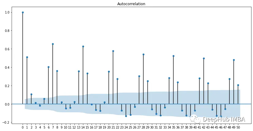
从上图可以看出,在7、1、21等处有峰值。这证实了我们的时间序列有7天的周期。
2、快速傅里叶变换
对时间序列进行傅里叶变换,寻找主频分量。主频率的倒数可以作为周期的估计值。
傅里叶变换是一种数学运算,它把一个复杂的信号分解成一组更简单的正弦和余弦波。傅里叶变换广泛应用于信号处理、通信、图像处理以及其他许多科学和工程领域。它允许我们在频域中分析和操作信号,这通常是一种比在时域中更自然和直观的理解和处理信号的方法。
 fromscipy.fftimportfft

 # Calculate the Fourier transform
 yf=np.fft.fft(record_by_date)
 xf=np.linspace(0.0, 1.0/(2.0), len(record_by_date)//2)

 # Find the dominant frequency
 # We have to drop the first element of the fft as it corresponds to the
 # DC component or the average value of the signal
 idx=np.argmax(np.abs(yf[1:len(record_by_date)//2]))
 freq=xf[idx]

 period=(1/freq)
 print(f"The period of the time series is {period}")
输出为:The period of the time series is 7.030927835051545。这与我们使用acf和目视检查发现的每周周期相似。
3、周期图
周期图 Periodogram 是一个信号或序列的功率谱密度(PSD)图。换句话说它是一个显示信号中每个频率包含多少总功率的图表。周期图是通过计算信号的傅里叶变换的幅值平方得到的,常用于信号处理和频谱分析。在某种意义上,只是前面给出的基于fft的方法的扩展。
 fromscipy.signalimportperiodogram

 freq, power=periodogram(record_by_date)
 period=1/freq[np.argmax(power)]
 print(f"The period of the time series is {period}")

 plt.plot(freq, power)
 plt.xlabel('Frequency (Hz)')
 plt.ylabel('Power spectral density')
 plt.show()
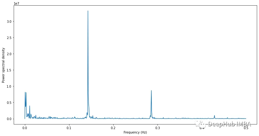
周期图可以清楚地看出,信号的最高功率在0.14,对应于7天的周期。
总结
本文,我们介绍了寻找时间序列周期的三种不同方法,通过使用这三种方法,我们能够识别信号的周期性,并使用常识进行确认。
作者:Shashindra Silva