
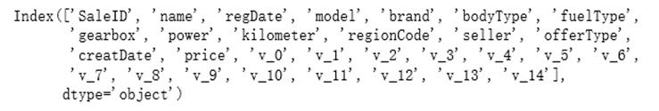
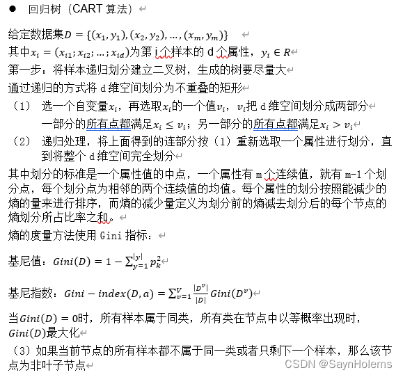
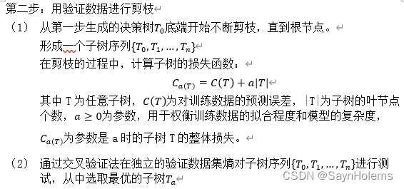
标题实验分析与设计思路
(1)读入数据
(2)分析数据格式和确定使用的模型
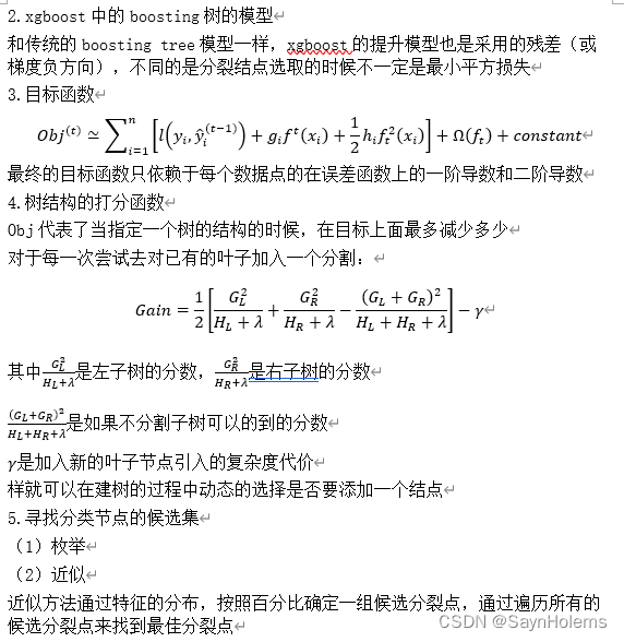
(3)数据预处理
(4)使用所选模型进行测试并改进
(5)应用不同算法(模型)对比效果
(6)使用集成学习算法提升回归效果
(7)网格搜索调参数
使用的函数库和初始化
import numpy as np
import pandas as pd
import matplotlib.pyplot as plt
import seaborn as sns
import warnings
import time

# 模型预测from sklearn.linear_model import LinearRegression
from sklearn.linear_model import Ridge
from sklearn.linear_model import Lasso
from sklearn.tree import DecisionTreeRegressor

# 集成学习from sklearn.ensemble import RandomForestRegressor
import xgboost as xgb

# 参数搜索from sklearn.model_selection import GridSearchCV,cross_val_score,StratifiedKFold
# 评价指标from sklearn.metrics import make_scorer
from sklearn.metrics import mean_squared_error, mean_absolute_error,accuracy_score
from sklearn.model_selection import learning_curve, validation_curve

warnings.filterwarnings("ignore")# 消除警告# 初始化图形参数
plt.rcParams['figure.figsize']=(16,9)# 设置大小# 图形美化
plt.style.use('ggplot')# 图例无法显示中文的解决方法:设置参数
plt.rcParams['font.sans-serif']=['SimHei']# 用来正常显示中文标签
plt.rcParams['axes.unicode_minus']=False# 用来正常显示负号
实验结果及分析
1、读取数据
这里使用在阿里巴巴天池下载的二手车交易数据https://tianchi.aliyun.com/?spm=5176.12281973.J_9711814210.8.3dd53eafkBCu9m
used_car.csv
- 数据说明:

- 读入数据
# 读取数据,以空格划分
used_car = pd.read_csv(r'C:\Desktop\数据挖掘实践\大作业\used_car.csv', sep=' ')# 输出数据大小print('数据大小:',used_car.shape)'''可以看到数据一共有150000条,31个属性'''# 预览头10行数据
used_car.head(10)
查看数据大小:可以看到数据一共有150000条,31个属性
2、数据预处理
- 查看数据信息
'''
可以看到:
model、bodyType、fuelType、gearbox这几个属性有缺失值
'''# 查看对应数据列名和是否存在NAN缺失信息
used_car.info()

可以看到:model、bodyType、fuelType、gearbox这几个属性有缺失值
print('各列缺失值统计结果为:')print(used_car.isnull().sum())

- 统计描述
# 查看数值特征列的统计信息
used_car.describe()

- 去除重复数据
# 默认根据所有属性去除,keep设置保留第一条一样的数据
used_car.drop_duplicates(keep='first')

可以看出无重复数据
- 处理缺失值 前面统计的时候知道,model、bodyType、fuelType、gearbox这几个属性有缺失值 且这些属性都是标签类的数值型数据 故填充缺失值使用众数 对于大数据集也可以直接去掉有空值的样本 使用函数dropna()
# 如果有多个众数的情况,用used_car.mode()[0]第一个众数填充
used_car['model']= used_car['model'].fillna(used_car['model'].mode()[0])
used_car['bodyType']= used_car['bodyType'].fillna(used_car['bodyType'].mode()[0])
used_car['fuelType']= used_car['fuelType'].fillna(used_car['fuelType'].mode()[0])
used_car['gearbox']= used_car['gearbox'].fillna(used_car['gearbox'].mode()[0])
- 再次查看是否还有缺失值
used_car.info()

- 提取不同类型的属性名
# 提取数值型属性名(exclude除去分类型)
numerical_cols = used_car.select_dtypes(exclude='object').columns
numerical_cols
# 提取分类型属性名(include包含分类型)
categorical_cols = used_car.select_dtypes(include='object').columns
categorical_cols

- 划分特征和标签数据(手动降维) 从数据说明中可以看出有些特征对于预测价格没有作用 这里直接将其剔除
# 选择特征列名
feature_cols =[col for col in numerical_cols if col notin['SaleID','name','regDate','creatDate','price','model','brand','regionCode','seller']]
feature_cols =[col for col in feature_cols if'Type'notin col]
X = used_car[feature_cols]
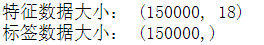
y = used_car['price']print('特征数据大小:',X.shape)print('标签数据大小:',y.shape)
- 查看标签数据(price)的分布
plt.hist(y)
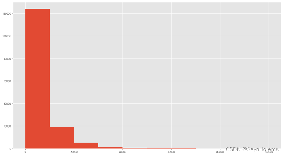
可以看到标签主要分布再0-2000内
数据归一化在后面优化结果里
3、挖掘算法
预测二手车价格是一个回归任务,故使用回归模型。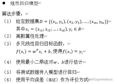
4、模型训练+预测结果
- 定义一个函数,进行k折交叉验证:
defmodelKFold2MAE(X,y,model,k):# k折交叉验证
    train_scores =[]# 存放训练集精度
    test_scores =[]# 存放测试集精度# k折交叉验证(n_splits=k)
    sk = StratifiedKFold(n_splits=k,shuffle=True,random_state=0)for train_ind,test_ind in sk.split(X,y):# 训练数据
        X_train = X.iloc[train_ind].values
        y_train = y.iloc[train_ind]# 测试数据
        X_test = X.iloc[test_ind].values
        y_test = y.iloc[test_ind]# 训练模型
        model.fit(X_train,y_train)# 预测
        pred_train = model.predict(X_train)
        pred_test = model.predict(X_test)# 精度(使用平均错误率MAE)
        train_score = mean_absolute_error(y_train,pred_train)
        train_scores.append(train_score)
        test_score = mean_absolute_error(y_test,pred_test)
        test_scores.append(test_score)print('训练集的平均MAE:',np.mean(train_scores))print('测试集的平均MAE:',np.mean(test_scores))return train_scores,test_scores
- 使用线性回归模型训练+预测结果
'''
可以看到计算出来的MAE很大
'''
lr = LinearRegression()
k =5
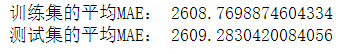
train_scores,test_scores = modelKFold2MAE(X,y,lr,k)
可以看到计算出来的MAE(平均绝对误差)很大
- 绘制特征v_2的值与标签的散点图
lr = LinearRegression()
lr.fit(X,y)# 绘制特征v_2的值与标签的散点图
subsample_index = np.random.randint(low=0, high=len(y), size=50)

plt.scatter(X['v_2'][subsample_index], y[subsample_index], color='black')
plt.scatter(X['v_2'][subsample_index], lr.predict(X.loc[subsample_index]), color='red')
plt.xlabel('v_2')
plt.ylabel('price')
plt.legend(['True Price','Predicted Price'],loc='best')print('The predicted price is obvious different from true price')
plt.show()
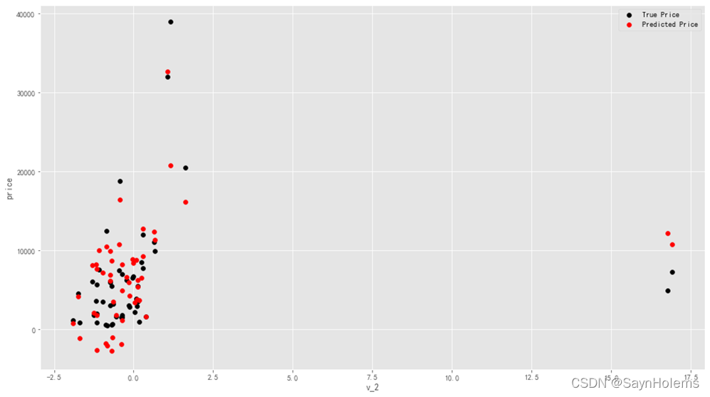
发现模型的预测结果(红色点)与真实标签(黑色点)的分布差异较大
且出现了部分预测值小于0的情况
这说明该模型存在问题
- 绘制标签数据的分布图:
print('It is clear to see the price shows a typical exponential distribution')
plt.figure(figsize=(15,5))
plt.subplot(1,2,1)
sns.distplot(y)
plt.subplot(1,2,2)
sns.distplot(y[y < np.quantile(y,0.9)])
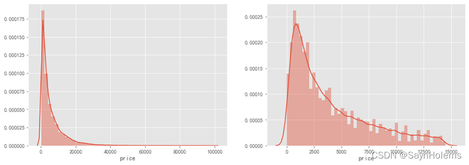
通过作图我们发现数据的标签(price)呈现长尾分布,不利于我们的建模预测
故对标签数据进行log(x+1)变换,使标签贴近于正态分布
# 对标签数据进行log(x+1)变换,使标签贴近于正态分布
y_ln = np.log(y+1)
- 再次以v_2特征和标签为xy轴对预测值和真实值进行可视化
lr = LinearRegression()
lr.fit(X,y_ln)# 绘制特征v_2的值与标签的散点图
subsample_index = np.random.randint(low=0, high=len(y_ln), size=50)

plt.scatter(X['v_2'][subsample_index], y_ln[subsample_index], color='black')
plt.scatter(X['v_2'][subsample_index], lr.predict(X.loc[subsample_index]), color='red')
plt.xlabel('v_2')
plt.ylabel('price')
plt.legend(['True Price','Predicted Price'],loc='best')print('The predicted price seems normal after np.log transforming')
plt.show()
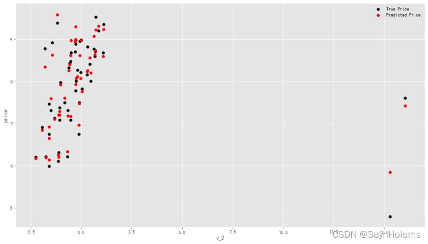
发现预测结果与真实值较为接近,且未出现异常状况
- 使用对数化之后的数据进行线性回归预测
# 使用对数化之后的数据进行线性回归预测
lr = LinearRegression().fit(X,y_ln)# 这里直接调用cross_val_score函数进行交叉验证
scores = cross_val_score(lr,
                        X=X,y=y_ln,
                        verbose=1,cv=5,
                        scoring=make_scorer(mean_absolute_error))print('线性回归5折交叉验证的平均MAE:',np.mean(scores))
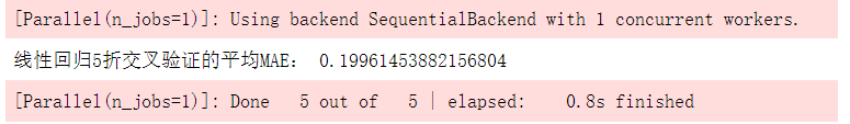
可以看到对数化之后的数据使用线性回归模型进行5折交叉验证之后的平均MAE明显比原始数据训练出来的模型的MAE小
说明对数据进行处理比没有处理的数据要更适合该模型
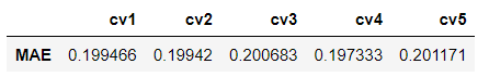
- 展示5折交叉验证的5个MAE
scores = pd.DataFrame(scores.reshape(1,-1))
scores.columns =['cv'+str(x)for x inrange(1,6)]
scores.index =['MAE']
scores
5、结果可视化
- 绘制学习率曲线和验证曲线
'''
定义一个绘制学习率曲线和验证曲线的函数
输入:estimator为传入的模型
      title为图像的标题
      cv为k折交叉验证的k
      n_jobs为learning_curve函数中的n_jobs参数

'''defplotLearningCurve(estimator,title,X,y,ylim=None,cv=None,n_jobs=1,train_size=np.linspace(.1,1.0,5)):# 画布
    plt.figure()
    plt.title(title)# 设置y轴区间if ylim isnotNone:
        plt.ylim(*ylim)

    plt.xlabel('Training example')
    plt.ylabel('score')# 调用learning_curve函数
    train_sizes, train_scores, test_scores = learning_curve(estimator,X,y,
                                                            cv=cv,n_jobs=n_jobs,
                                                            train_sizes=train_size,
                                                            scoring = make_scorer(mean_absolute_error))
    train_scores_mean = np.mean(train_scores, axis=1)
    train_scores_std = np.std(train_scores, axis=1)
    test_scores_mean = np.mean(test_scores, axis=1)
    test_scores_std = np.std(test_scores, axis=1)#区域
    plt.grid()
    plt.fill_between(train_sizes, train_scores_mean - train_scores_std,
                     train_scores_mean + train_scores_std, alpha=0.1,
                     color="r")
    plt.fill_between(train_sizes, test_scores_mean - test_scores_std,
                     test_scores_mean + test_scores_std, alpha=0.1,
                     color="g")# 绘制两条线
    plt.plot(train_sizes, train_scores_mean,'o-', color='r',
             label="Training score")
    plt.plot(train_sizes, test_scores_mean,'o-',color="g",
             label="Cross-validation score")
    plt.legend(loc="best")return plt
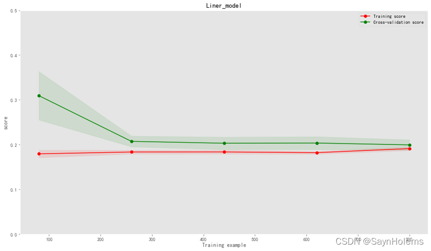
训练曲线和验证曲线相聚距离较小,说明该模型是一个地方差且低偏差的
一个比较好的模型
6、多种模型算法对比
models =[LinearRegression(),
          Ridge(),
          Lasso(),
          DecisionTreeRegressor()]
result =dict()# 遍历所有模型for model in models:
    model_name =str(model).split('(')[0]# 5折交叉验证
    scores = cross_val_score(model,
                        X=X,y=y_ln,
                        verbose=1,cv=5,
                        scoring=make_scorer(mean_absolute_error))print('{0} 5折交叉验证的平均MAE:{1}'.format(model_name,np.mean(scores)))
    result[model_name]= scores
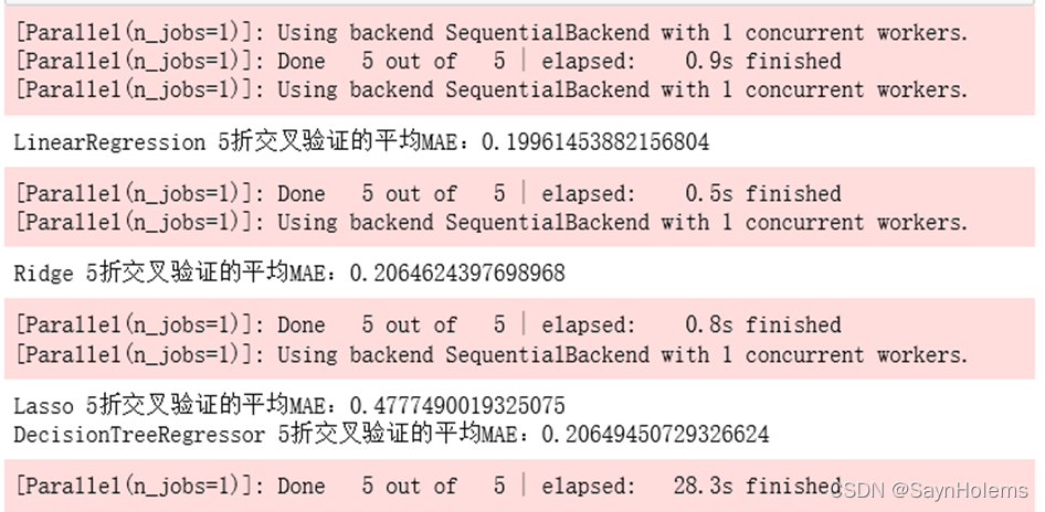
可以分别得到该模型的MAE以及训练时间(红色部分)
result = pd.DataFrame(result)
result.index =['cv'+str(x)for x inrange(1,6)]
result
- 将每次cv的MAE做成表格可视化
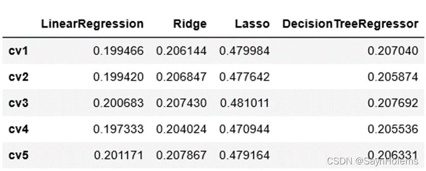
根据5折交叉验证的平均MAE可以分析出以下结果:
线性回归对于该数据效果最好
其次是回归树
Lasso的效果最差
7、集成
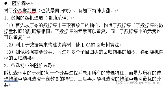
这里使用两种集成学习,一种是并行boosting迭代型的xgboost算法;一种是串行的随机森林算法
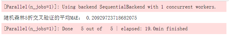
- 随机森林
forest = RandomForestRegressor(n_estimators=120,random_state=0,max_depth=7)
forest_scores = cross_val_score(forest,
                         X=X,y=y_ln,
                         verbose=1,cv=5,
                         scoring=make_scorer(mean_absolute_error))print('随机森林5折交叉验证的平均MAE:',np.mean(forest_scores))
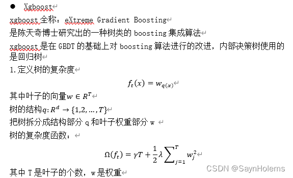
- xgboost模型
# xgb回归模型'''
n_estimators=120使用120个基学习器
learning_rate=0.1学习率
防止过拟合:设置
subsample=0.8
colsample_bytree=0.9列名筛选
max_depth=7最大深度
'''
xgr = xgb.XGBRegressor(n_estimators=120, learning_rate=0.1, gamma=0, subsample=0.8,\
colsample_bytree=0.9, max_depth=7)#,objective ='reg:squarederror'
xgr_scores = cross_val_score(xgr,
X=X,y=y_ln,
verbose=1,cv=5,
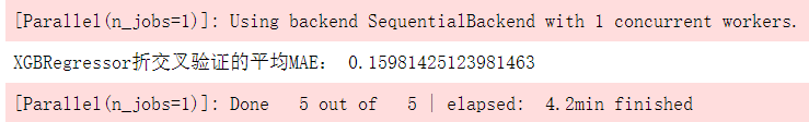
scoring=make_scorer(mean_absolute_error))print('XGBRegressor折交叉验证的平均MAE:',np.mean(xgr_scores))
- 对比结果可视化
fig = plt.figure(figsize=(20,10))
cv =[i for i inrange(5)]
plt.plot(cv,forest_scores,'go-',label='随机森林')
plt.plot(cv,xgr_scores,'r>--',label='xgboost')#设置x轴刻度
ticks = plt.xticks(cv)#设置x轴和y轴的名称
xlabel = plt.xlabel('cv')
ylabel = plt.ylabel('MAE',rotation=0)
plt.legend(loc='best')
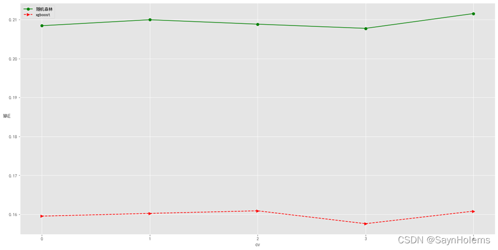
从上图可以看出
对于该数据,xgboost的效果要比随机森林好许多
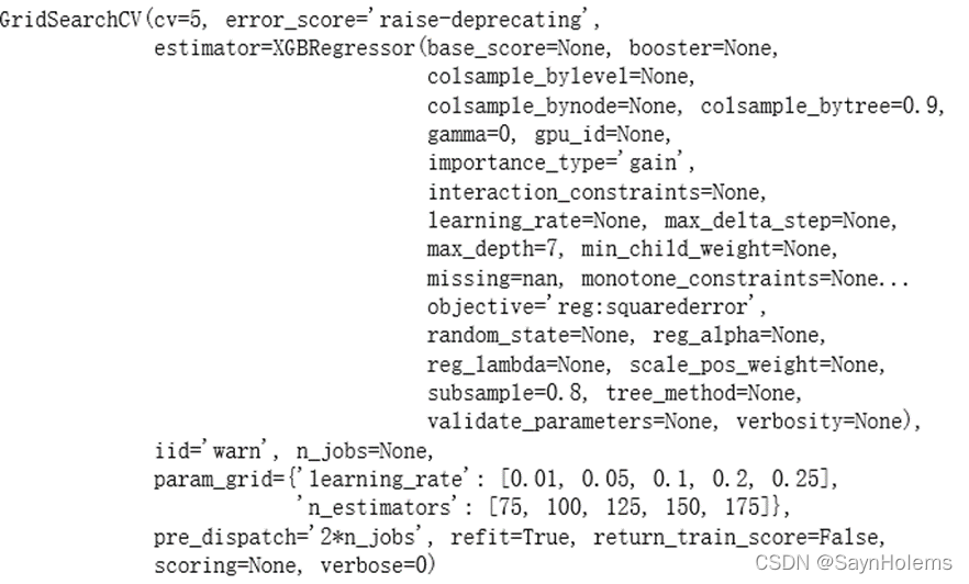
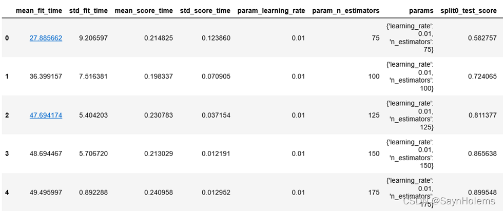
- 网格搜索调参 从上图的分析可以看出xgboost的效果较好 这里使用该算法进行网格调参选取最佳参数 主要调整的参数有两个: 基学习器数量和学习率;分别设置5个值进行调整
xgr = xgb.XGBRegressor(gamma=0, subsample=0.8,colsample_bytree=0.9, max_depth=7)
param_grid ={'learning_rate':[0.01,0.05,0.1,0.2,0.25],'n_estimators':[75,100,125,150,175]}# 带交叉验证的网格搜索,5折交叉验证
xgb_gs = GridSearchCV(xgr, param_grid, cv=5)
xgb_gs.fit(X,y)
输出最佳的参数和最佳参数的精度:
print('最佳参数:',xgb_gs.best_params_)print('最佳参数的训练精度:{:.2f}'.format(xgb_gs.best_score_))
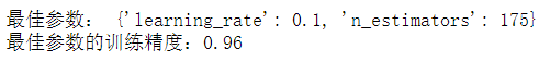
最佳的参数是175个基学习器和0.1的学习率
- 查看分析交叉验证的结果:
xgb_gs_result = pd.DataFrame(xgb_gs.cv_results_)# 显示前5行
display(xgb_gs_result.head())
8、使用集成算法前后的结果比较分析
主要分析DecisionTreeRegressor、随机森林和xgboost的结果
因为随机森林和xgboost使用的基分类器都是决策树
# 去除DecisionTreeRegressor的结果
dtr_scores =[]for i inrange(len(result['DecisionTreeRegressor'])):
    dtr_scores.append(result['DecisionTreeRegressor'].iloc[i])

fig = plt.figure(figsize=(20,10))
cv =[i for i inrange(5)]
plt.plot(cv,dtr_scores,'bo-',label='回归树')
plt.plot(cv,forest_scores,'g>--',label='随机森林')
plt.plot(cv,xgr_scores,'r>--',label='xgboost')#设置x轴刻度
ticks = plt.xticks(cv)#设置x轴和y轴的名称
xlabel = plt.xlabel('cv')
ylabel = plt.ylabel('MAE',rotation=0)
plt.legend(loc='best')
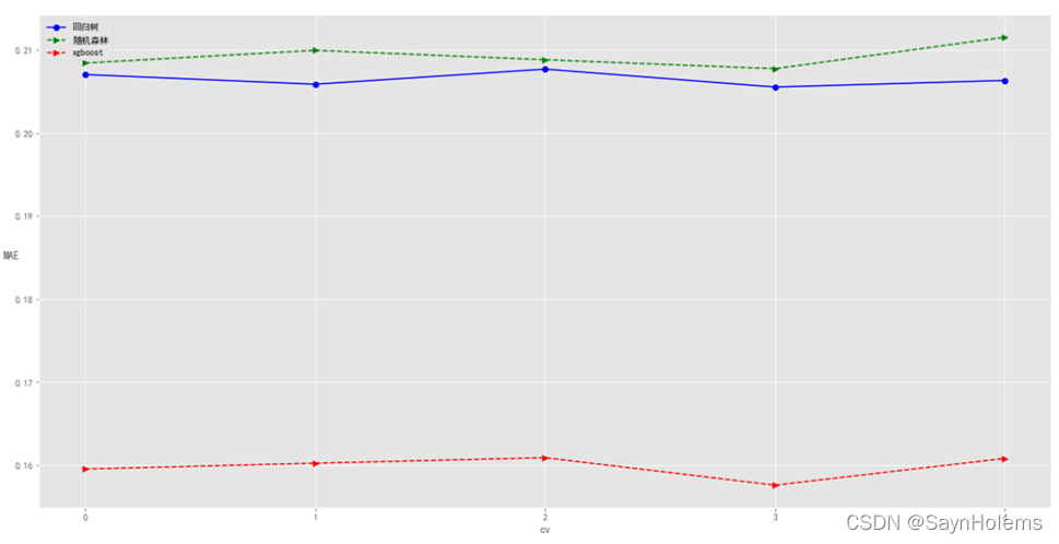
发现相比不使用集成学习的回归树,两种集成学习算法(随机森林和xgboost)的MAE更小,说明集成学习对于数据有较好的作用
其中以xgboost作用更为明显。
总结与思考
1、在整个的数据挖掘流程中,预处理是不是可有可无的一个步骤?主要解决哪些问题,有什么作用?
答:预处理是一个很重要且必不可少的步骤
主要解决:
(1)缺失数据填补或删除
(2)处理离群点或噪声点
(3)将数据成模型需要的格式(离散或是连续值)
(4)数据标准化
作用:
(1)可以处理缺失数据,否则模型无法运行
(2)确保模型不会因为数据格式等问题导致精度下降
2、不同算法之间有无优劣之分?有没有一种算法是最优的?
答:不同算法之间无法直观比较优劣,没有一种算法可以说是最优的。
对于不同的任务使用的算法不一样:分类任务使用分类算法、聚类任务使用聚类算法。
对于不同的数据适用的算法也不一样。存在对于数据A线性回归算法比回归树精度高,但是对于数据B回归树精度比线性回归算法精度高的情况。
版权归原作者 SaynHolems 所有, 如有侵权,请联系我们删除。