
这是机器未来的第57篇文章
原文首发地址:https://robotsfutures.blog.csdn.net/article/details/127116651

《Python数据科学快速入门系列》快速导航:
- 【Python数据科学快速入门系列 | 01】Numpy初窥——基础概念
- 【Python数据科学快速入门系列 | 02】创建ndarray对象的十多种方法
- 【Python数据科学快速入门系列 | 03】玩转数据摘取:Numpy的索引与切片
- 【Python数据科学快速入门系列 | 04】Numpy四则运算、矩阵运算和广播机制的爱恨情仇
- 【Python数据科学快速入门系列 | 05】常用科学计算函数
- 【Python数据科学快速入门系列 | 06】Matplotlib数据可视化基础入门(一)
- 【Python数据科学快速入门系列 | 07】Matplotlib数据可视化基础入门(二)
- 【Python数据科学快速入门系列 | 08】类别比较图表应用总结
文章目录
写在开始:
- 博客简介:专注AIoT领域,追逐未来时代的脉搏,记录路途中的技术成长!
- 博主社区:AIoT机器智能, 欢迎加入!
- 专栏简介:从0到1掌握数据科学常用库Numpy、Matploblib、Pandas。
- 面向人群:AI初级学习者
1. 概述
本篇文章总结常用的数据关系图表。
数据关系图表强调2个或以上变量的相关性关系。例如机器学习、深度学习时分析特征与标签的相关性分析。数据关系图表又分为数值关系、层次关系和网络关系三种。
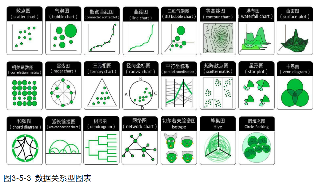
2. 常用的数据关系图表应用
2.1 散点图
散点图也叫 X-Y 图,它将所有的数据以点的形式展现在直角坐标系上,以显示变量之间的相互影响程度,点的位置由变量的数值决定。
通过观察散点图上数据点的分布情况,我们可以推断出变量间的相关性。如果变量之间不存在相互关系,那么在散点图上就会表现为随机分布的离散的点,如果存在某种相关性,那么大部分的数据点就会相对密集并以某种趋势呈现。数据的相关关系主要分为:正相关(两个变量值同时增长)、负相关(一个变量值增加另一个变量值下降)、不相关、线性相关、指数相关等,表现在散点图上的大致分布如下图所示。那些离点集群较远的点我们称为离群点或者异常点。
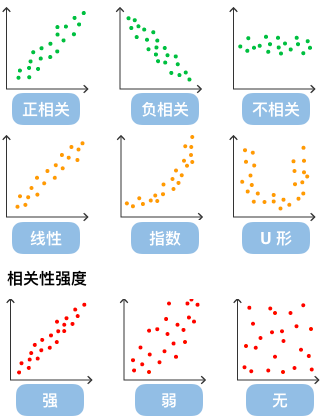
散点图经常与回归线(就是最准确地贯穿所有点的线)结合使用,归纳分析现有数据以进行预测分析。
对于那些变量之间存在密切关系,但是这些关系又不像数学公式和物理公式那样能够精确表达的,散点图是一种很好的图形工具。但是在分析过程中需要注意,这两个变量之间的相关性并不等同于确定的因果关系,也可能需要考虑其他的影响因素。
在matplotlib中,散点图是通过方法scatter来实现的。
plt.scatter??
A scatter plot of *y* vs. *x* with varying marker size and/or color.

Parameters
----------
x, y : float or array-like, shape (n, )
    The data positions.

s : float or array-like, shape (n, ), optional
    The marker size in points**2.
    Default is ``rcParams['lines.markersize'] ** 2``.

c : array-like or list of colors or color, optional
    The marker colors. Possible values:

    - A scalar or sequence of n numbers to be mapped to colors using
      *cmap* and *norm*.
    - A 2D array in which the rows are RGB or RGBA.
    - A sequence of colors of length n.
    - A single color format string.

    Note that *c* should not be a single numeric RGB or RGBA sequence
    because that is indistinguishable from an array of values to be
    colormapped. If you want to specify the same RGB or RGBA value for
    all points, use a 2D array with a single row.  Otherwise, value-
    matching will have precedence in case of a size matching with *x*
    and *y*.

    If you wish to specify a single color for all points
    prefer the *color* keyword argument.

    Defaults to `None`. In that case the marker color is determined
    by the value of *color*, *facecolor* or *facecolors*. In case
    those are not specified or `None`, the marker color is determined
    by the next color of the ``Axes``' current "shape and fill" color
    cycle. This cycle defaults to :rc:`axes.prop_cycle`.

marker : `~.markers.MarkerStyle`, default: :rc:`scatter.marker`
    The marker style. *marker* can be either an instance of the class
    or the text shorthand for a particular marker.
    See :mod:`matplotlib.markers` for more information about marker
    styles.

cmap : str or `~matplotlib.colors.Colormap`, default: :rc:`image.cmap`
    A `.Colormap` instance or registered colormap name. *cmap* is only
    used if *c* is an array of floats.

norm : `~matplotlib.colors.Normalize`, default: None
    If *c* is an array of floats, *norm* is used to scale the color
    data, *c*, in the range 0 to 1, in order to map into the colormap
    *cmap*.
    If *None*, use the default `.colors.Normalize`.

vmin, vmax : float, default: None
    *vmin* and *vmax* are used in conjunction with the default norm to
    map the color array *c* to the colormap *cmap*. If None, the
    respective min and max of the color array is used.
    It is an error to use *vmin*/*vmax* when *norm* is given.

alpha : float, default: None
    The alpha blending value, between 0 (transparent) and 1 (opaque).

linewidths : float or array-like, default: :rc:`lines.linewidth`
    The linewidth of the marker edges. Note: The default *edgecolors*
    is 'face'. You may want to change this as well.

edgecolors : {'face', 'none', *None*} or color or sequence of color, default: :rc:`scatter.edgecolors`
    The edge color of the marker. Possible values:

    - 'face': The edge color will always be the same as the face color.
    - 'none': No patch boundary will be drawn.
    - A color or sequence of colors.

    For non-filled markers, *edgecolors* is ignored. Instead, the color
    is determined like with 'face', i.e. from *c*, *colors*, or
    *facecolors*.

plotnonfinite : bool, default: False
    Whether to plot points with nonfinite *c* (i.e. ``inf``, ``-inf``
    or ``nan``). If ``True`` the points are drawn with the *bad*
    colormap color (see `.Colormap.set_bad`).

Returns
-------
`~matplotlib.collections.PathCollection`

Other Parameters
----------------
data : indexable object, optional
    If given, the following parameters also accept a string ``s``, which is
    interpreted as ``data[s]`` (unless this raises an exception):

    *x*, *y*, *s*, *linewidths*, *edgecolors*, *c*, *facecolor*, *facecolors*, *color*
**kwargs : `~matplotlib.collections.Collection` properties

See Also
--------
plot : To plot scatter plots when markers are identical in size and
    color.

Notes
-----
* The `.plot` function will be faster for scatterplots where markers
  don't vary in size or color.

* Any or all of *x*, *y*, *s*, and *c* may be masked arrays, in which
  case all masks will be combined and only unmasked points will be
  plotted.

* Fundamentally, scatter works with 1D arrays; *x*, *y*, *s*, and *c*
  may be input as N-D arrays, but within scatter they will be
  flattened. The exception is *c*, which will be flattened only if its
  size matches the size of *x* and *y*.
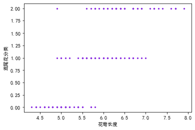
2.1.1 单特征与标签的相关性分析
首先,先来看一下单个特征与标签的关系,以鸢尾花花萼长度与鸢尾花的分类的相关性分析为例。
"""
    加载鸢尾花数据集
"""import numpy as np

data =[]
column_name =[]withopen(file='iris.txt',mode='r')as f:# 过滤标题行
    line = f.readline()if line:
        column_name = np.array(line.strip().split(','))whileTrue:
        line = f.readline()if line:
            data.append(line.strip().split(','))else:break

data = np.array(data,dtype=float)# 使用切片提取前4列数据作为特征数据
X_data = data[:,:4]# 或者 X_data = data[:, :-1]# 使用切片提取最后1列数据作为标签数据
y_data = data[:,-1]

data.shape, X_data.shape, y_data.shape
((150, 5), (150, 4), (150,))
from matplotlib import pyplot as plt

plt.rcParams["font.sans-serif"]=["SimHei"]#设置字体
plt.rcParams["axes.unicode_minus"]=False#该语句解决图像中的“-”负号的乱码问题

fig, ax = plt.subplots()# 花萼长度与鸢尾花分类的相关性分析
ax.scatter(X_data[:,0], y_data, c='blueviolet',marker='.', s=20)
ax.set_xlabel("花萼长度")
ax.set_ylabel("鸢尾花分类")
Text(0, 0.5, '鸢尾花分类')
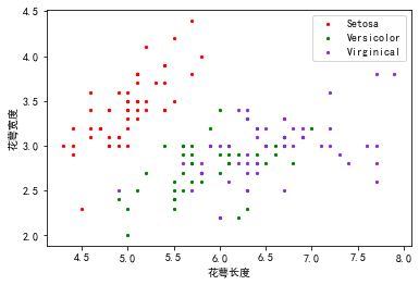
2.1.1 双特征与标签的相关性分析
从上面的图上来看,可以看到花萼长度和鸢尾花分类之间的相关性不是很直观,有重叠的部分。可以引入双变量,查看双变量与鸢尾花分类之间的相关性。其实散点图只能看两个变量之间的相关性,如何查看3个变量的相关性呢,用了个取巧的方式,将因变量(Y)作为颜色代码填入,其余两个自变量(X)作为x,y的值填入来实现。
看例子:查看一下花萼长度、花萼宽度与鸢尾花分类之间的相关性。
from matplotlib import pyplot as plt

plt.rcParams["font.sans-serif"]=["SimHei"]#设置字体
plt.rcParams["axes.unicode_minus"]=False#该语句解决图像中的“-”负号的乱码问题

fig, ax = plt.subplots()# 花萼长度与鸢尾花分类的相关性分析
ax.scatter(x=X_data[:,0], y=X_data[:,1], c=y_data, marker='.', s=20)
ax.set_xlabel("花萼长度")
ax.set_ylabel("花萼宽度")
Text(0, 0.5, '花萼宽度')
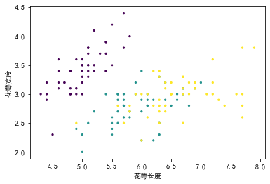
可以看到通过颜色将3种分类区分开了。除了上面的方式,也可以单独绘制3次不同颜色的点来实现,同时还可以增加图例,但是明显麻烦很多。
from cProfile import label
from matplotlib import pyplot as plt

plt.rcParams["font.sans-serif"]=["SimHei"]#设置字体
plt.rcParams["axes.unicode_minus"]=False#该语句解决图像中的“-”负号的乱码问题

fig, ax = plt.subplots()# 花萼长度与鸢尾花分类的相关性分析
ax.scatter(x=X_data[:,0][y_data==0], y=X_data[:,1][y_data==0], c="red", marker='.', s=20, label="Setosa")
ax.scatter(x=X_data[:,0][y_data==1], y=X_data[:,1][y_data==1], c="green", marker='.', s=20, label="Versicolor")
ax.scatter(x=X_data[:,0][y_data==2], y=X_data[:,1][y_data==2], c="blueviolet", marker='.', s=20, label="Virginical")

ax.set_xlabel("花萼长度")
ax.set_ylabel("花萼宽度")

ax.legend()
<matplotlib.legend.Legend at 0x1de6f0ec248>
2.1.3 双特征散点矩阵与标签的相关性分析
因为鸢尾花的特征数量其实为4个,那么其实有
C
4
2
C_{4}^{2}
C42共12种组合,可以通过散点矩阵图来实现可视化展现双变量与标签之间的相关性分析。
斜对角线是核密度曲线,展示不同鸢尾花分类对应不同特征的值的密度分布,其它子图展示两个特征与表现的相关性。
from matplotlib import pyplot as plt
import seaborn as sns

fig, ax = plt.subplots(4,4, figsize=(12,12))for i inrange(4):for j inrange(4):if i != j:
            ax[i][j].scatter(X_data[:,i], X_data[:,j], c=y_data, cmap='brg', s=10)else:# 核密度曲线KDE#
            sns.kdeplot(X_data[y_data==0][:,i], ax=ax[i][j], label="Setosa")
            sns.kdeplot(X_data[y_data==1][:,i], ax=ax[i][j], label="Versicolor")
            sns.kdeplot(X_data[y_data==2][:,i], ax=ax[i][j], label="Virginical")# 显示横轴自变量名称if i==0:
            ax[i][j].set_title(column_name[j])# 显示纵轴自变量名称if j==0:
            ax[i][j].set_ylabel(column_name[i])

plt.show()
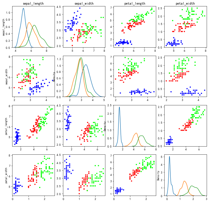
从上面的散点矩阵图可以看到已经有些散点图已经体现出聚类表现了。以上就是散点图的简单应用。
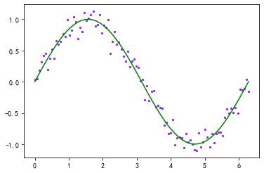
2.2 散点曲线图
在做机器学习线性回归分析的时候,我们通过机器学习训练完模型后,还需要验证模型是否符合数据集,我们可以在散点图上绘制回归线,看模型是否拟合良好。
import numpy as np
from matplotlib import pyplot as plt

mu =0
sigma =0.1

x_data = np.linspace(0,2*np.pi,100)
y_data = np.sin(x_data)

error =1.2
noise = np.random.normal(loc=mu, scale=sigma, size=len(y_data))*error

y_data_1 = y_data + noise

plt.scatter(x_data, y_data_1, c="blueviolet", marker='.', s=20)
plt.plot(x_data, y_data, c='green')
[<matplotlib.lines.Line2D at 0x1de6dbcee88>]
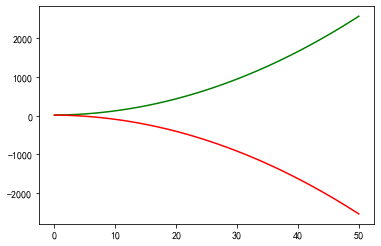
2.3 曲线图
曲线图可以很直观的展现X-Y之间的相关性。
import numpy as np
from matplotlib import pyplot as plt

mu =0
sigma =0.1

x_data = np.linspace(0,50,100)
y_data = x_data**2+ x_data +15
y_data_2 =(-1)* x_data**2- x_data +15

plt.plot(x_data, y_data, c='green')
plt.plot(x_data, y_data_2, c='red')
plt.show()
3. 总结
曲线图、散点图、散点矩阵图在机器学习和深度学习中应用到也较多,除了matplotlib可以绘制以外,pandas也带有很多绘图方法,后面进一步讨论。
参考文献:
— 博主热门专栏推荐 —
- Python零基础快速入门系列
- 深入浅出i.MX8企业级开发实战系列
- MQTT从入门到提高系列
- 物体检测快速入门系列
- 自动驾驶模拟器AirSim快速入门
- 安全利器SELinux入门系列
- Python数据科学快速入门系列

版权归原作者 机器未来 所有, 如有侵权,请联系我们删除。