
文章目录
说实话,Python 画图和 Matlab 画图十分相似『Matlab 转战 Python』—— 沃兹·基硕德
Part.I 基础知识
Chap.I 快应用
- Python 常用线型 + 点符号 + 颜色汇总
- Python 中图例 Legend 的调整
- Python 修改 x/y ticks
- Python 绘图字体与位置控制
下面是『进阶使用』:
- Python 让多图排版更加美观
- Python 箱型图的绘制并提取特征值
Chap.II 常用语句
下面是一些基本的绘图语句:
import matplotlib.pyplot as plt            # 导入模块

plt.style.use('ggplot')# 设置图形的显示风格
fig=plt.figure(1)# 新建一个 figure1
fig=plt.figure(figsize=(12,6.5),dpi=100,facecolor='w')
fig.patch.set_alpha(0.5)# 设置透明度为 0.5
font1 ={'weight':60,'size':10}# 创建字体,设置字体粗细和大小
ax1.set_xlim(0,100)# 设置 x 轴最大最小刻度
ax1.set_ylim(-0.1,0.1)# 设置 y 轴最大最小刻度
plt.xlim(0,100)# 和上面效果一样
plt.ylim(-1,1)
ax1.set_xlabel('X name',font1)# 设置 x 轴名字
ax1.set_ylabel('Y name',font1)# 设置 y 轴名字
plt.xlabel('aaaaa')# 设置 x 轴名字
plt.ylabel('aaaaa')# 设置 y 轴名字
plt.grid(True)# 增加格网
plt.grid(axis="y")# 只显示横向格网
plt.grid(axis="x")# 只显示纵向格网
ax=plt.gca()# 获取当前axis,
fig=plt.gcf()# 获取当前figures
plt.gca().set_aspect(1)# 设置横纵坐标单位长度相等
plt.text(x,y,string)# 在 x,y 处加入文字注释
plt.gca().set_xticklabels(labels, rotation=30, fontsize=16)# 指定在刻度上显示的内容
plt.xticks(ticks, labels, rotation=30, fontsize=15)# 上面两句合起来
plt.legend(['Float'],ncol=1,prop=font1,frameon=False)# 设置图例 列数、去掉边框、更改图例字体
plt.title('This is a Title')# 图片标题
plt.show()# 显示图片,没这行看不见图
plt.savefig(path, dpi=600)# 保存图片,dpi可控制图片清晰度
plt.rcParams['font.sans-serif']=['SimHei']# 添加这条可以让图形显示中文
mpl.rcParams['axes.unicode_minus']=False# 添加这条可以让图形显示负号
ax.spines['right'].set_color('none')
ax.spines['top'].set_color('none')#设置图片的右边框和上边框为不显示# 子图
ax1=plt.subplot(3,1,1)
ax1.scatter(time,data[:,1],s=5,color='blue',marker='o')# size, color, 标记
ax1=plt.subplot(3,1,2)...# 控制图片边缘的大小
plt.subplots_adjust(left=0, bottom=0, right=1, top=1,hspace=0.1,wspace=0.1)# 设置坐标刻度朝向,暂未成功
plt.rcParams['xtick.direction']='in'
ax = plt.gca()
ax.invert_xaxis()
ax.invert_yaxis()
Part.II 画图样例
不要忘记
import
plt
import matplotlib.pyplot as plt
下面是一些简单的绘图示例,上面快应用『进阶使用』部分会有些比较复杂的操作,感兴趣的可参看。
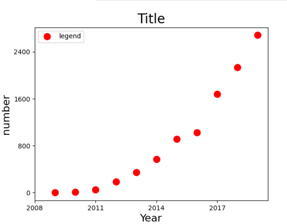
Chap.I 散点图
years =[2009,2010,2011,2012,2013,2014,2015,2016,2017,2018,2019]
turnovers =[0.5,9.36,52,191,350,571,912,1027,1682,2135,2684]
plt.figure()
plt.scatter(years, turnovers, c='red', s=100, label='legend')
plt.xticks(range(2008,2020,3))
plt.yticks(range(0,3200,800))
plt.xlabel("Year", fontdict={'size':16})
plt.ylabel("number", fontdict={'size':16})
plt.title("Title", fontdict={'size':20})
plt.legend(loc='best')
plt.show()
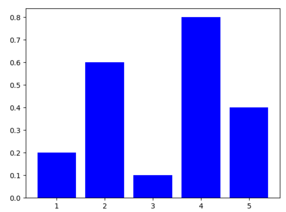
Chap.II 柱状图
X=[1,2,3,4,5]
Y=[0.2,0.6,0.1,0.8,0.4]
plt.bar(X,Y,color='b')
plt.show()
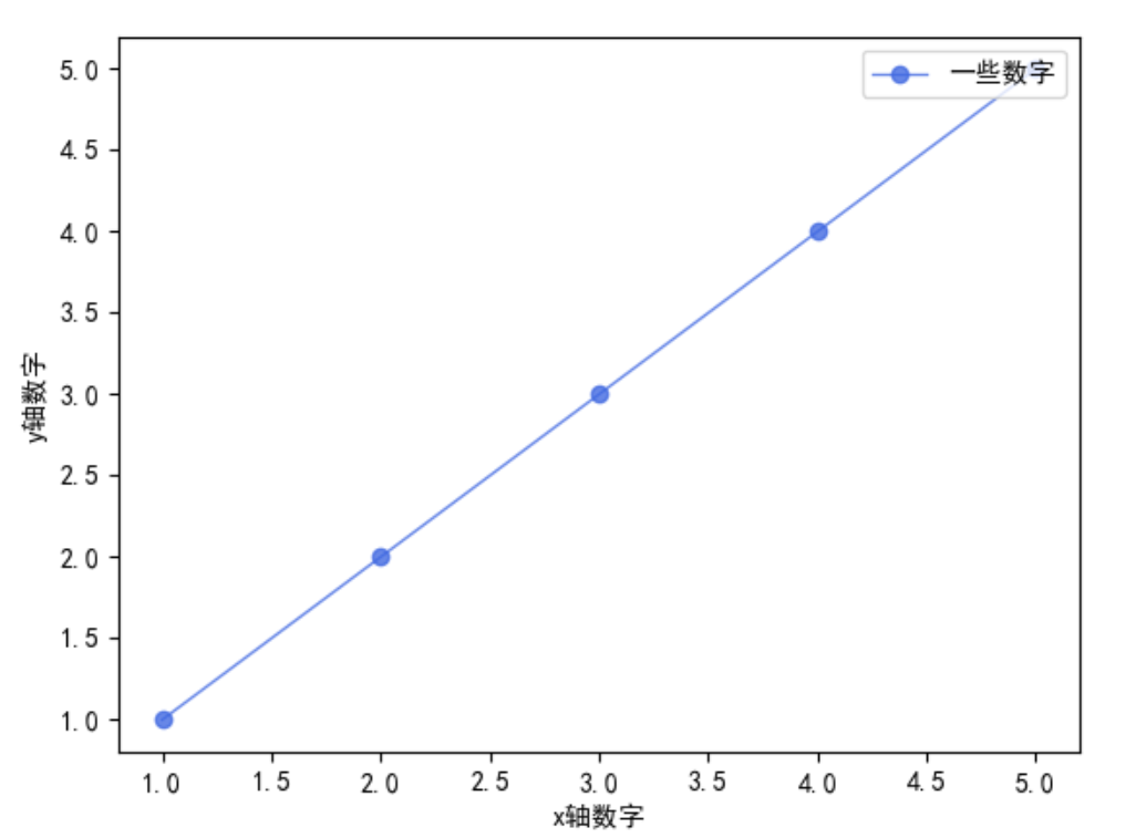
Chap.III 折线图
plt.rcParams['font.sans-serif']=['SimHei']# 添加这条可以让图形显示中文
x_axis_data =[1,2,3,4,5]
y_axis_data =[1,2,3,4,5]# plot中参数的含义分别是横轴值,纵轴值,线的形状,颜色,透明度,线的宽度和标签
plt.plot(x_axis_data, y_axis_data,'ro-', color='#4169E1', alpha=0.8, linewidth=1, label='一些数字')# 显示标签,如果不加这句,即使在plot中加了label='一些数字'的参数,最终还是不会显示标签
plt.legend(loc="upper right")
plt.xlabel('x轴数字')
plt.ylabel('y轴数字')
plt.show()
Chap.IV 概率分布直方图
主要通过函数
plt.hist()
来实现,
matplotlib.pyplot.hist(
x, bins=10,range=None, normed=False,edgecolor='k',
weights=None, cumulative=False, bottom=None,
histtype=u'bar', align=u'mid', orientation=u'vertical',
rwidth=None, log=False, color=None, label=None, stacked=False,
hold=None,**kwargs)
其中,常用的参数及其含义如下:
- bins:“直方条”的个数,一般可取20
- range=(a,b):只考虑区间
(a,b)之间的数据,绘图的时候也只绘制区间之内的 - edgecolor=‘k’:给直方图加上黑色边界,不然看起来很难看(下面的例子就没加,所以很难看)
example_list=[]
n=10000for i inrange(n):
    tmp=[np.random.normal()]
    example_list.extend(tmp)
width=100
n, bins, patches = plt.hist(example_list,bins = width,color='blue',alpha=0.5)
X = bins[0:width]+(bins[1]-bins[0])/2.0
Y = n
maxn=max(n)
maxn1=int(maxn%8+maxn+8*2)
ydata=list(range(0,maxn1+1,maxn1//8))
yfreq=[str(i/sum(n))for i in ydata]
plt.plot(X,Y,color='green')#利用返回值来绘制区间中点连线
p1 = np.polyfit(X, Y,7)#利用7次多项式拟合,返回拟多项式系数,按照阶数从高到低排列
Y1 = np.polyval(p1,X)
plt.plot(X,Y1,color='red')
plt.xlim(-2.5,2.5)
plt.ylim(0)
plt.yticks(ydata,yfreq)#这条语句控制纵坐标是频数或频率,打开是频率,否则是频数
plt.legend(['midpoint','fitting'],ncol=1,frameon=False)
plt.show()
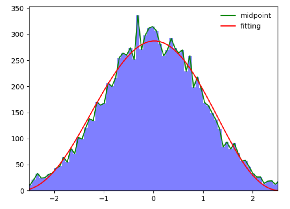
上面的图片中,绿线是直方图矩形的中点连线,红线是根据直方图的中点7次拟合的曲线。
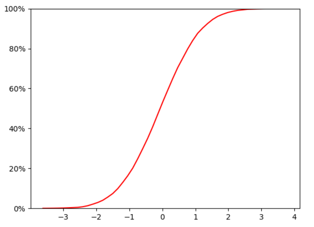
Chap.V 累计概率分布曲线
累积分布函数(Cumulative Distribution Function),又叫分布函数,是概率密度函数的积分,能完整描述一个实随机变量X的概率分布。
example_list=[]
n=10000for i inrange(n):
    tmp=[np.random.normal()]
    example_list.extend(tmp)
width=50
n, bins, patches = plt.hist(example_list,bins = width,color='blue',alpha=0.5)
plt.clf()# clear the figure
X = bins[0:width]+(bins[1]-bins[0])/2.0
bins=bins.tolist()
freq=[f/sum(n)for f in n]
acc_freq=[]for i inrange(0,len(freq)):if i==0:
        temp=freq[0]else:
        temp=sum(freq[:i+1])
    acc_freq.append(temp)
plt.plot(X,acc_freq,color='r')# Cumulative probability curve
yt=plt.yticks()
yt1=yt[0].tolist()defto_percent(temp,position=0):# convert float number to percentreturn'%1.0f'%(100*temp)+'%'
ytk1=[to_percent(i)for i in yt1 ]
plt.yticks(yt1,ytk1)
plt.ylim(0,1)
plt.show()
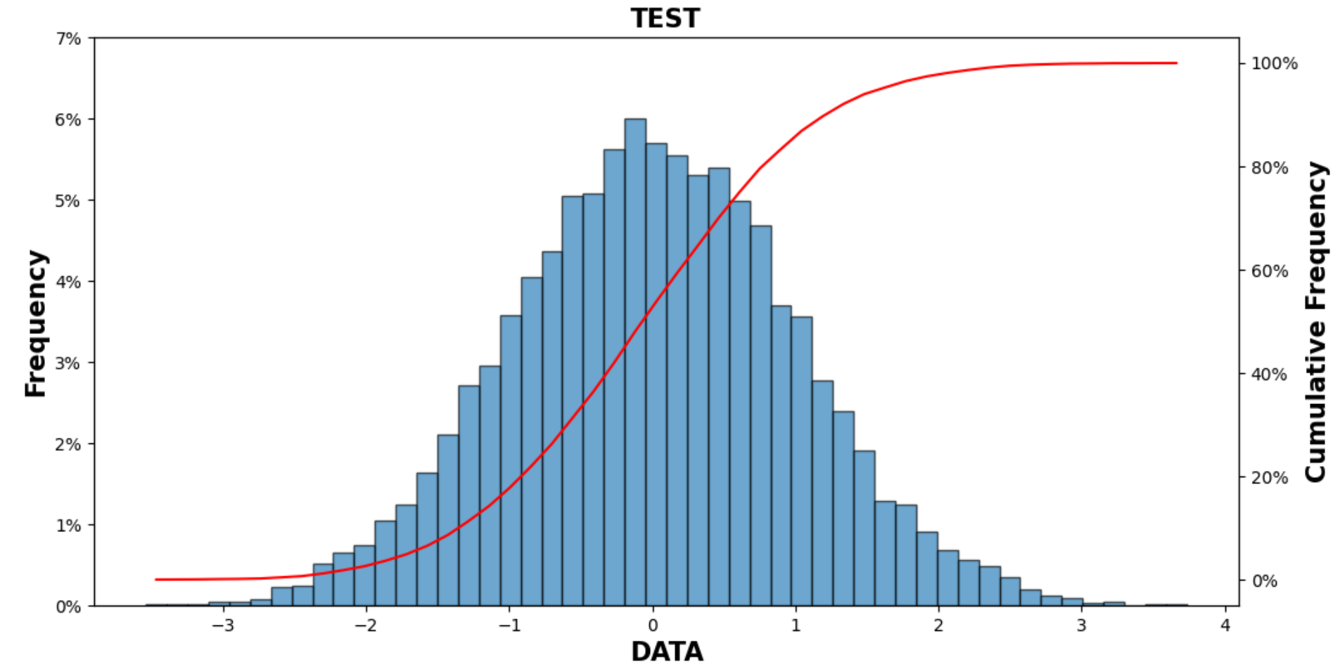
Chap.VI 概率分布直方图+累计概率分布图
参考:https://blog.csdn.net/qq_38412868/article/details/105319818
可以绘制概率分布直方图和累计概率曲线
笔者进行了一些的改编:
defdraw_cum_prob_curve(data,bins=20,title='Distribution Of Errors',xlabel='The Error(mm)',pic_path=''):"""
    plot Probability distribution histogram and Cumulative probability curve.

    > @param[in] data:          The error data
    > @param[in] bins:          The number of hist
    > @param[in] title:         The titile of the figure
    > @param[in] xlabel:        The xlable name
    > @param[in] pic_path:      The path where you want to save the figure
    return:     void
    """import matplotlib.pyplot as plt
    import matplotlib as mpl
    from matplotlib.ticker import FuncFormatter
    from matplotlib.pyplot import MultipleLocator
    defto_percent(temp,position=0):# convert float number to percentreturn'%1.0f'%(100*temp)+'%'
    fig, ax1 = plt.subplots(1,1, figsize=(12,6), dpi=100, facecolor='w')
    font1 ={'weight':600,'size':15}

    n, bins, patches=ax1.hist(data,bins =bins, alpha =0.65,edgecolor='k')# Probability distribution histogram
    yt=plt.yticks()
    yt1=yt[0].tolist()
    yt2=[i/sum(n)for i in yt1]
    ytk1=[to_percent(i)for i in yt2 ]
    plt.yticks(yt1,ytk1)
    X=bins[0:-1]+(bins[1]-bins[0])/2.0
    bins=bins.tolist()
    freq=[f/sum(n)for f in n]
    acc_freq=[]for i inrange(0,len(freq)):if i==0:
            temp=freq[0]else:
            temp=sum(freq[:i+1])
        acc_freq.append(temp)
    ax2=ax1.twinx()# double ylable
    ax2.plot(X,acc_freq)# Cumulative probability curve
    ax2.yaxis.set_major_formatter(FuncFormatter(to_percent))
    ax1.set_xlabel(xlabel,font1)
    ax1.set_title(title,font1)
    ax1.set_ylabel('Frequency',font1)
    ax2.set_ylabel("Cumulative Frequency",font1)#plt.savefig(pic_path,format='png', dpi=300)
调用示例:
example_list=[]
n=10000for i inrange(n):
    tmp=[np.random.normal()]
    example_list.extend(tmp)
tit='TEST'
xla='DATA'
draw_cum_prob_curve(example_list,50,tit,xla)
plt.show()
本文转载自: https://blog.csdn.net/Gou_Hailong/article/details/120089602
版权归原作者 流浪猪头拯救地球 所有, 如有侵权,请联系我们删除。
版权归原作者 流浪猪头拯救地球 所有, 如有侵权,请联系我们删除。