
并非所有彩色的图像都应该是彩色的,或者换句话说并非所有使用 RGB(红、绿、蓝)编码的图像都应该使用这些颜色! 在本文中,我们将探讨特征工程的不同方式(将原始颜色值进行展开)如何有助于提高卷积神经网络的分类性能。
有多种方法可以更改和调整 RGB 图像的颜色编码(例如,将 RGB 转换为 HSV、LAB 或 XYZ 值;scikit-image 提供了许多很棒的例程来执行此操作) - 但是本文不是关于此的,而更多的是思考数据试图捕获什么以及如何利用它。
数据集
为了更好地突出本文的目的,让我们看一下以下三个数据集(每张图像显示该数据集中的 100 张单独图像):
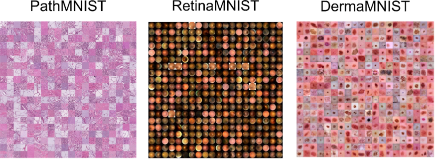
这三个数据集是 MedMNIST 数据集的一部分——图像取自相应的论文。
这些数据集的共同点是,来自给定数据集的单个图像都有其特定的颜色范围。 虽然粉红色或红色色调存在波动,但对于这些图像中的大多数,图像之间的对比度差异比实际 RGB 颜色值所代表的差异更为重要。
这为我们提供了一个独特的特征工程机会。 我们可以不使用原始的RGB颜色值,而是研究数据集对特定颜色空间的适应度是否有助于并改进我们最终结果指标。
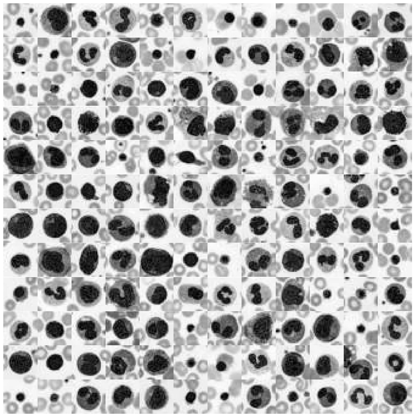
为了研究这个主题,我们使用MedMNIST的增强血细胞数据集(见原论文)。这个数据集包含了大约17000张来自10种不同血细胞类型的图像。让我们来看看这个数据集中的一些图片!
# Download dataset
!wget https://zenodo.org/record/5208230/files/bloodmnist.npz

# Load packages
import numpy as np
from glob import glob
import matplotlib.pyplot as plt
from tqdm.notebook import tqdm
import pandas as pd

import seaborn as sns

sns.set_context("talk")
%config InlineBackend.figure_format = 'retina'

# Load data set
data = np.load("bloodmnist.npz")
X_tr = data["train_images"].astype("float32") / 255
X_va = data["val_images"].astype("float32") / 255
X_te = data["test_images"].astype("float32") / 255
y_tr = data["train_labels"]
y_va = data["val_labels"]
y_te = data["test_labels"]

labels = ["basophils", "eosinophils", "erythroblasts",
          "granulocytes_immature", "lymphocytes",
          "monocytes", "neutrophils", "platelets"]

labels_tr = np.array([labels[j] for j in y_tr.ravel()])
labels_va = np.array([labels[j] for j in y_va.ravel()])
labels_te = np.array([labels[j] for j in y_te.ravel()])
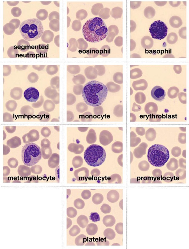
图像取自原始论文,并描述符合数据集的十种血细胞类型。
def plot_dataset(X):
    """Helper function to visualize first few images of a dataset."""
    fig, axes = plt.subplots(12, 12, figsize=(15.5, 16))
    for i, ax in enumerate(axes.flatten()):
        if X.shape[-1] == 1:
            ax.imshow(np.squeeze(X[i]), cmap="gray")
        else:
            ax.imshow(X[i])
        ax.axis("off")
        ax.set_aspect("equal")
    plt.subplots_adjust(wspace=0, hspace=0)
    plt.show()

# Plot dataset
plot_dataset(X_tr)
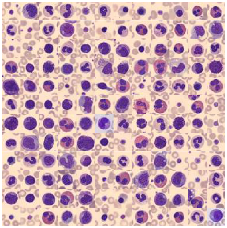
我们可以看到以下内容: 背景颜色以及主要目标对象颜色在大多数情况下是相同的(但并非总是如此)! 为了更好地理解为什么这能够为我们提供了颜色值特征工程的机会,让我们先看看这些图像占据的 RGB 颜色空间。
# Extract a few RGB color values
X_colors = X_tr.reshape(-1, 3)[::100]

# Plot color values in 3D space
fig = plt.figure(figsize=(16, 5))

# Loop through 3 different views
for i, view in enumerate([[-45, 10], [40, 80], [60, 10]]):
    ax = fig.add_subplot(1, 3, i + 1, projection="3d")
    ax.scatter(X_colors[:, 0], X_colors[:, 1], X_colors[:, 2], facecolors=X_colors, s=2)
    ax.set_xlabel("R")
    ax.set_ylabel("G")
    ax.set_zlabel("B")
    ax.xaxis.set_ticklabels([])
    ax.yaxis.set_ticklabels([])
    ax.zaxis.set_ticklabels([])
    ax.view_init(azim=view[0], elev=view[1], vertical_axis="z")
    ax.set_xlim(0, 1)
    ax.set_ylim(0, 1)
    ax.set_zlim(0, 1)
plt.suptitle("Colors in RGB space", fontsize=20)
plt.show()

这是原始数据集相同 RGB 颜色空间上的三个不同视图。 这个数据集只覆盖了整个立方体的一小部分,即所有 16'777'216 个可能的颜色值。 这为我们现在提供了三个独特的机会:
- 我们可以通过将 RGB 颜色转换为灰度图像来降低图像复杂性。
- 我们可以重新对齐和拉伸颜色值,以便 RGB 值更好地填充 RGB 颜色空间。
- 我们可以重新调整颜色值的方向,使三个立方体轴延伸到最大方差的方向。 这最好通过 PCA 方法完成。
其实还有多种其他方式来操作颜色值,但对于本文我们将使用上面提到的三种方式。
数据集扩充
1.灰度变换
首先,让我们将 RGB 图像转换为灰度图像(即从 3D 到 1D 数据集)。 灰度图像不仅仅是对 RGB 进行简单的平均,而是对其进行轻微不平衡的加权。 本文使用使用 scikit-image 的 rgb2gray 来执行这个转换。 此外我们将拉伸灰度值以完全覆盖图像的 0 到 255 值范围。
# Install scikit-image if not already done
!pip install -U scikit-image

from skimage.color import rgb2gray

# Create grayscale images
X_tr_gray = rgb2gray(X_tr)[..., None]
X_va_gray = rgb2gray(X_va)[..., None]
X_te_gray = rgb2gray(X_te)[..., None]

# Stretch color range to training min, max
gmin_tr = X_tr_gray.min()
X_tr_gray -= gmin_tr
X_va_gray -= gmin_tr
X_te_gray -= gmin_tr

gmax_tr = X_tr_gray.max()
X_tr_gray /= gmax_tr
X_va_gray /= gmax_tr
X_te_gray /= gmax_tr

X_va_gray = np.clip(X_va_gray, 0, 1)
X_te_gray = np.clip(X_te_gray, 0, 1)
让我们看看这些灰度颜色值是如何在之前的 RGB 颜色空间中定位的。
# Put 1D values into 3D space
X_tr_show = np.concatenate([X_tr_gray, X_tr_gray, X_tr_gray], axis=-1)

# Extract a few grayscale color values
X_grays = X_tr_show.reshape(-1, 3)[::100]

# Plot color values in 3D space
fig = plt.figure(figsize=(16, 5))

# Loop through 3 different views
for i, view in enumerate([[-45, 10], [40, 80], [60, 10]]):
    ax = fig.add_subplot(1, 3, i + 1, projection="3d")
    ax.scatter(X_grays[:, 0], X_grays[:, 1], X_grays[:, 2], facecolors=X_grays, s=2)
    ax.set_xlabel("R")
    ax.set_ylabel("G")
    ax.set_zlabel("B")
    ax.xaxis.set_ticklabels([])
    ax.yaxis.set_ticklabels([])
    ax.zaxis.set_ticklabels([])
    ax.view_init(azim=view[0], elev=view[1], vertical_axis="z")
    ax.set_xlim(0, 1)
    ax.set_ylim(0, 1)
    ax.set_zlim(0, 1)
plt.suptitle("Colors in Grayscale space", fontsize=20)
plt.show()
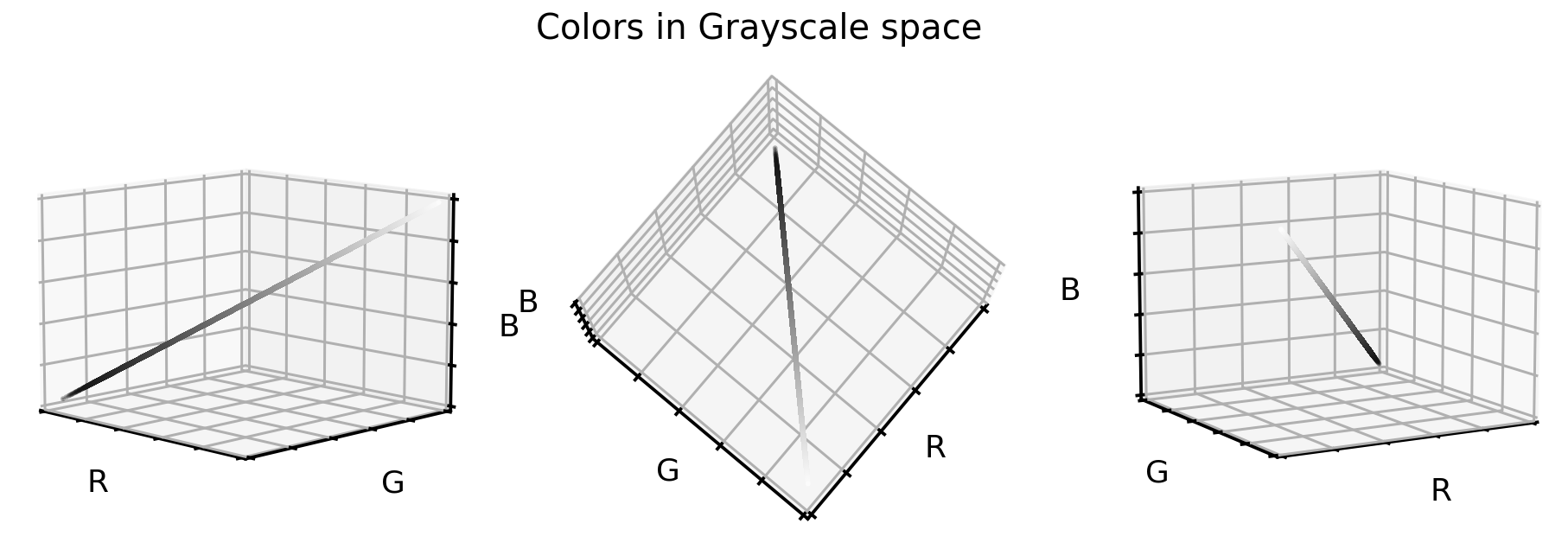
灰度颜色值正好位于立方体对角线上。我们将三维数据集减少到一维,现在看看单元格图像在灰度格式下的样子。
# Plot dataset
plot_dataset(X_tr_gray)
2.颜色调整和拉伸
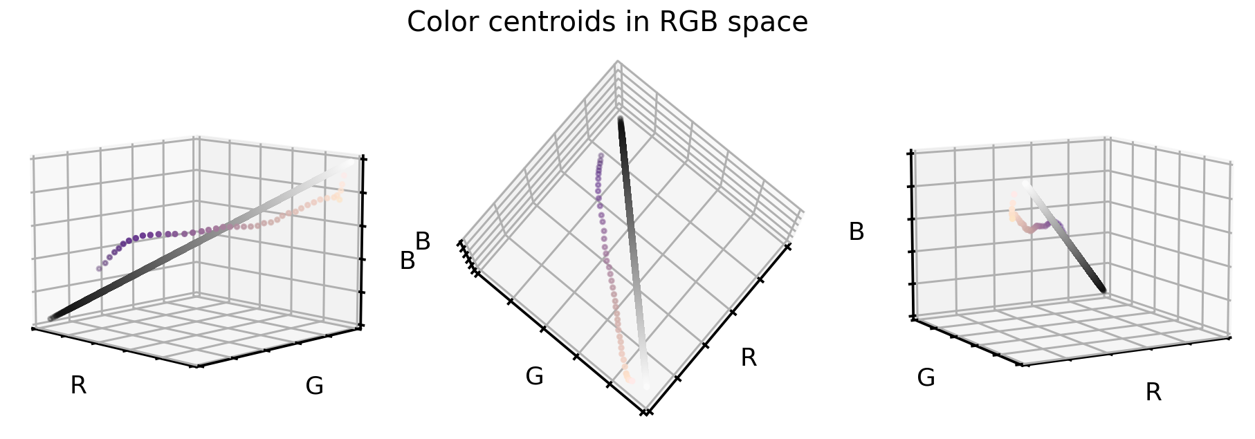
在第一个 RGB 立方体图中,我们看到该数据集的颜色值仅占整个立方体的一部分。 当将该点云与第二个 RGB 立方图中的黑白对角线进行比较时,我们可以看到原始颜色偏离轴并略微弯曲。
为了更好地说明我们的意思,这里尝试找到支持该点云的等距“云质心”(或质心)。
# Get RGB color values
X_colors = X_tr.reshape(-1, 3)

# Get distance of all color values to black (0,0,0)
dist_origin = np.linalg.norm(X_colors, axis=-1)

# Find index of 0.1% smallest entry
perc_sorted = np.argsort(np.abs(dist_origin - np.percentile(dist_origin, 0.1)))

# Find centroid of lowest 0.1% RGBs
centroid_low = np.mean(X_colors[perc_sorted][: len(X_colors) // 1000], axis=0)

# Order all RGB values with regards to distance to low centroid
order_idx = np.argsort(np.linalg.norm(X_colors - centroid_low, axis=-1))

# According to this order, divide all RGB values into N equal sized chunks
nth = 256
splits = np.array_split(np.arange(len(order_idx)), nth, axis=0)

# Compute centroids, i.e. RGB mean values of each segment
centroids = np.array([np.median(X_colors[order_idx][s], axis=0) for s in tqdm(splits)])

# Only keep centroids that are spaced enough
new_centers = [centroids[0]]
for i in range(len(centroids)):
    if np.linalg.norm(new_centers[-1] - centroids[i]) > 0.03:
        new_centers.append(centroids[i])
new_centers = np.array(new_centers)
找到这些中心后,在 RGB 颜色立方体中可视化它们。 为了对比,还要在该图中添加灰度对角线。
# Plot centroids in 3D space
fig = plt.figure(figsize=(16, 5))

# Loop through 3 different views
for i, view in enumerate([[-45, 10], [40, 80], [60, 10]]):
    ax = fig.add_subplot(1, 3, i + 1, projection="3d")
    ax.scatter(X_grays[:, 0], X_grays[:, 1], X_grays[:, 2], facecolors=X_grays, s=10)
    ax.scatter(
        new_centers[:, 0],
        new_centers[:, 1],
        new_centers[:, 2],
        facecolors=new_centers,
        s=10)
    ax.set_xlabel("R")
    ax.set_ylabel("G")
    ax.set_zlabel("B")
    ax.xaxis.set_ticklabels([])
    ax.yaxis.set_ticklabels([])
    ax.zaxis.set_ticklabels([])
    ax.set_xlim(0, 1)
    ax.set_ylim(0, 1)
    ax.set_zlim(0, 1)
    ax.view_init(azim=view[0], elev=view[1], vertical_axis="z")
plt.suptitle("Color centroids in RGB space", fontsize=20)
plt.show()
那么我们如何使用这两个信息(云质心和灰度对角线)来重新对齐和拉伸我们的原始数据集?一种有效方法如下:
- 对于原始数据集中的每个颜色值,我们计算到最近的云质心的距离向量。
- 然后将此距离向量添加到灰度对角线(即重新对齐质心)。
- 拉伸和剪切颜色值,以确保 99.9% 的所有值都在所需的颜色范围内。
# Create grayscale diagonal centroids (equal numbers to cloud centroids)
steps = np.linspace(0.2, 0.8, len(new_centers))

# Realign and stretch images
X_tr_stretch = np.array(
    [x - new_centers[np.argmin(np.linalg.norm(x - new_centers, axis=1))]
     + steps[np.argmin(np.linalg.norm(x - new_centers, axis=1))]
     for x in tqdm(X_tr.reshape(-1, 3))])
X_va_stretch = np.array(
    [x - new_centers[np.argmin(np.linalg.norm(x - new_centers, axis=1))]
     + steps[np.argmin(np.linalg.norm(x - new_centers, axis=1))]
     for x in tqdm(X_va.reshape(-1, 3))])
X_te_stretch = np.array(
    [x - new_centers[np.argmin(np.linalg.norm(x - new_centers, axis=1))]
     + steps[np.argmin(np.linalg.norm(x - new_centers, axis=1))]
     for x in tqdm(X_te.reshape(-1, 3))])

# Stretch and clip data
xmin_tr = np.percentile(X_tr_stretch, 0.05, axis=0)
X_tr_stretch -= xmin_tr
X_va_stretch -= xmin_tr
X_te_stretch -= xmin_tr
xmax_tr = np.percentile(X_tr_stretch, 99.95, axis=0)
X_tr_stretch /= xmax_tr
X_va_stretch /= xmax_tr
X_te_stretch /= xmax_tr
X_tr_stretch = np.clip(X_tr_stretch, 0, 1)
X_va_stretch = np.clip(X_va_stretch, 0, 1)
X_te_stretch = np.clip(X_te_stretch, 0, 1)
那么,原始 RGB 颜色值在重新对齐和拉伸后会是什么样子?
# Plot color values in 3D space
fig = plt.figure(figsize=(16, 5))

stretch_colors = X_tr_stretch[::100]

# Loop through 3 different views
for i, view in enumerate([[-45, 10], [40, 80], [60, 10]]):
    ax = fig.add_subplot(1, 3, i + 1, projection="3d")
    ax.scatter(
        stretch_colors[:, 0],
        stretch_colors[:, 1],
        stretch_colors[:, 2],
        facecolors=stretch_colors,
        s=2)
    ax.set_xlabel("R")
    ax.set_ylabel("G")
    ax.set_zlabel("B")
    ax.xaxis.set_ticklabels([])
    ax.yaxis.set_ticklabels([])
    ax.zaxis.set_ticklabels([])
    ax.view_init(azim=view[0], elev=view[1], vertical_axis="z")
    ax.set_xlim(0, 1)
    ax.set_ylim(0, 1)
    ax.set_zlim(0, 1)
plt.suptitle("Colors in realigned and stretched space", fontsize=20)
plt.show()
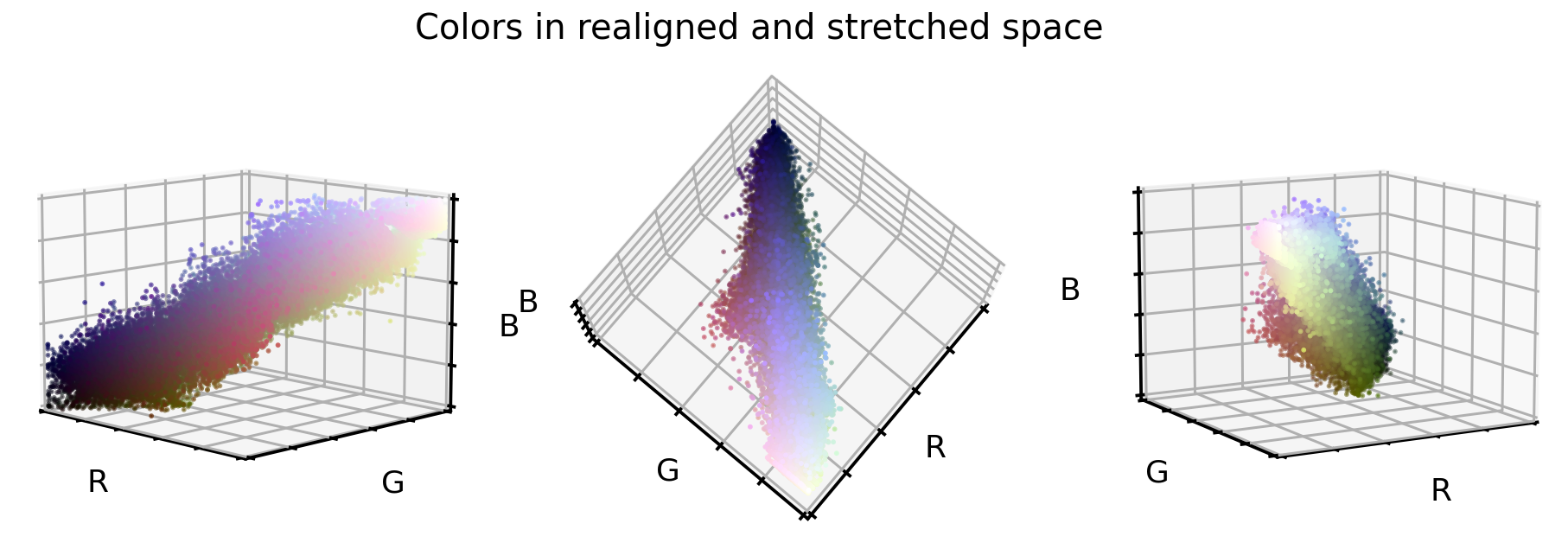
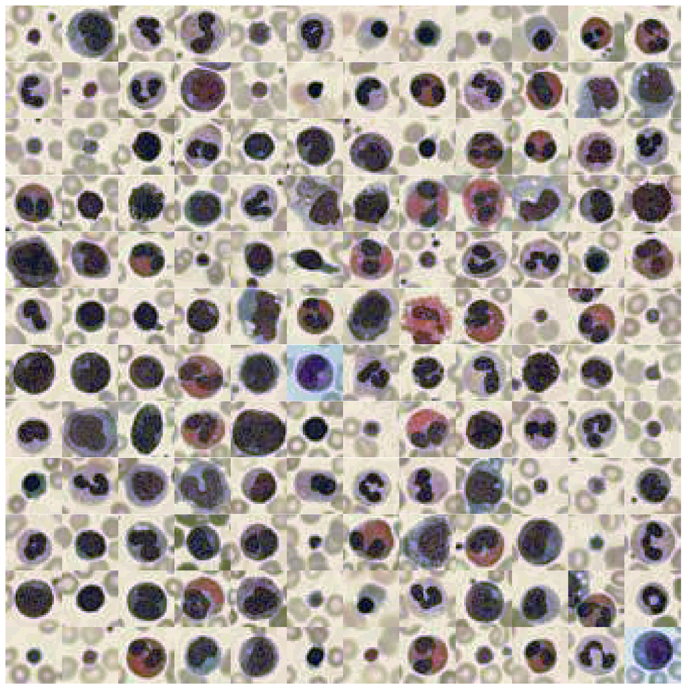
这看起来已经很有不错了。 点云更好地与立方体对角线对齐,并且似乎点云向各个方向延伸了一点。 在这种新的颜色编码中,细胞图像是什么样的?
# Convert data back into image space
X_tr_stretch = X_tr_stretch.reshape(X_tr.shape)
X_va_stretch = X_va_stretch.reshape(X_va.shape)
X_te_stretch = X_te_stretch.reshape(X_te.shape)

# Plot dataset
plot_dataset(X_tr_stretch)
3.PCA 转换
最后一个选项,让我们使用 PCA 方法将原始 RGB 颜色值转换为新的 3D 空间,这三个新轴中的每一个都尽可能多地解释差异。对于这种方法,本文将使用原始 RGB 颜色值,但也可以使用刚刚重新对齐和拉伸的值。
那么在这个新的 PCA 颜色空间中,原始的 RGB 颜色值是什么样的呢?
# Train PCA decomposition on original RGB values
from sklearn.decomposition import PCA

pca = PCA()
pca.fit(X_tr.reshape(-1, 3))

# Transform all data sets into new PCA space
X_tr_pca = pca.transform(X_tr.reshape(-1, 3))
X_va_pca = pca.transform(X_va.reshape(-1, 3))
X_te_pca = pca.transform(X_te.reshape(-1, 3))

# Stretch and clip data
xmin_tr = np.percentile(X_tr_pca, 0.05, axis=0)
X_tr_pca -= xmin_tr
X_va_pca -= xmin_tr
X_te_pca -= xmin_tr
xmax_tr = np.percentile(X_tr_pca, 99.95, axis=0)
X_tr_pca /= xmax_tr
X_va_pca /= xmax_tr
X_te_pca /= xmax_tr
X_tr_pca = np.clip(X_tr_pca, 0, 1)
X_va_pca = np.clip(X_va_pca, 0, 1)
X_te_pca = np.clip(X_te_pca, 0, 1)

# Flip first component
X_tr_pca[:, 0] = 1 - X_tr_pca[:, 0]
X_va_pca[:, 0] = 1 - X_va_pca[:, 0]
X_te_pca[:, 0] = 1 - X_te_pca[:, 0]

# Extract a few RGB color values
X_colors = X_tr_pca[::100].reshape(-1, 3)

# Plot color values in 3D space
fig = plt.figure(figsize=(16, 5))

# Loop through 3 different views
for i, view in enumerate([[-45, 10], [40, 80], [60, 10]]):
    ax = fig.add_subplot(1, 3, i + 1, projection="3d")
    ax.scatter(X_colors[:, 0], X_colors[:, 1], X_colors[:, 2], facecolors=X_colors, s=2)
    ax.set_xlabel("PC1")
    ax.set_ylabel("PC2")
    ax.set_zlabel("PC3")
    ax.xaxis.set_ticklabels([])
    ax.yaxis.set_ticklabels([])
    ax.zaxis.set_ticklabels([])
    ax.view_init(azim=view[0], elev=view[1], vertical_axis="z")
    ax.set_xlim(0, 1)
    ax.set_ylim(0, 1)
    ax.set_zlim(0, 1)
plt.suptitle("Colors in PCA space", fontsize=20)
plt.show()
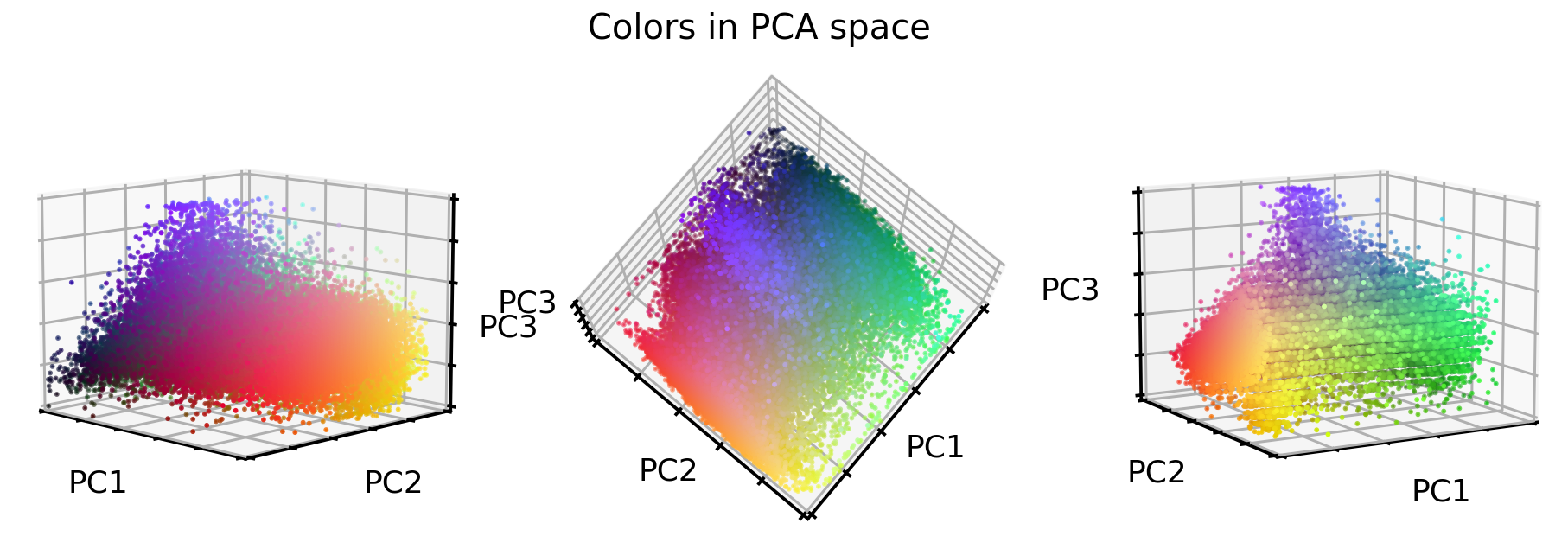
拉伸效果很好! 但是图像呢? 让我们来看看。
# Convert data back into image space
X_tr_pca = X_tr_pca.reshape(X_tr.shape)
X_va_pca = X_va_pca.reshape(X_va.shape)
X_te_pca = X_te_pca.reshape(X_te.shape)

# Plot dataset
plot_dataset(X_tr_pca)
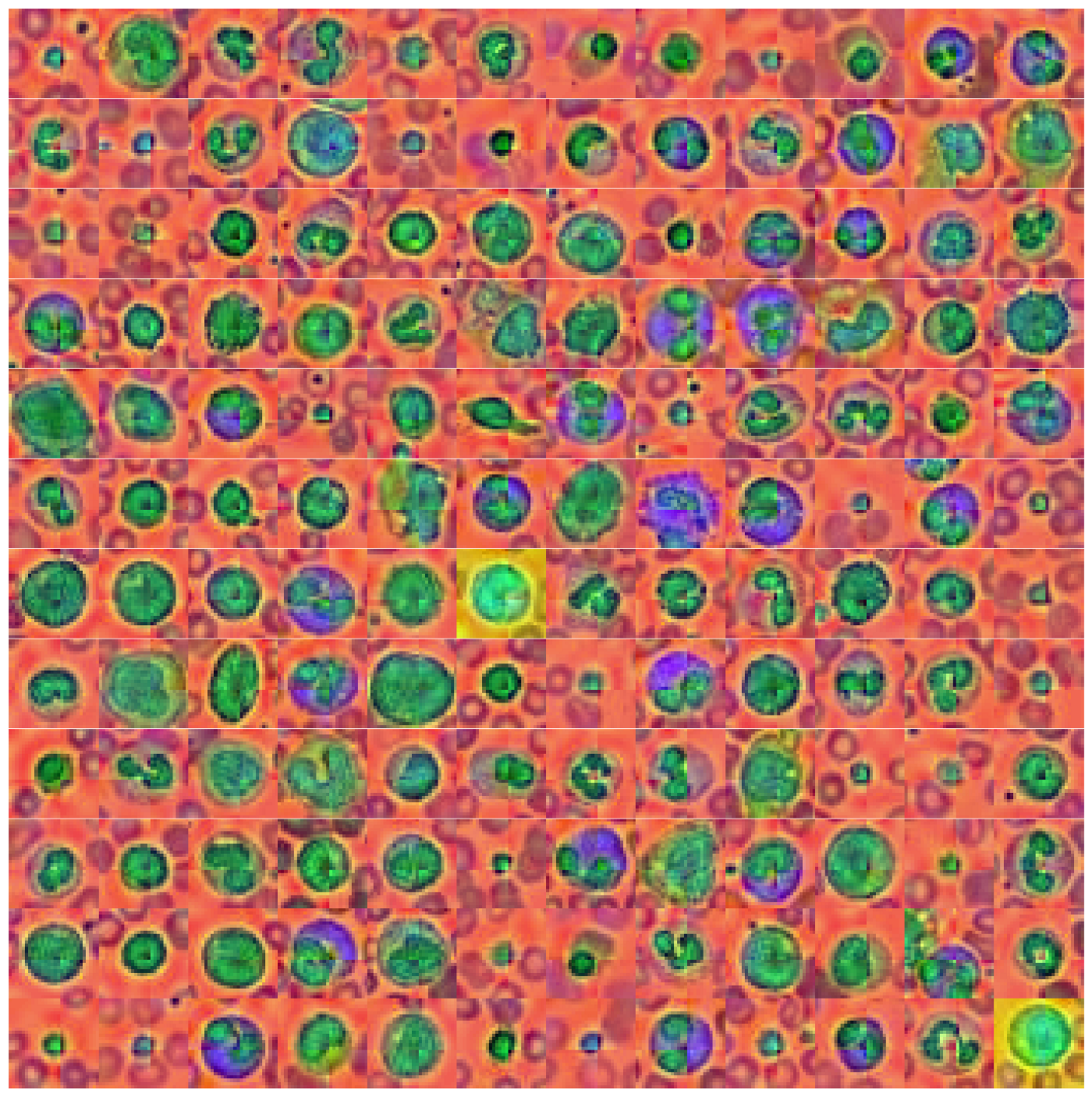
这看起来也很有意思。 各部分的颜色都不太相同,例如 背景、原子核和原子核周围的东西都有不同的颜色。 但是 PCA 转换也带来了图像中的一个伪影——图像中间的类似交叉的颜色边界。 目前尚不清楚这是从哪里来的,但我认为这是由于 MedMNIST 通过对原始数据集进行下采样而引入的数据集操作。
特征的相关性
在继续我们的下一部分研究之前(即测试这些颜色操作是否能帮助卷积神经网络对10个目标类进行分类),让我们快速地看看这些新的颜色值是如何相互关联的。
# Combine all images in one big dataframe
X_tr_all = np.vstack([X_tr.T, X_tr_gray.T, X_tr_stretch.T, X_tr_pca.T]).T
X_va_all = np.vstack([X_va.T, X_va_gray.T, X_va_stretch.T, X_va_pca.T]).T
X_te_all = np.vstack([X_te.T, X_te_gray.T, X_te_stretch.T, X_te_pca.T]).T

# Compute correlation matrix between all color features
corr_all = np.corrcoef(X_tr_all.reshape(-1, X_tr_all.shape[-1]).T)
cols = ["Red", "Green", "Blue", "Gray",
        "Stretch1", "Stretch2", "Stretch3",
        "PC1", "PC2", "PC3"]

plt.figure(figsize=(8, 8))
sns.heatmap(
    100 * corr_all,
    square=True,
    center=0,
    annot=True,
    fmt=".0f",
    cbar=False,
    xticklabels=cols,
    yticklabels=cols,
)
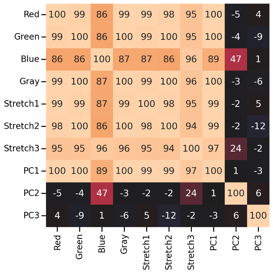
正如我们所看到的,许多新的颜色特征与原始的RGB值高度相关(除了第二和第三个PCA特征)。下面就可以测试颜色处理是否对图像分类有帮助。
测试图像分类
看看我们的颜色处理是否能帮助卷积神经网络对8个目标类进行分类。我们创建一个“小的”ResNet模型,并在数据集的所有4个版本(即原始,灰度,拉伸,和PCA)上训练它。
# The code for this ResNet architecture was adapted from here:
# https://towardsdatascience.com/building-a-resnet-in-keras-e8f1322a49ba
from tensorflow import Tensor
from tensorflow.keras.layers import (Input, Conv2D, ReLU, BatchNormalization, Add,
                                     AveragePooling2D, Flatten, Dense, Dropout)
from tensorflow.keras.models import Model

def relu_bn(inputs: Tensor) -> Tensor:
    relu = ReLU()(inputs)
    bn = BatchNormalization()(relu)
    return bn

def residual_block(x: Tensor, downsample: bool, filters: int, kernel_size: int = 3) -> Tensor:
    y = Conv2D(
        kernel_size=kernel_size,
        strides=(1 if not downsample else 2),
        filters=filters,
        padding="same")(x)
    y = relu_bn(y)
    y = Conv2D(kernel_size=kernel_size, strides=1, filters=filters, padding="same")(y)

    if downsample:
        x = Conv2D(kernel_size=1, strides=2, filters=filters, padding="same")(x)
    out = Add()([x, y])
    out = relu_bn(out)
    return out


def create_res_net(in_shape=(28, 28, 3)):

    inputs = Input(shape=in_shape)
    num_filters = 32

    t = BatchNormalization()(inputs)
    t = Conv2D(kernel_size=3, strides=1, filters=num_filters, padding="same")(t)
    t = relu_bn(t)

    num_blocks_list = [2, 2]
    for i in range(len(num_blocks_list)):
        num_blocks = num_blocks_list[i]
        for j in range(num_blocks):
            t = residual_block(t, downsample=(j == 0 and i != 0), filters=num_filters)
        num_filters *= 2

    t = AveragePooling2D(4)(t)
    t = Flatten()(t)
    t = Dense(128, activation="relu")(t)
    t = Dropout(0.5)(t)
    outputs = Dense(8, activation="softmax")(t)

    model = Model(inputs, outputs)

    model.compile(
        optimizer="adam", loss="sparse_categorical_crossentropy", metrics=["accuracy"])

    return model

def run_resnet(X_tr, y_tr, X_va, y_va, epochs=200, verbose=0):
    """Support function to train ResNet model"""

    # Create Model
    model = create_res_net(in_shape=X_tr.shape[1:])

    # Creates 'EarlyStopping' callback
    from tensorflow import keras

    earlystopping_cb = keras.callbacks.EarlyStopping(
        patience=10, restore_best_weights=True)

    # Train model
    history = model.fit(
        X_tr,
        y_tr,
        batch_size=120,
        epochs=epochs,
        validation_data=(X_va, y_va),
        callbacks=[earlystopping_cb],
        verbose=verbose)

    return model, history

def plot_history(history):
    """Support function to plot model history"""

    # Plots neural network performance metrics for train and validation
    fig, axs = plt.subplots(1, 2, figsize=(15, 4))
    results = pd.DataFrame(history.history)
    results[["accuracy", "val_accuracy"]].plot(ax=axs[0])
    results[["loss", "val_loss"]].plot(ax=axs[1], logy=True)
    plt.tight_layout()
    plt.show()

def plot_classification_report(X_te, y_te, model):
    """Support function to plot classification report"""

    # Show classification report
    from sklearn.metrics import classification_report

    y_pred = model.predict(X_te).argmax(axis=1)
    print(classification_report(y_te.ravel(), y_pred))

    # Show confusion matrix
    from sklearn.metrics import ConfusionMatrixDisplay

    fig, ax = plt.subplots(1, 2, figsize=(16, 7))
    ConfusionMatrixDisplay.from_predictions(
        y_te.ravel(), y_pred, ax=ax[0], colorbar=False, cmap="inferno_r")

    from sklearn.metrics import ConfusionMatrixDisplay

    ConfusionMatrixDisplay.from_predictions(
        y_te.ravel(), y_pred, normalize="true", ax=ax[1],
        values_format=".1f", colorbar=False, cmap="inferno_r")
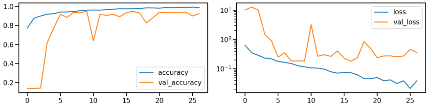
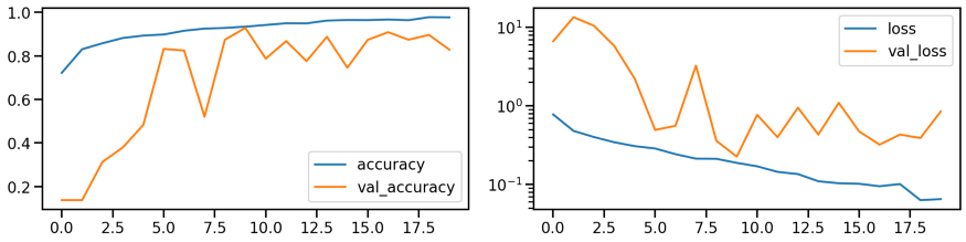
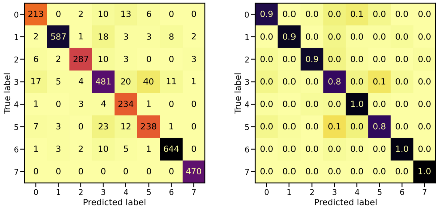
原始数据集的分类性能
首先在原始数据集上训练一个 ResNet 模型来建立一个基线。 下面显示了模型在训练期间的性能(准确率和损失)。
# Train model
model_orig, history_orig = run_resnet(X_tr, y_tr, X_va, y_va)

# Show model performance during training
plot_history(history_orig)
# Evaluate Model
loss_orig_tr, acc_orig_tr = model_orig.evaluate(X_tr, y_tr)
loss_orig_va, acc_orig_va = model_orig.evaluate(X_va, y_va)
loss_orig_te, acc_orig_te = model_orig.evaluate(X_te, y_te)

# Report classification report and confusion matrix
plot_classification_report(X_te, y_te, model_orig)

Train score: loss = 0.0537 - accuracy = 0.9817
Valid score: loss = 0.1816 - accuracy = 0.9492
Test score:  loss = 0.1952 - accuracy = 0.9421
模型已经训练好了,通过查看相应的混淆矩阵来看看它在检测 8 个目标类别方面的能力如何。 左侧的混淆矩阵显示了正确/错误识别的样本数量,而右侧则显示了每个目标类别的比例值。

灰度数据集的分类性能
对灰度转换的图像做同样的事情。 训练期间的模型性能如何?
# Train model
model_gray, history_gray = run_resnet(X_tr_gray, y_tr, X_va_gray, y_va)

# Show model performance during training
plot_history(history_gray)
那么混淆矩阵呢?
# Evaluate Model
loss_gray_tr, acc_gray_tr = model_gray.evaluate(X_tr_gray, y_tr)
loss_gray_va, acc_gray_va = model_gray.evaluate(X_va_gray, y_va)
loss_gray_te, acc_gray_te = model_gray.evaluate(X_te_gray, y_te)

# Report classification report and confusion matrix
plot_classification_report(X_te_gray, y_te, model_gray)

Train score: loss = 0.1118 - accuracy = 0.9619
Valid score: loss = 0.2255 - accuracy = 0.9287
Test score:  loss = 0.2407 - accuracy = 0.9220
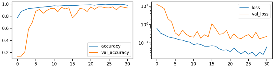
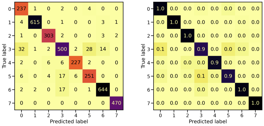
重新对齐和拉伸数据集的分类性能
对重新对齐和拉伸的图像做同样的事情。
# Train model
model_stretch, history_stretch = run_resnet(X_tr_stretch, y_tr, X_va_stretch, y_va)

# Show model performance during training
plot_history(history_stretch)
混淆矩阵
# Evaluate Model
loss_stretch_tr, acc_stretch_tr = model_stretch.evaluate(X_tr_stretch, y_tr)
loss_stretch_va, acc_stretch_va = model_stretch.evaluate(X_va_stretch, y_va)
loss_stretch_te, acc_stretch_te = model_stretch.evaluate(X_te_stretch, y_te)

# Report classification report and confusion matrix
plot_classification_report(X_te_stretch, y_te, model_stretch)

Train score: loss = 0.0229 - accuracy = 0.9921
Valid score: loss = 0.1672 - accuracy = 0.9533
Test score:  loss = 0.1975 - accuracy = 0.9491
PCA 转换的数据集的分类性能
# Train model
model_pca, history_pca = run_resnet(X_tr_pca, y_tr, X_va_pca, y_va)

# Show model performance during training
plot_history(history_pca)

混淆矩阵
# Evaluate Model
loss_pca_tr, acc_pca_tr = model_pca.evaluate(X_tr_pca, y_tr)
loss_pca_va, acc_pca_va = model_pca.evaluate(X_va_pca, y_va)
loss_pca_te, acc_pca_te = model_pca.evaluate(X_te_pca, y_te)

# Report classification report and confusion matrix
plot_classification_report(X_te_pca, y_te, model_pca)

Train score: loss = 0.0289 - accuracy = 0.9918
Valid score: loss = 0.1459 - accuracy = 0.9509
Test score:  loss = 0.1898 - accuracy = 0.9448

模型对比
训练了所有这些单独的模型,让我们看看它们之间的关系以及它们之间的区别。 首先,将它们各自对测试集的预测画在一起,比较这些不同的模型预测相同值的方式。
# Compute model specific predictions
y_pred_orig = model_orig.predict(X_te).argmax(axis=1)
y_pred_gray = model_gray.predict(X_te_gray).argmax(axis=1)
y_pred_stretch = model_stretch.predict(X_te_stretch).argmax(axis=1)
y_pred_pca = model_pca.predict(X_te_pca).argmax(axis=1)

# Aggregate all model predictions
target = y_te.ravel()
predictions = np.array([y_pred_orig, y_pred_gray, y_pred_stretch, y_pred_pca])[
    :, np.argsort(target)]

# Plot model individual predictions
plt.figure(figsize=(20, 3))
plt.imshow(predictions, aspect="auto", interpolation="nearest", cmap="rainbow")
plt.xlabel(f"Predictions for all {predictions.shape[1]} test samples")
plt.ylabel("Model")
plt.yticks(ticks=range(4), labels=["Orig", "Gray", "Stretched", "PCA"]);
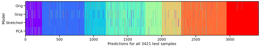
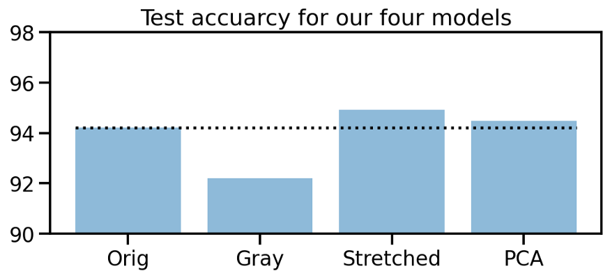
我们可以看到,除了原始数据集,其他模型在第8个目标类(红色部分)中都不会出错。所以我们的操作似乎是有用的。在这三种方法中,“重新排列和拉伸”的数据集似乎表现最好。为了支持这一说法,让我们看看我们四个模型的测试准确性。
# Collect accuracies
accs_te = np.array([acc_orig_te, acc_gray_te, acc_stretch_te, acc_pca_te]) * 100

# Plot accuracies
plt.figure(figsize=(8, 3))

plt.title("Test accuracy for our four models")
plt.bar(["Orig", "Gray", "Stretched", "PCA"], accs_te, alpha=0.5)
plt.hlines(accs_te[0], -0.4, 3.4, colors="black", linestyles="dotted")
plt.ylim(90, 98);
模型叠加
4个模型都有一些不同,让我们试着进一步训练一个“元”模型,它使用我们4个模型的预测作为输入。
# Compute prediction probabilities for all models and data sets
y_prob_tr_orig = model_orig.predict(X_tr)
y_prob_tr_gray = model_gray.predict(X_tr_gray)
y_prob_tr_stretch = model_stretch.predict(X_tr_stretch)
y_prob_tr_pca = model_pca.predict(X_tr_pca)

y_prob_va_orig = model_orig.predict(X_va)
y_prob_va_gray = model_gray.predict(X_va_gray)
y_prob_va_stretch = model_stretch.predict(X_va_stretch)
y_prob_va_pca = model_pca.predict(X_va_pca)

y_prob_te_orig = model_orig.predict(X_te)
y_prob_te_gray = model_gray.predict(X_te_gray)
y_prob_te_stretch = model_stretch.predict(X_te_stretch)
y_prob_te_pca = model_pca.predict(X_te_pca)

# Combine prediction probabilities into meta data sets
y_prob_tr = np.concatenate(
    [y_prob_tr_orig, y_prob_tr_gray, y_prob_tr_stretch, y_prob_tr_pca], axis=1)
y_prob_va = np.concatenate(
    [y_prob_va_orig, y_prob_va_gray, y_prob_va_stretch, y_prob_va_pca], axis=1)
y_prob_te = np.concatenate(
    [y_prob_te_orig, y_prob_te_gray, y_prob_te_stretch, y_prob_te_pca], axis=1)

# Combine training and validation dataset
y_prob_train = np.concatenate([y_prob_tr, y_prob_va], axis=0)
y_train = np.concatenate([y_tr, y_va], axis=0).ravel()
有许多不同的分类模型可供选择,但为了保持简短和紧凑,让我们快速训练一个多层感知器分类器,并将其得分与其他四种模型进行比较。
from sklearn.neural_network import MLPClassifier

# Create MLP classifier
clf = MLPClassifier(
    hidden_layer_sizes=(32, 16), activation="relu", solver="adam", alpha=0.42, batch_size=120,
    learning_rate="adaptive", learning_rate_init=0.001, max_iter=100, shuffle=True, random_state=24,
    early_stopping=True, validation_fraction=0.15)

# Train model
clf.fit(y_prob_train, y_train)

# Compute prediction accuracy of meta classifier
acc_meta_te = np.mean(clf.predict(y_prob_te) == y_te.ravel())

# Collect accuracies
accs_te = np.array([acc_orig_te, acc_gray_te, acc_stretch_te, acc_pca_te, 0]) * 100
accs_meta = np.array([0, 0, 0, 0, acc_meta_te]) * 100

# Plot accuracies
plt.figure(figsize=(8, 3))

plt.title("Test accuracy for all five models")
plt.bar(["Orig", "Gray", "Stretched", "PCA", "Meta"], accs_te, alpha=0.5)
plt.bar(["Orig", "Gray", "Stretched", "PCA", "Meta"], accs_meta, alpha=0.5)
plt.hlines(accs_te[0], -0.4, 4.4, colors="black", linestyles="dotted")
plt.ylim(90, 98);

太棒了!在原始数据集和三种颜色变换数据集上训练四种不同的模型,然后利用这些预测概率训练一种新的元分类器,帮助我们将初始预测准确率从94%提高到96.4%!
本文地址:https://miykael.github.io/blog/2021/color_engineering_medmnist/
作者:michael notter