
上期“原来基因功能富集分析这么简单”介绍如何使用DAVID在线分析工具对基因进行GO/KEGG功能富集分析。本期则介绍使用R语言ggplot包对DAVID在线分析工具所获得的基因GO/KEGG功能富集结果进行可视化。
1 数据准备
数据输入格式(xlsx格式):
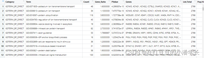
注:DAVID导出来的“%”这列为“Gene ratio”;上面只展示“BP”的数据,其余“CC”和“MF”也是类似格式,故不一一列举。
2 R包加载、数据导入及处理
#下载包#

install.packages("dplyr")

install.packages("ggplot2")

install.packages("tidyverse")

install.packages("openxlsx")

#加载包#

library (dplyr)

library (ggplot2)

library(tidyverse)

library(openxlsx)

#数值导入#

BP = read.xlsx('C:/Rdata/jc/enrich-gene.xlsx',sheet= "go_result_BP",sep=',')

CC = read.xlsx('C:/Rdata/jc/enrich-gene.xlsx',sheet= "go_result_CC",sep=',')

MF = read.xlsx('C:/Rdata/jc/enrich-gene.xlsx',sheet= "go_result_MF",sep=',')

head(BP)
###数据导入数据处理###

#ego = rbind(go_result_BP,go_result_CC,go_result_MF) #将三个组进行合并,需要合并可选择

#ego = ego[,1:3] #提取前几列进行操作,有需要可选择

#print(ego) #预览数据
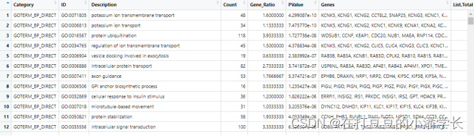
#DVIAD获得的数据term列是GO:0005251~delayed rectifier potassium channel activity形式的,故需要将其拆分。可在Excel中进行分列也可以应用一下函数进行分列。

BP = separate(BP,Term, sep="~",into=c("ID","Description"))

CC = separate(CC,Term, sep="~",into=c("ID","Description"))

MF = separate(MF,Term, sep="~",into=c("ID","Description"))
#提取各组数据需要展示的数量#
display_number = c(15, 10, 5) ##这三个数字分别代表选取的BP、CC、MF的数量
go_result_BP = as.data.frame(BP)[1:display_number[1], ]
go_result_CC = as.data.frame(CC)[1:display_number[2], ]
go_result_MF = as.data.frame(MF)[1:display_number[3], ]
#将提取的各组数据进行整合
go_enrich = data.frame(
ID=c(go_result_BP$ID, go_result_CC$ID, go_result_MF$ID), #指定ego_result_BP、ego_result_CC、ego_result_MFID为ID
Description=c(go_result_BP$Description,go_result_CC$Description,go_result_MF$Description),
GeneNumber=c(go_result_BP$Count, go_result_CC$Count, go_result_MF$Count), #指定ego_result_BP、ego_result_CC、ego_result_MF的Count为GeneNumber
type=factor(c(rep("Biological Process", display_number[1]), #设置biological process、cellular component、molecular function 的展示顺序
rep("Cellular Component", display_number[2]),
rep("Molecular Function", display_number[3])),
levels=c("Biological Process", "Cellular Component","Molecular Function" )))
##设置GO term名字长短,过长则设置相应长度
for(i in 1:nrow(go_enrich)){
description_splite=strsplit(go_enrich$Description[i],split = " ")
description_collapse=paste(description_splite[[1]][1:5],collapse = " ") #选择前五个单词GO term名字
go_enrich$Description[i]=description_collapse
go_enrich$Description=gsub(pattern = "NA","",go_enrich$Description) #gsub()可以用于字段的删减、增补、替换和切割,可以处理一个字段也可以处理由字段组成的向量。gsub(“目标字符”, “替换字符”, 对象)
}
#转成因子,防止重新排列
#go_enrich$type_order=factor(rev(as.integer(rownames(go_enrich))),labels=rev(go_enrich$Description))
go_enrich$type_order = factor(go_enrich$Description,levels=go_enrich$Description,ordered = T)
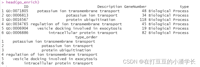
head(go_enrich)
3 GO富集结果可视化
#纵向柱状图#

ggplot(go_enrich,

       aes(x=type_order,y=Count, fill=type)) + #x、y轴定义;根据type填充颜色

       geom_bar(stat="identity", width=0.8) +  #柱状图宽度

       scale_fill_manual(values = c("#6666FF", "#33CC33", "#FF6666") ) +  #柱状图填充颜色

       coord_flip() +  #让柱状图变为纵向

       xlab("GO term") +  #x轴标签

       ylab("Gene_Number") +  #y轴标签

       labs(title = "GO Terms Enrich")+  #设置标题

       theme_bw()

#help(theme) #查阅这个函数其他具体格式
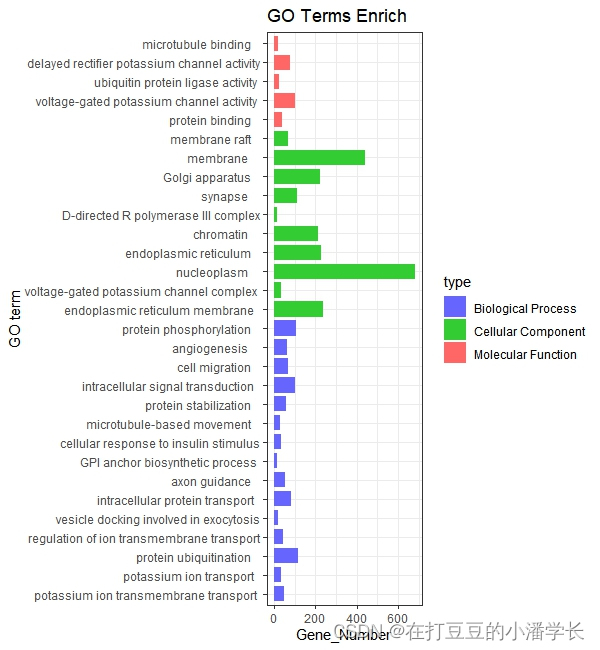
图1 纵向柱状图
#横向柱状图#

ggplot(go_enrich,

       aes(x=type_order,y=Count, fill=type)) +  #x、y轴定义;根据type填充颜色

       geom_bar(stat="identity", width=0.8) +  #柱状图宽度

       scale_fill_manual(values = c("#6666FF", "#33CC33", "#FF6666") ) + #柱状图填充颜色

       xlab("GO term") + #x轴标签

       ylab("Gene_Number") +  #y轴标签

       labs(title = "GO Terms Enrich")+ #设置标题

  theme_bw() +

       theme(axis.text.x=element_text(family="sans",face = "bold", color="gray50",angle = 70,vjust = 1, hjust = 1 )) #对字体样式、颜色、还有横坐标角度()
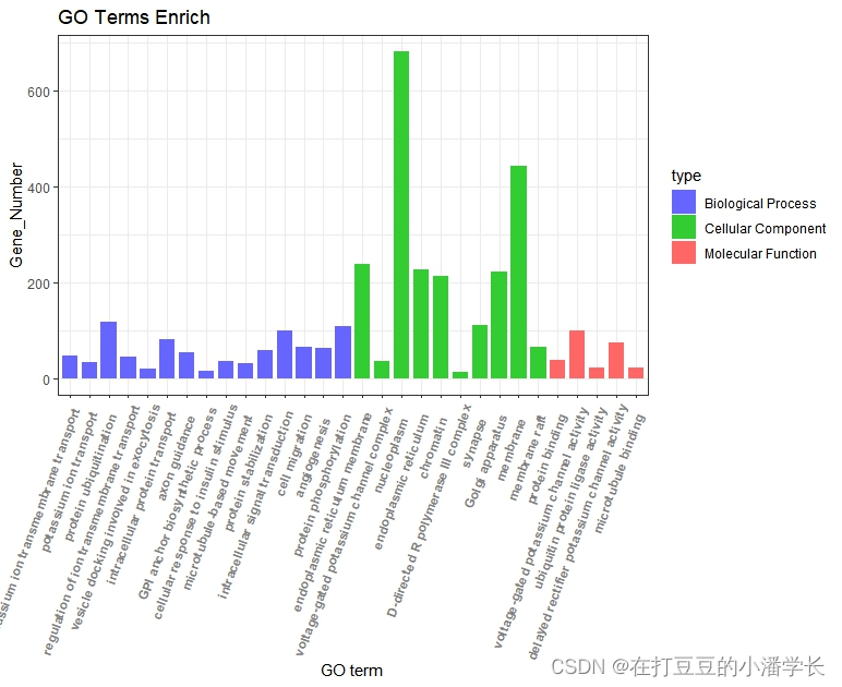
图2 横向柱状图
#分组柱状图绘制#

ggplot(go_result_BP,aes(x = Gene_Ratio,y = Description,fill=PValue))  +  #fill=PValue,根据PValue填充颜色;color=PValue根据PValue改变线的颜色

       geom_bar(stat="identity",width=0.8 ) + ylim(rev(go_result_BP$Description)) + #柱状图宽度与y轴显示顺序

       theme_test() + #调整背景色

       scale_fill_gradient(low="red",high ="blue") +  #调节填充的颜色

       labs(size="Genecounts",x="GeneRatio",y="GO term",title="GO_BP") + #设置图内标签(x、y轴、标题)

      theme(axis.text=element_text(size=10,color="black"),

        axis.title = element_text(size=16),title = element_text(size=13))
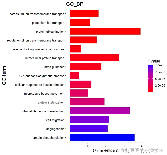

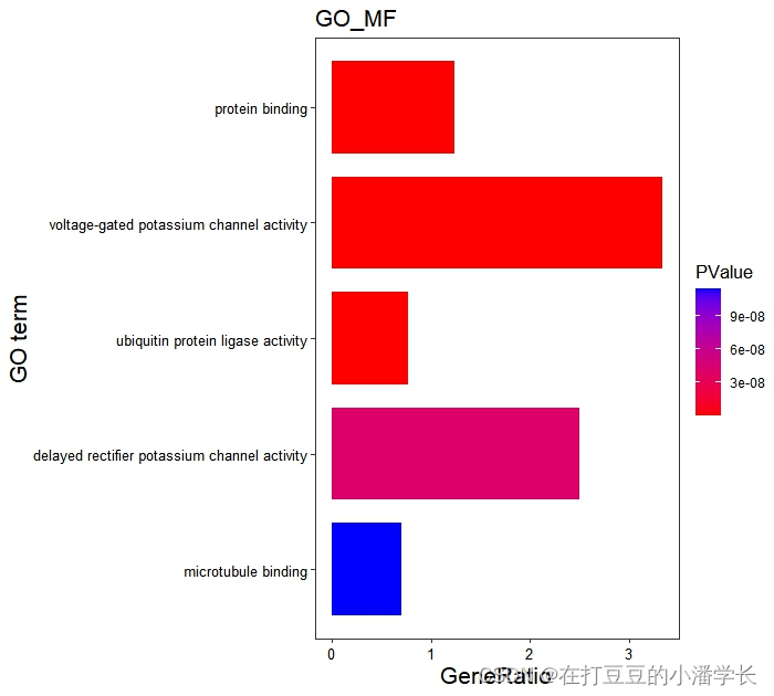
图3分组柱状图绘制
#气泡图#

ego = rbind(go_result_BP,go_result_CC,go_result_MF)

ego = as.data.frame(ego)

rownames(ego) = 1:nrow(ego)

ego$order=factor(rev(as.integer(rownames(ego))),labels = rev(ego$Description))

head(ego)

ggplot(ego,aes(y=order,x=Gene_Ratio))+

  geom_point(aes(size=Count,color=PValue))+

  scale_color_gradient(low = "red",high ="blue")+

  labs(color=expression(PValue,size="Count"),

         x="Gene Ratio",y="GO term",title="GO Enrichment")+

  theme_bw()
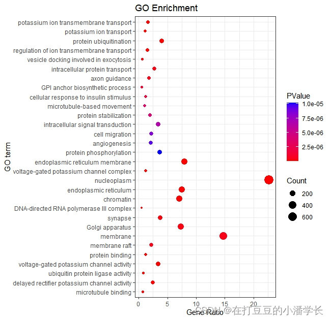
图4 气泡图
#分组气泡图绘制#

ggplot(go_result_BP,  #根据所绘制的分组进行绘制

       aes(x=Gene_Ratio,y=Description,color= PValue)) +  #color= -1*PValue可定义成倒数

       geom_point(aes(size=Count))  +

       ylim(rev(go_result_BP$Description)) +  #rev相反的意思

      labs(size="Genecounts",x="GeneRatio",y="GO_term",title="GO_BP") +  #调标签名称

      scale_color_gradient(low="red",high ="blue") +   #改颜色

      theme(axis.text=element_text(size=10,color="black"),

        axis.title = element_text(size=16),title = element_text(size=13))
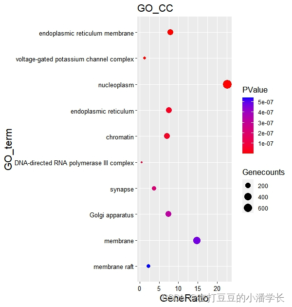

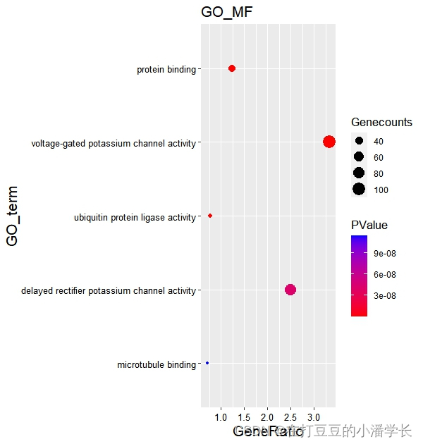
图5 分组气泡图
4 KEGG富集结果可视化
###KEGG可视化###

#数据导入#

kk_result= read.xlsx('C:/Rdata/jc/enrich-gene.xlsx', sheet= "KEGG", sep = ',')

#数据处理#

display_number = 30#显示数量设置

kk_result = as.data.frame(kk_result)[1:display_number[1], ]

kk = as.data.frame(kk_result)

rownames(kk) = 1:nrow(kk)

kk$order=factor(rev(as.integer(rownames(kk))),labels = rev(kk$Description))

#柱状图#

ggplot(kk,aes(y=order,x=Count,fill=PValue))+

       geom_bar(stat = "identity",width=0.8)+ #柱状图宽度设置

       scale_fill_gradient(low = "red",high ="blue" )+

       labs(title = "KEGG Pathways Enrichment",  #设置标题、x轴和Y轴名称

       x = "Gene number",

       y = "Pathway")+

  theme(axis.title.x = element_text(face = "bold",size = 16),

       axis.title.y = element_text(face = "bold",size = 16),

       legend.title = element_text(face = "bold",size = 16))+

  theme_bw()

图5 KEGG富集分析柱状图
#气泡图#

ggplot(kk,aes(y=order,x=Gene_Ratio))+

     geom_point(aes(size=Count,color=PValue))+

     scale_color_gradient(low = "red",high ="blue")+

     labs(color=expression(PValue,size="Count"),

       x="Gene Ratio",y="Pathways",title="KEGG Pathway Enrichment")+

  theme_bw()
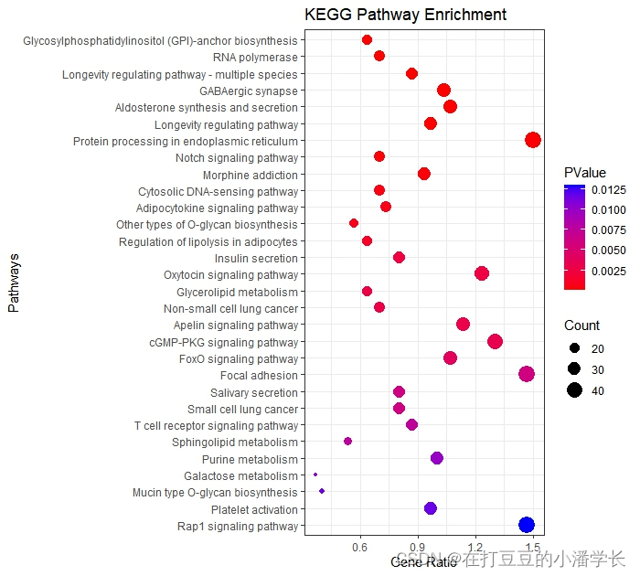
图6 KEGG富集分析气泡图
好了本次分享就到这里,下期将分享使用R clusterProfiler包对基因进行GO/KEGG功能富集分析,敬请期待。

关注“在打豆豆的小潘学长”公众号,发送“富集分析1”获得完整代码包和演示数据。
本文转载自: https://blog.csdn.net/weixin_54004950/article/details/128498456
版权归原作者 在打豆豆的小潘学长 所有, 如有侵权,请联系我们删除。
版权归原作者 在打豆豆的小潘学长 所有, 如有侵权,请联系我们删除。