
⭐本专栏旨在对Python的基础语法进行详解,精炼地总结语法中的重点,详解难点,面向零基础及入门的学习者,通过专栏的学习可以熟练掌握python编程,同时为后续的数据分析,机器学习及深度学习的代码能力打下坚实的基础。
🔥本文已收录于Python基础系列专栏: Python基础系列教程 欢迎订阅,持续更新。

文章目录
13.0 环境配置
【1】 要不要plt.show()
- ipython中可用魔术方法 %matplotlib inline
- pycharm 中必须使用plt.show()
%matplotlib inline # 配置,可以再ipython中生成就显示,而不需要多余plt.show来完成。import matplotlib.pyplot as plt
plt.style.use("seaborn-whitegrid")# 用来永久地改变风格,与下文with临时改变进行对比
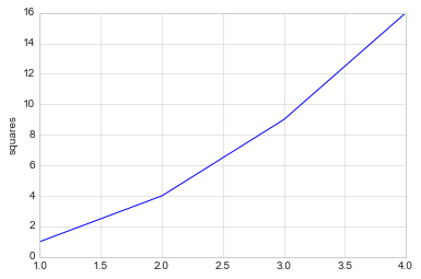
x =[1,2,3,4]
y =[1,4,9,16]
plt.plot(x, y)
plt.ylabel("squares")# plt.show()
Text(0, 0.5, 'squares')
【2】设置样式
plt.style.available[:5]
['bmh', 'classic', 'dark_background', 'fast', 'fivethirtyeight']
临时地改变风格,采用with这个上下文管理器。
with plt.style.context("seaborn-white"):
    plt.plot(x, y)
【3】将图像保存为文件
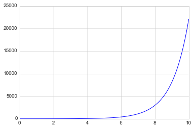
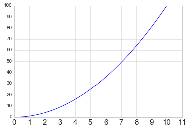
import numpy as np
x = np.linspace(0,10,100)
plt.plot(x, np.exp(x))
plt.savefig("my_figure.png")
13.1 Matplotlib库
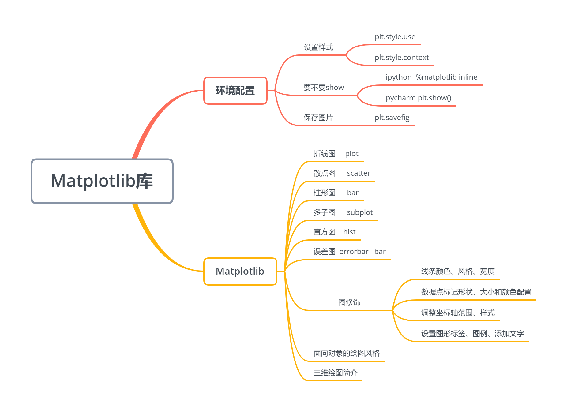
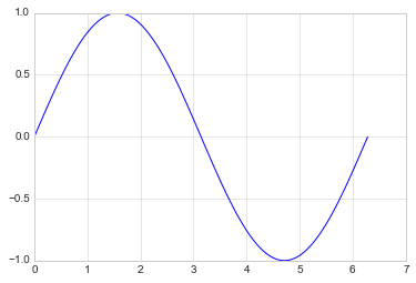
13.1.1 折线图
%matplotlib inline
import matplotlib.pyplot as plt
plt.style.use("seaborn-whitegrid")import numpy as np
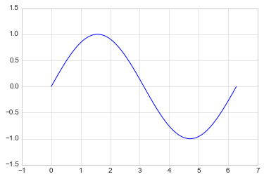
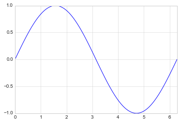
x = np.linspace(0,2*np.pi,100)
plt.plot(x, np.sin(x))
[<matplotlib.lines.Line2D at 0x18846169780>]
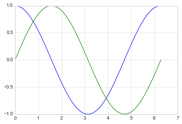
- 绘制多条曲线
x = np.linspace(0,2*np.pi,100)
plt.plot(x, np.cos(x))
plt.plot(x, np.sin(x))
[<matplotlib.lines.Line2D at 0x1884615f9e8>]
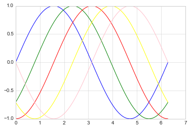
【1】调整线条颜色和风格
- 调整线条颜色
offsets = np.linspace(0, np.pi,5)
colors =["blue","g","r","yellow","pink"]for offset, color inzip(offsets, colors):
    plt.plot(x, np.sin(x-offset), color=color)# color可缩写为c
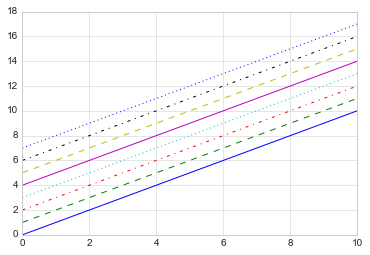
- 调整线条风格
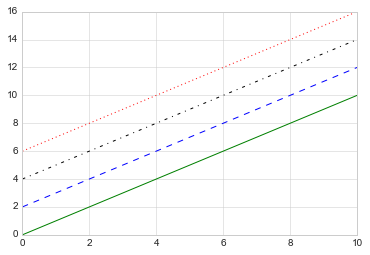
x = np.linspace(0,10,11)
offsets =list(range(8))
linestyles =["solid","dashed","dashdot","dotted","-","--","-.",":"]for offset, linestyle inzip(offsets, linestyles):
    plt.plot(x, x+offset, linestyle=linestyle)# linestyle可简写为ls
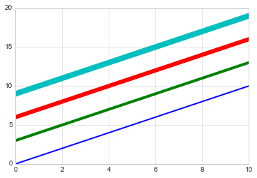
- 调整线宽
x = np.linspace(0,10,11)
offsets =list(range(0,12,3))
linewidths =(i*2for i inrange(1,5))for offset, linewidth inzip(offsets, linewidths):
    plt.plot(x, x+offset, linewidth=linewidth)# linewidth可简写为lw
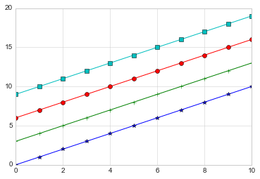
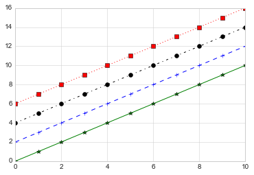
- 调整数据点标记
marker设置坐标点
x = np.linspace(0,10,11)
offsets =list(range(0,12,3))
markers =["*","+","o","s"]for offset, marker inzip(offsets, markers):
    plt.plot(x, x+offset, marker=marker)
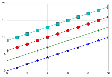
markersize 设置坐标点大小
x = np.linspace(0,10,11)
offsets =list(range(0,12,3))
markers =["*","+","o","s"]for offset, marker inzip(offsets, markers):
    plt.plot(x, x+offset, marker=marker, markersize=10)# markersize可简写为ms
颜色跟风格设置的简写 color_linestyles = [“g-”, “b–”, “k-.”, “r:”]
x = np.linspace(0,10,11)
offsets =list(range(0,8,2))
color_linestyles =["g-","b--","k-.","r:"]for offset, color_linestyle inzip(offsets, color_linestyles):
    plt.plot(x, x+offset, color_linestyle)
颜色_风格_线性 设置的简写 color_marker_linestyles = [“g*-”, “b±-”, “ko-.”, “rs:”]
x = np.linspace(0,10,11)
offsets =list(range(0,8,2))
color_marker_linestyles =["g*-","b+--","ko-.","rs:"]for offset, color_marker_linestyle inzip(offsets, color_marker_linestyles):
    plt.plot(x, x+offset, color_marker_linestyle)
其他用法及颜色缩写、数据点标记缩写等请查看官方文档,如下:
https://matplotlib.org/api/_as_gen/matplotlib.pyplot.plot.html#matplotlib.pyplot.plot
【2】调整坐标轴
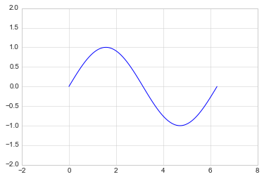
- xlim, ylim # 限制x,y轴
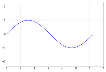
x = np.linspace(0,2*np.pi,100)
plt.plot(x, np.sin(x))
plt.xlim(-1,7)
plt.ylim(-1.5,1.5)
(-1.5, 1.5)
- axis
x = np.linspace(0,2*np.pi,100)
plt.plot(x, np.sin(x))
plt.axis([-2,8,-2,2])
[-2, 8, -2, 2]
tight 会紧凑一点
x = np.linspace(0,2*np.pi,100)
plt.plot(x, np.sin(x))
plt.axis("tight")
(0.0, 6.283185307179586, -0.9998741276738751, 0.9998741276738751)
equal 会松一点
x = np.linspace(0,2*np.pi,100)
plt.plot(x, np.sin(x))
plt.axis("equal")
(0.0, 7.0, -1.0, 1.0)
?plt.axis # 可以查询其中的功能
Object `plt.axis # 可以查询其中的功能` not found.
- 对数坐标
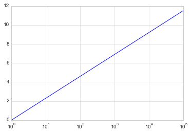
x = np.logspace(0,5,100)
plt.plot(x, np.log(x))
plt.xscale("log")
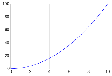
- 调整坐标轴刻度
plt.xticks(np.arange(0, 12, step=1))
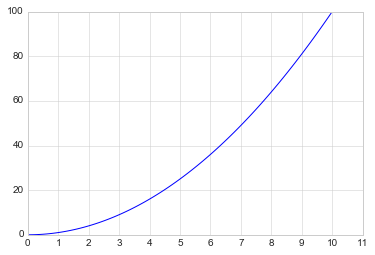
x = np.linspace(0,10,100)
plt.plot(x, x**2)
plt.xticks(np.arange(0,12, step=1))
([<matplotlib.axis.XTick at 0x18846412828>,
  <matplotlib.axis.XTick at 0x18847665898>,
  <matplotlib.axis.XTick at 0x18847665630>,
  <matplotlib.axis.XTick at 0x18847498978>,
  <matplotlib.axis.XTick at 0x18847498390>,
  <matplotlib.axis.XTick at 0x18847497d68>,
  <matplotlib.axis.XTick at 0x18847497748>,
  <matplotlib.axis.XTick at 0x18847497438>,
  <matplotlib.axis.XTick at 0x1884745f438>,
  <matplotlib.axis.XTick at 0x1884745fd68>,
  <matplotlib.axis.XTick at 0x18845fcf4a8>,
  <matplotlib.axis.XTick at 0x18845fcf320>],
 <a list of 12 Text xticklabel objects>)
x = np.linspace(0,10,100)
plt.plot(x, x**2)
plt.xticks(np.arange(0,12, step=1), fontsize=15)
plt.yticks(np.arange(0,110, step=10))
([<matplotlib.axis.YTick at 0x188474f0860>,
  <matplotlib.axis.YTick at 0x188474f0518>,
  <matplotlib.axis.YTick at 0x18847505a58>,
  <matplotlib.axis.YTick at 0x188460caac8>,
  <matplotlib.axis.YTick at 0x1884615c940>,
  <matplotlib.axis.YTick at 0x1884615cdd8>,
  <matplotlib.axis.YTick at 0x1884615c470>,
  <matplotlib.axis.YTick at 0x1884620c390>,
  <matplotlib.axis.YTick at 0x1884611f898>,
  <matplotlib.axis.YTick at 0x188461197f0>,
  <matplotlib.axis.YTick at 0x18846083f98>],
 <a list of 11 Text yticklabel objects>)
- 调整刻度样式
plt.tick_params(axis=“both”, labelsize=15)
x = np.linspace(0,10,100)
plt.plot(x, x**2)
plt.tick_params(axis="both", labelsize=15)
【3】设置图形标签
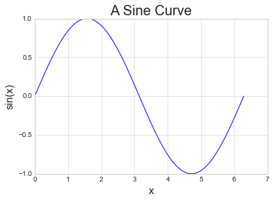
x = np.linspace(0,2*np.pi,100)
plt.plot(x, np.sin(x))
plt.title("A Sine Curve", fontsize=20)
plt.xlabel("x", fontsize=15)
plt.ylabel("sin(x)", fontsize=15)
Text(0, 0.5, 'sin(x)')
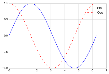
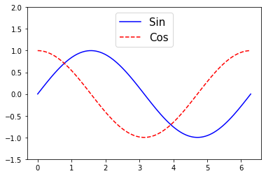
【4】设置图例
- 默认
x = np.linspace(0,2*np.pi,100)
plt.plot(x, np.sin(x),"b-", label="Sin")
plt.plot(x, np.cos(x),"r--", label="Cos")
plt.legend()
<matplotlib.legend.Legend at 0x1884749f908>
- 修饰图例
import matplotlib.pyplot as plt
import numpy as np
x = np.linspace(0,2*np.pi,100)
plt.plot(x, np.sin(x),"b-", label="Sin")
plt.plot(x, np.cos(x),"r--", label="Cos")
plt.ylim(-1.5,2)
plt.legend(loc="upper center", frameon=True, fontsize=15)# frameon=True增加图例的边框
<matplotlib.legend.Legend at 0x19126b53b80>
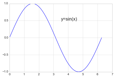
【5】添加文字和箭头
- 添加文字
x = np.linspace(0,2*np.pi,100)
plt.plot(x, np.sin(x),"b-")
plt.text(3.5,0.5,"y=sin(x)", fontsize=15)# 前两个为文字的坐标,后面是内容和字号
Text(3.5, 0.5, 'y=sin(x)')
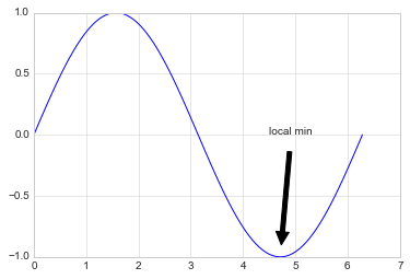
- 添加箭头
x = np.linspace(0,2*np.pi,100)
plt.plot(x, np.sin(x),"b-")
plt.annotate('local min', xy=(1.5*np.pi,-1), xytext=(4.5,0),
             arrowprops=dict(facecolor='black', shrink=0.1),)
Text(4.5, 0, 'local min')
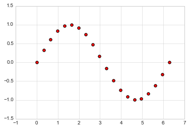
13.1.2 散点图
【1】简单散点图
x = np.linspace(0,2*np.pi,20)
plt.scatter(x, np.sin(x), marker="o", s=30, c="r")# s 大小  c 颜色
<matplotlib.collections.PathCollection at 0x188461eb4a8>
【2】颜色配置
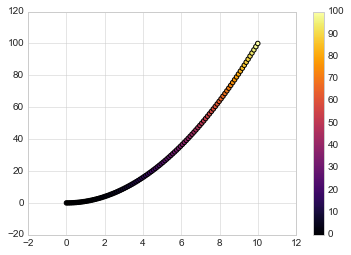
x = np.linspace(0,10,100)
y = x**2
plt.scatter(x, y, c=y, cmap="inferno")# 让c随着y的值变化在cmap中进行映射
plt.colorbar()# 输出颜色条
<matplotlib.colorbar.Colorbar at 0x18848d392e8>
颜色配置参考官方文档
https://matplotlib.org/examples/color/colormaps_reference.html
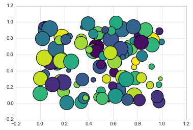
【3】根据数据控制点的大小
x, y, colors, size =(np.random.rand(100)for i inrange(4))
plt.scatter(x, y, c=colors, s=1000*size, cmap="viridis")
<matplotlib.collections.PathCollection at 0x18847b48748>
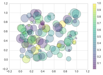
【4】透明度
x, y, colors, size =(np.random.rand(100)for i inrange(4))
plt.scatter(x, y, c=colors, s=1000*size, cmap="viridis", alpha=0.3)
plt.colorbar()
<matplotlib.colorbar.Colorbar at 0x18848f2be10>
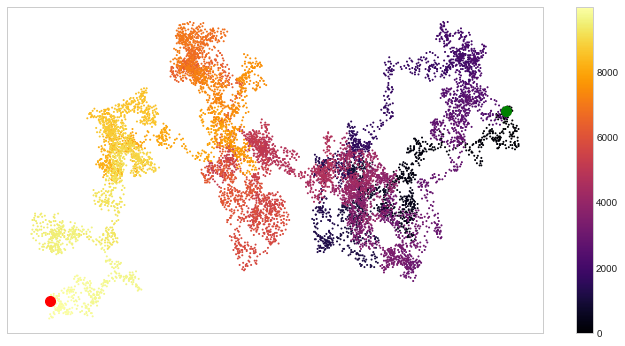
【例】随机漫步
from random import choice

classRandomWalk():"""一个生产随机漫步的类"""def__init__(self, num_points=5000):
        self.num_points = num_points
        self.x_values =[0]
        self.y_values =[0]deffill_walk(self):whilelen(self.x_values)< self.num_points:
            x_direction = choice([1,-1])
            x_distance = choice([0,1,2,3,4])
            x_step = x_direction * x_distance

            y_direction = choice([1,-1])
            y_distance = choice([0,1,2,3,4])
            y_step = y_direction * y_distance

            if x_step ==0or y_step ==0:continue
            next_x = self.x_values[-1]+ x_step
            next_y = self.y_values[-1]+ y_step
            self.x_values.append(next_x)
            self.y_values.append(next_y)
rw = RandomWalk(10000)
rw.fill_walk()
point_numbers =list(range(rw.num_points))
plt.figure(figsize=(12,6))# 设置画布大小
plt.scatter(rw.x_values, rw.y_values, c=point_numbers, cmap="inferno", s=1)
plt.colorbar()
plt.scatter(0,0, c="green", s=100)
plt.scatter(rw.x_values[-1], rw.y_values[-1], c="red", s=100)

plt.xticks([])
plt.yticks([])
([], <a list of 0 Text yticklabel objects>)
13.1.3 柱形图
【1】简单柱形图
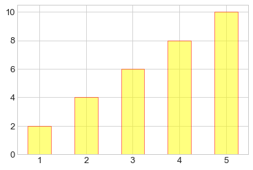
x = np.arange(1,6)
plt.bar(x,2*x, align="center", width=0.5, alpha=0.5, color='yellow', edgecolor='red')
plt.tick_params(axis="both", labelsize=13)
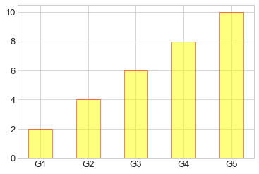
x = np.arange(1,6)
plt.bar(x,2*x, align="center", width=0.5, alpha=0.5, color='yellow', edgecolor='red')
plt.xticks(x,('G1','G2','G3','G4','G5'))
plt.tick_params(axis="both", labelsize=13)

x =('G1','G2','G3','G4','G5')
y =2* np.arange(1,6)
plt.bar(x, y, align="center", width=0.5, alpha=0.5, color='yellow', edgecolor='red')
plt.tick_params(axis="both", labelsize=13)
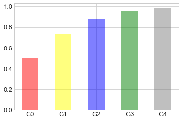
x =["G"+str(i)for i inrange(5)]
y =1/(1+np.exp(-np.arange(5)))

colors =['red','yellow','blue','green','gray']
plt.bar(x, y, align="center", width=0.5, alpha=0.5, color=colors)
plt.tick_params(axis="both", labelsize=13)
【2】累加柱形图
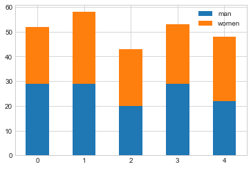
x = np.arange(5)
y1 = np.random.randint(20,30, size=5)
y2 = np.random.randint(20,30, size=5)
plt.bar(x, y1, width=0.5, label="man")
plt.bar(x, y2, width=0.5, bottom=y1, label="women")
plt.legend()
<matplotlib.legend.Legend at 0x2052db25cc0>
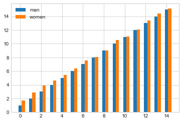
【3】并列柱形图
x = np.arange(15)
y1 = x+1
y2 = y1+np.random.random(15)
plt.bar(x, y1, width=0.3, label="man")
plt.bar(x+0.3, y2, width=0.3, label="women")
plt.legend()
<matplotlib.legend.Legend at 0x2052daf35f8>
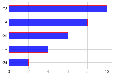
【4】横向柱形图barh
x =['G1','G2','G3','G4','G5']
y =2* np.arange(1,6)
plt.barh(x, y, align="center", height=0.5, alpha=0.8, color="blue", edgecolor="red")# 注意这里将bar改为barh,宽度用height设置
plt.tick_params(axis="both", labelsize=13)
13.1.4 多子图
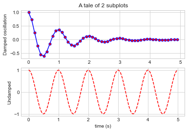
【1】简单多子图
deff(t):return np.exp(-t)* np.cos(2*np.pi*t)

t1 = np.arange(0.0,5.0,0.1)
t2 = np.arange(0.0,5.0,0.02)

plt.subplot(211)
plt.plot(t1, f(t1),"bo-", markerfacecolor="r", markersize=5)
plt.title("A tale of 2 subplots")
plt.ylabel("Damped oscillation")

plt.subplot(212)
plt.plot(t2, np.cos(2*np.pi*t2),"r--")
plt.xlabel("time (s)")
plt.ylabel("Undamped")
Text(0, 0.5, 'Undamped')
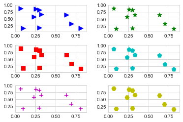
【2】多行多列子图
x = np.random.random(10)
y = np.random.random(10)

plt.subplots_adjust(hspace=0.5, wspace=0.3)

plt.subplot(321)
plt.scatter(x, y, s=80, c="b", marker=">")

plt.subplot(322)
plt.scatter(x, y, s=80, c="g", marker="*")

plt.subplot(323)
plt.scatter(x, y, s=80, c="r", marker="s")

plt.subplot(324)
plt.scatter(x, y, s=80, c="c", marker="p")

plt.subplot(325)
plt.scatter(x, y, s=80, c="m", marker="+")

plt.subplot(326)
plt.scatter(x, y, s=80, c="y", marker="H")
<matplotlib.collections.PathCollection at 0x2052d9f63c8>
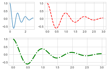
【3】不规则多子图
deff(x):return np.exp(-x)* np.cos(2*np.pi*x)

x = np.arange(0.0,3.0,0.01)
grid = plt.GridSpec(2,3, wspace=0.4, hspace=0.3)# 两行三列的网格

plt.subplot(grid[0,0])# 第一行第一列位置
plt.plot(x, f(x))

plt.subplot(grid[0,1:])# 第一行后两列的位置
plt.plot(x, f(x),"r--", lw=2)

plt.subplot(grid[1,:])# 第二行所有位置
plt.plot(x, f(x),"g-.", lw=3)
[<matplotlib.lines.Line2D at 0x2052d6fae80>]
13.1.5 直方图
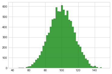
【1】普通频次直方图
mu, sigma =100,15
x = mu + sigma * np.random.randn(10000)

plt.hist(x, bins=50, facecolor='g', alpha=0.75)
(array([  1.,   0.,   0.,   5.,   3.,   5.,   1.,  10.,  15.,  19.,  37.,
         55.,  81.,  94., 125., 164., 216., 258., 320., 342., 401., 474.,
        483., 590., 553., 551., 611., 567., 515., 558., 470., 457., 402.,
        347., 261., 227., 206., 153., 128.,  93.,  79.,  41.,  22.,  17.,
         21.,   9.,   2.,   8.,   1.,   2.]),
 array([ 40.58148736,  42.82962161,  45.07775586,  47.32589011,
         49.57402436,  51.82215862,  54.07029287,  56.31842712,
         58.56656137,  60.81469562,  63.06282988,  65.31096413,
         67.55909838,  69.80723263,  72.05536689,  74.30350114,
         76.55163539,  78.79976964,  81.04790389,  83.29603815,
         85.5441724 ,  87.79230665,  90.0404409 ,  92.28857515,
         94.53670941,  96.78484366,  99.03297791, 101.28111216,
        103.52924641, 105.77738067, 108.02551492, 110.27364917,
        112.52178342, 114.76991767, 117.01805193, 119.26618618,
        121.51432043, 123.76245468, 126.01058893, 128.25872319,
        130.50685744, 132.75499169, 135.00312594, 137.25126019,
        139.49939445, 141.7475287 , 143.99566295, 146.2437972 ,
        148.49193145, 150.74006571, 152.98819996]),
 <a list of 50 Patch objects>)
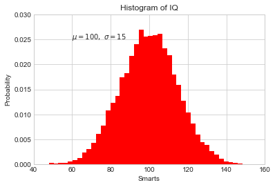
【2】概率密度
mu, sigma =100,15
x = mu + sigma * np.random.randn(10000)

plt.hist(x,50, density=True, color="r")# 概率密度图
plt.xlabel('Smarts')
plt.ylabel('Probability')
plt.title('Histogram of IQ')
plt.text(60,.025,r'$\mu=100,\ \sigma=15$')
plt.xlim(40,160)
plt.ylim(0,0.03)
(0, 0.03)
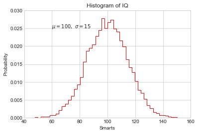
mu, sigma =100,15
x = mu + sigma * np.random.randn(10000)

plt.hist(x, bins=50, density=True, color="r", histtype='step')#不填充,只获得边缘
plt.xlabel('Smarts')
plt.ylabel('Probability')
plt.title('Histogram of IQ')
plt.text(60,.025,r'$\mu=100,\ \sigma=15$')
plt.xlim(40,160)
plt.ylim(0,0.03)
(0, 0.03)
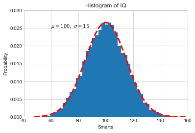
from scipy.stats import norm
mu, sigma =100,15# 想获得真正高斯分布的概率密度图
x = mu + sigma * np.random.randn(10000)# 先获得bins,即分配的区间
_, bins, __ = plt.hist(x,50, density=True)
y = norm.pdf(bins, mu, sigma)# 通过norm模块计算符合的概率密度
plt.plot(bins, y,'r--', lw=3)
plt.xlabel('Smarts')
plt.ylabel('Probability')
plt.title('Histogram of IQ')
plt.text(60,.025,r'$\mu=100,\ \sigma=15$')
plt.xlim(40,160)
plt.ylim(0,0.03)
(0, 0.03)
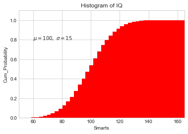
【3】累计概率分布
mu, sigma =100,15
x = mu + sigma * np.random.randn(10000)

plt.hist(x,50, density=True, cumulative=True, color="r")# 将累计cumulative设置为true即可
plt.xlabel('Smarts')
plt.ylabel('Cum_Probability')
plt.title('Histogram of IQ')
plt.text(60,0.8,r'$\mu=100,\ \sigma=15$')
plt.xlim(50,165)
plt.ylim(0,1.1)
(0, 1.1)
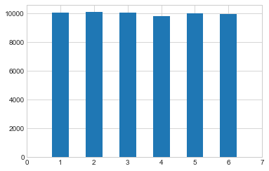
【例】模拟投两个骰子
classDie():"模拟一个骰子的类"def__init__(self, num_sides=6):
        self.num_sides = num_sides

    defroll(self):return np.random.randint(1, self.num_sides+1)
- 重复投一个骰子
die = Die()
results =[]for i inrange(60000):
    result = die.roll()
    results.append(result)

plt.hist(results, bins=6,range=(0.75,6.75), align="mid", width=0.5)
plt.xlim(0,7)
(0, 7)
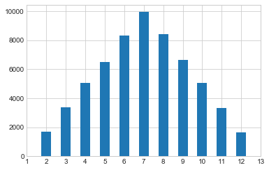
- 重复投两个骰子
die1 = Die()
die2 = Die()
results =[]for i inrange(60000):
    result = die1.roll()+die2.roll()
    results.append(result)

plt.hist(results, bins=11,range=(1.75,12.75), align="mid", width=0.5)
plt.xlim(1,13)
plt.xticks(np.arange(1,14))
([<matplotlib.axis.XTick at 0x2052fae23c8>,
  <matplotlib.axis.XTick at 0x2052ff1fa20>,
  <matplotlib.axis.XTick at 0x2052fb493c8>,
  <matplotlib.axis.XTick at 0x2052e9b5a20>,
  <matplotlib.axis.XTick at 0x2052e9b5e80>,
  <matplotlib.axis.XTick at 0x2052e9b5978>,
  <matplotlib.axis.XTick at 0x2052e9cc668>,
  <matplotlib.axis.XTick at 0x2052e9ccba8>,
  <matplotlib.axis.XTick at 0x2052e9ccdd8>,
  <matplotlib.axis.XTick at 0x2052fac5668>,
  <matplotlib.axis.XTick at 0x2052fac5ba8>,
  <matplotlib.axis.XTick at 0x2052fac5dd8>,
  <matplotlib.axis.XTick at 0x2052fad9668>],
 <a list of 13 Text xticklabel objects>)
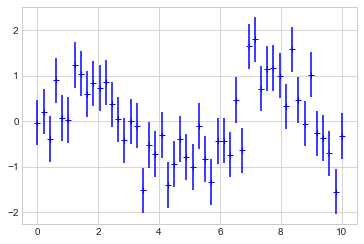
13.1.6 误差图
【1】基本误差图
x = np.linspace(0,10,50)
dy =0.5# 每个点的y值误差设置为0.5
y = np.sin(x)+ dy*np.random.randn(50)

plt.errorbar(x, y , yerr=dy, fmt="+b")
<ErrorbarContainer object of 3 artists>
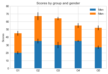
【2】柱形图误差图
menMeans =(20,35,30,35,27)
womenMeans =(25,32,34,20,25)
menStd =(2,3,4,1,2)
womenStd =(3,5,2,3,3)
ind =['G1','G2','G3','G4','G5']
width =0.35

p1 = plt.bar(ind, menMeans, width=width, label="Men", yerr=menStd)
p2 = plt.bar(ind, womenMeans, width=width, bottom=menMeans, label="Men", yerr=womenStd)

plt.ylabel('Scores')
plt.title('Scores by group and gender')
plt.yticks(np.arange(0,81,10))
plt.legend()
<matplotlib.legend.Legend at 0x20531035630>
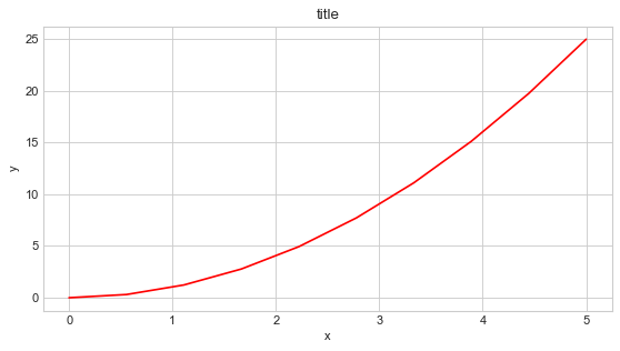
13.1.7 面向对象的风格简介
【例1】 普通图
x = np.linspace(0,5,10)
y = x **2

fig = plt.figure(figsize=(8,4), dpi=80)# 图像
axes = fig.add_axes([0.1,0.1,0.8,0.8])# 轴 left, bottom, width, height (range 0 to 1)

axes.plot(x, y,'r')
axes.set_xlabel('x')
axes.set_ylabel('y')
axes.set_title('title')
Text(0.5, 1.0, 'title')
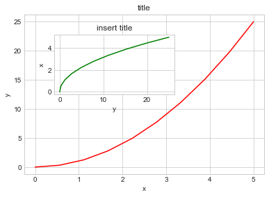
【2】画中画
x = np.linspace(0,5,10)
y = x **2

fig = plt.figure()

ax1 = fig.add_axes([0.1,0.1,0.8,0.8])
ax2 = fig.add_axes([0.2,0.5,0.4,0.3])

ax1.plot(x, y,'r')

ax1.set_xlabel('x')
ax1.set_ylabel('y')
ax1.set_title('title')

ax2.plot(y, x,'g')
ax2.set_xlabel('y')
ax2.set_ylabel('x')
ax2.set_title('insert title')
Text(0.5, 1.0, 'insert title')
【3】 多子图
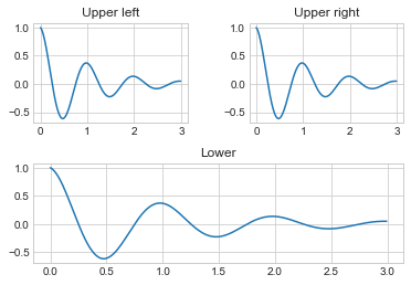
deff(t):return np.exp(-t)* np.cos(2*np.pi*t)

t1 = np.arange(0.0,3.0,0.01)

fig= plt.figure()
fig.subplots_adjust(hspace=0.4, wspace=0.4)

ax1 = plt.subplot(2,2,1)
ax1.plot(t1, f(t1))
ax1.set_title("Upper left")

ax2 = plt.subplot(2,2,2)
ax2.plot(t1, f(t1))
ax2.set_title("Upper right")

ax3 = plt.subplot(2,1,2)
ax3.plot(t1, f(t1))
ax3.set_title("Lower")
Text(0.5, 1.0, 'Lower')
13.1.8 三维图形简介
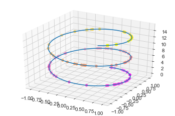
【1】三维数据点与线
from mpl_toolkits import mplot3d # 注意要导入mplot3d

ax = plt.axes(projection="3d")
zline = np.linspace(0,15,1000)
xline = np.sin(zline)
yline = np.cos(zline)
ax.plot3D(xline, yline ,zline)# 线的绘制

zdata =15*np.random.random(100)
xdata = np.sin(zdata)
ydata = np.cos(zdata)
ax.scatter3D(xdata, ydata ,zdata, c=zdata, cmap="spring")# 点的绘制
<mpl_toolkits.mplot3d.art3d.Path3DCollection at 0x2052fd1e5f8>
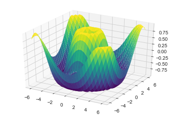
【2】三维数据曲面图
deff(x, y):return np.sin(np.sqrt(x**2+ y**2))

x = np.linspace(-6,6,30)
y = np.linspace(-6,6,30)
X, Y = np.meshgrid(x, y)# 网格化
Z = f(X, Y)

ax = plt.axes(projection="3d")
ax.plot_surface(X, Y, Z, cmap="viridis")# 设置颜色映射
<mpl_toolkits.mplot3d.art3d.Poly3DCollection at 0x20531baa5c0>
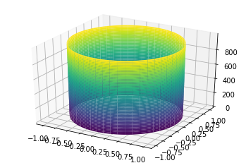
import numpy as np
import matplotlib.pyplot as plt
from mpl_toolkits import mplot3d

t = np.linspace(0,2*np.pi,1000)
X = np.sin(t)
Y = np.cos(t)
Z = np.arange(t.size)[:, np.newaxis]

ax = plt.axes(projection="3d")
ax.plot_surface(X, Y, Z, cmap="viridis")
<mpl_toolkits.mplot3d.art3d.Poly3DCollection at 0x1c540cf1cc0>
13.2 Seaborn库-文艺青年的最爱
【1】Seaborn 与 Matplotlib
Seaborn 是一个基于 matplotlib 且数据结构与 pandas 统一的统计图制作库
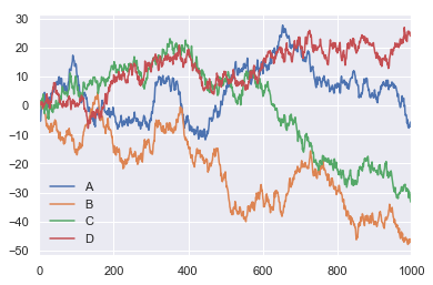
x = np.linspace(0,10,500)
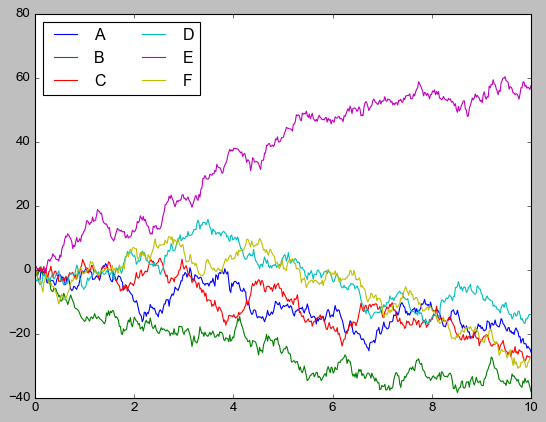
y = np.cumsum(np.random.randn(500,6), axis=0)with plt.style.context("classic"):
plt.plot(x, y)
plt.legend("ABCDEF", ncol=2, loc="upper left")
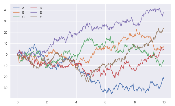
import seaborn as sns

x = np.linspace(0,10,500)
y = np.cumsum(np.random.randn(500,6), axis=0)
sns.set()# 改变了格式
plt.figure(figsize=(10,6))
plt.plot(x, y)
plt.legend("ABCDEF", ncol=2, loc="upper left")
<matplotlib.legend.Legend at 0x20533d825f8>
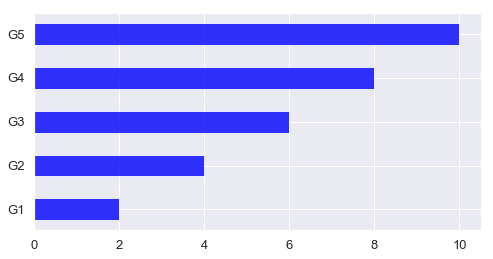
【2】柱形图的对比
x =['G1','G2','G3','G4','G5']
y =2* np.arange(1,6)

plt.figure(figsize=(8,4))
plt.barh(x, y, align="center", height=0.5, alpha=0.8, color="blue")
plt.tick_params(axis="both", labelsize=13)
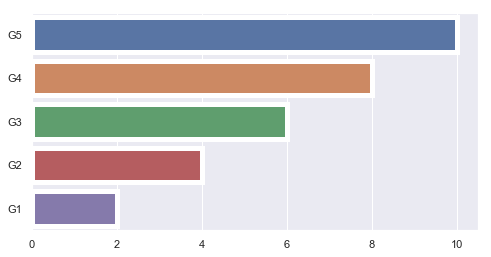
import seaborn as sns

plt.figure(figsize=(8,4))
x =['G5','G4','G3','G2','G1']
y =2* np.arange(5,0,-1)#sns.barplot(y, x)
sns.barplot(y, x, linewidth=5)
<matplotlib.axes._subplots.AxesSubplot at 0x20533e92048>
sns.barplot?
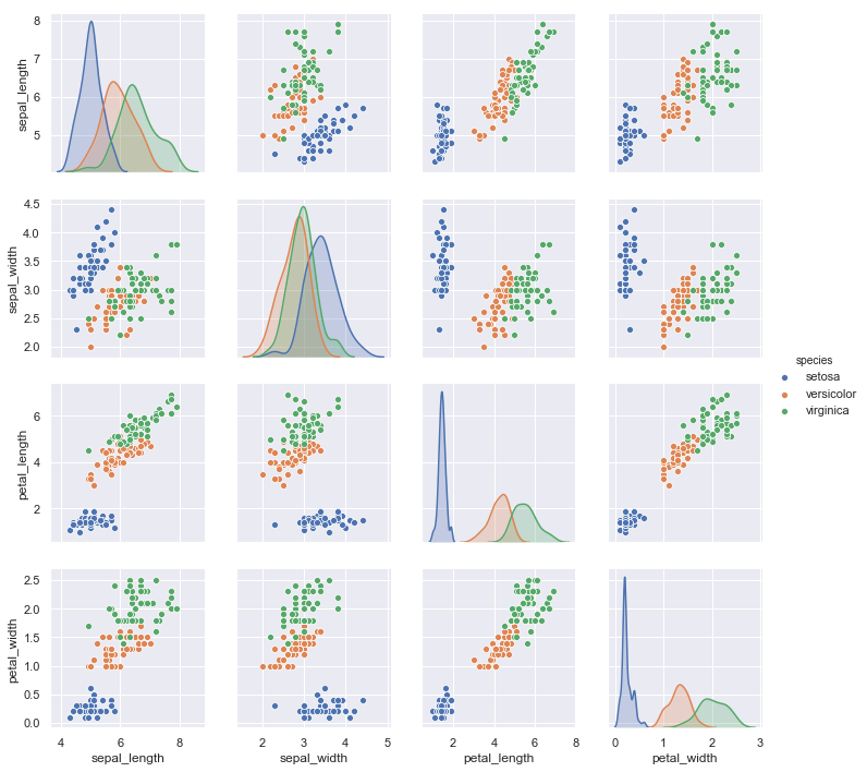
【3】以鸢尾花数据集为例
iris = sns.load_dataset("iris")
iris.head()
sepal_lengthsepal_widthpetal_lengthpetal_widthspecies05.13.51.40.2setosa14.93.01.40.2setosa24.73.21.30.2setosa34.63.11.50.2setosa45.03.61.40.2setosa
sns.pairplot(data=iris, hue="species")
<seaborn.axisgrid.PairGrid at 0x205340655f8>
13.3 Pandas 中的绘图函数概览
import pandas as pd
【1】线形图
df = pd.DataFrame(np.random.randn(1000,4).cumsum(axis=0),
                  columns=list("ABCD"),
                  index=np.arange(1000))
df.head()
ABCD0-1.3114430.970917-1.635011-0.2047791-1.6185020.810056-1.1192461.2396892-3.5587871.431716-0.8162011.1556113-5.377557-0.3127440.6509220.3521764-3.9170451.1810971.5724060.965921
df.plot()
<matplotlib.axes._subplots.AxesSubplot at 0x20534763f28>
df = pd.DataFrame()
df.plot?
【2】柱形图
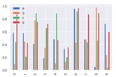
df2 = pd.DataFrame(np.random.rand(10,4), columns=['a','b','c','d'])
df2
abcd00.5876000.0987360.4447570.87747510.5800620.4515190.2123180.42967320.4153070.7840830.8912050.75628730.1900530.3509870.6625490.72919340.4856020.1099740.8915540.47349250.3318840.1289570.2043030.36342060.9627500.4312260.9176820.97271370.4834100.4865920.4392350.87521080.0543370.9858120.4690160.89471290.7309050.2371660.0431950.600445
- 多组数据竖图
df2.plot.bar()
<matplotlib.axes._subplots.AxesSubplot at 0x20534f1cb00>
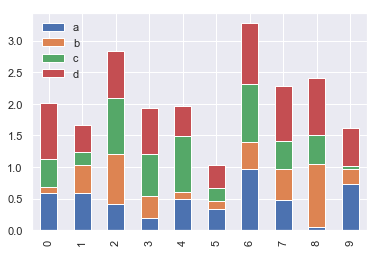
- 多组数据累加竖图
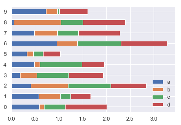
df2.plot.bar(stacked=True)# 累加的柱形图
<matplotlib.axes._subplots.AxesSubplot at 0x20534f22208>
- 多组数据累加横图
df2.plot.barh(stacked=True)# 变为barh
<matplotlib.axes._subplots.AxesSubplot at 0x2053509d048>
【3】直方图和密度图
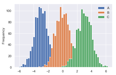
df4 = pd.DataFrame({"A": np.random.randn(1000)-3,"B": np.random.randn(1000),"C": np.random.randn(1000)+3})
df4.head()
ABC0-4.2504241.0432681.3561061-2.393362-0.8916203.7879062-4.4112250.4363811.2427493-3.465659-0.8459661.5403474-3.6068501.6434043.689431
- 普通直方图
df4.plot.hist(bins=50)
<matplotlib.axes._subplots.AxesSubplot at 0x20538383b38>
- 累加直方图
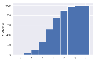
df4['A'].plot.hist(cumulative=True)
<matplotlib.axes._subplots.AxesSubplot at 0x2053533bbe0>
- 概率密度图
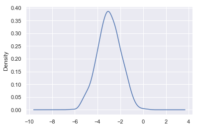
df4['A'].plot(kind="kde")
<matplotlib.axes._subplots.AxesSubplot at 0x205352c4e48>
- 差分
df = pd.DataFrame(np.random.randn(1000,4).cumsum(axis=0),
                  columns=list("ABCD"),
                  index=np.arange(1000))
df.head()
ABCD0-0.277843-0.310656-0.782999-0.04903210.644248-0.505115-0.3638420.3991162-0.614141-1.227740-0.787415-0.1174853-0.055964-2.376631-0.814320-0.71617940.058613-2.355537-2.1742910.351918
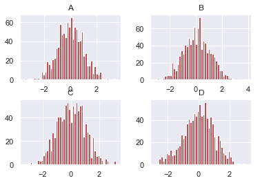
df.diff().hist(bins=50, color="r")
array([[<matplotlib.axes._subplots.AxesSubplot object at 0x000002053942A6A0>,
        <matplotlib.axes._subplots.AxesSubplot object at 0x000002053957FE48>],
       [<matplotlib.axes._subplots.AxesSubplot object at 0x00000205395A4780>,
        <matplotlib.axes._subplots.AxesSubplot object at 0x00000205395D4128>]],
      dtype=object)
df = pd.DataFrame()
df.hist?
【4】散点图
housing = pd.read_csv("housing.csv")
housing.head()
longitudelatitudehousing_median_agetotal_roomstotal_bedroomspopulationhouseholdsmedian_incomemedian_house_valueocean_proximity0-122.2337.8841.0880.0129.0322.0126.08.3252452600.0NEAR BAY1-122.2237.8621.07099.01106.02401.01138.08.3014358500.0NEAR BAY2-122.2437.8552.01467.0190.0496.0177.07.2574352100.0NEAR BAY3-122.2537.8552.01274.0235.0558.0219.05.6431341300.0NEAR BAY4-122.2537.8552.01627.0280.0565.0259.03.8462342200.0NEAR BAY
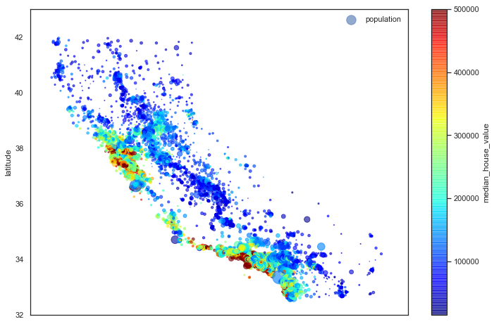
"""基于地理数据的人口、房价可视化"""# 圆的半价大小代表每个区域人口数量(s),颜色代表价格(c),用预定义的jet表进行可视化with sns.axes_style("white"):
    housing.plot(kind="scatter", x="longitude", y="latitude", alpha=0.6,
                 s=housing["population"]/100, label="population",
                 c="median_house_value", cmap="jet", colorbar=True, figsize=(12,8))
plt.legend()
plt.axis([-125,-113.5,32,43])
[-125, -113.5, 32, 43]
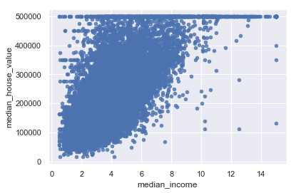
housing.plot(kind="scatter", x="median_income", y="median_house_value", alpha=0.8)
'c' argument looks like a single numeric RGB or RGBA sequence, which should be avoided as value-mapping will have precedence in case its length matches with 'x' & 'y'.  Please use a 2-D array with a single row if you really want to specify the same RGB or RGBA value for all points.

<matplotlib.axes._subplots.AxesSubplot at 0x2053a45a9b0>
【5】多子图
df = pd.DataFrame(np.random.randn(1000,4).cumsum(axis=0),
                  columns=list("ABCD"),
                  index=np.arange(1000))
df.head()
ABCD0-0.1345100.364371-0.831193-0.79690310.1301021.003402-0.622822-1.64077120.0668730.1261740.180913-2.9286433-1.686890-0.0507400.312582-2.37945540.655660-0.390920-1.144121-2.625653
- 默认情形
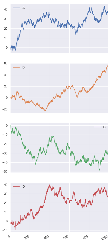
df.plot(subplots=True, figsize=(6,16))
array([<matplotlib.axes._subplots.AxesSubplot object at 0x0000020539BF46D8>,
       <matplotlib.axes._subplots.AxesSubplot object at 0x0000020539C11898>,
       <matplotlib.axes._subplots.AxesSubplot object at 0x0000020539C3D0B8>,
       <matplotlib.axes._subplots.AxesSubplot object at 0x0000020539C60908>],
      dtype=object)
- 设定图形安排
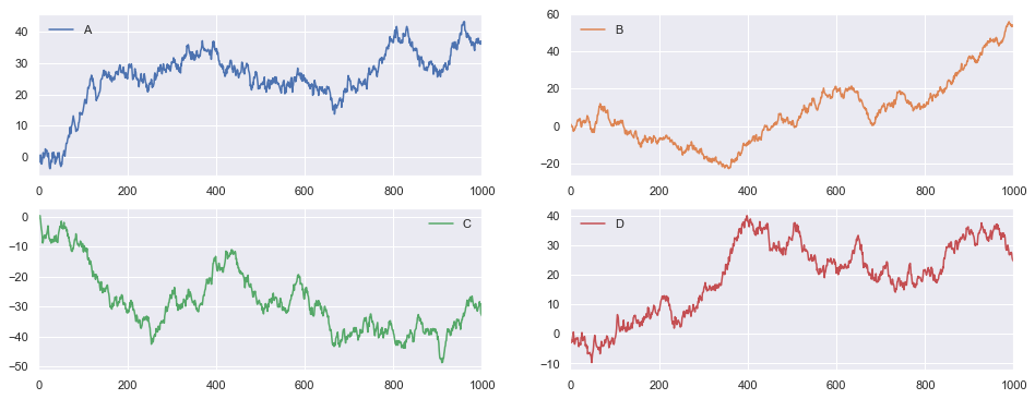
df.plot(subplots=True, layout=(2,2), figsize=(16,6), sharex=False)
array([[<matplotlib.axes._subplots.AxesSubplot object at 0x000002053D9C2898>,
        <matplotlib.axes._subplots.AxesSubplot object at 0x000002053D9F5668>],
       [<matplotlib.axes._subplots.AxesSubplot object at 0x000002053D68BF98>,
        <matplotlib.axes._subplots.AxesSubplot object at 0x000002053D6B7940>]],
      dtype=object)
其他内容请参考Pandas中文文档
https://www.pypandas.cn/docs/user_guide/visualization.html#plot-formatting
版权归原作者 timerring 所有, 如有侵权,请联系我们删除。