
gitee:grid-project-gitee
B站视频:Vue-Grid-Layout
一、搭建项目框架
- 创建vue项目
vue create vite-layout // 使用 vue/cli 创建 vue 项目
- 下载依赖
npm i vue-grid-layout less less-loader@4 --s
// 下载 vue-grid-layout依赖、less预处理器(两者保持版本相兼容即可)
- 项目样式重置
style.css:

* {
  margin: 0;
  padding: 0;
  box-sizing: border-box;
}
body {
  display: flex;
  justify-content: center;
  align-items: center;
  width: 100%;
  height: 100%;
}
- 搭建 vue-grid-layout的环境
文件结构(暂定)
- src
|- components
|- Top
|- Card
|- Layout
Top 文件夹做项目的头部
Card 文件夹做项目的拖拽单元
Layout 文件夹做拖拽的画布
App.vue:
<template>
<div class="app_main">
<topVue /> // 头部高50px
<layout /> // 剩余 650px 做拖拽的内容区
</div>
</template>
<script>
import topVue from "@com/Top/index.vue";
import layout from "@com/Layout/index.vue";
export default {
components: { topVue, layout },
};
</script>
<style lang="less" scoped>
.app_main {
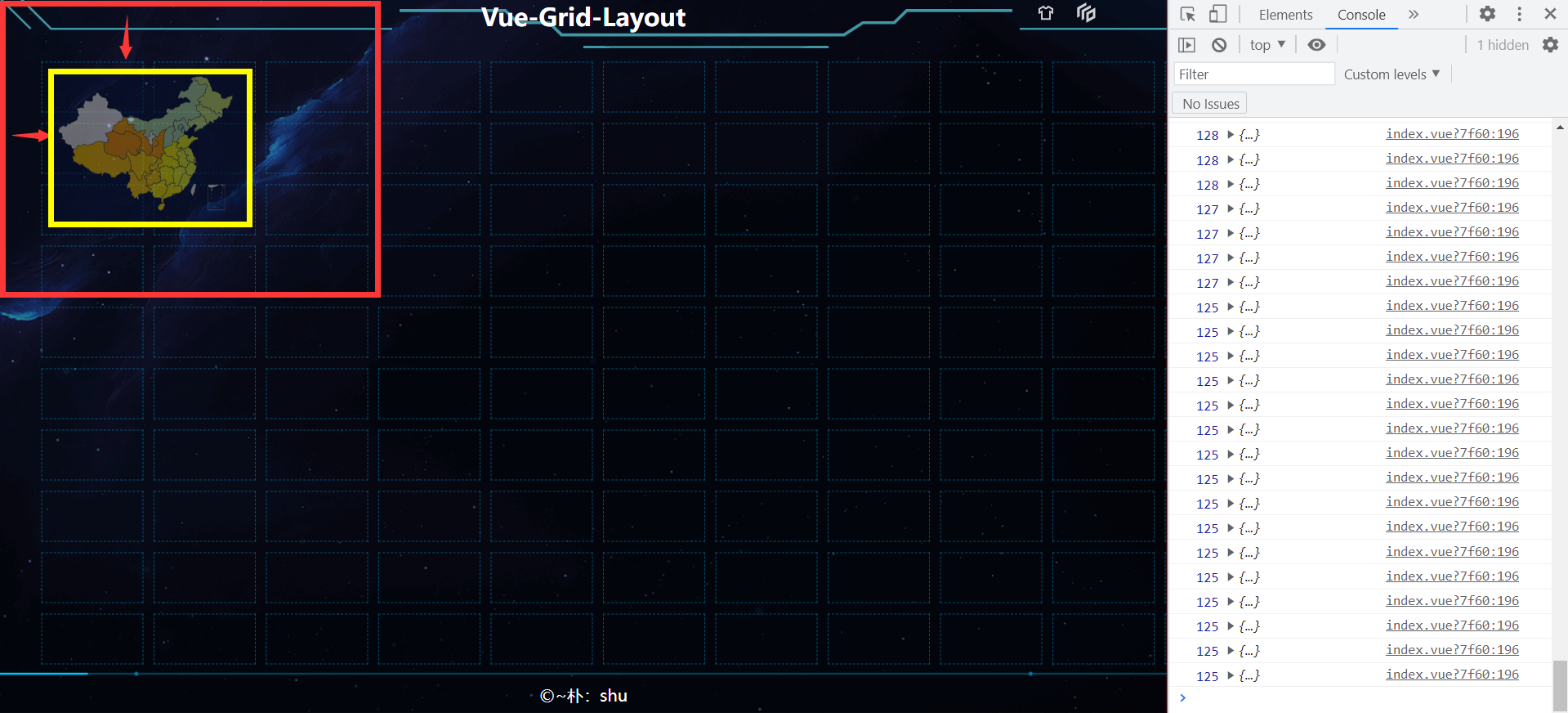
// 固定app的宽高是为了后期计算方便,在实际项目中,也会有一个 baseWidth baseHeight (UI设计的原始宽高)
border: solid red 1px;
width: 1500px;
height: 700px;
}
</style>
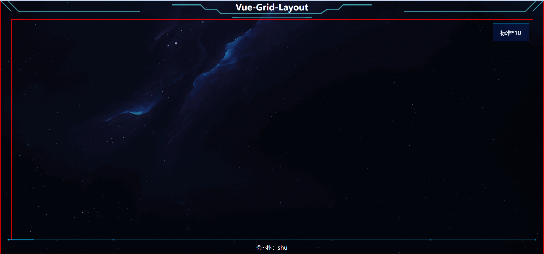
如下:
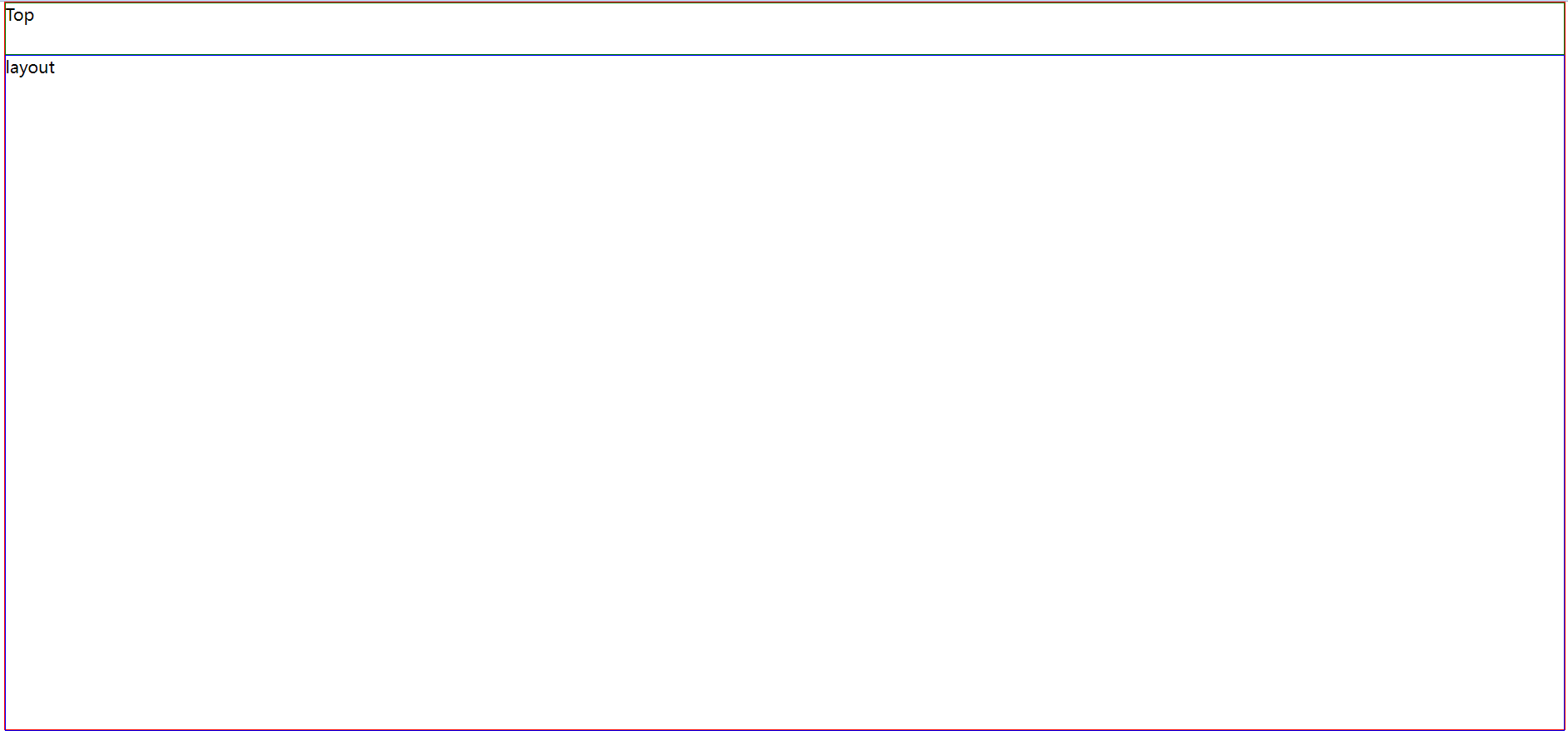
【注意:我们设计为整数,只是为了等会在计算item的宽高时方便!】
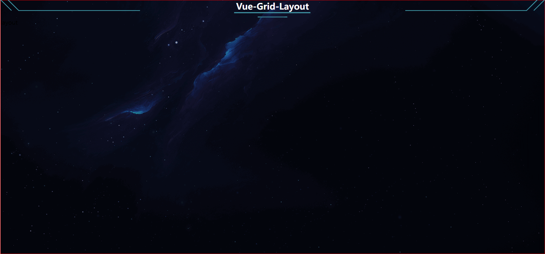
二、 设计头部
根据自己的项目设计即可,我做演示就不要求了,我直接引用 Data V 的大屏头部、背景图片;
调整一下样式(目前先这样,后期需要加东西我们再优化):
Top/index.vue:

<template>
  <div class="top-header">
    <div class="dv-decoration-8 header-left-decoration">
      <svg width="384" height="60">
        <polyline
          stroke="#3f96a5"
          stroke-width="2"
          fill="transparent"
          points="0, 0 30, 30"
        ></polyline>
        <polyline
          stroke="#3f96a5"
          stroke-width="2"
          fill="transparent"
          points="20, 0 50, 30 384, 30"
        ></polyline>
        <polyline
          stroke="#3f96a5"
          fill="transparent"
          stroke-width="3"
          points="0, 57, 200, 57"
        ></polyline>
      </svg>
    </div>
    <div class="dv-decoration-5 header-center-decoration">
      <svg width="614" height="60">
        <polyline
          fill="transparent"
          stroke="#3f96a5"
          stroke-width="3"
          points="0,12 110.52,12 122.80000000000001,24 153.5,24 165.78,36 442.08,36 460.5,24 491.20000000000005,24 503.47999999999996,12 614,12"
        >
          <animate
            attributeName="stroke-dasharray"
            attributeType="XML"
            from="0, 316.1165429846644, 0, 316.1165429846644"
            to="0, 0, 632.2330859693288, 0"
            dur="1.2s"
            begin="0s"
            calcMode="spline"
            keyTimes="0;1"
            keySplines="0.4,1,0.49,0.98"
            repeatCount="indefinite"
          ></animate>
        </polyline>
        <polyline
          fill="transparent"
          stroke="#3f96a5"
          stroke-width="2"
          points="184.2,48 429.79999999999995,48"
        >
          <animate
            attributeName="stroke-dasharray"
            attributeType="XML"
            from="0, 122.79999999999998, 0, 122.79999999999998"
            to="0, 0, 245.59999999999997, 0"
            dur="1.2s"
            begin="0s"
            calcMode="spline"
            keyTimes="0;1"
            keySplines=".4,1,.49,.98"
            repeatCount="indefinite"
          ></animate>
        </polyline>
      </svg>
    </div>
    <div class="dv-decoration-8 header-right-decoration">
      <svg width="384" height="60">
        <polyline
          stroke="#3f96a5"
          stroke-width="2"
          fill="transparent"
          points="384, 0 354, 30"
        ></polyline>
        <polyline
          stroke="#3f96a5"
          stroke-width="2"
          fill="transparent"
          points="364, 0 334, 30 0, 30"
        ></polyline>
        <polyline
          stroke="#3f96a5"
          fill="transparent"
          stroke-width="3"
          points="384, 57, 184, 57"
        ></polyline>
      </svg>
    </div>
    <div class="top-header-title">Vue-Grid-Layout</div>
  </div>
</template>

<script>
export default {};
</script>

<style lang="less" scoped>
.top-header {
  height: 50px;
  width: 100%;
  display: flex;
  align-items: center;
  justify-content: space-between;
  position: relative;
  svg {
    height: 50px;
  }
  &-title {
    position: absolute;
    top: 0;
    left: 50%;
    color: #fff;
    transform: translateX(-50%);
    font-size: 24px;
    font-weight: 700;
  }
}
</style>
三、 拖拽区设计
- 设计理念:
分grid-layout、grid-item 文件的目的是,使得 拖拽数据项和 layout 父级分开,通过数据传递实现渲染,因为 item 的事件是很多的,分开写逻辑更清晰。
- layout.vue:
// 引入组件
import { GridLayout } from "vue-grid-layout";// 引入自己的GridItem
import myGridItem from "./item.vue";
<!-- 主拖拽区 -->
    <grid-layout
      :layout="layout"
      :col-num="12"
      :row-height="30"
      :is-draggable="true"
      :is-resizable="true"
      :is-mirrored="false"
      :vertical-compact="true"
      :margin="[10, 10]"
      :use-css-transforms="true"
    >
     // 通过自定义组件的方式引用 item 数据项
      <myGridItem :itemData="layout" />
    </grid-layout>
- item.vue:
import { GridItem } from "vue-grid-layout"; // 在我们定义的 item 组件中,引用grid-item 组件,使用 props 传入的数据进行渲染
 <grid-item
      v-for="item in itemData"
      :x="item.x"
      :y="item.y"
      :w="item.w"
      :h="item.h"
      :i="item.i"
      :key="item.i"
      class="grid-item"
    >
      {{ item.i }}
    </grid-item>

// css:
<style lang="less" scoped>
.grid-item {
  // 我们迎合 DATa v 的样式,模仿实现item
  border: solid black 1px;
  background-color: #cccccc;
}
</style>
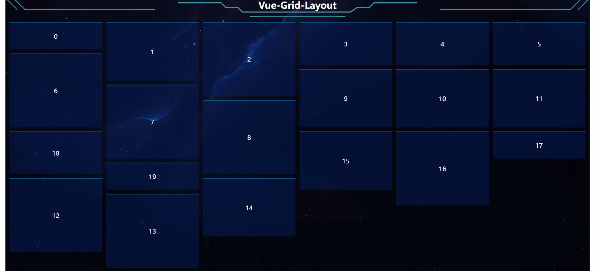
- 实现的初步效果如下:
【注意:实现的效果我是直接使用了 Data V 的样式哈,大家可以自己设计更好看的】
四、拖拽数据项设计
- item 数据项的宽度高度计算方法
这个知识点我已经在上一篇文章中详细讲述过了,这里再强调一下!
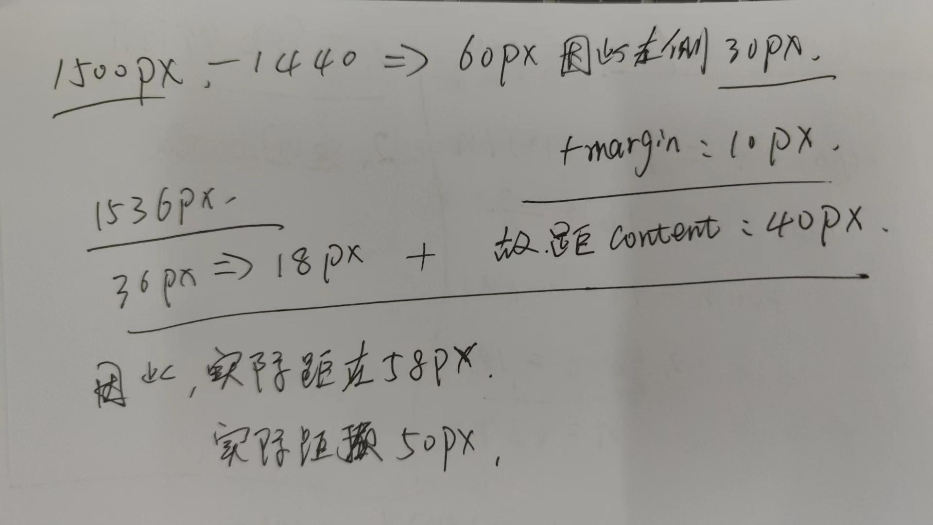
我们目前的拖拽区 :width: 1500px; height:650px;
我们将宽度分为 10列,每一列是多少px?
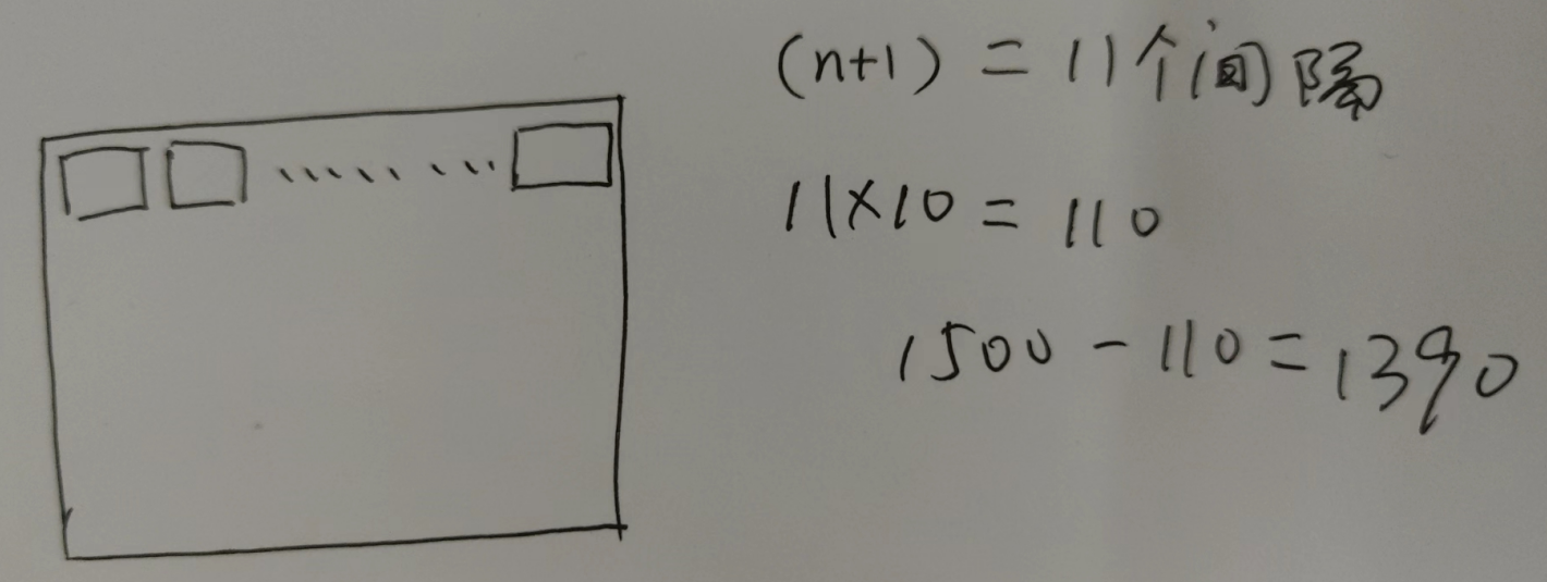
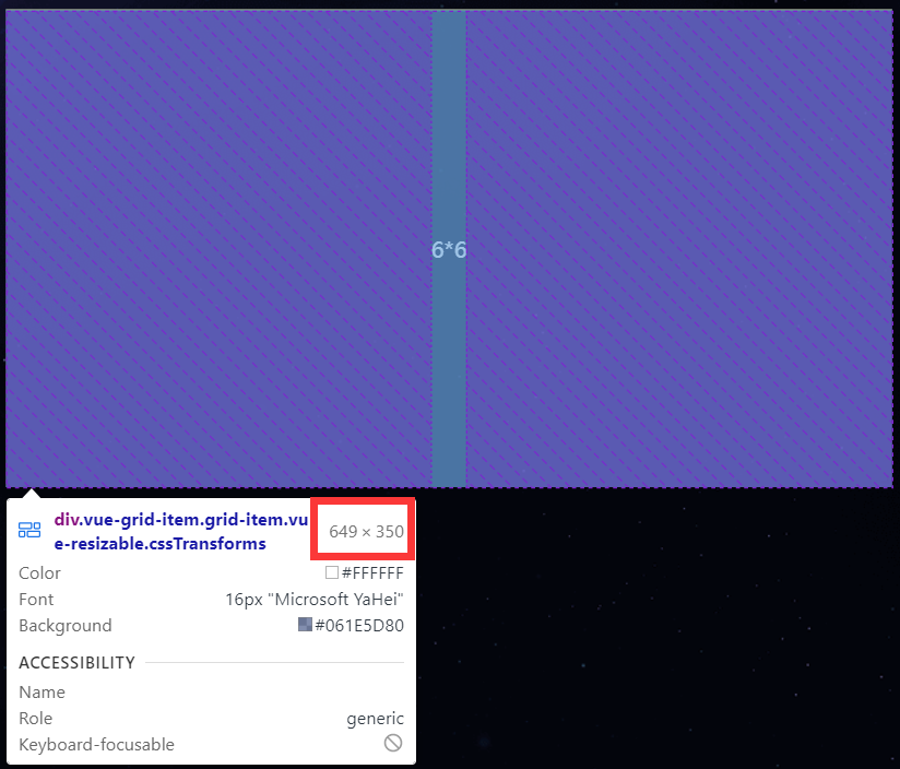
不知道这个图会不会更加清晰的看出item间的关系,始终别忘了【:margin="[10, 10]"】的存在,因此,将一行分为10份,必定有11个间隔(margin)因此,11个间隔占用:11*10px=110px;因此,剩余1390px来平分给 10 个item。故而,每一个item的宽度就是 139px。
我们验证一下: { x: 0, y: 0, w: 1, h: 1, i: "标准1*1" }:
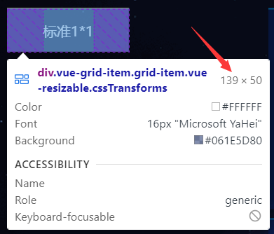
:row-height="50" 这个属性表示每一行的高度是 50px,那么,650px的高度,可以分成多少行?
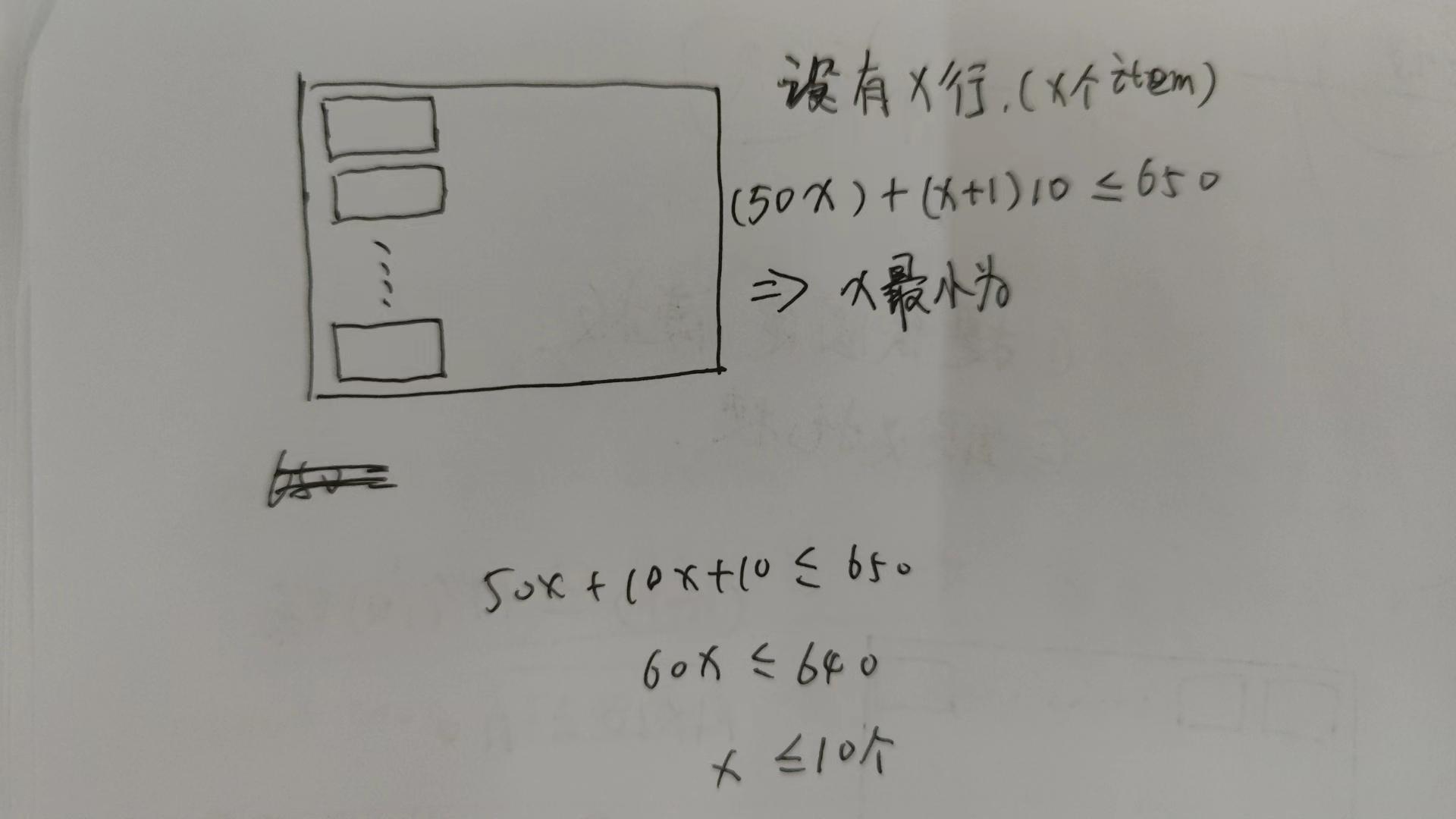
当我们放下11个的时候,已经显示不全了。
- 规避计算误差
我们简单回顾了一下item的计算方式,那我们该如何处理,来规避这种计算带来的误差呢?
高度的处理:经过我们计算,当取10行的时候,(10+1)10+5010=610px;因此,我们需要将多余的40px,分给头部【具体的分配方式应该视项目,有底部的,分给底部,我们的目的就是确保拖拽区只有10行!】
底部放置版权等信息还是可行的;
宽度的处理:宽度我们保留10个,item的宽度为139px,那么,整个拖拽区的规格为 10*10 个格子。
layout.vue:
<!--
      拖拽区 ===> content
      拖拽画布考虑:【这个主要是设计拖拽的宽高、间距、特别!!!是item的宽高对后期的影响是很大的】
      1. 我们目前的 content :width: 1500px; height:650px
      2. 我们将宽度分为 10列,每一列是多少px?  width -【col + 1】* margin / col
      3. 高度的计算方式: row * n + (n + 1) * margin <= height
     -->
    <grid-layout
      :layout="layout"
      :col-num="10"
      :row-height="50"
      :is-draggable="true"
      :is-resizable="true"
      :is-mirrored="false"
      :vertical-compact="true"
      :margin="[10, 10]"
      :use-css-transforms="true"
    >
      <myGridItem :itemData="layout" />
    </grid-layout>

item.vue:
<grid-item
      v-for="item in itemData"
      :x="item.x"
      :y="item.y"
      :w="item.w"
      :h="item.h"
      :i="item.i"
      :key="item.i"
      class="grid-item"
    >
      {{ item.i }}
    </grid-item>
- 计算方案优化
【考虑:】这种方案是否合适?我们现在的实际宽高和item的宽高比为 1/1=139/50,在实际的项目中是不会考虑这种大格子方案的。原因如下:
- 我们需要设计一个 600px * 300px的卡片,那么,它的配置项该怎么写?w:4.3;h:6,我们发现,宽度就不能是整数。这在实际项目中是需要规避的。
因此,我们还需要优化宽度的计算结果:我们假设需要每一列宽度100px,margin 10px,1500px可以取10100+1110=1110px;剩余390px我们不用。【现在的格子数还是1010;当然你也可以多加两个。】我们再取三个格子,13100+140=1440px,剩60px不用【不用的含义是左右留白,这也是设计中常用的方案】
我们通过反推实现最佳的尺寸:格子尺寸:10050px,因此 一个单元格与实际尺寸的比值就是 1/1= 100/50.这样,我们设计 600300 的卡片,w:6,h:6.验证一下:
这样还是会受到实际 margin 值的影响,我们还需要控制margin的影响,具体的方案我在后面再给大家详细说一下这个拖拽数据项的计算及margin的消除,现在我们只需要考虑占几个格子就行了。
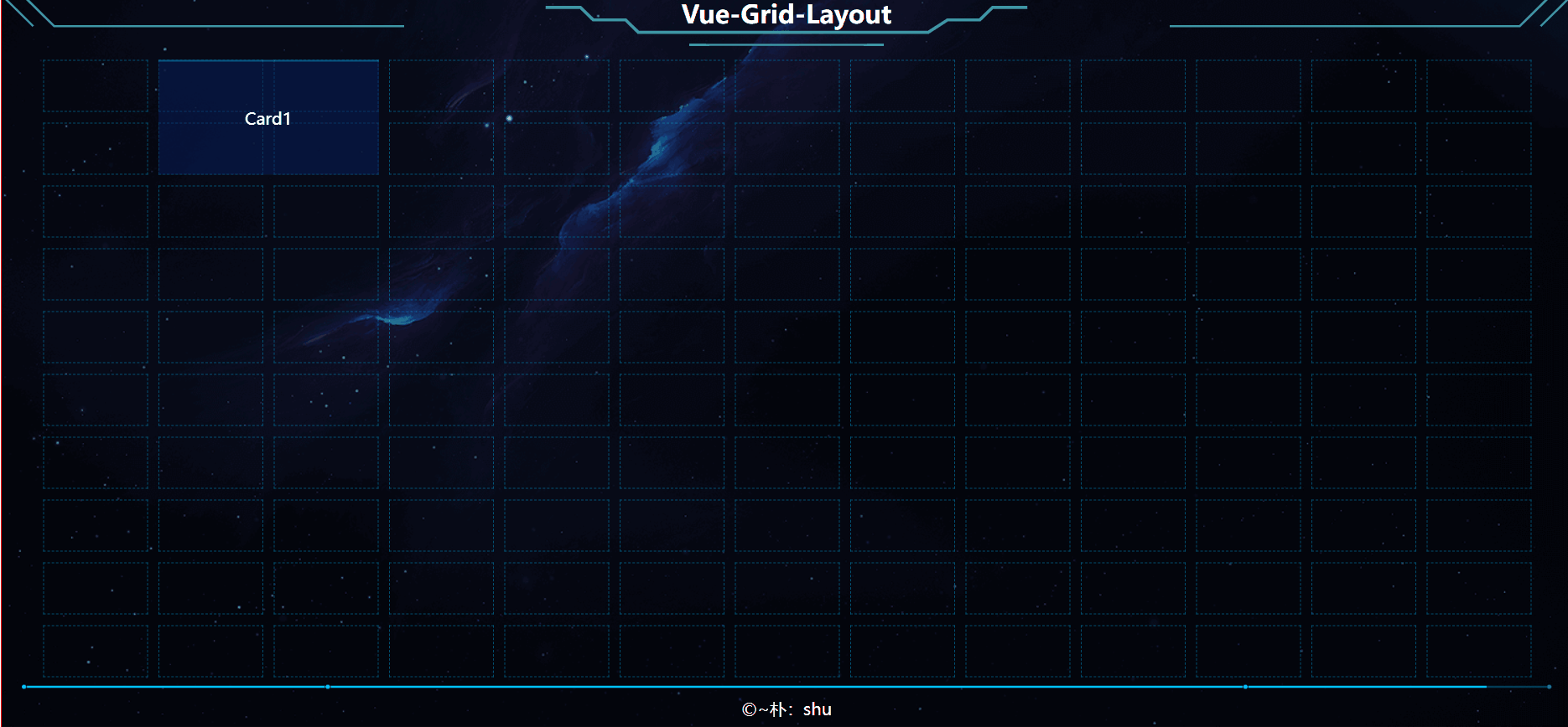
总结:我们目前设计的格子数:1310,格子尺寸为 10050px,margin:10*10px,加了背景框,效果如上。
五、卡片设计
基本概念:我们将拖拽的最小单元称为卡片,就是 item数据项。
Card 文件夹设计:
- Card
    |- card1
        |- card.vue
        |- config.js
    |- index.js
1. Card/index.js 是做所有组件导出,注册为全局组件,配合 componentIs 实现动态加载。
2. 每一个文件夹表示一个卡片,有card.vue、config.js 两个文件,一个是卡片内容,一个是卡片配置项。
- 举例说明:
// 默认导出卡片配置项
export const option = {
  // 我们目前的单位是格子数哈!后期教大家如何用 px 做单位
  kpzsmc: "Card1", // 卡片展示名称
  kpid: "card1", // 卡片id【请保持唯一】
  kd: 2, // 宽度
  gd: 2, // 高度
  x: 0, // 初始 x 位置
  y: 0, // 初始 y 位置
  zxkd: 2, // 最小宽度
  zxgd: 2, // 最小高度
  zdkd: 4, // 最大宽度
  zdgd: 4, // 最大高度
};

<template>
  <div>Card1</div>
</template>
- item.vue
<grid-item
      v-for="item in itemData"
      :x="item.x"
      :y="item.y"
      :w="item.w"
      :h="item.h"
      :i="item.i"
      :key="item.i"
      class="grid-item"
    >
    // 使用 component IS 实现动态加载组件【i就是卡片id,就是注册组件的名称】
      <component :is="item.i"></component>
    </grid-item>
那么,我们传入 item 的数据就必须是 config.js 配置的真实数据,新建 getCard.js:
export const getCardConfigList = () => {
  // 获取 Card 文件夹下的所有 config.js 配置项,并配置成数据,同时满足 item i、w、h、x、y 的数据格式
  const config = require.context("../Card/", true, /config.js$/);
  // 将得到的上下文作用域转为数组方便遍历
  const requireAll = (context) => context.keys().map(context);

  const list = [];
  requireAll(config).forEach((conf) => {
    const item = conf.option;
    list.push({
      kpzsmc: item.kpzsmc,
      kpid: item.kpid,
      x: item.x,
      y: item.y,
      w: item.kd,
      h: item.gd,
      minW: item.zxkd,
      minH: item.zxgd,
      maxW: item.zdkd,
      maxH: item.zdgd,
      i: item.kpid, // 防止 key 重复,【同时,也是组件的name】
    });
  });
  return list;
};

layout.vue 中引用:

// 引入 自定义配置项
import { getCardConfigList } from "./getCard";
this.layout = getCardConfigList();
这样就实现数据联动了:
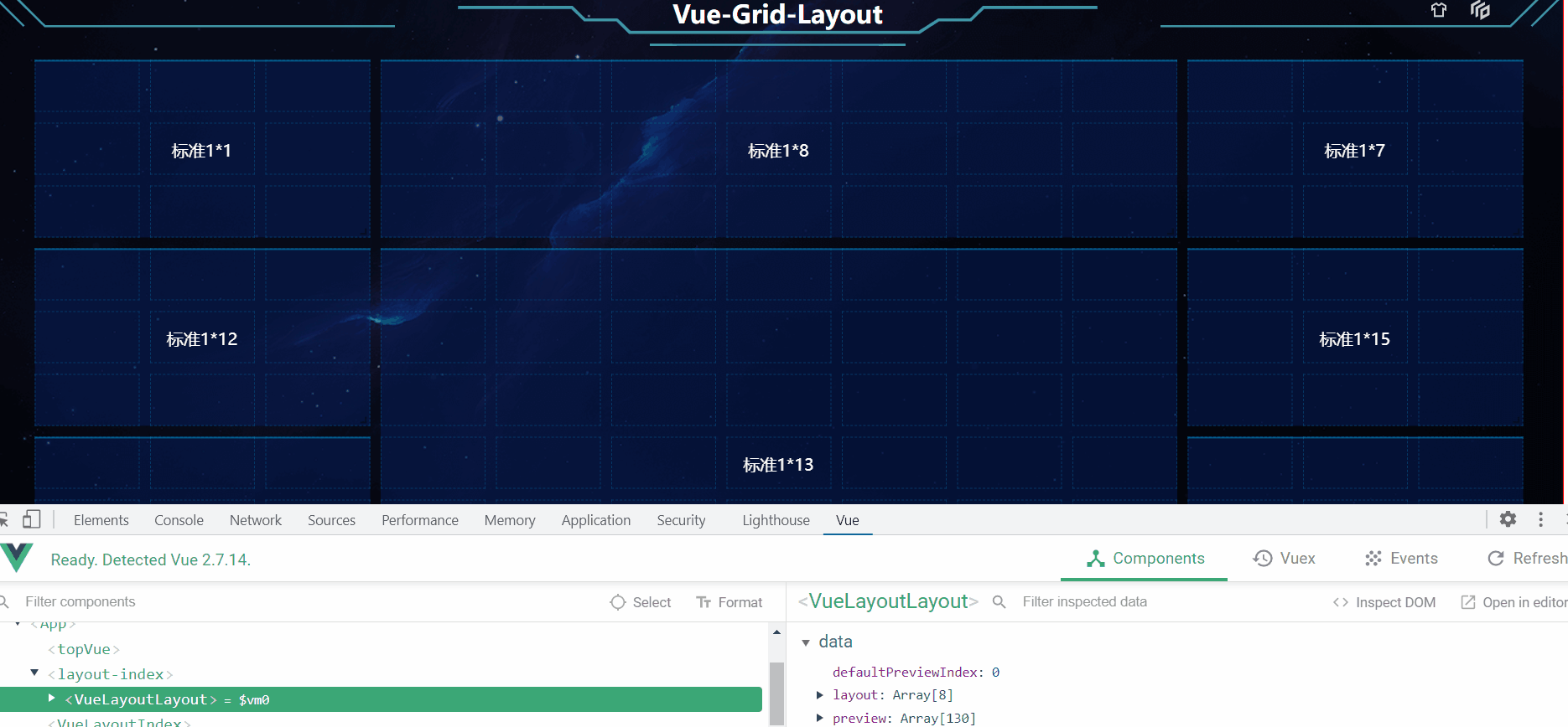
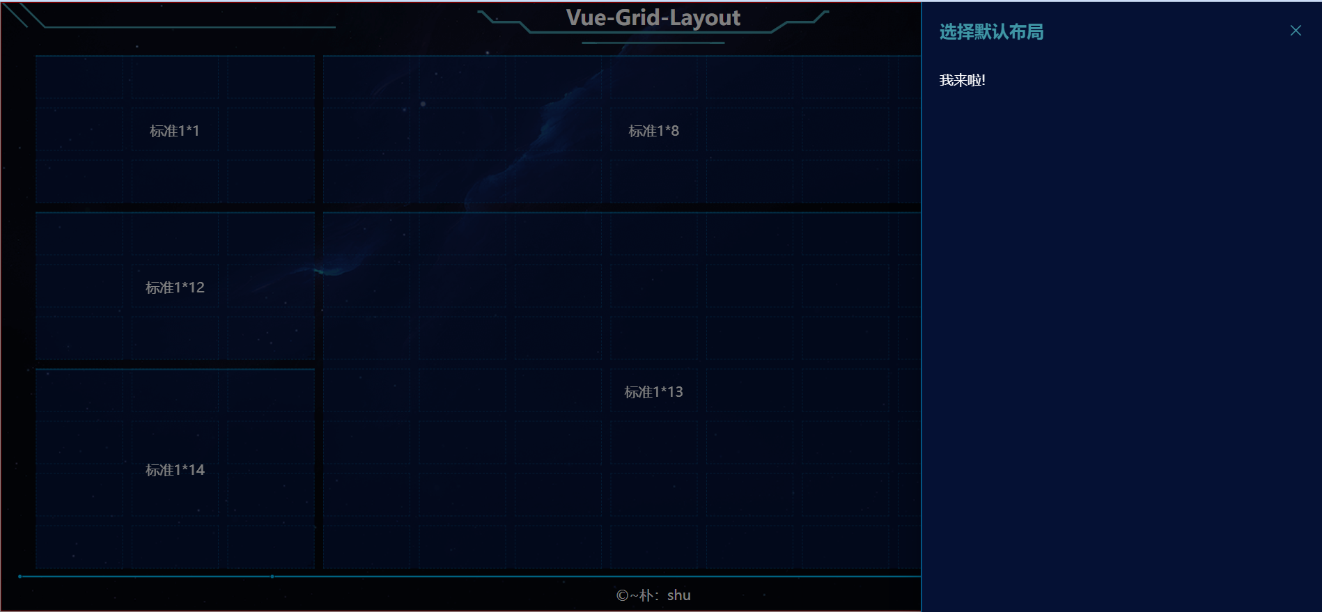
六、预设拖拽布局
- 预设布局指的是我们给一个默认的布局,我们先设计系统的功能,添加菜单栏:

左侧预设、右侧自定义拖拽,预设就是给一套默认的位置关系。我们简单实现一下:(我们知道,拖拽、缩放后,页面会实时保存 layout 数据,是双向绑定的关系,我们直接拖拽好,复制配置项作为默认预设即可,如下图)
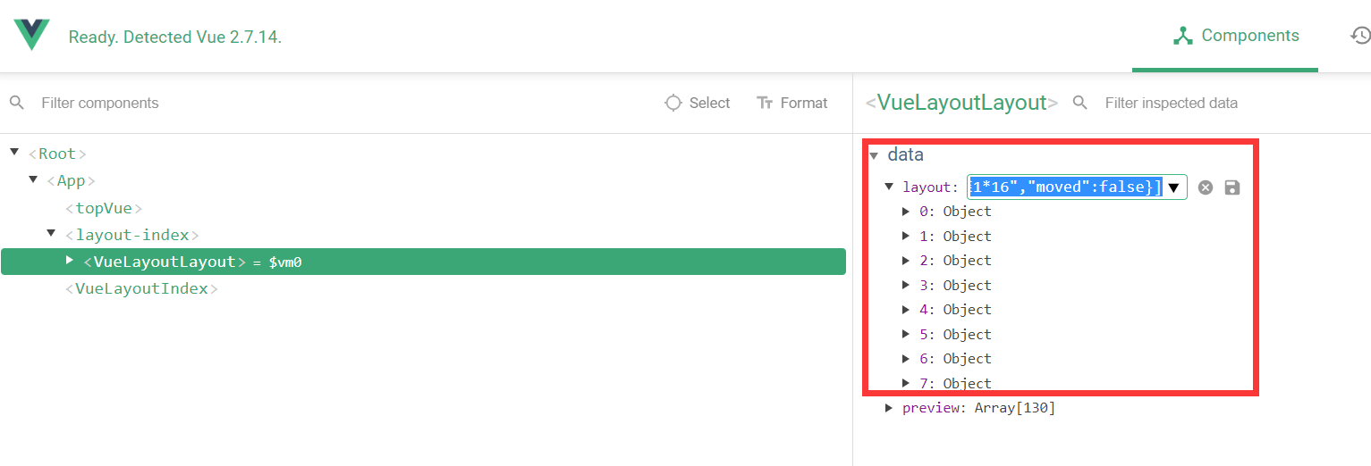
如上,简单的预设获取方法,效果如下:
defaultPreview.js:
export const defaultPreviewData = [
  [
    { x: 10, y: 0, w: 3, h: 3, i: "标准1*7", moved: false },
    { x: 3, y: 0, w: 7, h: 3, i: "标准1*8", moved: false },
    { x: 0, y: 0, w: 3, h: 3, i: "标准1*1", moved: false },
    { x: 0, y: 3, w: 3, h: 3, i: "标准1*12", moved: false },
    { x: 3, y: 3, w: 7, h: 7, i: "标准1*13", moved: false },
    { x: 0, y: 6, w: 3, h: 4, i: "标准1*14", moved: false },
    { x: 10, y: 3, w: 3, h: 3, i: "标准1*15", moved: false },
    { x: 10, y: 6, w: 3, h: 4, i: "标准1*16", moved: false },
  ],
  [
    { x: 10, y: 0, w: 3, h: 3, i: "标准1*7", moved: false },
    { x: 0, y: 0, w: 3, h: 3, i: "标准1*1", moved: false },
    { x: 0, y: 3, w: 3, h: 3, i: "标准1*12", moved: false },
    { x: 3, y: 0, w: 7, h: 10, i: "标准1*13", moved: false },
    { x: 0, y: 6, w: 3, h: 4, i: "标准1*14", moved: false },
    { x: 10, y: 3, w: 3, h: 3, i: "标准1*15", moved: false },
    { x: 10, y: 6, w: 3, h: 4, i: "标准1*16", moved: false },
  ],
  [
    { x: 6, y: 0, w: 4, h: 6, i: "标准1*7", moved: false },
    { x: 0, y: 0, w: 3, h: 3, i: "标准1*1", moved: false },
    { x: 0, y: 3, w: 3, h: 3, i: "标准1*12", moved: false },
    { x: 3, y: 0, w: 3, h: 6, i: "标准1*13", moved: false },
    { x: 0, y: 6, w: 3, h: 4, i: "标准1*14", moved: false },
    { x: 10, y: 0, w: 3, h: 10, i: "标准1*15", moved: false },
    { x: 3, y: 6, w: 7, h: 4, i: "标准1*16", moved: false },
  ],
  [
    { x: 6, y: 0, w: 7, h: 3, i: "标准1*7", moved: false },
    { x: 0, y: 0, w: 3, h: 3, i: "标准1*1", moved: false },
    { x: 0, y: 3, w: 6, h: 3, i: "标准1*12", moved: false },
    { x: 3, y: 0, w: 3, h: 3, i: "标准1*13", moved: false },
    { x: 0, y: 6, w: 3, h: 4, i: "标准1*14", moved: false },
    { x: 6, y: 3, w: 7, h: 3, i: "标准1*15", moved: false },
    { x: 3, y: 6, w: 10, h: 4, i: "标准1*16", moved: false },
  ],
];
使用 element-ui 抽屉组件实现预设选择、卡片拖拽
现在涉及到组件间传递数据了,我们采用 vuex 传输,
- vuex:
 //数据,相当于data
  state: {
    defaultPreviewIndex: 0,
  },
  getters: {},
  //里面定义方法,操作state方发
  mutations: {
    setDefaultPreviewIndex(state, data) {
      state.defaultPreviewIndex = data;
    },
  },

// 设置选中的值
Top/index.vue
methods:{
    choosePreview(index) {
      // 赋值给vuex
      this.$store.commit("setDefaultPreviewIndex", index);
      this.$message.success(`已选择默认布局${index + 1}`);
      console.log(index);
    },
}

// 取值
Layout/layout.vue
 computed: {
    defaultPreviewIndex() {
      return this.$store.state.defaultPreviewIndex;
    },
  },
效果如下:
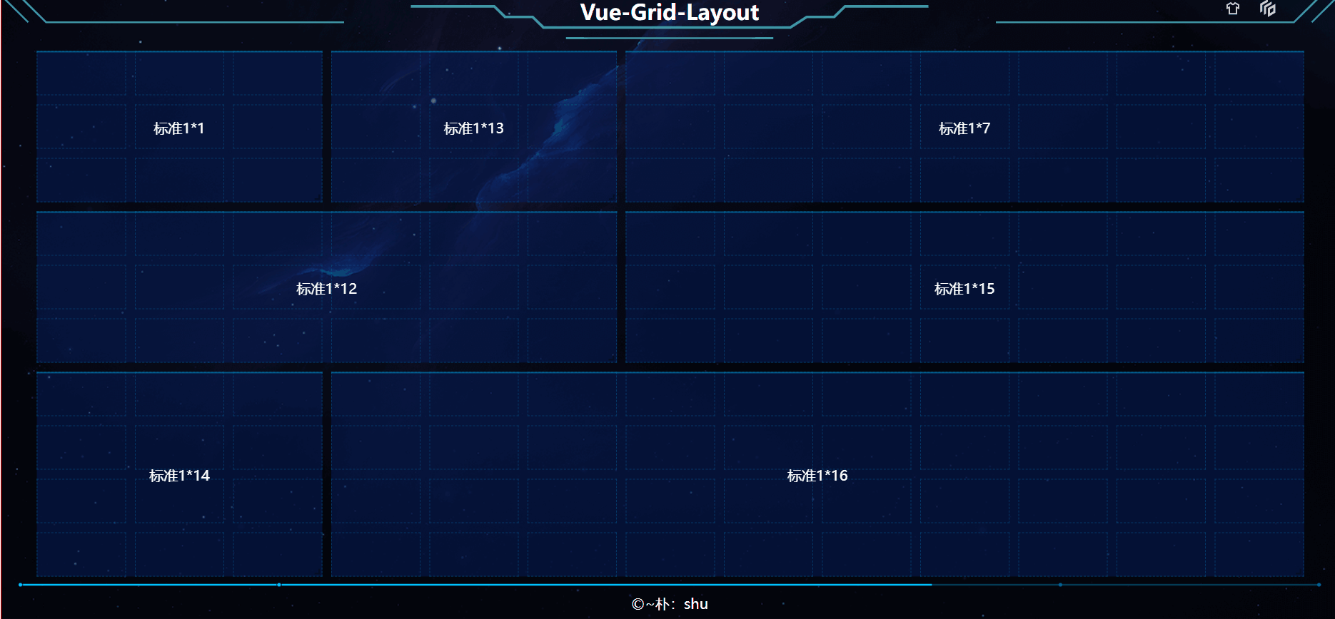
如何对应上实际的卡片呢?只需要将 默认预设的i设置为对应卡片的kpid即可。
- 将默认预设应用到卡片上:
上一章已经说过,通过 componentIS 实现映射自定义卡片,因此,预设中的数据 i,将其设置为卡片id,即可实现应用到卡片上,剩下的工作就是制作卡片了。如下图:
- 默认预设实现效果及难点分析:
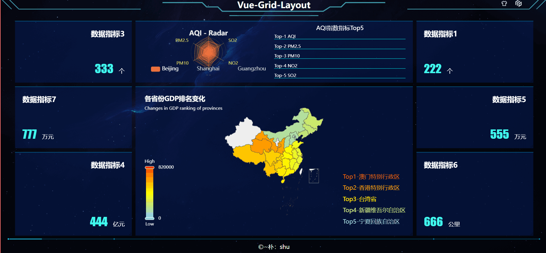
在有Echarts的情景下,拖拽大小会导致监听不到 resize 事件,因此,需要借助第三方库实现:
npm i element-resize-detector --s
// 引用
const elementResizeDetectorMaker = require("element-resize-detector");
let erd = elementResizeDetectorMaker();

// 使用
mouted(){
  this.$nextTick(() => {
     erd.listenTo(this.$refs.echarts, () => {
          this.$nextTick(function () {
            //使echarts尺寸重置
            this.myChart.resize();
          });
        });
    })
}
// 这样就能实现 元素 resize 重新渲染Echarts。
// 在后期的卡片拖拽 缩放中,该方法也是同样重要,只是演示效果,卡片的样式就没有那么充实了。
七、自定义拖拽布局
- 卡片超市
我们将获取所有配置项的方法封装到工具函数(util)中,根据预设样式,打开卡片超市,表示我们需要拖动卡片,需要同步打开背景预览框(位置提示),关闭、保存的时候,取消提示背景,并关闭抽屉。
【截图提示我违规,后面再看效果吧】
- 拖拽实现原理
我们现在该将卡片拖出来了,使用 以下两个事件,即可获取当前拖拽在页面中的位置,然后,通过传参给layout,实时生成预览,dragend 结束时,将拖拽过程中生成的所有数据正式生成最终数据。
@drag="($event) => dragHandle($event, item)"
@dragend="($event) => dragendpHandle($event, item)"
我们的主拖拽区是有间距的,在获取到坐标后,需要减去相应的值,才能确定拖拽到那个区域,同时,这个事件一直在触发,考虑节流,同时,在相同位置上也触发,考虑条件【我们以被拖动元素的左上顶点作为位置判断依据】!
- 计算偏差
1536px 是可视区的宽度(document.documentElement.clientWidth),其他的都是居中,左右除以2就行了,高度就是 top 的高度 50,加上 margin 10px,因此,左上顶点,各距离60px。通过 vuex 传递数据:
 // 拖动开始
    dragHandle(e, item) {
      // 如果初始位置为0 不执行
      if (!e.x && !e.y) return;

      this.drawerCard = false;

      const Tx = e.clientX - 58;
      const Ty = e.clientY - 60;

      // 如果保持不动*(位置不变)
      if (Tx == atPiont[0] && Ty == atPiont[1]) return;

      this.$store.commit("setAtPiont", [Tx, Ty]);

      // drag 事件一直在执行,只有初始化的时候,不同的 kpid 才执行该语句[初次加载,null]
      if (!this.$store.state.dragItem ||
        this.$store.state.dragItem.kpid != item.kpid)
        this.$store.commit("setDragItem", item);
    },

    // 拖动结束
    dragendpHandle(e, item) {
      const Tx = e.clientX - 58;
      const Ty = e.clientY - 60;
      // 清空实时位置
      this.$store.commit("setAtPiont", [null, null]);
      this.$store.commit("setEndPiont", [Tx, Ty]);
【注意:drag 方法会重复调用很多次,我们应该用条件控制其频繁修改我们的变量,或使用节流实现页面控制】
- layout 通过实时数据渲染:
layout.vue watch:
"$store.state.atPiont": {
      handler(val) {
        // 监听实时位置
        console.log("实时位置", val);
      },
      deep: true,
    },
    "$store.state.endPiont": {
      handler(val) {
        // 监听最后位置
        console.log("最后位置", val);
      },
      deep: true,
    },
生成预览数据:
   <!-- 预览数据 -->
   <myGridItem :itemData="previewData" />

    "$store.state.atPiont": {
      handler(val) {
        if (!val[0] && !val[1]) return;
        // 监听实时位置,并生成预览对象
        const item = this.$store.state.dragItem;
        // console.log("实时位置", val, item);
        this.previewData = cloneDeep(this.layout);
        this.previewData.push({
          // x y 要根据实时位置生成
          x: Math.ceil(val[0] / 100) - 1,
          y: Math.ceil(val[1] / 50) - 1,
          w: item.w,
          h: item.h,
          i: item.i,
        });
      },
      deep: true,
    },

 "$store.state.endPiont": {
      handler(val) {
        // 监听最后位置【转换为正式数据】
        this.layout = cloneDeep(this.previewData);
        // console.log("最后位置", val);
      },
      deep: true,
    },
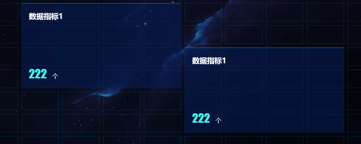
上面的代码其实隐藏了一个问题,如下图,previewData 和 layout 各有一份一样的数据,导致不同的拖拽层出现两个一模一样的卡片。
// 我们转换为正式数据后,预览数据不久不需要了嘛?
// 监听最后位置【转换为正式数据】
   this.layout = cloneDeep(this.previewData);
   this.previewData = []; // 清空预览数据
- 删除元素
 closeItemHandle(item) {
      // 预览与正式数据公用一个 item 因此,需两者都清除数据
      this.layout.splice(
        this.layout.findIndex((i) => i.i == item.i),
        1
      );
      this.previewData.splice(
        this.previewData.findIndex((i) => i.i == item.i),
        1
      );
    },
八、总结
常见的事件以及交互我在这里就不细说了,大家可以看我上一篇文章,实现的总体效果欢迎看我B站视频:Vue-Grid-Layout
有问题欢迎留言谈论~
版权归原作者 ~朴:shu 所有, 如有侵权,请联系我们删除。