
写在前面:
我特别喜欢收集前端好看的特效代码,前端好用的网站。今天给大家分享出来,如果觉得有帮助可以点赞收藏支持一下,如果能关注一下就再好不过了ヾ(≧▽≦*)o,之后还会分享许多干货,话不多说,上动图(网站在文章末尾):
非新手可以跳过
考虑到看此文章的小伙伴有一些是新手。
有些小伙伴0基础小伙伴担心,我没有编程工具怎么办?
可以参照这篇文章:http://t.csdn.cn/fB8yF
如果小伙伴想一起来学习前端知识,那么就从这篇文章开始吧
前端HTML:
🍓按钮系列
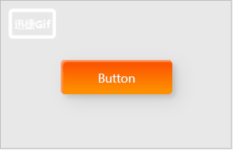
HTML:
<button class="custom-btn btn"><span>Button</span></button>
CSS:
/* From www.lingdaima.com */
.custom-btn {
 width: 130px;
 height: 40px;
 color: #fff;
 border-radius: 5px;
 padding: 10px 25px;
 font-family: 'Lato', sans-serif;
 font-weight: 500;
 background: transparent;
 cursor: pointer;
 transition: all 0.3s ease;
 position: relative;
 display: inline-block;
 box-shadow: inset 2px 2px 2px 0px rgba(255, 255, 255, .5),
        7px 7px 20px 0px rgba(0, 0, 0, .1),
        4px 4px 5px 0px rgba(0, 0, 0, .1);
 outline: none;
}

.btn {
 background: linear-gradient(0deg, rgba(255, 151, 0, 1) 0%, rgba(251, 75, 2, 1) 100%);
 line-height: 42px;
 padding: 0;
 border: none;
}

.btn span {
 position: relative;
 display: block;
 width: 100%;
 height: 100%;
}

.btn:before,
.btn:after {
 position: absolute;
 content: "";
 right: 0;
 bottom: 0;
 background: rgba(251, 75, 2, 1);
 box-shadow: -7px -7px 20px 0px rgba(255, 255, 255, .9),
        -4px -4px 5px 0px rgba(255, 255, 255, .9),
        7px 7px 20px 0px rgba(0, 0, 0, .2),
        4px 4px 5px 0px rgba(0, 0, 0, .3);
 transition: all 0.3s ease;
}

.btn:before {
 height: 0%;
 width: 2px;
}

.btn:after {
 width: 0%;
 height: 2px;
}

.btn:hover {
 color: rgba(251, 75, 2, 1);
 background: transparent;
}

.btn:hover:before {
 height: 100%;
}

.btn:hover:after {
 width: 100%;
}

.btn span:before,
.btn span:after {
 position: absolute;
 content: "";
 left: 0;
 top: 0;
 background: rgba(251, 75, 2, 1);
 box-shadow: -7px -7px 20px 0px rgba(255, 255, 255, .9),
        -4px -4px 5px 0px rgba(255, 255, 255, .9),
        7px 7px 20px 0px rgba(0, 0, 0, .2),
        4px 4px 5px 0px rgba(0, 0, 0, .3);
 transition: all 0.3s ease;
}

.btn span:before {
 width: 2px;
 height: 0%;
}

.btn span:after {
 height: 2px;
 width: 0%;
}

.btn span:hover:before {
 height: 100%;
}

.btn span:hover:after {
 width: 100%;
}
** 更多按钮(文章最后有链接地址):**

🍇多选框系列
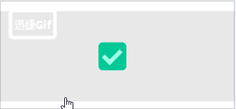
HTML:
<label class="cont">
  <input checked="" type="checkbox">
  <span></span>
</label>
CSS:
/* From www.lingdaima.com */
.cont {
 display: flex;
 align-items: center;
 transform: scale(1);
}

input[type="checkbox"] {
 height: 2rem;
 width: 2rem;
 margin: 5px;
 display: inline-block;
 appearance: none;
 position: relative;
 background-color: #F2ECFF;
 border-radius: 15%;
 cursor: pointer;
 overflow: hidden;
}

input[type="checkbox"]::after {
 content: '';
 display: block;
 height: 1rem;
 width: .5rem;
 border-bottom: .31rem solid #a0ffe7;
 border-right: .31rem solid #a0ffe7;
 opacity: 0;
 transform: rotate(45deg) translate(-50%, -50%);
 position: absolute;
 top: 50%;
 left: 20%;
 transition: .25s ease;
}

input[type="checkbox"]::before {
 content: '';
 display: block;
 height: 0;
 width: 0;
 background-color: #00C896;
 border-radius: 50%;
 opacity: .5;
 transform: translate(-50%, -50%);
 position: absolute;
 top: 50%;
 left: 50%;
 transition: .3s ease;
}

input[type="checkbox"]:checked::before {
 height: 130%;
 width: 130%;
 opacity: 100%;
}

input[type="checkbox"]:checked::after {
 opacity: 100%;
}

span {
 font-size: 2rem;
}
🍈开关系列
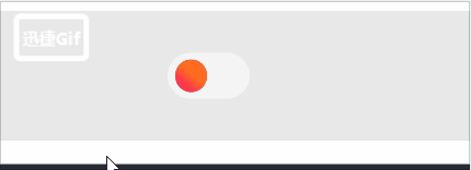
HTML:
<label class="switch">
  <input type="checkbox">
  <span class="slider"></span>
</label>
CSS:
/* From www.lingdaima.com */
/* The switch - the box around the slider */
.switch {
/* --moon-mask: ; */
 font-size: 17px;
 position: relative;
 display: inline-block;
 width: 3.5em;
 height: 2em;
}

/* Hide default HTML checkbox */
.switch input {
 opacity: 0;
 width: 0;
 height: 0;
}

/* The slider */
.slider {
 position: absolute;
 cursor: pointer;
 top: 0;
 left: 0;
 right: 0;
 bottom: 0;
 background-color: #f4f4f5;
 transition: .4s;
 border-radius: 30px;
}

.slider:before {
 position: absolute;
 content: "";
 height: 1.4em;
 width: 1.4em;
 border-radius: 20px;
 left: 0.3em;
 bottom: 0.3em;
 background: linear-gradient(40deg,#ff0080,#ff8c00 70%);
 ;
 transition: .4s;
}

input:checked + .slider {
 background-color: #303136;
}

input:checked + .slider:before {
 transform: translateX(1.5em);
 background: #303136;
 box-shadow: inset -3px -2px 5px -2px #8983f7, inset -10px -5px 0 0 #a3dafb;
}
🍅卡片系列

HTML:
<div class="card">
  <div class="card2">
  </div>
</div>
CSS:
/* From www.lingdaima.com */
.card {
 width: 190px;
 height: 254px;
 background-image: linear-gradient(163deg, #00ff75 0%, #3700ff 100%);
 border-radius: 20px;
 transition: all .3s;
}

.card2 {
 width: 190px;
 height: 254px;
 background-color: #1a1a1a;
 border-radius:;
 transition: all .2s;
}

.card2:hover {
 transform: scale(0.98);
 border-radius: 20px;
}

.card:hover {
 box-shadow: 0px 0px 30px 1px rgba(0, 255, 117, 0.30);
}
以上精美样式来自:零代码 - 精美CSS样式库 (lingdaima.com)
本文转载自: https://blog.csdn.net/m0_70571756/article/details/125091038
版权归原作者 新一代小卷王 所有, 如有侵权,请联系我们删除。
版权归原作者 新一代小卷王 所有, 如有侵权,请联系我们删除。