
Styled-Component
Styled Components 是一个使用CSS-in-JS技术实现的样式组件库,它是一个为React和React Native设计的库。它允许我们在应用中使用JavaScript和CSS混合起来编写样式级组件。并且它是支持Sass的,不需要添加任何库。
1. Styled Component的几大优势:
(1)Scoped Style(范围限定的样式)
不用担心引用的css文件被其他人修改
(2)CSS in JS
可以在JS中使用component内部变量做条件判断
const Button = styled.button`
  /* Adapt the colors based on primary prop */
  background: ${props=> props.primary ?"palevioletred":"white"};
  color: ${props=> props.primary ?"white":"palevioletred"};
`;<Button primary>Normal</Button>
(3)可移植性
没有了css,所有样式都在组件内部,方便移植到其他平台,如React Native。
(4)没有了样式命名的冲突
没有class name的冲突,适用于微前端架构。 因为微前端的一大问题就是不用sub app之间可能定义了相同名称的样式。 而style component的class name是通过hash算法得出的,不会冲突。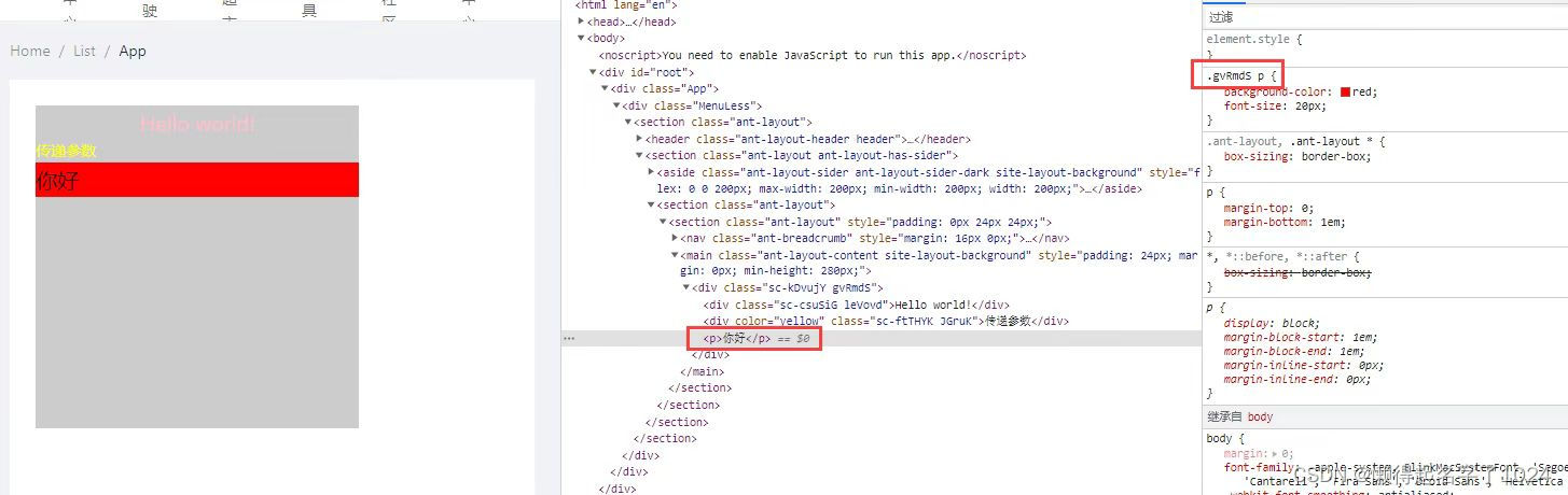
(5)便于对样式做unit test
通过style-components团队提供的组件
npm install --dev jest-styled-components
我们可以进行如下的单元测试
import React from'react'import styled from'styled-components'import renderer from'react-test-renderer'import'jest-styled-components'const Button = styled.button`
  color: red;
`test('it works',()=>{const tree = renderer.create(<Button />).toJSON()expect(tree).toMatchSnapshot()})
2. 基本使用
(1)安装
npm install styled-components --save
(2)引入库
import styled from"styled-components";
(3)定义样式组件
这里就定义了一个样式组件Title,可以看到,它的实现还是非常简单的,语法就是:styled.标签名,后面跟一个模板字符串,其内容就是组件的样式属性。这样就创建了一个带样式的React组件。
import React from"react";import styled from"styled-components";const Title = styled.h1`
  font-size: 20px;
  text-align: center;
  color: red;
`;exportdefaultfunctionApp(){return<Title>Hello World</Title>;}
2. 样式嵌套
在styled-components中也可以使用css选择器、伪元素、媒体查询以及各类的声明样式。
标签名选择器、类选择器、伪类和伪元素跟css中是一样的
import React from"react";import styled from"styled-components";const Title = styled.div`
  text-align: center;
    img {
        height: 100px;
        width: 200px;
    }
    p {
        font-size: 20px;
        color: red;
    }
`;exportdefaultfunctionApp({imgUrl}){return(<Title><p>Hello World</p><img src={imgURl} alt=""/></Title>);}
3. 创建全局样式
使用createGlobalStyle可以创建全局样式,引入进App.js中
import{ createGlobalStyle }from"styled-components";exportconst GlobalStyle = createGlobalStyle`
* {
    margin: 0;
    padding: 0;
    box-sizing: border-box;
    // background: pink
  }
`
4. 样式嵌套
import React from"react";import styled from"styled-components";const Title = styled.div`
  text-align: center;
    img {
        height: 100px;
        width: 200px;
    }
    p {
        font-size: 20px;
        color: red;
    }
`;exportdefaultfunctionApp({imgUrl}){return(<Title><p>Hello World</p><img src={imgURl} alt=""/></Title>);}
5. 组件传参
import React from"react";import styled from"styled-components";const Title = styled.div`
  text-align: center;

    img {
        height: 100px;
        width: 200px;
    }

    p {
        font-size: 20px;
        color: ${props=> props.color};
    }
`;exportdefaultfunctionApp({imgUrl, themeColor}){return(<Title><p color={themeColor}>Hello World</p><img src={imgURl} alt=""/></Title>);}
这样就实现了动态改变文字的颜色。
6.样式组件的继承
我们还可以使用其他组件的样式,并继承它们所有的样式(如果有相同的样式,则会覆盖继承来的样式),只需将其包装在styled()构造函数中,来看例子:
const BoringButton = styled.button`
    color: blue;
    background-color: green;
`;const CoolButton =styled(BoringButton)`
  color: pink;
`;
这样,下面的组件就获得了上面组件的样式,并覆盖了重复了样式color。
7. 使用css辅助函数(公共样式)
如果我们需要在多个样式组件中使用通用的样式,css辅助函数就派上用场了,来看看css辅助函数是如何使用的:
import React from"react";import styled,{css}from"styled-components";const commonStyle = css`
  color: white;
  font-size: 20px;
`;const Button = styled.button`${commonStyle};
  background-color: red;
`;const AnotherButton = styled.button`${commonStyle};
  background-color: green;
`;
这里定义的commonStyle在两个button组件中使用时,不会有自己单独的类,而是会添加到这两个button组件对应的类中。
8. as多态属性
as可用于更改样式组件的标签类型(如将div转为button,button转为a标签等), 也可传递自定义组件。
exportconst Button = styled.button`
//  background-color: blue;
`exportconst NewButton = styled.button`
 background-color: yellow;
`
<Button>我是一个按钮</Button><Button as='a' href="https://cvma.test.cmbchina.cn/CVM/console/SystemConsoleV2.aspx?IsBizSite=0" target='_blank'>我是使用as修改后的按钮</Button><Button as={NewButton}>我是一个新按钮</Button>
9. attrs
attrs 一种添加属性的方式。注:只能添加原生标签默认属性,不可自定义属性。
exportconst Input = styled.input.attrs({type:'text',length:(props: string | any[])=> props.length ||10})`
    background: palevioletred;
    border-radius: 3px;
    border: none;
    color: white;
    padding: ${(props:{padding: any;})=> props.padding}`;exportconst PasswordInput =styled(Input).attrs({type:'password',})`
 background: #8a8a8a;
 length: 300px
`
<Input length="20" padding="10px"></Input><PasswordInput></PasswordInput>
版权归原作者 懒得起名字了1024 所有, 如有侵权,请联系我们删除。