
1- 前言
在本文中你将收获
- 小程序如何使用自定义组件
- 自定义组件之间的传值
- 自定义组件中插槽的使用
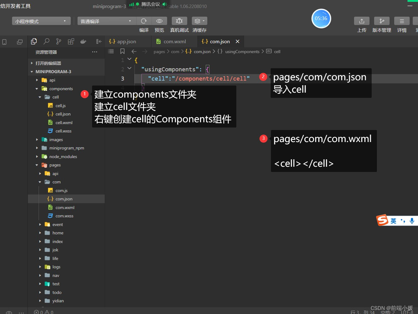
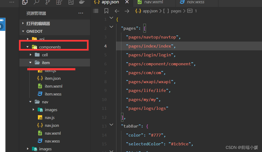
2- 组件文件新建
2.1 定义组件
在根目录新建components文件夹,建立cell 文件夹,右击创建cell的Component组件
- cell.js
- cell.wxml
- cell.json
- cell.wxss
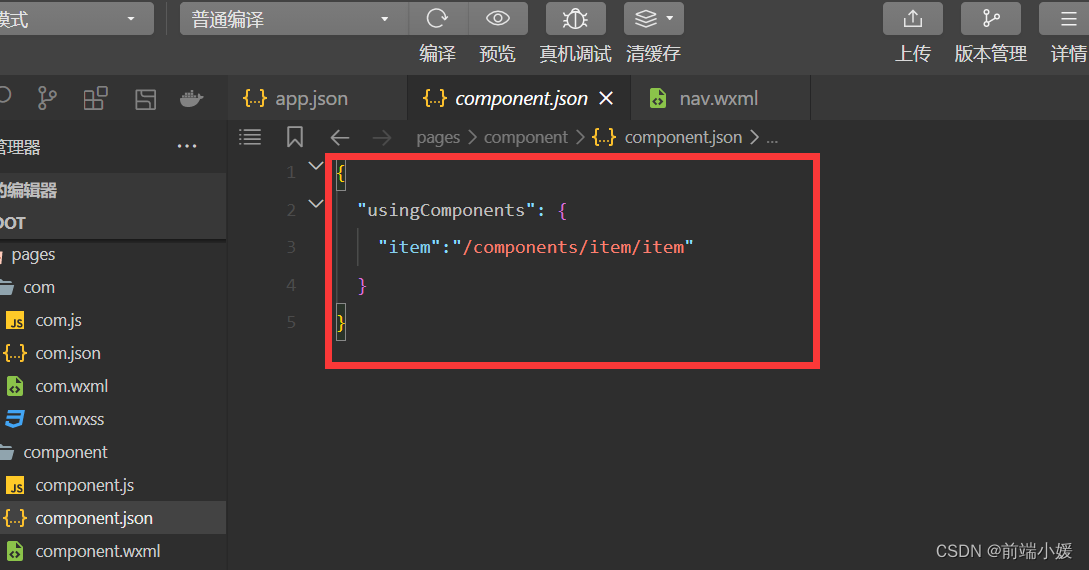
2.2 注册组件
页面的xxx.json ,usingComponent注册
"usingComponents":{"item":"/components/item/item"}
2.3 使用组件
<item></item>
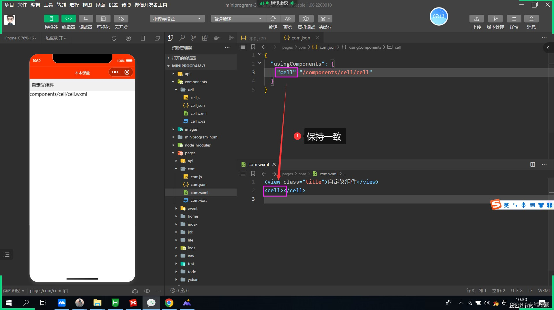
2.4 图参考
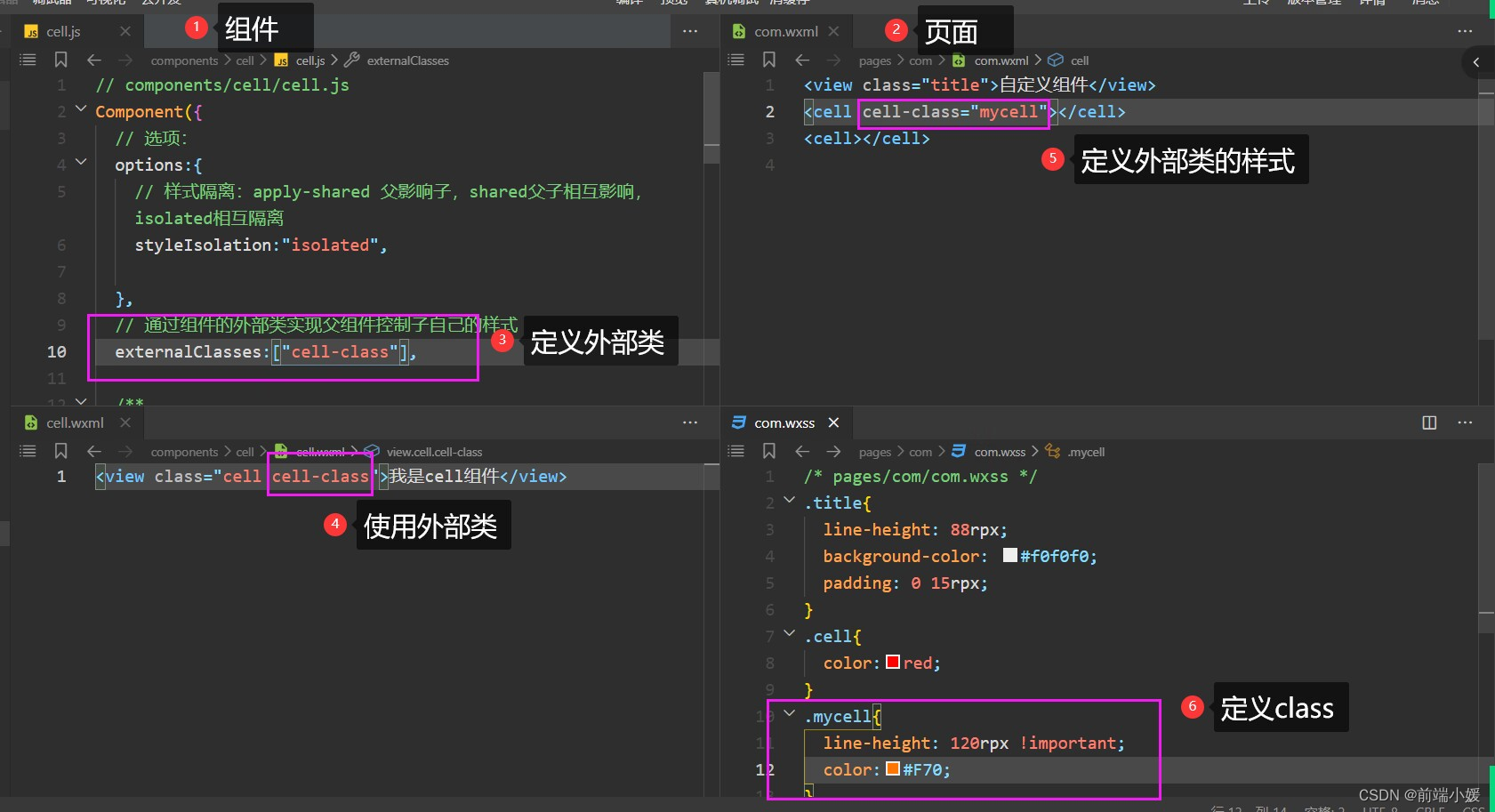
3- 外部类和样式隔离
3.1定义组件
- cell.wxml 文件
<viewclass="cell cell-class"></view>
- cell.wxss
/* pages/com/com.wxss */.cell{color: tomato;}.mycell{color: #f70;line-height: 120rpx !important;}
- cell.js 文件
/* 选项 */options:{/* 样式隔离:apply-shared 父影响子
    shared 父子相互影响   isolated 相互隔离
    */styleIsolation:'isolated',},//通过组件的外部类实现父组件控制自己的样式externalClasses:["cell-class"],
3.2 使用组件
<cell></cell><cellcell-class="mycell"></cell>
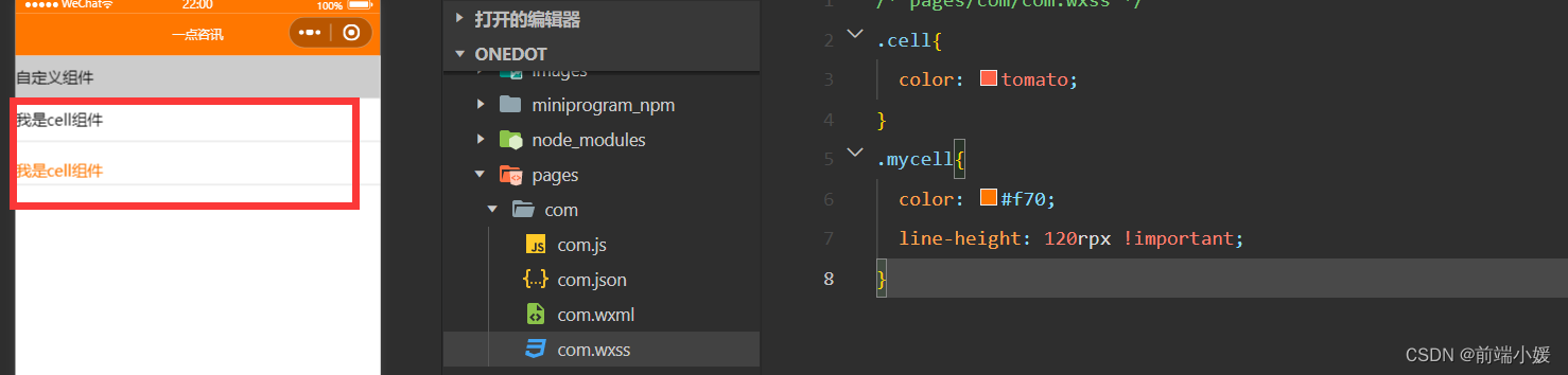
3.3 图解释
4- 组件插槽
4.1 默认插槽
- cell.wxml
<viewclass="cell">
  我是cell组件
  <slot></slot></view>
- cell.js
/* 选项 */options:{//允许多个插槽multipleSlots:true,},
- cell.wxss
.cell{height: 88rpx;line-height: 88rpx;border-bottom: 1rpx solid #cccccc;}
使用cell组件
<cell><text>放假</text><text>快点到来</text></cell>
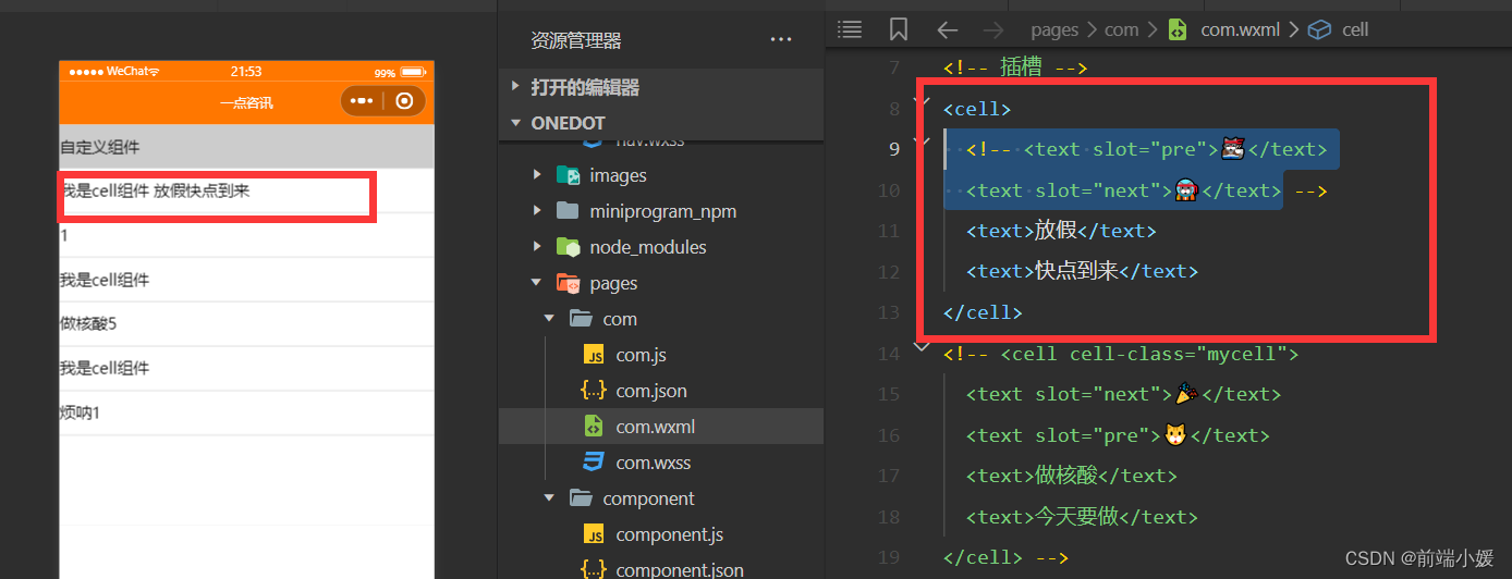
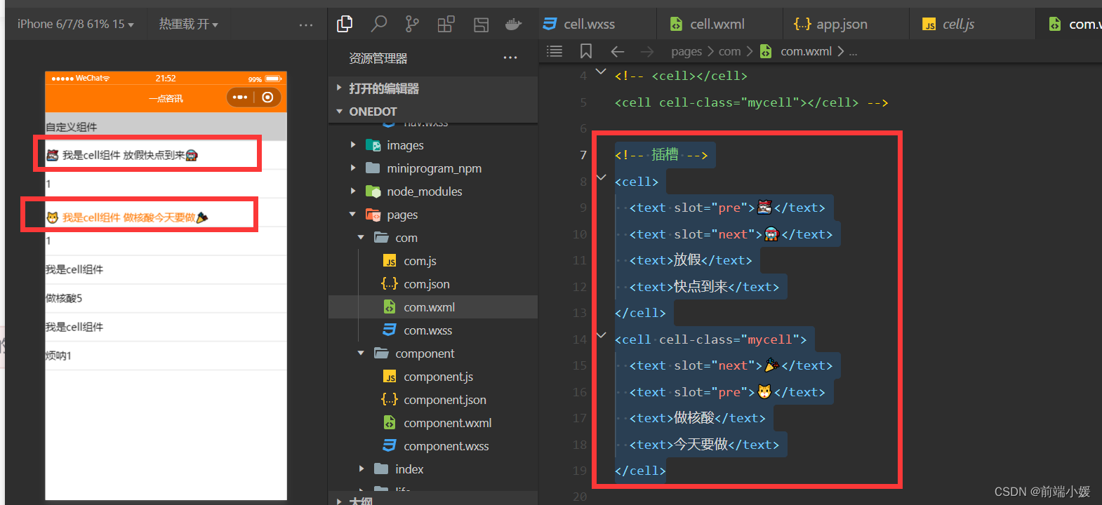
4.2 命名多插槽
- cell.wxml
<viewclass="cell cell-class"><slotname="pre"></slot>
  我是cell组件
  <slot></slot><slotname="next"></slot></view>
- cell.js
/* 选项 */options:{//允许多个插槽multipleSlots:true,},
- cell.wxss
.cell{height: 88rpx;line-height: 88rpx;border-bottom: 1rpx solid #cccccc;}
- com.wxml
<!-- 插槽 --><cell><textslot="pre">🐱👓</text><textslot="next">🐱🚀</text><text>放假</text><text>快点到来</text></cell><cellcell-class="mycell"><textslot="next">🎉</text><textslot="pre">🐱</text><text>做核酸</text><text>今天要做</text></cell>
5- 组件传参
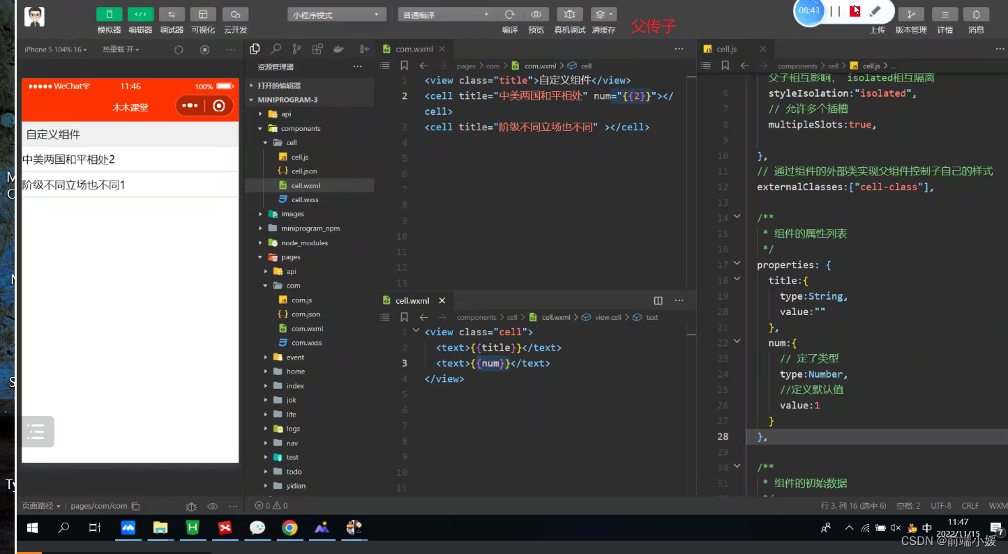
5.1 父传子
5.1.1 定义组件
- cell.wxml
<viewclass="cell"><text>{{title}}</text><text>{{num}}</text></view>
- cell.js
// components/cell/cell.jsComponent({/* 选项 */options:{/* 样式隔离:apply-shared 父影响子
    shared 父子相互影响   isolated 相互隔离
    */styleIsolation:'isolated',//允许多个插槽multipleSlots:true,},/**
   * 组件的属性列表
   */properties:{title:{type:String,value:""},num:{type:Number,value:1}},/**
   * 组件的初始数据
   */data:{//定义组件自己的数据countcount:1},/**
   * 组件的方法列表
   */})
5.1.2 使用组件
- com.wxml
<celltitle="做核酸"num="{{5}}"></cell><celltitle="烦呐"></cell>
5.1.3 图解
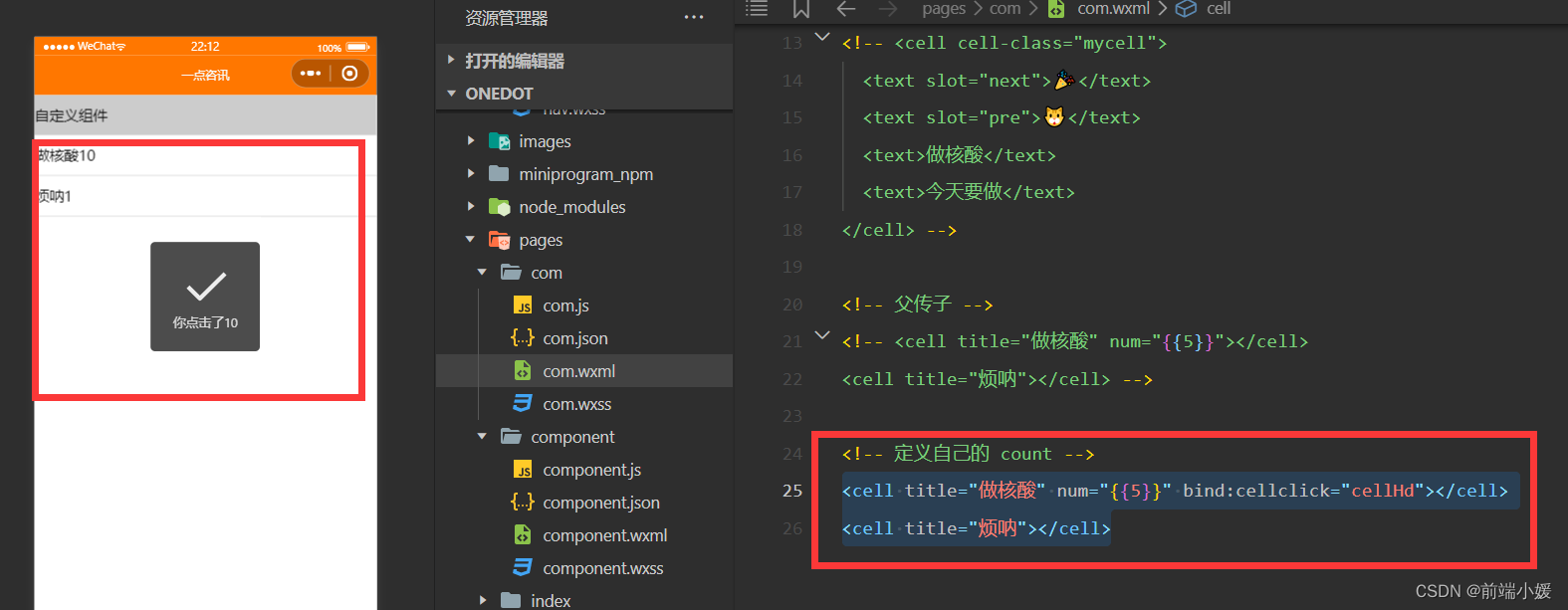
5.2 子传参父
5.2.1 定义组件
- cell.wxml
<viewclass="cell"bindtap="tapHd"><text>{{title}}</text><text>{{count}}</text></view>
- cell.js
// components/cell/cell.jsComponent({/* 选项 */options:{/* 样式隔离:apply-shared 父影响子
    shared 父子相互影响   isolated 相互隔离
    */styleIsolation:'isolated',//允许多个插槽multipleSlots:true,},/**
   * 组件的属性列表
   */properties:{title:{type:String,value:""},num:{type:Number,value:1}},/**
   * 组件的初始数据
   */data:{//定义组件自己的数据countcount:1},lifetimes:{//在组件生命周期attached挂载更新countattached(){
      console.log(this.data);//count 的值为父组件传递的num值this.setData({count:this.data.num})}},/**
   * 组件的方法列表
   */methods:{tapHd(){this.setData({count:this.data.count+5})//发送一个事件this.triggerEvent("cellclick",this.data.count)}}})
5.2.2 使用组件
- com.wxml
<viewclass="cell"bindtap="tapHd"><text>{{title}}</text><text>{{count}}</text></view>
5.2.3 图解
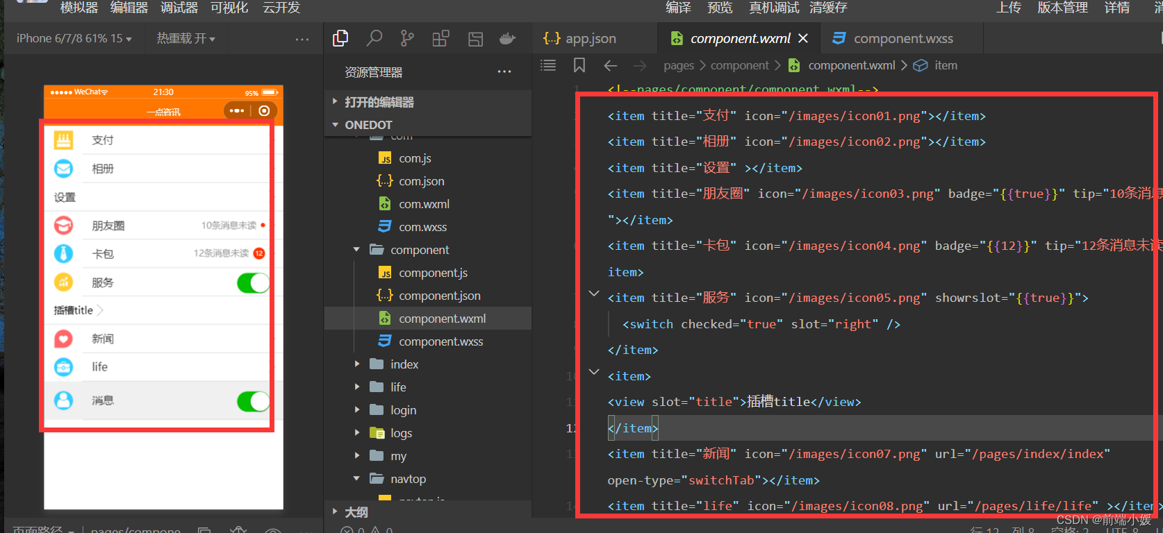
6- 案例item组件
6.1 定义组件
- 首先在根目录下创建一个专门放自定义组件的文件夹;
- 然后在小程序编辑器里,右键,新建Component;
<!--components/item/item.wxml--><navigatorclass="item itemclass"url="{{url}}"open-type="{{openType}}"bindtap="itemclick"><viewclass="icon"wx:if="{{icon}}"><imagesrc="{{icon}}"mode="aspectFill"/></view><viewclass="content"><viewclass="title"wx:if="{{title}}">
      {{title}}
    </view><slotname="title"wx:else></slot><viewclass="right"wx:if="{{!showrslot}}"><viewclass="tip">{{tip}}</view><viewclass="badge"wx:if="{{badge}}"><viewwx:if="{{badge===true}}"class="dot"></view><viewwx:elseclass="redbadge">{{badge}}</view></view><viewclass="arrow"></view></view><slotname="right"wx:else></slot></view></navigator>
/* components/item/item.wxss */.item{line-height: 88rpx;display: flex;align-items: center;justify-content: space-between;}.icon{margin-left: 30rpx;margin-right: 30rpx;height: 100%;display: flex;align-items: center;}.icon image{width: 60rpx;height: 60rpx;}.content{padding: 0 30rpx;border-bottom: 1rpx solid #ccc;display: flex;flex: 1;}.title{flex: 1;color: #333;font-size: 35rpx;}.right{display: flex;align-items: center;}.right .arrow{height: 25rpx;width: 25rpx;border-top: 3rpx solid #999;border-right: 3rpx solid #999;transform:rotate(45deg);}.tip{color: #999;font-size: 28rpx;}.dot{height: 15rpx;width: 15rpx;background-color: #f30;margin-left: 15rpx;border-radius: 50%;}.redbadge{font-size: 20rpx;padding: 5rpx;background-color: #f30;width: 30rpx;max-height: 30rpx;line-height: 30rpx;color: #fff;text-align: center;margin-left: 15rpx;border-radius: 20rpx;}
6.2 使用组件
- 引入组件:在页面的 json 文件中进行引用声明;
<!-- 引用组件的json文件 -->{"usingComponents":{"cell":"/components/cell/cell"}}
- 在页面的 wxml 中像使用基础组件一样使用自定义组件(名字和声明的保持一致)
<!-- 引用组件的wxml文件 --><!--pages/component/component.wxml--><itemtitle="支付"icon="/images/icon01.png"></item><itemtitle="相册"icon="/images/icon02.png"></item><itemtitle="设置"></item><itemtitle="朋友圈"icon="/images/icon03.png"badge="{{true}}"tip="10条消息未读"></item><itemtitle="卡包"icon="/images/icon04.png"badge="{{12}}"tip="12条消息未读"></item><itemtitle="服务"icon="/images/icon05.png"showrslot="{{true}}"><switchchecked="true"slot="right"/></item><item><viewslot="title">插槽title</view></item><itemtitle="新闻"icon="/images/icon07.png"url="/pages/index/index"open-type="switchTab"></item><itemtitle="life"icon="/images/icon08.png"url="/pages/life/life"></item><itemtitle="消息"icon="/images/icon06.png"showrslot="{{true}}"itemclass="myitem"><switchchecked="true"slot="right"/></item>
.myitem{line-height: 120rpx !important;background-color: #f0f0f0;}
往期传送门
【Vue】描述项目中两个功能模块的业务(一点见解)
【Git】Git基础操作一文详解,入门易懂(附图和案例
【Vue3】整理的一些Vue3知识点和案例(Vue3 获取窗口宽和高)
本文转载自: https://blog.csdn.net/qq_59012240/article/details/127893282
版权归原作者 前端小媛 所有, 如有侵权,请联系我们删除。
版权归原作者 前端小媛 所有, 如有侵权,请联系我们删除。