
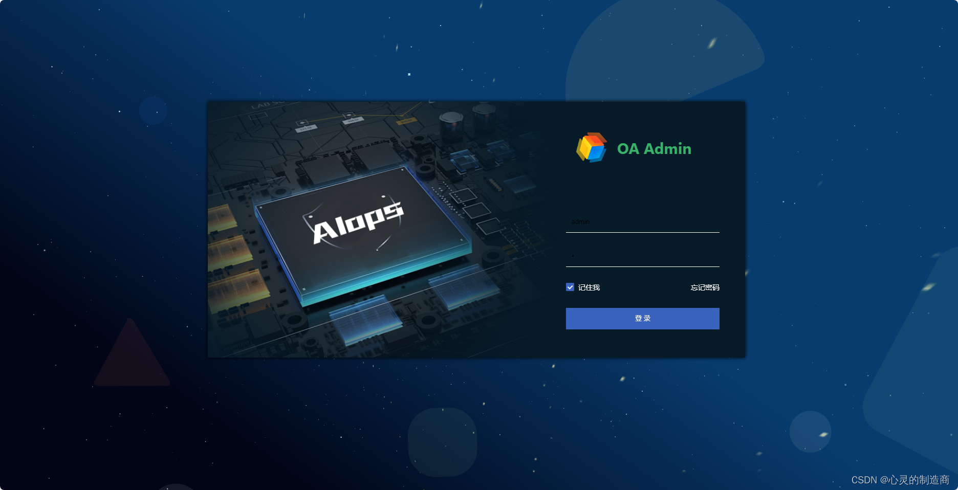
动态颗粒背景,适合做背景使用,VUE、HTML前端显示直接看效果
废话不多说直接上代码;
一、html 代码部分
<template><divid="login"><divclass="container"><divclass="login-form">登录表单部分</div><divclass="lgBGimg"><divclass="starBgc"><divclass="star"v-for="(item,index) in starsCount":key="index"ref="star"></div></div></div></div><divclass="cavbg"><canvasid="spacebg"></canvas></div></div></template>
二、脚本部分
<script>exportdefault{setup(){return{
      starsCount:800,//数量
      distance:600,//间距};},mounted(){const starArr=this.$refs.star
    starArr.forEach(item=>{let speed =0.2+(Math.random()*1)let distance =this.distance+(Math.random()*300)
      item.style.transformOrigin=`0 0 ${distance}px`
      item.style.transform=`translate3d(0,0,-${distance}px) rotateY(${(Math.random()*360)}deg) rotateX(${(Math.random()*-50)}deg) scale(${speed},${speed})`});

    window.requestAnimFrame =(function(){return  window.requestAnimationFrame
    })();let canvas = document.getElementById("spacebg");let ct2d = canvas.getContext("2d");let numStars =1800;let radius ='0.'+Math.floor(Math.random()*9)+1;let focalLength = canvas.width *2;let warp =0;let centerX;let centerY;let stars =[];let star;let i;let animate =true;initializeStars();functionexecuteFrame(){if(animate)requestAnimFrame(executeFrame);moveStars();drawStars();}functioninitializeStars(){
      centerX = canvas.width /2;
      centerY = canvas.height /2;

      stars =[];for(i =0; i < numStars; i++){
        star ={
          x: Math.random()* canvas.width,
          y: Math.random()* canvas.height,
          z: Math.random()* canvas.width,
          o:'0.'+Math.floor(Math.random()*99)+1};
        stars.push(star);}}functionmoveStars(){for(i =0; i < numStars; i++){
        star = stars[i];
        star.z--;if(star.z <=0){
          star.z = canvas.width;}}}functiondrawStars(){var pixelX, pixelY, pixelRadius;if(canvas.width != window.innerWidth || canvas.width != window.innerWidth){
        canvas.width = window.innerWidth;
        canvas.height = window.innerHeight;initializeStars();}

      window.onresize=()=>{if(canvas.width != window.innerWidth || canvas.width != window.innerWidth){
          canvas.width = window.innerWidth;
          canvas.height = window.innerHeight;initializeStars();}}if(warp==0){
        ct2d.fillStyle ="rgba(0,10,20,1)";// let lineGradient = ct2d.createLinearGradient (100, 10, 100, 60);//第一张图效果let lineGradient = ct2d.createLinearGradient(500,50,100,600);//第二张图效果
        lineGradient.addColorStop(0,'#083c6f');
        lineGradient.addColorStop(1,'#010516');
        ct2d.fillStyle = lineGradient;
        ct2d.fillRect(0,0, canvas.width, canvas.height);}
        ct2d.fillStyle ="rgba(209, 255, 255, "+radius+")";for(i =0; i < numStars; i++){
        star = stars[i];
        pixelX =(star.x - centerX)*(focalLength / star.z);
        pixelX += centerX;
        pixelY =(star.y - centerY)*(focalLength / star.z);
        pixelY += centerY;
        pixelRadius =1*(focalLength / star.z);
        ct2d.fillRect(pixelX, pixelY, pixelRadius, pixelRadius);
        ct2d.fillStyle ="rgba(209, 255, 255, "+star.o+")";}}executeFrame();}};</script>
三、样式部分代码
<style lang="less">
#login{width: 100%;height: 100%;position: relative;overflow: hidden;.container{width: 100%;height: 100%;position: relative;&:before{position: absolute;width:100%;height:100%;background:url(../../common/assets/image/background.svg);background-size: cover;opacity:0.08;display: block;content:'';z-index:2;}}.desc{width: 100% !important;text-align: center !important;color: gray !important;height: 60px !important;line-height: 60px !important;}.cavbg{position:absolute;left:0;top:0;z-index:0;}.lgBGimg{position: absolute;top:0px;left:0px;right:0px;bottom:0px;width:100%;height:100%;z-index:1;.starBgc{position: absolute;left:48%;bottom: -99px;transform:perspective(500px);transform-style: preserve-3d;perspective-origin: 50% 100%;animation: rotate 90s infinite linear;opacity:0.75;.star{width: 2px;height: 2px;background: #f7f7b8;position: absolute;top: 0;left: 0;backface-visibility: hidden;}@keyframes rotate{0%{transform:perspective(400px)rotateZ(20deg)rotateX(-40deg)rotateY(0);}100%{transform:perspective(400px)rotateZ(20deg)rotateX(-40deg)rotateY(-360deg);}}}}}
</style>
效果使用了3种,分别是GIF动效、CSS3动效、2DJS动效动态元素结合,开发而成的视频视频效果
搞完手工,最后给大家放上个视频看看效果吧,欢迎留言交了讨论一下吧
动态颗粒元素背景
本文转载自: https://blog.csdn.net/DJCBPL/article/details/136028402
版权归原作者 心灵的制造商 所有, 如有侵权,请联系我们删除。
版权归原作者 心灵的制造商 所有, 如有侵权,请联系我们删除。