
🏍️作者简介:大家好,我是亦世凡华、渴望知识储备自己的一名在校大学生
🛵个人主页:亦世凡华、
🛺系列专栏:微信小程序
🚲座右铭:人生亦可燃烧,亦可腐败,我愿燃烧,耗尽所有光芒。
👀引言
⚓经过web前端开发的学习,相信大家对于前端开发有了一定深入的了解,今天我开设了微信小程序专栏,主要想从移动端开发方向进一步发展,而对于我来说写移动端博文的第一站就是小程序开发,希望看到我文章的朋友能对你有所帮助。
🍇什么是tabBar
tabBar是移动端应用常见的页面效果,用于实现多页面的快速切换。小程序中通常将其分成两类,分别是:底部 tabBar 和 顶部 tabBar 简言之:就是位于小程序底部或顶部的调整导航栏,与微信底部导航栏类似。
注意:
tabBar中只能配置最少2个、最多5个tab页签
当渲染顶部的tabBar时,不显示icon,只显示文本
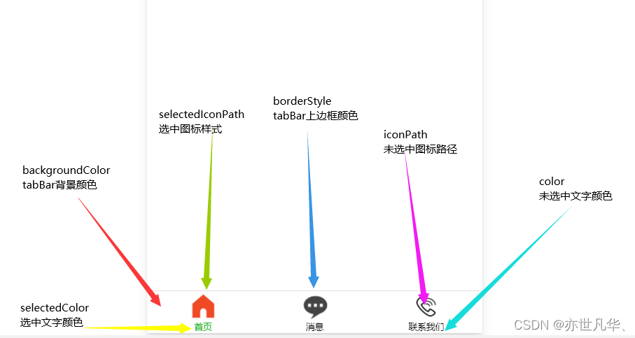
🍈tabBar的6个组成部分
①backgroundColor:tabBar的背景色
②selectedIconPath:选中时的图片路径
③borderStyle:tabBar上边框的颜色
④iconPath:未选中时的图片路径
⑤selectedColor:tab上的文字选中时的颜色
⑥color:tab上文字的默认(未选中)颜色
🍉tabBar配置项
属性类型必填项默认值描述positionString否bottomtabBar的位置,仅支持bottom/topborderStyleString否blacktabBar上边框颜色,仅支持black/whitecolorHexColor否无tab上文字的默认(未选中)颜色selectedColorHexColor否无tab上文字的选中颜色backgroundColorHexColor否无tabBar的背景色listArray是无tab页签的列表(最少2个,最多5个)
tab项的配置选项
在list数组里面填写的tab页签,每个tab页签可以配置如下配置选项:
属性类型必填描述pagePathString是页面路径,页面必须在pages中预先定义textString是tab上显示的文字iconPathString否未选中时的图标路径;当position为top时,不显示iconselectedIconPathString否选中时的图标路径;当position为top时,不显示icon
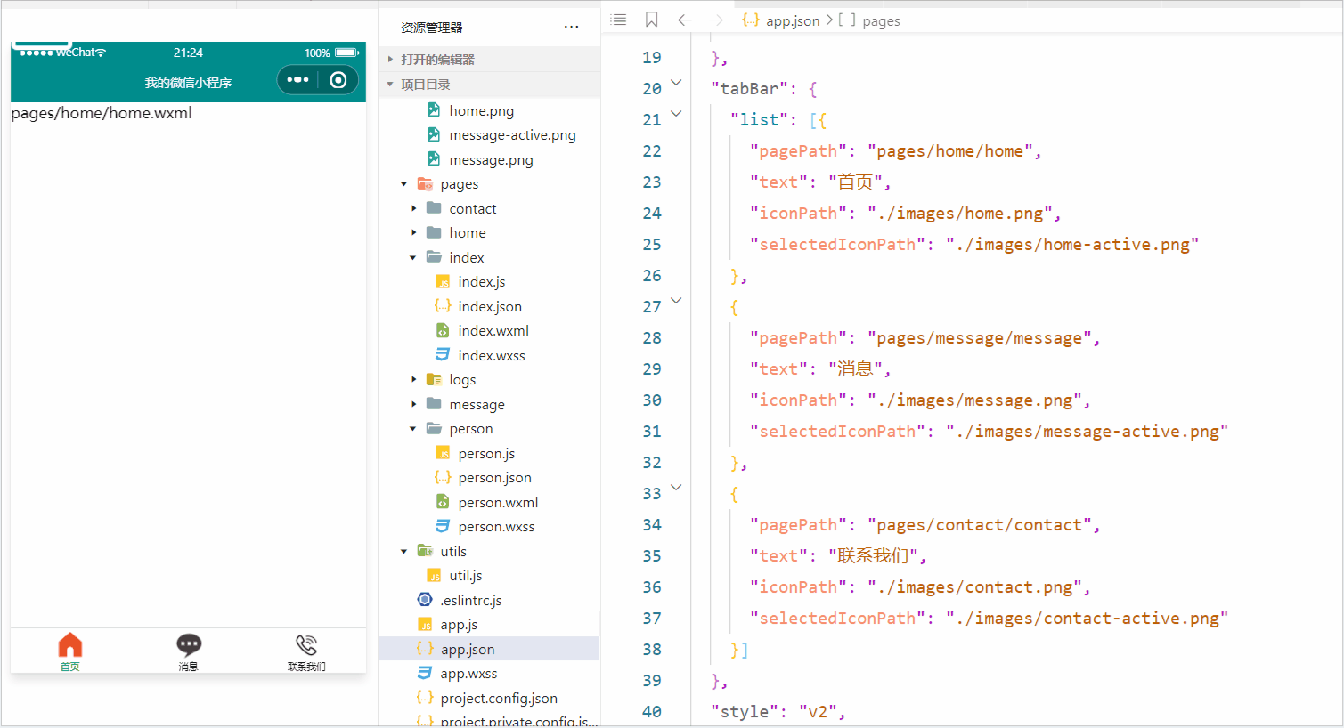
{
  "pages":[
    "pages/home/home",
    "pages/message/message",
    "pages/contact/contact",
    "pages/person/person",
    "pages/index/index",
    "pages/logs/logs"

  ],
  "window":{
    "backgroundTextStyle":"dark",
    "navigationBarBackgroundColor": "#008c8c",
    "navigationBarTitleText": "我的微信小程序",
    "navigationBarTextStyle":"white",
    "enablePullDownRefresh": true,
    "backgroundColor": "#0f0",
    "onReachBottomDistance": 50
  },
  "tabBar": {
    "list": [{
      "pagePath": "pages/home/home",
      "text": "首页",
      "iconPath": "./images/home.png",
      "selectedIconPath": "./images/home-active.png"
    },
    {
      "pagePath": "pages/message/message",
      "text": "消息",
      "iconPath": "./images/message.png",
      "selectedIconPath": "./images/message-active.png"
    },
    {
      "pagePath": "pages/contact/contact",
      "text": "联系我们",
      "iconPath": "./images/contact.png",
      "selectedIconPath": "./images/contact-active.png"
    }]
  },
  "style": "v2",
  "sitemapLocation": "sitemap.json"
}
🍊自定义tabBar
自定义 tabBar 可以让开发者更加灵活地设置 tabBar 样式,以满足更多个性化的场景。详细了解的话请参考官方文档说明:自定义tabBar
配置信息
官方文档明确说明:
为了保证低版本兼容以及区分哪些页面是 tab 页,tabBar 的相关配置项需完整声明,但这些字段不会作用于自定义 tabBar 的渲染,所有下图的list是不用删除的。
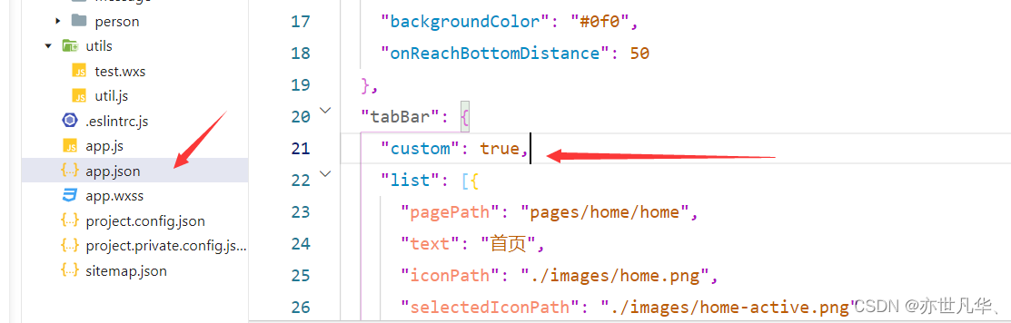
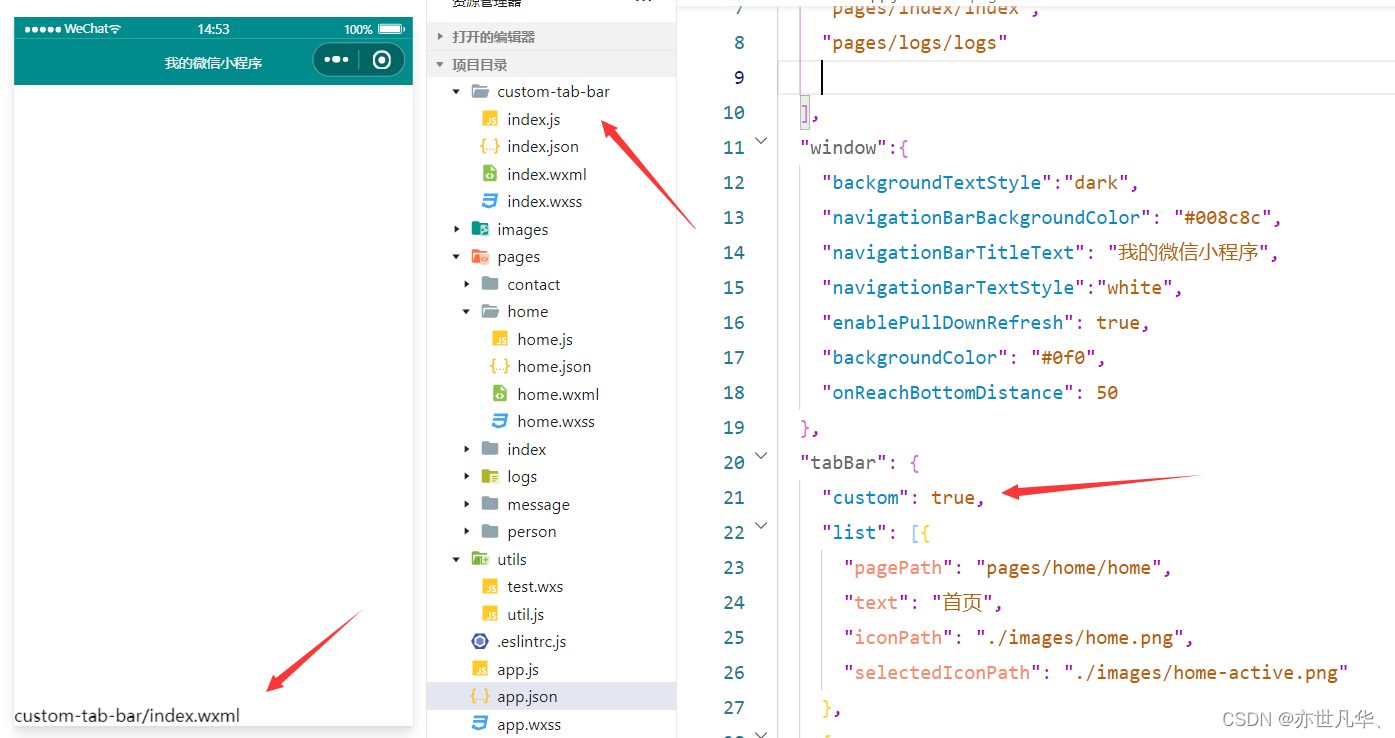
添加tabBar代码文件
注意:添加的文件夹名字必须要和官方文件名字一样,不能乱修改名字;然后右键文件夹选择新建Component输入index 即可。
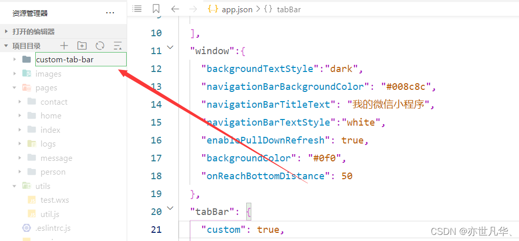
只要我们在app.json中声明了custom:true同时又创建了对应的custom-tab-bar对应的文件结构,微信小程序会自动识别custom-tab-bar对应的组件,把它的结构渲染到页面上,当作我们的tabBar
编写tabBar代码
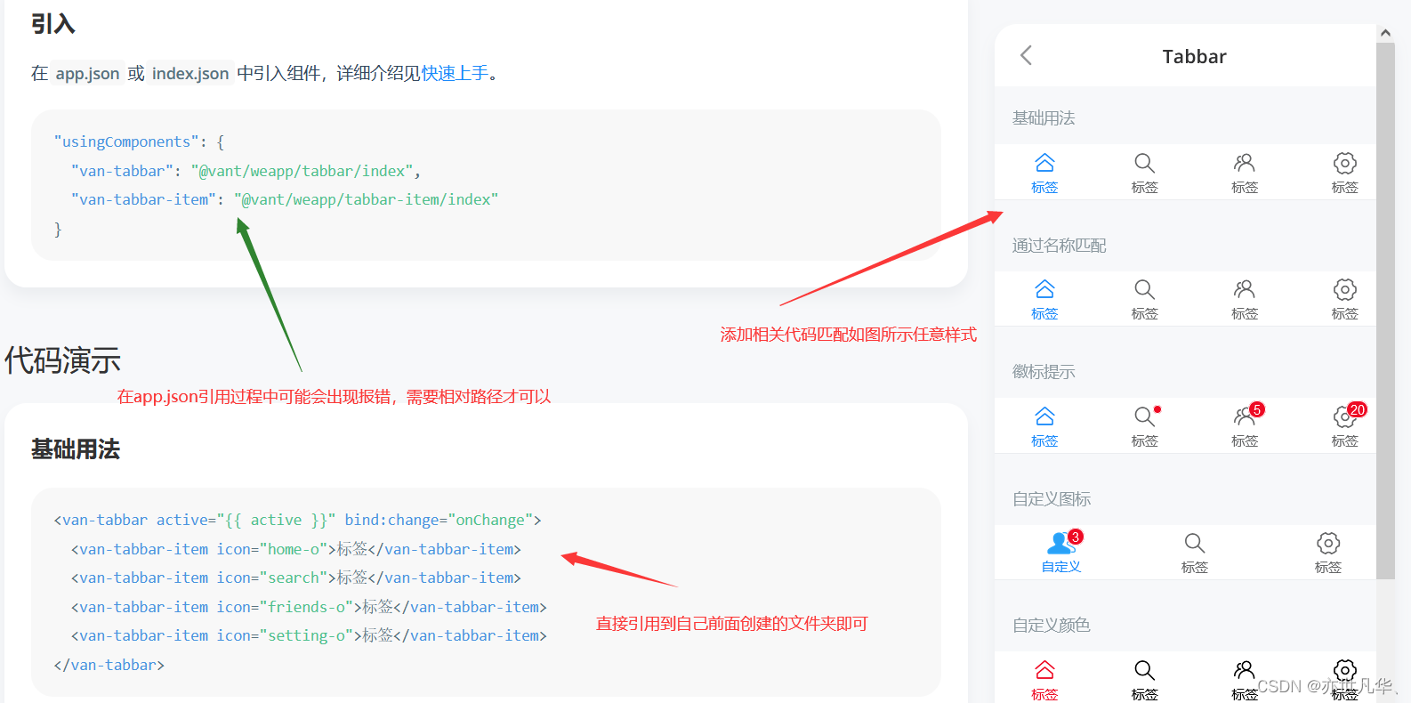
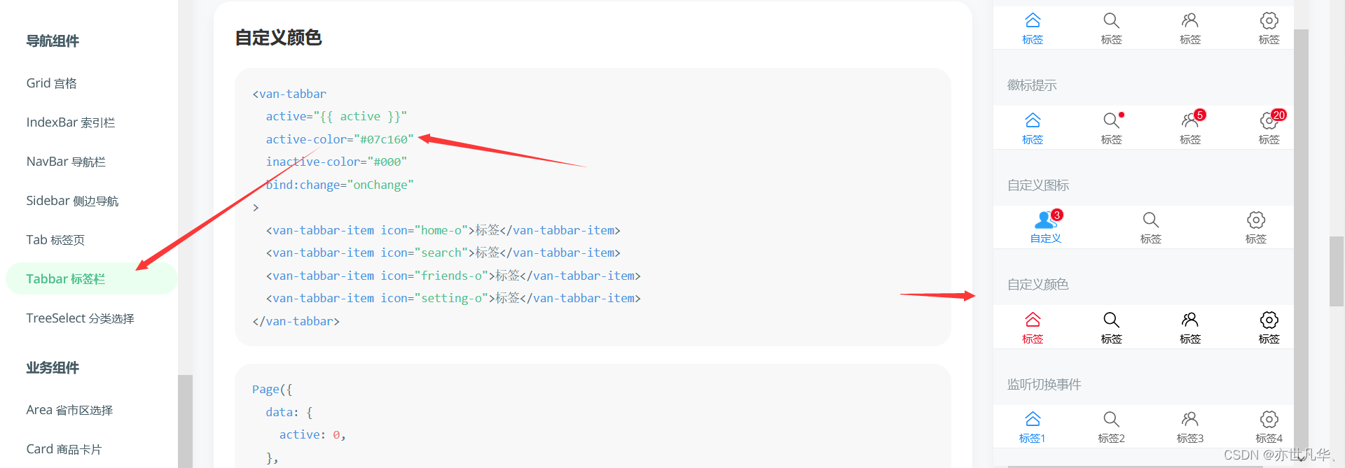
我们自定义 tabBar 可以通过** Vant 组件库** 里面的 tabBar 标签栏样式来快速便捷的创建我们的tabBar代码,如何配置 Vant 组件库的具体过程就不在演示了,详情请看一下如下这篇文章:
Vant组件库的安装及使用
自定义tabBar图标
Vant组件库也为我们提供了具体的方法:可以通过 slot 自定义图标,其中 icon slot 代表未选中状态下的图标,icon-active slot 代表选中状态下的图标。
<van-tabbar-item info="3">
  <image slot="icon" src="/images/home.png" mode="aspectFit" style="width: 30px; height: 18px;"/>
  <image slot="icon-active" src="/images/home-active.png" mode="aspectFit" style="width: 30px; height: 18px;"/>
  首页
</van-tabbar-item>
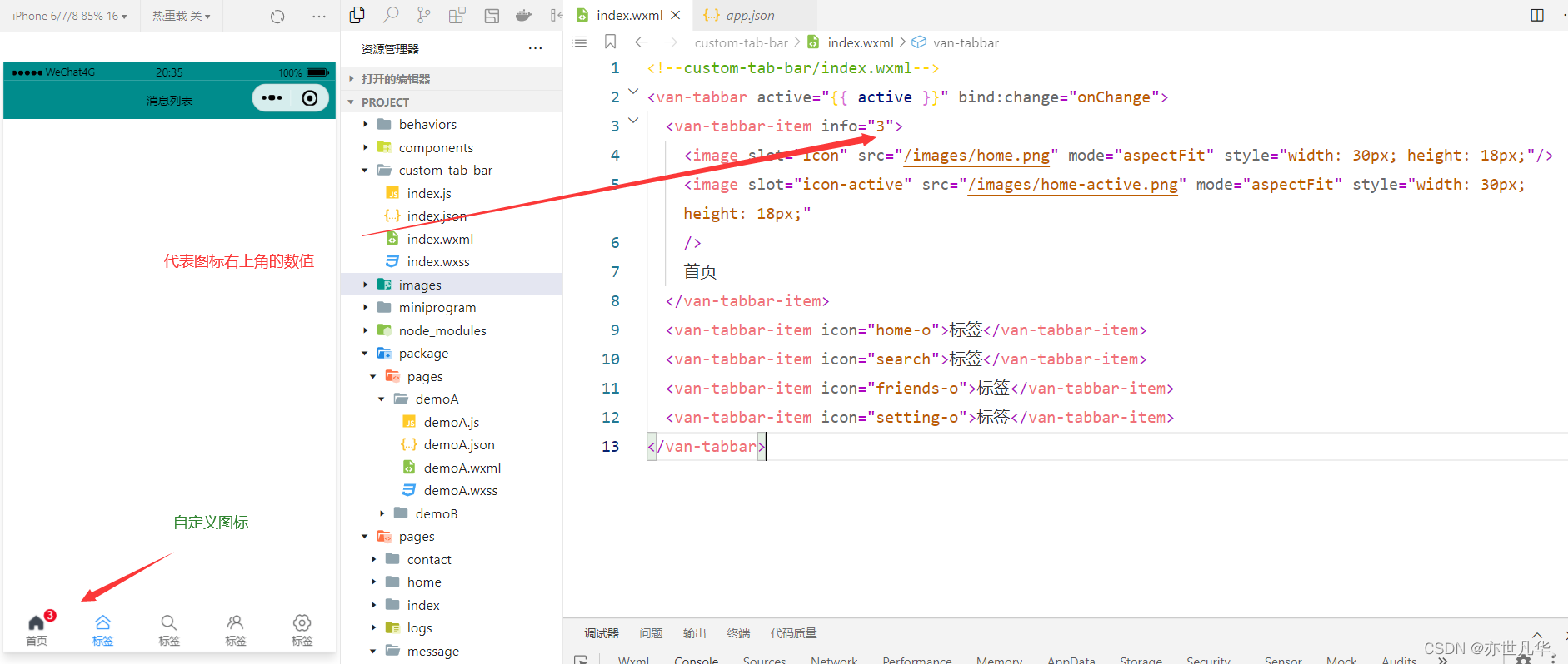
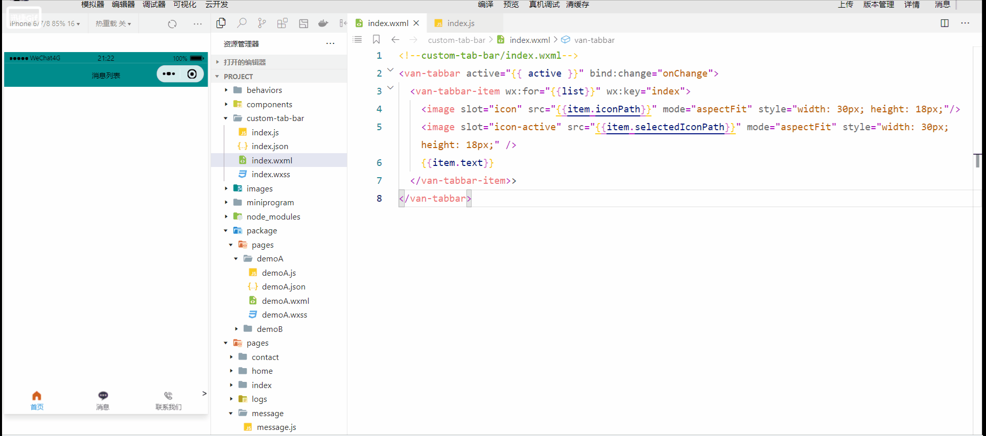
虽然我们可以自定义图标,但是上面的自定义一个图标就要写好多代码,能不能有种方法可以简便的自定义我们的图标,可以的。我们可以通过循环的形式将我们的tabbar-item给我们渲染出来。
首先我们需要将 list 里面的文件复制到自定义组件文件夹下 .js文件下的data里面:
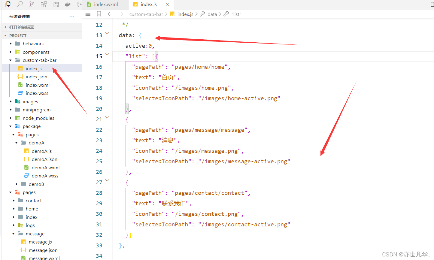
// .wxml
<van-tabbar active="{{ active }}" bind:change="onChange">
  <van-tabbar-item wx:for="{{list}}" wx:key="index">
    <image slot="icon" src="{{item.iconPath}}" mode="aspectFit" style="width: 30px; height: 18px;"/>
    <image slot="icon-active" src="{{item.selectedIconPath}}" mode="aspectFit" style="width: 30px; height: 18px;" />
    {{item.text}}
  </van-tabbar-item>>
</van-tabbar>
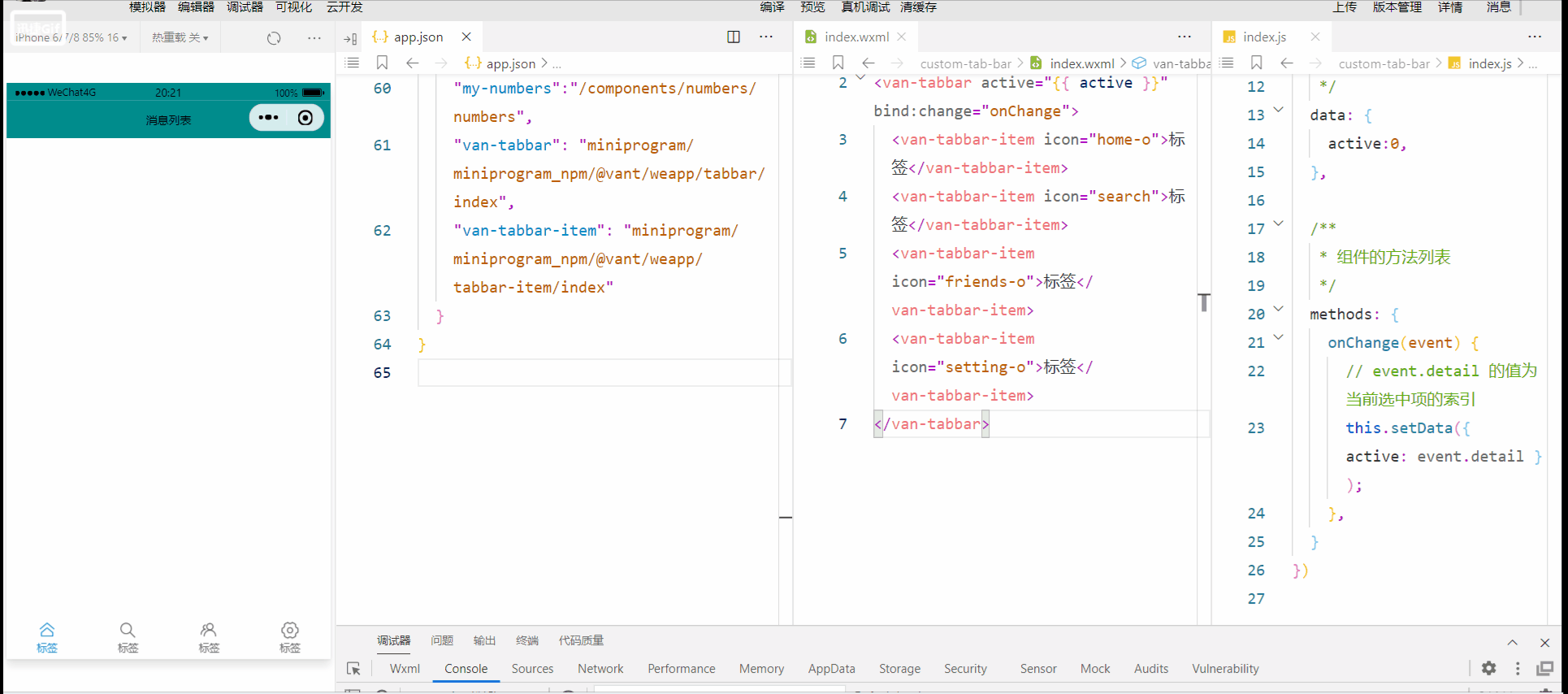
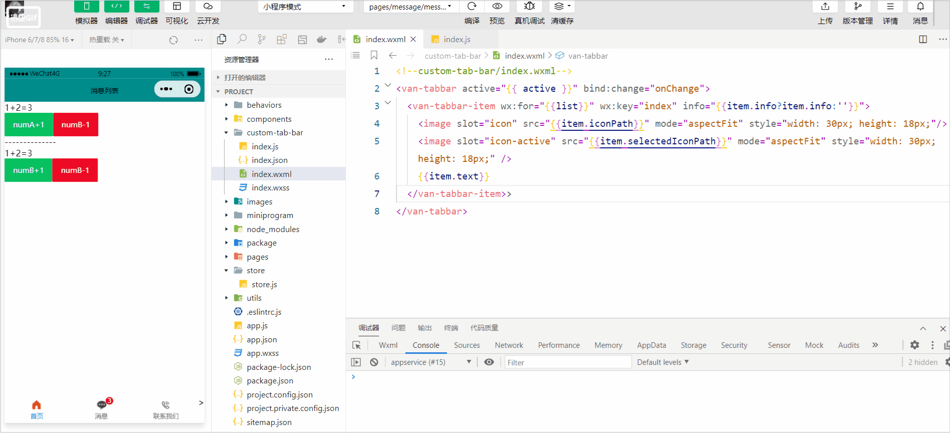
渲染tabBar的数字徽标
我们可以通过设置 info 属性来渲染tabBar上的数字徽标,如下图代码图片所示:
<!--custom-tab-bar/index.wxml-->
<van-tabbar active="{{ active }}" bind:change="onChange">
  <van-tabbar-item wx:for="{{list}}" wx:key="index" info="2">
    <image slot="icon" src="{{item.iconPath}}" mode="aspectFit" style="width: 30px; height: 18px;"/>
    <image slot="icon-active" src="{{item.selectedIconPath}}" mode="aspectFit" style="width: 30px; height: 18px;" />
    {{item.text}}
  </van-tabbar-item>>
</van-tabbar>

这样做的结果虽然能达到数字徽标效果的出现,但显然是把它写死了,所以我们要进行动态的绑定,这里我们可以参考一下微信官方文档的介绍。
// custom-tab-bar/index.wxml
<van-tabbar active="{{ active }}" bind:change="onChange">
<van-tabbar-item wx:for="{{list}}" wx:key="index" info="{{item.info?item.info:''}}">
<image slot="icon" src="{{item.iconPath}}" mode="aspectFit" style="width: 30px; height: 18px;"/>
<image slot="icon-active" src="{{item.selectedIconPath}}" mode="aspectFit" style="width: 30px; height: 18px;" />
{{item.text}}
</van-tabbar-item>>
</van-tabbar>
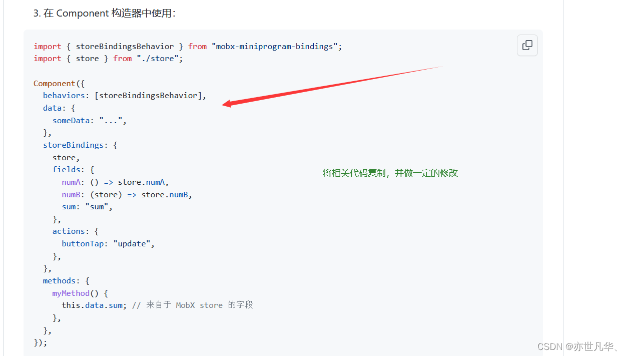
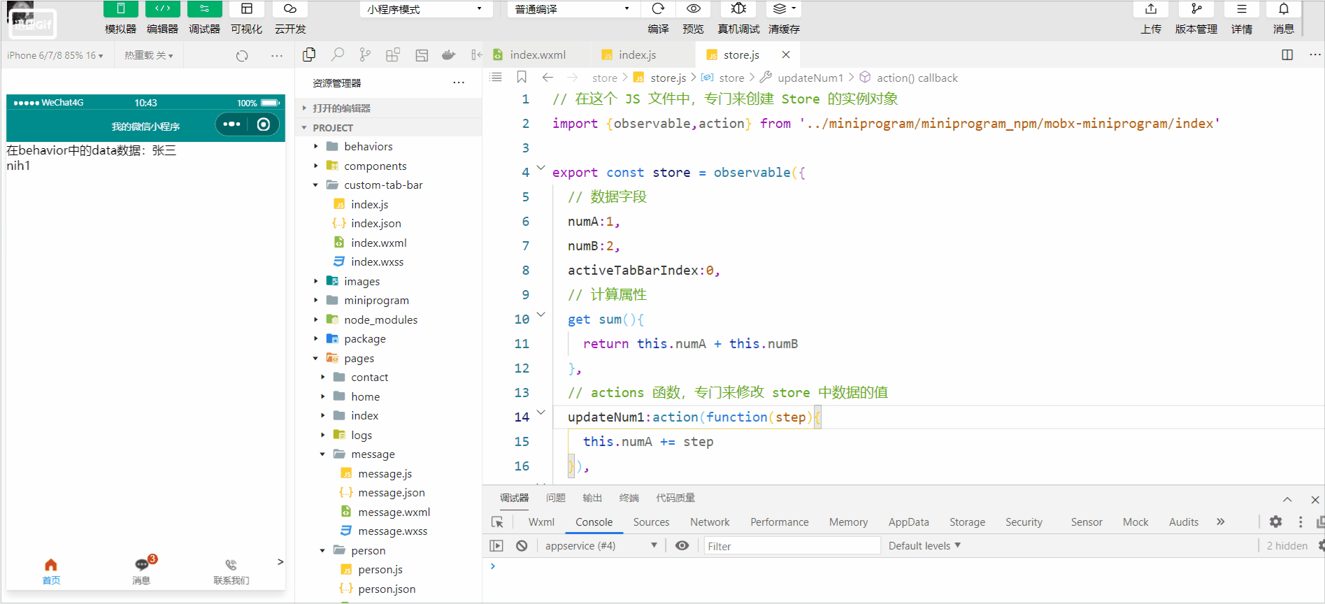
// custom-tab-bar/index.js
import {storeBindingsBehavior} from '../miniprogram/miniprogram_npm/mobx-miniprogram-bindings/index'
import {store} from '../store/store'
Component({
behaviors:[storeBindingsBehavior],
storeBindings: {
store,
fields: {
sum: "sum",
},
actions: {
},
},
observers:{
'sum':function(val){
// console.log(val);
this.setData({
'list[1].info':val>0?val:0 //三元运算符,如果数字徽标的数值小于零,就赋值为0
})
}
},
/**
* 组件的属性列表
*/
properties: {
},
/**
* 组件的初始数据
*/
data: {
active:0,
"list": [{
"pagePath": "pages/home/home",
"text": "首页",
"iconPath": "/images/home.png",
"selectedIconPath": "/images/home-active.png"
},
{
"pagePath": "pages/message/message",
"text": "消息",
"iconPath": "/images/message.png",
"selectedIconPath": "/images/message-active.png",
info:2
},
{
"pagePath": "pages/contact/contact",
"text": "联系我们",
"iconPath": "/images/contact.png",
"selectedIconPath": "/images/contact-active.png"
}]
},
/**
* 组件的方法列表
*/
methods: {
onChange(event) {
// event.detail 的值为当前选中项的索引
this.setData({ active: event.detail });
},
}
})
tabBar页面切换及其样式设置
我们将active引入到store实例对象当中,来动态的获取页面的索引值;在我们进行自定义tabBar的时候切换页面可能会出现闪烁问题,可自行百度,这里仅以举例为主。
//.wxml
<van-tabbar active="{{active}}" bind:change="onChange">
  <van-tabbar-item wx:for="{{list}}" wx:key="index" info="{{item.info?item.info:''}}">
    <image slot="icon" src="{{item.iconPath}}" mode="aspectFit" style="width: 30px; height: 18px;"/>
    <image slot="icon-active" src="{{item.selectedIconPath}}" mode="aspectFit" style="width: 30px; height: 18px;" />
    {{item.text}}
  </van-tabbar-item>>
</van-tabbar>

//.js
// custom-tab-bar/index.js
import {storeBindingsBehavior} from '../miniprogram/miniprogram_npm/mobx-miniprogram-bindings/index'
import {store} from '../store/store'
Component({
  behaviors:[storeBindingsBehavior],
  storeBindings: {
    store,
    fields: {
      sum: "sum",
      active:'activeTabBarIndex',
    },
    actions: {
      updateActive:'updateActiveTabBarIndex'
    },
  },
  observers:{
    'sum':function(val){
      // console.log(val);
      this.setData({
       'list[1].info':val>0?val:0 //三元运算符,如果数字徽标的数值小于零,就赋值为0
      })
    }
  },
  /**
   * 组件的属性列表
   */
  properties: {

  },

  /**
   * 组件的初始数据
   */
  data: {
    "list": [{
      "pagePath": "/pages/home/home",
      "text": "首页",
      "iconPath": "/images/home.png",
      "selectedIconPath": "/images/home-active.png"
    },
    {
      "pagePath": "/pages/message/message",
      "text": "消息",
      "iconPath": "/images/message.png",
      "selectedIconPath": "/images/message-active.png",
      info:2
    },
    {
      "pagePath": "/pages/contact/contact",
      "text": "联系我们",
      "iconPath": "/images/contact.png",
      "selectedIconPath": "/images/contact-active.png"
    }]
  },

  /**
   * 组件的方法列表
   */
  methods: {
    onChange(event) {
      // event.detail 的值为当前选中项的索引
      // this.setData({ active: event.detail })
      this.updateActive(event.detail)
      wx.switchTab({
        url: this.data.list[event.detail].pagePath,
      })

    },
  }
})

//store.js
// 在这个 JS 文件中,专门来创建 Store 的实例对象
import {observable,action} from '../miniprogram/miniprogram_npm/mobx-miniprogram/index'

export const store = observable({
  // 数据字段
  numA:1,
  numB:2,
  activeTabBarIndex:0,
  // 计算属性
  get sum(){
    return this.numA + this.numB
  },
  // actions 函数,专门来修改 store 中数据的值
  updateNum1:action(function(step){
    this.numA += step
  }),
  updateNum2:action(function(step){
    this.numB += step
  }),
  updateActiveTabBarIndex:action(function(index){
    this.activeTabBarIndex = index
  })
})
当然我们也可以设置tabBar选中项的文本颜色:
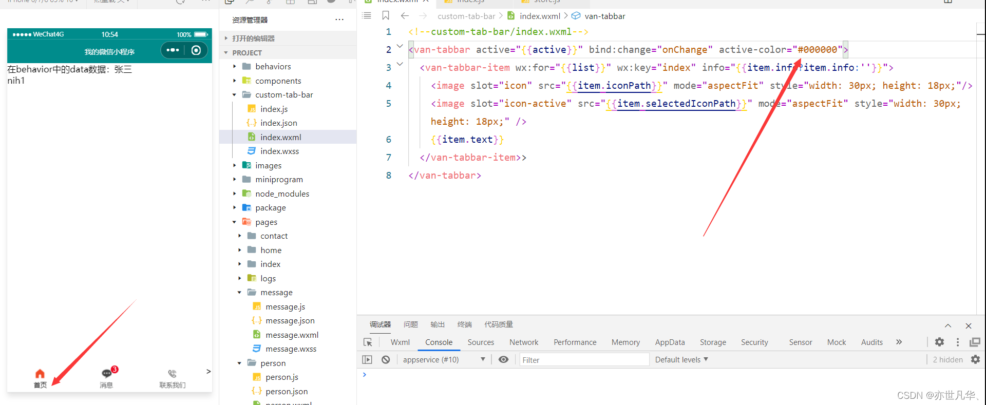
其他具体的tabBar样式设置可自行参考 Vant组件库,tabBar底部栏的讲解今天就到这了。
版权归原作者 亦世凡华、 所有, 如有侵权,请联系我们删除。