
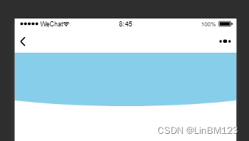
第一种:::after
<template>
    <view>
        <view class="bg">
        </view>
    </view>
</template>
<style>
.bg{
    background-color: pink;
}
.bg::after{
    content: '';
    position: absolute;
    width: 160%;
    height: 100px;
    background: skyblue;
    left: -30%;
    border-radius: 0 0 50% 50%;
}
</style>
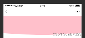
第二种:border-radius
<template>
    <view>
        <view class="bg">
        </view>
    </view>
</template>
<style>
.bg{
    background-color: pink;
    border-radius:0 0 50% 50%/40%;
    height: 100px;
    width: 160%;
    margin-left: -30%;
}
</style>
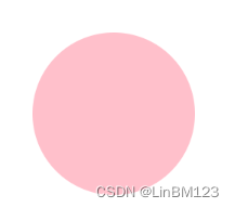
** border-radius:* * /***
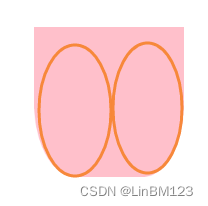
** border-radius:50% 50%/50%;**
height: 200px;
width: 200px;
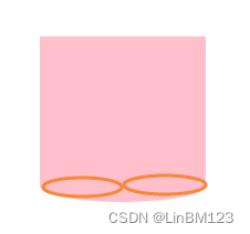
** border-radius:0 0 50% 50%/50%;**
height: 200px;
width: 200px;
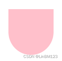
** border-radius:0 0 50% 50%/10%;**
height: 200px;
width: 200px;
** border-radius:0 0 50% 50%/90%;**
height: 200px;
width: 200px;
本文转载自: https://blog.csdn.net/LinBM123/article/details/126398208
版权归原作者 LinBM123 所有, 如有侵权,请联系我们删除。
版权归原作者 LinBM123 所有, 如有侵权,请联系我们删除。