
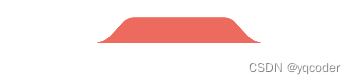
1. 效果图

2. 开始
准备一个元素,将元素左上角,右上角设为圆角。
<!DOCTYPE html>
<html lang="en">
  <head>
    <meta charset="UTF-8" />
    <meta name="viewport" content="width=device-width, initial-scale=1.0" />
    <title>Document</title>
    <style>
      .tab {
        width: 150px;
        height: 40px;
        margin: 0 auto;
        background: #ed6a5e;
        border-radius: 10px 10px 0 0;
      }
    </style>
  </head>
  <body>
    <div class="tab"></div>
  </body>
</html>

然后要在左右两边拼接弧形,我们可以写两个伪元素
.tab::before,
.tab::after {
  content: "";
  position: absolute;
  width: 10px;
  height: 10px;
  bottom: 0;
}

.tab::before {
  left: -10px;
}
.tab::before {
  right: -10px;
}

那怎么将这两个元素做成弧形呢,可以使用渐变。
.tab::before {
  background: radial-gradient(circle at 0 0, transparent 10px, #ed6a5e 10px);
}
.tab::after {
  background: radial-gradient(circle at 100% 0, transparent 10px, #ed6a5e 10px);
}

这下我们有了弧形,那怎么做成效果图的样式呢,最后我们可以使用旋转。
.tab {
  transform: perspective(30px) rotateX(20deg);
  transform-origin: center bottom;
}
3.完整代码
<!DOCTYPE html>
<html lang="en">
  <head>
    <meta charset="UTF-8" />
    <meta name="viewport" content="width=device-width, initial-scale=1.0" />
    <title>Document</title>
    <style>
      .tab {
        width: 150px;
        height: 40px;
        margin: 0 auto;
        background: #ed6a5e;
        border-radius: 10px 10px 0 0;
        position: relative;
        transform: perspective(30px) rotateX(20deg);
        transform-origin: center bottom;
      }
      .tab::before,
      .tab::after {
        content: "";
        position: absolute;
        width: 10px;
        height: 10px;
        bottom: 0;
        background: #000;
      }

      .tab::before {
        left: -10px;
        background: radial-gradient(
          circle at 0 0,
          transparent 10px,
          #ed6a5e 10px
        );
      }
      .tab::after {
        right: -10px;
        background: radial-gradient(
          circle at 100% 0,
          transparent 10px,
          #ed6a5e 10px
        );
      }
    </style>
  </head>
  <body>
    <div class="tab"></div>
  </body>
</html>
本文转载自: https://blog.csdn.net/weixin_64684095/article/details/138960388
版权归原作者 yqcoder 所有, 如有侵权,请联系我们删除。
版权归原作者 yqcoder 所有, 如有侵权,请联系我们删除。