
   最近开始搞vue了。

   由于 element UI 中的 table 不能像 antd 里的 table 直接注入 json 字符串生成表头,这导致了不能轻松的通过后台生成表格,或是对表头进行排序,在网上参考找了一种最简易的方法,可以给表格里面注入各种自己想要的效果,代码如下:
<el-table v-loading="loading" :data="data">
      <el-table-column v-for="(th, key) in tableColumns" :key="key" :prop="th.prop"
        :label="th.label" :align="th.align"
        :width="th.width" v-if="th.visible">

         <!--这里通过字段来判断注入的方法 没有的话默认为显示 row[th.prop] -->
        <template slot-scope="scope">

          <div v-if="th.prop === 'status'">
            <a>{{scope.row.status}}</a>
          </div>
          <div v-else-if="th.prop === 'createTime'">
            <a>{{scope.row.status}}</a>
          </div>
          <!--默认显示 -->
          <div v-else>
            <span>{{ scope.row[th.prop] }}</span>
          </div>
        </template>
      </el-table-column>

      <!--操作列 -->
      <el-table-column label="操作" align="center" class-name="small-padding fixed-
         width">
        <template v-slot="scope">
          <el-button size="mini" type="text" icon="el-icon-edit"
            @click="handleUpdate(scope.row)">  修改</el-button>
          <el-button size="mini" type="text" icon="el-icon-delete"
            @click="handleDelete(scope.row)"]">删除</el-button>
        </template>
      </el-table-column>
</el-table>
相应的json字符串为以下:
 tableColumns: [
        {
          id: 1,
          label: '岗位编号',
          prop: 'id',
          align: 'center',
          disabled: true,
          visible: true,
        },
        {
          id: 2,
          label: '岗位编码',
          prop: 'code',
          align: 'center',
          disabled: true,
          visible: true,
        },
        {
          id: 3,
          label: '岗位名称',
          prop: 'name',
          align: 'center',
          disabled: false,
          visible: true,
        },
        {
          id: 4,
          label: '岗位排序',
          prop: 'sort',
          align: 'center',
          disabled: false,
          visible: true,
        },
        {
          id: 5,
          label: '状态',
          prop: 'status',
          align: 'center',
          disabled: false,
          visible: true,
        },
        {
          id: 6,
          label: '创建时间',
          prop: 'createTime',
          align: 'center',
          disabled: false,
          visible: true,
          width: 180
        },
      ],
其中id是用来扩展功能,方便进行tree操作,label是表头名称,prop是对应后台字段,align是对齐方式,disabled是扩展tree操作的选择,visible是用开显示隐藏的,由此扩展功能来给表头做移动和显隐,引用一个小插件:
<template>
  <div class="top-right-btn" :style="style">

    <el-row>
      <el-tooltip class="item" effect="dark" content="显隐顺序列" placement="top"
        v-if="tableColumns">
        <el-button size="mini" circle icon="el-icon-menu" @click="showDrag()" />
      </el-tooltip>
    </el-row>

    <el-dialog :title="titleDrag" :visible.sync="openDrag" width="300px" append-to-body
      :modal=false>
      <el-tree :data="tableColumns" node-key="id" show-checkbox :default-checked-
        keys="checkArray" default-expand-all
        ref="tree" @check-change="handleCheckChange" @node-drag-start="handleDragStart"
        @node-drop="handleDrop"
        draggable :allow-drop="allowDrop">
      </el-tree>
    </el-dialog>

  </div>
</template>
<script>
export default {
  name: "RightToolbar",
  data() {
    return {
      //是否显示拖拽框
      openDrag:false,
      //弹出框
      titleDrag: "显示/隐藏拖拽",
      //是否推拽中
      dragBool: false,
      //默认check的树节点
      checkArray: [],
    };
  },
  props: {
    tableColumns:{
      type:Array,
    }
  },
  methods: {

    // 打开显隐列drag
    showDrag() {
      this.openDrag = true;
      this.tableColumns.forEach((item) => {
        if (item.visible)
          this.checkArray.push(item.id)
      })
    },

    //选取改变
    handleCheckChange(data, checked, indeterminate) {
      this.tableColumns.forEach((item, key) => {
        if (item.id === data.id)
          this.tableColumns[key].visible = checked
      })
    },

    //开始拖拽
    handleDragStart(node, ev) {
      this.dragBool = node.data.visible
    },

    //拖拽放下
    handleDrop(draggingNode, dropNode, dropType, ev) {
      setTimeout(() => {
        let array = [];
        this.tableColumns.forEach((item, key) => {
          if (item.id === draggingNode.data.id && this.dragBool)
            this.tableColumns[key].visible = true
        })
        this.tableColumns.forEach((item) => {
          if (item.visible)
            array.push(item.id)
        })
        this.dragBool =false;
        this.$refs.tree.setCheckedKeys(array);
      }, 0)
    },

    //允许放下
    allowDrop(draggingNode, dropNode, type) {
      return type === "next" || type === "prev"
    },
  },
};
</script>
<style lang="scss" scoped>

.registCaseBox {
  margin-top: 200px;
}

</style>
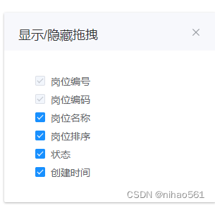
这个小组件可以拖拽,来控制表头的顺序及隐藏,json中的disabled 控制这个列 是不可隐藏的。
本文转载自: https://blog.csdn.net/nihao561/article/details/128868113
版权归原作者 nihao561 所有, 如有侵权,请联系我们删除。
版权归原作者 nihao561 所有, 如有侵权,请联系我们删除。