
文章目录
🍋前言:
本文主要展示小程序端封装轮播图组件,使用的是uniapp进行的开发,主要使用的是uniapp官网提供的
swiper组件,可以参考官方文档,查看一些相关API。
效果图一睹为快:

话不多说直接上正文一起来学习一下封装轮播图组件吧!
🍍正文
1、首先了解
swiper
组件
滑块视图容器。
一般用于左右滑动或上下滑动,比如banner轮播图。
注意滑动切换和滚动的区别,滑动切换是一屏一屏的切换。
swiper下的每个
swiper-item是一个滑动切换区域,不能停留在2个滑动区域之间。
1.1、小小的demo示例:
<template>
<view class="uni-margin-wrap">
    <swiper class="swiper" circular :indicator-dots="true" :autoplay="true" :interval="2000"
    :duration="500">
        <swiper-item>
        <view class="swiper-item uni-bg-red">A</view>
</swiper-item>
<swiper-item>
            <view class="swiper-item uni-bg-green">B</view>
</swiper-item>
<swiper-item>
                <view class="swiper-item uni-bg-blue">C</view>
</swiper-item>
</swiper>
</view>
</template>

<style>
.uni-margin-wrap {
        width: 690rpx;
        width: 100%;
    }
    .swiper {
        height: 300rpx;
    }
    .swiper-item {
        display: block;
        height: 300rpx;
        line-height: 300rpx;
        text-align: center;
    }
</style>
效果图如下:
1.2、自定义轮播图效果展示说明
我们要做的是:
- 轮播图底部颜色渐变
- 左下方包含对应图片的一行文字说明
- 指示点在右下方,选中颜色为白色,未选中为灰色
效果图如下:

2、完成自定义轮播图效果
我们先完成效果再去探讨如何封装成组件。如下示例代码展示了自定义轮播图的效果:
**
swiper
常用属性介绍**:
indicator-dots:轮播图正前方的小圆点(此案例没有使用官方提供的,是自定义的在右下角附近)autoplay:是否自动切换interval:图片轮播间隔此处为3秒duration:图片轮播动画时长 此处为0.5秒circular:是否开启无缝轮播(此处为到第三张图片后无缝播放第一张图片)
<template>
        <!-- 轮播图组件 -->
        <view class="px-3 py-2 ">
            <view class="position-relative">
                <swiper :autoplay="true" :interval="3000" :duration="500" circular style="height: 250rpx;"
                    @change="changeIndicatorDots">
                    <swiper-item v-for="(item,index) in swipers" :key="index">
                        <image :src="item.src" mode="sapectFill" style="height:250rpx;width: 100%;" class="rounded-lg">
                        </image>
                    </swiper-item>
                </swiper>
                <view class="flex align-center text-white rounded-bottom-lg px-2 pb-1" style="position: absolute; bottom: 0; left: 0; right: 0;
                        background-image: linear-gradient(to bottom,rgba(0,0,0,0),rgba(0,0,0,0.8));">
                    <view style="width: 80%;" class="text-ellipsis">
                        <!-- 获取当前指示点的位置,获取对应的title -->
                        <text>{{swipers[current].title}}</text>
                    </view>
                    <view style="width: 20%;" class="flex align-center justify-end flex-shrink">
                        <!-- 指示点选中当前图片为白色 未选中为灰色 -->
                        <view v-for="(item,index) in swipers" :key="index" style="height: 16rpx;width: 16rpx ; "
                            class="rounded-circle ml-1"
                            :style="index===current?'background-color:rgba(255,255,255,1)':'background-color:rgba(255,255,255,0.5)'">
                        </view>
                    </view>
                </view>
            </view>
        </view>
    </view>
</template>

<script>
    export default {
        data() {
            return {
                current: 0, // 标识当前选中的图片序列号
                swipers: [{
                    src: '/static/swiper/1.jpg',
                    title: '自定义轮播图组件图片一'
                }, {
                    src: '/static/swiper/2.jpg',
                    title: '自定义轮播图组件图片二名字很长测试用'
                }, {
                    src: '/static/swiper/3.jpg',
                    title: '自定义轮播图组件图片三'
                }]
            }
        },
        onLoad() {
        },
        methods: {
           // changeIndicatorDots方法会在轮播的图片切换后调用,e.detail.current表示当前所在滑块的 index
            changeIndicatorDots(e) {
                this.current = e.detail.current
            }
        }
    }
</script>
示例代码中的class类中的类名样式是我已经在全局配置好的,由于篇幅比较长,之后的小程序文章也会经常使用,我已经上传到了CSDN资源(免费),点击链接跳转下载可查看相对应的样式。
点击跳转下载free.css文件
3、组件封装——自定义轮播图
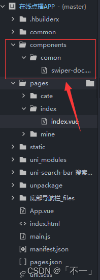
3.1、创建
swiper-doc.vue
组件
3.2、组件调用,封装完成
首先我们要清楚,我们封装的内容为我们自定义的部分,swiper滑块区域是不需要封装的是通用的,我们使用插槽站位。我们只需要将我们自定义的指示点、介绍文字、渐变模块封装即可。
示例代码如下:
swiper-doc.vue文件:
<template>
        <view class="position-relative">
            <!-- 轮播图组件不需要直接使用插槽 -->
            <slot></slot>
            <view class="flex align-center text-white rounded-bottom-lg px-2 pb-1" style="position: absolute; bottom: 0; left: 0; right: 0;
                    background-image: linear-gradient(to bottom,rgba(0,0,0,0),rgba(0,0,0,0.8));">
                <view style="width: 80%;" class="text-ellipsis">
                    <!-- 获取当前指示点的位置,获取对应的title -->
                    <text>{{info[current].title}}</text>
                </view>
                <view style="width: 20%;" class="flex align-center justify-end flex-shrink">
                    <!-- 指示点选中当前图片为白色 未选中为灰色 -->
                    <view v-for="(item,index) in info" :key="index" style="height: 16rpx;width: 16rpx ; "
                        class="rounded-circle ml-1"
                        :style="index===current?'background-color:rgba(255,255,255,1)':'background-color:rgba(255,255,255,0.5)'">
                    </view>
                </view>
            </view>
    </view>
</template>

<script>
    export default{
        props:{
            info:Array,
            current:{
                type:Number,
                default:0
            }
        }
    }
</script>
- info表示我们所需的轮播图片数据;
- current表示那个轮播图片的索引,用于获取title和指示点。
index.vue文件:
<view class="px-3 py-2 ">
            <swiperDot class="position-relative" :current="current" :info="swipers">
            <!--
                    swiper常用属性介绍:
                        indicator-dots:轮播图正前方的小圆点(此案例没有使用官方提供的,是自定义的在右下角附近)
                        autoplay:是否自动切换
                        interval:图片轮播间隔此处为3秒
                        duration:图片轮播动画时长 此处为0.5秒
                        circular:是否开启无缝轮播(此处为到第三张图片后无缝播放第一张图片)
                 -->
                <swiper :autoplay="true" :interval="3000" :duration="500" circular style="height: 250rpx;"
                    @change="changeIndicatorDots">
                    <swiper-item v-for="(item,index) in swipers" :key="index">
                        <image :src="item.src" mode="sapectFill" style="height:250rpx;width: 100%;" class="rounded-lg">
                        </image>
                    </swiper-item>
                </swiper>
            </swiperDot>
</view>
<script>
   // 引入指示点组件,注册并使用
    import swiperDot from '@/components/comon/swiper-doc.vue'
    export default {
        components: {
            swiperDot
        },
        data() {
            return {
                current: 0, // 标识当前选中的图片序列号
                swipers: [{
                    src: '/static/swiper/1.jpg',
                    title: '自定义轮播图组件图片一'
                }, {
                    src: '/static/swiper/2.jpg',
                    title: '自定义轮播图组件图片二名字很长测试用'
                }, {
                    src: '/static/swiper/3.jpg',
                    title: '自定义轮播图组件图片三'
                }]
            }
        },
        onLoad() {

        },
        methods: {
            // changeIndicatorDots方法会在轮播的图片切换后调用,e.detail.current表示当前所在滑块的 index
            changeIndicatorDots(e) {
                this.current = e.detail.current
            }
        }
    }
</script>
注意:文章案例中的swipers数组在实际开发中应该是从后端获取的,我们这里是自己直接定义的。
🎃专栏分享:
小程序项目实战专栏:《uniapp小程序开发》
前端面试专栏地址:《面试必看》
⏳
      名言警句:说能做的,做说过的


    \textcolor{red} {名言警句:说能做的,做说过的}


 名言警句:说能做的,做说过的
✨
      原创不易,还希望各位大佬支持一下


    \textcolor{blue}{原创不易,还希望各位大佬支持一下}


 原创不易,还希望各位大佬支持一下
👍
      点赞,你的认可是我创作的动力!


    \textcolor{green}{点赞,你的认可是我创作的动力!}


 点赞,你的认可是我创作的动力!
⭐️
      收藏,你的青睐是我努力的方向!


    \textcolor{green}{收藏,你的青睐是我努力的方向!}


 收藏,你的青睐是我努力的方向!
✏️
      评论,你的意见是我进步的财富!


    \textcolor{green}{评论,你的意见是我进步的财富!}


 评论,你的意见是我进步的财富!
本文转载自: https://blog.csdn.net/qq_49002903/article/details/126809121
版权归原作者 「不一」 所有, 如有侵权,请联系我们删除。
版权归原作者 「不一」 所有, 如有侵权,请联系我们删除。