
自适应布局
线性布局(Row(),Column())
具有拉伸能力(Blank()组件填充空白处)
占比能力(layoutweight,设置百分比)
延伸能力(List,Scroll)
将justifyContent属性设置为FlexAlign.SpaceEvenly可以完成均分能力
弹性布局(Flex())
也能通过(flexBasis,flexGrow,flexShrink)来实现自适应拉伸,
通过flex布局可以灵活设置子组件在父组件中的位置,
通过flexWrap可以实现折行能力(自动换行),
将justifyContent属性设置为FlexAlign.SpaceEvenly可以完成均分能力
线性布局通过(Blank())实现的是左右拉伸,弹性布局实现的是均分拉伸
层叠布局(Stack())
可以实现组件之间的叠加
网络布局(Grid())
具有较强的页面均分能力,用来绘制网格布局,会随着容器的大小自适应缩放
布局约束
aspectRatio可以实现缩放能力
displayPriority属性实现隐藏能力
线性布局
通过Row(),Column()实现线性布局
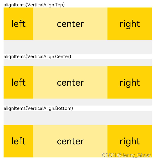
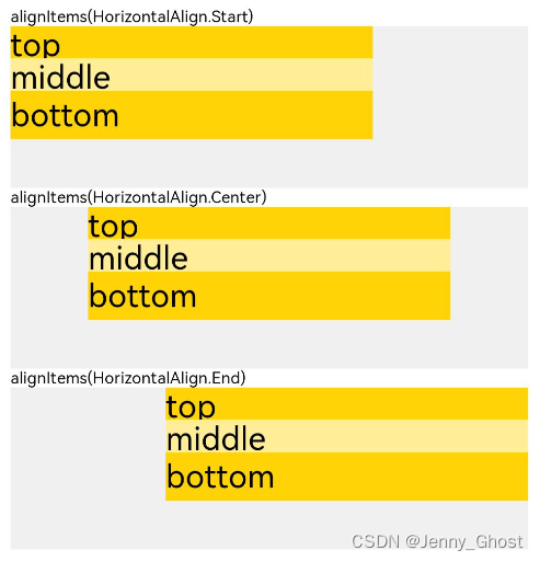
使用 alignItems设置垂直于排列方向的排列方式
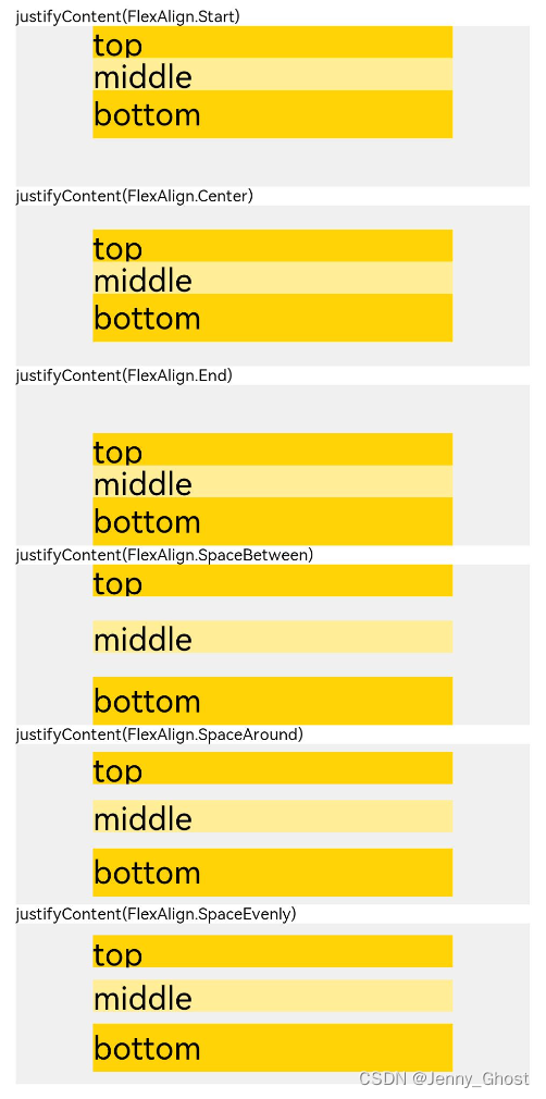
使用justifyContent设置子组件在主轴方向上的排列方式
通过space参数设置主轴(排列方向)上子组件的间距。达到各子组件在排列方向上的等间距效果。
通过alignItems属性设置容器排列方向的垂直方向上,子组件在父容器中的对齐方式取值为VerticalAlign类型,水平方向取值为HorizontalAlign类型。
通过justifyContent属性设置子组件在主轴(排列方向)上的对齐方式。实现布局的自适应均分能力。取值为FlexAlign类型。

自适应拉伸
通过Blank()组件在容器主轴方向自动填充空白空间,达到自适应拉伸效果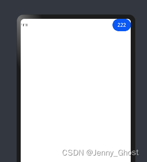
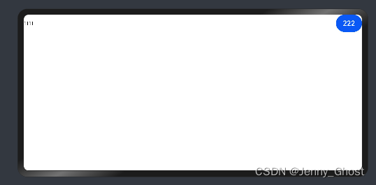
Row(){Text('1111')Blank()Button('222')}.width('100%')
自适应缩放
两种方法:
1.设置layoutWeight属性的子组件与兄弟元素占主轴尺寸按照权重进行分配
![[外链图片转存失败,源站可能有防盗链机制,建议将图片保存下来直接上传(img-TXxj7mKd-1677199845703)(../UI开发/media/image-20230210084718989.png)]](https://img-blog.csdnimg.cn/ab5b42472cfb40cdba957736ebcdde6c.png)
Row(){Column(){Text('layoutWeight(1)').textAlign(TextAlign.Center)}.layoutWeight(1).backgroundColor(0xffd306).height('100%')Column(){Text('layoutWeight(2)').textAlign(TextAlign.Center)}.layoutWeight(2).backgroundColor(0xffed97).height('100%')Column(){Text('layoutWeight(3)').textAlign(TextAlign.Center)}.layoutWeight(3).backgroundColor(0xffd306).height('100%')}.backgroundColor(0xffd306).height('30%')
2.父容器尺寸确定时,使用百分比设置子组件以及兄弟组件的width宽度
![[外链图片转存失败,源站可能有防盗链机制,建议将图片保存下来直接上传(img-GpzjNbzC-1677199845705)(../UI开发/media/image-20230210084745743.png)]](https://img-blog.csdnimg.cn/936dd0642d1e4a36938c638578a83721.png)
Row(){Column(){Text('left width 20%').textAlign(TextAlign.Center)}.width('20%').backgroundColor(0xffd306).height('100%')Column(){Text('center width 50%').textAlign(TextAlign.Center)}.width('50%').backgroundColor(0xffed97).height('100%')Column(){Text('right width 30%').textAlign(TextAlign.Center)}.width('30%').backgroundColor(0xffd306).height('100%')}.backgroundColor(0xffd306).height('30%')
定位能力
相对定位
offset属性
Text('2 offset(15, 30)').offset({ x:15, y:30})
绝对定位
position属性
Text('2 offset(15, 30)').positon({ x:15, y:30})
自适应延伸
使用scroll组件和list组件可以将屏幕放不下的组件通过滚动的方式展示
通过scrollable 和listDirection 设置滚动方向
.scrollable(ScrollDirection.Horizontal) // 滚动方向横向
.scrollable(ScrollDirection.Vertical) // 滚动方向横向
.listDirection(Axis.Horizontal) // 列表水平排列
层叠布局
通过层叠容器Stack实现,组件一层层叠加,上面的组件会覆盖下面的组件
//通过设置alignContene可以设置组件的位置//左上:TopStart,上中:Top,右上:TopEnd,左:Start,中:Center,//右:End,右下:BottomStart,中下:Bottom,右下:BottomEndStack({ alignContent: Alignment.TopStart }){Column(){Text('Stack子元素2').fontSize(20)}.width(150).height(150).backgroundColor(Color.Pink)Column(){Text('Stack子元素1').textAlign(TextAlign.End).fontSize(20)}.width(100).height(100).backgroundColor(0xffd306)}.margin({ top:100}).width(350).height(350).backgroundColor(0xe0e0e0)
z序控制
.zIndex(1)//数值越大所在层数越高
弹性布局
Flex({//布局方向,Row,RowReverse,Column,ColumnReverse
direction?: FlexDirection,//当子组件宽度之和大于父组件的宽度会换行//'wrapReverse'换行后按照主轴的反方向进行排列,
wrap?: FlexWrap.Wrap,//对齐方式,如下图
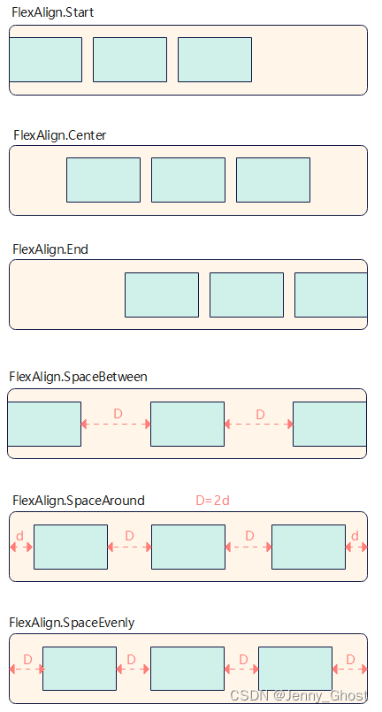
justifyContent?: FlexAlign
//
alignItems?: ItemAlign,//
alignContent?: FlexAlign
}){}
组件对齐方式
容器默认存在两根轴:主轴(main axis)和垂直于主轴的交叉轴(cross axis)如果是flexdirection:row那主轴就是水平的,如果是flex direction:column主轴就是垂直的
主轴对齐JustufyContent
Flex({ justifyContent: FlexAlign.Start }) {
交叉轴对齐alignItems,
ItemAlign.Auto: 使用Flex容器中默认配置。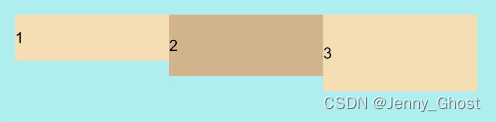
ItemAlign.Start: 交叉轴方向首部对齐。
ItemAlign.Center: 交叉轴方向居中对齐。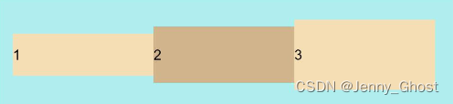
ItemAlign.End:交叉轴方向底部对齐。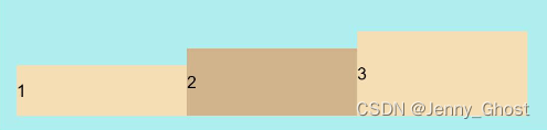
ItemAlign.Stretch:交叉轴方向拉伸填充,在未设置尺寸时,拉伸到容器尺寸。
ItemAlign. Baseline:交叉轴方向文本基线对齐。
内容对齐alignContent

FlexAlign.Start: 子组件各行与交叉轴起点对齐。
FlexAlign.Center: 子组件各行在交叉轴方向居中对齐。
FlexAlign.End: 子组件各行与交叉轴终点对齐
FlexAlign.SpaceBetween: 子组件各行与交叉轴两端对齐,各行间垂直间距平均分布。
FlexAlign.SpaceAround: 子组件各行间距相等,是元素首尾行与交叉轴两端距离的两倍。
FlexAlign.SpaceEvenly: 子组件各行间距,子组件首尾行与交叉轴两端距离都相等。
弹性布局的自适应拉伸
通过子组件的flexBasis,flexGrow,flexShrink属性设置其再父容器的占比,达到自适应布局能力
flexBasis: 设置子组件在父容器主轴方向上的基准尺寸。如果设置了该值,则子项占用的空间为设置的值;如果没设置或者为auto,那子项的空间为width/height的值。
flexGrow(父组件大于子组件): 设置父容器的剩余空间分配给此属性所在组件的比例。用于"瓜分"父组件的剩余空间。
flexShrink(父组件小于子组件): 当父容器空间不足时,子组件的压缩比例
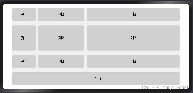
网络布局(Grid)
网络布局具有较强的页面均分能力通过Grid和GridItem组件实现 Grid用于设置网格布局相关参数,GridItem定义子组件相关特征
当容器尺寸发生变化时所有子组件都会自动调整
行列数量,占比设置
通过Grid的组件的.columnsTemplate(‘1fr 2fr 4fr’)和 .rowsTemplate(‘1fr 2fr 1fr’ 1fr)属性设置网格布局行列数量与尺寸占比,一个fr代表布局的个数,前面的数字代表占比
行列间距
使用.columnsGap(10).rowsGap(20)来设置间距
.columnsGap(10)
.rowsGap(20)
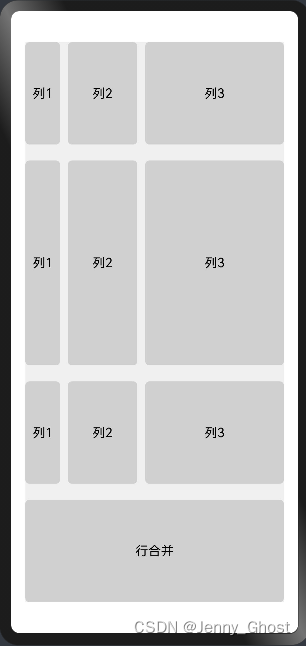
GridItem的设置
子组件横跨多行时,通过rowStart(columnStart)设置子组件起始行编号,rowEnd(columnEnd)设置终点行编号。当rowStart(columnStart)值与rowEnd(columnEnd)值相同时,子组件只占一个网格
// xxx.ets@Entry@Component
struct GridExample {@State Number:Array<string>=['1','2','3','1','2','3','1','2','3']build(){Column({ space:5}){Grid(){ForEach(this.Number,(num:string)=>{GridItem(){Text(`列${num}`).fontSize(16).textAlign(TextAlign.Center).backgroundColor(0xd0d0d0).width('100%').height('100%').borderRadius(5)}})GridItem(){Text(`行合并`).fontSize(16).textAlign(TextAlign.Center).backgroundColor(0xd0d0d0).width('100%').height('100%').borderRadius(5)}.columnStart(1).columnEnd(3)}.columnsTemplate('1fr 2fr 4fr').rowsTemplate('1fr 2fr 1fr 1fr').columnsGap(10).rowsGap(20).width('90%').backgroundColor(0xF0F0F0).height('90%').margin({top:'5%'})}.width('100%')}}
响应式布局
当窗口尺寸发生巨大改变时,依靠自适应布局可能会带来图片被异常拉伸,留白过多的情况,使用响应式布局可以根据特定的特征(如窗口宽度、屏幕方向等)自动变化以适应外部容器变化的布局能力。
提供了三种响应式布局能力
断点:将窗口宽度划分为不同的范围(即断点),监听窗口尺寸变化,当断点改变时同步调整页面布局。
媒体查询:媒体查询支持监听窗口宽度、横竖屏、深浅色、设备类型等多种媒体特征,当媒体特征发生改变时同步调整页面布局。
栅格布局:栅格组件将其所在的区域划分为有规律的多列,通过调整不同断点下的栅格组件的参数以及其子组件占据的列数等,实现不同的布局效果。
断点
断点以应用窗口的宽度入手,将不同区间的宽度分成了不同的断点,在不同区间内实现不同的布局效果
GridRow新栅格组件中,允许开发者使用breakpoints自定义修改断点的取值范围
断点的设置
在Ability的onWindowStageCreate生命周期回调中,通过窗口对象获取启动时的应用窗口宽度并注册回调函数监听窗口尺寸变化。
// MainAbility.tsimport window from'@ohos.window'import display from'@ohos.display'exportdefaultclassMainAbilityextendsAbility{private windowObj: window.Window
  private curBp:string...// 根据当前窗口尺寸更新断点privateupdateBreakpoint(windowWidth){// 将长度的单位由px换算为vplet windowWidthVp = windowWidth /(display.getDefaultDisplaySync().densityDPI /160)let newBp:string=''//在断点区间发生改变时更改newBp的值if(windowWidthVp <320){
      newBp ='xs'}elseif(windowWidthVp <520){
      newBp ='sm'}elseif(windowWidthVp <840){
      newBp ='md'}else{
      newBp ='lg'}if(this.curBp !== newBp){this.curBp = newBp
      // 使用状态变量记录当前断点值
      AppStorage.SetOrCreate('currentBreakpoint',this.curBp)}}onWindowStageCreate(windowStage: window.WindowStage){
    windowStage.getMainWindow().then((windowObj)=>{this.windowObj = windowObj
      // 获取应用启动时的窗口尺寸this.updateBreakpoint(windowObj.getWindowProperties().windowRect.width)// 注册回调函数,监听窗口尺寸变化
      windowObj.on('windowSizeChange',(windowSize)=>{this.updateBreakpoint(windowSize.width)})});}// 窗口销毁时,取消窗口尺寸变化监听onWindowStageDestroy(){if(this.windowObj){this.windowObj.off('windowSizeChange')}}}
@Entry@Component
struct Index {@StorageProp('currentBreakpoint') curBp:string='sm'build(){Flex({justifyContent: FlexAlign.Center, alignItems: ItemAlign.Center}){Text(this.curBp).fontSize(50).fontWeight(FontWeight.Medium)}.width('100%').height('100%')}}
![[外链图片转存失败,源站可能有防盗链机制,建议将图片保存下来直接上传(img-JXSwHNi0-1677199845706)(../UI开发/media/image-20230210180331826.png)]](https://img-blog.csdnimg.cn/568152c19382491ab3a9d4055662e5ea.png)
断点名称取值范围(vp)xs[0, 320)sm[320, 520)md[520, 840)lg[840, +∞)
媒体查询
媒体查询引入与使用
首先导入媒体查询模块。
import mediaquery from'@ohos.mediaquery'
通过matchMediaSync接口设置媒体查询条件,保存返回的条件监听句柄listener。
媒体查询条件,媒体特征要用()包裹,而且可以有多个
listener = mediaquery.matchMediaSync('(orientation: landscape)')
查询代码格式
[media-type][and|not|only][(media-feature)]

screen and(round-screen:true)//当设备屏幕是圆形时条件成立。(max-height:800)//当高度小于等于800时条件成立。(height <=800)//当高度小于等于800时条件成立。
给条件监听句柄listener绑定回调函数onPortrait,当listener检测设备状态变化时执行回调函数。在回调函数内,根据不同设备状态更改页面布局或者实现业务逻辑。
onPortrait(mediaQueryResult){if(mediaQueryResult.matches){// do something here}else{// do something here}}
listener.on('change', onPortrait)
示例
import mediaquery from'@ohos.mediaquery'let portraitFunc =null@Entry@Component
struct MediaQueryExample {@State color:string='#DB7093'@State text:string='Portrait'//在这里进行媒体条件查询
  listener = mediaquery.matchMediaSync('(max-height: 800)')// 当设备高度小于800时条件成立onPortrait(mediaQueryResult){if(mediaQueryResult.matches){this.color ='#FFD700'this.text ='Landscape'}else{this.color ='#DB7093'this.text ='Portrait'}}aboutToAppear(){
    portraitFunc =this.onPortrait.bind(this)// 绑定当前应用实例this.listener.on('change', portraitFunc)}build(){Flex({ direction: FlexDirection.Column, alignItems: ItemAlign.Center, justifyContent: FlexAlign.Center }){Text(this.text).fontSize(50).fontColor(this.color)}.width('100%').height('100%')}}
![[外链图片转存失败,源站可能有防盗链机制,建议将图片保存下来直接上传(img-RxdNe3c0-1677199845707)(../UI开发/media/image-20230210180355608.png)]](https://img-blog.csdnimg.cn/e562bded11aa41759d4398b3b6850e36.png)
栅格布局
栅格容器(GridRow)
GridRow有columns、gutter、direction、breakpoints四个属性
columns用来设置栅格布局的总列数,默认值为12
gutter用来设置元素之间的距离,决定内容间的紧密程度
direction用来设置栅格子组件在容器中的排列方向
breakpoints设置断点的值
columns
columns的默认值为12,未设置的情况下格栅布局在所有的断点下都会被布局成12列,设置了数值后,在任何断点下都会被设置成对应的列数
columns支持xs, sm, md, lg, xl, xxl来设置列数
GridRow({ columns: { sm: 4, md: 8 }}){}
gutter
设置组件之间的间距
GridRow({ gutter: 10 }){}
GridRow({ gutter: {x:5,y:10} }){}
direction
GridRow({ direction: GridRowDirection.Row }){}
GridRow({ direction: GridRowDirection.RowReverse }){}
breakpoints
允许使用breakpoints自定义修改断点的取值范围,最多支持六个断点,所以数组长度不大于5
通过reference设置断点参照物
breakpoints: {
  value: ['200vp', '300vp', '400vp', '500vp', '600vp'],
  reference: BreakpointsReference.WindowSize
}
栅格子组件(GridCol)
通过给GridCol传参或者设置属性两种方式,设置span,offset,order的值
span
子组件占栅格布局的列数,决定了子组件的宽度,默认为1
![[外链图片转存失败,源站可能有防盗链机制,建议将图片保存下来直接上传(img-8MaXfw90-1677199845707)(../UI开发/media/image-20230210180414881.png)]](https://img-blog.csdnimg.cn/b2d3d00ca9d1409ca865ea76db15f54a.png)
图中GridRow的columns设置为8,GridCol的span设置为1,当span设置为2时就会占两列的宽度(如右图)
GridCol({span:{xs:1,sm:2,md:3,lg:4}}){}
GridCol({span:2}){}
offset
栅格子组件相对于前一个子组件的偏移列数
GridCol({ offset:{ xs:1,sm:2,md:3,lg:4}})GridCol({ offset:1})

order
栅格子组件的序号,决定子组件排列次序
GridCol({ order:{ xs:1, sm:5, md:3, lg:7}}){Row(){Text("1")}.width("100%").height("50vp")}.backgroundColor(Color.Red)GridCol({ order:{ xs:2, sm:2, md:6, lg:1}}){Row(){Text("2")}.width("100%").height("50vp")}.backgroundColor(Color.Orange)
布局约束
通过组件的宽高比和显示优先级约束组件显示效果
aspectRatio
指定当前组件的宽高比,aspectRatio = width/height。
displayPriority
设置当前组件在布局容器中显示的优先级,当父容器空间不足时,低优先级的组件会被隐藏。
classContainerInfo{
  label:string='';
  size:string='';}classChildInfo{
  text:string='';
  priority:number=0;}@Entry@Component
struct DisplayPriorityExample {// 显示容器大小private container: ContainerInfo[]=[{ label:'Big container', size:'90%'},{ label:'Middle container', size:'50%'},{ label:'Small container', size:'30%'}]private children: ChildInfo[]=[{ text:'1\n(priority:2)', priority:2},{ text:'2\n(priority:1)', priority:1},{ text:'3\n(priority:3)', priority:3},{ text:'4\n(priority:1)', priority:1},{ text:'5\n(priority:2)', priority:2}]@State currentIndex:number=0;build(){Column({ space:10}){// 切换父级容器大小Button(this.container[this.currentIndex].label).backgroundColor(0x317aff).onClick(()=>{this.currentIndex =(this.currentIndex +1)%this.container.length;})// 通过变量设置Flex父容器宽度Flex({ justifyContent: FlexAlign.SpaceBetween }){ForEach(this.children,(item)=>{// 使用displayPriority给子组件绑定显示优先级Text(item.text).width(120).height(60).fontSize(24).textAlign(TextAlign.Center).backgroundColor(0xbbb2cb).displayPriority(item.priority)}, item => item.text)}.width(this.container[this.currentIndex].size).backgroundColor(0xd2cab3)}.width("100%").margin({ top:50})}}

动画
动画分为属性动画和显式动画
属性动画
组件的某些通用属性变化时,可以通过属性动画实现渐变过渡效果
例如一个组件的width、height、backgroundColor、opacity、scale、rotate、translate等属性发生改变后,通过.animation对变化过程实施渐变过渡效果
名称参数类型必填描述durationnumber否设置动画时长。单位为毫秒,默认动画时长为1000毫秒。 默认值:1000temponumber否动画播放速度。数值越大,动画播放速度越快,数值越小,播放速度越慢 值为0时,表示不存在动画。 默认值:1curvestring | Curve | ICurve9+否设置动画曲线。默认曲线为线性。 默认值:Curve.Lineardelaynumber否设置动画延迟执行的时长。单位为毫秒,默认不延时播放。 默认值:0iterationsnumber否设置播放次数。默认播放一次,设置为-1时表示无限次播放。 默认值:1playModePlayMode否设置动画播放模式,默认播放完成后重头开始播放。 默认值:PlayMode.NormalonFinish() => void否状态回调,动画播放完成时触发。
Button('change rotate angle').onClick(()=>{this.rotateAngle =90}).animation({
          duration:1200,
          curve: Curve.Friction,
          delay:500,
          iterations:-1,// 设置-1表示动画无限循环
          playMode: PlayMode.AlternateReverse
        })
显式动画
提供全局animateTo显式动画接口来指定由于闭包代码导致的状态变化插入过渡动效。
//在value中设置动画属性,()=>{}函数中设置状态变化
animateTo(value: AnimateParam, event: () => void): void
Button('change rotate angle').margin(50).rotate({ x:0, y:0, z:1, angle:this.rotateAngle }).onClick(()=>{animateTo({
            duration:1200,
            curve: Curve.Friction,
            delay:500,
            iterations:-1,// 设置-1表示动画无限循环
            playMode: PlayMode.AlternateReverse,onFinish:()=>{console.info('play end')}},()=>{this.rotateAngle =90})})
转场动画
页面间转场
页面间转场在页面之间的跳转使用
使用pageTransition方法配置页面入场(PageTransitionEnter(){})页面退场(PageTransitionExit(){})自定义转场动效
组件内转场
组件内转场,在组件插入删除时使用
组件内转场主要通过transition属性配置转场参数,在组件插入和删除时显示过渡动效,主要用于容器组件中的子组件插入和删除时
共享元素转场
共享元素转场设置页面间转场时共享元素的转场动效
两个页面中id值相同且不为空字符串的组件即为共享元素
.sharedTransition({
  id: string,
  {
   duration?: number,
   curve?: Curve | string,
   delay?: number,
   motionPath?:
    {
     path: string,
     form?: number,
     to?: number,
     rotatable?: boolean
    },
  zIndex?: number,
  type?: SharedTransitionEffectType
  }
})
//page1Image($r('app.media.ic_health_heart')).width(50).height(50).sharedTransition('sharedImage',{ duration:800, curve: Curve.Linear, delay:100})
//page2Image($r('app.media.unknow')).width(50).height(50).sharedTransition('sharedImage',{ duration:800, curve: Curve.Linear, delay:100})
路径动画
设置组件进行位移动画时的运动路径。
path中的Mstart.x start.y是初始位置Lend.x end.y是最终位置
// xxx.ets@Entry@Component
struct MotionPathExample {@State toggle:boolean=truebuild(){Column(){Button('click me')// 执行动画:从起点移动到(300,200),再到(300,500),再到终点.motionPath({ path:'Mstart.x start.y L300 200 L300 500  Lend.x end.y', from:0.0, to:1.0, rotatable:false}).onClick(()=>{animateTo({ duration:5000, curve: Curve.Linear },()=>{this.toggle =false// 通过this.toggle变化组件的位置})}).position(this.toggle?{x:0,y:0}:{x:200,y:200})}.width('100%').height('100%')}}
弹窗
警告弹窗
AlertDialog.show
// xxx.ets@Entry@Component
struct AlertDialogExample {build(){Column({ space:5}){Button('one button dialog').onClick(()=>{
          AlertDialog.show({//弹窗标题
              title:'title',//弹窗内容。
              message:'text',//点击遮障层时,是否关闭弹窗默认值:true
              autoCancel:true,//弹窗在竖直方向上的对齐方式默认值:DialogAlignment.Default
              alignment: DialogAlignment.Bottom,//弹窗相对alignment所在位置的偏移量。
              offset:{ dx:0, dy:-20},//弹窗容器宽度所占用栅格数。
              gridCount:3,//确认按钮的文本内容、文本色、按钮背景色和点击回调。
              confirm:{
                value:'button',
                  fontColor: Color.Blue,
                  backgroundColor:  Color.Blue,action:()=>{console.info('Button-clicking callback')}},//点击遮障层关闭dialog时的回调cancel:()=>{console.info('Closed callbacks')}})}).backgroundColor(0x317aff)//有两个按钮的弹窗Button('two button dialog').onClick(()=>{
          AlertDialog.show({
              title:'title',
              message:'text',
              autoCancel:true,
              alignment: DialogAlignment.Bottom,
              gridCount:4,
              offset:{ dx:0, dy:-20},
              primaryButton:{
                value:'cancel',action:()=>{console.info('Callback when the first button is clicked')}},
              secondaryButton:{
                value:'ok',action:()=>{console.info('Callback when the second button is clicked')}},cancel:()=>{console.info('Closed callbacks')}})}).backgroundColor(0x317aff)}.width('100%').margin({ top:5})}}
列表选择弹窗
ActionSheet.show
@Entry@Component
struct ActionSheetExample {build(){Flex({ direction: FlexDirection.Column, alignItems: ItemAlign.Center, justifyContent: FlexAlign.Center }){Button('Click to Show ActionSheet').onClick(()=>{
          ActionSheet.show({
            title:'ActionSheet title',
            message:'message',
            autoCancel:true,
            confirm:{
              value:'Confirm button',action:()=>{console.log('Get Alert Dialog handled')}},cancel:()=>{console.log('actionSheet canceled')},
            alignment: DialogAlignment.Bottom,
            offset:{ dx:0, dy:-10},//设置选项内容,每个选择项支持设置图片、文本和选中的回调
            sheets:[{
                title:'apples',action:()=>{console.log('apples')}},{
                title:'bananas',action:()=>{console.log('bananas')}},{
                title:'pears',action:()=>{console.log('pears')}}]})})}.width('100%').height('100%')}}
自定义弹窗
自定义弹窗使用@CustomDialog装饰,在build函数中进行弹窗结构的自定义,通过controller自带的函数进行点击事件回调的编写
CustomDialogController
// xxx.ets@CustomDialog
struct CustomDialogExample {@Link textValue:string@Link inputValue:string
  controller: CustomDialogController
  cancel:()=>voidconfirm:()=>voidbuild(){Column(){Text('Change text').fontSize(20).margin({ top:10, bottom:10})TextInput({ placeholder:'', text:this.textValue }).height(60).width('90%').onChange((value:string)=>{this.textValue = value
        })Text('Whether to change a text?').fontSize(16).margin({ bottom:10})Flex({ justifyContent: FlexAlign.SpaceAround }){Button('cancel').onClick(()=>{this.controller.close()this.cancel()}).backgroundColor(0xffffff).fontColor(Color.Black)Button('confirm').onClick(()=>{this.inputValue =this.textValue
            this.controller.close()this.confirm()}).backgroundColor(0xffffff).fontColor(Color.Red)}.margin({ bottom:10})}}}@Entry@Component
struct CustomDialogUser {@State textValue:string=''@State inputValue:string='click me'
  dialogController: CustomDialogController =newCustomDialogController({
    builder:CustomDialogExample({
      cancel:this.onCancel,
      confirm:this.onAccept,
      textValue: $textValue,
      inputValue: $inputValue
    }),
    cancel:this.existApp,
    autoCancel:true,
    alignment: DialogAlignment.Default,
    offset:{ dx:0, dy:-20},
    gridCount:4,
    customStyle:false})onCancel(){console.info('Callback when the first button is clicked')}onAccept(){console.info('Callback when the second button is clicked')}existApp(){console.info('Click the callback in the blank area')}build(){Column(){Button(this.inputValue).onClick(()=>{this.dialogController.open()}).backgroundColor(0x317aff)}.width('100%').margin({ top:5})}}
日期选择弹窗
DatePickerDialog.show
// xxx.ets@Entry@Component
struct DatePickerDialogExample {
  selectedDate: Date =newDate("2010-1-1")build(){Column(){Button("DatePickerDialog").margin(20).onClick(()=>{
          DatePickerDialog.show({
            start:newDate("2000-1-1"),
            end:newDate("2100-12-31"),
            selected:this.selectedDate,onAccept:(value: DatePickerResult)=>{// 通过Date的setFullYear方法设置按下确定按钮时的日期,这样当弹窗再次弹出时显示选中的是上一次确定的日期this.selectedDate.setFullYear(value.year, value.month, value.day)console.info("DatePickerDialog:onAccept()"+JSON.stringify(value))},onCancel:()=>{console.info("DatePickerDialog:onCancel()")},onChange:(value: DatePickerResult)=>{console.info("DatePickerDialog:onChange()"+JSON.stringify(value))}})})Button("Lunar DatePickerDialog").margin(20).onClick(()=>{
          DatePickerDialog.show({
            start:newDate("2000-1-1"),
            end:newDate("2100-12-31"),
            selected:this.selectedDate,
            lunar:true,onAccept:(value: DatePickerResult)=>{this.selectedDate.setFullYear(value.year, value.month, value.day)console.info("DatePickerDialog:onAccept()"+JSON.stringify(value))},onCancel:()=>{console.info("DatePickerDialog:onCancel()")},onChange:(value: DatePickerResult)=>{console.info("DatePickerDialog:onChange()"+JSON.stringify(value))}})})}.width('100%')}}
时间选择弹窗
TimePickerDialog.show
// xxx.ets@Entry@Component
struct TimePickerDialogExample {private selectTime: Date =newDate('2020-12-25T08:30:00')build(){Column(){Button("TimePickerDialog 12小时制").margin(20).onClick(()=>{
          TimePickerDialog.show({
            selected:this.selectTime,onAccept:(value: TimePickerResult)=>{// 设置selectTime为按下确定按钮时的时间,这样当弹窗再次弹出时显示选中的为上一次确定的时间this.selectTime.setHours(value.hour, value.minute)console.info("TimePickerDialog:onAccept()"+JSON.stringify(value))},onCancel:()=>{console.info("TimePickerDialog:onCancel()")},onChange:(value: TimePickerResult)=>{console.info("TimePickerDialog:onChange()"+JSON.stringify(value))}})})Button("TimePickerDialog 24小时制").margin(20).onClick(()=>{
          TimePickerDialog.show({
            selected:this.selectTime,
            useMilitaryTime:true,onAccept:(value: TimePickerResult)=>{this.selectTime.setHours(value.hour, value.minute)console.info("TimePickerDialog:onAccept()"+JSON.stringify(value))},onCancel:()=>{console.info("TimePickerDialog:onCancel()")},onChange:(value: TimePickerResult)=>{console.info("TimePickerDialog:onChange()"+JSON.stringify(value))}})})}.width('100%')}}
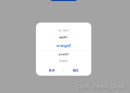
文本选择弹窗
自定义数组给用户选择
// xxx.ets@Entry@Component
struct TextPickerDialogExample {@State select:number=2private fruits:string[]=['apple1','orange2','peach3','grape4','banana5']build(){Column(){Button("TextPickerDialog").margin(20).onClick(()=>{
          TextPickerDialog.show({
            range:this.fruits,
            selected:this.select,onAccept:(value: TextPickerResult)=>{// 设置select为按下确定按钮时候的选中项index,这样当弹窗再次弹出时显示选中的是上一次确定的选项this.select = value.index
              console.info("TextPickerDialog:onAccept()"+JSON.stringify(value))},onCancel:()=>{console.info("TextPickerDialog:onCancel()")},onChange:(value: TextPickerResult)=>{console.info("TextPickerDialog:onChange()"+JSON.stringify(value))}})})}.width('100%')}}
手势处理
手势绑定
通过gesture,priorityGesture,parallelGesture来绑定手势识别,识别成功后通过事件回调通知组件
手势类型GestureType
名称描述TapGesture点击手势,支持单次点击、多次点击识别。LongPressGesture长按手势。PanGesture平移手势,滑动最小距离为5vp时识别成功。PinchGesture捏合手势。RotationGesture旋转手势。SwipeGesture滑动手势,滑动最小速度为100vp/s时识别成功。GestureGroup手势识别组,多种手势组合为复合手势,支持连续识别、并行识别和互斥识别。
TapGesture
支持单次和多次点击的识别
.gesture(TapGesture({ count:2}).onAction((event: GestureEvent)=>{this.value =JSON.stringify(event.fingerList[0])}))
LongPressGesture
触发长按手势
.gesture(LongPressGesture({ repeat:true})// 由于repeat设置为true,长按动作存在时会连续触发,触发间隔为duration(默认值500ms).onAction((event: GestureEvent)=>{if(event.repeat){this.count++}})// 长按动作一结束触发.onActionEnd(()=>{this.count =0}))
PanGesture
触发拖动手势,滑动的最小距离为5vp时拖动手势识别成功,可以设置拖动的手指数,滑动方向
.gesture(PanGesture(this.panOption).onActionStart((event: GestureEvent)=>{console.info('Pan start')}).onActionUpdate((event: GestureEvent)=>{this.offsetX =this.positionX + event.offsetX
          this.offsetY =this.positionY + event.offsetY
        }).onActionEnd(()=>{this.positionX =this.offsetX
          this.positionY =this.offsetY
          console.info('Pan end')}))//修改触发条件Button('修改PanGesture触发条件').onClick(()=>{// 将PanGesture手势事件触发条件改为双指以任意方向拖动this.panOption.setDirection(PanDirection.All)this.panOption.setFingers(2)})
PinchGesture
捏合手势
最少手指为2指,最大为5指,最小识别距离为3vp
.gesture(PinchGesture({ fingers:3})//三指触发.onActionStart((event: GestureEvent)=>{console.info('Pinch start')}).onActionUpdate((event: GestureEvent)=>{this.scaleValue =this.pinchValue * event.scale
          this.pinchX = event.pinchCenterX
          this.pinchY = event.pinchCenterY
        }).onActionEnd(()=>{this.pinchValue =this.scaleValue
          console.info('Pinch end')}))
RotationGesture
旋转手势
触发旋转手势的最少手指为2指,最大为5指,最小改变度数为1度
.gesture(RotationGesture().onActionStart((event: GestureEvent)=>{console.info('Rotation start')}).onActionUpdate((event: GestureEvent)=>{this.angle =this.rotateValue + event.angle
        }).onActionEnd(()=>{this.rotateValue =this.angle
          console.info('Rotation end')}))
SwipeGesture
滑动手势
滑动速度大于100vp/s时可识别成功。
.gesture(SwipeGesture({ direction: SwipeDirection.Vertical })//设置滑动.onAction((event: GestureEvent)=>{this.speed = event.speed
          this.rotateAngle = event.angle
        }))
吴国熙
2023.2.10
pescript
.gesture(
PinchGesture({ fingers: 3 })//三指触发
.onActionStart((event: GestureEvent) => {
console.info(‘Pinch start’)
})
.onActionUpdate((event: GestureEvent) => {
this.scaleValue = this.pinchValue * event.scale
this.pinchX = event.pinchCenterX
this.pinchY = event.pinchCenterY
})
.onActionEnd(() => {
this.pinchValue = this.scaleValue
console.info(‘Pinch end’)
})
)
## RotationGesture

旋转手势

触发旋转手势的最少手指为2指,最大为5指,最小改变度数为1度

```typescript
    .gesture(
      RotationGesture()
        .onActionStart((event: GestureEvent) => {
          console.info('Rotation start')
        })
        .onActionUpdate((event: GestureEvent) => {
          this.angle = this.rotateValue + event.angle
        })
        .onActionEnd(() => {
          this.rotateValue = this.angle
          console.info('Rotation end')
        })
      )
SwipeGesture
滑动手势
滑动速度大于100vp/s时可识别成功。
.gesture(SwipeGesture({ direction: SwipeDirection.Vertical })//设置滑动.onAction((event: GestureEvent)=>{this.speed = event.speed
          this.rotateAngle = event.angle
        }))
版权归原作者 Jenny_Ghost 所有, 如有侵权,请联系我们删除。