
一、flex布局的原理
1,flex是”flexible Box”的缩写,意为”弹性布局”;

2.当我们为父盒子设为flex布局以后,子元素的float、clear和vertical-align属性将会失效。
言而简之:flex布局原理就是通过给父盒子添加flex属性,来控制子盒子的位置和排列方式。
二、flex布局父项常见属性
- flex-direction:设置主轴的方向
- justify-content:设置主轴上的子元素排列方式
- flex-wrap:设置子元素是否换行
- align-content:设置侧轴上的子元素的排列方式(多行)
- align-items:设置侧轴上的子元素的排列方式(单行)
- flex-flow:复合属性,相当于同时设置了flex-direction和flex-wrap
三、主轴和侧轴
**1.****在flex布局中,是分为主轴和侧轴两个方向的**

默认主轴就是x轴方向,水平向右

默认侧轴方向就是y轴方向,垂直向下

**2.****属性值**

flex-direction属性决定主轴的方向(即项目的排列方向)
当然,主轴和侧轴是会变化的,就看flex-direction设置谁为主轴,剩下的就是侧轴了。但是子元素是跟着主轴来进行排列的
属性
说明
row
默认值从左到右
row-reverse
从右到左
column
从上到下
column-reverse
从下到上
<!DOCTYPE html> <html lang="en"> <head><meta charset="UTF-8">
<meta http-equiv="X-UA-Compatible" content="IE=edge">
<meta name="viewport" content="width=device-width, initial-scale=1.0">
<title>初体验</title>
<style>
div {
/*给父级添加flex,里面的行内元素就转换成了块级元素 */
display: flex;
width: 300px;
height: 150px;
background-color: skyblue;
margin: 0 auto;
/* 默认是沿着x轴排列的 */
/* flex-direction: row; */
/* 翻转,倒着排列 */
/* flex-direction: row-reverse; */
/* 设置y轴为主轴,x轴就成了侧轴 */
/* flex-direction: column; */
/* 沿y轴翻转 */
flex-direction: column-reverse;
}
div span {
width: 90px;
height: 45px;
background-color: plum;
margin: 5px;
/* flex: 1; */
}
</style>
<div>

    <span>1</span>

    <span>2</span>

    <span>3</span>

</div>
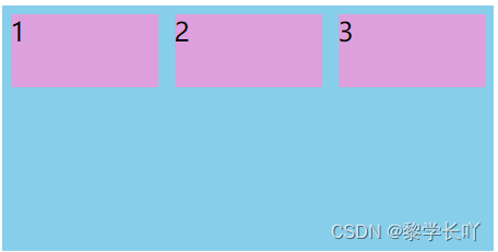
flex-direction:row;
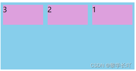
flex-direction:row-reverse;
flex-direction:column;

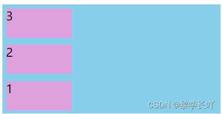
flex-direction:column-reverse;
本文转载自: https://blog.csdn.net/qq_48491815/article/details/125666881
版权归原作者 颜正义 所有, 如有侵权,请联系我们删除。
版权归原作者 颜正义 所有, 如有侵权,请联系我们删除。