
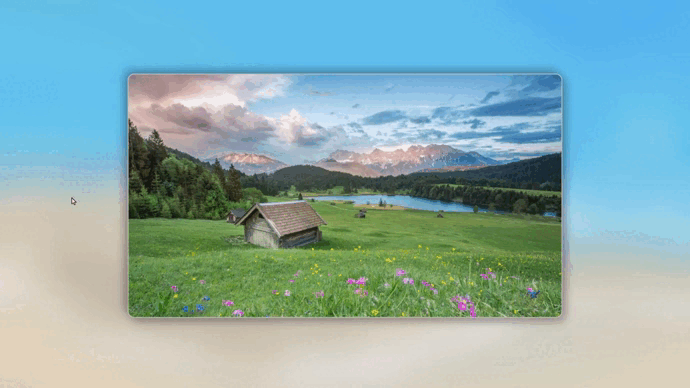
效果演示
JS 详解
HTML 和 CSS 部分放在了文章最后的源代码中,这里只对 JS 部分进行详解!
首先,需要获取操作的对象:
- 图片展示框(鼠标移入事件)
- 放大镜(显示和跟随鼠标)
- 放大镜中的图片(改变位置)
let imgShow = document.querySelector('.img-show');  // 图片展示框
let imgLarge = document.querySelector('.img-large');    // 放大镜
let img = document.querySelector('img');    // 放大镜中图片
给图片展示框添加事件监听器,鼠标移入图片展示框时,显示放大镜:
imgShow.addEventListener('mouseover', function() {
    // 鼠标移入图片时,显示放大镜
    imgLarge.style.display = "block";
});
鼠标在图片展示框中移动时的事件监听器:
imgShow.addEventListener('mousemove', function(event) {
    // 计算鼠标在图片展示框中相对位置
    let x = event.pageX - this.offsetLeft;
    let y = event.pageY - this.offsetTop;
});
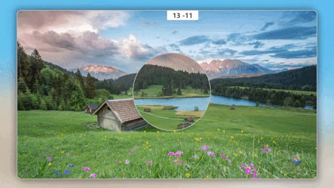
注意:打印出 x,y 的值会发现,鼠标相对图片展示框的位置会出现负值,如下图所示:
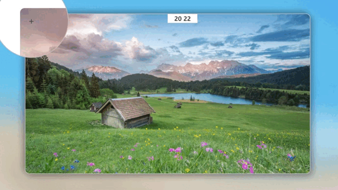
而理论上应该都是正值,这是因为图片展示框采用的是 absolute 定位,并且用 transform 进行二次平移实现了水品垂直居中,我们先暂时将 transform 的平移效果注释掉,再次打印 x,y 的值:
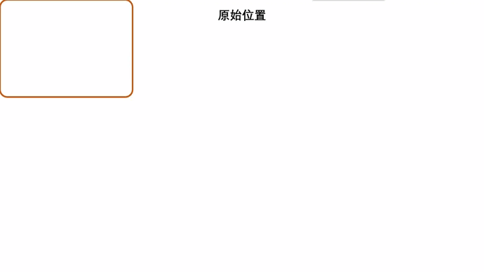
发现相对位置全部变成了正值,由此可见:transform 平移的位置是不影响 ofsetLeft 和 offsetTop 的值。对于absolute 定位,ofsetLeft 和 offsetTop 依旧使用原始位置的值,并且坐标系也不会发生改变,依旧是原始位置的左上角,这就是为什么会出现负值,用一张动图来形容一下鼠标相对位置参考坐标系:
如果理解了 x 和 y 的值如何决定,就可以进行下一步了,下面会根据 x 和 y 的值进行一些数学计算!
接下来实现放大镜跟随鼠标移动:
// 放大镜跟随鼠标移动
imgLarge.style.left = (x + 480 - 125)+'px';
imgLarge.style.top = (y + 270 - 125)+'px';
根据上述的坐标系,(x + 480)是为了让放大镜始终跟随鼠标,( - 125)是为了让鼠标始终保持在放大镜中间,因为放大镜的宽为 250px。如果不理解,可以先把 +480 和 -125 去掉查看效果,然后逐个加上去再查看效果。这里不再演示!
限制放大镜的查看范围:
// 放大镜超出范围后消失
if (x < -480 || x > 480 || y < -270 || y > 270) {
    imgLarge.style.display = "none";
}
放大镜中图片的移动:
// 放大镜中图片位置的移动
img.style.left = (-(x+480)*2 + 125)+'px';
img.style.top = (-(y+270)*2 + 125)+'px';
原理就是计算出两个图片之间的比例,然后根据鼠标在图片展示框中的相对位置,计算出放大镜中图片的位置偏移量,让放大镜中的图片实现移动。
- (x+480)回归原始位置坐标系
- *2 是两张图片的比例
- -(x+480)*2 加负号是为了同方向移动,不然移动方向是相反的,可以自行尝试!
- +125 如果不加的话你会发现放大位置和原始位置对不上,可以自行尝试!
源代码
<!DOCTYPE html>
<head>
<meta charset="UTF-8">
<title>放大镜效果</title>
<style>
* {
margin: 0;
padding: 0;
box-sizing: border-box;
}
body {
background: url(./images/bg.jpg);
background-size: cover;
}
/* 背景图片高斯模糊 */
body::after {
content: "";
position: absolute; /* 一定要用绝对定位 */
width: 100%;
height: 100%;
backdrop-filter: blur(30px); /* 模糊半径 */
z-index: -1; /* 一定要将层级调低,不然会导致整个页面高斯模糊 */
}
.img-show {
position: absolute;
top: 50%;
left: 50%;
transform: translate(-50%, -50%);
width: 960px;
height: 540px;
border: 2px solid #bebebe;
border-radius: 15px;
box-shadow: 8px 8px 20px rgba(0, 0, 0, .3), -8px -8px 20px rgba(0, 0, 0, .3);
background: url(./images/show.jpg);
background-size: cover;
}
.img-show .img-large {
display: none;
position: absolute;
width: 250px;
height: 250px;
border: 2px solid #bebebe;
border-radius: 125px;
overflow: hidden;
background-color: #fff;
}
/* 放大镜中间的准心 */
.img-show .img-large::after {
content: "+";
position: absolute;
left: 50%;
top: 50%;
transform: translate(-50%, -50%);
color: #3e3e3e;
font-size: 30px;
}
/* 放大镜显示时隐藏鼠标指针 */
.img-show .img-large:hover {
cursor: none;
}
.img-show .img-large img {
position: absolute;
width: 1920px;
border-radius: 15px;
}
</style>
</head>
<body>
<div class="img-show">
<div class="img-large">
<img src="./images/show.jpg" alt="">
</div>
</div>
<script>
// 获取需要操作的对象
let imgShow = document.querySelector('.img-show');
let imgLarge = document.querySelector('.img-large');
let img = document.querySelector('img');
// 鼠标移入图片时,显示放大镜
imgShow.addEventListener('mouseover', function() {
imgLarge.style.display = "block";
});
// 放大镜跟随鼠标移动
imgShow.addEventListener('mousemove', function(event) {
// 计算鼠标在图片展示框中相对位置
let x = event.pageX - this.offsetLeft;
let y = event.pageY - this.offsetTop;
// 放大镜跟随鼠标移动
imgLarge.style.left = (x + 480 - 125)+'px';
imgLarge.style.top = (y + 270 - 125)+'px';
// 放大镜超出范围后消失
if (x < -480 || x > 480 || y < -270 || y > 270) {
imgLarge.style.display = "none";
}
// 放大镜中图片位置的移动
img.style.left = (-(x+480)*2 + 125)+'px';
img.style.top = (-(y+270)*2 + 125)+'px';
});
</script>
</body>
</html>
本文转载自: https://blog.csdn.net/apple_54470279/article/details/124493950
版权归原作者 @半岛铁盒@ 所有, 如有侵权,请联系我们删除。
版权归原作者 @半岛铁盒@ 所有, 如有侵权,请联系我们删除。