
文章目录
导文
在 UniApp 中,自定义导航栏通常涉及到隐藏默认的导航栏,并在页面顶部添加自定义的视图组件来模拟导航栏的功能。
隐藏默认导航栏:
全局隐藏
在你的页面
pages.json
配置中,为相应的页面设置
navigationStyle
为
custom
,这将隐藏默认的导航栏。
"globalStyle":{"navigationStyle":"custom"},
当前页面隐藏
{"pages":[{"path":"pages/index/index","style":{"navigationStyle":"custom"}},// ... 其他页面配置]}
添加自定义导航栏视图:
手写导航栏
在你的页面
.vue
文件中,使用
<view>
或
<template>
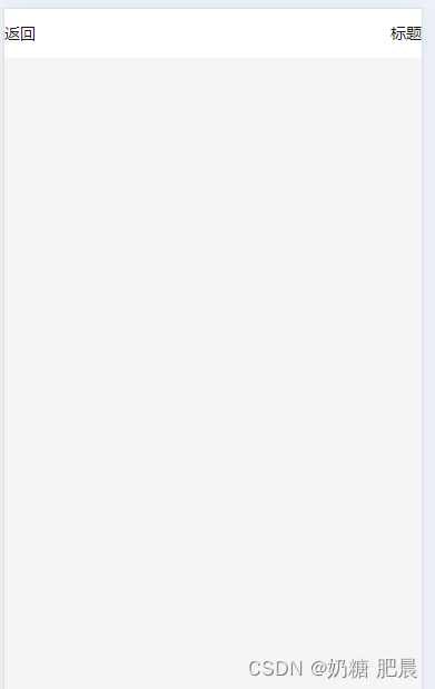
标签在页面顶部添加自定义的导航栏视图。这可以包括标题文本、返回按钮、搜索框等。
<template><viewclass="container"><viewclass="custom-nav-bar"><textclass="back-button"@click="goBack">返回</text><textclass="title">标题</text><!-- 这里可以添加其他导航栏元素 --></view><!-- 页面内容 --><viewclass="content"><!-- ... --></view></view></template><script>exportdefault{methods:{goBack(){
         uni.navigateBack();},// ... 其他方法}};</script><style>.custom-nav-bar{display: flex;justify-content: space-between;align-items: center;height: 44px;/* 根据需要调整高度 */background-color: #fff;/* 导航栏背景色 *//* 其他样式属性 */}.back-button{/* 返回按钮样式 */}.title{/* 标题样式 */}/* 其他样式 */</style>
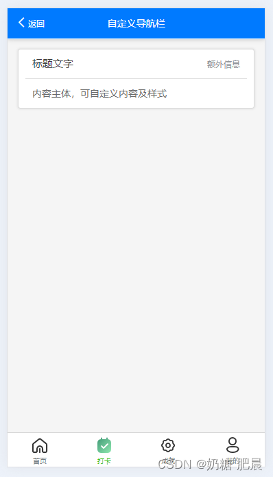
组件导航栏
使用uinapp原生的组件
<template><view class="checkIn"><view class="checkIn-date"><uni-nav-bar dark :fixed="true" shadow background-color="#007AFF" status-bar left-icon="left" left-text="返回"
            title="自定义导航栏"@clickLeft="back"/></view><view class="checkIn-main"><uni-card title="标题文字" thumbnail="" extra="额外信息" note="Tips">
                内容主体,可自定义内容及样式
            </uni-card></view></view></template><script>exportdefault{
    components:{},data(){return{}},onReady(){},
    methods:{}}</script><style></style>
官网详细配置》》
您好,我是肥晨。
欢迎关注我获取前端学习资源,日常分享技术变革,生存法则;行业内幕,洞察先机。
标签:
uni-app
本文转载自: https://blog.csdn.net/weixin_48998573/article/details/139828707
版权归原作者 奶糖 肥晨 所有, 如有侵权,请联系我们删除。
版权归原作者 奶糖 肥晨 所有, 如有侵权,请联系我们删除。