
文章目录
参考视频:
VUE项目,VUE项目实战,vue后台管理系统,前端面试,前端面试项目
案例链接【前端】Vue+Element UI案例:通用后台管理系统-导航栏(视频p1-16)https://blog.csdn.net/karshey/article/details/127640658【前端】Vue+Element UI案例:通用后台管理系统-Header+导航栏折叠(p17-19)https://blog.csdn.net/karshey/article/details/127652862【前端】Vue+Element UI案例:通用后台管理系统-Home组件:卡片、表格(p20-22)https://blog.csdn.net/karshey/article/details/127674643【前端】Vue+Element UI案例:通用后台管理系统-Echarts图表准备:axios封装、mock数据模拟实战(p23-25)https://blog.csdn.net/karshey/article/details/127735159【前端】Vue+Element UI案例:通用后台管理系统-Echarts图表:折线图、柱状图、饼状图(p27-30)https://blog.csdn.net/karshey/article/details/127737979【前端】Vue+Element UI案例:通用后台管理系统-面包屑、tag栏(p31-35)https://blog.csdn.net/karshey/article/details/127756733【前端】Vue+Element UI案例:通用后台管理系统-用户管理:Form表单填写、Dialog对话框弹出(p36-38)https://blog.csdn.net/karshey/article/details/127787418【前端】Vue+Element UI案例:通用后台管理系统-用户管理:Table表格增删查改、Pagination分页、搜索框(p39-42)https://blog.csdn.net/karshey/article/details/127777962【前端】Vue+Element UI案例:通用后台管理系统-登陆页面Login(p44)https://blog.csdn.net/karshey/article/details/127795302【前端】Vue+Element UI案例:通用后台管理系统-登陆页面功能:登录权限跳转、路由守卫、退出(p45-46)https://blog.csdn.net/karshey/article/details/127849502【前端】Vue+Element UI案例:通用后台管理系统-登陆不同用户显示不同菜单、动态添加路由(p47-48)https://blog.csdn.net/karshey/article/details/127865621【前端】Vue+Element UI案例:通用后台管理系统-项目总结https://blog.csdn.net/karshey/article/details/127867638
目标
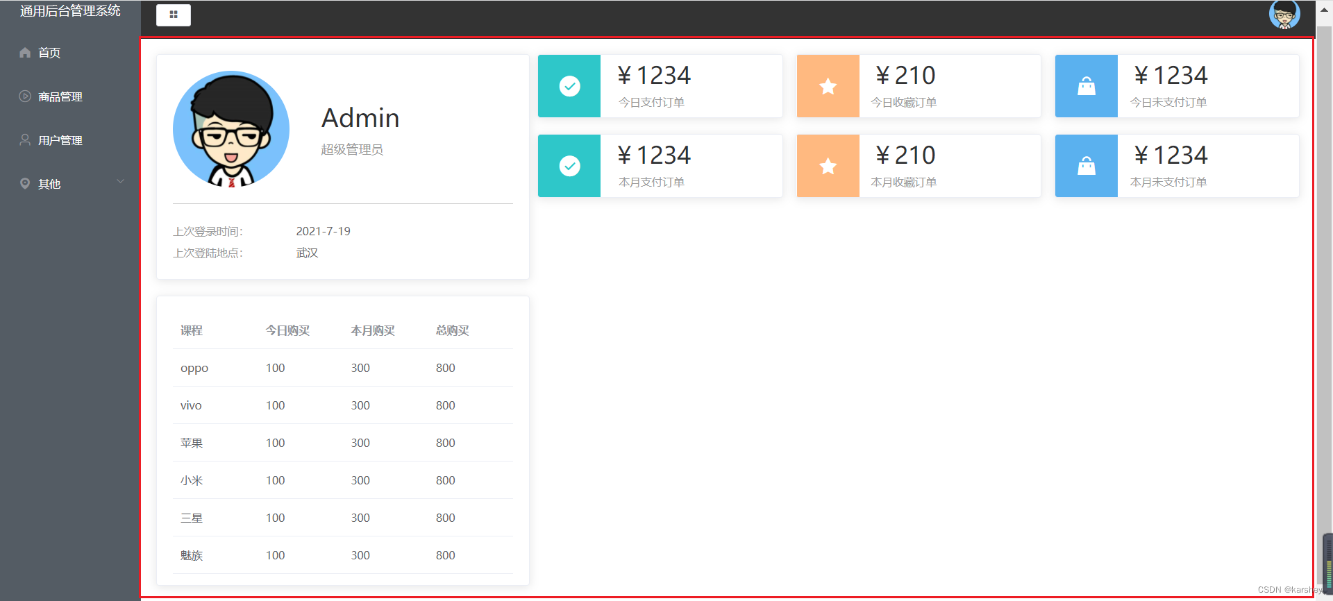
- 红框内部分
- 都是卡片,鼠标悬停会有阴影
- 左下是表格
代码
0.布局
分为左右两边,大约1:2。如果一共分为24份的话,就是8:16.
打开文档:我们可以选它,改成8:16.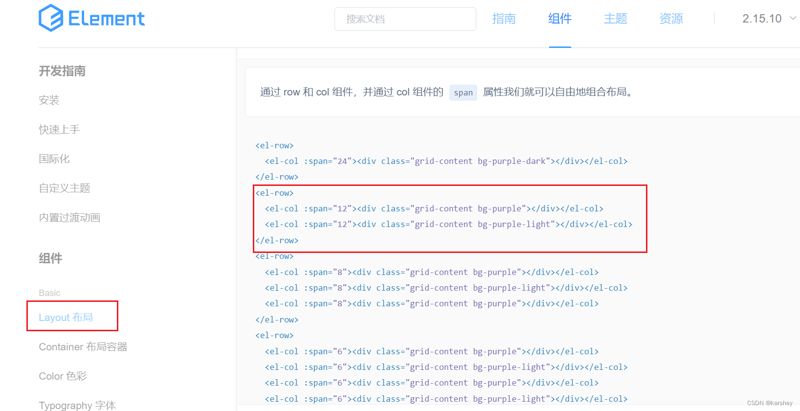
<template><el-row><el-col:span="8"><divclass="grid-content bg-purple"></div></el-col><el-col:span="16"><divclass="grid-content bg-purple-light"></div></el-col></el-row></template>
1.左上User卡片
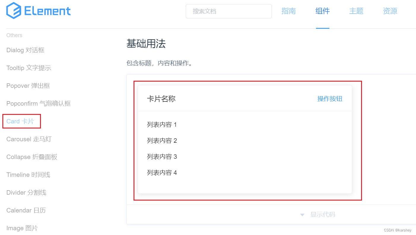
我们这里要的只是鼠标悬停产生阴影的效果,所以只用它的标签
el-card
即可。
我们把结构写上:
<el-card><divclass="user"><imgsrc="../assets/images/user.png"alt=""><divclass="userInfo"><pdivclass="name">Admin</p><pdivclass="access">超级管理员</p></div></div><divclass="loginInfo"><p>上次登录时间:<span>2021-7-19</span></p><p>上次登陆地点:<span>武汉</span></p></div></el-card></el-col>
加上样式:
.user{
    // 垂直居中
    display: flex;align-items: center;

    // 外边距:分割线距离loginInfo的距离
    margin-bottom: 20px;
    // 内边距:分割线距离User的距离
    padding-bottom: 20px;border-bottom: 1px solid #ccc;img{width: 150px;height: 150px;border-radius: 50%;margin-right: 40px;}.userInfo{.name{font-size: 32px;margin-bottom: 10px;}.access{color: #999999;}}}.loginInfo{p{line-height: 28px;font-size: 14px;color: #999999;span{color: #666666;margin-left: 60px;}}}
效果: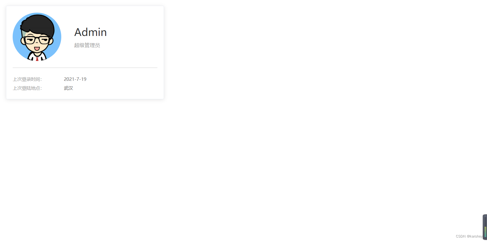
其实这里花精力比较多的地方会是样式。但样式不是本篇的重点。
2.左下table卡片
2.1数据:TableData.js
把它单独放到一个js中再导出:
const TableData =[{name:'oppo',todayBuy:100,monthBuy:300,totalBuy:800},{name:'vivo',todayBuy:100,monthBuy:300,totalBuy:800},{name:'苹果',todayBuy:100,monthBuy:300,totalBuy:800},{name:'小米',todayBuy:100,monthBuy:300,totalBuy:800},{name:'三星',todayBuy:100,monthBuy:300,totalBuy:800},{name:'魅族',todayBuy:100,monthBuy:300,totalBuy:800}]exportdefault TableData
2.2table
我们的table也要有鼠标悬停有阴影的效果,所以它也要在
el-card
里。
找到文档中的table:data是对象数据,prop用于填入数据,label是列名。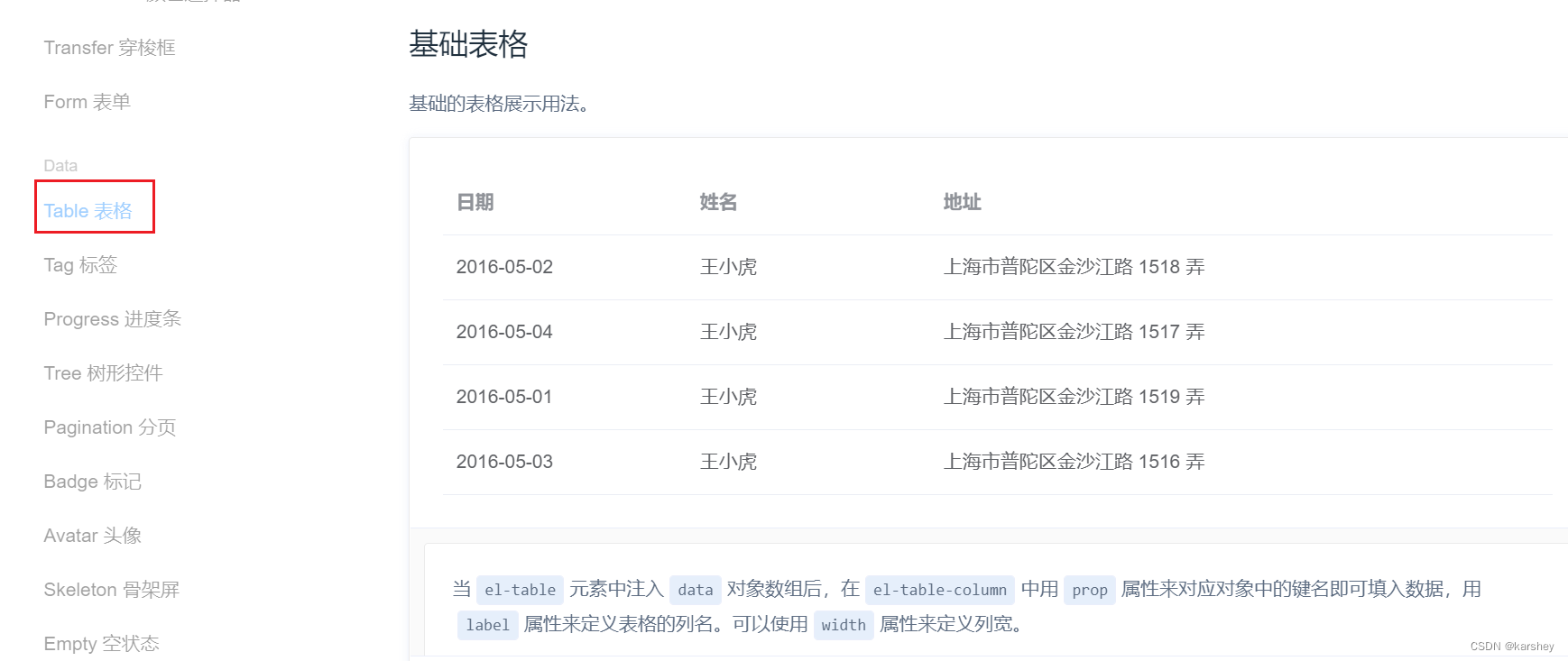
代码:
<el-cardstyle="margin-top: 20px;"><el-table:data="TableData"style="width: 100%"><el-table-columnprop="name"label="课程"></el-table-column><el-table-columnprop="todayBuy"label="今日购买"></el-table-column><el-table-columnprop="monthBuy"label="本月购买"></el-table-column><el-table-columnprop="totalBuy"label="总购买"></el-table-column></el-table></el-card>
效果:
2.3代码优化:循环
显然上述代码是重复代码,我们可以把它优化:把prop和label的值放在一个对象的键值对里:
const TableLabel={name:'课程',todayBuy:'今日购买',monthBuy:'本月购买',totalBuy:'总购买'}exportdefault TableLabel
在html里循环:
<el-cardstyle="margin-top: 20px;"><el-table:data="TableData"style="width: 100%"><!-- 这里的val,key对应的是对象里的 --><el-table-columnv-for="(value, key) in TableLabel":prop="key":label="value"></el-table-column></el-table></el-card>
3.右上数据卡片
3.1数据:CountData
const CountData =[{
        name:"今日支付订单",
        value:1234,
        icon:"success",
        color:"#2ec7c9",},{
        name:"今日收藏订单",
        value:210,
        icon:"star-on",
        color:"#ffb980",},{
        name:"今日未支付订单",
        value:1234,
        icon:"s-goods",
        color:"#5ab1ef",},{
        name:"本月支付订单",
        value:1234,
        icon:"success",
        color:"#2ec7c9",},{
        name:"本月收藏订单",
        value:210,
        icon:"star-on",
        color:"#ffb980",},{
        name:"本月未支付订单",
        value:1234,
        icon:"s-goods",
        color:"#5ab1ef",},]exportdefault CountData
3.2结构
显然我们可以用循环来写。
<divclass="num"><el-cardv-for="item in CountData":key="item.name":body-style="{ display: 'flex', padding: 0 }"><iclass="icon":class="`el-icon-${item.icon}`":style="{ backgroundColor: item.color }"></i><divclass="details"><pclass="price">{{ priceFormate(item.value) }}</p><pclass="desc">{{ item.name }}</p></div></el-card></div>
效果: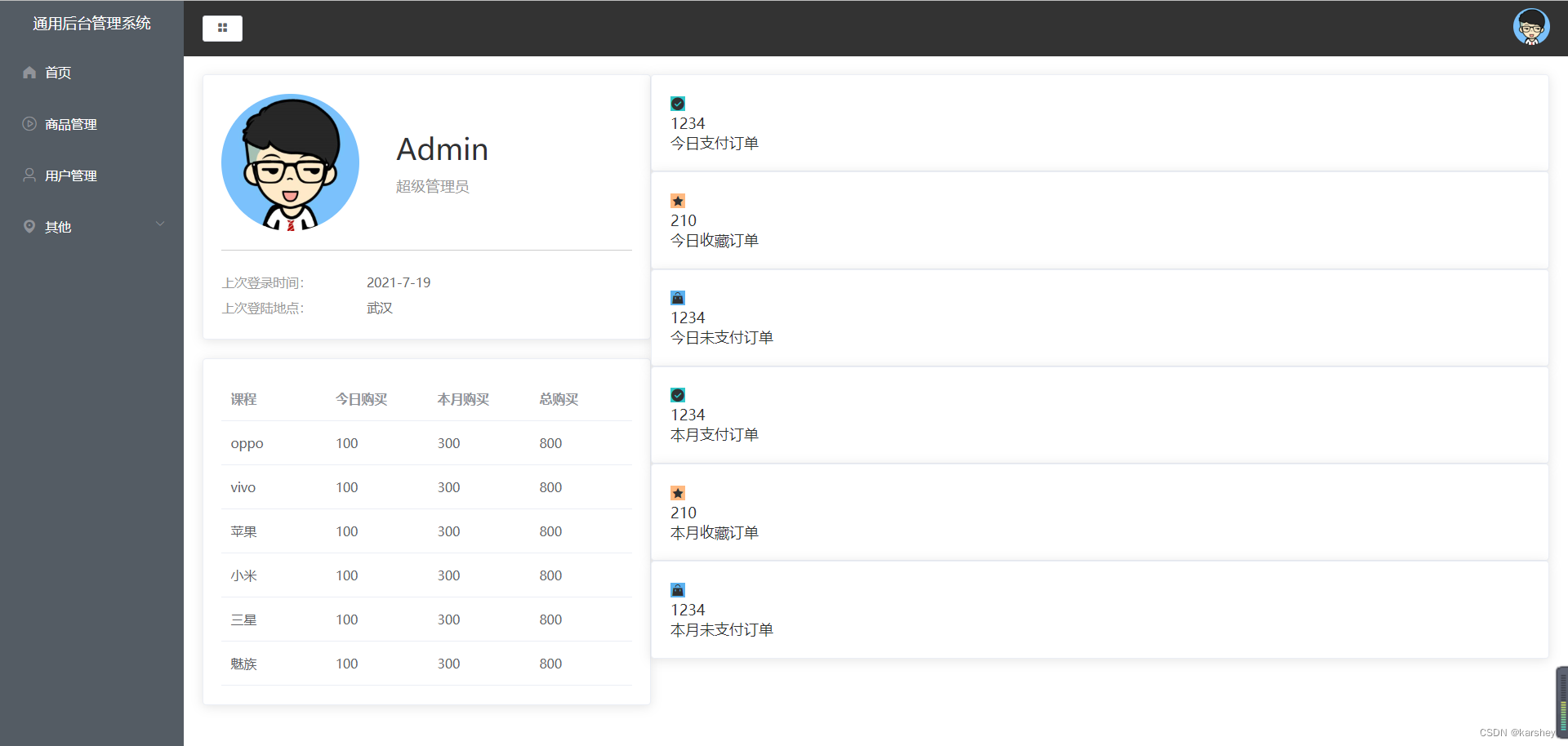
3.3布局
一行三个,显然可以flex布局,每个的width是33.3%,这是排满的情况。
如果我们想要有点间隙,那就要width是32%。
看一下文档,想给卡片设置样式,可以添加属性
body-style
: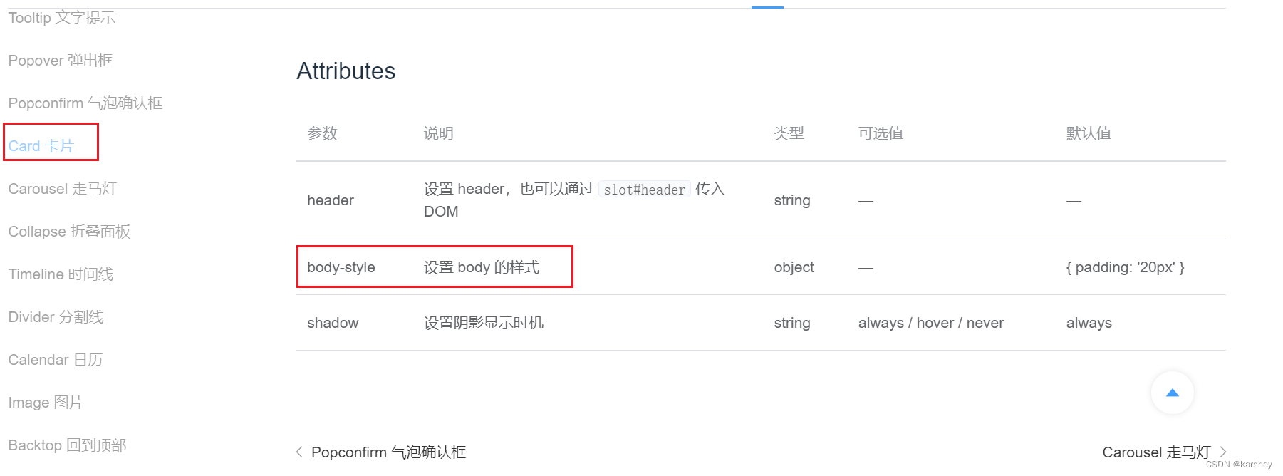
<el-cardv-for="item in CountData":key="item.name":body-style="{ display: 'flex', padding: 0 }">
css:
.num{display: flex;
    // 要换行
    flex-wrap: wrap;
    // 从头到尾均匀排列
    justify-content: space-between;margin-left:20px;.el-card{width: 32%;margin-bottom: 20px;}}
3.4样式
css:
.num{display: flex;
    // 要换行
    flex-wrap: wrap;
    // 从头到尾均匀排列
    justify-content: space-between;margin-left: 20px;.el-card{width: 32%;margin-bottom: 20px;.icon{width: 80px;height: 80px;line-height: 80px;text-align: center;font-size: 30px;color: #fff;}.details{
            // 竖着排且居中
            display: flex;flex-direction: column;justify-content: center;margin-left: 15px;.price{font-size: 30px;margin-bottom: 10px;line-height: 30px;height: 30px;}.desc{font-size: 14px;color: #999;text-align: center;}}}}
效果: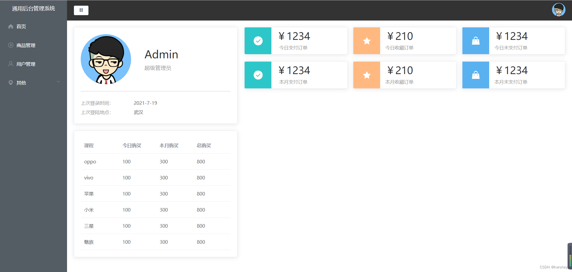
总代码
Home.vue
<template><el-row><el-col:span="8"><!-- user卡片 --><el-card><divclass="user"><imgsrc="../assets/images/user.png"alt=""><divclass="userInfo"><pdivclass="name">Admin</p><pdivclass="access">超级管理员</p></div></div><divclass="loginInfo"><p>上次登录时间:<span>2021-7-19</span></p><p>上次登陆地点:<span>武汉</span></p></div></el-card><!-- table卡片 --><el-cardstyle="margin-top: 20px;"><el-table:data="TableData"style="width: 100%"><!-- 这里的val,key对应的是对象里的 --><el-table-columnv-for="(value, key) in TableLabel":prop="key":label="value"></el-table-column></el-table></el-card></el-col><el-col:span="16"><divclass="num"><el-cardv-for="item in CountData":key="item.name":body-style="{ display: 'flex', padding: 0 }"><iclass="icon":class="`el-icon-${item.icon}`":style="{ backgroundColor: item.color }"></i><divclass="details"><pclass="price">{{ priceFormate(item.value) }}</p><pclass="desc">{{ item.name }}</p></div></el-card></div></el-col></el-row></template><script>import TableData from'../data/TableData'import TableLabel from'../data/TableLabel'import CountData from'../data/CountData'exportdefault{data(){return{
            TableData,
            TableLabel,
            CountData
        }},methods:{priceFormate(price){return"¥"+ price
        }}}</script><stylelang="less"scoped>.user{
    // 垂直居中
    display: flex;align-items: center;

    // 外边距:分割线距离loginInfo的距离
    margin-bottom: 20px;
    // 内边距:分割线距离User的距离
    padding-bottom: 20px;border-bottom: 1px solid #ccc;img{width: 150px;height: 150px;border-radius: 50%;margin-right: 40px;}.userInfo{.name{font-size: 32px;margin-bottom: 10px;}.access{color: #999999;}}}.loginInfo{p{line-height: 28px;font-size: 14px;color: #999999;span{color: #666666;margin-left: 60px;}}}.num{display: flex;
    // 要换行
    flex-wrap: wrap;
    // 从头到尾均匀排列
    justify-content: space-between;margin-left: 20px;.el-card{width: 32%;margin-bottom: 20px;.icon{width: 80px;height: 80px;line-height: 80px;text-align: center;font-size: 30px;color: #fff;}.details{
            // 竖着排且居中
            display: flex;flex-direction: column;justify-content: center;margin-left: 15px;.price{font-size: 30px;margin-bottom: 10px;line-height: 30px;height: 30px;}.desc{font-size: 14px;color: #999;text-align: center;}}}}</style>
参考
视频p20-p22
版权归原作者 karshey 所有, 如有侵权,请联系我们删除。