
先上效果视频:
演示视频
基本思路:
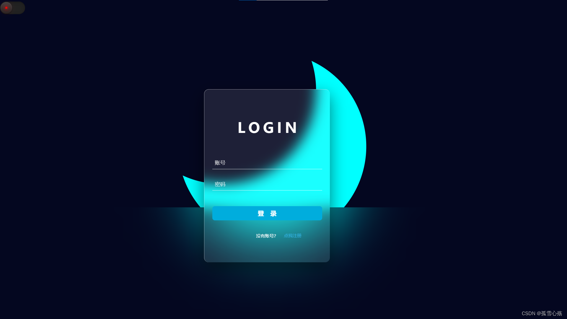
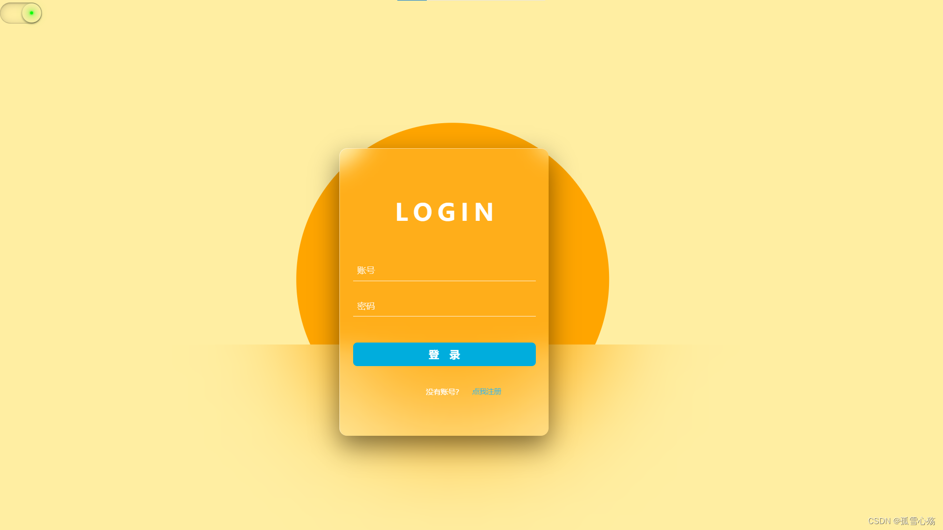
一:日月切换模块
- 用阴影画出太阳和月亮
2.用transform: translate; transform: rotate;两个属性实现日月交换效果
3.使用<label for="" hidden>标签实现左上角滑块与复选按钮的链接
4.用兄弟选择器“~”实现一个元素对另一个元素的控制
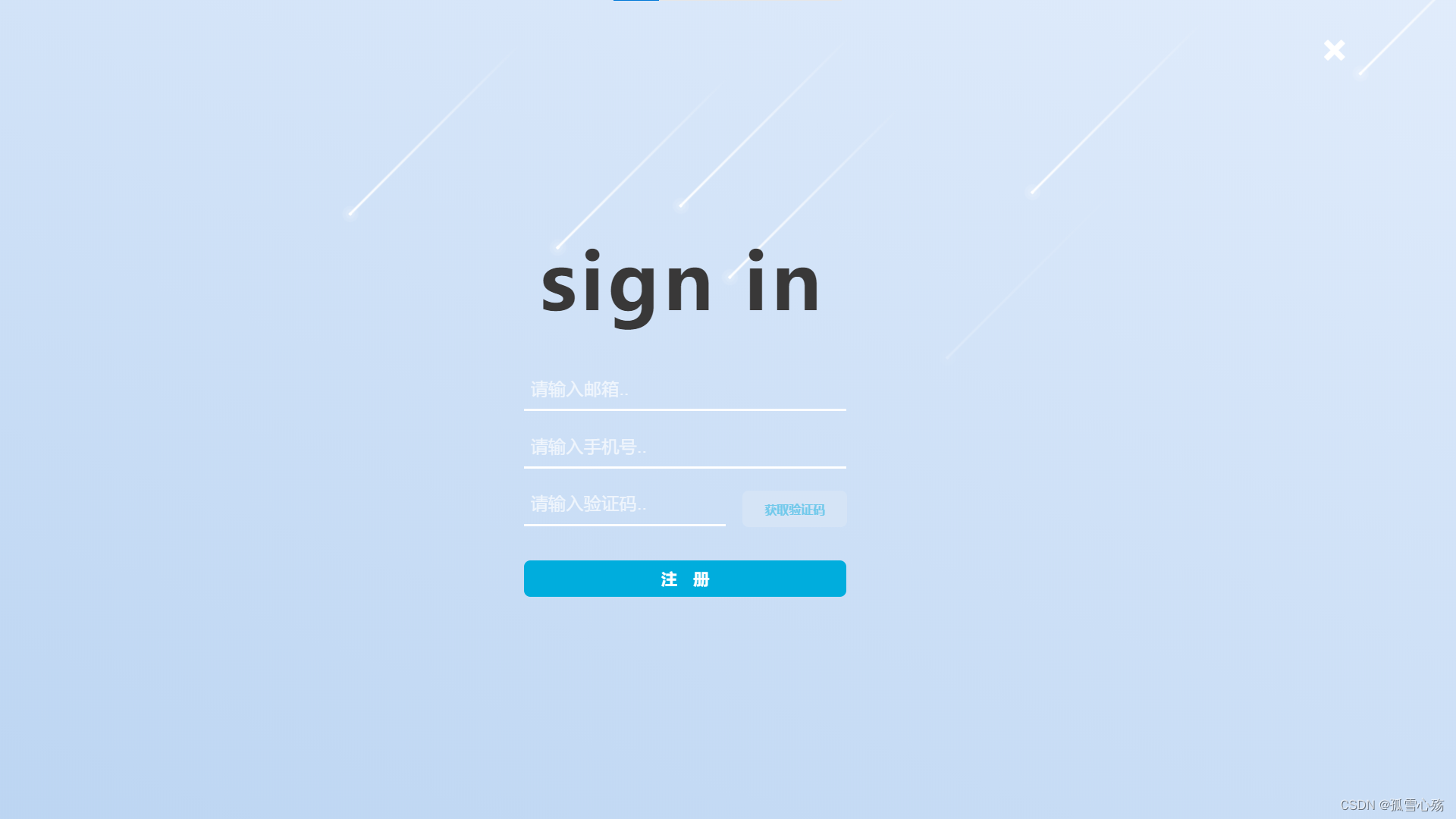
二:注册界面模块
1.使用z-index属性,使注册界面元素全部位于登陆界面之上
2.把注册界面大盒子用clip-path: circle裁剪为一个圆形
3.用<label>元素实现“点我注册”与复选按钮的链接
4.给各元素加过渡效果
5.使用point-event:none属性,使展示注册页面时,底层的登陆界面事件不会生效
其他模块的思路都比较简单,看一下代码和里面的注释基本上就能看懂
具体的实现方法,见下面的代码:
HTML:
<!DOCTYPE html>
<html>
<meta charset="UTF-8">
<meta http-equiv="X-UA-Compatible" content="IE=edge">
<meta name="viewport" content="width=device-width, initial-scale=1.0">
<title>登陆界面</title>
<link rel="stylesheet" href="login.css">
</head>
<body class="container2">
<!-- 按钮模块 -->
<input type="checkbox" id="a12" hidden>
<i class="indicator"></i>
<label class="c2" for="a12"></label>
<!-- 日月交替模块 -->
<div id="container" class="dark">
<div class="bg"></div>
<div class="moon-box">
<div class="moon"></div>
</div>
<div class="sun-box">
<div class="sun"></div>
</div>
<div class="sea"></div>
</div>
<!-- 登录模块 -->
<div class="form-box">
<div class="tit">login</div>
<input type="text" placeholder="账号">
<input type="password" placeholder="密码">
<button>登录</button>
<span>
没有账号?
</span>
</div>
<!-- 注册特效模块 -->
<div class="sign">
<input type="checkbox" id="search_btn" hidden>
<label class="search-btn" for="search_btn">
<i class="search" aria-hidden="true">点我注册</i>
</label>
<label class="close-btn" for="search_btn">
<i class="close" aria-hidden="true"></i>
</label>
<div class="container3">
<!-- 注册界面 -->
<!-- 流星 -->
<div class="container4">
<span></span>
<span></span>
<span></span>
<span></span>
<span></span>
<span></span>
<span></span>
<span></span>
<span></span>
<span></span>
</div>
<h2 class="signin"><span>sign in</span></h2>
<div class="search-box s1">
<input type="text" placeholder="请输入邮箱..">
<!-- <i class="search fa" aria-hidden="true">1</i> -->
<!-- aria-hidden方便无障碍模式阅读 -->
</div>
<div class="search-box s1 s2">
<input type="text" placeholder="请输入手机号..">
</div>
<div class="search-box s1 s3">
<input type="text" placeholder="请输入验证码..">
<button class="verification-code">获取验证码</button>
<button class="sign-btn">注册</button>
</div>
<!-- 利用这个盒子,把底下的checked/hover事件全盖住,嘿嘿嘿 -->
<div class="shade"></div>
</div>
</body>
</html>
CSS:
@font-face {
    font-family: 'icomoon';
    src: url('fonts/icomoon.eot?1tb2pa');
    src: url('fonts/icomoon.eot?1tb2pa#iefix') format('embedded-opentype'),
        url('fonts/icomoon.ttf?1tb2pa') format('truetype'),
        url('fonts/icomoon.woff?1tb2pa') format('woff'),
        url('fonts/icomoon.svg?1tb2pa#icomoon') format('svg');
    font-weight: normal;
    font-style: normal;
    font-display: block;
}

body {
    /* 初始化 取消内外边距 */
    margin: 0;
    padding: 0;
    overflow: hidden;
    zoom: 85%;
}

button {
    /* 去除按钮自带样式 */
    border: none !important;
    outline: none !important;
}

#container {
    /* 100%窗口高度 */
    height: 100vh;
}

.bg {
    /* 绝对定位 */
    position: absolute;
    top: 0;
    left: 0;
    width: 100%;
    height: 100%;
}

.sun {
    margin: 0;
    padding: 0;
    /* 绝对定位 水平垂直居中 */
    position: absolute;
    top: 500px;
    left: 48%;
    transform: translate(-50%, -50%);
    width: 600px;
    height: 600px;
    background: orange;
    border-radius: 50%;
}

.moon {
    margin: 0;
    padding: 0;
    position: absolute;
    top: 54%;
    left: 48%;
    /* 计算得出月亮的位置 */
    transform: translate(calc(-50% + -160px), calc(-50% + -180px));
    width: 600px;
    height: 600px;
    /* 通过阴影绘制月亮 */
    box-shadow: 160px 180px 0 cyan;
    border-radius: 50%;
}

.sea {
    position: absolute;
    bottom: 0;
    width: 100%;
    height: 35%;
    /* 背景模糊制造大海的感觉 */
    backdrop-filter: blur(100px);
    -webkit-backdrop-filter: blur(100px);
    z-index: 100;
}

.sun,
.moon,
.sun-box,
.moon-box,
.bg {
    /* 添加动画过渡 */
    transition: all 1s ease-in-out;
}

.sun-box,
.moon-box {
    /* 相对定位 */
    position: relative;
    /* 溢出隐藏 */
    /* overflow: hidden; */
}

.light .bg {
    background: #ffeea2;
}

/* 夜晚 */
.dark .sun-box {
    height: 0;
}

.dark .moon-box {
    height: 100%;
}

.dark .bg {
    background: #040720;
}

/* ................................................. */
/* ....................按钮模块..................... */
/* ...... ..........................................*/

.container2 .c2 {
    /* 相对定位 */
    /* position: relative; */
    transition: 1s;
    z-index: 1;
    float: left;
    margin: 5px 0;
    cursor: pointer;
    position: relative;
    display: block;
    width: 80px;
    height: 40px;
    background-color: #222;
    border-radius: 40px;
    /* 内阴影 */
    box-shadow: inset 0 2px 15px rgba(0, 0, 0, 0.2),
        inset 0 2px 2px rgba(0, 0, 0, 0.2),
        inset 0 -1px 1px rgba(0, 0, 0, 0.2);
}

/* 滑块 */
.container2 .indicator {
    /* 绝对定位 */
    position: absolute;
    z-index: 2;
    left: 0px;
    top: 5px;
    width: 40px;
    height: 40px;
    /* 渐变背景 */
    background: linear-gradient(to bottom, #444, #222);
    border-radius: 50%;
    /* 阴影 */
    box-shadow: 0 2px 5px rgba(0, 0, 0, 0.5),
        inset 0 1px 1px rgba(255, 255, 255, 0.1);
    /* 缩小 */
    transform: scale(0.9);
    /* 动画过渡 */
    transition: 1s;
    /* 鼠标事件取消 */
    pointer-events: none;
}

/* 滑块中心发光点 */
.container2 .indicator::before {
    content: "";
    width: 5px;
    height: 5px;
    /* 绝对定位 居中 */
    position: absolute;
    left: 50%;
    top: 50%;
    transform: translate(-50%, -50%);
    background-color: #f00;
    border-radius: 50%;
    /* 阴影制造发光效果 */
    box-shadow: 0 0 2px #f00,
        0 0 5px #f00,
        0 0 10px #f00,
        0 0 15px #f00,
        0 0 20px #f00,
        0 0 25px #f00,
        0 0 30px #f00,
        0 0 35px #f00;
    transition: 0.5s;
}

/* 勾选复选框后滑块的变化 */
.container2 input:checked~.indicator {
    left: 40px;
}

.container2 input:checked~.indicator::before {
    background-color: #0f0;
    box-shadow: 0 0 2px #0f0,
        0 0 5px #0f0,
        0 0 10px #0f0,
        0 0 15px #0f0,
        0 0 20px #0f0,
        0 0 25px #0f0,
        0 0 30px #0f0,
        0 0 35px #0f0;
}

.container2 input:checked~.dark .sun-box {
    height: 100% !important;
}

.container2 input:checked~.dark .sun {
    top: 62%;
}

.container2 input:checked~.dark .moon-box {
    height: 0 !important;
    transform-origin: -10px;
    transform: rotate(-90deg);
}

.container2 input:checked~.dark .bg {
    background: #ffeea2;
}

.container2 input:checked~label {
    background-color: #ffeea2;
}

.container2 input:checked~.indicator {
    background: #ffeea2;
    box-shadow: 0 0 .5;
}

/* ................................................. */
/* ....................登录模块...................... */
/* ...... ..........................................*/

.form-box {
    /* transform: scale(0.7, 0.7);   */
    /* zoom: 90%; */
    position: fixed;
    top: 28%;
    left: 36%;
    width: 400px;
    height: 550px;
    z-index: 101;
    background-color: rgba(255, 255, 255, 0.1);
    /* 背景模糊 */
    backdrop-filter: blur(20px);
    border-top: 1px solid rgba(255, 255, 255, 0.5);
    border-left: 1px solid rgba(255, 255, 255, 0.5);
    border-radius: 15px;
    display: flex;
    flex-direction: column;
    align-items: center;
    /* 阴影 */
    box-shadow: 0px 20px 50px rgba(0, 0, 0, 0.5);
}

.form-box .tit {
    cursor: default;
    color: #fff;
    font-size: 45px;
    font-weight: bold;
    /* 大写 */
    text-transform: uppercase;
    /* 字间距 */
    letter-spacing: 10px;
    text-indent: 10px;
    margin: 90px auto 50px auto;
}

.form-box input {
    width: 350px;
    height: 35px;
    font-size: 17px;
    background: transparent;
    text-indent: 8px;
    border: none;
    border-bottom: 1px solid rgba(255, 255, 255, 0.8);
    margin: 15px auto;
    outline: none;
    color: #fff;
}

.form-box input::placeholder {
    color: rgba(255, 255, 255, 0.8);
}

.form-box button {
    font-size: 20px;
    width: 350px;
    height: 45px;
    margin: 35px auto 40px auto;
    border: none;
    background: #00addd;
    color: #fff;
    letter-spacing: 20px;
    text-indent: 20px;
    border-radius: 8px;
    font-weight: bold;
    cursor: pointer;
}

.form-box button:hover {
    transition: .5s;
    background: #0098d4;
    letter-spacing: 50px;
    text-indent: 45px;
}

.form-box span {
    font-size: 14px;
    color: #fff;
}

.form-box a {
    color: #00addd;
    text-decoration: none;
}

/* .............................................. */
/* ....................注册特效................... */
/* ...............................................*/
.search,
.close {
    font-family: 'icomoon';
    white-space: nowrap;
    font-style: normal;
    text-align: center;
}

.search:hover {
    text-decoration: underline;
}

.close {
    transition: .3s;
}

.close:hover {
    color: #f55858;
}

.search {
    font-size: 14px;
    color: #33b7eb;
}

/* 注册按钮 */
.search-btn {
    pointer-events: all;
    z-index: 301;
    font-style: normal;
    position: absolute;
    top: 79.2%;
    left: 59%;
    width: 50px;
    height: 50px;
    line-height: 60px;
    text-align: center;
    cursor: pointer;
}

/* 关闭按钮 */
.close-btn {
    background: none !important;
    pointer-events: all;
    position: absolute;
    top: -238px;
    right: -600px;
    z-index: 302;
    font-size: 25px;
    color: #fff;
    cursor: pointer;
    display: none;
}

.container3 {
    /* zoom: 80%; */
    z-index: 301;
    position: absolute;
    background: linear-gradient(200deg, #e7f0fd, #accbee);
    top: -97%;
    left: -180%;
    width: 2000px;
    height: 2000px;
    /* background-color: darkgrey; */
    /* 渐变背景 */
    /* background: linear-gradient(200deg, #6e86ee, #453c90); */
    /* 将元素剪切为一个圆形 【25px表示圆的半径】 【50% 50%表示圆心位置】 */
    clip-path: circle(40px at 50% 50%);
    /* clip-path: inset(975px 975px round 15px); */
    /* 设置过渡 */
    transition: .9s;
    opacity: 0;
}

.search-box {
    z-index: 303;
    /* 默认宽度为0(隐藏) */
    position: fixed;
    top: 0%;
    left: 0%;
    width: 0;
    height: 50px;
    border-bottom: 3px solid #fff;
    transition: 0.3s;
}

.search-box input {
    width: 100%;
    height: 50px;
    background: none;
    border: none;
    outline: none;
    color: #fff;
    font-size: 22px;
    font-weight: 500;
    /* 请输入前的缩进 */
    text-indent: 8px;
}

.search-box input::placeholder {
    color: rgba(255, 255, 255, 0.7);
}

.search-box .fa {
    width: 50px;
    height: 50px;
    line-height: 50px;
    color: #fff;
    font-size: 22px;
    text-align: center;
    cursor: pointer;
}

#search_btn:checked~.search-btn {
    display: none;
}

#search_btn:checked~.container3 .shade {
    pointer-events: all;
    position: fixed;
    top: 28%;
    left: 36%;
    width: 400px;
    height: 550px;
    z-index: 120;
}

#search_btn:checked~.close-btn {
    display: block;
}

#search_btn:checked~.container3 {
    opacity: 1;
    clip-path: circle(100%);
}

#search_btn:checked~.container3 .search-box {
    width: 400px;
}

.sign {
    pointer-events: none;
    position: fixed;
    top: 28%;
    left: 37%;
    width: 400px;
    height: 550px;
    z-index: 300;
    /* 100%窗口高度 */
    /* 弹性布局 水平+垂直居中 */
    /* display: flex;
    justify-content: center;
    align-items: center; */
}

/* ................................................. */
/* ....................注册界面...................... */
/* ...... ..........................................*/

.signin {
    pointer-events: all;
    position: fixed;
    top: 20%;
    left: 37%;
    z-index: 330;
    font-size: 96px;
    color: #393838;
    font-weight: bold;
    letter-spacing: 5px;
    cursor: pointer;
}

.signin span {
    /* 动画过渡 */
    transition: 0.5s;
}

.signin:hover span {
    margin-right: 10px;
}

.signin:hover span::after {
    font-size: 20px;
    content: " us";
}

.signin:hover span {
    color: #fff;
    /* 文字阴影 */
    text-shadow: 0 0 10px #fff,
        0 0 20px #fff,
        0 0 40px #fff,
        0 0 80px #fff,
        0 0 120px #fff,
        0 0 160px #fff;
}

.s1 {
    pointer-events: all;
    position: fixed;
    float: left;
    top: 45%;
    left: 36%;
}

.s2 {
    top: 52%;
}

.s3 {
    width: 250px !important;
    top: 59%;
}

.s3 button {
    position: fixed;
    pointer-events: all !important;
    font-style: normal;
    top: 56.5%;
    left: 51%;
    font-size: 15px;
    width: 130px;
    height: 45px;
    margin: 35px auto 40px auto;
    border: none;
    background-color: #d5e4f6;
    color: #71c9eb;
    /* letter-spacing: 20px;
    text-indent: 20px; */
    border-radius: 8px;
    font-weight: bold;
    cursor: pointer;
    transition: .5s;
}

.s3 .verification-code:hover {
    background-color: #5abce6;
    color: #d5e4f6;
}

.sign-btn-box {
    overflow: hidden;
    color: #00aeff;
    border: 2px solid #00aeff;
}

.s3 .sign-btn {
    font-size: 20px;
    position: fixed;
    top: 65%;
    left: 36%;
    width: 400px;
    background: #00addd;
    color: #fff;
    letter-spacing: 20px;
    text-indent: 20px;
    border-radius: 8px;
    font-weight: bold;
    cursor: pointer;
}

.s3 .sign-btn:hover {
    transition: .5s;
    background: #0098d4;
    letter-spacing: 50px;
    text-indent: 45px;
}

/* 流星特效 */

.container4 span {
    position: absolute;
    top: 50%;
    left: 50%;
    width: 4px;
    height: 4px;
    background-color: #fff;
    border-radius: 50%;
    /* 发光效果 */
    box-shadow: 0 0 0 4px rgba(255, 255, 255, 0.1),
        0 0 0 8px rgba(255, 255, 255, 0.1),
        0 0 20px rgba(255, 255, 255, 1);
    /* 执行动画 */
    animation: animate 3s linear infinite;
}

/* 拖尾效果 */
.container4 span::before {
    content: "";
    position: absolute;
    top: 50%;
    transform: translateY(-50%);
    width: 300px;
    height: 3px;
    background: linear-gradient(90deg, #fff, transparent);
}

/* 分别为每一个流星设置位置、动画延迟时间、动画时长 */
.container4 span:nth-child(1) {
    top: 0;
    right: 0;
    /* initial关键字用于设置CSS属性为它的默认值 */
    /* 这个东西可以用来强制覆盖前面设置的属性 */
    /* left的初始值为auto,所以就相当于left:auto */
    left: initial;
    /* 动画延迟时间 */
    animation-delay: 0s;
    /* 动画时长 */
    animation-duration: 1s;
}

.container4 span:nth-child(2) {
    top: 0;
    right: 80px;
    left: initial;
    animation-delay: 0.2s;
    animation-duration: 3s;
}

.container4 span:nth-child(3) {
    top: 80px;
    right: 0;
    left: initial;
    animation-delay: 0.4s;
    animation-duration: 2s;
}

.container4 span:nth-child(4) {
    top: 0;
    right: 180px;
    left: initial;
    animation-delay: 0.6s;
    animation-duration: 1.5s;
}

.container4 span:nth-child(5) {
    top: 0;
    right: 400px;
    left: initial;
    animation-delay: 0.8s;
    animation-duration: 2.5s;
}

.container4 span:nth-child(6) {
    top: 0;
    right: 600px;
    left: initial;
    animation-delay: 1s;
    animation-duration: 3s;
}

.container4 span:nth-child(7) {
    top: 300px;
    right: 0;
    left: initial;
    animation-delay: 1.2s;
    animation-duration: 1.75s;
}

.container4 span:nth-child(8) {
    top: 0;
    right: 700px;
    left: initial;
    animation-delay: 1.4s;
    animation-duration: 1.25s;
}

.container4 span:nth-child(9) {
    top: 0;
    right: 1000px;
    left: initial;
    animation-delay: 0.75s;
    animation-duration: 2.25s;
}

.container4 span:nth-child(10) {
    top: 0;
    right: 450px;
    left: initial;
    animation-delay: 2.75s;
    animation-duration: 2.25s;
}

/* 流星坠落动画 */
@keyframes animate {
    0% {
        transform: rotate(315deg) translateX(0);
        opacity: 1;
    }

    90% {
        opacity: 1;
    }

    100% {
        transform: rotate(315deg) translateX(-1000px);
        opacity: 0;
    }
}
注:里面使用到了iocmoon中的字体图标,需要的可自行前往icomoon网站下载
灵感来源:
B站大佬艾恩小灰灰https://space.bilibili.com/13604667/
本文转载自: https://blog.csdn.net/lonely__snow/article/details/129348203
版权归原作者 孤雪心殇 所有, 如有侵权,请联系我们删除。
版权归原作者 孤雪心殇 所有, 如有侵权,请联系我们删除。