
鸿蒙开发-序言
鸿蒙开发-工具
鸿蒙开发-初体验
鸿蒙开发-运行机制
鸿蒙开发-运行机制-Stage模型
鸿蒙开发-UI
鸿蒙开发-UI-组件
鸿蒙开发-UI-组件-状态管理
鸿蒙开发-UI-应用-状态管理
鸿蒙开发-UI-渲染控制
鸿蒙开发-UI-布局
文章目录
前言
上文学习了鸿蒙开发UI布局相关的知识,简单介绍了布局的分类。本文详细学习其中一种常见布局方式-线性布局。
一、基本概念
开发中最常用的布局,通过线性容器Row和Column构建,其子元素在线性方向上(Row:水平方向和Column:垂直方向)依次排列。
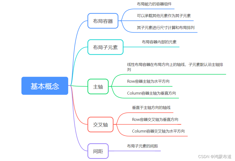
二、布局子元素
1.子元素排列方向上的间距
布局容器内,可以通过space属性设置排列方向上子元素的间距,使各子元素在排列方向上有等间距效果
Column容器内排列方向上的间距
Column({ space: 20 }) {
  Text('space: 20').fontSize(15).fontColor(Color.Gray).width('90%')
  Row().width('90%').height(50).backgroundColor(0xF5DEB3)
  Row().width('90%').height(50).backgroundColor(0xD2B48C)
  Row().width('90%').height(50).backgroundColor(0xF5DEB3)
}.width('100%')

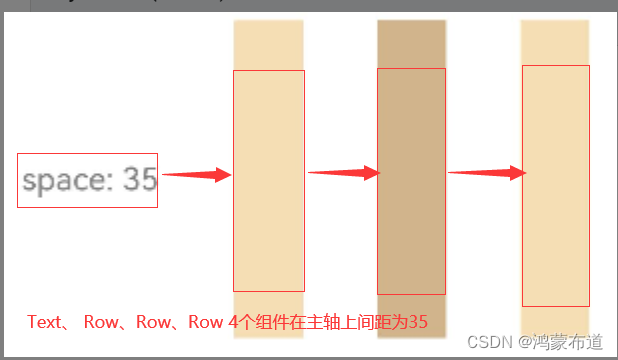
Row容器内排列方向上的间距
Row({ space: 35 }) {
  Text('space: 35').fontSize(15).fontColor(Color.Gray)
  Row().width('10%').height(150).backgroundColor(0xF5DEB3)
  Row().width('10%').height(150).backgroundColor(0xD2B48C)
  Row().width('10%').height(150).backgroundColor(0xF5DEB3)
}.width('90%')
2.子元素交叉轴上的对齐方式
布局容器内,可以通过alignItems属性设置子元素在交叉轴(排列方向的垂直方向)上的对齐方式,且在各类尺寸屏幕中,表现一致。其中,交叉轴为垂直方向时使用VerticalAlign,交叉轴为水平方向使用HorizontalAlign。
alignSelf属性用于控制单个子元素在容器交叉轴上的对齐方式,其优先级高于alignItems属性,如果设置了alignSelf属性,则在单个子元素上会覆盖alignItems属性。
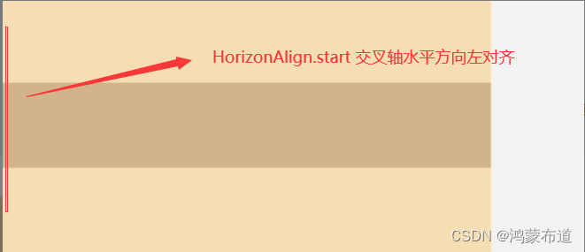
Column容器内子元素在水平方向上的排列
HorizontalAlign.Start:子元素在水平方向左对齐
Column() {
  Column() {
  }.width('80%').height(50).backgroundColor(0xF5DEB3)

  Column() {
  }.width('80%').height(50).backgroundColor(0xD2B48C)

  Column() {
  }.width('80%').height(50).backgroundColor(0xF5DEB3)
}.width('100%').alignItems(HorizontalAlign.Start).backgroundColor('rgb(242,242,242)')
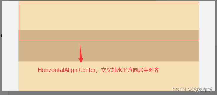
HorizontalAlign.Center:子元素在水平方向居中对齐
Column() {
  Column() {
  }.width('80%').height(50).backgroundColor(0xF5DEB3)

  Column() {
  }.width('80%').height(50).backgroundColor(0xD2B48C)

  Column() {
  }.width('80%').height(50).backgroundColor(0xF5DEB3)
}.width('100%').alignItems(HorizontalAlign.Center).backgroundColor('rgb(242,242,242)')
HorizontalAlign.End:子元素在水平方向右对齐
Column() {
  Column() {
  }.width('80%').height(50).backgroundColor(0xF5DEB3)

  Column() {
  }.width('80%').height(50).backgroundColor(0xD2B48C)

  Column() {
  }.width('80%').height(50).backgroundColor(0xF5DEB3)
}.width('100%').alignItems(HorizontalAlign.End).backgroundColor('rgb(242,242,242)')

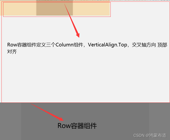
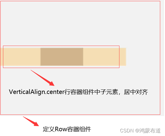
Row容器内子元素在垂直方向上的排列
VerticalAlign.Top:子元素在垂直方向顶部对齐
Row() {
  Column() {
  }.width('20%').height(30).backgroundColor(0xF5DEB3)

  Column() {
  }.width('20%').height(30).backgroundColor(0xD2B48C)

  Column() {
  }.width('20%').height(30).backgroundColor(0xF5DEB3)
}.width('100%').height(200).alignItems(VerticalAlign.Top).backgroundColor('rgb(242,242,242)')
VerticalAlign.Center:子元素在垂直方向居中对齐
Row() {
  Column() {
  }.width('20%').height(30).backgroundColor(0xF5DEB3)

  Column() {
  }.width('20%').height(30).backgroundColor(0xD2B48C)

  Column() {
  }.width('20%').height(30).backgroundColor(0xF5DEB3)
}.width('100%').height(200).alignItems(VerticalAlign.Center).backgroundColor('rgb(242,242,242)')
VerticalAlign.Bottom:子元素在垂直方向底部对齐
Row() {
  Column() {
  }.width('20%').height(30).backgroundColor(0xF5DEB3)

  Column() {
  }.width('20%').height(30).backgroundColor(0xD2B48C)

  Column() {
  }.width('20%').height(30).backgroundColor(0xF5DEB3)
}.width('100%').height(200).alignItems(VerticalAlign.Bottom).backgroundColor('rgb(242,242,242)')

3.子元素主轴上的排列方式
布局容器内,可以通过justifyContent属性设置子元素在容器主轴上的排列方式。可以从主轴起始位置开始排布,也可以从主轴结束位置开始排布,或者均匀分割主轴的空间
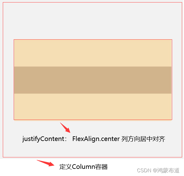
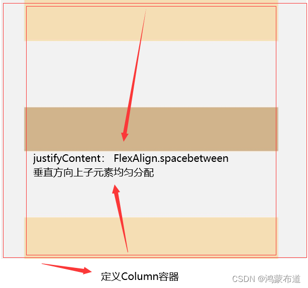
Column容器内子元素在垂直方向上的排列
justifyContent(FlexAlign.Start):元素在垂直方向首端对齐,第一个元素与行首对齐,同时后续的元素与前一个对齐
Column() {
  Column() {
  }.width('80%').height(50).backgroundColor(0xF5DEB3)

  Column() {
  }.width('80%').height(50).backgroundColor(0xD2B48C)

  Column() {
  }.width('80%').height(50).backgroundColor(0xF5DEB3)
}.width('100%').height(300).backgroundColor('rgb(242,242,242)').justifyContent(FlexAlign.Start)

justifyContent(FlexAlign.Center):元素在垂直方向中心对齐,第一个元素与行首的距离与最后一个元素与行尾距离相同
Column() {
  Column() {
  }.width('80%').height(50).backgroundColor(0xF5DEB3)

  Column() {
  }.width('80%').height(50).backgroundColor(0xD2B48C)

  Column() {
  }.width('80%').height(50).backgroundColor(0xF5DEB3)
}.width('100%').height(300).backgroundColor('rgb(242,242,242)').justifyContent(FlexAlign.Center)
justifyContent(FlexAlign.End):元素在垂直方向尾部对齐,最后一个元素与行尾对齐,其他元素与后一个对齐
Column() {
  Column() {
  }.width('80%').height(50).backgroundColor(0xF5DEB3)

  Column() {
  }.width('80%').height(50).backgroundColor(0xD2B48C)

  Column() {
  }.width('80%').height(50).backgroundColor(0xF5DEB3)
}.width('100%').height(300).backgroundColor('rgb(242,242,242)').justifyContent(FlexAlign.End)

justifyContent(FlexAlign.Spacebetween):垂直方向均匀分配元素,相邻元素之间距离相同。第一个元素与行首对齐,最后一个元素与行尾对齐
Column() {
  Column() {
  }.width('80%').height(50).backgroundColor(0xF5DEB3)

  Column() {
  }.width('80%').height(50).backgroundColor(0xD2B48C)

  Column() {
  }.width('80%').height(50).backgroundColor(0xF5DEB3)
}.width('100%').height(300).backgroundColor('rgb(242,242,242)').justifyContent(FlexAlign.SpaceBetween)
justifyContent(FlexAlign.SpaceAround):垂直方向均匀分配元素,相邻元素之间距离相同。第一个元素到行首的距离和最后一个元素到行尾的距离是相邻元素之间距离的一半
Column() {
  Column() {
  }.width('80%').height(50).backgroundColor(0xF5DEB3)

  Column() {
  }.width('80%').height(50).backgroundColor(0xD2B48C)

  Column() {
  }.width('80%').height(50).backgroundColor(0xF5DEB3)
}.width('100%').height(300).backgroundColor('rgb(242,242,242)').justifyContent(FlexAlign.SpaceAround)

justifyContent(FlexAlign.SpaceEvenly):垂直方向均匀分配元素,相邻元素之间的距离、第一个元素与行首的间距、最后一个元素到行尾的间距都完全一样
Column() {
  Column() {
  }.width('80%').height(50).backgroundColor(0xF5DEB3)

  Column() {
  }.width('80%').height(50).backgroundColor(0xD2B48C)

  Column() {
  }.width('80%').height(50).backgroundColor(0xF5DEB3)
}.width('100%').height(300).backgroundColor('rgb(242,242,242)').justifyContent(FlexAlign.SpaceEvenly)

Row容器内子元素在水平方向上的排列
justifyContent(FlexAlign.Start):元素在水平方向方向首端对齐,第一个元素与行首对齐,同时后续的元素与前一个对齐
Row() {
  Column() {
  }.width('20%').height(30).backgroundColor(0xF5DEB3)

  Column() {
  }.width('20%').height(30).backgroundColor(0xD2B48C)

  Column() {
  }.width('20%').height(30).backgroundColor(0xF5DEB3)
}.width('100%').height(200).backgroundColor('rgb(242,242,242)').justifyContent(FlexAlign.Start)

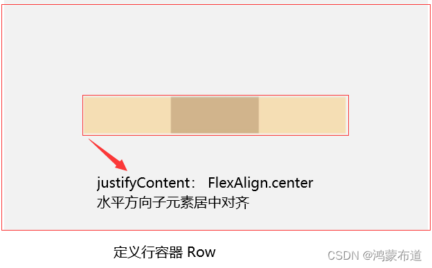
justifyContent(FlexAlign.Center):元素在水平方向方向中心对齐,第一个元素与行首的距离与最后一个元素与行尾距离相同
Row() {
  Column() {
  }.width('20%').height(30).backgroundColor(0xF5DEB3)

  Column() {
  }.width('20%').height(30).backgroundColor(0xD2B48C)

  Column() {
  }.width('20%').height(30).backgroundColor(0xF5DEB3)
}.width('100%').height(200).backgroundColor('rgb(242,242,242)').justifyContent(FlexAlign.Center)
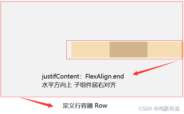
justifyContent(FlexAlign.End):元素在水平方向方向尾部对齐,最后一个元素与行尾对齐,其他元素与后一个对齐
Row() {
  Column() {
  }.width('20%').height(30).backgroundColor(0xF5DEB3)

  Column() {
  }.width('20%').height(30).backgroundColor(0xD2B48C)

  Column() {
  }.width('20%').height(30).backgroundColor(0xF5DEB3)
}.width('100%').height(200).backgroundColor('rgb(242,242,242)').justifyContent(FlexAlign.End)
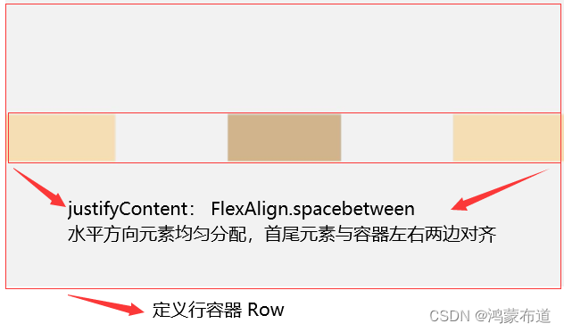
justifyContent(FlexAlign.Spacebetween):水平方向方向均匀分配元素,相邻元素之间距离相同。第一个元素与行首对齐,最后一个元素与行尾对齐
Row() {
  Column() {
  }.width('20%').height(30).backgroundColor(0xF5DEB3)

  Column() {
  }.width('20%').height(30).backgroundColor(0xD2B48C)

  Column() {
  }.width('20%').height(30).backgroundColor(0xF5DEB3)
}.width('100%').height(200).backgroundColor('rgb(242,242,242)').justifyContent(FlexAlign.SpaceBetween)
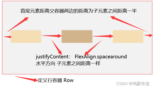
justifyContent(FlexAlign.SpaceAround):水平方向方向均匀分配元素,相邻元素之间距离相同。第一个元素到行首的距离和最后一个元素到行尾的距离是相邻元素之间距离的一半
Row() {
  Column() {
  }.width('20%').height(30).backgroundColor(0xF5DEB3)

  Column() {
  }.width('20%').height(30).backgroundColor(0xD2B48C)

  Column() {
  }.width('20%').height(30).backgroundColor(0xF5DEB3)
}.width('100%').height(200).backgroundColor('rgb(242,242,242)').justifyContent(FlexAlign.SpaceAround)
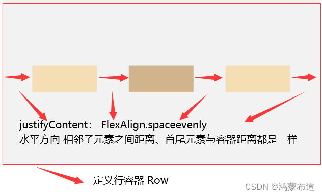
justifyContent(FlexAlign.SpaceEvenly):水平方向方向均匀分配元素,相邻元素之间的距离、第一个元素与行首的间距、最后一个元素到行尾的间距都完全一样
Row() {
  Column() {
  }.width('20%').height(30).backgroundColor(0xF5DEB3)

  Column() {
  }.width('20%').height(30).backgroundColor(0xD2B48C)

  Column() {
  }.width('20%').height(30).backgroundColor(0xF5DEB3)
}.width('100%').height(200).backgroundColor('rgb(242,242,242)').justifyContent(FlexAlign.SpaceEvenly)
三、自适应
1.自适应拉伸
在线性布局下,空白填充组件Blank,在容器主轴方向自动填充空白空间,达到自适应拉伸效果。Row和Column作为容器,只需要添加宽高为百分比,当屏幕宽高发生变化时,会产生自适应效果
2.自适应缩放
自适应缩放是指子组件随容器尺寸的变化而按照预设的比例自动调整尺寸,适应各种不同大小的设备。在线性布局中,可以使用以下两种方法实现自适应缩放
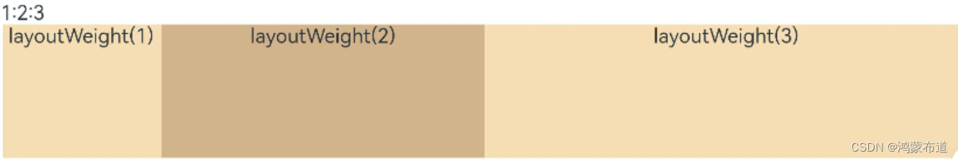
2.1 父容器尺寸确定时,使用layoutWeight属性设置子组件和兄弟元素在主轴上的权重,忽略元素本身尺寸设置,使它们在任意尺寸的设备下自适应占满剩余空间
@Entry
@Component
struct layoutWeightExample {
  build() {
    Column() {
      Text('1:2:3').width('100%')
      Row() {
        Column() {
          Text('layoutWeight(1)')
            .textAlign(TextAlign.Center)
        }.layoutWeight(1).backgroundColor(0xF5DEB3).height('100%')

        Column() {
          Text('layoutWeight(2)')
            .textAlign(TextAlign.Center)
        }.layoutWeight(2).backgroundColor(0xD2B48C).height('100%')

        Column() {
          Text('layoutWeight(3)')
            .textAlign(TextAlign.Center)
        }.layoutWeight(3).backgroundColor(0xF5DEB3).height('100%')

      }.backgroundColor(0xffd306).height('30%')

    }
  }
}
横屏效果
竖屏效果

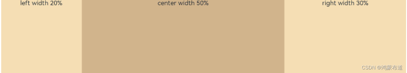
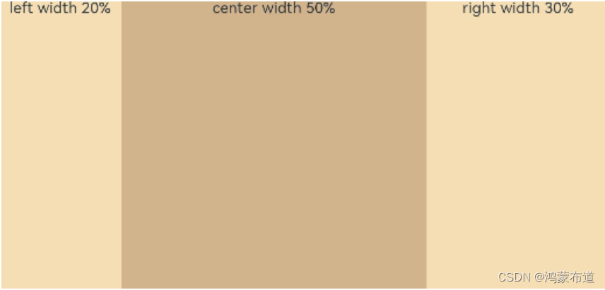
2.2 父容器尺寸确定时,使用百分比设置子组件和兄弟元素的宽度,使他们在任意尺寸的设备下保持固定的自适应占比
@Entry
@Component
struct WidthExample {
  build() {
    Column() {
      Row() {
        Column() {
          Text('left width 20%')
            .textAlign(TextAlign.Center)
        }.width('20%').backgroundColor(0xF5DEB3).height('100%')

        Column() {
          Text('center width 50%')
            .textAlign(TextAlign.Center)
        }.width('50%').backgroundColor(0xD2B48C).height('100%')

        Column() {
          Text('right width 30%')
            .textAlign(TextAlign.Center)
        }.width('30%').backgroundColor(0xF5DEB3).height('100%')
      }.backgroundColor(0xffd306).height('30%')
    }
  }
}
横屏效果
竖屏效果
3.自适应延伸
自适应延伸是指在不同尺寸设备下,当页面的内容超出屏幕大小而无法完全显示时,可以通过滚动条进行拖动展示。这种方法适用于线性布局中内容无法一屏展示的场景。通常有以下两种实现方式
3.1 在List中添加滚动条,当List子项过多一屏放不下时,可以将每一项子元素放置在不同的组件中,通过滚动条进行拖动展示。可以通过scrollBar属性设置滚动条的常驻状态,edgeEffect属性设置拖动到内容最末端的回弹效果
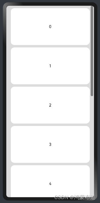
3.2 使用Scroll组件:在线性布局中,当一屏无法完全显示时,可以在Column或Row组件的外层包裹一个可滚动的容器组件Scroll来实现可滑动的线性布局
@Entry
@Component
struct ScrollExample {
  scroller: Scroller = new Scroller();
  private arr: number[] = [0, 1, 2, 3, 4, 5, 6, 7, 8, 9];

  build() {
    Scroll(this.scroller) {
      Column() {
        ForEach(this.arr, (item) => {
          Text(item.toString())
            .width('90%')
            .height(150)
            .backgroundColor(0xFFFFFF)
            .borderRadius(15)
            .fontSize(16)
            .textAlign(TextAlign.Center)
            .margin({ top: 10 })
        }, item => item)
      }.width('100%')
    }
    .backgroundColor(0xDCDCDC)
    .scrollable(ScrollDirection.Vertical) // 滚动方向为垂直方向
    .scrollBar(BarState.On) // 滚动条常驻显示
    .scrollBarColor(Color.Gray) // 滚动条颜色
    .scrollBarWidth(10) // 滚动条宽度
    .edgeEffect(EdgeEffect.Spring) // 滚动到边沿后回弹
  }
}
Column容器中通过ForEach创建多个Text组件,当一个屏幕显示不下,在Column组件外包装一个Scroll组件,实现Column组件内子元素滑动效果

总结
本文详细学习其中一种常见布局方式-线性布局,学习了线性容器内子元素在主轴以及交叉轴上的排列方式,同时也学习了子元素自适应相关的知识点,后面继续学习层叠布局。
版权归原作者 鸿蒙布道 所有, 如有侵权,请联系我们删除。