
一、全局配置
app.json文件就是项目的全局配置文件

(1)小程序窗口的组成部分

(2)导航栏 navigationBar
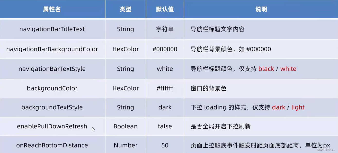
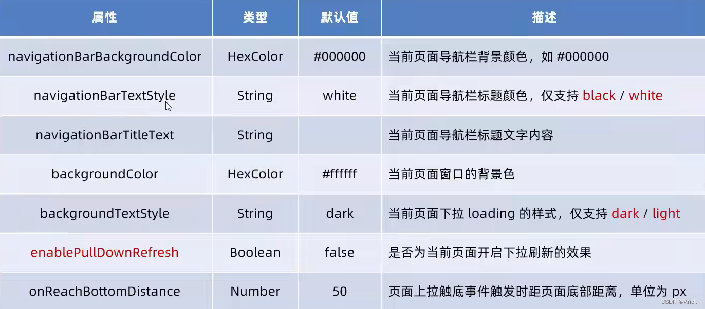
1)window节点常用配置项
2)设置导航栏
- 设置导航栏标题文字
app.json-->window-->navigationBarTitleText
- 设置导航栏背景色
app.json-->window-->navigationBarBackgroundColor
- 设置导航栏的标题颜色
app.json-->window-->navigationBarTextStyle
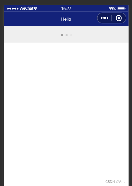
app.json文件中window节点代码
 "window":{
    "backgroundTextStyle":"light",
    "navigationBarBackgroundColor": "#13227a",
    "navigationBarTitleText": "Hello",
    "navigationBarTextStyle":"white"
  },

(3)下拉刷新页面
1)概念
下拉刷新是移动端的转有名词,指的是通过手指在屏幕上的下拉滑动操作,从而重新加载页面数据的行为
2)设置下拉刷新
- 开启下拉刷新
app.json-->window-->enablePullDownRefresh-->true
- 设置下拉刷新时窗口的背景色
app.json-->window-->backgroundColor-->指定十六进制的颜色值#efefef
- 设置下拉刷新时loading样式
app.json-->window-->backgroundTextStyle-->dark
"window":{
    "navigationBarBackgroundColor": "#13227a",
    "navigationBarTitleText": "Hello",
    "navigationBarTextStyle":"white",
    "enablePullDownRefresh": true,
    "backgroundColor": "#efefef",
    "backgroundTextStyle":"dark"
  },
(4)上拉触底的距离
1)概念
上拉触底是移动端的专有名词,通过手指在屏幕上的上拉滑动操作,从而加载更多数据的行为
2)设置
app.json-->window-->onReachBottomDistance-->设置新值
注意:小程序默认触底距离为50px,若没有特殊的需求,那么直接使用默认值即可
(5)底部导航栏 tabBar
1)概念
tabBar是移动端应用常见的页面效果,用于实现多页面的快速切换
小程序中tabBar分为两类
- 底部tabBat(常用)
- 顶部tabBar
注意点
- tabBar中只能配置最少2个、最多5个tab页签
- 当渲染顶部tabBar时,不显示icon图标,只显示文本
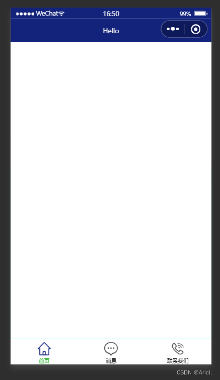
tabBar的6个组成部分
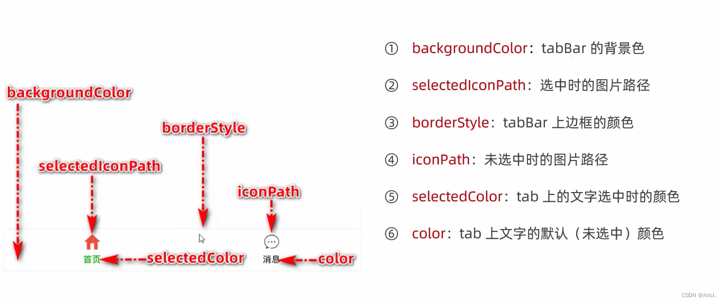
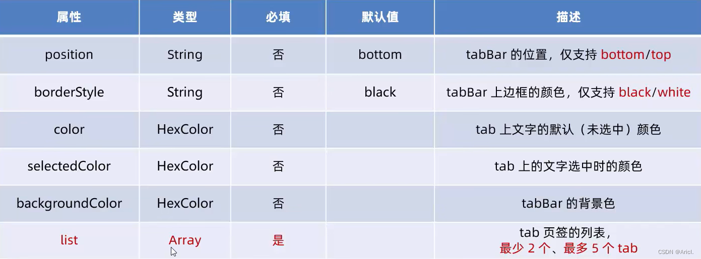
2)tabBar节点配置项
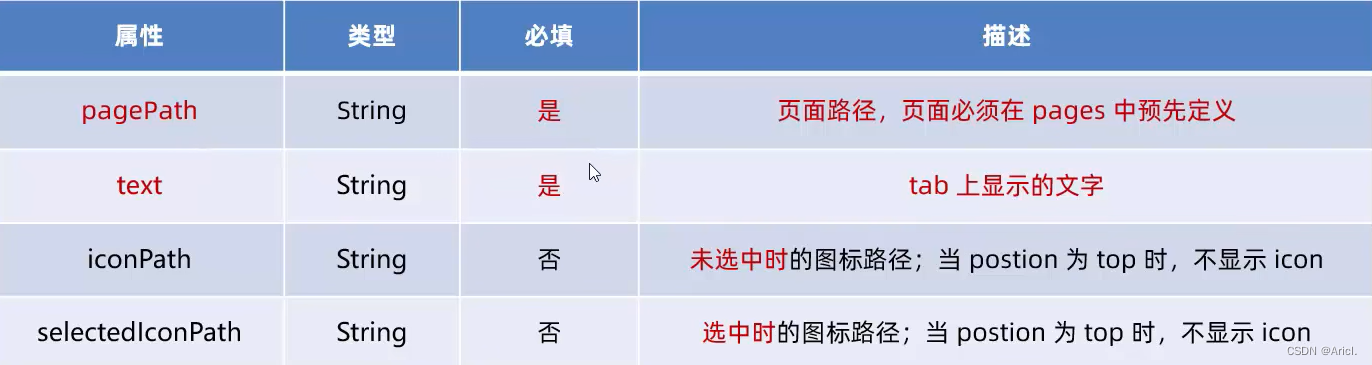
3)每个tab项的配置选项
4)示例

app.json文件中tabBar节点代码
"tabBar": {
    "list": [{
      "pagePath": "pages/index/index",
      "text": "首页",
      "iconPath": "images/home.png",
      "selectedIconPath": "images/home-active.png"
    },
    {
      "pagePath": "pages/message/message",
      "text": "消息",
      "iconPath": "images/message.png",
      "selectedIconPath": "images/message-active.png"
    },
    {
      "pagePath": "pages/contract/contract",
      "text": "联系我们",
      "iconPath": "images/contract.png",
      "selectedIconPath": "images/contract-active.png"
    }
  ]
  },
注意事项
- 可以先在项目的根目录下新建image文件夹,来专门存储项目需要使用到的icon图标
- 作为tabBar的页面必须放在app.json文件中Pages节点的前面,否则无法正常跳转(切记)
(5)图标的获取
博主极力推荐阿里巴巴图库矢量网,免费,且图标丰富,真的很良心的一个实用网站!

二、页面配置
(1)概念
小程序中,每一个页面都有一个属于自己的.json页面配置文件,用来对当前页面的窗口外观、页面效果等进行特定的配置
(2)页面配置与全局配置的关系
- app.json中的window节点,可以全局配置小程序中每一个页面的窗口表现
- 若某个页面想要特殊的窗口外观表现,就可以使用页面级别的.json配置文本进行配置
- 当全局配置与页面配置冲突时,根据“ 就近原则 ”,会以页面配置为准从而覆盖掉全局配置
(3)常用配置项
配置方法与全局配置同理,不再展示。
三、综合案例
本案例是本地生活小程序首页界面的初步实现
** (1)步骤**
- 先配置导航栏效果
- 配置底部tabBar效果
- 实现顶部的轮播图
- 实现九宫格功能框
- 实现底部图片布局
(2)真机调试效果图

(3) 完整代码
- js文件
// index.js
Page({
  data: {
        image: [{path:"/images/food.png",name:"吃美食"},{path:"/images/wash.png",name:"约洗浴"},{path:"/images/marry.png",name:"结婚啦"},{path:"/images/KTV.png",name:"去唱歌"},{path:"/images/work.png",name:"找工作"},{path:"/images/teacher.png",name:"报辅导"},{path:"/images/car.png",name:"养汽车"},{path:"/images/hotel.png",name:"定酒店"},{path:"/images/fush.png",name:"找装修"}],
  },
  onLoad:function(options) {
     console.log(options)
  }
})
(图片路径需自定义)
- json文件
{
  "usingComponents": {
    "mt-test1":"/components/test/test1"
  },
  "enablePullDownRefresh": true,
  "backgroundColor": "#efefef",
  "backgroundTextStyle": "dark"
}
- wxml文件
<!-- 首页顶部的轮播图效果 -->
<swiper indicator-dots indicator-color="white" circular autoplay >
        <swiper-item>
           <image src="/images/locallife.png" ></image>
        </swiper-item>
        <swiper-item>
           <image src="/images/locallife2.png"></image>
        </swiper-item>
        <swiper-item>
            <image src="/images/locallife3.png"></image>
        </swiper-item>
</swiper>

<!-- 九宫格功能区 -->
<!-- 外层容器 -->
<view class="gridList">
      <!-- 内层容器 -->
      <navigator class="gridItem" wx:for="{{image}}" url="/pages/shoplist/shoplist?title={{item.name}}">
            <image src="{{item.path}}"></image>
            <text>{{item.name}}</text>
      </navigator>
</view>

<!-- 底部图片功能块 -->
<view class="img-box">
     <image src="/images/tuijian.png" mode="widthFix"></image>
     <image src="/images/pingjia.png" mode="widthFix"></image>
</view>
- wxss文件
swiper {
  height: 400rpx;
}
swiper image{
  width: 100%;
  height: 100%;
}

.gridList{
  /* flex布局格式 */
  display: flex;
  /* 允许自动换行 */
  flex-wrap: wrap;
  /* 给外层容器左边与上部加上边框线 */
  border-left: 1rpx solid #efefef;
  border-top:  1rpx solid #efefef;
}

.gridItem{
  width: 33.33%;
  /* 每个图片的固定高度 */
  height: 200rpx;
  display: flex;
  flex-direction: column;
  align-items: center;
  justify-content: center;
  /* 给内层容器中的每一项加上右侧和底部的边框线 */
  border-right: 1rpx solid #efefef;
  border-bottom: 1rpx solid #efefef;
  /* 改变盒子的方式为border-box */
  box-sizing: border-box;

}

.gridItem image{
  width: 60rpx;
  height: 60rpx;
}

.gridItem text{
  font-size: 24rpx;
  /* 设置文本与图片的上部距离 */
  margin-top: 10rpx;
}

.img-box{
  display: flex;
  padding: 20rpx 10rpx;
  justify-content: space-around;
}
.img-box image{
  width: 45%;
}
都看到这里了,不妨点个赞再溜哈(doge)
版权归原作者 Aricl. 所有, 如有侵权,请联系我们删除。