
案例1:实现购物车页面布局
- 页面内容:表格-Table
- 组件:按钮-Buttons
<!DOCTYPE html>
<html lang="en">
<head>
<meta charset="UTF-8">
<meta http-equiv="X-UA-Compatible" content="IE=edge">
<meta name="viewport" content="width=device-width, initial-scale=1.0">
<title>案例1:实现购物车页面布局</title>
<!-- 支持手机端 -->
<meta name="viewport" content="width=device-width,initial-scale=1.0">
<!-- 引入CSS -->
<link rel="stylesheet" href="CSS/bootstrap.css" />
<!-- 引入Bootstrap图标的样式 -->
<link rel="stylesheet" href="font/bootstrap-icons.css" />
<style>
.navbar-collapse {
/*1代表弹性扩大占用父容器剩余部分 0代表不占用*/
flex-grow: 0;
}
.active {
/*加粗*/
font-weight: bold;
}
.text-right button{
width: 120px;/*宽度*/
height: 30px;/*高度*/
line-height: 10px;/*行高*/
margin-top: 10px;/*上间距*/
}
</style>
</head>
<body>
<!-- 导航条 -->
<nav class="navbar navbar-expand-lg navbar-light bg-light">
<!-- 固定容器 -->
<div class="container">
<a class="navbar-brand" href="#">你好,欢迎来到集美家居</a>
<button class="navbar-toggler" type="button" data-toggle="collapse" data-target="#navbarNav"
aria-controls="navbarNav" aria-expanded="false" aria-label="Toggle navigation">
<span class="navbar-toggler-icon"></span>
</button>
<div class="collapse navbar-collapse" id="navbarNav">
<ul class="navbar-nav">
<!-- active激活的 -->
<li class="nav-item ">
<a class="nav-link" href="#">首页<span class="sr-only">(current)</span></a>
</li>
<li class="nav-item">
<a class="nav-link" href="#">分类</a>
</li>
<li class="nav-item">
<a class="nav-link" href="#">登录</a>
</li>
<li class="nav-item">
<a class="nav-link ">注册</a>
</li>
<li class="nav-item active">
<a class="nav-link ">我的购物车</a>
</li>
</ul>
</div>
</div>
</nav>
<!-- 购物车 -->
<div class="container">
<!-- text-center居中 -->
<table style="margin-top: 20px;" class="table table-hover text-center ">
<!-- class="bg-primary" 加颜色 -->
<thead class="bg-primary" style="color: aliceblue;">
<tr>
<th scope="col">商品名称</th>
<th scope="col">商品价格</th>
<th scope="col">购买数量</th>
<th scope="col">小计</th>
<th scope="col">操作</th>
</tr>
</thead>
<tbody>
<tr>
<th scope="row">哆啦A梦</th>
<td>¥9.9</td>
<td><input class="text-center" value="1" /></td>
<td>9.9元</td>
<td><a href="#"><i class="bi bi-trash3-fill"></i></a></td>
</tr>
<tr>
<th scope="row">白玫瑰</th>
<td>¥29.9</td>
<td><input class="text-center" value="2" /></td>
<td>59.8元</td>
<td><a href="#"><i class="bi bi-trash3-fill"></i></a></td>
</tr>
<tr>
<th scope="row">小熊</th>
<td>¥39.9</td>
<td><input class="text-center" value="4" /></td>
<td>159.6元</td>
<td><a href="#"><i class="bi bi-trash3-fill"></i></a></td>
</tr>
</tbody>
</table>
<!-- 合计 -->
<div class="text-right">
<h2>合计:229.3元</h2>
<button type="button" class="btn btn-success">继续购物</button>
<button type="button" class="btn btn-danger">点我结算</button>
</div>
</div>
<!-- 引入jQuery的类库 -->
<!-- 再引入Bootstrap的类库 -->
<script src="js/jquery-3.6.4.js"></script>
<script src="js/bootstrap.js"></script>
</body>
</html>
效果图

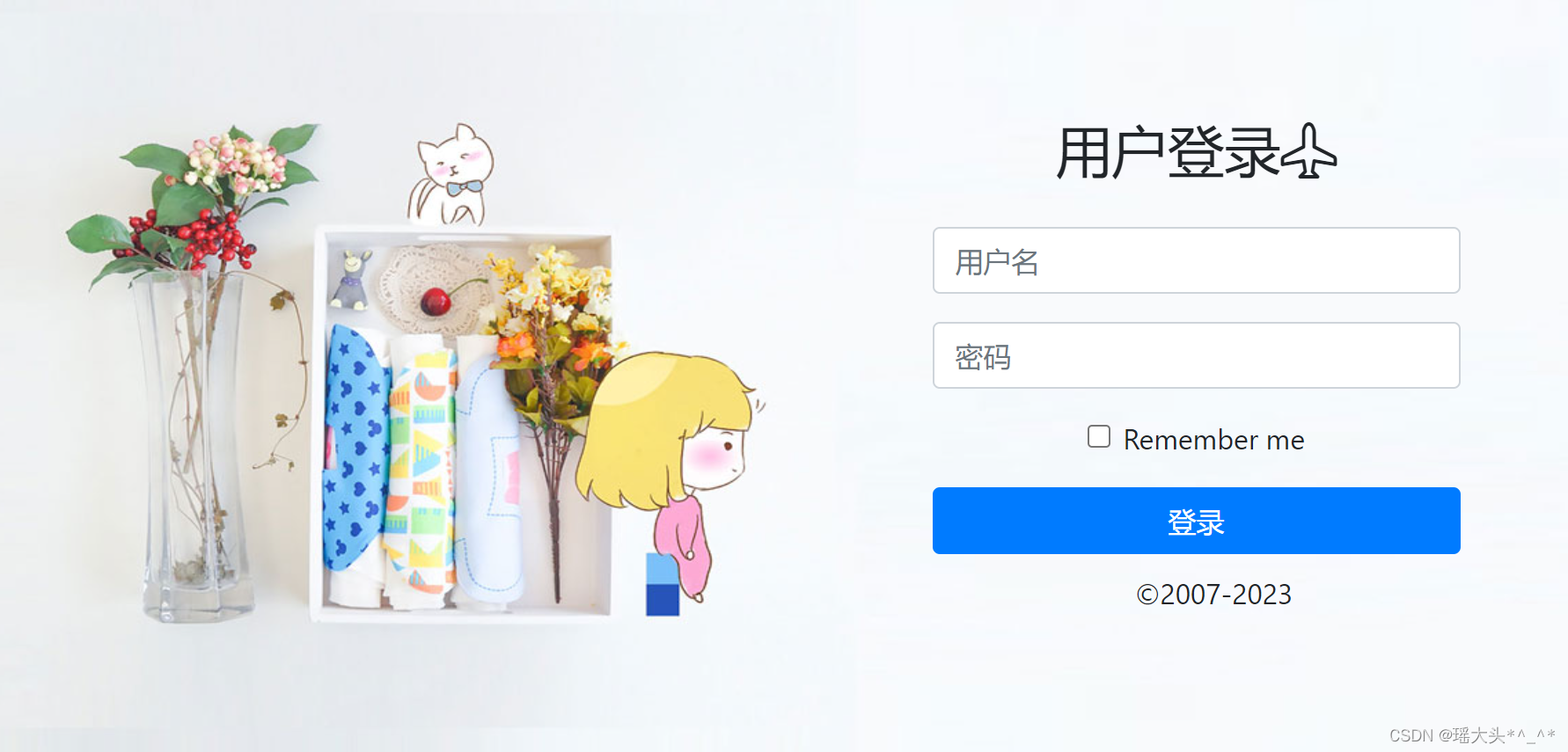
** 案例2:实现登录&注册界面**
- 表单组件:Forms
<!DOCTYPE html>
<html lang="en">
<head>
<meta charset="UTF-8">
<meta http-equiv="X-UA-Compatible" content="IE=edge">
<meta name="viewport" content="width=device-width, initial-scale=1.0">
<title>案例2:实现登录&注册界面</title>
<!-- 支持手机端 -->
<meta name="viewport" content="width=device-width,initial-scale=1.0">
<!-- 引入CSS -->
<link rel="stylesheet" href="CSS/bootstrap.css" />
<link rel="stylesheet" href="font/bootstrap-icons.css" />
<style>
.bj{
background-image: url(img/img/bg.jpg);
background-repeat: no-repeat;/*不平铺*/
height: 100%;/*占用父容器的全部 父容器必须定义*/
background-size: 100% 100%; /* 设置图片的尺寸*/
}
/* 父容器 */
body,html{
height: 100%;
}
.bj form{
width: 300px;/*宽度*/
position: absolute; /*绝对定位*/
top:30%;/*距离上面的距离*/
right: 15%;/*距离右面的距离*/
text-align: center;/*内容居中*/
}
.bj button{
width: 300px;
margin-bottom: 10px;/*下间距*/
}
.bj h2{
margin-bottom:25px ;
}
</style>
</head>
<body>
<div class="bj">
<form>
<div class="form-group">
<h2>用户登录<i class="bi bi-airplane"></i></h2>
<!-- placeholder:提示文本 -->
<input type="email" placeholder="用户名" class="form-control" id="exampleInputEmail1" aria-describedby="emailHelp">
</div>
<div class="form-group">
<input type="password" placeholder="密码" class="form-control" id="exampleInputPassword1">
</div>
<div class="form-group form-check">
<input type="checkbox" class="form-check-input" id="exampleCheck1">
<label class="form-check-label" for="exampleCheck1">Remember me</label>
</div>
<button type="submit" class="btn btn-primary">登录</button>
<div class="form-group form-check">
<label class="form-check-label" for="exampleCheck1">©2007-2023</label>
</div>
</form>
</div>
<!-- 引入jQuery的类库 -->
<!-- 再引入Bootstrap的类库 -->
<script src="js/jquery-3.6.4.js"></script>
<script src="js/bootstrap.js"></script>
</body>
</html>
效果图
案例3:图标组件的使用
<!DOCTYPE html>
<html lang="en">
<head>
<meta charset="UTF-8">
<meta http-equiv="X-UA-Compatible" content="IE=edge">
<meta name="viewport" content="width=device-width, initial-scale=1.0">
<title>案例3:图标组件的使用</title>
<!-- 支持手机端 -->
<meta name="viewport" content="width=device-width,initial-scale=1.0">
<!-- 引入CSS -->
<link rel="stylesheet" href="CSS/bootstrap.css" />
<!-- 引入Bootstrap图标的样式 -->
<link rel="stylesheet" href="font/bootstrap-icons.css" />
<style>
.navbar-collapse {
/*1代表弹性扩大占用父容器剩余部分 0代表不占用*/
flex-grow: 0;
}
.active {
font-weight: bold;
/*加粗*/
}
.form-group {
width: 300px;
/*宽度*/
margin-left: auto;
/*左间距自动*/
margin-right: auto;
/*右间距自动*/
}
form {
height: 100px;
/*高度*/
background-color: darkgray;
/*背景颜色*/
padding-top: 31px;
/*内间距 100-38=62/2*/
margin-top: 15px;
/*上间距*/
margin-bottom: 15px;
/*下间距*/
}
</style>
</head>
<body>
<!-- 导航条 -->
<nav class="navbar navbar-expand-lg navbar-light bg-light">
<!-- 固定容器 -->
<div class="container">
<a class="navbar-brand" href="#">你好,欢迎来到集美家居</a>
<button class="navbar-toggler" type="button" data-toggle="collapse" data-target="#navbarNav"
aria-controls="navbarNav" aria-expanded="false" aria-label="Toggle navigation">
<span class="navbar-toggler-icon"></span>
</button>
<div class="collapse navbar-collapse" id="navbarNav">
<ul class="navbar-nav">
<!-- active激活的 -->
<li class="nav-item ">
<a class="nav-link" href="#">首页<span class="sr-only">(current)</span></a>
</li>
<li class="nav-item active">
<a class="nav-link" href="#">分类</a>
</li>
<li class="nav-item">
<a class="nav-link" href="#">登录</a>
</li>
<li class="nav-item">
<a class="nav-link ">注册</a>
</li>
<li class="nav-item">
<a class="nav-link ">我的购物车</a>
</li>
</ul>
</div>
</div>
</nav>
<div class="container">
<!-- 第一行搜索区域 -->
<div class="row">
<div class="col">
<form>
<div class="form-group">
<div class="input-group mb-3">
<input type="text" class="form-control" placeholder="请输入家居关键字"
aria-label="Recipient's username" aria-describedby="button-addon2">
<div class="input-group-append">
<button class="btn btn btn-primary" type="button" id="button-addon2"><i class="bi bi-search-heart"></i></button>
</div>
</div>
</div>
</form>
</div>
</div>
<!-- 第 二行-->
<div class="row">
<!-- 左侧占三份 为分类 -->
<div class="col-3">
<div class="list-group">
<a href="#" class="list-group-item list-group-item-action active" aria-current="true">
所有商品
</a>
<a href="#" class="list-group-item list-group-item-action">装饰摆件</a>
<a href="#" class="list-group-item list-group-item-action">布艺软饰</a>
<a href="#" class="list-group-item list-group-item-action">墙饰壁挂</a>
<a href="#" class="list-group-item list-group-item-action">蜡艺香薰</a>
<a class="list-group-item list-group-item-action disabled">创意家居</a>
</div>
</div>
<!-- 右侧占9份 为商品 -->
<div class="col-9">
<!--大PC一行4列 中PC一行3列 平板一行2列 -->
<div class="row">
<div class="col-lg-3 col-md-4 col-sm-6">
<figure class="figure text-center">
<img src="img/img/bz01.jpg" class="figure-img img-fluid rounded" alt="...">
<figcaption class="figure-caption"><b>白玫瑰的高贵</b> <b>¥89.9</b> <a href="#"><i style="color:darksalmon" class="bi bi-cart-check"></i></a></figcaption>
</figure>
</div>
<div class="col-lg-3 col-md-4 col-sm-6">
<figure class="figure text-center">
<img src="img/img/bz02.jpg" class="figure-img img-fluid rounded" alt="...">
<figcaption class="figure-caption"><b>白玫瑰的高贵</b> <b>¥89.9</b> <a href="#"><i style="color:darksalmon" class="bi bi-cart-check"></i></a></figcaption>
</figure>
</div>
<div class="col-lg-3 col-md-4 col-sm-6">
<figure class="figure text-center">
<img src="img/img/bz03.jpg" class="figure-img img-fluid rounded" alt="...">
<figcaption class="figure-caption"><b>白玫瑰的高贵</b> <b>¥89.9</b> <a href="#"><i style="color:darksalmon" class="bi bi-cart-check"></i></a></figcaption>
</figure>
</div>
<div class="col-lg-3 col-md-4 col-sm-6">
<figure class="figure text-center">
<img src="img/img/bz04.jpg" class="figure-img img-fluid rounded" alt="...">
<figcaption class="figure-caption"><b>白玫瑰的高贵</b> <b>¥89.9</b> <a href="#"><i style="color:darksalmon" class="bi bi-cart-check"></i></a></figcaption>
</figure>
</div>
<div class="col-lg-3 col-md-4 col-sm-6">
<figure class="figure text-center">
<img src="img/img/bz05.jpg" class="figure-img img-fluid rounded" alt="...">
<figcaption class="figure-caption"><b>白玫瑰的高贵</b> <b>¥89.9</b> <a href="#"><i style="color:darksalmon" class="bi bi-cart-check"></i></a></figcaption>
</figure>
</div>
<div class="col-lg-3 col-md-4 col-sm-6">
<figure class="figure text-center">
<img src="img/img/bz06.jpg" class="figure-img img-fluid rounded" alt="...">
<figcaption class="figure-caption"><b>白玫瑰的高贵</b> <b>¥89.9</b> <a href="#"><i style="color:darksalmon" class="bi bi-cart-check"></i></a></figcaption>
</figure>
</div>
<div class="col-lg-3 col-md-4 col-sm-6">
<figure class="figure text-center">
<img src="img/img/bz07.jpg" class="figure-img img-fluid rounded" alt="...">
<figcaption class="figure-caption"><b>白玫瑰的高贵</b> <b>¥89.9</b> <a href="#"><i style="color:darksalmon" class="bi bi-cart-check"></i></a></figcaption>
</figure>
</div>
<div class="col-lg-3 col-md-4 col-sm-6">
<figure class="figure text-center">
<img src="img/img/bz08.jpg" class="figure-img img-fluid rounded" alt="...">
<figcaption class="figure-caption"><b>白玫瑰的高贵</b> <b>¥89.9</b> <a href="#"><i style="color:darksalmon" class="bi bi-cart-check"></i></a></figcaption>
</figure>
</div>
</div>
</div>
</div>
<!-- 引入jQuery的类库 -->
<!-- 再引入Bootstrap的类库 -->
<script src="js/jquery-3.6.4.js"></script>
<script src="js/bootstrap.js"></script>
</body>
</html>
效果图

熟悉其他的(页面内容-组件)等效果
- 折叠
- 滚动监听
- 下拉菜单
- 分页
- 导航-面包屑导航等等
本文转载自: https://blog.csdn.net/qq_73126462/article/details/130290334
版权归原作者 瑶大头*^_^* 所有, 如有侵权,请联系我们删除。
版权归原作者 瑶大头*^_^* 所有, 如有侵权,请联系我们删除。