
🔥一个人走得远了,就会忘记自己为了什么而出发,希望你可以不忘初心,不要随波逐流,一直走下去🎶
🦋 欢迎关注🖱点赞👍收藏🌟留言🐾
🦄 本文由 程序喵正在路上 原创,CSDN首发!
💖 系列专栏:HTML5+CSS3+移动端前端
🌠 首发时间:2022年8月16日
✅ 如果觉得博主的文章还不错的话,希望小伙伴们三连支持一下哦
阅读指南
学习目标
- 能够使用精灵图
- 能够使用字体图标
- 能够写出 CSS 三角
- 能够写出常见的 CSS 用户界面样式
- 能够说出常见的布局技巧
精灵图
1. 为什么需要精灵图?
客户端要访问一个网页时,浏览器会向服务器发送请求,服务器接收到请求后,会返回请求页面给客户端
一个网页中往往会应用很多小的背景图像作为修饰,当网页中的图像过多时,服务器就会频繁地接收和发送请求图片,造成服务器请求压力过大,这将大大降低页面的加载速度
因此,为了有效地减少服务器接收和发送请求的次数,提高页面的加载速度,出现了 CSS 精灵技术(也称为 CSS Sprites、CSS 雪碧)
核心原理:将网页中的一些小背景图像整合到一张大图中,这样服务器只需要一次请求就可以了
2. 精灵图的使用
使用精灵图核心:
- 精灵技术主要针对于背景图片使用,就是把多个小背景图片整合到一张大图片中
- 这个大图片也称为 sprites 精灵图或者雪碧图
- 移动背景图片位置,此时可以使用 background-position
- 移动的距离就是这个目标图片的 x 和 y 坐标,注意网页中的坐标有所不同
- 因为一般情况下都是往上往左移动,所以数值是负值
- 使用精灵图的时候需要精确测量,每个小背景图片的大小和位置
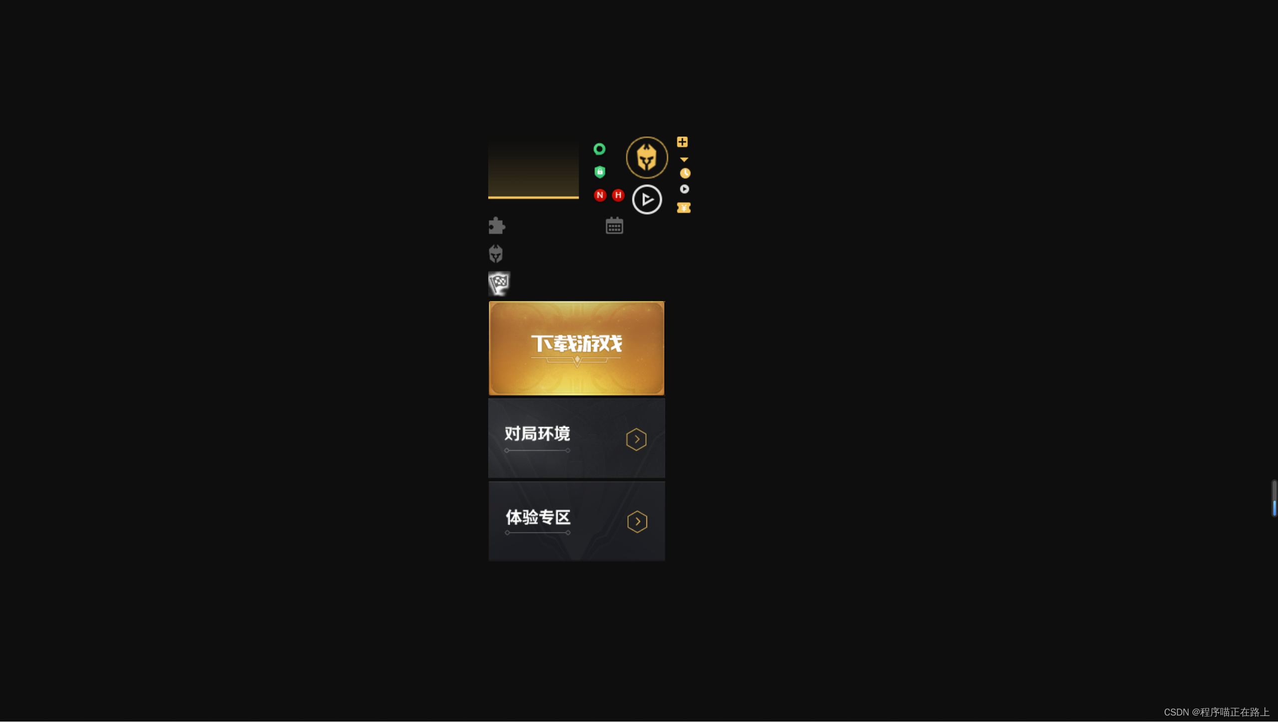
在王者荣耀的官网,我们可以找到这样的一张精灵图
怎么显示这张精灵图中的特定部分呢
<!DOCTYPEhtml><htmllang="en"><head><metacharset="UTF-8"><metahttp-equiv="X-UA-Compatible"content="IE=edge"><metaname="viewport"content="width=device-width, initial-scale=1.0"><title>精灵图的使用</title><style>.box1{width: 60px;height: 60px;margin: 100px auto;background:url(images/index.png) no-repeat -182px 0;}.box2{width: 27px;height: 25px;margin: 200px;background:url(images/index.png) no-repeat -155px -106px;}</style></head><body><divclass="box1"></div><divclass="box2"></div></body></html>
运行结果:
3. 精灵图应用案例
素材在此
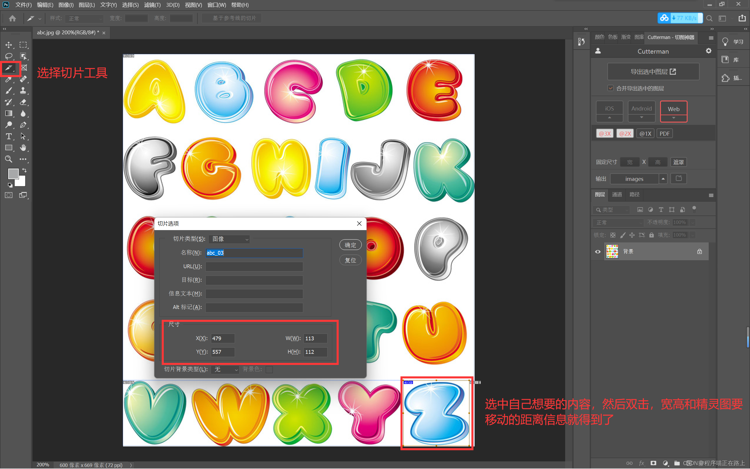
代码实现:
<!DOCTYPEhtml><htmllang="en"><head><metacharset="UTF-8"><metahttp-equiv="X-UA-Compatible"content="IE=edge"><metaname="viewport"content="width=device-width, initial-scale=1.0"><title>利用精灵图拼出自己的名字</title><style>span{display: inline-block;background:url(images/abcd.jpg) no-repeat;}.c{width: 109px;height: 110px;background-position: -237px -8px;}.z{width: 113px;height: 112px;background-position: -479px -557px;}.r{width: 110px;height: 109px;background-position: -139px -415px;}</style></head><body><spanclass="c"></span><spanclass="z"></span><spanclass="r"></span></body></html>
运行结果:
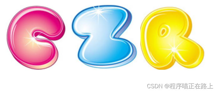
怎么样,快去试试看吧
字体图标
1. 字体图标的产生
下图中圈起来的就是字体图标,不是图片哦
字体图标的使用场景:主要用于显示网页中通用、常用的一些小图标
精灵图是有很多优点的,但是缺点也很明显
- 图片文件占用空间还是比较大的
- 图片本身放大和缩小会失真
- 一旦图片制作完毕想要更换非常复杂
于是,一种技术出现了,就是字体图标 iconfont
字体图标可以为前端工程师提供一种方便高效的图标使用方式,展示的是图标,本质属于字体
2. 字体图标的优点
- 轻量级:一个字体图标要比一系列的图像要小,一旦字体加载了,图标就会马上渲染出来,减少了服务器请求
- 灵活性:本质其实是文字,可以很随意地改变颜色、产生阴影、透明效果、旋转等等
- 兼容性:几乎支持所有的浏览器,请放心使用
注意:字体图标不能替代精灵技术,只是对工作中图标部分技术的提升和优化
总结:
- 如果遇到一些结构和样式比较简单的小图标,就用字体图标
- 如果遇到一些结构和样式复杂一点的小图片,就用精灵图
3. 下载字体图标
字体图标是一些网页常见的小图标,我们直接从网上下载即可,使用可以分为:
- 字体图标的下载
- 字体图标的引入(引入到我们 html 页面中)
- 字体图标的追加(以后添加新的小图标)
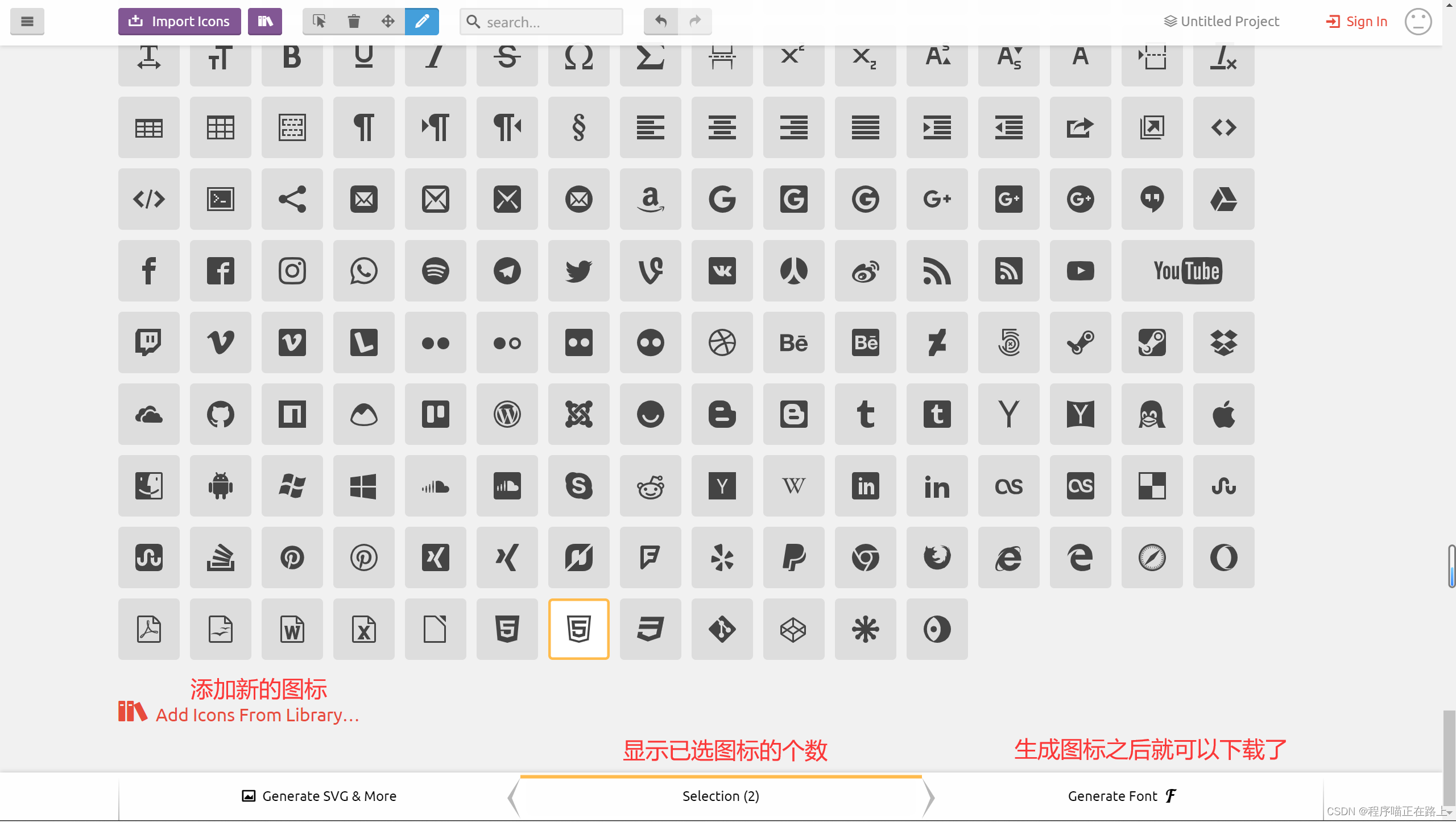
推荐的下载网站:
- icomoon 字库IcoMoon 成立于 2011 年,推出了第一个自定义图标字体生成器,它允许用户选择所需要的图标,使它们呈一字型。该字库内容种类繁多,非常全面,唯一的遗憾是国外服务器,打开网速较慢
- iconfont 字库 这个是阿里巴巴 M2UX 的一个 iconfont 字体图标字库,包含了淘宝图标库和阿里巴巴图标库,可以使用 AI 制作图表上传生成,重点是 —— 免费
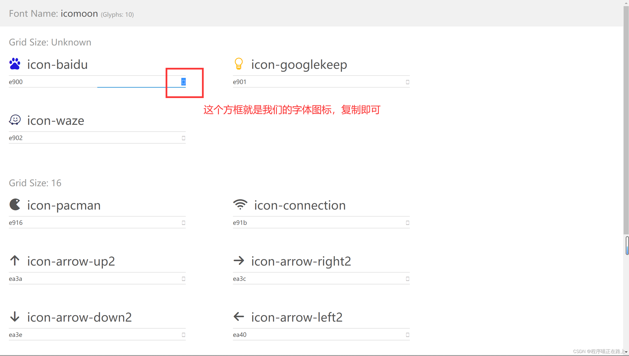
拿 icomoon 字库 来说,基本操作如下
4. 引入字体图标
下载完毕之后,注意原先的文件不要删,后面会用
- 把下载包里面的 fonts 文件夹放入页面根目录下
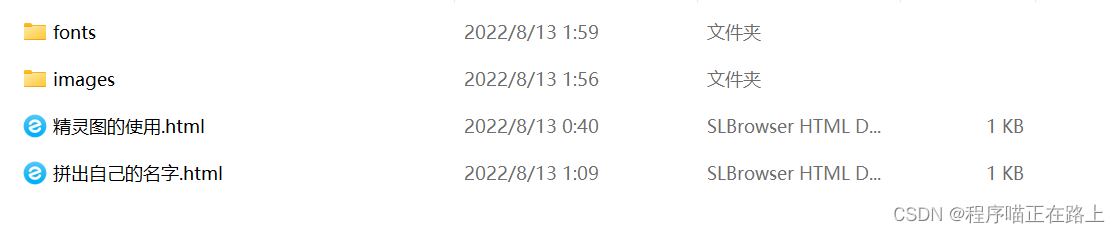
- 在 CSS 样式中全局声明字体:简单理解为将这些字体文件通过 css 引入到我们页面中 一定要注意文件路径的问题
我们用下面这一系列代码来声明字体,这段代码也可以在 style.css 中找到
@font-face{font-family:'icomoon';src:url('fonts/icomoon.eot?q42srk');src:url('fonts/icomoon.eot?q42srk#iefix')format('embedded-opentype'),url('fonts/icomoon.ttf?q42srk')format('truetype'),url('fonts/icomoon.woff?q42srk')format('woff'),url('fonts/icomoon.svg?q42srk#icomoon')format('svg');font-weight: normal;font-style: normal;font-display: block;}
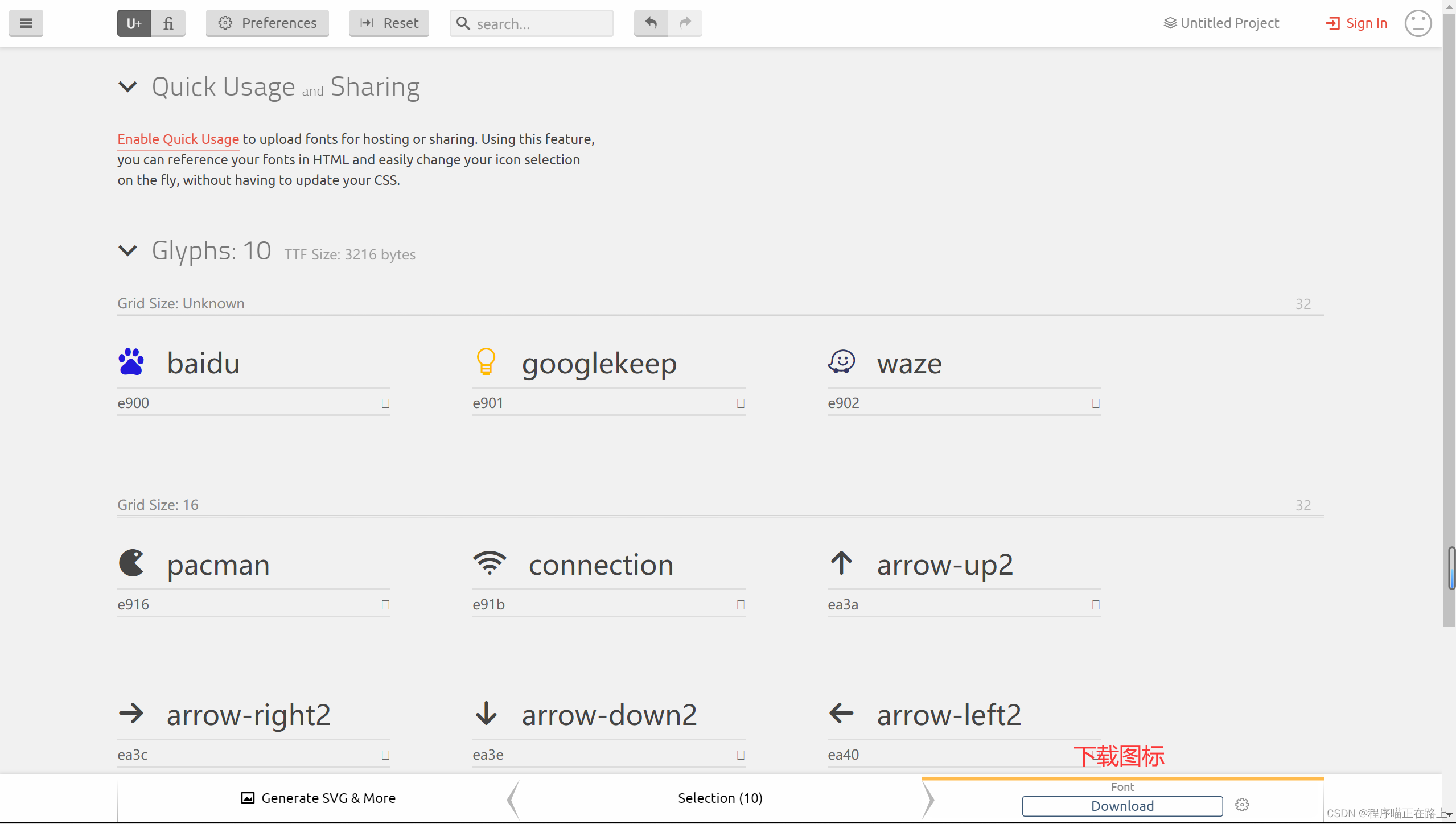
打开 demo.html 我们可以复制下载的图标
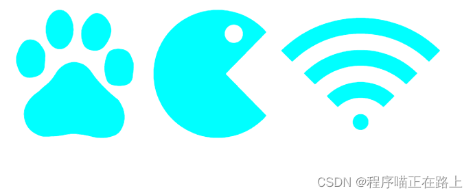
<!DOCTYPEhtml><htmllang="en"><head><metacharset="UTF-8"><metahttp-equiv="X-UA-Compatible"content="IE=edge"><metaname="viewport"content="width=device-width, initial-scale=1.0"><title>字体图标的使用</title><style>/* 字体声明 */@font-face{font-family:'icomoon';src:url('fonts/icomoon.eot?q42srk');src:url('fonts/icomoon.eot?q42srk#iefix')format('embedded-opentype'),url('fonts/icomoon.ttf?q42srk')format('truetype'),url('fonts/icomoon.woff?q42srk')format('woff'),url('fonts/icomoon.svg?q42srk#icomoon')format('svg');font-weight: normal;font-style: normal;font-display: block;}span{/* 指定字体,和字体声明中一致 */font-family:'icomoon';font-size: 100px;color: cyan;}</style></head><body><span></span><span></span><span></span></body></html>
5. 字体图标的追加
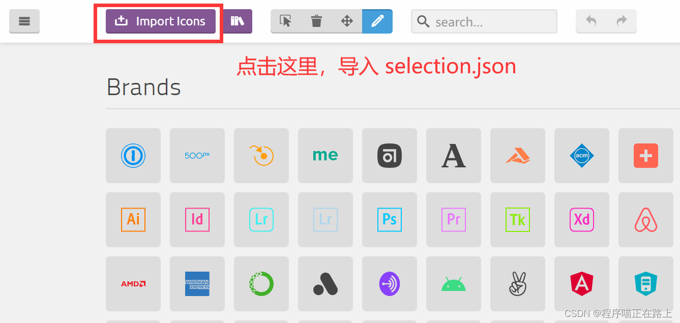
如果工作中,原来的字体图标不够用了,我们需要添加新的字体图标到原来的字体文件
把压缩包里面的 selection.json 重新上传,然后选中自己想要新的图标,重新下载压缩包,并替换原来的文件即可
CSS 三角
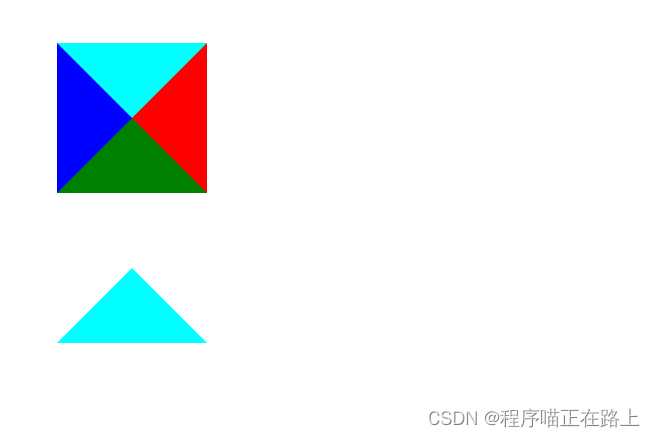
1. CSS三角制作
网页中常见一些三角形,使用 CSS 直接画出来就可以,不必做成图片或者字体图标
<!DOCTYPEhtml><htmllang="en"><head><metacharset="UTF-8"><metahttp-equiv="X-UA-Compatible"content="IE=edge"><metaname="viewport"content="width=device-width, initial-scale=1.0"><title>CSS三角制作</title><style>.box1{width: 0;height: 0;border: 10px solid;border-top-color: cyan;border-right-color: red;border-bottom-color: green;border-left-color: blue;}.box2{width: 0;height: 0;border: 10px solid transparent;/* 要显示的一边改变颜色,其他边透明 */border-bottom-color: cyan;}</style></head><body><divclass="box1"></div><divclass="box2"></div></body></html>
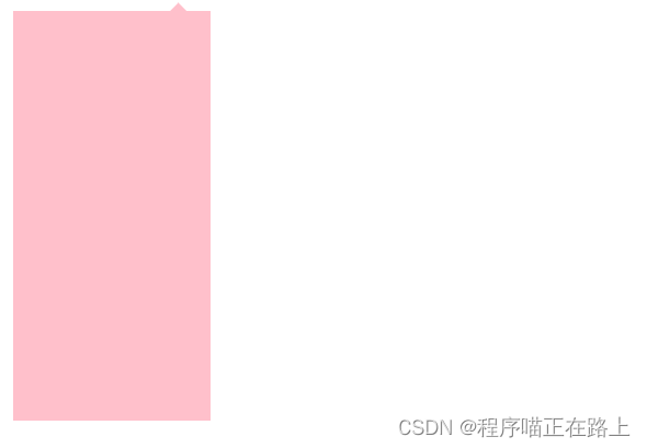
2. CSS三角应用-京东效果
<!DOCTYPEhtml><htmllang="en"><head><metacharset="UTF-8"><metahttp-equiv="X-UA-Compatible"content="IE=edge"><metaname="viewport"content="width=device-width, initial-scale=1.0"><title>CSS三角应用</title><style>.jd{position: relative;width: 120px;height: 249px;background-color: pink;}.jd span{position: absolute;right: 15px;top: -10px;width: 0;height: 0;/* 兼容低版本浏览器 */line-height: 0;font-size: 0;border: 5px solid transparent;border-bottom-color: pink;}</style></head><body><divclass="jd"><span></span></div></body></html>
CSS 用户界面样式
1. 什么是界面样式
所谓的界面样式,就是更改一些用户操作样式,以便提供更好的用户体验
- 更改用户的鼠标样式
- 表单轮廓
- 防止表单域拖拽
2. 更换用户鼠标样式
li{cursor: pointer;}
设置或检索在对象上移动的鼠标指针采用何种系统预定义的光标形状
属性值描述default小白,默认pointer小手move移动text文本not-allowed禁止
<!DOCTYPEhtml><htmllang="en"><head><metacharset="UTF-8"><metahttp-equiv="X-UA-Compatible"content="IE=edge"><metaname="viewport"content="width=device-width, initial-scale=1.0"><title>鼠标样式</title></head><body><ul><listyle="cursor: default;">我是鼠标默认样式</li><listyle="cursor: pointer;">我是鼠标小手样式</li><listyle="cursor: move;">我是鼠标移动样式</li><listyle="cursor: text;">我是鼠标文本样式</li><listyle="cursor: not-allowed;">我是鼠标禁止样式</li></ul></body></html>
3. 表单轮廓线
给表单添加
outline: 0;
或者
outline: none;
样式之后,就可以去掉默认的蓝色边框
4. 防止表单域拖拽
实际开发中,我们文本域右下角是不可以拖拽的
给文本域添加
resize: none;
样式之后,就可以防止被拖拽
<!DOCTYPEhtml><htmllang="en"><head><metacharset="UTF-8"><metahttp-equiv="X-UA-Compatible"content="IE=edge"><metaname="viewport"content="width=device-width, initial-scale=1.0"><title>去掉表单轮廓线和防止文本域拖拽</title><style>input,
        textarea{outline: none;}textarea{resize: none;}</style></head><body><inputtype="text"><textareaname=""id=""cols="30"rows="10"></textarea></body></html>

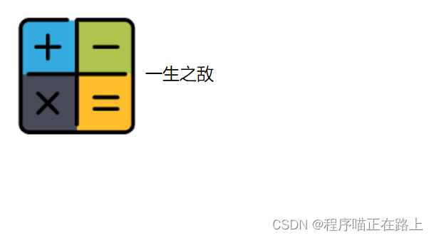
vertical-align 属性应用
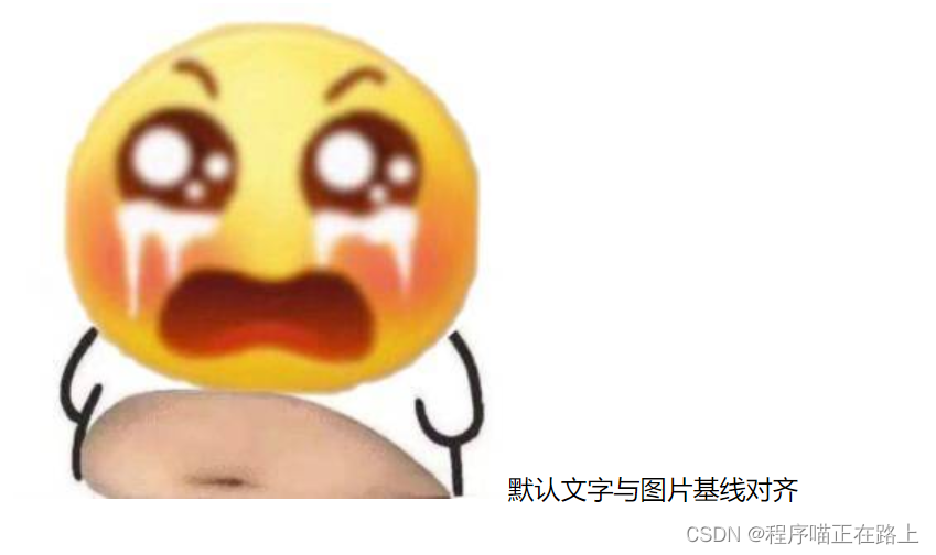
CSS 的 vertical-align 属性使用场景:经常用于设置图片或者表单(行内块元素)和文字垂直对齐
功能:用于设置一个元素的垂直对齐方式,但是它只针对于行内元素或者行内块元素有效
语法:
vertical-align: baseline | top | middle | bottom
值描述baseline默认,元素放置在父元素的基线上top把元素的顶端于行中最高元素的顶端对齐middle把此元素放置在父元素的中部bottom把元素的顶端与行中最低的元素的顶端对齐
<!DOCTYPEhtml><htmllang="en"><head><metacharset="UTF-8"><metahttp-equiv="X-UA-Compatible"content="IE=edge"><metaname="viewport"content="width=device-width, initial-scale=1.0"><title>vertical-align</title><style>img{vertical-align: middle;}</style></head><body><imgsrc="images/math.png"alt="">一生之敌
</body></html>
1. 图片、表单和文字对齐
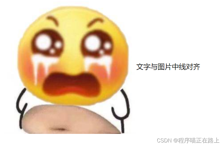
图片、表单都属于行内块元素,默认的 vertical-align 是基线对齐
此时可以给图片、表单这些行内块元素的 vertical-align 属性设置为 middle 就可以让文字和图片垂直居中对齐了
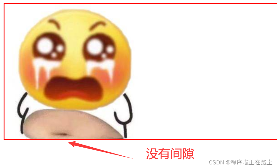
2. 解决图片底部默认白色间隙问题
bug:图片底侧会有一个空白间隙,原因是行内块元素会和文字的基线对齐
主要解决方法有两种:
- 给图片添加
vertical-align: middle | top | bottom;等 (推荐) - 把图片转换为块级元素
display: block;
<!DOCTYPEhtml><htmllang="en"><head><metacharset="UTF-8"><metahttp-equiv="X-UA-Compatible"content="IE=edge"><metaname="viewport"content="width=device-width, initial-scale=1.0"><title>解决图片底部空白间隙</title><style>div{border: 2px solid red;}img{vertical-align: bottom;}</style></head><body><div><imgsrc="images/smile.jpg"alt=""></div></body></html>
溢出的文字省略号显示
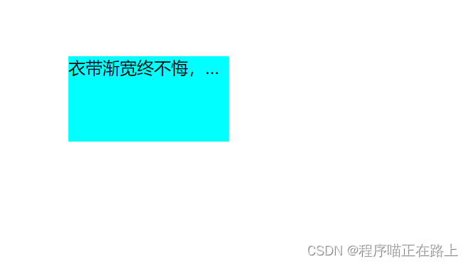
1. 单行文本溢出显示省略号——必须满足三个条件
/* 1.文字显示不开时强制显示 */white-space: nowrap;/* 2. 超出部分隐藏 */overflow: hidden;/* 3. 文字用省略号替代超出的部分 */text-overflow: ellipsis;
<!DOCTYPEhtml><htmllang="en"><head><metacharset="UTF-8"><metahttp-equiv="X-UA-Compatible"content="IE=edge"><metaname="viewport"content="width=device-width, initial-scale=1.0"><title>单行文字溢出</title><style>div{width: 150px;height: 80px;background-color: cyan;margin: 100px auto;/* 1.文字显示不开时强制显示 */white-space: nowrap;/* 2. 超出部分隐藏 */overflow: hidden;/* 3. 文字用省略号替代超出的部分 */text-overflow: ellipsis;}</style></head><body><div>
        衣带渐宽终不悔,为伊消得人憔悴
    </div></body></html>
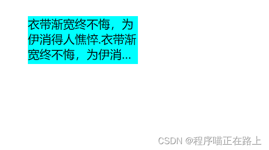
2. 多行文本溢出显示省略号
多行文本溢出显示省略号,有较大兼容性问题,适合于 webKit 浏览器或者移动端(移动端大部分是 webKit 内核)
/* 弹性伸缩盒子模型显示 */display: -webkit-box;/* 限制在一个块元素显示的文本的行数 */-webkit-line-clamp: 3;/* 设置或检索伸缩盒子对象的子元素的排列方式 */-webkit-box-orient: vertical;
<!DOCTYPEhtml><htmllang="en"><head><metacharset="UTF-8"><metahttp-equiv="X-UA-Compatible"content="IE=edge"><metaname="viewport"content="width=device-width, initial-scale=1.0"><title>多行文字溢出</title><style>div{width: 150px;height: 65px;background-color: cyan;margin: 100px auto;overflow: hidden;text-overflow: ellipsis;/* 弹性伸缩盒子模型显示 */display: -webkit-box;/* 限制在一个块元素显示的文本的行数 */-webkit-line-clamp: 3;/* 设置或检索伸缩盒子对象的子元素的排列方式 */-webkit-box-orient: vertical;}</style></head><body><div>
        衣带渐宽终不悔,为伊消得人憔悴.衣带渐宽终不悔,为伊消得人憔悴
    </div></body></html>
更推荐让后台人员来做这个效果,因为后台人员可以设置显示多少个字,操作更简单
常见布局技巧
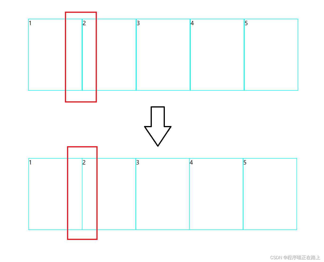
1. margin负值的运用一
让每个盒子 margin 往左侧移动 -1px 正好压住相邻盒子边框
<!DOCTYPEhtml><htmllang="en"><head><metacharset="UTF-8"><metahttp-equiv="X-UA-Compatible"content="IE=edge"><metaname="viewport"content="width=device-width, initial-scale=1.0"><title>margin负值的巧妙运用</title><style>ul li{float: left;list-style: none;width: 150px;height: 200px;border: 1px solid cyan;margin-left: -1px;}</style></head><body><ul><li>1</li><li>2</li><li>3</li><li>4</li><li>5</li></ul></body></html>
2. margin负值的运用二
鼠标经过某个盒子的时候,提高当前盒子的层级即可(如果没有定位,则加相对定位(保留位置),如果有定位,则加 z-index)
<!DOCTYPEhtml><htmllang="en"><head><metacharset="UTF-8"><metahttp-equiv="X-UA-Compatible"content="IE=edge"><metaname="viewport"content="width=device-width, initial-scale=1.0"><title>margin负值的巧妙运用</title><style>ul li{float: left;list-style: none;width: 150px;height: 200px;border: 1px solid cyan;margin-left: -1px;}ul li:hover{/* 盒子没有定位时,加相对定位 */position: relative;/* 盒子有定位时,由于子绝父相无法添加相对定位 */z-index: 1;border: 1px solid red;}</style></head><body><ul><li>1</li><li>2</li><li>3</li><li>4</li><li>5</li></ul></body></html>

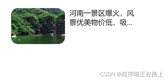
3. 文字围绕浮动元素
类似于下图这样的效果,该怎么实现呢?
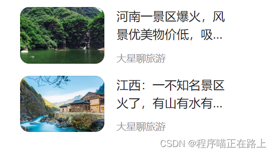
<!DOCTYPEhtml><htmllang="en"><head><metacharset="UTF-8"><metahttp-equiv="X-UA-Compatible"content="IE=edge"><metaname="viewport"content="width=device-width, initial-scale=1.0"><title>文字围绕浮动元素</title><style>.box{width: 280px;height: 70px;margin: 100px auto;}.pic{float: left;width: 120px;height: 60px;margin-right: 10px;}.pic img{width: 100%;border-radius: 15px;}.box p{overflow: hidden;text-overflow: ellipsis;/* 弹性伸缩盒子模型显示 */display: -webkit-box;/* 限制在一个块元素显示的文本的行数 */-webkit-line-clamp: 2;/* 设置或检索伸缩盒子对象的子元素的排列方式 */-webkit-box-orient: vertical;}</style></head><body><divclass="box"><divclass="pic"><imgsrc="images/img.jpg"alt=""></div><p>河南一景区爆火,风景优美物价低,吸引许多游客前来打卡</p></div></body></html>
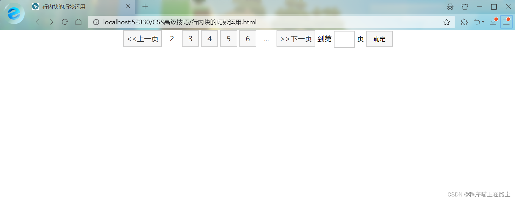
4. 行内块的巧妙运用
<!DOCTYPEhtml><htmllang="en"><head><metacharset="UTF-8"><metahttp-equiv="X-UA-Compatible"content="IE=edge"><metaname="viewport"content="width=device-width, initial-scale=1.0"><title>行内块的巧妙运用</title><style>*{margin: 0;padding: 0;}.box{text-align: center;}.box a{display: inline-block;width: 36px;height: 36px;background-color: #f7f7f7;border: 1px solid #ccc;text-align: center;line-height: 36px;text-decoration: none;color: #333;}.box .prev,
.box .next{width: 85px;}.box .current,
.box .elp{background-color: #fff;border: none;}.box input{width: 45px;height: 36px;border: 1px solid #ccc;outline: none;}.box button{width: 60px;height: 36px;background-color: #f7f7f7;border: 1px solid #ccc;}</style></head><body><divclass="box"><ahref="#"class="prev"><<上一页</a><ahref="#"class="current">2</a><ahref="#">3</a><ahref="#">4</a><ahref="#">5</a><ahref="#">6</a><ahref="#"class="elp">...</a><ahref="#"class="next">>>下一页</a>
到第
<inputtype="text">
页
<button>确定</button></div></body></html>
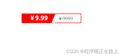
5. CSS三角强化
<!DOCTYPEhtml><htmllang="en"><head><metacharset="UTF-8"><metahttp-equiv="X-UA-Compatible"content="IE=edge"><metaname="viewport"content="width=device-width, initial-scale=1.0"><title>CSS三角巧妙运用</title><style>.price{width: 160px;height: 24px;border: 1px solid red;margin: 100px auto;}.miaosha{position: relative;float: left;width: 90px;height: 100%;background-color: red;text-align: center;color: #fff;font-weight: 700;margin-right: 8px;}.miaosha i{position: absolute;top: 0;right: 0;width: 0;height: 0;/* 1. 只保留右边的边框有颜色 */border-color: transparent #fff transparent transparent;/* 2. 样式都是solid */border-style: solid;/* 3. 上边框宽度要大,右边框宽度稍小,其余边框为0 */border-width: 24px 10px 0 0;}.origin{font-size: 12px;color: gray;text-decoration: line-through;}</style></head><body><divclass="price"><spanclass="miaosha">
            ¥9.99
            <i></i></span><spanclass="origin">¥9999</span></div></body></html>
效果图:
CSS初始化
不同浏览器对有些标签的默认值是不同的,为了消除不同浏览器对 HTML 文本呈现的差异,照顾浏览器的兼容,我们需要对 CSS 进行初始化
简单理解:CSS 初始化是指重设浏览器的样式,也称为 CSS reset
每个网页都必须首先进行 CSS 初始化
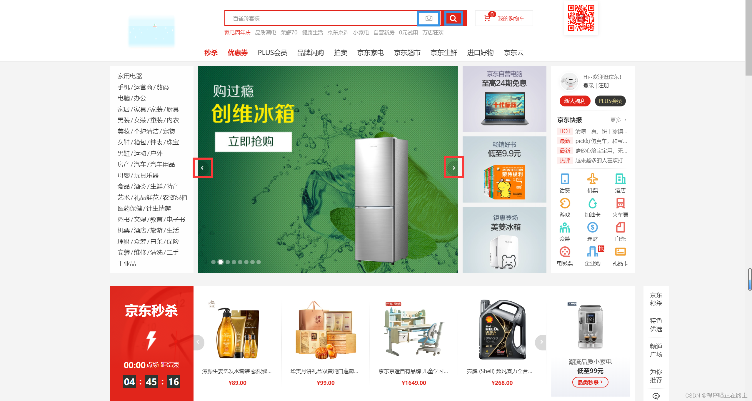
这里我们以京东 CSS 初始化代码为例,打开京东商城源代码,找到其 CSS 代码
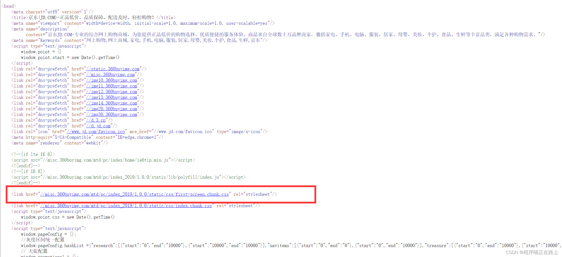
再找到初始化代码
我们来看一下它都做了些什么工作
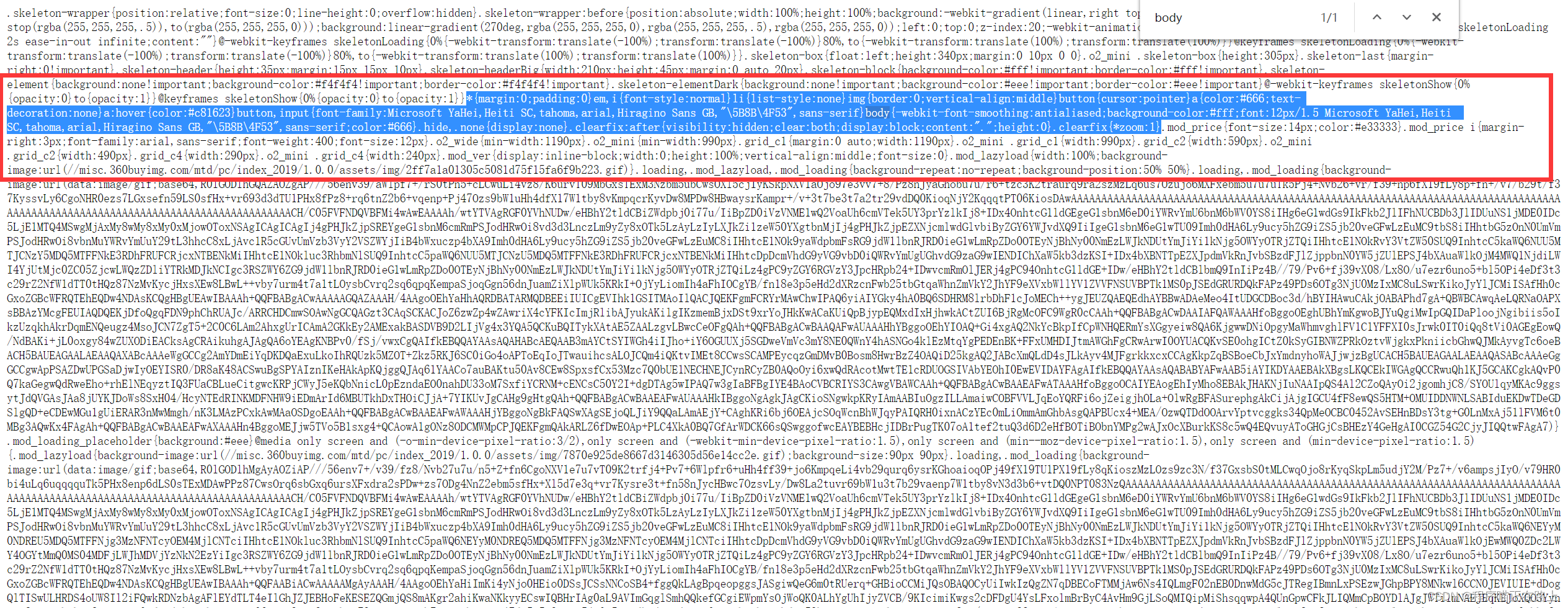
/* 把所有标签的内外边距清零 */*{margin: 0;padding: 0
}/* em 和 i 斜体的文字不倾斜 */em,
i{font-style: normal
}/* 去掉 li 的小圆点 */li{list-style: none
}img{/* border: 0 照顾低版本浏览器,如果图片外面包含了链接会有边框的问题 */border: 0;/* 取消图片底侧有空白缝隙的问题 */vertical-align: middle
}button{/* 当我们鼠标经过button按钮的时候,鼠标变成小手 */cursor: pointer
}a{color: #666;text-decoration: none
}a:hover{color: #c81623
}button,
input{/* "\5B8B\4F53" 就是宋体的意思 */font-family: Microsoft YaHei, Heiti SC, tahoma, arial, Hiragino Sans GB,"\5B8B\4F53", sans-serif
}body{/* 抗锯齿性,让文字显示得更加清晰 */-webkit-font-smoothing: antialiased;background-color: #fff;font: 12px/1.5 Microsoft YaHei, Heiti SC, tahoma, arial, Hiragino Sans GB,"\5B8B\4F53", sans-serif;color: #666
}.hide,
.none{display: none
}.clearfix:after{visibility: hidden;clear: both;display: block;content:".";height: 0
}.clearfix{
    *zoom: 1
}
Unicode 编码字体:
把中文字体的名称用相应的 Unicode 编码来代替,这样就可以有效地避免浏览器解释 CSS 代码时候出现乱码
比如:
- 黑体 \9ED1\4F53
- 宋体 \5B8B\4F53
- 微软雅黑 \5FAF\8F6F\96C5\9ED1
🧸 这次的分享就到这里啦,继续加油哦^^
🐱 我是程序喵,陪你一点点进步
🍭 有出错的地方欢迎在评论区指出来,共同进步,谢谢啦
版权归原作者 程序喵正在路上 所有, 如有侵权,请联系我们删除。