
方案实现方式优点缺点vm vh1.按照设计稿的尺寸,将px按比例计算转为vw和vh1.可以动态计算图表的宽高,字体等,灵活性较高 2.当屏幕比例跟 ui 稿不一致时,不会出现两边留白情况1.每个图表都需要单独做字体、间距、位移的适配,比较麻烦scale1.通过 scale 属性,根据屏幕大小,对图表进行整体的等比缩放1.代码量少,适配简单2.一次处理后不需要在各个图表中再去单独适配 3.文字,图片等大小均能自动适配1.因为是根据 ui 稿等比缩放,当大屏跟 ui 稿的比例不一样时,会出现周边留白情况2.当缩放比例过大时候,字体会有一点点模糊,就一点点3.当缩放比例过大时候,事件热区会偏移。插件v-scale-screen是使用 css 属性 transform 实现缩放效果的一个大屏自适应组件,通过 scale 进行等比例计算,达到等比例缩放的效果可以通过api调整原稿的宽高
方案一:vw vh
1.当屏幕正好为16:9的时候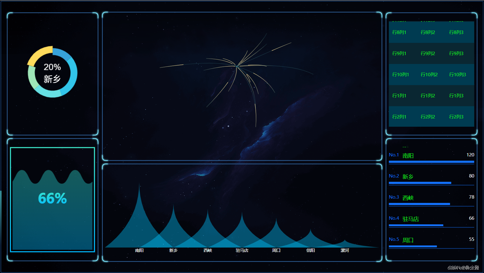
2.当屏幕的尺寸比例大于 16:9 (左右拉长)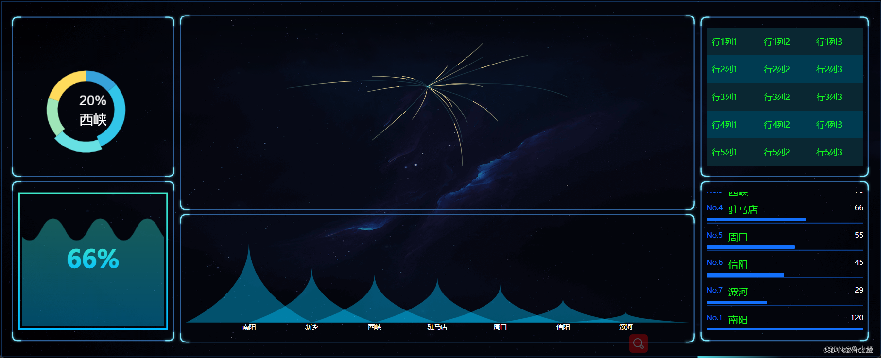
3.当屏幕的尺寸比例小于 16:9 时(左右变窄或者上下拉高)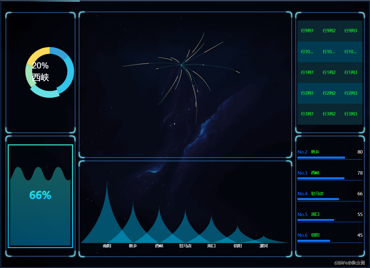
实现方法:
css 方案 - sass
utils.scss
// 使用 scss 的 math 函数,https://sass-lang.com/documentation/breaking-changes/slash-div
@use "sass:math";// 默认设计稿的宽度$designWidth:1920;// 默认设计稿的高度$designHeight:1080;// px 转为 vw 的函数
@functionvw($px){
  @return math.div($px, $designWidth)* 100vw;}// px 转为 vh 的函数
@functionvh($px){
  @return math.div($px, $designHeight)* 100vh;}
复制代码
路径配置只需在vue.config.js里配置一下utils.scss的路径,就可以全局使用了
vue.config.js
module.exports ={css:{loaderOptions:{sass:{prependData:`@import "@/assets/css/utils.scss";`}}},}
在 .vue 中使用
<template><div class="box"></div></template><script>exportdefault{name:"Box",}</script><style lang="scss" scoped="scoped">/*
 直接使用 vw 和 vh 函数,将像素值传进去,得到的就是具体的 vw vh 单位
 */.box{width:vw(300);height:vh(100);
    font-size:vh(16);
    background-color: black;
    margin-left:vw(10);
    margin-top:vh(10);border:vh(2) solid red;}</style>
css 方案 - less
utils.less
@charset "utf-8";// 默认设计稿的宽度
@designWidth:1920;// 默认设计稿的高度
@designHeight:1080;.px2vw(@name, @px){
  @{name}:(@px / @designWidth)* 100vw;}.px2vh(@name, @px){
  @{name}:(@px / @designHeight)* 100vh;}.px2font(@px){
  font-size:(@px / @designWidth)* 100vw;}

路径配置在vue.config.js里配置一下utils.less
<style lang="less" scoped="scoped">/*
 直接使用 vw 和 vh 函数,将像素值传进去,得到的就是具体的 vw vh单位
 */.box{.px2vw(width,300);.px2vh(height,100);.px2font(16);.px2vw(margin-left,300);.px2vh(margin-top,100);
    background-color: black;}</style>

定义 js 样式处理函数
// 定义设计稿的宽高const designWidth =1920;const designHeight =1080;// px转vwexportconstpx2vw=(_px)=>{return(_px *100.0)/ designWidth +'vw';};exportconstpx2vh=(_px)=>{return(_px *100.0)/ designHeight +'vh';};exportconstpx2font=(_px)=>{return(_px *100.0)/ designWidth +'vw';};
屏幕变化后,图表自动调整
这种使用方式有个弊端,就是屏幕尺寸发生变化后,需要手动刷新一下才能完成自适应调整
为了解决这个问题,你需要在各个图表中监听页面尺寸变化,重新调整图表,在 vue 项目中,也可以借助element-resize-detector,最好封装个 resize 的指令,在各图表中就只要使用该指令就可以了,毕竟作为程序员,能偷懒就偷懒。
解决方案一
1:安装 element-resize-detector
npm install element-resize-detector --save
2:封装成自定义指令使用
// directive.jsimport*as ECharts from"echarts";import elementResizeDetectorMaker from"element-resize-detector";import Vue from"vue";constHANDLER="_vue_resize_handler";functionbind(el, binding){
  el[HANDLER]= binding.value
    ? binding.value:()=>{let chart = ECharts.getInstanceByDom(el);if(!chart){return;}
        chart.resize();};// 监听绑定的div大小变化,更新 echarts 大小elementResizeDetectorMaker().listenTo(el, el[HANDLER]);}functionunbind(el){// window.removeEventListener("resize", el[HANDLER]);elementResizeDetectorMaker().removeListener(el, el[HANDLER]);delete el[HANDLER];}// 自定义指令:v-chart-resize 示例:v-chart-resize="fn"
Vue.directive("chart-resize",{ bind, unbind });
3:main.js 中引入
import'@/directive/directive';
4:html 代码中使用
<template><div class="linechart"><div ref="chart" v-chart-resize class="chart"></div></div></template>
这里要注意的是,图表中如果需要 tab 切换动态更新图表数据,在更新数据时一定不要用 echarts 的 dispose 方法先将图表移除,再重新绘制,因为 resize 指令中挂载到的图表实例还是旧的,就监听不到新的 chart 元素的 resize 了,更新数据只需要用 chart 的 setOption 方法重新设置配置项即可。
解决方案二
1.在echarts中可以echarts.init(chatDom).resize()来解决宽高的自适应问题
let chatDom = document.getElementById('main');let myChart =this.$echarts.init(chatDom);//根据父盒子的尺寸调整echarts的大小setTimeout(()=>{
            window.addEventListener('resize',()=>{this.$echarts.init(chatDom).resize();});},20);
2.在DataV中可以添加key来解决
<dv-water-level-pond :config="config2":key="key" ref="pie2"/>data(){return{key:1}},mounted(){this.pieOutlineFunc();},methods:{pieOutlineFunc(){var _this =this;
            window.addEventListener('resize',function(e){
                _this.$nextTick(()=>{
                    console.log(_this.$refs.pie2);
                    _this.key++;});});}}
方案二:csale
通过 css 的 scale 属性,根据屏幕大小,用js监测屏幕的大小变化对图表进行整体的等比缩放,从而达到自适应效果
当屏幕的尺寸比例刚好是 16:9 时,页面能刚好全屏展示,内容占满显示器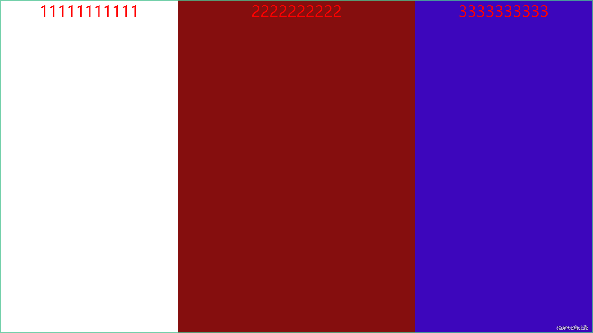
当屏幕尺寸比例大于 16:9 时,上下左右留白,左右占满并居中,显示比例保持 16:9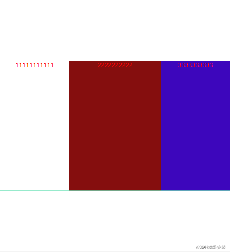
当屏幕尺寸比例大于 16:9 时,页面左右留白,上下占满并居中,显示比例保持 16:9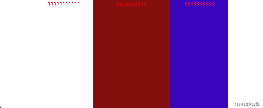
代码
html
<template><div class="screen-root"><div class="screen" id="screen"><div class="div1"><h1>11111111111</h1></div><div class="div2"><h1>2222222222</h1></div><div class="div3"><h1>3333333333</h1></div></div></div></template>
js
<script>exportdefault{mounted(){// 初始化自适应  ----在刚显示的时候就开始适配一次this.handleScreenAuto();// 绑定自适应函数   ---防止浏览器栏变化后不再适配
        window.onresize=()=>this.handleScreenAuto();},deleted(){
        window.onresize =null;},methods:{// 数据大屏自适应函数handleScreenAuto(){const designDraftWidth =1920;//设计稿的宽度const designDraftHeight =1080;//设计稿的高度// 根据屏幕的变化适配的比例const scale =
                document.documentElement.clientWidth / document.documentElement.clientHeight <
                designDraftWidth / designDraftHeight
                    ? document.documentElement.clientWidth / designDraftWidth
                    : document.documentElement.clientHeight / designDraftHeight;// 缩放比例
            document.querySelector('#screen').style.transform =`scale(${scale}) translate(-50%,-50%)`;return1;}}};</script>
css
<style lang="scss" scoped>/*
  除了设计稿的宽高是根据您自己的设计稿决定以外,其他复制粘贴就完事
*/
h1 {color: red;
    font-size: 50px;}.screen-root {height: 100vh;width: 100vw;.screen {display: inline-block;width: 1920px;//设计稿的宽度height: 1080px;//设计稿的高度
        transform-origin:00;position: absolute;left:50%;top:50%;border: 2px solid rgb(31,210,145);
        box-sizing: border-box;display: flex;.div1 {
            background-color: #fff;height:100%;
            text-align: center;flex:0130%;}.div2 {
            background-color:rgb(133,14,14);height:100%;
            text-align: center;flex:0140%;}.div3 {
            background-color:rgb(61,6,188);height:100%;
            text-align: center;flex:0130%;}}}</style>
方案三:插件v-scale-screen
它其实也是通过 scale 进行等比例计算放大和缩小的,和方案二的原理是一样的,还可以通过api调整样式,源码地址和对应的API。
使用方法:
1.vue2请使用v-scale-screen@1.0.0版本,vue3请使用v-scale-screen@2.0.0版本
npm install [email protected]
# or
yarn add v-scale-screen
2.使用-vue2中使用插件导入,vue3以组件导入
vue2
// main.jsimport VScaleScreen from'v-scale-screen'
Vue.use(VScaleScreen)
组件内使用
//html<v-scale-screen width="1920" height="1080":boxStyle="boxStyle"><div><v-chart>....</v-chart><v-chart>....</v-chart><v-chart>....</v-chart><v-chart>....</v-chart><v-chart>....</v-chart></div></v-scale-screen>//jsdata(){return{boxStyle:{backgroundColor:'green'},}
vue3
<v-scale-screen width="1920" height="1080"><div><v-chart>....</v-chart><v-chart>....</v-chart><v-chart>....</v-chart><v-chart>....</v-chart><v-chart>....</v-chart></div></v-scale-screen><script>import VScaleScreen from'v-scale-screen'exportdefault{components:{
    VScaleScreen
  }}</script>
———————————————
本文为CSDN博主「鲁少聚」的原创文章,遵循CC 4.0 BY-SA版
原文链接:https://blog.csdn.net/L1147484597/article/details/128443705
版权归原作者 ZXH0122 所有, 如有侵权,请联系我们删除。