
效果图:
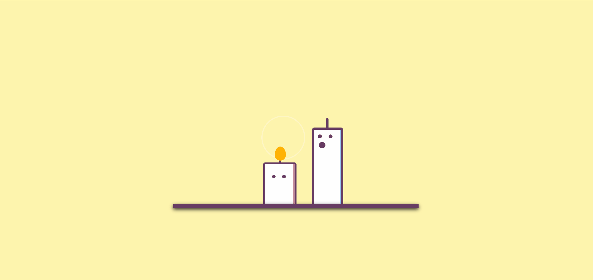
向大家介绍如何使用 CSS 和关键帧动画创建一个可爱的蜡烛动画效果。这个动画效果可以用于节日祝福、生日祝福等场合,让网页更加有趣和生动。
HTML代码
<!doctype html>
<html>

<head>
    <meta charset="utf-8">
    <title>纯css3卡通蜡烛小人动画特效演示</title>
    <link href="./css/datouwang.css" rel="stylesheet" type="text/css">
</head>

<body>
    <div class="wrapper">
        <div class="candles">
            <div class="light__wave"></div>
            <div class="candle1">
                <div class="candle1__body">
                    <div class="candle1__eyes">
                        <span class="candle1__eyes-one"></span>
                        <span class="candle1__eyes-two"></span>
                    </div>
                    <div class="candle1__mouth"></div>
                </div>
                <div class="candle1__stick"></div>
            </div>
            <div class="candle2">
                <div class="candle2__body">
                    <div class="candle2__eyes">
                        <div class="candle2__eyes-one"></div>
                        <div class="candle2__eyes-two"></div>
                    </div>
                </div>
                <div class="candle2__stick"></div>
            </div>
            <div class="candle2__fire"></div>
            <div class="sparkles-one"></div>
            <div class="sparkles-two"></div>
            <div class="candle__smoke-one"></div>
            <div class="candle__smoke-two"></div>
        </div>
        <div class="floor"></div>
    </div>
</body>

</html>
<link>标签:
通过<link>标签引入外部CSS文件datouwang.css,该文件包含了样式定义用于渲染页面元素。
页面结构:
.wrapper:整体容器,用于包裹所有元素。
.candles:蜡烛小人容器,包括蜡烛、火焰、眼睛、嘴巴等元素。
.light__wave:光波效果。
.candle1和.candle2:两根蜡烛,每根蜡烛包括蜡烛身体、眼睛、眼睛、眼睛、火焰以及支架等部分。
.candle1__body和.candle2__body:蜡烛的身体部分。
.candle1__eyes和.candle2__eyes:蜡烛的眼睛部分。
.candle1__eyes-one、.candle1__eyes-two、.candle2__eyes-one、.candle2__eyes-two:眼睛的具体元素。
.candle1__mouth:蜡烛1的嘴巴部分。
.candle1__stick和.candle2__stick:蜡烛的支架部分。
.candle2__fire:蜡烛2的火焰部分。
.sparkles-one和.sparkles-two:闪烁效果。
.candle__smoke-one和.candle__smoke-two:烟雾效果。
floor:地板部分
CSS结构:
body部分设置了背景颜色以及一个名为change-background的动画,使背景颜色在两种不同的颜色之间循环变化。.wrapper是整个动画的容器,通过绝对定位将其放置在页面的中心位置,并进行缩放和偏移。.floor是一个代表地面的元素,也进行了绝对定位,并设置了阴影效果。.candles是蜡烛的容器,用于包裹所有蜡烛元素。.candle1和.candle2分别代表两支蜡烛,它们都是绝对定位的白色长方体,通过设置不同的动画效果,让它们看起来像是在跳舞或者闪烁。.candle1__stick和.candle2__stick是蜡烛的支架,使用绝对定位放置并进行了旋转和移动的动画效果。.candle1__eyes,.candle2__eyes,.candle1__mouth以及.candle__smoke-one,.candle__smoke-two等元素则是组成蜡烛的眼睛、嘴巴和烟雾等部分,通过不同的动画效果来模拟眨眼、摇晃和吐烟的效果。- 最后还有一些关键帧动画 (
@keyframes) 的定义,用于实现上述提到的各种动画效果,比如眨眼、身体放大缩小、火焰舞动等。
body {
  background-color: #FEF4AD;
  animation: change-background 3s infinite linear;
}

.wrapper {
  position: absolute;
  left: 50%;
  top: 70%;
  transform: scale(1.5, 1.5) translate(-50%, -50%);
}

.floor {
  position: absolute;
  left: 50%;
  top: 50%;
  width: 350px;
  height: 5px;
  background: #673C63;
  transform: translate(-50%, -50%);
  box-shadow: 0px 2px 5px #111;
  z-index: 2;
}

.candles {
  position: absolute;
  left: 50%;
  top: 50%;
  width: 250px;
  height: 150px;
  transform: translate(-50%, -100%);
  z-index: 1;
}

.candle1 {
  position: absolute;
  left: 50%;
  top: 50%;
  width: 35px;
  height: 100px;
  background: #fff;
  border: 3px solid #673C63;
  border-bottom: 0px;
  border-radius: 3px;
  transform-origin: center right;
  transform: translate(60%, -25%);
  box-shadow: -2px 0px 0px #95c6f2 inset;
  animation: expand-body 3s infinite linear;
}

.candle1__stick, .candle2__stick {
  position: absolute;
  left: 50%;
  top: 0%;
  width: 3px;
  height: 15px;
  background: #673C63;
  border-radius: 8px;
  transform: translate(-50%, -100%);
}

.candle2__stick {
  height: 12px;
  transform-origin: bottom center;
  animation: stick-animation 3s infinite linear;
}

.candle1__eyes, .candle2__eyes {
  position: absolute;
  left: 50%;
  top: 0%;
  width: 35px;
  height: 30px;
  transform: translate(-50%, 0%);
}

.candle1__eyes-one {
  position: absolute;
  left: 30%;
  top: 20%;
  width: 5px;
  height: 5px;
  border-radius: 100%;
  background: #673C63;
  transform: translate(-70%, 0%);
  animation: blink-eyes 3s infinite linear;
}

.candle1__eyes-two {
  position: absolute;
  left: 70%;
  top: 20%;
  width: 5px;
  height: 5px;
  border-radius: 100%;
  background: #673C63;
  transform: translate(-70%, 0%);
  animation: blink-eyes 3s infinite linear;
}

.candle1__mouth {
  position: absolute;
  left: 40%;
  top: 20%;
  width: 0px;
  height: 0px;
  border-radius: 20px;
  background: #673C63;
  transform: translate(-50%, -50%);
  animation: uff 3s infinite linear;
}

.candle__smoke-one {
  position: absolute;
  left: 30%;
  top: 50%;
  width: 30px;
  height: 3px;
  background: grey;
  transform: translate(-50%, -50%);
  animation: move-left 3s infinite linear;
}

.candle__smoke-two {
  position: absolute;
  left: 30%;
  top: 40%;
  width: 10px;
  height: 10px;
  border-radius: 10px;
  background: grey;
  transform: translate(-50%, -50%);
  animation: move-top 3s infinite linear;
}

.candle2 {
  position: absolute;
  left: 20%;
  top: 65%;
  width: 42px;
  height: 60px;
  background: #fff;
  border: 3px solid #673C63;
  border-bottom: 0px;
  border-radius: 3px;
  transform: translate(60%, -15%);
  transform-origin: center right;
  box-shadow: -2px 0px 0px #95c6f2 inset;
  animation: shake-left 3s infinite linear;
}

.candle2__eyes-one {
  position: absolute;
  left: 30%;
  top: 50%;
  width: 5px;
  height: 5px;
  display: inline-block;
  border: 0px solid #673C63;
  border-radius: 100%;
  float: left;
  background: #673C63;
  transform: translate(-80%, 0%);
  animation: changeto-lower 3s infinite linear;
}

.candle2__eyes-two {
  position: absolute;
  left: 70%;
  top: 50%;
  width: 5px;
  height: 5px;
  display: inline-block;
  border: 0px solid #673C63;
  border-radius: 100%;
  float: left;
  background: #673C63;
  transform: translate(-80%, 0%);
  animation: changeto-greater 3s infinite linear;
}

.light__wave {
  position: absolute;
  top: 35%;
  left: 35%;
  width: 75px;
  height: 75px;
  border-radius: 100%;
  z-index: 0;
  transform: translate(-25%, -50%) scale(2.5, 2.5);
  border: 2px solid rgba(255, 255, 255, 0.2);
  animation: expand-light 3s infinite linear;
}

.candle2__fire {
  position: absolute;
  top: 50%;
  left: 40%;
  display: block;
  width: 16px;
  height: 20px;
  background-color: red;
  border-radius: 50% 50% 50% 50% / 60% 60% 40% 40%;
  background: #FF9800;
  transform: translate(-50%, -50%);
  animation: dance-fire 3s infinite linear;
}

@keyframes blink-eyes {
  0%,35% {
    opacity: 1;
    transform: translate(-70%, 0%);
  }
  36%,39% {
    opacity: 0;
    transform: translate(-70%, 0%);
  }
  40% {
    opacity: 1;
    transform: translate(-70%, 0%);
  }
  50%,65% {
    transform: translate(-140%, 0%);
  }
  66% {
    transform: translate(-70%, 0%);
  }
}
@keyframes expand-body {
  0%,40% {
    transform: scale(1, 1) translate(60%, -25%);
  }
  45%,55% {
    transform: scale(1.1, 1.1) translate(60%, -28%);
  }
  60% {
    transform: scale(0.89, 0.89) translate(60%, -25%);
  }
  65% {
    transform: scale(1, 1) translate(60%, -25%);
  }
  70% {
    transform: scale(0.95, 0.95) translate(60%, -25%);
  }
  75% {
    transform: scale(1, 1) translate(60%, -25%);
  }
}
@keyframes uff {
  0%,40% {
    width: 0px;
    height: 0px;
  }
  50%,54% {
    width: 15px;
    height: 15px;
    left: 30%;
  }
  59% {
    width: 5px;
    height: 5px;
    left: 20%;
  }
  62% {
    width: 2px;
    height: 2px;
    left: 20%;
  }
  67% {
    width: 0px;
    height: 0px;
    left: 30%;
  }
}
@keyframes change-background {
  0%,59%,98%,100% {
    background: #FEF4AD;
  }
  61%,97% {
    background: #F8AE39;
  }
}
@keyframes move-left {
  0%,59%,100% {
    width: 0px;
    left: 40%;
  }
  60% {
    width: 30px;
    left: 30%;
  }
  68% {
    width: 0px;
    left: 20%;
  }
}
@keyframes move-top {
  0%,64%,100% {
    width: 0px;
    height: 0px;
    top: 0%;
  }
  65% {
    width: 10px;
    height: 10px;
    top: 40%;
    left: 40%;
  }
  80% {
    width: 0px;
    height: 0px;
    top: 20%;
  }
}
@keyframes shake-left {
  0%,40% {
    left: 20%;
    transform: translate(60%, -15%);
  }
  50%,54% {
    left: 20%;
    transform: translate(60%, -15%);
  }
  59% {
    left: 20%;
    transform: translate(60%, -15%);
  }
  62% {
    left: 18%;
    transform: translate(60%, -15%);
  }
  65% {
    left: 21%;
    transform: translate(60%, -15%);
  }
  67% {
    left: 20%;
    transform: translate(60%, -15%);
  }
  75% {
    left: 20%;
    transform: scale(1.15, 0.85) translate(60%, -15%);
    background: #fff;
    border-color: #673C63;
  }
  91% {
    left: 20%;
    transform: scale(1.18, 0.82) translate(60%, -10%);
    background: #F44336;
    border-color: #F44336;
    box-shadow: -2px 0px 0px #F44336 inset;
  }
  92% {
    left: 20%;
    transform: scale(0.85, 1.15) translate(60%, -15%);
  }
  95% {
    left: 20%;
    transform: scale(1.05, 0.95) translate(60%, -15%);
  }
  97% {
    left: 20%;
    transform: scale(1, 1) translate(60%, -15%);
  }
}
@keyframes stick-animation {
  0%,40% {
    left: 50%;
    top: 0%;
    transform: translate(-50%, -100%);
  }
  50%,54% {
    left: 50%;
    top: 0%;
    transform: translate(-50%, -100%);
  }
  59% {
    left: 50%;
    top: 0%;
    transform: translate(-50%, -100%);
  }
  62% {
    left: 50%;
    top: 0%;
    transform: rotateZ(-15deg) translate(-50%, -100%);
  }
  65% {
    left: 50%;
    top: 0%;
    transform: rotateZ(15deg) translate(-50%, -100%);
  }
  70% {
    left: 50%;
    top: 0%;
    transform: rotateZ(-5deg) translate(-50%, -100%);
  }
  72% {
    left: 50%;
    top: 0%;
    transform: rotateZ(5deg) translate(-50%, -100%);
  }
  74%,84% {
    left: 50%;
    top: 0%;
    transform: rotateZ(0deg) translate(-50%, -100%);
  }
  85% {
    transform: rotateZ(180deg) translate(0%, 120%);
  }
  92% {
    left: 50%;
    top: 0%;
    transform: translate(-50%, -100%);
  }
}
@keyframes expand-light {
  10%,29%,59%,89% {
    transform: translate(-25%, -50%) scale(0, 0);
    border: 2px solid rgba(255, 255, 255, 0);
  }
  90%,20%,50% {
    transform: translate(-25%, -50%) scale(1, 1);
  }
  95%,96%,26%,27%,56%,57% {
    transform: translate(-25%, -50%) scale(2, 2);
    border: 2px solid rgba(255, 255, 255, 0.5);
  }
  0%,28%,58%,100% {
    transform: translate(-25%, -50%) scale(2.5, 2.5);
    border: 2px solid rgba(255, 255, 255, 0.2);
  }
}
@keyframes dance-fire {
  59%,89% {
    left: 40%;
    width: 0px;
    height: 0px;
  }
  90%,0%,7%,15%,23%,31%,39%,47%,55% {
    left: 40.8%;
    width: 16px;
    height: 20px;
    background: #FFC107;
  }
  94%,3%,11%,19%,27%,35%,43%,51%,58% {
    left: 41.2%;
    width: 16px;
    height: 20px;
    background: #FF9800;
  }
}
@keyframes changeto-lower {
  0%,70%,90% {
    padding: 0px;
    display: inline-block;
    border-radius: 100%;
    background: #673C63;
    border-width: 0 0 0 0;
    border: 0px solid #673C63;
    transform: translate(-90%, 0%);
  }
  71%,89% {
    background: none;
    border: solid #673C63;
    border-radius: 0px;
    border-width: 0 2px 2px 0;
    display: inline-block;
    padding: 1px;
    float: left;
    transform-origin: bottom left;
    transform: rotate(-45deg) translate(-50%, -65%);
    -webkit-transform: rotate(-45deg) translate(-50%, -65%);
  }
}
@keyframes changeto-greater {
  0%,70%,90% {
    top: 50%;
    padding: 0px;
    display: inline-block;
    border-radius: 100%;
    background: #673C63;
    border-width: 0 0 0 0;
    border: 0px solid #673C63;
    transform: translate(-80%, 0%);
  }
  71%,89% {
    top: 30%;
    background: none;
    border: solid #673C63;
    border-radius: 0px;
    border-width: 0 2px 2px 0;
    display: inline-block;
    padding: 1px;
    float: left;
    transform-origin: bottom left;
    transform: rotate(135deg) translate(-80%, 20%);
    -webkit-transform: rotate(135deg) translate(-80%, 20%);
  }
}
本文转载自: https://blog.csdn.net/m_aolifande/article/details/136392631
版权归原作者 张文知 所有, 如有侵权,请联系我们删除。
版权归原作者 张文知 所有, 如有侵权,请联系我们删除。