
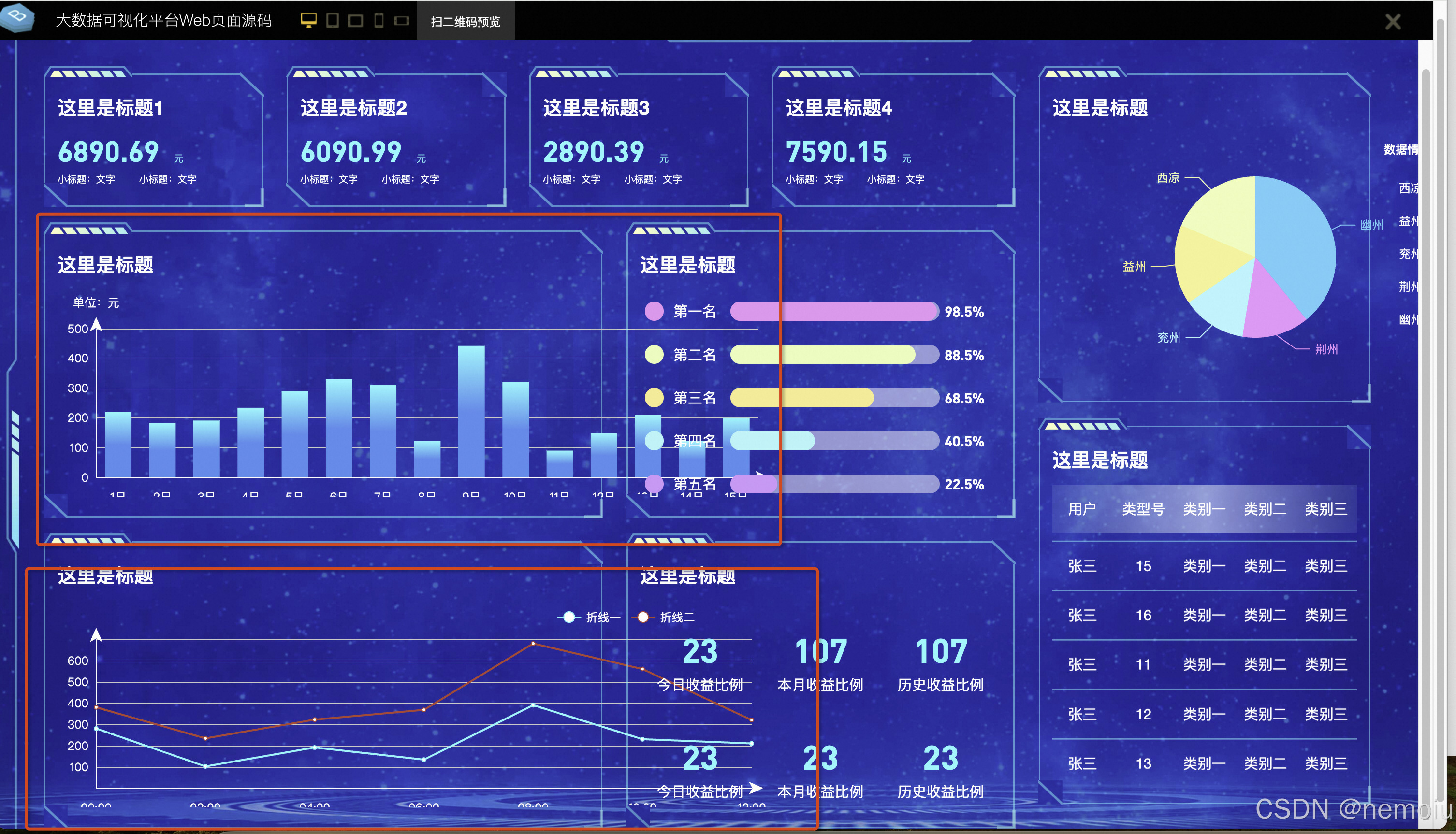
背景
最近公司来了一个大屏的项目,之前没有接触过,因此看了很多方案,总结了一下,然后选择了一种方案去实现,看完这篇文章,只要你有设计稿,拿来就用可以100%高度还原任何场景!
方案比较
大屏方案比较
方案实现方法优点缺点vw, vh按照设计稿的尺寸,将
px
按比例计算转为
vw
和
vh
1.可以动态计算图表的宽高,字体等,灵活性较高
2.当屏幕比例跟 ui 稿不一致时,不会出现两边留白情况1.需要编写公共转换函数,为每个图表都单独做字体、间距、位移的适配,比较麻烦scale通过
scale
属性,根据屏幕大小,对图表进行整体的等比缩放1.代码量少,适配简单
2.一次处理后不需要在各个图表中再去单独适配1.因为是根据 ui 稿等比缩放,当大屏跟 ui 稿的比例不一样时,会出现周边留白情况
2.当缩放比例过大时候,字体和图片会有一点点失真.
3.当缩放比例过大时候,事件热区会偏移。rem+vw,vh1.获得 rem 的基准值
2.动态的计算
html根元素的font-size
3.图表中通过 vw vh 动态计算字体、间距、位移等1.布局的自适应代码量少,适配简单1.因为是根据 ui 稿等比缩放,当大屏跟 ui 稿的比例不一样时,会出现周边留白情况
2.图表需要单个做字体、间距、位移的适配
这几种方案中相对而言最容易实现的是scale,但是sacle作为最简单的方案其缺点也很明显,当ui和大屏比例不一致会留白,并且存在字体和图片失真的情况。作为对技术有追求的人,我们肯定会选择一种相对实现简单和不会“膈应”的方法。笔者在思考了这几个方案的利弊后,果断选择了第一种,用vw、vh来实现,为什么呢?因为笔者的工资ui小姐姐画的设计稿比较美妙,1920/1080的设计稿css可以拿来直接用。很多人不禁要提问了?不是要转换成vw,vh吗,怎么可以拿来直接用。下面开始本文的重点了,教你实现ui稿设计的大屏结构和各种矢量图!
方案实现
一、vw,vh(推荐)
在这种方案的设计下,我们可以直接使用vw单位也可以使用postcss-px-to-viewport去一键式转换,当然这个方案还有重点,echarts中的样式不会被转换,可以看到下面的大屏中,当大屏宽度变化时,echart并没有变。
实现
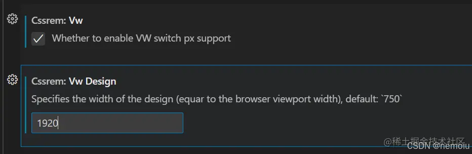
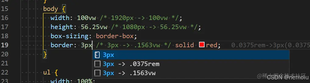
在实现中你既可以直接使用vw单位,譬如笔者的ui为1920/1080,那么100vw=1920px,100vh=1080vh,或者你可以在vscode中使用插件将px转换成vw
**
cssrem
插件方式转换**
接着就可以按照 1920px * 1080px 的设计稿愉快开发,此时的页面已经是响应式,并宽高比不变
**
webpack
插件转换**
当然,笔者作为著名的懒人,你也可以像我一样,使用postcss-px-to-viewport插件去一键转换,这样在写css样式的时候会在webpack打包时被转换成vw单位,
安装方案:
npm install postcss-px-to-viewport
然后在根目录下新建一个postcss.config.js文件,里面做如下配置
module.exports = {
  plugins: {
    'postcss-px-to-viewport': {
      unitToConvert: 'px', // 要转化的单位
      viewportWidth: 1920, // UI设计稿的宽度
      unitPrecision: 6, // 转换后的精度,即小数点位数
      propList: ['*'], // 指定转换的css属性的单位,*代表全部css属性的单位都进行转换
      viewportUnit: 'vw', // 指定需要转换成的视窗单位,默认vw
      fontViewportUnit: 'vw', // 指定字体需要转换成的视窗单位,默认vw
      selectorBlackList: [], // 指定不转换为视窗单位的类名,
      minPixelValue: 1, // 默认值1,小于或等于1px则不进行转换
      mediaQuery: true, // 是否在媒体查询的css代码中也进行转换,默认false
      replace: true, // 是否转换后直接更换属性值
      include: /\/src\/,
      exclude: [/node_modules/], // 设置忽略文件,用正则做目录名匹配
      landscape: false // 是否处理横屏情况
    }
  }
}
好了,相信你到这步,除了echarts之外的css样式能完成了,但是你可能不知道怎么去实现大屏中那些炫酷的效果??ui小姐姐画的炫酷设计可不能浪费啊。
ui实现
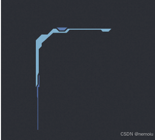
譬如,我想实现下面这样一个炫酷的边框,这边以datav中的案例为例,自己的ui肯定有所不同哈~那么我自己去实现要怎么做呢?
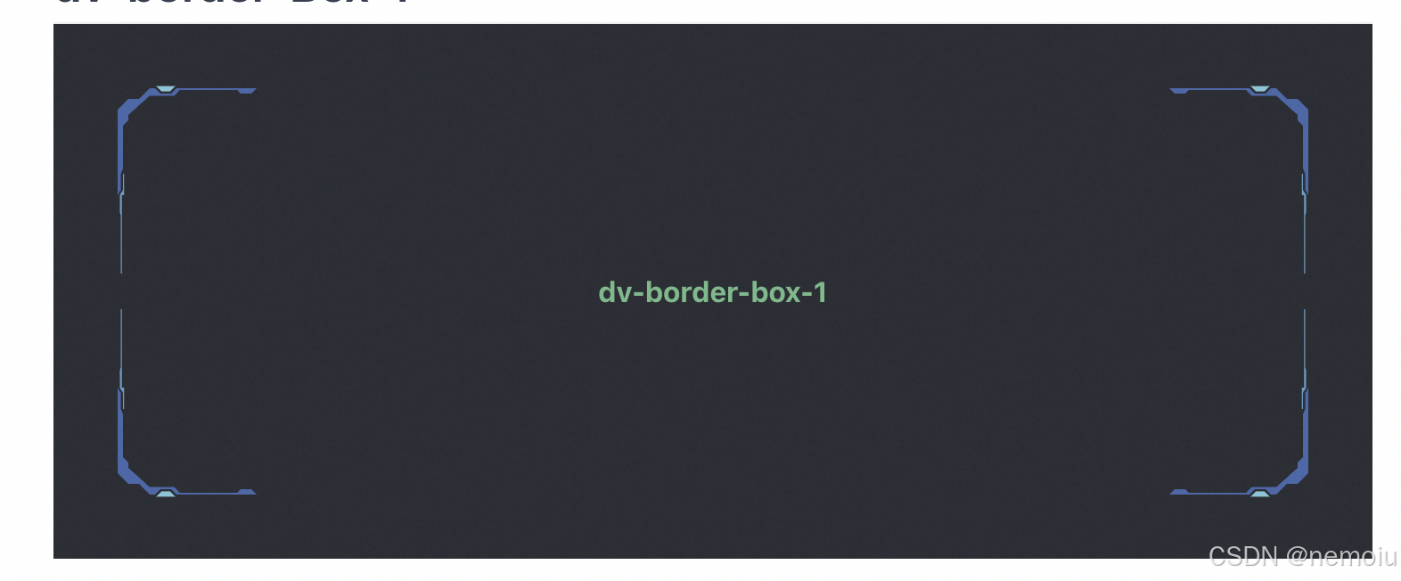
可以看看datav中这个border的源码,其实很简单
https://github.com/DataV-Team/DataV/blob/master/src/components/borderBox1/src/main.vue
以上面为例子,让我们看看源码是如何实现的
<template>
  <div class="dv-border-box-1" :ref="ref">
    <svg class="border" :width="width" :height="height">
      <polygon :fill="backgroundColor" :points="`10, 27 10, ${height - 27} 13, ${height - 24} 13, ${height - 21} 24, ${height - 11}
      38, ${height - 11} 41, ${height - 8} 73, ${height - 8} 75, ${height - 10} 81, ${height - 10}
      85, ${height - 6} ${width - 85}, ${height - 6} ${width - 81}, ${height - 10} ${width - 75}, ${height - 10}
      ${width - 73}, ${height - 8} ${width - 41}, ${height - 8} ${width - 38}, ${height - 11}
      ${width - 24}, ${height - 11} ${width - 13}, ${height - 21} ${width - 13}, ${height - 24}
      ${width - 10}, ${height - 27} ${width - 10}, 27 ${width - 13}, 25 ${width - 13}, 21
      ${width - 24}, 11 ${width - 38}, 11 ${width - 41}, 8 ${width - 73}, 8 ${width - 75}, 10
      ${width - 81}, 10 ${width - 85}, 6 85, 6 81, 10 75, 10 73, 8 41, 8 38, 11 24, 11 13, 21 13, 24`" />
    </svg>

    <svg
      width="150px"
      height="150px"
      :key="item"
      v-for="item in border"
      :class="`${item} border`"
    >
      <polygon
        :fill="mergedColor[0]"
        points="6,66 6,18 12,12 18,12 24,6 27,6 30,9 36,9 39,6 84,6 81,9 75,9 73.2,7 40.8,7 37.8,10.2 24,10.2 12,21 12,24 9,27 9,51 7.8,54 7.8,63"
      >
        <animate
          attributeName="fill"
          :values="`${mergedColor[0]};${mergedColor[1]};${mergedColor[0]}`"
          dur="0.5s"
          begin="0s"
          repeatCount="indefinite"
        />
      </polygon>
      <polygon
        :fill="mergedColor[1]"
        points="27.599999999999998,4.8 38.4,4.8 35.4,7.8 30.599999999999998,7.8"
      >
        <animate
          attributeName="fill"
          :values="`${mergedColor[1]};${mergedColor[0]};${mergedColor[1]}`"
          dur="0.5s"
          begin="0s"
          repeatCount="indefinite"
        />
      </polygon>
      <polygon
        :fill="mergedColor[0]"
        points="9,54 9,63 7.199999999999999,66 7.199999999999999,75 7.8,78 7.8,110 8.4,110 8.4,66 9.6,66 9.6,54"
      >
        <animate
          attributeName="fill"
          :values="`${mergedColor[0]};${mergedColor[1]};transparent`"
          dur="1s"
          begin="0s"
          repeatCount="indefinite"
        />
      </polygon>
    </svg>

    <div class="border-box-content">
      <slot></slot>
    </div>
  </div>
</template>

<script>
import autoResize from '../../../mixin/autoResize'

import { deepMerge } from '@jiaminghi/charts/lib/util/index'

import { deepClone } from '@jiaminghi/c-render/lib/plugin/util'

export default {
  name: 'DvBorderBox1',
  mixins: [autoResize],
  props: {
    color: {
      type: Array,
      default: () => ([])
    },
    backgroundColor: {
      type: String,
      default: 'transparent'
    }
  },
  data () {
    return {
      ref: 'border-box-1',

      border: ['left-top', 'right-top', 'left-bottom', 'right-bottom'],

      defaultColor: ['#4fd2dd', '#235fa7'],

      mergedColor: []
    }
  },
  watch: {
    color () {
      const { mergeColor } = this

      mergeColor()
    }
  },
  methods: {
    mergeColor () {
      const { color, defaultColor } = this

      this.mergedColor = deepMerge(deepClone(defaultColor, true), color || [])
    }
  },
  mounted () {
    const { mergeColor } = this

    mergeColor()
  }
}
</script>

<style lang="less">
.dv-border-box-1 {
  position: relative;
  width: 100%;
  height: 100%;

  .border {
    position: absolute;
    display: block;
  }

  .right-top {
    right: 0px;
    transform: rotateY(180deg);
  }

  .left-bottom {
    bottom: 0px;
    transform: rotateX(180deg);
  }

  .right-bottom {
    right: 0px;
    bottom: 0px;
    transform: rotateX(180deg) rotateY(180deg);
  }

  .border-box-content {
    position: relative;
    width: 100%;
    height: 100%;
  }
}
</style>
可以看到上面代码中的 <svg>标签中的内容就是就是下面这个图案实现的效果,而代码中的css是将其旋转然后通过position去定位到固定位置,animate即为它的动画效果,是不是很简单?如果我们想做到类似的效果,找到ui设计稿中的图形,再将图形的svg复制到项目中,加上一些动画效果和css就能实现。
echarts实现
  好了,相信你看完上面的内容对整个大屏架构的自适应和动静态效果具体实现已经了如指掌了,那么到了这个时候就是要去实现echarts的自适应效果了

 echarts的具体实现相信大家翻着说明文档都能做出来,主要就是实现当页面变化时的自适应~
笔者为了造福大家,封装了一个转换宽高的函数和echarts组件,大家直接修修改改就能拿去用。
首先呢,echarts需要给他封装一个组件,让其在页面变化时可以自适应调节大小
echarts组件:
import React, { useEffect, useRef, FC } from 'react';
import * as echarts from 'echarts';
import { calculate } from './calculate';

const Echarts = (props) => {
  const chartRef = useRef();
  const { options } = props;
  let chart;
  useEffect(() => {
    // 创建一个echarts实例,返回echarts实例。不能在单个容器中创建多个echarts实例
    chart = echarts.init(chartRef.current);
    chart.setOption(calculate(options));
    //监听echartsResize函数,实现图表自适应
    window.addEventListener('resize', echartsResize);
    return () => {
      // chart.dispose() 销毁实例。实例销毁后无法再被使用
      window.removeEventListener('resize', echartsResize);
      chart.dispose();
    };
  }, []);

  const echartsResize = () => {
    echarts.init(chartRef.current).resize();

    chart && chart.setOption(calculate(options));
  };

  useEffect(() => {
    chart && chart.setOption(calculate(options));
  }, [options]);

  return (
    // 把图表封装单独放入一个组件中
    <div style={{ width: '100%', height: '100%' }} ref={chartRef}></div>
  );
};

export default Echarts;
可以看到这个组件没什么特别的,其中重要的就是calculate函数了,那么这个函数是怎么样的,他的作用又是什么?
calculate函数:
export function calculate(_options) {
  const copy = JSON.parse(JSON.stringify(_options));
  return changeFontSize(copy);
}

function changeFontSize(s) {
  const changeList = [
    'fontSize',
    'itemWidth',
    'itemHeight',
    'symbolSize',
    'width',
    'height',
    'itemGap',
    'length',
    'top',
    'bottom',
    'left',
    'right',
    'margin',
    'size',
    'borderWidth',
    'distance',
    'radius',
  ];
  for (let i in s) {
    if (typeof s[i] == 'object') {
      changeFontSize(s[i]);
    } else {
      if (changeList.includes(i)) {
        s[i] = fontSize(s[i]);
      }
    }
  }
  return s;
}

export function fontSize(res) {
  let clientWidth = window.innerWidth || document.documentElement.clientWidth || document.body.clientWidth;
  if (!clientWidth) return;
  let fontSize = clientWidth / 1920;
  return res * fontSize;
}
这个函数的主要作用就是将Echarts实例中的option中有关尺寸的信息全部转换为相对于我们设计稿的比例,我们的设计稿为1920,那么fontSize函数中的尺寸即为1920,然后将定义的Echarts组件用到我们的项目中去,具体用法:
import React from 'react';
import Echarts from '@/components/echartsComponent';
fuction MyChart() {
  const option = {
    grid: {
      top: '16', // 上边距
      bottom: '36', // 下边距
      left: '32', // 左边距
      right: '0', // 右边距
      containLabel: false,
    },
    xAxis: {
      type: 'category',
      data: ['10.27', '10.28', '10.29', '10.30'],
      axisLabel: {
        fontSize: '12',
        margin: '10',
      },
      axisTick: {
        alignWithLabel: true, // 确保刻度线与标签对齐
      },
    },
    yAxis: {
      type: 'value',
      axisLabel: {
        fontSize: '12',
        margin: '8',
      },
      splitLine: {
        show: true, // 是否显示分隔线
        lineStyle: {
          color: '#333333', // 网格线颜色
        },
      },
    },
return (
  <div>
    <Echarts options={option}></Echarts>
  </div>
)
}
这样Echarts就可以以组件的形式引入到我们的项目中去使用,大家只要给他赋予固定的宽高样式即可使用,上面的Echarts实现效果如下:
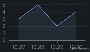
这个图表会随页面大小自适应变化哦~到这步为止我们的大屏项目相信你已经没有了任何疑问。
二、scale(参考其他博主)
实现
方案一:根据宽度的比率进行缩放。(宽度比率=网页当前宽 / 设计稿宽)
<script>
window.onload = function () {
  triggerScale();
  window.addEventListener("resize", function () {
    triggerScale();
  });
};

function triggerScale() {
  var targetX = 1920;
  var targetY = 1080;

  // 获取html的宽度和高度(不包含滚动条)
  var currentX =
    document.documentElement.clientWidth || document.body.clientWidth;
  // https://developer.mozilla.org/en-US/docs/Web/API/Element/clientWidth
  var currentY =
    document.documentElement.clientHeight || document.body.clientHeight;

  // 1.缩放比例  3840 / 2160 => 2
  var ratio = currentX / targetX;

  var bodyEl = document.querySelector("body");
  // 2.需要修改缩放的原点 body { transform-origin: left top; }
  bodyEl.setAttribute("style", `transform:scale(${ratio})`);
}
</script>
方案二:动态计算网页宽高比,决定是是否按照宽度的比率进行缩放。
<script>
window.onload = function () {
  triggerScale();
  window.addEventListener("resize", function () {
    triggerScale();
  });
};

function triggerScale() {
  var targetX = 1920;
  var targetY = 1080;
  var targetRatio = 16 / 9;
  var currentX =
    document.documentElement.clientWidth || document.body.clientWidth;
  var currentY =
    document.documentElement.clientHeight || document.body.clientHeight;

  // 1.缩放比例  3840 / 2160 => 2
  var ratio = currentX / targetX;
  var currentRatio = currentX / currentY;
  var transformStr = "";
  if (currentRatio > targetRatio) {
    ratio = currentY / targetY;
    transformStr = `transform:scale(${ratio}) translateX(-${
      targetX / 2
    }px); left:50%;`;
  } else {
    transformStr = `transform:scale(${ratio})`;
  }
  var bodyEl = document.querySelector("body");
  // 2.需要修改缩放的原点 body { transform-origin: left top; }
  bodyEl.setAttribute("style", transformStr);
}
</script>
方案三:Vue3 hooks封装 useScalePage
import { onMounted, onUnmounted } from 'vue';
import _ from 'lodash'

/**
  大屏适配的 hooks
 */
export default function useScalePage(option) {

  const resizeFunc = _.throttle(function() {
    triggerScale() // 动画缩放网页
  }, 100)

  onMounted(()=>{
    triggerScale()  // 动画缩放网页
    window.addEventListener('resize', resizeFunc)
  })

  onUnmounted(()=>{
    window.removeEventListener('resize', resizeFunc) // 释放
  })

  // 大屏的适配
  function triggerScale() {
    // 1.设计稿的尺寸
    let targetX = option.targetX ||  1920
    let targetY = option.targetY || 1080
    let targetRatio = option.targetRatio ||  16 / 9 // 宽高比率

    // 2.拿到当前设备(浏览器)的宽度
    let currentX = document.documentElement.clientWidth || document.body.clientWidth
    let currentY = document.documentElement.clientHeight || document.body.clientHeight

    // 3.计算缩放比例
    let scaleRatio = currentX / targetX; // 参照宽度进行缩放 ( 默认情况 )
    let currentRatio = currentX / currentY // 宽高比率

    // 超宽屏
    if(currentRatio > targetRatio) {
      // 4.开始缩放网页
      scaleRatio = currentY / targetY // 参照高度进行缩放
      document.body.style = `width:${targetX}px; height:${targetY}px;transform: scale(${scaleRatio}) translateX(-50%); left: 50%`
    } else {
      // 4.开始缩放网页
      document.body.style = `width:${targetX}px; height:${targetY}px; transform: scale(${scaleRatio})`
    }
  }
}
剩下的将px将换成rem的方法笔者在这不推荐因此不做赘述。
版权归原作者 nemoiu 所有, 如有侵权,请联系我们删除。