
业务中时常有各种确认提醒,但是样式呢又和开源软件不同,这时我们就需要定制开发自己的组件。本文主要介绍一种常见的弹框提醒确认组件。
效果如下:
提醒框: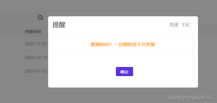
确认框: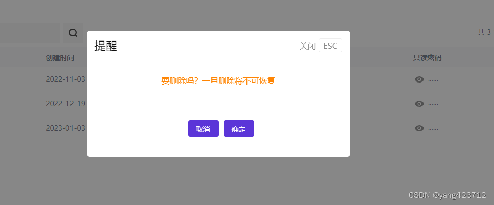
本文主要是仿照iview官网的思路写的,不对的地方请多多指教。
废话不多说,直接讲解步骤
一、创建自定义组件modal.vue
<template><div class="custom-modal-wrap" v-if="isShow"><div class="custom-modal":style="{ width }"><div class="custom-modal-content"><div class="custom-modal-header"><div class="title">{{ title }}</div><div class="modal-close" @click="handleCancel">
            关闭 <span>ESC</span></div></div><div class="custom-modal-body"><div class="alarm-info">{{ content }}</div></div><div class="custom-modal-footer"><Button type="primary" @click="handleCancel" v-if="type =='confirm'">{{ cancelText }}</Button><Button type="primary" @click="handleConfirm">{{ okText }}</Button></div></div></div></div></template><script>exportdefault{name:"customModal",data(){return{//调用的时候里面的配置除了content外其他都为非必填,不传以默认项为准isShow:false,//控制显隐title:"提醒",//标题type:"confirm",//类型content:"",//内容okText:"确定",cancelText:"取消",width:"520px",//百分比或者字符串};},methods:{handleConfirm(){this.isShow =false;if(this.onOK){this.onOK();}},handleCancel(){this.isShow =false;if(this.onCancel){this.onCancel();}},},mounted(){let that =this;
    that.$nextTick(()=>{
      document.addEventListener("keyup",function(e){if(e.keyCode ==27){
          that.isShow =false;}});});},};</script><style lang="less" scoped>.custom-modal-wrap {position: fixed;top:0;left:0;width:100%;height:100%;//   display: flex;overflow: auto;//   justify-content: center;//   align-items: center;
  z-index:999999;outline:0;
  background-color:rgba(55,55,55,0.6);}.custom-modal {width: auto;margin:0 auto;position: relative;outline:0;top: 100px;}.custom-modal-content {position: relative;
  background-color: #fff;border:0;
  border-radius: 6px;
  background-clip: padding-box;
  box-shadow:0 4px 12px rgb(000/15%);}.custom-modal-header {
  border-bottom: none;height: auto;
  line-height: normal;display: flex;
  justify-content: space-between;
  align-items: center;padding: 14px 16px;}.custom-modal-header {.title {
    font-size: 22px;color: #111111;height: auto;
    line-height: normal;}.modal-close {
    white-space: nowrap;
    font-size: 16px;
    font-weight: normal;
    font-stretch: normal;color: #888888;
    span {border: 1px solid #eeeeee;padding: 2px 8px;
      border-radius: 4px;cursor: pointer;}}}.custom-modal-body {padding:0 16px;
  font-size: 14px;
  line-height:1.5;}.custom-modal-footer {
  border-top: none;
  text-align: center;padding: 40px 18px 40px 18px;display: flex;
  justify-content: center;
  align-items: center;button:not(first-child){
    margin-left: 10px;}}</style>
全局样式在iview的基础上改的,global.less文件内容如下
// 自定义弹框样式.custom-modal-footer-block {.ivu-modal-header {
    border-bottom: none !important;.title {
      font-size: 22px;color: #111111;height: auto;
      line-height: normal;}}.ivu-modal-body {
    padding-bottom:0;
    padding-top:0;.form {.ivu-form-item:last-child {
        margin-bottom:0;}}.type {margin:0;}}.ivu-modal-footer {
    border-top: none !important;
    text-align: center;
    padding-bottom: 40px;
    padding-top: 40px;}}.ivu-modal-header {height: auto;
  line-height: normal;display: flex;
  justify-content: space-between;
  align-items: center;.modal-close {
      white-space: nowrap;
      font-size: 16px;
      font-weight: normal;
      font-stretch: normal;color: #888888;

      span {border: 1px solid #eeeeee;padding: 2px 8px;
          border-radius: 4px;cursor: pointer;}}}.ivu-modal-close {display: none;}.ivu-modal-footer {
  padding-bottom: 40px;}.alarm-info {
  border-top: 1px solid #eeeeee;
  border-bottom: 1px solid #eeeeee;height: 80px;
  font-size: 16px;color: #ff8503;
  text-align: center;
  line-height: 80px;}
二、新建modal.js,创建对应的实例,挂载、合并配置项
import Vue from'vue';import customModal from'./modal.vue';const modal = Vue.extend(customModal);// console.log(new modal({data}))let instance =newmodal({}).$mount();
document.body.appendChild(instance.$el);
customModal.confirm=function(option){
    Object.assign(instance, option,{type:'confirm'});//这个要合并的type属性是根据调用方法来确定类型的,对应modal.vue中要设置的type,这个地方是必填项,后面扩展的话自己考虑,类似于iview中success、error、warming等类型,用来区分
    instance.isShow =true;}
customModal.info=function(option){
    Object.assign(instance, option,{type:'info'});
    instance.isShow =true;}exportdefault customModal;
customModal就和Vue原型链上的$Modal类似,小伙伴可以自己看看里面的API
三、main.js文件中挂载在原型上
// 自定义弹框import customModal from'./components/modal/modal.js';Vue.prototype.$customModal = customModal;
四、方法调用
this.$customModal.confirm({title:'提醒',content:"要删除吗?一旦删除将不可恢复",onOK:()=>{this.handleRemove(row.name);},onCancel:()=>{}})this.$customModal.info({title:'提醒',content:"要删除吗?一旦删除将不可恢复",//onOK回调方法有无都可以,无的话就和iview的Modal一样的效果,有的话就是多了个回调。onOK:()=>{this.handleRemove(row.name);},})
本文转载自: https://blog.csdn.net/yang423712/article/details/128852546
版权归原作者 yang423712 所有, 如有侵权,请联系我们删除。
版权归原作者 yang423712 所有, 如有侵权,请联系我们删除。