
一般提示框的样式,一般由设计稿而定,如果用uniapp的showmodel,那个并不能满足我们需要的自定义样式,所以最好的方式是我们自己封装一个!(想什么样就什么样)!
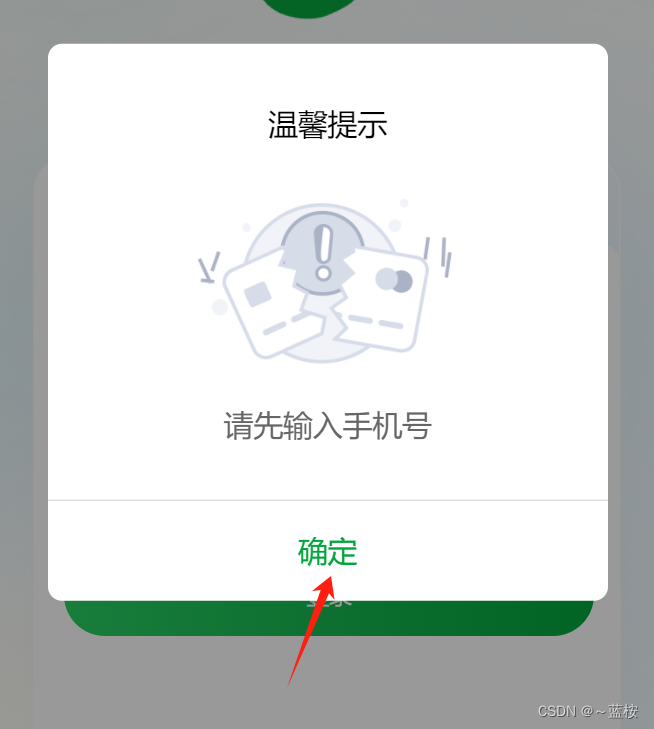
一、页面效果
二、使用uni-popup
直接看代码吧!
<template>
  <view>
    <uni-popup ref="tipPopup" type="center" :is-mask-click="true">
      <view class="pop">
        <view class="title">
          温馨提示
        </view>
        <!-- 提示icon -->
        <view class="tip-img">
          <image src="../../static/image/tip/tip-icon.png" mode=""></image>
        </view>
        <view class="tip-info">
          {{title}}
        </view>
        <view class="sure" @click="sure">
          确定
        </view>
      </view>
    </uni-popup>
  </view>
</template>

<script>
  export default {
    name:"showTip",
    props:["title"],
    data() {
      return {

      };
    },
    methods: {
      open() {
        this.$refs.tipPopup.open()
      },
      sure() {
        this.$refs.tipPopup.close()
      }
    }
  }
</script>

<style scoped>
.pop {
    position: absolute;
    left: 50%;
    top: 50%;
    transform: translate(-50%,-50%);
    background-color: #fff;
    border-radius: 16rpx;
    height: 576rpx;
    z-index: 99;
    width: 640rpx;
    padding: 30rpx 0;
  }
  .title {
    text-align: center;
    font-size: 34rpx;
    font-weight: 500;
    margin-top: 38rpx;
  }
  .tip-img {
    margin: 0 auto;
    width: 296rpx;
    height: 204rpx;
    margin-top: 64rpx;
  }
  .tip-img image {
    width: 100%;
    height: 100%;
  }
  .tip-info {
    padding: 0 30rpx;
    font-size: 34rpx;
    color: #666;
    margin-top: 32rpx;
    margin-bottom: 64rpx;
    text-align: center;
  }
  .sure {
    width: 100%;
    border-top: 1rpx solid #d1d1d1;
    height: 112rpx;
    text-align: center;
    line-height: 112rpx;
    color: #02A53C;
    font-size: 34rpx;
    font-weight: 500;
  }
</style>
我这里是把他封装成组件,一般这种交互性的,用得到的地方比较多,也建议封装成组件进行使用。
三、在页面中使用
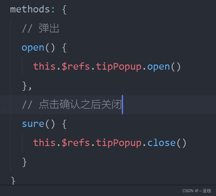
主要是这俩个方法控制关和开。
导入和使用:
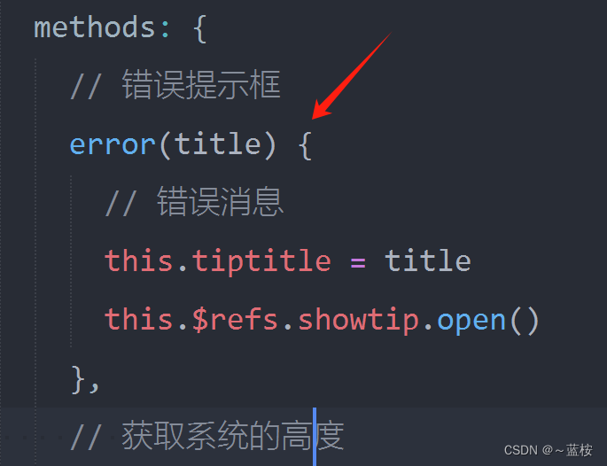
<!-- 错误提示弹窗 -->
    <showTip ref="showtip" :title="tiptitle"></showTip>
import showTip from "/components/showTip/showTip.vue";
声明:
在data中声明数据:
privacyVisible: false,
tiptitle: "错误",
声明组件:
components: {
      showTip
    },
然后就可以使用了:
比如:
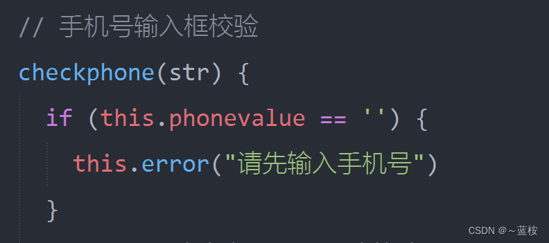
顺便把错误的提示文字传进去组件,组件通过props接收直接使用。
根据这个规则,就可以在此基础上封装成自己需要的样式就可以了!
本文转载自: https://blog.csdn.net/weixin_62639453/article/details/136792680
版权归原作者 ~蓝桉 所有, 如有侵权,请联系我们删除。
版权归原作者 ~蓝桉 所有, 如有侵权,请联系我们删除。