
<el-row :gutter="10">
  <el-col :xs="8" :sm="6" :md="4" :lg="3" :xl="1"><div class="grid-content bg-purple"></div></el-col>
  <el-col :xs="4" :sm="6" :md="8" :lg="9" :xl="11"><div class="grid-content bg-purple-light"></div></el-col>
  <el-col :xs="4" :sm="6" :md="8" :lg="9" :xl="11"><div class="grid-content bg-purple"></div></el-col>
  <el-col :xs="8" :sm="6" :md="4" :lg="3" :xl="1"><div class="grid-content bg-purple-light"></div></el-col>
</el-row>
参数详解:
0、官网layout布局介绍
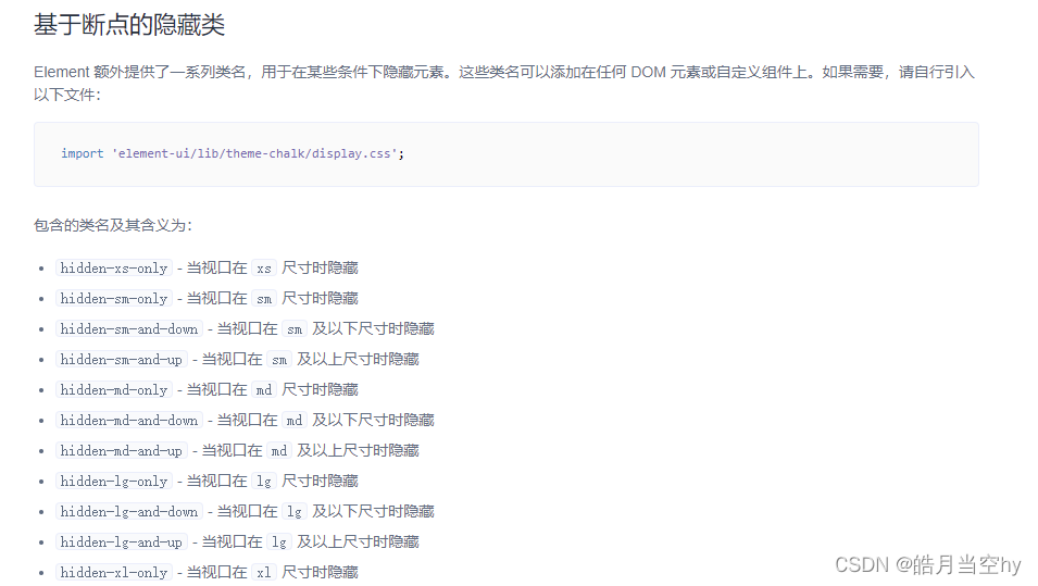
1、屏幕大小尺寸参数
名称尺寸xs(最小号 )<768pxsm(小号)≥768pxmd(中号)≥992pxlg(大号)≥1200pxxl(更大号)≥1920px
**row 代表行:**
<el-row></el-row>
col 代表行列:
<el-col></el-col>
tip:col组件的:span属性的布局调整,一共分为24栏(以下分别代表24列,12列)
//24列
<el-row gutter="20">
   <el-col :span="24">
       <div style="height:50px; background: #bb0ac1"></div>
   </el-col>
</el-row>

//12列
<el-row gutter="20">
    <el-col :span="12">
        <div style="height:50px; background: #25c10a"></div>
    </el-col>
</el-row>

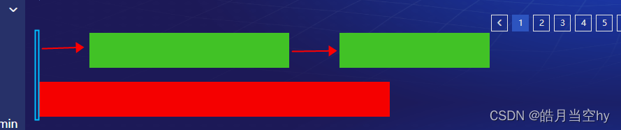
**
row组件的:gutter
属性**来调整布局之间的宽度---分栏间距(如下图)

**Col组件的
:offset
属性**调整方块的偏移位置(每次1格/24格)
**row组件的
type="flex"
启动flex布局,再通过row组件的
justify
属性调整排版方式,属性值分别有:**
- justify=center 居中对齐
- justify=start 左对齐
- justify=end 右对齐
- justify=space-between 空格间距在中间对齐
- justify=space-around 左右各占半格空格对齐
项目中用到过得媒体查询:
@media (max-width: 1910px) and (min-width: 980px) {两个数值之间的(zhyd)}
@media screen and (min-width: 981px) {PC}
@media screen and (max-width: 980px) {Mobile}
标签:
vue.js
本文转载自: https://blog.csdn.net/qq_33911541/article/details/125805762
版权归原作者 皓月当空hy 所有, 如有侵权,请联系我们删除。
版权归原作者 皓月当空hy 所有, 如有侵权,请联系我们删除。