
技术栈

项目展示

在线体验(推荐)
https://yangyanyan.top/echarts-jobmap/
源码
记得给个star
https://gitee.com/yyy1203/echarts-jobmap.git
笔记教程
很详细喔,跟着我的教程来,很简单哒
https://blog.csdn.net/qq_23073811/article/details/123425963
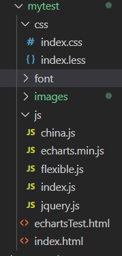
文件架构以及部分源码展示
文件架构
- 架构其实就是简单的前端三剑客
部分源码展示
核心代码
index.js
,主要包含对echarts的配置
// 柱状图模块1 左边纵向(function(){// 立即执行函数// 1实例化对象var myChart = echarts.init(document.querySelector(".bar1 .chart"));// 2. 指定配置项和数据var option ={
color:["#2f89cf"],
tooltip:{
trigger:"axis",
axisPointer:{// 坐标轴指示器,坐标轴触发有效
type:"shadow"// 默认为直线,可选为:'line' | 'shadow'}},// 修改图表的大小
grid:{
left:"0%",
top:"10px",
right:"0%",
bottom:"4%",
containLabel:true},// x轴
xAxis:[{
type:"category",
data:["旅游行业","教育培训","游戏行业","医疗行业","电商行业","社交行业","金融行业"],
axisTick:{
alignWithLabel:true},// 修改刻度标签 相关样式
axisLabel:{
color:"rgba(255,255,255,.6)",
fontSize:10},// 不显示x坐标轴的样式
axisLine:{
show:false}}],// y轴
yAxis:[{
type:"value",// 修改刻度标签 相关样式
axisLabel:{
color:"rgba(255,255,255,.6) ",
fontSize:12},// y轴的线条改为了 2像素
axisLine:{
lineStyle:{
color:"rgba(255,255,255,.1)",
width:2}},// y轴分割线的颜色
splitLine:{
lineStyle:{
color:"rgba(255,255,255,.1)"}}}],
series:[{
name:"直接访问",
type:"bar",
barWidth:"35%",
data:[200,300,300,900,1500,1200,600],
itemStyle:{// 修改柱子圆角
barBorderRadius:5}}]};// 3. 把配置项给实例对象
myChart.setOption(option);// 4. 让图表跟随屏幕自动的去适应
window.addEventListener("resize",function(){
myChart.resize();});})();// 柱状图2 横向(function(){var myColor =["#1089E7","#F57474","#56D0E3","#F8B448","#8B78F6"];// 1. 实例化对象var myChart = echarts.init(document.querySelector(".bar2 .chart"));// 2. 指定配置和数据var option ={
grid:{
top:"10%",
left:"22%",
bottom:"10%"// containLabel: true},// 不显示x轴的相关信息
xAxis:{
show:false},
yAxis:[// 两组y轴数据 左右{
type:"category",
inverse:true,// 反转坐标轴
data:["HTML5","CSS3","javascript","VUE","NODE"],// 不显示y轴的线
axisLine:{
show:false},// 不显示刻度
axisTick:{
show:false},// 把刻度标签里面的文字颜色设置为白色
axisLabel:{
color:"#fff"}},{
data:[702,350,610,793,664],
inverse:true,// 不显示y轴的线
axisLine:{
show:false},// 不显示刻度
axisTick:{
show:false},// 把刻度标签里面的文字颜色设置为白色
axisLabel:{
color:"#fff"}}],
series:[// 两组数据重叠成一个{
name:"条",
type:"bar",
data:[70,34,60,78,69],
yAxisIndex:0,// 类似z-index// 修改第一组柱子的圆角
itemStyle:{
barBorderRadius:20,// 此时的color 可以修改柱子的颜色
color:function(params){// params 传进来的是柱子对象// console.log(params);// dataIndex 是当前柱子的索引号return myColor[params.dataIndex];}},// 柱子之间的距离
barCategoryGap:50,//柱子的宽度
barWidth:10,// 显示柱子内的文字
label:{
show:true,
position:"inside",// {c} 会自动的解析为 数据 data里面的数据
formatter:"{c}%"}},{
name:"框",
type:"bar",
barCategoryGap:50,
barWidth:15,
yAxisIndex:1,
data:[100,100,100,100,100],
itemStyle:{
color:"none",
borderColor:"#00c1de",
borderWidth:3,
barBorderRadius:15}}]};// 3. 把配置给实例对象
myChart.setOption(option);// 4. 让图表跟随屏幕自动的去适应
window.addEventListener("resize",function(){
myChart.resize();});})();// 折线图1模块制作 左边(function(){// 年份数据var yearData =[{
year:"2020",// 年份
data:[// 两个数组是因为有两条线[24,40,101,134,90,230,210,230,120,230,210,120],[40,64,191,324,290,330,310,213,180,200,180,79]]},{
year:"2021",// 年份
data:[// 两个数组是因为有两条线[123,175,112,197,121,67,98,21,43,64,76,38],[143,131,165,123,178,21,82,64,43,60,19,34]]}];// 1. 实例化对象var myChart = echarts.init(document.querySelector(".line1 .chart"));// 2.指定配置var option ={// 通过这个color修改两条线的颜色
color:["#00f2f1","#ed3f35"],
tooltip:{
trigger:"axis"},
legend:{// 如果series 对象有name 值,则 legend可以不用写data// 修改图例组件 文字颜色
textStyle:{
color:"#4c9bfd"},// 这个10% 必须加引号
right:"10%"},
grid:{
top:"20%",
left:"3%",
right:"4%",
bottom:"3%",
show:true,// 显示边框
borderColor:"#012f4a",// 边框颜色
containLabel:true// 包含刻度文字在内},
xAxis:{
type:"category",
boundaryGap:false,
data:["1月","2月","3月","4月","5月","6月","7月","8月","9月","10月","11月","12月"],
axisTick:{
show:false// 去除刻度线},
axisLabel:{
color:"#4c9bfd"// 文本颜色},
axisLine:{
show:false// 去除轴线}},
yAxis:{
type:"value",
axisTick:{
show:false// 去除刻度线},
axisLabel:{
color:"#4c9bfd"// 文本颜色},
axisLine:{
show:false// 去除轴线},
splitLine:{
lineStyle:{
color:"#012f4a"// 分割线颜色}}},
series:[{
name:"新增粉丝",
type:"line",// smooth:true 可以让我们的折线显示带有弧度
smooth:true,
data: yearData[0].data[0]},{
name:"新增游客",
type:"line",
smooth:true,
data: yearData[0].data[1]}]};// 3. 把配置给实例对象
myChart.setOption(option);// 4. 让图表跟随屏幕自动的去适应
window.addEventListener("resize",function(){
myChart.resize();});// 5.点击切换效果$(".line h2").on("click","a",function(){// alert(1);// console.log($(this).index());// 点击 a 之后 根据当前a的索引号 找到对应的 yearData的相关对象// console.log(yearData[$(this).index()]);var obj = yearData[$(this).index()];
option.series[0].data = obj.data[0];
option.series[1].data = obj.data[1];// 需要重新渲染
myChart.setOption(option);});})();// 折线图2 模块制作(function(){var myChart = echarts.init(document.querySelector(".line2 .chart"));var option ={
tooltip:{
trigger:"axis"},
legend:{
top:"0%",
textStyle:{
color:"rgba(255,255,255,.5)",
fontSize:"12"}},
grid:{
left:"10",
top:"30",
right:"10",
bottom:"10",
containLabel:true},
xAxis:[{
type:"category",
boundaryGap:false,// x轴更换数据
data:["01","02","03","04","05","06","07","08","09","10","11","12","13","14","15","16","17","18","19","20","21","22","23","24","25","26","26","28","29","30"],// 文本颜色为rgba(255,255,255,.6) 文字大小为 12
axisLabel:{
textStyle:{
color:"rgba(255,255,255,.6)",
fontSize:12}},// x轴线的颜色为 rgba(255,255,255,.2)
axisLine:{
lineStyle:{
color:"rgba(255,255,255,.2)"}}}],
yAxis:[{
type:"value",
axisTick:{
show:false},
axisLine:{
lineStyle:{
color:"rgba(255,255,255,.1)"}},
axisLabel:{
textStyle:{
color:"rgba(255,255,255,.6)",
fontSize:12}},// 修改分割线的颜色
splitLine:{
lineStyle:{
color:"rgba(255,255,255,.1)"}}}],
series:[{
name:"播放量",
type:"line",
smooth:true,// 单独修改当前线条的样式
lineStyle:{
color:"#0184d5",
width:"2"},// 填充颜色设置
areaStyle:{
color:newecharts.graphic.LinearGradient(0,0,0,1,[{
offset:0,
color:"rgba(1, 132, 213, 0.4)"// 渐变色的起始颜色},{
offset:0.8,
color:"rgba(1, 132, 213, 0.1)"// 渐变线的结束颜色}],false),
shadowColor:"rgba(0, 0, 0, 0.1)"},// 设置拐点
symbol:"circle",// 拐点大小
symbolSize:8,// 开始不显示拐点, 鼠标经过显示
showSymbol:false,// 设置拐点颜色以及边框
itemStyle:{
color:"#0184d5",
borderColor:"rgba(221, 220, 107, .1)",
borderWidth:12},
data:[30,40,30,40,30,40,30,60,20,40,30,40,30,40,30,40,30,60,20,40,30,40,30,40,30,40,20,60,50,40]},{
name:"转发量",
type:"line",
smooth:true,
lineStyle:{
normal:{
color:"#00d887",
width:2}},
areaStyle:{
normal:{
color:newecharts.graphic.LinearGradient(0,0,0,1,[{
offset:0,
color:"rgba(0, 216, 135, 0.4)"},{
offset:0.8,
color:"rgba(0, 216, 135, 0.1)"}],false),
shadowColor:"rgba(0, 0, 0, 0.1)"}},// 设置拐点 小圆点
symbol:"circle",// 拐点大小
symbolSize:5,// 设置拐点颜色以及边框
itemStyle:{
color:"#00d887",
borderColor:"rgba(221, 220, 107, .1)",
borderWidth:12},// 开始不显示拐点, 鼠标经过显示
showSymbol:false,
data:[130,10,20,40,30,40,80,60,20,40,90,40,20,140,30,40,130,20,20,40,80,70,30,40,30,120,20,99,50,20]}]};
myChart.setOption(option);// 4. 让图表跟随屏幕自动的去适应
window.addEventListener("resize",function(){
myChart.resize();});})();// 饼形图1(function(){// 1. 实例化对象var myChart = echarts.init(document.querySelector(".pie1 .chart"));// 2.指定配置var option ={
color:["#065aab","#066eab","#0682ab","#0696ab","#06a0ab"],
tooltip:{
trigger:"item",
formatter:"{a} <br/>{b}: {c} ({d}%)"},
legend:{
bottom:"0%",// 修改小图标的大小
itemWidth:10,
itemHeight:10,// 修改图例组件的文字为 12px
textStyle:{
color:"rgba(255,255,255,.5)",
fontSize:"12"}},
series:[{
name:"年龄分布",
type:"pie",// 这个radius可以修改饼形图的大小// radius 第一个值是内圆的半径 第二个值是外圆的半径
radius:["40%","60%"],
center:["50%","45%"],
avoidLabelOverlap:false,// 图形上的文字
label:{
show:false,
position:"center"},// 链接文字和图形的线是否显示
labelLine:{
show:false},
data:[{
value:1,
name:"0岁以下"},{
value:4,
name:"20-29岁"},{
value:2,
name:"30-39岁"},{
value:2,
name:"40-49岁"},{
value:1,
name:"50岁以上"}]}]};// 3. 把配置给实例对象
myChart.setOption(option);// 4. 让图表跟随屏幕自动的去适应
window.addEventListener("resize",function(){
myChart.resize();});})();// 饼形图2 地区分布模块(function(){var myChart = echarts.init(document.querySelector(".pie2 .chart"));var option ={
color:["#006cff","#60cda0","#ed8884","#ff9f7f","#0096ff","#9fe6b8","#32c5e9","#1d9dff"],
tooltip:{
trigger:"item",
formatter:"{a} <br/>{b} : {c} ({d}%)"},
legend:{
bottom:"0%",
itemWidth:10,
itemHeight:10,
textStyle:{
color:"rgba(255,255,255,.5)",
fontSize:"12"}},
series:[{
name:"地区分布",
type:"pie",
radius:["10%","70%"],
center:["50%","50%"],
roseType:"radius",// 半径模式// 图形的文字标签
label:{
fontSize:10},// 链接图形和文字的线条
labelLine:{// length 链接图形的线条
length:6,// length2 链接文字的线条
length2:8},
data:[{
value:20,
name:"云南"},{
value:26,
name:"北京"},{
value:24,
name:"山东"},{
value:25,
name:"河北"},{
value:20,
name:"江苏"},{
value:25,
name:"浙江"},{
value:30,
name:"四川"},{
value:42,
name:"湖北"}]}]};
myChart.setOption(option);// 监听浏览器缩放,图表对象调用缩放resize函数
window.addEventListener("resize",function(){
myChart.resize();});})();// 模拟飞行路线模块地图模块(function(){var myChart = echarts.init(document.querySelector(".map .chart"));var geoCoordMap ={
上海:[121.4648,31.2891],
东莞:[113.8953,22.901],
东营:[118.7073,37.5513],
中山:[113.4229,22.478],
临汾:[111.4783,36.1615],
临沂:[118.3118,35.2936],
丹东:[124.541,40.4242],
丽水:[119.5642,28.1854],
乌鲁木齐:[87.9236,43.5883],
佛山:[112.8955,23.1097],
保定:[115.0488,39.0948],
兰州:[103.5901,36.3043],
包头:[110.3467,41.4899],
北京:[116.4551,40.2539],
北海:[109.314,21.6211],
南京:[118.8062,31.9208],
南宁:[108.479,23.1152],
南昌:[116.0046,28.6633],
南通:[121.1023,32.1625],
厦门:[118.1689,24.6478],
台州:[121.1353,28.6688],
合肥:[117.29,32.0581],
呼和浩特:[111.4124,40.4901],
咸阳:[108.4131,34.8706],
哈尔滨:[127.9688,45.368],
唐山:[118.4766,39.6826],
嘉兴:[120.9155,30.6354],
大同:[113.7854,39.8035],
大连:[122.2229,39.4409],
天津:[117.4219,39.4189],
太原:[112.3352,37.9413],
威海:[121.9482,37.1393],
宁波:[121.5967,29.6466],
宝鸡:[107.1826,34.3433],
宿迁:[118.5535,33.7775],
常州:[119.4543,31.5582],
广州:[113.5107,23.2196],
廊坊:[116.521,39.0509],
延安:[109.1052,36.4252],
张家口:[115.1477,40.8527],
徐州:[117.5208,34.3268],
德州:[116.6858,37.2107],
惠州:[114.6204,23.1647],
成都:[103.9526,30.7617],
扬州:[119.4653,32.8162],
承德:[117.5757,41.4075],
拉萨:[91.1865,30.1465],
无锡:[120.3442,31.5527],
日照:[119.2786,35.5023],
昆明:[102.9199,25.4663],
杭州:[119.5313,29.8773],
枣庄:[117.323,34.8926],
柳州:[109.3799,24.9774],
株洲:[113.5327,27.0319],
武汉:[114.3896,30.6628],
汕头:[117.1692,23.3405],
江门:[112.6318,22.1484],
沈阳:[123.1238,42.1216],
沧州:[116.8286,38.2104],
河源:[114.917,23.9722],
泉州:[118.3228,25.1147],
泰安:[117.0264,36.0516],
泰州:[120.0586,32.5525],
济南:[117.1582,36.8701],
济宁:[116.8286,35.3375],
海口:[110.3893,19.8516],
淄博:[118.0371,36.6064],
淮安:[118.927,33.4039],
深圳:[114.5435,22.5439],
清远:[112.9175,24.3292],
温州:[120.498,27.8119],
渭南:[109.7864,35.0299],
湖州:[119.8608,30.7782],
湘潭:[112.5439,27.7075],
滨州:[117.8174,37.4963],
潍坊:[119.0918,36.524],
烟台:[120.7397,37.5128],
玉溪:[101.9312,23.8898],
珠海:[113.7305,22.1155],
盐城:[120.2234,33.5577],
盘锦:[121.9482,41.0449],
石家庄:[114.4995,38.1006],
福州:[119.4543,25.9222],
秦皇岛:[119.2126,40.0232],
绍兴:[120.564,29.7565],
聊城:[115.9167,36.4032],
肇庆:[112.1265,23.5822],
舟山:[122.2559,30.2234],
苏州:[120.6519,31.3989],
莱芜:[117.6526,36.2714],
菏泽:[115.6201,35.2057],
营口:[122.4316,40.4297],
葫芦岛:[120.1575,40.578],
衡水:[115.8838,37.7161],
衢州:[118.6853,28.8666],
西宁:[101.4038,36.8207],
西安:[109.1162,34.2004],
贵阳:[106.6992,26.7682],
连云港:[119.1248,34.552],
邢台:[114.8071,37.2821],
邯郸:[114.4775,36.535],
郑州:[113.4668,34.6234],
鄂尔多斯:[108.9734,39.2487],
重庆:[107.7539,30.1904],
金华:[120.0037,29.1028],
铜川:[109.0393,35.1947],
银川:[106.3586,38.1775],
镇江:[119.4763,31.9702],
长春:[125.8154,44.2584],
长沙:[113.0823,28.2568],
长治:[112.8625,36.4746],
阳泉:[113.4778,38.0951],
青岛:[120.4651,36.3373],
韶关:[113.7964,24.7028]};var XAData =[[{ name:"西安"},{ name:"拉萨", value:100}],[{ name:"西安"},{ name:"上海", value:100}],[{ name:"西安"},{ name:"广州", value:100}],[{ name:"西安"},{ name:"西宁", value:100}],[{ name:"西安"},{ name:"银川", value:100}]];var XNData =[[{ name:"西宁"},{ name:"北京", value:100}],[{ name:"西宁"},{ name:"上海", value:100}],[{ name:"西宁"},{ name:"广州", value:100}],[{ name:"西宁"},{ name:"西安", value:100}],[{ name:"西宁"},{ name:"银川", value:100}]];var YCData =[[{ name:"拉萨"},{ name:"潍坊", value:100}],[{ name:"拉萨"},{ name:"哈尔滨", value:100}],[{ name:"银川"},{ name:"上海", value:100}],[{ name:"银川"},{ name:"西安", value:100}],[{ name:"银川"},{ name:"西宁", value:100}]];var planePath ="path://M1705.06,1318.313v-89.254l-319.9-221.799l0.073-208.063c0.521-84.662-26.629-121.796-63.961-121.491c-37.332-0.305-64.482,36.829-63.961,121.491l0.073,208.063l-319.9,221.799v89.254l330.343-157.288l12.238,241.308l-134.449,92.931l0.531,42.034l175.125-42.917l175.125,42.917l0.531-42.034l-134.449-92.931l12.238-241.308L1705.06,1318.313z";//var planePath = 'arrow';varconvertData=function(data){var res =[];for(var i =0; i < data.length; i++){var dataItem = data[i];var fromCoord = geoCoordMap[dataItem[0].name];var toCoord = geoCoordMap[dataItem[1].name];if(fromCoord && toCoord){
res.push({
fromName: dataItem[0].name,
toName: dataItem[1].name,
coords:[fromCoord, toCoord],
value: dataItem[1].value
});}}return res;};var color =["#a6c84c","#ffa022","#46bee9"];//航线的颜色var series =[];[["西安", XAData],["西宁", XNData],["银川", YCData]].forEach(function(item, i){
series.push({
name: item[0]+" Top3",
type:"lines",
zlevel:1,
effect:{
show:true,
period:6,
trailLength:0.7,
color:"red",//arrow箭头的颜色
symbolSize:3},
lineStyle:{
normal:{
color: color[i],
width:0,
curveness:0.2}},
data:convertData(item[1])},{
name: item[0]+" Top3",
type:"lines",
zlevel:2,
symbol:["none","arrow"],
symbolSize:10,
effect:{
show:true,
period:6,
trailLength:0,
symbol: planePath,
symbolSize:15},
lineStyle:{
normal:{
color: color[i],
width:1,
opacity:0.6,
curveness:0.2}},
data:convertData(item[1])},{
name: item[0]+" Top3",
type:"effectScatter",
coordinateSystem:"geo",
zlevel:2,
rippleEffect:{
brushType:"stroke"},
label:{
normal:{
show:true,
position:"right",
formatter:"{b}"}},
symbolSize:function(val){return val[2]/8;},
itemStyle:{
normal:{
color: color[i]},
emphasis:{
areaColor:"#2B91B7"}},
data: item[1].map(function(dataItem){return{
name: dataItem[1].name,
value: geoCoordMap[dataItem[1].name].concat([dataItem[1].value])};})});});var option ={
tooltip:{
trigger:"item",
formatter:function(params, ticket, callback){if(params.seriesType =="effectScatter"){return"线路:"+ params.data.name +""+ params.data.value[2];}elseif(params.seriesType =="lines"){return(
params.data.fromName +">"+
params.data.toName +"<br />"+
params.data.value
);}else{return params.name;}}},
legend:{
orient:"vertical",
top:"bottom",
left:"right",
data:["西安 Top3","西宁 Top3","银川 Top3"],
textStyle:{
color:"#fff"},
selectedMode:"multiple"},
geo:{
map:"china",
label:{
emphasis:{
show:true,
color:"#fff"}},// 把中国地图放大了1.2倍
zoom:1.2,
roam:true,
itemStyle:{
normal:{// 地图省份的背景颜色
areaColor:"rgba(20, 41, 87,0.6)",
borderColor:"#195BB9",
borderWidth:1},
emphasis:{
areaColor:"#2B91B7"}}},
series: series
};
myChart.setOption(option);// 监听浏览器缩放,图表对象调用缩放resize函数
window.addEventListener("resize",function(){
myChart.resize();});})();
本文转载自: https://blog.csdn.net/qq_23073811/article/details/123573109
版权归原作者 coderYYY 所有, 如有侵权,请联系我们删除。
版权归原作者 coderYYY 所有, 如有侵权,请联系我们删除。