
目录
一、简述
本次主要介绍::after,::before,box-shadow这三个属性。
::after,::before这两个是伪类选择器,box-shaow是用来设置元素的阴影效果
before:向选定的元素前插入内容
after:向选定的元素后插入内容
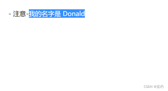
使用content 属性来指定要插入的内容,值可以为空,但是不能不写,如果不写的话伪类选择器就不会显示出来。
例如以下代码:
<!DOCTYPEhtml><html><head><metacharset="utf-8"><title>test</title><style>div:before{content:"- 注意-";}</style></head><body><div>我的名字是 Donald</div></body></html>
伪类选择器的内容是不可选中的
二、太极效果制作
1.第一步:编写html部分
我们只需要定义一个div标签即可,用它来完成太极的制作
<!DOCTYPEhtml><htmllang="en"><head><metacharset="UTF-8"><metahttp-equiv="X-UA-Compatible"content="IE=edge"><metaname="viewport"content="width=device-width, initial-scale=1.0"><title>太极</title></head><body><div></div></body></html>
2.第二步:设置div的样式
body{background-color: antiquewhite;}div{width: 150px;height: 300px;margin: 100px auto;background-color: white;border-radius: 50%;border-right: 150px solid black;box-shadow: 0px 0px 30px blueviolet;}
这里的box-shadow的第一个值是x轴移动的值,第二个值是y轴移动的值,第三个值代表模糊度,第四个是阴影的颜色。
效果: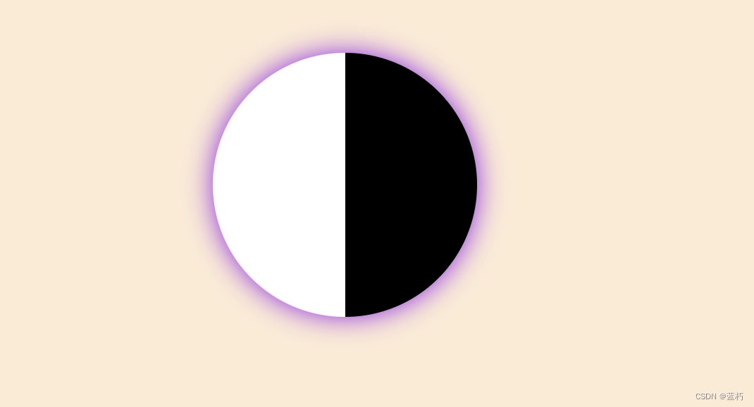
第三步:通过伪类选择器画出两个小圆
div::after,div::before{content:"";display: block;border-radius: 50%;margin-left: 75px;border: 50px solid black;background-color: white;width:50px;height: 50px;}
content必须要写出来,值为空也可以,如果不写的话伪类选择器就不会显示。
设置它的边框颜色为黑色,然后就可以和大圆的黑色部分连接起来了。
效果:
4.第四步:将after的边框和背景分别改成白色和黑色。
/*覆盖上面::after的border和background-color两个属性*/div::after{border: 50px solid white;background-color: black;}
效果: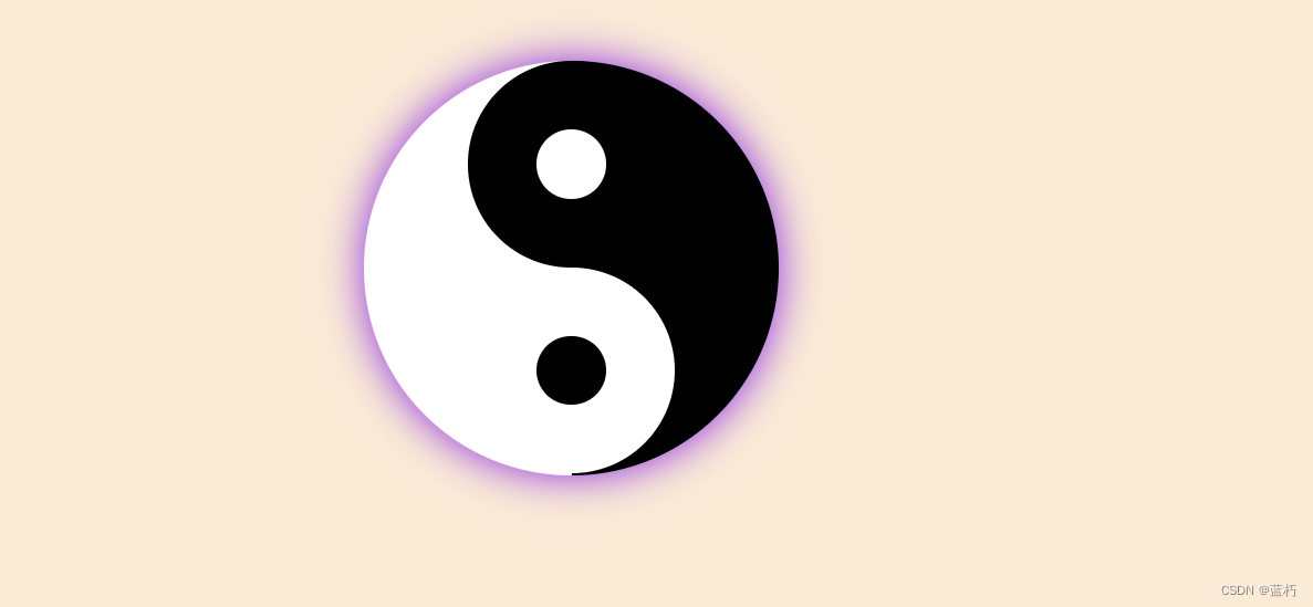
5.当然你也可以给它个动画让它动起来,当我们鼠标移动到太极上时它就开始转动
div:hover{animation: mytest 2s linear infinite;}@keyframes mytest{to{transform:rotate(360deg);}}
CSS完整代码:
body{background-color: antiquewhite;}div{width: 150px;height: 300px;margin: 100px auto;background-color: white;border-radius: 50%;border-right: 150px solid black;box-shadow: 0px 0px 30px blueviolet;}div:hover{animation: mytest 2s linear infinite;}@keyframes mytest{to{transform:rotate(360deg);}}div::after,div::before{content:"";display: block;border-radius: 50%;margin-left: 75px;border: 50px solid black;background-color: white;width:50px;height: 50px;}div::after{border: 50px solid white;background-color: black;}
本文转载自: https://blog.csdn.net/lx00000025/article/details/130251670
版权归原作者 蓝朽 所有, 如有侵权,请联系我们删除。
版权归原作者 蓝朽 所有, 如有侵权,请联系我们删除。