
文章目录
运行示例
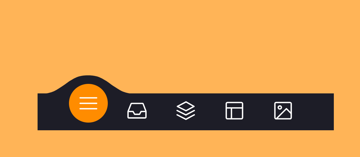
点击左上角 打开网页 效果更佳哦
核心代码
index.html
<!DOCTYPE html><html lang="en"><head><meta charset="UTF-8"><title>SVG超酷动画Tab菜单栏DEMO演示</title><link rel="stylesheet" href="./style.css"></head><body><!-- partial:index.partial.html --><menu class="menu"><button class="menu__item active" style="--bgColorBody: #ffb457; --bgColorItem: #ff8c00;"><svg class="icon" viewBox="0 0 24 24"><path d="M3.8,6.6h16.4"/><path d="M20.2,12.1H3.8"/><path d="M3.8,17.5h16.4"/></svg></button><button class="menu__item" style="--bgColorBody: #ff96bd; --bgColorItem: #f54888;"><svg class="icon" viewBox="0 0 24 24"><path  d="M6.7,4.8h10.7c0.3,0,0.6,0.2,0.7,0.5l2.8,7.3c0,0.1,0,0.2,0,0.3v5.6c0,0.4-0.4,0.8-0.8,0.8H3.8C3.4,19.3,3,19,3,18.5v-5.6c0-0.1,0-0.2,0.1-0.3L6,5.3C6.1,5,6.4,4.8,6.7,4.8z"/><path  d="M3.4,12.9H8l1.6,2.8h4.9l1.5-2.8h4.6"/></svg></button><button class="menu__item" style="--bgColorBody: #9999fb; --bgColorItem: #4343f5;"><svg class="icon" viewBox="0 0 24 24"><path  d="M3.4,11.9l8.8,4.4l8.4-4.4"/><path  d="M3.4,16.2l8.8,4.5l8.4-4.5"/><path  d="M3.7,7.8l8.6-4.5l8,4.5l-8,4.3L3.7,7.8z"/></button><button class="menu__item" style="--bgColorBody: #ffe797; --bgColorItem: #e0b115;"><svg class="icon" viewBox="0 0 24 24"><path  d="M5.1,3.9h13.9c0.6,0,1.2,0.5,1.2,1.2v13.9c0,0.6-0.5,1.2-1.2,1.2H5.1c-0.6,0-1.2-0.5-1.2-1.2V5.1C3.9,4.4,4.4,3.9,5.1,3.9z"/><path  d="M4.2,9.3h15.6"/><path  d="M9.1,9.5v10.3"/></button><button class="menu__item" style="--bgColorBody: #cffff1; --bgColorItem:#65ddb7;"><svg class="icon" viewBox="0 0 24 24"><path  d="M5.1,3.9h13.9c0.6,0,1.2,0.5,1.2,1.2v13.9c0,0.6-0.5,1.2-1.2,1.2H5.1c-0.6,0-1.2-0.5-1.2-1.2V5.1C3.9,4.4,4.4,3.9,5.1,3.9z"/><path  d="M5.5,20l9.9-9.9l4.7,4.7"/><path  d="M10.4,8.8c0,0.9-0.7,1.6-1.6,1.6c-0.9,0-1.6-0.7-1.6-1.6C7.3,8,8,7.3,8.9,7.3C9.7,7.3,10.4,8,10.4,8.8z"/></svg></button><div class="menu__border"></div></menu><div class="svg-container"><svg viewBox="0 0 202.9 45.5"><clipPath id="menu" clipPathUnits="objectBoundingBox" transform="scale(0.0049285362247413 0.021978021978022)"><path  d="M6.7,45.5c5.7,0.1,14.1-0.4,23.3-4c5.7-2.3,9.9-5,18.1-10.5c10.7-7.1,11.8-9.2,20.6-14.3c5-2.9,9.2-5.2,15.2-7
          c7.1-2.1,13.3-2.3,17.6-2.1c4.2-0.2,10.5,0.1,17.6,2.1c6.1,1.8,10.2,4.1,15.2,7c8.8,5,9.9,7.1,20.6,14.3c8.3,5.5,12.4,8.2,18.1,10.5
          c9.2,3.6,17.6,4.2,23.3,4H6.7z"/></clipPath></svg></div><!-- partial --><script  src="script.js"></script></body></html>
js
代码的解释:
- 代码以一些注释开始,提到了设计师和原始图片来源。
- 代码使用"use strict"启用JavaScript的严格模式,这有助于捕捉常见的编码错误并强制执行更好的编码实践。
- 代码选择HTML文档中的body元素,并将其分配给
body变量。 - 它选择所有具有"class"为"menu__item"的元素,并将它们分配给
menu变量。 - 它选择具有"class"为"menu__border"的元素,并将其分配给
menuBorder变量。 - 它声明一个未分配任何值的变量
active。这个变量将用于跟踪当前活动的菜单项。 - 定义了
clickItem函数。该函数在单击菜单项时触发。 - 在
clickItem函数内部,首先检查是否已经有一个活动的菜单项。如果有,它会从中删除"active"类。 - 然后,它将"active"类添加到被点击的菜单项(
this指的是被点击的菜单项)。 - 它使用
getBoundingClientRect()计算被点击菜单项的位置和大小,并将其分配给box变量。 - 更新
active变量为被点击的菜单项。 - 将body元素的背景颜色设置为被点击菜单项的"–bgColorBody" CSS自定义属性的值。
- 调用
offsetMenuBorder函数,将box和menuBorder变量作为参数传递。 offsetMenuBorder函数根据被点击菜单项的位置计算菜单边框元素的左侧位置,并更新菜单边框元素的transformCSS属性。- 最后,为每个菜单项添加了点击事件监听器,当点击时触发
clickItem函数。
// Designed by:  Mauricio Bucardo// Original image: https://dribbble.com/shots/5619509-Animated-Tab-Bar"use strict";let body = document.body;let menu = document.querySelectorAll(".menu__item");let menuBorder = document.querySelector(".menu__border");let active ;functionclickItem(){

    active = document.querySelector("button.active");if(active){
        active.classList.remove("active");}this.classList.add("active");let box =this.getBoundingClientRect();

    active =this;
    body.style.backgroundColor = active.style.getPropertyValue("--bgColorBody");offsetMenuBorder(box, menuBorder);}functionoffsetMenuBorder(box, menuBorder){let left = Math.floor(box.left - menuBorder.closest("menu").offsetLeft -(menuBorder.offsetWidth  - box.width)/2)+"px";
    menuBorder.style.transform =`translate3d(${left}, 0 , 0)`}

menu.forEach(item=>{
    item.addEventListener("click", clickItem);})
css
html {

    box-sizing: border-box;--bgColorMenu : #1d1d27;--duration:.7s;}

html *,
html *::before,
html *::after {

    box-sizing: inherit;}

body{margin:0;display: flex;height: 100vh;
    align-items: center;
    justify-content: center;
    background-color: #ffb457;transition: background-color var(--duration);-webkit-tap-highlight-color: transparent;}.menu{display: flex;width:32.05em;
    font-size:1.5em;padding:02.85em;position: relative;
    align-items: center;
    justify-content: center;
    background-color:var(--bgColorMenu);}.menu__item{all: unset;
    flex-grow:1;
    z-index:100;display: flex;cursor: pointer;position: relative;
    align-items: center;
    justify-content: center;padding:0.55em 00.85em;transition: transform var(--duration);}.menu__item::before{content:"";
    z-index:-1;width:4.2em;height:4.2em;
    border-radius:50%;position: absolute;transform:scale(0);transition: background-color var(--duration), transform var(--duration);}.menu__item.active {transform:translate3d(0,-.8em ,0);}.menu__item.active::before{transform:scale(1);
    background-color:var(--bgColorItem);}.icon{width:2.6em;height:2.6em;stroke: white;fill: transparent;
    stroke-width: 1pt;
    stroke-miterlimit:10;
    stroke-linecap: round;
    stroke-linejoin: round;
    stroke-dasharray:400;}.menu__item.active .icon {animation: strok 1.5s reverse;}

@keyframes strok {100%{
        stroke-dashoffset:400;}}.menu__border{left:0;bottom:99%;width:10.9em;height:2.4em;position: absolute;
    clip-path:url(#menu);
    background-color:var(--bgColorMenu);transition: transform var(--duration);}.svg-container {width:0;height:0;}

@media screen and(max-width: 50em){.menu{
        font-size:.8em;}}
标签:
前端
本文转载自: https://blog.csdn.net/Why_does_it_work/article/details/131729612
版权归原作者 雪碧有白泡泡 所有, 如有侵权,请联系我们删除。
版权归原作者 雪碧有白泡泡 所有, 如有侵权,请联系我们删除。