
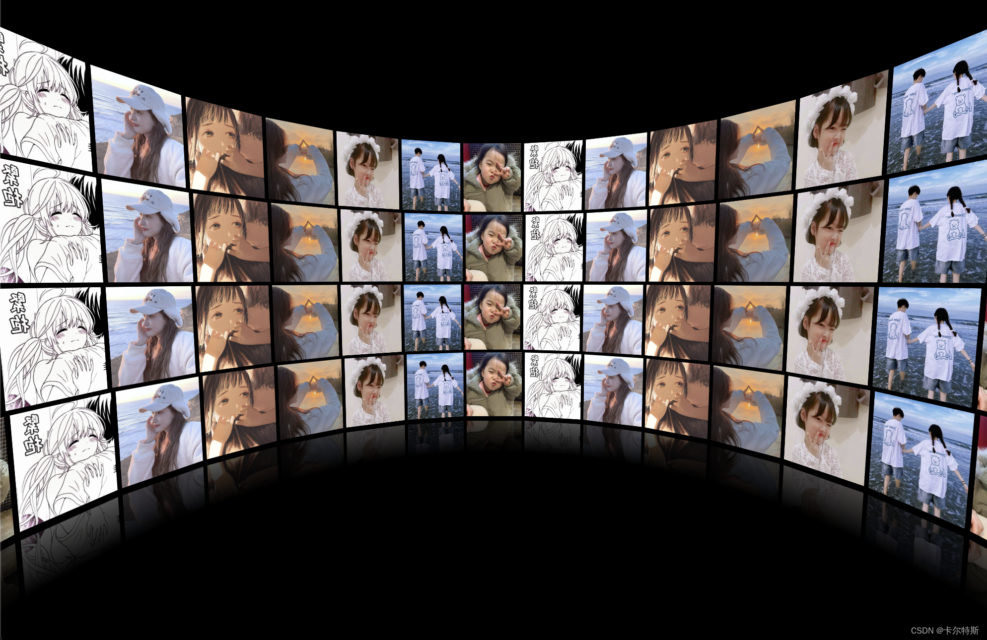
案例动画 Gif 动画地址,图片太大传不上来!
案例 DEMO 源码地址 ,仅供参考。
<!DOCTYPEhtml><htmllang="en"><head><metacharset="UTF-8"><metaname="viewport"content="width=device-width, initial-scale=1.0"><title>Document</title><style>html, body{/* 禁止滚动 */overflow: hidden;/* 触摸设备上浏览器不会对触摸事件做任何处理,所有触摸事件都会被忽略 */touch-action: none;/* 禁止选中 */user-select: none;/* 清空所有状态 */width: 100%;height: 100%;margin: 0;padding: 0;background-color: #000;}body{/* 控制好摄像头位置 */perspective: 500px;perspective-origin: center;}.box{transform-style: preserve-3d;height: 100%;/* 倾斜一点 */transform:rotateX(-30deg);}.box-imgs{transform-style: preserve-3d;/* 用于内部图片坐标全部归零,好进行布局 */position: relative;/* 为了居中 */margin: auto;/* 这里的宽高是为了给下面 img 的宽高 100% 用的,可以调整去掉,设置到图片本身上去 */width: 120px;height: 140px;/* 自动旋转 */animation: autoRotate 200s infinite linear;}.box-imgs:not(:first-child){margin-top: 6px;}.box-imgs img{transform-style: preserve-3d;/* 坐标归零 */position: absolute;left: 0;top: 0;width: 100%;height: 100%;}.box-imgs:last-child img{/* 倒影,如果有多层照片叠加,可以考虑只设置最底下一排有倒影 */-webkit-box-reflect: below 10px linear-gradient(transparent, transparent, #0005);}@keyframes autoRotate{from{transform:rotateY(0deg);}to{transform:rotateY(360deg);}}</style></head><body><!-- 父容器 --><divclass="box"id="box"><!-- 第一排 --><divclass="box-imgs"id="box-imgs1"><!-- 第一排中的图片 --><imgsrc="img/1.webp"><imgsrc="img/2.webp"><imgsrc="img/3.webp"><imgsrc="img/4.webp"><imgsrc="img/6.webp"><imgsrc="img/7.webp"><imgsrc="img/8.webp"><imgsrc="img/1.webp"><imgsrc="img/2.webp"><imgsrc="img/3.webp"><imgsrc="img/4.webp"><imgsrc="img/6.webp"><imgsrc="img/7.webp"><imgsrc="img/8.webp"><imgsrc="img/1.webp"><imgsrc="img/2.webp"><imgsrc="img/3.webp"><imgsrc="img/4.webp"><imgsrc="img/6.webp"><imgsrc="img/7.webp"><imgsrc="img/8.webp"><imgsrc="img/1.webp"><imgsrc="img/2.webp"><imgsrc="img/3.webp"><imgsrc="img/4.webp"><imgsrc="img/6.webp"><imgsrc="img/7.webp"><imgsrc="img/8.webp"></div><!-- 第二排 --><divclass="box-imgs"id="box-imgs2"><!-- 第二排中的图片 --><imgsrc="img/1.webp"><imgsrc="img/2.webp"><imgsrc="img/3.webp"><imgsrc="img/4.webp"><imgsrc="img/6.webp"><imgsrc="img/7.webp"><imgsrc="img/8.webp"><imgsrc="img/1.webp"><imgsrc="img/2.webp"><imgsrc="img/3.webp"><imgsrc="img/4.webp"><imgsrc="img/6.webp"><imgsrc="img/7.webp"><imgsrc="img/8.webp"><imgsrc="img/1.webp"><imgsrc="img/2.webp"><imgsrc="img/3.webp"><imgsrc="img/4.webp"><imgsrc="img/6.webp"><imgsrc="img/7.webp"><imgsrc="img/8.webp"><imgsrc="img/1.webp"><imgsrc="img/2.webp"><imgsrc="img/3.webp"><imgsrc="img/4.webp"><imgsrc="img/6.webp"><imgsrc="img/7.webp"><imgsrc="img/8.webp"></div><!-- 第三排 --><divclass="box-imgs"id="box-imgs3"><!-- 第三排中的图片 --><imgsrc="img/1.webp"><imgsrc="img/2.webp"><imgsrc="img/3.webp"><imgsrc="img/4.webp"><imgsrc="img/6.webp"><imgsrc="img/7.webp"><imgsrc="img/8.webp"><imgsrc="img/1.webp"><imgsrc="img/2.webp"><imgsrc="img/3.webp"><imgsrc="img/4.webp"><imgsrc="img/6.webp"><imgsrc="img/7.webp"><imgsrc="img/8.webp"><imgsrc="img/1.webp"><imgsrc="img/2.webp"><imgsrc="img/3.webp"><imgsrc="img/4.webp"><imgsrc="img/6.webp"><imgsrc="img/7.webp"><imgsrc="img/8.webp"><imgsrc="img/1.webp"><imgsrc="img/2.webp"><imgsrc="img/3.webp"><imgsrc="img/4.webp"><imgsrc="img/6.webp"><imgsrc="img/7.webp"><imgsrc="img/8.webp"></div><!-- 第四排 --><divclass="box-imgs"id="box-imgs4"><!-- 第四排中的图片 --><imgsrc="img/1.webp"><imgsrc="img/2.webp"><imgsrc="img/3.webp"><imgsrc="img/4.webp"><imgsrc="img/6.webp"><imgsrc="img/7.webp"><imgsrc="img/8.webp"><imgsrc="img/1.webp"><imgsrc="img/2.webp"><imgsrc="img/3.webp"><imgsrc="img/4.webp"><imgsrc="img/6.webp"><imgsrc="img/7.webp"><imgsrc="img/8.webp"><imgsrc="img/1.webp"><imgsrc="img/2.webp"><imgsrc="img/3.webp"><imgsrc="img/4.webp"><imgsrc="img/6.webp"><imgsrc="img/7.webp"><imgsrc="img/8.webp"><imgsrc="img/1.webp"><imgsrc="img/2.webp"><imgsrc="img/3.webp"><imgsrc="img/4.webp"><imgsrc="img/6.webp"><imgsrc="img/7.webp"><imgsrc="img/8.webp"></div></div><script>// =================================================== 入门示例 - 正常自动旋转// 照片墙圆弧半径let radius =560;// 每排容器let boxImgs1 = document.getElementById('box-imgs1');let boxImgs2 = document.getElementById('box-imgs2');let boxImgs3 = document.getElementById('box-imgs3');let boxImgs4 = document.getElementById('box-imgs4');// 每排容器中的所有图片let imgs1 = Array.from(boxImgs1.getElementsByTagName('img'))let imgs2 = Array.from(boxImgs2.getElementsByTagName('img'))let imgs3 = Array.from(boxImgs3.getElementsByTagName('img'))let imgs4 = Array.from(boxImgs4.getElementsByTagName('img'))// 设置圆弧倾斜角度functionsetStyle(dom, i, len, delayTime){
      dom.style.transform =`rotateY(${i *(360/ len)}deg) translateZ(${radius}px)`;// 缩放调整额外在追加一些动画// dom.style.transition = 'transform 1s';// dom.style.transitionDelay = `${delayTime || (len - i) / 4}s`}// 刷新一遍位置functionreloadStyle(){for(let i =0; i < imgs1.length; i++){setStyle(imgs1[i], i, imgs1.length,0)}for(let i =0; i < imgs2.length; i++){setStyle(imgs2[i], i, imgs2.length,0)}for(let i =0; i < imgs3.length; i++){setStyle(imgs3[i], i, imgs3.length,0)}for(let i =0; i < imgs4.length; i++){setStyle(imgs4[i], i, imgs4.length,0)}}// 初始化一遍reloadStyle()// =================================================== 升级示例 - 鼠标缩放(注释即失效)// 鼠标滚轮 || 触摸板上下滚动,不要使用捏合手势,浏览器内容默认会被放大
    document.onmousewheel=function(e){// 获取捏合数值
      e || e.window.event
      const num = e.wheelDelta /20||-e.detail
      // 在原基础上调整角度数值
      radius += num
      // 重新布局reloadStyle()}// =================================================== 升级示例 - 鼠标拖拽(注释即失效)// 拖拽容器let dragBox = document.getElementById('box')// 初始化坐标参数let startX,
        startY,
        endX,
        endY,
        tX =0,
        tY =10,
        desX =0,
        desY =0// 鼠标按下
    document.onpointerdown=function(e){// 清楚惯性定时器clearInterval(dragBox.timer)// 鼠标点击位置
      e = e || ewindow.event
      startX = e.clientX
      startY = e.clientY
      // 停止自动旋转playAutoRotate(false)// 鼠标移动this.onpointermove=function(e){// 记录结束时位置
        e = e || window.event
        endX = e.clientX
        endY = e.clientY
        // 计算移动距离并修改角度
        desX = endX - startX
        desY = endY - startY
        tX += desX *0.1
        tY += desY *0.1// 设置角度changeDragBoxRotate()// 记录
        startX = endX
        startY = endY
      }// 鼠标抬起this.onpointerup=function(e){// 添加惯性旋转
        dragBox.timer =setInterval(function(){// 计算惯性
          desX *=0.95
          desY *=0.95
          tX += desX *0.1
          tY += desY *0.1// 设置惯性角度changeDragBoxRotate()// 惯性数值不能大于指定数值,免的滚太多if(Math.abs(desX)<0.5&& Math.abs(desY)<0.5){// 清空定时器clearInterval(dragBox.timer)// 开启自动旋转playAutoRotate(true)}})// 清空this.onpointermove =this.onpointerup =null}returnfalse}// 修改拖拽角度functionchangeDragBoxRotate(){// X轴旋转 0 - 180 度if(tY >180){ tY =180}if(tY <0){ tY =0}// Y 轴旋转角度不限制
      dragBox.style.transform =`rotateX(${-tY}deg) rotateY(${tX}deg)`}// 控制旋转状态functionplayAutoRotate(isPlay){// 状态const status = isPlay ?'running':'paused'// 任意控制一层
      boxImgs2.style.animationPlayState = status
      boxImgs4.style.animationPlayState = status
    }</script></body></html>
本文转载自: https://blog.csdn.net/zz00008888/article/details/135228574
版权归原作者 卡尔特斯 所有, 如有侵权,请联系我们删除。
版权归原作者 卡尔特斯 所有, 如有侵权,请联系我们删除。