
系列文章目录
- 手把手带你玩转Spark机器学习-专栏介绍
- 手把手带你玩转Spark机器学习-问题汇总[持续更新]
- 手把手带你玩转Spark机器学习-Spark的安装及使用
- 手把手带你玩转Spark机器学习-使用Spark进行数据处理和数据转换
- 手把手带你玩转Spark机器学习-使用Spark构建分类模型
- 手把手带你玩转Spark机器学习-使用Spark构建回归模型
- 手把手带你玩转Spark机器学习-使用Spark构建聚类模型
文章目录
前言
前面几篇博客,我们介绍了监督学习,其中训练数据都标记了需要被预测的真实值,比如说分类的类别或者回归预测为实数的目标变量。接下来我们将考虑数据没有标注的情况,具体模型称为无监督学习,即模型训练过程中没有被目标标签监督。在实际应用中,无监督的例子也很常见,原因是在很多真实场景中,标注数据的获取非常困难,代价非常大,但是我们仍然想要从数据中学习基本的结构用来预测。
本文以Covid-19新冠肺炎的公开数据为例,为大家演示如何在Spark上进行空缺值处理、异常检测、去除重复项等预处理操作。
同时为了直观了解过去一段时间内新冠肺炎病例演变情况,我们还引入geopandas来画一个比较酷炫的全球新冠肺炎地理热图,并通过coding将png图像转换成一个动态图片gif,最后我们讲解了K-means在新冠肺炎数据上的实际应用,并针对最终的聚类结果作出相应的解释及分析。
文章中涉及到的code可到本人github处下载:SparkML
一、获取数据集
Our World in Data 维护了一个COVID-19(冠状病毒) 数据的集合。他们在 COVID-19 大流行期间每天更新它。它包括以下数据:
指标来源更新国家数Vaccinations(疫苗接种)Our World in Data 团队整理的官方数据日更新218Tests & positivity(检测及阳性)Our World in Data 团队整理的官方数据周更新193Hospital & ICU(医院及重症监护室)Our World in Data 团队整理的官方数据日更新47Confirmed cases(确诊病例)JHU CSSE COVID-19 Data日更新217Confirmed deaths(确认死亡)JHU CSSE COVID-19 Data日更新217Reproduction rate(繁殖率)Arroyo-Marioli F, Bullano F, Kucinskas S, Rondón-Moreno C日更新192Policy responses(政策回应)Oxford COVID-19 Government Response Tracker日更新187Other variables of interest(其他感兴趣的变量)International organizations (UN, World Bank, OECD, IHME…) 国际组织静态不变241
二、数据Load及Overview
1.引入库并读入数据
import warnings
warnings.filterwarnings("ignore")file='owid-covid-data.csv'import pyspark
from pyspark.sql import SparkSession, SQLContext

spark = SparkSession.builder.appName("Covid Data Mining").config('spark.sql.debug.maxToStringFields',2000).getOrCreate()
full_df = spark.read.csv(file, header=True, inferSchema=True)
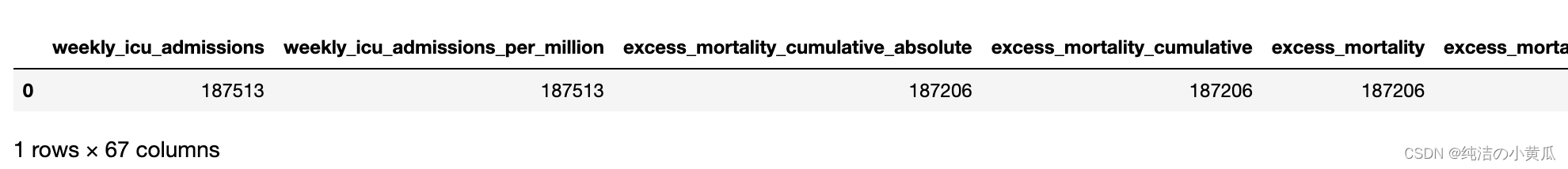
print(f"The total number of samples is {full_df.count()}, with each sample corresponding to {len(full_df.columns)} features.")
The total number of samples is 193812, with each sample corresponding to 67 features.
如上图所示,样本总数为193812,每个样本对应67个特征。
为了识别每个特征及其类型,我们可以使用如下代码:
full_df.printSchema()

如上图所示,大部分的特征是double类型,但是也存在一些类别类变量:
- iso_code:对应于每个国家名称的字符串
- location:对应于每个位置名称的字符串
- continent:对应位置所属大陆的字符串
- tests_units:与每个位置使用的单位相对应的字符串,以计算测试次数
还有日期特征,它的类型是字符串,但是它会在下面被正确地转换成一个日期时间对象。以下命令为每个功能提供了一些示例。
full_df.select("iso_code","location","continent","date","tests_units").show(5)

如上图所示,特征test_units存在很多的null值,为了进一步了解数据的情况,我们统计每列的空缺值个数
from pyspark.sql import functions as F

miss_vals = full_df.select([F.count(F.when(F.isnull(c), c)).alias(c)for c in full_df.columns]).collect()[0].asDict()
miss_vals =dict(sorted(miss_vals.items(), reverse=True, key=lambda item: item[1]))import pandas as pd

pd.DataFrame.from_records([miss_vals])
2.数据预处理
由于本文演示demo使用的数据是动态更新的,因此当同学们在运行代码时,使用的数据可能已经是我写这篇博客之后的数据了,因此结果可能会有些不同。
为了确保实验结果一致,我们对数据集的时间范围进行限定,选择2022-04-01至2022-06-12期间的数据进行实验
full_df = full_df.withColumn('date',F.to_date(F.unix_timestamp(F.col('date'),'yyyy-MM-dd').cast("timestamp")))
dates =("2022-04-01","2022-06-01")
df = full_df.where(F.col('date').between(*dates))
我们重新执行下样本个数统计及空缺值统计的code
print(f"The total number of samples is {df.count()}, with each sample corresponding to {len(df.columns)} features.")

miss_vals = df.select([F.count(F.when(F.isnull(c), c)).alias(c)for c in df.columns]).collect()[0].asDict()
miss_vals =dict(sorted(miss_vals.items(), reverse=True, key=lambda item: item[1]))

pd.DataFrame.from_records([miss_vals])

如上图所示,2022-04-01至2022-06-12期间共有样本数16874,每个样本对应67个特征。
2.1空缺值处理
正常来说,即使我们对数据进行一番过滤后,数据依然也存在大量空值。在调查如何处理它们之前,重要的是我们要了解它们丢失的原因。就continent(大洲)特征而言,以下命令阐明了它包含空值的原因。
df.sort("continent").select("iso_code","continent","location").show(5)

如上图所示,显然,OWID 已经根据收入或一般聚合(例如continent级别)等标准执行了一系列聚合。因为它们以后可能会被证明是有用的,所以没有理由丢弃它们。可以简单地将空值设置为等于“OWID”值,以便以后能够在需要时调用它们。
df = df.fillna({'continent':'OWID'})
另一个空缺字段是test_units
df.select("tests_units").distinct().show()

换句话说,tests_units 只是一个变量,表示每个国家/地区如何报告已执行的测试。例如,在被检测人员的情况下,报告的总测试数量预计会低于执行测试的相同报告,因为在同一天可以对一个人进行多次测试。这意味着缺失值是由于某些国家/地区没有提供有关他们如何计算每日测试总数的相关信息。当然,这不是丢弃相关数据的理由,因此缺失值将被字符串“no info”替换。
df = df.fillna({'tests_units':'no info'})
我们再转向定量特征,大多数缺失值是由于相关数据在某些地点的研究时间段内不可用,或者简单地等于零。例如,new_vaccinations 列中有 8673 个缺失值,这要么是由于某些地点没有疫苗,要么是由于这些地点报告在特定日期没有接种疫苗。在这种情况下,最好的方法是用 0 替换所有这些值。在少数情况下,缺失值不是由于这两个原因中的任何一个,而是由于错误报告、错误或其他原因,我们希望能找到它在他们的分析过程中,尤其是他们的可视化过程中。在这种情况下,我们将能够重新处理它们或完全丢弃它们。
df = df.fillna(0)
我们再确认下数据中没有空缺值
miss_vals = df.select([F.count(F.when(F.isnull(c), c)).alias(c)for c in df.columns]).collect()[0].asDict()ifany(list(miss_vals.values()))!=0:print("There are still missing values in the DataFrame.")else:print("All missing values have been taken care of.")
2.2异常检测
在讨论了缺失值的情况之后,接下来我们也讨论一下异常值的情况。通常,异常值的识别需要进一步的分析,例如可视化。此外,有几种类型的异常值,例如全局异常值或基于上下文的异常值(即仅在特定条件或上下文下为异常值的点),这意味着以通用方式处理异常值是不明智的。
尽管如此,如果选择这样做,处理异常值的系统方法是基于四分位距方法。四分位间距 R 定义为
R
=
Q
3
−
Q
1
R = Q_{3} - Q_{1}
R=Q3−Q1 其中
Q
i
Q_{i}
Qi 是第
i
i
i 个四分位数。所研究特征的值高于
Q
3
+
α
R
Q_{3} + \alpha R
Q3+αR或低于
Q
1
−
α
R
Q_{1} - \alpha R
Q1−αR 的每个点都被归类为该特定特征的异常值,其中
α
\alpha
α 是定义“决策边界”的标量,单位为
R
R
R。这基本上是箱线图的构造方式,其中
R
R
R对应于箱线的高度,
α
R
\alpha R
αR 等于晶须的长度。
α
\alpha
α 的一个非常常见的选择是
α
=
1.5
\alpha =1.5
α=1.5 。基于这些,可以定义一个函数来识别与特定特征相关的所有异常值。
defOutlierDetector(dataframe, features, alpha=1.5):"""
    Args:
        dataframe (pyspark.sql.dataframe.DataFrame):
            the DataFrame hosting the data
        features (string or List):
            List of features (columns) for which we wish to identify outliers.
            If set equal to 'all', outliers are identified with respect to all features.
        alpha (double):
            The parameter that defines the decision boundary (see markdown above)
    """
    feat_types =dict(dataframe.dtypes)if features =='all':
        features = dataframe.columns

    outliers_cols =[]for feat in features:# We only care for quantitative featuresif feat_types[feat]=='double':
            Q1, Q3 = dataframe.approxQuantile(feat,[0.25,0.75],0)
            R = Q3 - Q1
            lower_bound = Q1 -(R * alpha)
            upper_bound = Q3 +(R * alpha)# In this way we construct a query, which can be matched to a DataFrame column, thus returning a new# column where every point that corresponds to an Outlier has a boolean value set to True
            outliers_cols.append(F.when(~F.col(feat).between(lower_bound, upper_bound),True).alias(feat +'_outlier'))# Sample points that do not correspond to outliers correspond to a False value for the new column
    outlier_df = dataframe.select(*outliers_cols)
    outlier_df = outlier_df.fillna(False)return outlier_df
例如,我们可以检查 5 个随机 DataFrame 行中的任何一个是否对应于 new_cases 特征的异常值:
2.3重复条目
在进行探索性数据分析之前,预处理阶段的最后一步是定位可能的重复条目并丢弃重复项。当谈到重复时,我们实际上并不是指整行,而是指日期和位置列的组合条目。这两个特征的重复条目意味着该位置在给定日期提供了不止一份每日报告。以下命令显示过滤后的 DataFrame 中不存在重复项,但是,即使有,也可以使用 df = df.dropDuplicates([‘location’,‘date’]) 删除它们。
if df.count()!= df.select(['location','date']).distinct().count():print("There are duplicate entries present in the DataFrame.")else:print("Either there are no duplicate entries present in the DataFrame, or all of them have already been removed).")
3.数据探索分析
数据分析(Exploratory Data Analysis)简称EDA。在深入了解 EDA 之前,我们导入了一些库,并展示了一些辅助函数和命令,这些函数和命令将在未来用于可视化。
import matplotlib
import numpy as np
import matplotlib.pyplot as plt
import seaborn as sns

from matplotlib.colors import ListedColormap, LinearSegmentedColormap, TwoSlopeNorm
from mpl_toolkits.axes_grid1 import make_axes_locatable

defCustomCmap(from_rgb,to_rgb):# from color r,g,b
    r1,g1,b1 = from_rgb

    # to color r,g,b
    r2,g2,b2 = to_rgb

    cdict ={'red':((0, r1, r1),(1, r2, r2)),'green':((0, g1, g1),(1, g2, g2)),'blue':((0, b1, b1),(1, b2, b2))}

    cmap = LinearSegmentedColormap('custom_cmap', cdict)return cmap

mycmap = CustomCmap([1.0,1.0,1.0],[72/255,99/255,147/255])
mycmap_r = CustomCmap([72/255,99/255,147/255],[1.0,1.0,1.0])

mycol =(72/255,99/255,147/255)
mycomplcol =(129/255,143/255,163/255)
othercol1 =(135/255,121/255,215/255)
othercol2 =(57/255,119/255,171/255)
othercol3 =(68/255,81/255,91/255)
othercol4 =(73/255,149/255,139/255)
- 死亡率最高国家的演变
在这里,死亡率的计算方法是死亡总数除以每个地点的人口(另一个常见的定义是 Covid 的死亡总数除以 Covid 病例的总数)。为此,构建了一个名为死亡率的列。使用此列,我们确定了研究时间间隔内每一天的死亡率最高的 10 个国家。
dates_frame = df.select("date").distinct().orderBy('date').collect()
dates_list =[str(dates_frame[x][0])for x inrange(len(dates_frame))]

df_for_mort = df.filter(F.col('population')!=0.0).withColumn("mortality", F.col("total_deaths")/F.col("population"))for i, this_day inenumerate(dates_list):
    this_day_top_10 = df_for_mort.filter(F.col('date')== this_day).orderBy("mortality", ascending=False).select(["location","mortality"]).take(10)if i ==0:
        ct_list =[(this_day_top_10[x][0],this_day_top_10[x][1])for x inrange(10)]print("During "+this_day+", the top 10 countries with the highest mortality rate were:")for country, instance in ct_list:print(f"▶ {country}, with mortality rate {100*instance:.2f}%.")
        new_set =set(ct_list[x][0]for x inrange(10))elif i ==len(dates_list)-1:
        ct_list =[(this_day_top_10[x][0],this_day_top_10[x][1])for x inrange(10)]print("During "+this_day+", the top 10 countries with the highest mortality rate were:")for country, instance in ct_list:print(f"▶ {country}, with mortality rate {100*instance:.2f}%.")else:
        new_set =set(this_day_top_10[x][0]for x inrange(10))if new_set != old_set:
            left_out = old_set-new_set
            new_additions = new_set-old_set
            print("This was the top ten until "+this_day+", when "+", ".join(str(s)for s in new_additions)+" joined the list, replacing "+", ".join(str(s)for s in left_out)+".")
    new_set, old_set =set(), new_set
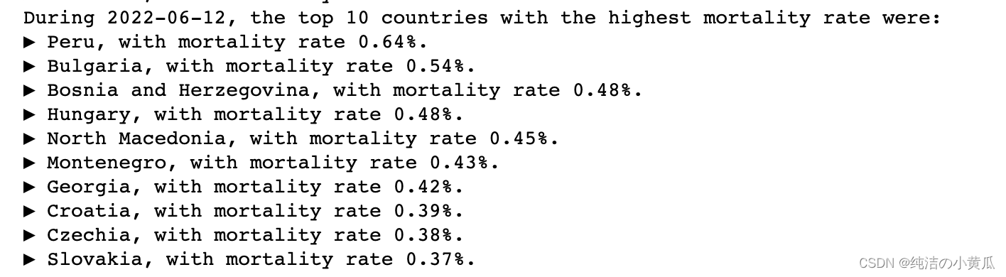
以6月12号为例,新冠肺炎导致的死亡率最高的10个国家分别是:
- 秘鲁,死亡率 0.64 % 0.64% 0.64%
- 保加利亚,死亡率 0.54 % 0.54% 0.54%
- 波斯尼亚,死亡率 0.48 % 0.48% 0.48%
- 匈牙利,死亡率 0.48 % 0.48% 0.48%
- 北马其顿,死亡率 0.45 % 0.45% 0.45%
- 黑山,死亡率 0.43 % 0.43% 0.43%
- 乔治亚州,死亡率 0.42 0.42% 0.42
- 克罗地亚,死亡率 0.39 % 0.39% 0.39%
- 捷克,死亡率 0.38 % 0.38% 0.38%
- 斯洛伐克,死亡率 0.37 % 0.37% 0.37%
- 每百万病例总数排名前列国家的演变
for i, this_day inenumerate(dates_list):
   this_day_top_10 = df.filter(F.col('date')== this_day).orderBy("total_cases_per_million", ascending=False).select(["location","total_cases_per_million"]).take(10)if i ==0:
       ct_list =[(this_day_top_10[x][0],this_day_top_10[x][1])for x inrange(10)]print("During "+this_day+", the top 10 countries with the highest number of total cases per million were:")for country, instance in ct_list:print(f"▶ {country}, with {instance} total cases per million.")
       new_set =set(ct_list[x][0]for x inrange(10))elif i ==len(dates_list)-1:
       ct_list =[(this_day_top_10[x][0],this_day_top_10[x][1])for x inrange(10)]print("During "+this_day+", the top 10 countries with the highest number of total cases per million were:")for country, instance in ct_list:print(f"▶ {country}, with {instance} total cases per million.")else:
       new_set =set(this_day_top_10[x][0]for x inrange(10))if new_set != old_set:
           left_out = old_set-new_set
           new_additions = new_set-old_set
           print("This was the top ten until "+this_day+", when "+", ".join(str(s)for s in new_additions)+" joined the list, replacing "+", ".join(str(s)for s in left_out)+".")
   new_set, old_set =set(), new_set
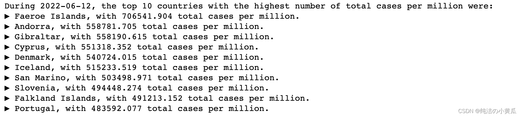
以2022-06-12为例,每百万新冠肺炎病例数TOP国家分别是:
- 法罗群岛,每百万病例数706541
- 安道尔,每百万病例数558781
- 直布罗陀,每百万病例数558190
- 塞普洛斯,每百万病例数551318
- 丹麦,每百万病例数540724
- 冰岛,每百万病例数515233
- 圣马力诺,每百万病例数503498
- 斯洛文尼亚,每百万病例数494448
- 福克兰群岛,每百万病例数491213
- 葡萄牙,每百万病例数483592
- 住院患者和ICU入院
# dt_ord = df.filter(df.iso_code=="CHN").orderBy("date", ascending=True).groupBy("date")
dt_ord = df.orderBy("date", ascending=True).groupBy("date")

hosps = dt_ord.agg(F.sum("hosp_patients")).collect()
hosps =[hosps[i][1]for i inrange(len(hosps))]

icus = dt_ord.agg(F.sum("icu_patients")).collect()
icus =[icus[i][1]for i inrange(len(icus))]

sns.set(style ="darkgrid")

alt_dts_list =[dt.replace('2022-','')for dt in dates_list]
tick_marks = np.arange(len(alt_dts_list))

fig,[ax1,ax2]= plt.subplots(1,2, figsize=(14,5))for pat, col, style, ax, where inzip([hosps,icus],[mycol, mycomplcol],['solid','dashed'],[ax1,ax2],['Normal Beds','ICUs']):
    ax.plot(alt_dts_list, pat, linestyle=style, color=col)
    ax.set_xlabel("Date")
    ax.set_ylabel("Number of Patients")
    ax.set_title(f"Daily Number of Patients in {where}", fontsize=14)
    ax.set_xticks(tick_marks[::5])
    ax.set_xticklabels(alt_dts_list[::5], rotation=45)

plt.show()

matplotlib.rc_file_defaults()
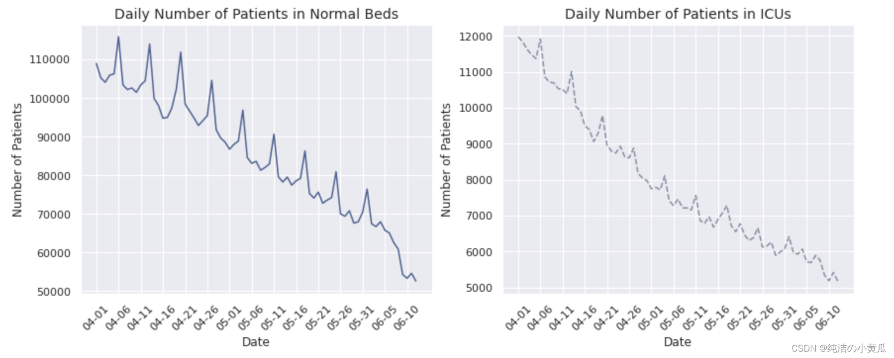
很明显,住院和 ICU 入院的总体趋势是下降的,在本文限定的两个多月的时间内,这两个数字已经下降到其初始值的近一半。请注意两个图表具有相似的模式,这似乎暗示了住院患者数量与 ICU 患者数量之间的相关性。一个重要的区别是,住院患者人数的绝对值与 ICU 入院人数相比要高得多,这是合理的,因为较轻病例的数量与较严重的病例数量相比要高。
- 总病例的地理热图
这里我们开发了一个有趣的可视化:地理热图。它是世界各国的 2D 表示,并根据特定特征而言,根据其强度进行着色。下面,我们构建了全球范围内总病例数的地理热图。每天都会提取一张热图图像。热图是使用 geopandas 库构建的:
print('Initializing the construction of heatmaps for every day.')

ct =0for this_day in dates_list:# The conversion of the required columns into a Pandas df is necessary to perform the mapping
    day_df = df.filter(F.col('date')== this_day).select(["iso_code","total_cases"]).toPandas()

    merged_df = pd.merge(left=geo_df, right=day_df, how='left', left_on='iso_code', right_on='iso_code')

    title =f'Total COVID-19 Cases as of {this_day}'
    col ='total_cases'
    vmin, vmax = merged_df[col].min(), merged_df[col].max()
    cmap = mycmap
    divnorm = TwoSlopeNorm(vcenter=0.08*20365726)# Create figure and axes for Matplotlib
    fig, ax = plt.subplots(1, figsize=(20,8))# Remove the axis
    ax.axis('off')
    merged_df.plot(column=col, ax=ax, edgecolor='1.0', linewidth=1, norm=divnorm, cmap=cmap)# Add a title
    ax.set_title(title, fontdict={'fontsize':'25','fontweight':'3'})# Create colorbar as a legend
    sm = plt.cm.ScalarMappable(norm=plt.Normalize(vmin=vmin, vmax=vmax), cmap=cmap)# Empty array for the data range
    sm._A =[]# Add the colorbar to the figure
    cbaxes = fig.add_axes([0.15,0.25,0.01,0.4])
    cbar = fig.colorbar(sm, cax=cbaxes)
    plt.savefig(f'world_map_{this_day}.png', bbox_inches='tight')
    plt.close(fig)
    ct +=1print(f'Process complete. {ct} heatmap(s) were extracted, ready to be converted into a .gif file.')
上面的代码,生成了一张张世界热图
为了能够清晰地看到每天的变化趋势,我们将一张张png图片转成gif,如下所示:
from PIL import Image
frames =[]for this_day in dates_list:
    frames.append(Image.open(f'world_map_{this_day}.png'))

frames =[frame.convert('PA')for frame in frames]

frames[0].save('Total COVID-19 Cases.gif',format='GIF',
               append_images=frames[1:],
               save_all=True,
               duration=1, loop=0, transparency=3)
如上图所示,从4月份到6月份可以看到新冠肺炎病例总数的变化,由于CSDN对gif上传大小有限制,所以图片被我代码压缩了,我们可以发现中国区域的颜色有着
由浅变深的过程,这个与我国过去两个月新冠疫情加剧相吻合。
- 超额死亡率的地理相关性 根据之前的可视化,一些邻国似乎与病例总数相关(例如法国和德国)。我们推测其他特征也会呈现地理相关性,比如说超额死亡率。超额死亡率是每周报告而不是每天报告的一个特征。根据前几年的报告,它等于特定一周的总死亡人数减去平均死亡人数。虽然它不是与 Covid 直接相关的特征,但预计在全球大流行期间,高死亡率主要归因于这种大流行。为了调查邻国之间的相关性,我们必须首先制定一份可提供超额死亡率报告的日期列表(对于所有其他日期,由于我们的预处理,条目均为零)。
exc_dates_list = df.filter(F.col('excess_mortality')!=0.0).select(['date']).distinct().orderBy('date').collect()
exc_dates_list =[str(exc_dates_list[i][0])for i inrange(len(exc_dates_list))]
为了演示方便,同时考虑到欧洲独特的地理环境,我们选择欧洲国家作为演示示例。
print('Initializing the construction of heatmaps for every day.')

ct =0for this_day in exc_dates_list:
    europe_df = df.filter(F.col('date')== this_day).filter(F.col('continent')=='Europe').filter(F.col('excess_mortality')!=0.0).select(["iso_code","excess_mortality"])

    geo_eu = pd.merge(left=geo_df, right=europe_df.toPandas(), how='inner', on='iso_code')

    fig, ax = plt.subplots(1,1)

    col ='excess_mortality'
    cmap = mycmap

    vmin, vmax = geo_eu[col].min(), geo_eu[col].max()
    sm = plt.cm.ScalarMappable(norm=plt.Normalize(vmin=vmin, vmax=vmax), cmap=cmap)

    ax.axis('off')
    ax.axis([-13,44,33,72])
    geo_eu.plot(column=col, ax=ax, edgecolor='1.0', linewidth=1, norm=None, cmap=cmap)
    ax.set_title(f'Excess Mortality in Europe as of {this_day}', fontdict={'fontsize':'14','fontweight':'3'})

    divider = make_axes_locatable(ax)
    cax = divider.append_axes("right", size="5%", pad=.2)
    fig.add_axes(cax)
    fig.colorbar(sm, cax=cax)
    plt.savefig(f'europe_{this_day}.png', bbox_inches='tight')
    plt.close(fig)
    ct +=1print(f'Process complete. {ct} heatmap(s) were extracted, ready to be converted into a .gif file.')
生成欧洲的地理热图,然后将热图转换成gif图
from PIL import Image

frames =[]for this_day in exc_dates_list:
    frames.append(Image.open(f'europe_{this_day}.png'))

frames =[frame.convert('PA')for frame in frames]

gif_name ='Excess Mortality in Europe.gif'
frames[0].save(gif_name,format='GIF',
               append_images=frames[1:],
               save_all=True,
               duration=1000, loop=0, transparency=8,quality=200,optimize=True)
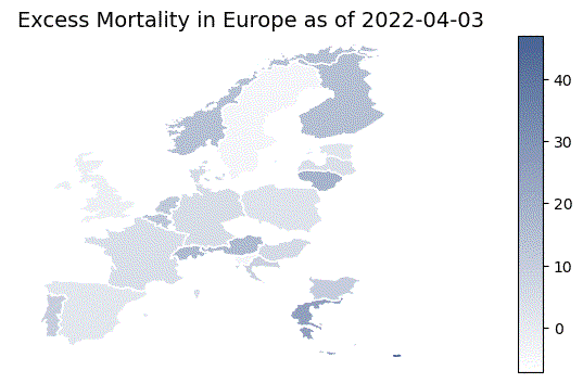
基于此可视化,可以安全地假设确实存在与超额死亡率值显着相关的邻国。德国和瑞士就是这样一对国家的一个例子,因为它们在高死亡率方面似乎同时有高点和低点。
为了更精确地生成这些结果,我们需要构建一个新的 PySpark 数据框,其中包含每个欧洲国家的所有超额死亡率报告,这些国家提供了所有先前计算日期的报告。甚至有 1 个缺失值的国家都不会被考虑在内,以便能够得出尽可能安全的结论,因为就这一特征而言,可用数据量非常小。然后,使用这个新创建的 DataFrame,可以构建一个 Pearson 相关矩阵,从而不仅揭示了具有相同地理边界的相关国家对,而且还揭示了这种相关性的确切值。由于在本文选定的时间内,每个欧洲国家都存在一些缺失值,所以我们选取其他时间区间内(2021-01-01", "2021-02-28)的数据进行实验。
european_df = df.filter(F.col('continent')=='Europe').filter(F.col('excess_mortality')!=0.0)
european_cts = european_df.select(['location']).distinct().collect()
european_cts =[european_cts[i][0]for i inrange(len(european_cts))if european_df.filter(F.col('location')== european_cts[i][0]).count()==len(exc_dates_list)]print(f'{len(european_cts)} European countries are chosen for this analysis.')
31 European countries are chosen for this analysis.
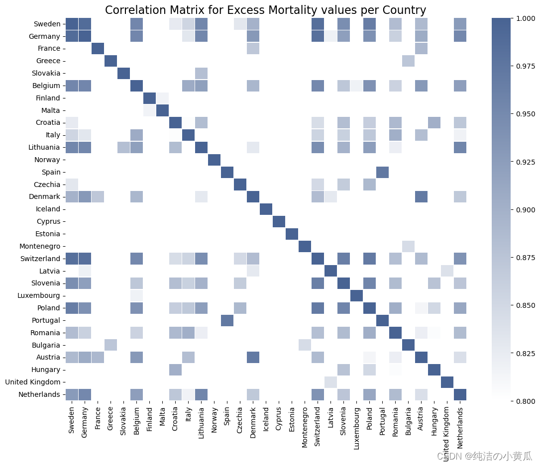
如前所述,就超额死亡率而言,瑞士和德国确实对应于一对高度相关的邻国。事实上,在大多数情况下,似乎只有邻国(例如比利时和德国,或卢森堡和荷兰)及其第二邻国表现出高相关值,相关值随着邻国指数(即有多少个国家)显着下降两个国家以外的国家)增加超过 2。
4 K-Means聚类
前面我们分享了如何进行数据分析及可视化操作,接下来我们展示下如何对新冠肺炎数据进行聚类,关于聚类算法的原理,大家可以参考我写得一些博客:K-means聚类算法原理分析与实际应用案例分析,基于改进的K-means算法在共享交通行业客户细分中的应用。本篇文章主要聚焦在K-means的Spark实现。
在实现K-means时,我们需要确定K的最佳取值,在实际应用场景我们可以通过elbow method来确定K的取值,但是为了演示简便,我们通过可视化的方式来确定K的取值。
我们知道k-means是以最小化样本与质点平方误差作为目标函数,将每个簇的质点与簇内样本点的平方距离误差和称为畸变程度(distortions),那么,对于一个簇,它的畸变程度越低,代表簇内成员越紧密,畸变程度越高,代表簇内结构越松散。 畸变程度会随着类别的增加而降低,但对于有一定区分度的数据,在达到某个临界点时畸变程度会得到极大改善,之后缓慢下降,这个临界点就可以考虑为聚类性能较好的点。其图像像一个胳膊肘,故名为elbow method
sns.set(style ="darkgrid")

fig,[ax1,ax2]= plt.subplots(1,2, figsize=(12,5))for idx,(ax,this_day)inenumerate(zip([ax1,ax2],[exc_dates_list[0],exc_dates_list[-1]])):

    eff_df = df.filter(F.col('excess_mortality_cumulative_per_million')!=0.0).filter(F.col('date')== this_day).select(['total_cases_per_million','excess_mortality_cumulative_per_million','location'])

    pdf = eff_df.select(['total_cases_per_million','excess_mortality_cumulative_per_million']).toPandas()

    points = ax.scatter(pdf.total_cases_per_million, pdf.excess_mortality_cumulative_per_million,
                                  color=mycol, alpha=0.5)

    ax.set_title(f'Scatterplot of Countries as of {this_day}')
    ax.set_xlabel('Total Cases per Million')
    ax.set_ylabel('Excess Mortality (Cumulative) per Million')

plt.show()

matplotlib.rc_file_defaults()
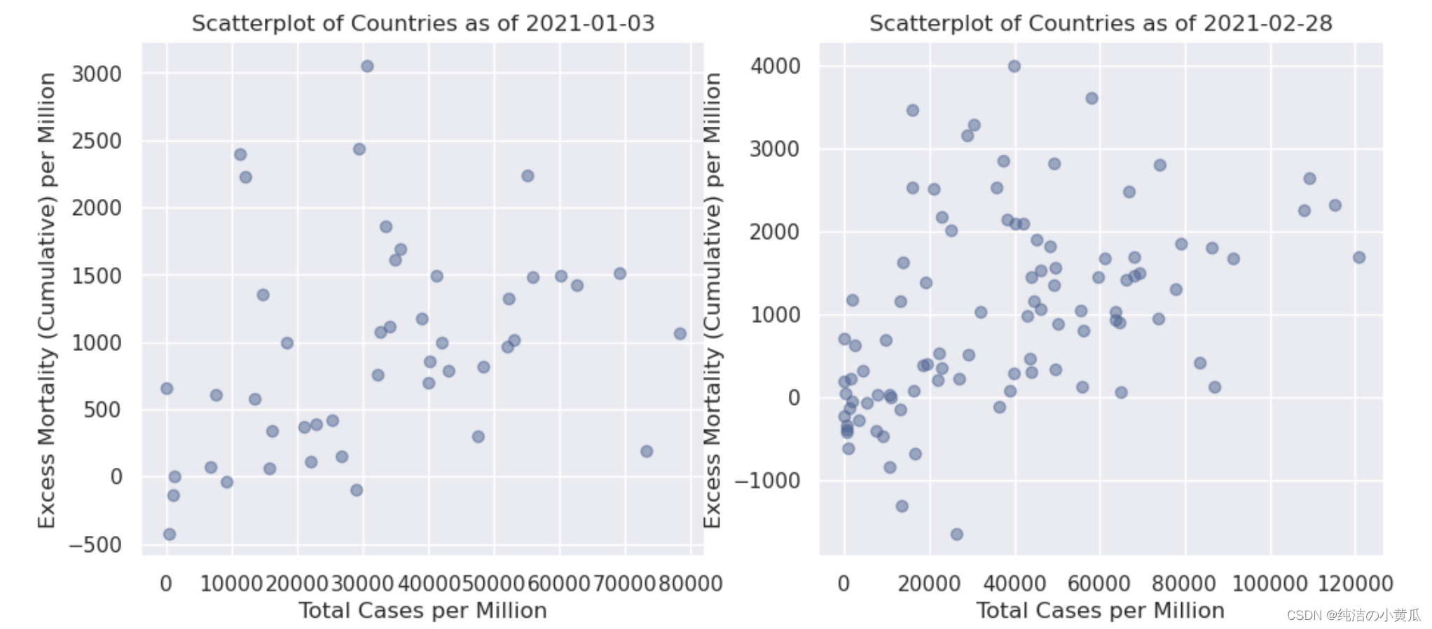
即使通过这种初步的可视化,我们也可以就数据本身得出一个非常重要的结论:到 2 月底,报告超额死亡率的国家数量更多了。就 k 的选择(即要考虑的集群数量)而言,第一个日期的合理假设是 k = 2:一个集群包括每百万新冠病例较少的国家,一个集群包括每百万人中有更多新冠病例的国家,因为除了一些异常值——似乎超额死亡率与总病例数成正比。另一方面,d的情况要复杂一些。我们将为此案例选择 k = 3。我们发现在横轴100000-120000之间有四个点,我们希望聚类算法能够把这四个点圈成一个簇。
from pyspark.ml.clustering import KMeans

sns.set(style ="darkgrid")

numclusters =[2,3]
colors =[mycol, mycomplcol, othercol1, othercol2, othercol3, othercol4]

fig,[ax1,ax2]= plt.subplots(1,2, figsize=(14,5))for idx,(ax,this_day)inenumerate(zip([ax1,ax2],[exc_dates_list[0],exc_dates_list[-1]])):

    eff_df = df.filter(F.col('excess_mortality_cumulative_per_million')!=0.0).filter(F.col('date')== this_day).filter(F.col('date')== this_day).select(['total_cases_per_million','excess_mortality_cumulative_per_million','location'])

    vectorAssembler = VectorAssembler(inputCols =['total_cases_per_million','excess_mortality_cumulative_per_million'], outputCol ="features")
    feat_df = vectorAssembler.transform(eff_df)
    feat_df = feat_df.select(['features','location'])

    kmeans = KMeans().setK(numclusters[idx]).setSeed(1).setFeaturesCol("features").setPredictionCol("cluster")
    model = kmeans.fit(feat_df)
    transformed = model.transform(feat_df)
    centroids = model.clusterCenters()

    transformed = transformed.join(eff_df,'location')

    clusters, centers, images ={},{},{}for i inrange(numclusters[idx]):

        clusters[i]= transformed.filter(F.col('cluster')==i).select(['location','cluster','total_cases_per_million','excess_mortality_cumulative_per_million']).toPandas().set_index('location')

        images[i]= ax.scatter(clusters[i].total_cases_per_million, clusters[i].excess_mortality_cumulative_per_million,
                                  color=colors[i], alpha=0.5)
        centers[i]= ax.scatter(centroids[i][0], centroids[i][1], color=colors[i], marker='x')

    clusttuple =(images[i]for i inrange(numclusters[idx]))
    clustnames =('Cluster '+str(i+1)for i inrange(numclusters[idx]))

    ax.legend(clusttuple, clustnames, loc='best')

    ax.set_title(f'Clusters of Countries as of {this_day}')
    ax.set_xlabel('Total Cases per Million')
    ax.set_ylabel('Excess Mortality (Cumulative) per Million')

plt.show()

matplotlib.rc_file_defaults()
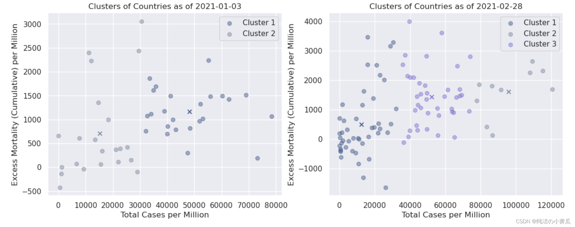
如上图所示,我们将不同簇用不同的颜色对比展示,每个簇的质心用 X 表示。就第一个日期(1 月初)而言,确实可以观察到所有国家都以某种方式分为两个簇这是最初的可视化所预期的。就第二个日期(2 月下旬)而言,每百万病例总数超过 10 万例(> 10%)的 4 个国家似乎确实属于同一簇。该簇中的所有国家/地区是:
print(*clusters[2].index, sep=', ')
Albania, Armenia, Aruba, Austria, Belgium, Bosnia and Herzegovina, Brazil, Bulgaria, Chile, Colombia, Costa Rica, Croatia, Cyprus, Denmark, Estonia, France, French Polynesia, Georgia, Hungary, Ireland, Italy, Kosovo, Latvia, Lebanon, Liechtenstein, Lithuania, Malta, Moldova, Monaco, Netherlands, North Macedonia, Peru, Poland, Qatar, Romania, Serbia, Spain, Sweden, Switzerland, United Kingdom
从第三个簇中,我们发现39个打印的国家中,有30个是欧洲国家;簇与簇之间的分界线是按照水平轴上的数量进行分割的。
总结
本文我们利用COVID-19的数据,构建了一个聚类模型。同时我们介绍了如何利用Spark进行数据的探索性分析及可视化操作,我们还展示如何画地理热图,以及如何画相关性系数图,并通过代码将PNG图像转换成gif动态图片,简单又好玩。
版权归原作者 纯洁の小黄瓜 所有, 如有侵权,请联系我们删除。