
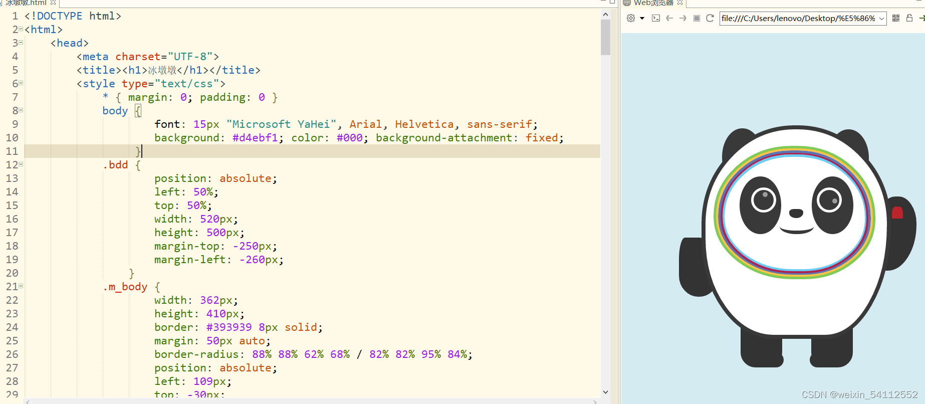
效果图
代码 :
css:
<style type="text/css">
            * { margin: 0; padding: 0 }
            body {
                    font: 15px "Microsoft YaHei", Arial, Helvetica, sans-serif;
                    background: #d4ebf1; color: #000; background-attachment: fixed;
                 }
            .bdd {
                    position: absolute;
                    left: 50%;
                    top: 50%;
                    width: 520px;
                    height: 500px;
                    margin-top: -250px;
                    margin-left: -260px;
                }
            .m_body {
                    width: 362px;
                    height: 410px;
                    border: #393939 8px solid;
                    margin: 50px auto;
                    border-radius: 88% 88% 62% 68% / 82% 82% 95% 84%;
                    position: absolute;
                    left: 109px;
                    top: -30px;
                    background: #fff;
                }
            .earL, .earR {
                            background: #393939;
                            width: 81px;
                            height: 115px;
                            border-radius: 50%;
                            position: absolute;
                            z-index: -1;
                        }
            .earL {
                    left: 150px;
                    top: 26px;
                    transform: rotate( -10deg );
                }
            .earR {
                    left: 362px;
                    top: 28px;
                    transform: rotate(10deg);
                }
            .eyeL, .eyeR {
                    background: #393939;
                    width: 83px;
                    height: 115px;
                    border-radius: 50%;
                    position: absolute;
                }
            .eyeL {
                    left: 185px;
                    top: 122px;
                    transform: rotate(45deg);
                }
            .eyeR {
                    left: 329px;
                    top: 122px;
                    transform: rotate(-45deg);
                }
            .eyeL:before, .eyeR:before {
                    content: "";
                    width: 40px;
                    height: 40px;
                    border: #fff 5px solid;
                    border-radius: 100%;
                    position: absolute;
                }
            .eyeL:before {
                    right: 10px;
                    top: 22px;
                }
            .eyeR:before {
                    left: 10px;
                    top: 22px;
                }
            .eyeL:after, .eyeR:after {
                    content: "";
                    width: 10px;
                    height: 10px;
                    background: #9b9b9b;
                    border-radius: 100%;
                    position: absolute;
                }
            .eyeL:after {
                    right: 27px;
                    top: 31px;
                }
            .eyeR:after {
                    left: 41px;
                    top: 44px;
                }
            .face {
                    position: absolute;
                    border-radius: 48% 48% 44% 49%/ 53% 54% 45% 47%;
                }
            .c_blue {
                    border: #6bcdf3 5px solid;
                    width: 280px;
                    height: 224px;
                    left: 150px;
                    top: 78px;
                }
            .c_red {
                    border: #af2350 5px solid;
                    width: 287px;
                    height: 233px;
                    left: 146px;
                    top: 73px;
                }
            .c_purple {
                    border: #5d75b3 5px solid;
                    width: 295px;
                    height: 240px;
                    left: 142px;
                    top: 70px;
                }
            .c_yellow {
                    border: #ffc346 5px solid;
                    width: 305px;
                    height: 248px;
                    left: 137px;
                    top: 65px;
                }
            .c_green {
                    border: #7fcb58 5px solid;
                    width: 313px;
                    height: 256px;
                    left: 133px;
                    top: 61px;
                }
            .armL, .armR {
                    background: #333;
                    position: absolute;
                    z-index: -1;
                }
            .armL {
                    width: 75px;
                    height: 118px;
                    left: 64px;
                    top: 244px;
                    transform: rotate(45deg);
                    border-radius: 24% 69% 68% 76%/ 53% 95% 40% 52%;
                }
            .armR {
                    width: 75px;
                    height: 148px;
                    left: 463px;
                    top: 162px;
                    transform: rotate(37deg);
                    border-radius: 56% 62% 98% 6%/ 40% 46% 80% 58%;
                }
            .armR:before {
                    content: "";
                    width: 16px;
                    height: 24px;
                    background: #bc242c;
                    position: absolute;
                    border-top-left-radius: 50%;
                    border-top-right-radius: 50%;
                    transform: rotate(45deg);
                    left: 32px; top: 20px;
                }
            .armR:after {
                    content: "";
                    width: 16px;
                    height: 24px;
                    background: #bc242c;
                    position: absolute;
                    border-top-left-radius: 50%;
                    border-top-right-radius: 50%;
                    transform: rotate(-45deg);
                    left: 26px;
                    top: 20px;
                }
            .arm_c {
                    content: "";
                    width: 16px;
                    height: 24px;
                    position: absolute;
                    left: 426px;
                    top: 20px;
                }
            .nose{
                    background-color: #333333;
                    position: absolute;
                    left: 284px;
                    top: 187px;
                    width: 28px;
                    height: 18px;
                    border-radius: 42px 42px 60px 61px/ 30px 30px 50px 46px;
                }
            .mouse {
                    position: absolute;
                    left: 265px;
                    top: 205px;
                    width: 68px;
                    height: 25px;
                    border-radius: 48%;
                    border: #393939 7px solid;
                    border-top: none;
                    border-left: 0;
                    border-right: 0;
                }
            .legL, .legR {
                    background: #333;
                    position: absolute;
                    width: 83px;
                    height: 80px;
                    border-radius: 0 0 30px 30px;
                    z-index: -1;
                }
            .legL {
                    left: 187px;
                    top: 423px;
                }
            .legR {
                    left: 328px;
                    top: 423px;
                }
            .legL:after, .legR:after {
                    content: "";
                    width: 43px;
                    height: 30px;
                    position: absolute;
                    background: #333;
                    border-radius: 30px;
                }
            .legL:after {
                    bottom: 0;
                    right: -3px;
                }
            .legR:after {
                    bottom: 0;
                    left: -3px;
                }
        </style>
html:
<div class="bdd">
            <div class="m_body"></div>
            <div class="earL"></div>
            <div class="earR"></div>
            <div class="eyeL"></div>
            <div class="eyeR"></div>
            <div class="face c_blue"></div>
            <div class="face c_red"></div>
            <div class="face c_purple"></div>
            <div class="face c_yellow"></div>
            <div class="face c_green"></div>
            <div class="nose"></div>
            <div class="mouse"></div>
            <div class="armL"></div>
            <div class="armR"></div>
            <div class="legL"></div>
            <div class="legR"></div>
        </div>
本文转载自: https://blog.csdn.net/weixin_54112552/article/details/122855648
版权归原作者 weixin_54112552 所有, 如有侵权,请联系我们删除。
版权归原作者 weixin_54112552 所有, 如有侵权,请联系我们删除。