
一、background总览
1、简介
background
属性是所有背景属性的缩写,通常建议在代码中使用该缩写属性,而不是使用多条单独的背景属性,因为该缩写属性在老版本浏览器中支持性更好,而且书写简便。未写在缩写属性中的其他背景属性,则会采用默认值。
但我个人不提倡一味的使用缩写属性,因为当缩写的属性过多时,会导致这行代码过长,而且可读性也会变差,所以个人建议只在缩写属性中缩写4~6个属性,如果还需要用到其他属性则通过单独背景属性来定义。
2、系列属性
背景系列属性,共包含9种属性,除了
background-blend-mode
属性以外,其他8种属性全都支持通过
background
属性进行简写。
background-color:设置元素的背景颜色,默认值:transparent。background-image:设置元素的背景图像,默认值:none。background-size:设置元素背景图像的大小,默认值:auto。background-position:设置元素背景图像的位置,默认值:0% 0%。background-repeat:设置背景图像是否重复,以及如何重复,默认值:repeat。background-clip:设置元素背景的渲染区域,默认值:border-box。background-origin:设置元素背景的定位区域(背景区),默认值:border-box。background-attachment:设置元素的背景图像是否随页面滚动或固定,默认值:scroll。background-blend-mode(不支持简写):设置元素背景层的混合模式,默认值:normal。
3、缩写规则
①
background-color
、
background-image
、
background-size
、
background-position
、
background-repeat
、
background-attachment
这六条属性的属性值可以出现0次或1次,不出现时取其默认值。
② 所有属性可以任意设置顺序,但是
background-size
只能紧跟在
background-position
属性后面出现,两条属性之间通过
/
连接。
③
background-clip
和
background-origin
拥有三条相同的属性值,这三条属性值可以出现0次、1次和2次,出现0次表示都取默认值;出现1次则表示同时设置
background-clip
和
background-origin
的属性,两者一致;出现2次则表示第一个值为
background-origin
的属性值,第二个值为
background-clip
的属性值。
④ 如果通过
background
属性设置了多个背景层,那么每个背景层之间需要通过
,
进行分割,按顺序从前往后渲染,当前面背景层有未能覆盖的区域,将会被后面的背景层填充。但是
background-color
属性只能在最后一个背景层中设置,因为一个元素的背景颜色是唯一的。
案例代码:
/* 代码太长 可读性较差 *//* 依次设置:bg-color bg-image bg-repeat bg-position/bg-size bg-origin bg-clip bg-attachment */background: #ccc url(./image/img.png) no-repeat 0 0 / 100% 100% border-box border-box fixed;/* 长度适中 可读性较好 *//* 依次设置:bg-color bg-image bg-repeat bg-position bg-attachment */background: #ccc url(./image/img.png) no-repeat 0 0 fixed;background-size: 100% 100%;background-origin: padding-box;background-clip: border-box;
二、background-color(背景颜色)
该属性用来设置元素的背景颜色,每个元素的背景颜色是唯一的,其属性值分为以下四种:
- 1、固定颜色关键词:
red、yellow、blue、transparent(默认值)等等。 - 2、RGB(RGBA:红色-绿色-蓝色-透明度)颜色值:
rgb(0,0,0)、rgba(0,0,0,0.2)等等。 - 3、十六进制颜色码:
#fff、#CFCFCF等等。 - 4、HSL(HSLA:色相 - 饱和度 - 亮度 - 透明度):
hsl(120deg, 50%, 50%)、hsla(120deg, 50%, 50%,0.5)。
三、background-image(背景图像)
该属性用来设置元素的背景图像,可以为一个元素同时设置多个背景图像,而且可以与背景颜色同时设置,其属性值有三种:
none(默认值)
、
url(图片地址)(引用图片)
、
linear-gradient:(颜色渐变)(生成渐变图片)
。
如果设置的图片无法被绘制(比如:url所指的图片不存在),其效果等同于设置为:
none
。
当设置多个背景图像时,图像的绘制顺序为
z轴
的反方向,先设置的背景图像位于最上层,距离用户最近;最后设置的背景图像位于最下层,距离用户最远。也就是说多个背景图像之间如果发生重叠,那么会按照设置的背景图像的先后顺序,决定显示优先级,先设置的背景图像会覆盖在后设置的背景图像之上。
当同时设置元素的背景图片和背景颜色时,背景图像的优先级会高于背景颜色,背景图像将会覆盖在背景颜色之上,背景图片未覆盖的区域会被背景颜色所填充。如果背景图片存在了透明或者半透明区域,那这部分区域的背景颜色也会透显出来。个人还是比较建议背景色和背景图片同时设置的,因为当背景图片加载失败或者其他原因未显示时,还有背景颜色进行兜底显示。
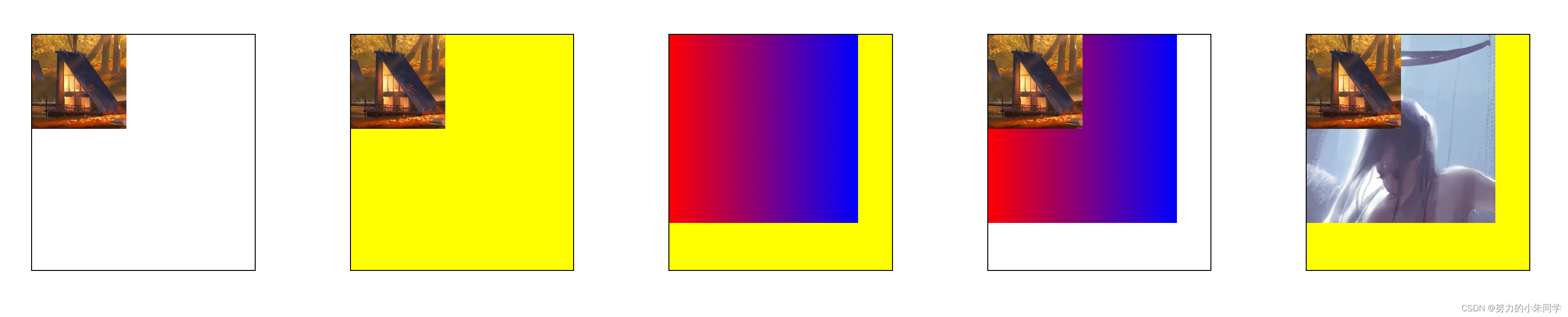
案例代码:
<style>.bg{width: 250px;height: 250px;margin: 50px;background-repeat: no-repeat;border: 1px solid #000;/* 设置边框 便于观察 */}.bg0{/* 设置单个背景 */background-image:url(./image/img.png);background-size: 100px 100px;}.bg1{/* 同时设置单个图片背景和背景颜色 */background-image:url(./image/img.png);background-size: 100px 100px;background-color: yellow;}.bg2{/* 同时设置单个渐变背景和背景颜色 */background-image:linear-gradient(to right, red, blue);background-size: 200px 200px;background-color: yellow;}.bg3{/* 同时设置多个图片背景(渐变背景) */background-image:url(./image/img.png),linear-gradient(to right, red, blue);background-size: 100px 100px,200px 200px;}.bg4{/* 同时设置多个图片背景和背景颜色 */background-image:url(./image/img.png),url(./image/img2.jpg);background-size: 100px 100px,200px 200px;background-color: yellow;}</style>
展示效果:
四、background-size(背景图像的大小)
该属性用来设置背景图像的大小,其属性值有:
length(携带css单位的数值)
、
percentage(百分比数值)
、
auto(默认值,按照图像本身的大小比例)
、
cover(缩放背景图片以完全覆盖背景区)
、
contain(缩放背景图片以完全装入背景区)
。利用不同的属性值,我们可以实现单张拉伸铺满、多张重复铺满、缩放覆盖等多种样式的背景图像。
如果我们设置的背景图像未能完全覆盖背景区,那背景区中未被覆盖的部分,则会显示
background-color
设置的背景颜色。
当给元素设置多张背景图像时,我们也可以通过给该属性设置多组值,每组值之间通过
,
进行分隔,按照对应的顺序来分别设置多张背景图像的大小。
还有一点要注意的是:如果我们使用
linear-gradient()
方法生成的渐变图像作为元素背景,那么在设置背景图像大小时,最好不要只指定一个值,另一个值采用
auto
,因为目前不是所有浏览器都完全支持CSS3的
background-size规范
和
Image Values gradient规范
。(例如Firefox 8之前的版本)
1、auto
该属性值
auto auto
为
background-size
的默认值,表示直接渲染图像本身的大小比例,超出元素大小的部分会被截掉,所以很可能会出现背景图像显示不全的问题,除非你背景图像的宽高正好等于元素的宽高,不常用。
2、length
该属性值采用带有css单位的数值,来直接设置背景图像的大小,针对某个背景图像,可以设置一个或者两个数值,中间以空格相隔,数值不能为负数。常用的数值单位有:
em
、
rem
、
px
、
vh
、
vw
等等。
当我们只设置一个数值时,这个数值将作为宽度值大小,高度值将被设定为
auto
,此时图片的高度将会根据图片本身的宽高比例,以及设定的宽度,进行自适应匹配。
当我们设置两个数值时,第一个将作为宽度值大小,第二个作为高度值大小,如果此时设置的宽高并不符合图像本身的宽高比例,那图像就会被拉伸变形。
当设置的数值数量大于两个时,该属性值将成为无效属性,不被浏览器识别,浏览器会取默认值
auto auto
。
3、percentage
该属性值采用百分比
%
单位,来设置背景图像的大小,该百分比的基数是元素的背景区,背景区由
background-origin
属性指定,但是存在一种特殊情况:当
background-attachment: fixed;
时,背景区为浏览器的可视区,不包括滚动条。该属性值的使用方式与
length
基本相同,可以设置一个或者两个数值,数值不能为负数。
length
与
percentage
可结合使用。
当我们只设置一个数值时,这个数值将作为宽度值大小,高度值将被设定为
auto
,此时图片的高度将会根据图片本身的宽高比例,以及设定的宽度,进行自适应匹配。
当我们设置两个数值时,第一个将作为宽度值大小,第二个作为高度值大小,如果此时设置的宽高并不符合图像本身的宽高比例,那图像就会被拉伸变形。当设置属性值为
100% 100%
时,背景图片的宽高等于背景区的宽高,相当于将背景图像拉伸铺满整个背景区。
当设置的数值数量大于两个时,该属性值将成为无效属性,不被浏览器识别,浏览器会取默认值
auto auto
。
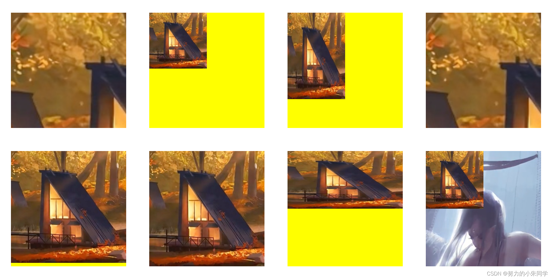
案例代码:
<style>.bg{width: 200px;height: 200px;margin: 20px;background-color: yellow;/* 兜底背景颜色 */background-repeat: no-repeat;/* 禁止背景重复 */background-image:url(./image/img.png);}.bg0{/* 默认值 */background-size: auto auto;}.bg1{/* 宽度固定 高度根据图片原来的比例进行自适应 */background-size: 100px;/* 相当于 100px auto */}.bg2{/* 宽高都固定 宽高比发生变化 图片拉伸变形 */background-size: 100px 150px;}.bg3{/* 设置三个属性值 属性无效 取默认值 */background-size: 100px 150px 200px;}.bg4{/* 设置单个百分比属性值 该百分比是相对于元素的宽高 */background-size: 100%;/* 相当于 100% auto */}.bg5{/* 设置两个百分比属性值 完全覆盖背景区 */background-size: 100% 100%;}.bg6{/* 同时设置百分比和length */background-size: 100% 100px;}.bg7{/* 设置多个背景图像 多个背景大小 */background-image:url(./image/img.png),url(./image/img2.jpg);background-size: 100px 100px, 100% 100%;}</style><divstyle="display: flex;align-items: center;justify-content: flex-start;"><divclass="bg bg0"></div><divclass="bg bg1"></div><divclass="bg bg2"></div><divclass="bg bg3"></div></div><divstyle="display: flex;align-items: center;justify-content: flex-start;"><divclass="bg bg4"></div><divclass="bg bg5"></div><divclass="bg bg6"></div><divclass="bg bg7"></div></div>
展示效果:
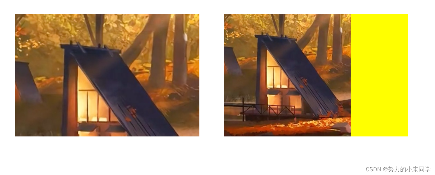
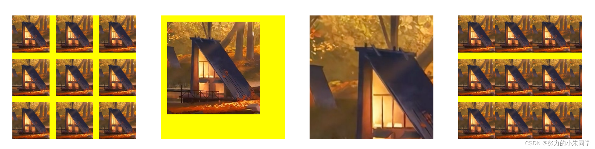
4、cover
该属性值在保持图像的宽高比例的前提下,尽可能的缩放图像以完全覆盖背景区,当背景图像和背景区的宽高比例不同时,背景图像在缩放到完全覆盖背景区后,肯定会导致一部分图像超出背景区,超出部分会被裁减掉,导致图像显示不完全的情况。
该属性值只能单独使用,不存在为某一背景图像设置大小时出现两个值的情况
5、contain
该属性值是在保持图像的宽高比例的前提下,尽可能的缩放图像以完全放入背景区,当背景图像和背景区的宽高比例不同时,背景图像在缩放到背景区后,肯定会导致一部分背景区未被覆盖,未被覆盖的区域则会显示
background-color
设置的背景颜色。
该属性值只能单独使用,不存在为某一背景图像设置大小时出现两个值的情况
案例代码:
<style>.bg{width: 200px;height: 200px;margin: 20px;background-color: yellow;/* 兜底背景颜色 */background-repeat: no-repeat;/* 禁止背景重复 */background-image:url(./image/img.png);}.bg8{/* 设置背景区的宽高比例与背景的宽高比例不同 */width: 300px;/* 设置单个cover属性值 */background-size: cover;}.bg9{/* 设置背景区的宽高比例与背景的宽高比例不同 */width: 300px;/* 设置单个contain属性值 */background-size: contain;}</style><divstyle="display: flex;align-items: center;justify-content: flex-start;"><divclass="bg bg8"></div><divclass="bg bg9"></div></div>
效果展示:
五、background-position(背景图像的定位)
该属性规定了背景图像的位置,这个定位是相对于
background-origin
规定的定位区域的,该属性只对背景图像有作用,对背景颜色是不起作用的。属性值类型有:
length(携带css单位的数值)
、
percentage(百分比数值,默认值为 0% 0%)
、
关键字(center、left、top等)
。该属性的属性值可以使用4种语法进行定义,分别对应
1~4
个属性值的情况,当属性值为
length
或
percentage
时,可以为负数。
我们还可以通过
background-position-x
和
background-position-y
两条属性,来单独设置背景图像在X轴方向和Y轴方向的位置,不常用。
当我们给元素设置多个背景图像时,我们可以通过给该属性设置多组值,每组值之间通过
,
进行分隔,按照对应的顺序来分别设置多张背景图像的位置。
如果我们使用
percentage
百分比值来设置背景图像的位置,则该百分比偏移量是相对于背景区的,其基数为:背景区的尺寸减去背景图像的尺寸。以X轴方向为例,
0%
表示背景图像的左边界与背景区的左边界对齐,
100%
表示背景图像的右边界与背景区的右边界对齐。
// 实际偏移量计算公式
(container width - image width) * (position x%) = (x offset value)
(container height - image height) * (position y%) = (y offset value)
因此,当使用
background-size
设置的背景图像的大小等于背景区的大小时,那么此时
background-position
设置
percentage
百分比值将不起作用,因为
container width - image width = 0
,但可以使用
length
值,来设置背景图像偏移。
1、单值语法
此时对应设置一个属性值的情况,第二个值默认是
center(50%)
,其值可能为:
① 关键字
center
,相当于
center center
或
50% 50%
,表示背景图像居中,即背景图像的中心点与背景区的中心点重合,而不是图像的左上角起点。如果此时背景区的大小不是背景图像大小的整数倍,且
background-repeat: repeat;
,则背景区的四边的背景图像被裁切。
② 关键字
top
、
left
、
bottom
、
right
其中之一,表示背景图像的贴紧背景区的哪一个边界,然后另一维度则取
center(50%)
③
length
或
percentage
,相当于指定了X坐标,Y坐标取默认值为
center(50%)
。
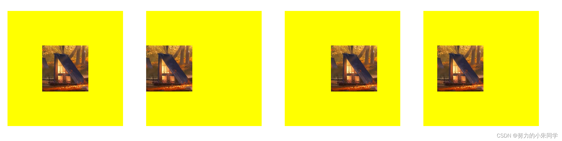
案例代码:
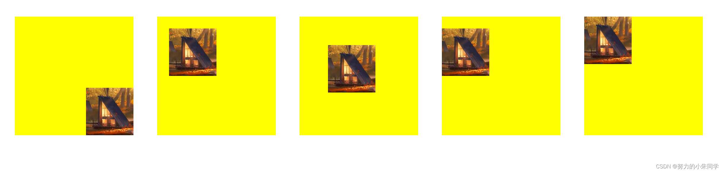
<style>.bg{width: 200px;height: 200px;margin: 20px;background-color: yellow;/* 兜底背景颜色 */background-image:url(./image/img.png);background-size: 80px 80px;/* 设置背景图像大小 */background-repeat: no-repeat;/* 设置背景图像重复方式 */}.bg0{/* 背景图片居中 */background-position: center;/* 相当于center center */}.bg1{/* 背景图片靠左 */background-position: left;/* 相当于 left center */}.bg2{/* 只设置X轴位置 */background-position: 80px;/* 相当于 50px center */}.bg3{/* 只设置X轴位置 */background-position: 20%;/* 相当于 20% 50px */}</style><divstyle="display: flex;align-items: center;justify-content: flex-start;"><divclass="bg bg0"></div><divclass="bg bg1"></div><divclass="bg bg2"></div><divclass="bg bg3"></div></div>
效果展示:
2、双值语法
此时对应设置两个属性值的情况,一个值定义X轴位置,另一个值定义Y轴位置,默认值为:
left top
(
0% 0%
)。每个值可能为:
① 关键字
center
、
top
、
left
、
bottom
、
right
其中之一:如果值为
left
或
right
,则这个值定义的是X轴位置,另一个值定义Y轴位置;如果值为
top
或
bottom
,则这个值定义的是Y轴位置,另一个值定义X轴方向;如果值为
center
,则这个值是定义X轴还是Y轴,需要看另一个值是
top
、
bottom
还是
left
、
right
决定。
如果一个值是
left
或
right
,则另外一个值不可以是
left
或
right
,因为两个值必须分别定义不同轴。同理,如果一个值是
top
或
bottom
,则另外一个值不可以是
top
或
bottom
。
②
length
或
percentage
:这个值是定义X轴还是Y轴,取决于另一个值。如果另一个值是
left
或
right
,则这个值定义的是Y轴位置;如果另一个值是
top
或
bottom
,则这个值定义的是X轴位置;如果另一个值也是
length
或
percentage
,则由值的先后顺序决定,第一个值定义X轴位置,第二个值定义Y轴位置。
注意: 两个值的顺序问题:如果两个值都为关键字,则顺序不重要,
left top
和
top left
的效果相同;如果两个值中存在
length
或
percentage
,则顺序很重要,第一个值必然是定义X轴位置,第二个值必然是定义Y轴位置,
left 20px
与
20px left
效果不同,且第二个是无效的,因为第二个值应该定义Y轴位置。
案例代码:
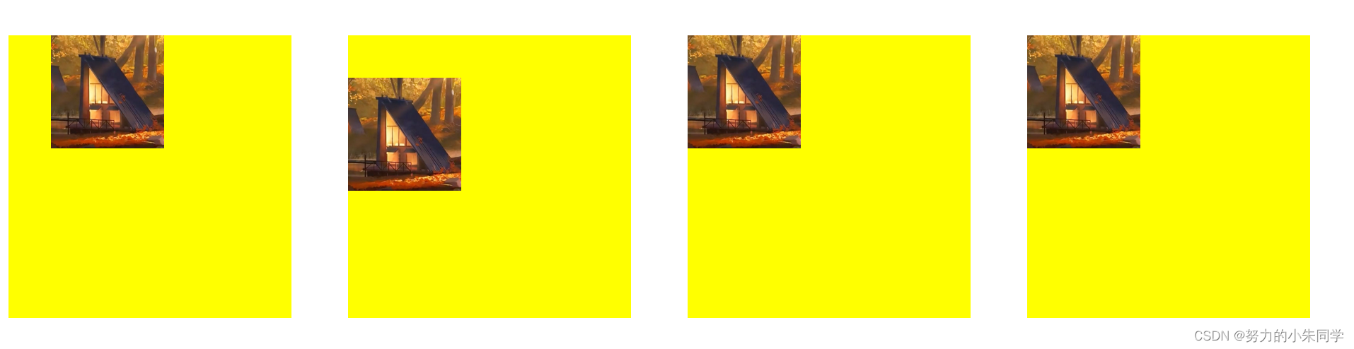
<style>.bg{width: 200px;height: 200px;margin: 20px;background-color: yellow;/* 兜底背景颜色 */background-image:url(./image/img.png);background-size: 80px 80px;/* 设置背景图像大小 */background-repeat: no-repeat;/* 设置背景图像重复方式 */}.bg4{/* 双值:关键字 关键字 */background-position: right bottom;}.bg5{/* 双值:length length */background-position: 20px 20px;}.bg6{/* 双值:百分比 百分比 */background-position: 40% 40%;}.bg7{/* 双值:关键字 length */background-position: left 20px;}.bg8{/* 错误示范 双值:关键字 百分比 */background-position: top 20%;/* 设置错误 取默认值 left left */}</style>
效果展示:
3、三值语法
此时对应设置三个属性值的情况,这三个属性值只可能是两个关键字值和一个
length
或
percentage
值,两个关键字定义X轴和Y轴位置,一个
length
或
percentage
定义其前面的那个关键字所定义轴上的偏移量。三个属性值的排列情况只有两种可能:① 关键字、
length
或
percentage
、关键字。② 关键字、关键字、
length
或
percentage
,此时
length
或
percentage
定义的是第二个关键字。
第一个值只能是关键字
center
、
top
、
left
、
bottom
、
right
其中之一,如果值为
left
或
right
,则该值定义的是X轴,另一个关键字定义的是Y轴。
第二个值可以是
length
或
percentage
,也可以是关键字。如果是
length
或
percentage
,则表示这是在第一个值所定义的轴方向上的偏移量;如果是关键字,则表示在第一个值的基础上,定义另外一个方向轴。
第三个值可以是
length
或
percentage
,也可以是关键字。如果是
length
或
percentage
,那么前两个值一定都是关键字,这第三个值表示在第二个值所定义的轴方向上的偏移量;如果是关键字,则表示第二个值是
length
或
percentage
,这第三个值示在第一个值的基础上,定义另外一个方向轴。
案例代码:
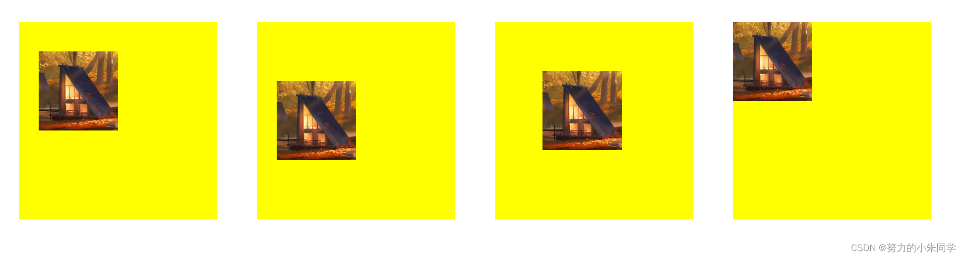
<style>.bg{width: 200px;height: 200px;margin: 20px;background-color: yellow;/* 兜底背景颜色 */background-image:url(./image/img.png);background-size: 80px 80px;/* 设置背景图像大小 */background-repeat: no-repeat;/* 设置背景图像重复方式 */}.bg9{/* 三值:关键字 偏移量 关键字 */background-position: left 30px top;}.bg10{/* 三值:关键字 关键字 偏移量 */background-position: left top 30px;}.bg11{/* 错误的三值:偏移量 关键字 偏移量 */background-position: 20px left 20px;}.bg12{/* 错误的三值:偏移量 关键字 关键字 */background-position: 20px left top;}</style><divstyle="display: flex;align-items: center;justify-content: flex-start;"><divclass="bg bg9"></div><divclass="bg bg10"></div><divclass="bg bg11"></div><divclass="bg bg12"></div></div>
效果展示:
4、四值语法
此时对应设置四个属性值的情况,属性值只可能是:关键字、
length
或
percentage
、关键字、
length
或
percentage
,这一种情况。第一个和第三个值是定义X轴和Y轴方向的关键字,先后顺序可颠倒,第二个值和第三个值则是表示其前面那个值定义的轴上的偏移量。
案例代码:
<style>.bg{width: 200px;height: 200px;margin: 20px;background-color: yellow;/* 兜底背景颜色 */background-image:url(./image/img.png);background-size: 80px 80px;/* 设置背景图像大小 */background-repeat: no-repeat;/* 设置背景图像重复方式 */}.bg13{/* 四值:关键字 偏移量 关键字 偏移量 */background-position: left 20px top 30px;}.bg14{/* 四值:关键字 偏移量 关键字 偏移量 */background-position: left 20px top 50%;}.bg15{/* 四值:关键字 偏移量 关键字 偏移量 */background-position: left 40% top 50px;}.bg16{/* 错误的四值:关键字 关键字 偏移量 偏移量 */background-position: left top 40% 50px;}</style><divstyle="display: flex;align-items: center;justify-content: flex-start;"><divclass="bg bg13"></div><divclass="bg bg14"></div><divclass="bg bg15"></div><divclass="bg bg16"></div></div>
效果展示:
六、background-repeat(背景图像的重复)
该属性规定了背景图像在背景区(
background-origin
定义)内的重复方式,可以是沿X轴重复、Y轴重复、X轴和Y轴重复,以及不重复。单属性值有6种:
repeat(默认值,X轴和Y轴重复)
、
repeat-x(仅X轴重复)
、
repeat-y(仅Y轴重复)
、
space(X轴和Y轴重复,在不对图像裁切的前提下,尽可能多的重复)
、
round(X轴和Y轴重复,但图像被缩放)
、
no-repeat(图像不重复)
。
双属性值为
repeat
、
no-repeat
、
space
、
round
四种属性值的组合,共计16种。其中部分双属性值可进行简写,上述单属性值语法就是完整双属性值语法的简写形式:
如果设置了背景图像重复,且背景区的大小不是背景图像大小的整数倍,那么最后边缘的背景图像就会按照背景区边缘进行裁切。
我们给元素设置多个背景图像时,我们可以通过给该属性设置多组值,每组值之间通过
,
进行分隔,按照对应的顺序来分别设置多张背景图像的重复方式。
1、repeat(repeat-x、repeat-y)
该属性值设置背景图像在固定方向(X轴、Y轴)上重复,直至到达该背景区的边缘,如果最后一个背景图像的大小超出了背景区的边缘,则该背景图像超出的部分会被裁切。
2、no-repeat
该属性值设置背景图像不会重复,只会渲染一次,可能会出现背景区不能被完全覆盖的情况。背景图像的位置由
background-position
来决定。
案例代码:
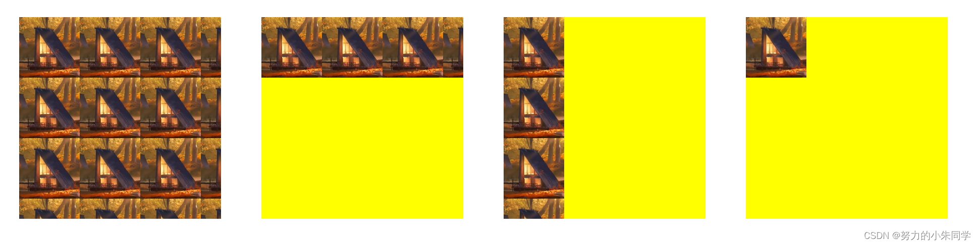
<style>.bg{width: 200px;height: 200px;margin: 20px;background-color: yellow;/* 兜底背景颜色 */background-image:url(./image/img.png);background-size: 60px 60px;}.bg0{/* 默认值 */background-repeat: repeat;}.bg1{/* 水平方向不重复 */background-repeat: repeat-x;}.bg2{/* 垂直方向不重复 */background-repeat: repeat-y;}.bg3{/* 水平垂直方向都不重复 */background-repeat: no-repeat;}</style><divstyle="display: flex;align-items: center;justify-content: flex-start;"><divclass="bg bg0"></div><divclass="bg bg1"></div><divclass="bg bg2"></div><divclass="bg bg3"></div></div>
效果展示:
3、space
该属性值设置背景图像在不被裁切的前提下,尽可能多的在X轴和Y轴上重复,如果背景区大小不是背景图像大小的整数倍,那么就会出现未被背景图像覆盖的空白区域。无论是X轴方向还是Y轴方向,第一个和最后一个图像都会被固定在背景区相应的边上,同时空白区域会均匀的分布在重复的背景图像之前,即图像的上下左右间隔相同。
在设置该属性值时,只要背景图片的重复次数超过1次,那么
background-position
属性将不起作用。只有在背景图片的大小只能在背景区内重复一次时,
background-position
属性才会起作用。
还存在一种特殊情况:当背景图像的大小超过背景区的大小时,图像无法重复,只会被裁切。
案例代码:
<style>.bg{width: 200px;height: 200px;margin: 20px;background-color: yellow;/* 兜底背景颜色 */background-image:url(./image/img.png);background-size: 60px 60px;}.bg4{/* 水平垂直方向都重复 但不裁切 且背景图像被重复多次 */background-repeat: space;/* 此时 background-position 属性不生效 */background-position: 20px 20px;}.bg5{/* 水平垂直方向都重复 但不裁切 且背景图像大小只能被重复一次 */background-size: 150px 150px;/* 此时 background-position 属性才会生效 */background-position: 10px 10px;background-repeat: space;}.bg6{/* 背景图像的大小超过背景区的大小 */background-size: 300px 300px;/* 此时图像无法重复 只能被裁切 */background-repeat: space;}.bg7{/* 此时水平方向重复且裁切 垂直方向重复但不裁切 */background-repeat: repeat space;}</style><divstyle="display: flex;align-items: center;justify-content: flex-start;"><divclass="bg bg4"></div><divclass="bg bg5"></div><divclass="bg bg6"></div><divclass="bg bg7"></div></div>
效果展示:
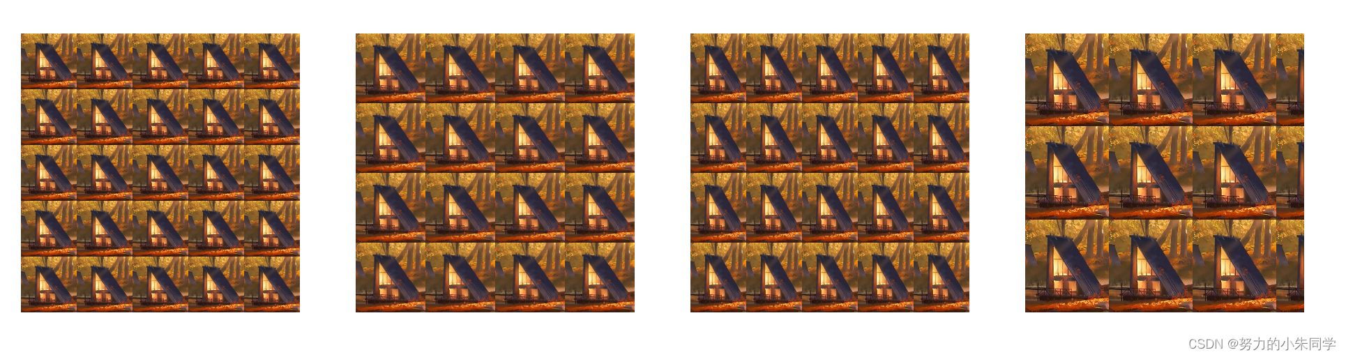
4、round
该属性值设置背景图像在X轴和Y轴上重复,图像不会被裁切,而是被平均缩放,正好完全覆盖整个背景区,至于背景图片是缩小还是放大,则取决于浏览器策略,在何时增加一次背景图像的重复。经过不完全测试,在chrome、firefox、safari三个浏览器中,当背景区重复渲染背景图像在X轴和Y轴方向剩余空间的尺寸,大于背景图像对应方向尺寸的
50%
时,就会增加一次背景图像的重复,并平均缩小背景图像,使其正好全覆盖背景区;反之,当重复渲染背景图像在X轴和Y轴方向剩余空间的尺寸,小于背景图像对应方向尺寸的
50%
时,就会直接平均放大背景图像,使其正好全覆盖背景区。
案例代码:
<style>.bg{width: 200px;height: 200px;margin: 20px;background-color: yellow;/* 兜底背景颜色 */background-image:url(./image/img.png);background-size: 60px 60px;}.bg8{/* 水平垂直方向都重复 并拉伸背景图像 使其在重复一定次数后 正好全覆盖背景区 *//* 此时重复四次后 剩余空间大小 大于背景图像大小的50% 则压缩图像 重复次数加1 */background-size: 44px 44px;background-repeat: round;}.bg9{/* 此时重复四次后 剩余空间大小 小于背景图像大小的50% 则放大图像 */background-size: 45px 45px;background-repeat: round;}.bg10{/* 此时重复四次后 X轴剩余空间大小大于背景图像大小的50% 压缩图像 重复次数加1 *//* Y轴剩余空间大小 小于背景图像大小的50% 则放大图像*/background-size: 44px 45px;background-repeat: round;}.bg11{/* 此时水平方向重复且裁切 垂直方向缩放 */background-repeat: repeat round;}</style><divstyle="display: flex;align-items: center;justify-content: flex-start;"><divclass="bg bg8"></div><divclass="bg bg9"></div><divclass="bg bg10"></div><divclass="bg bg11"></div></div>
效果展示:
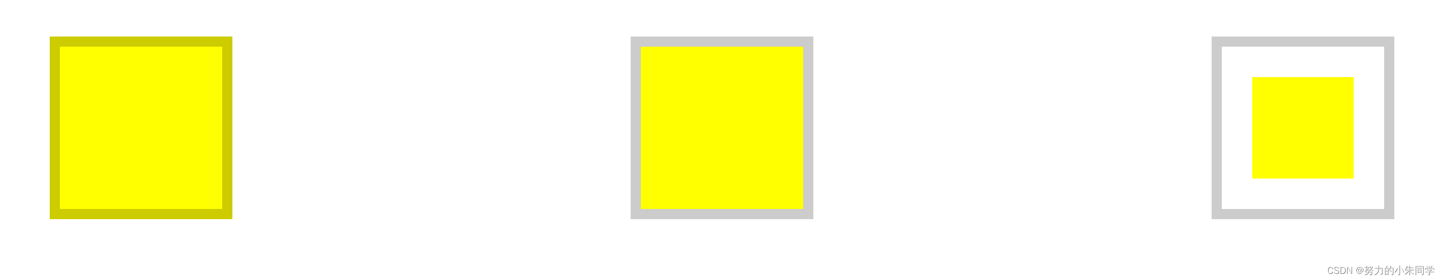
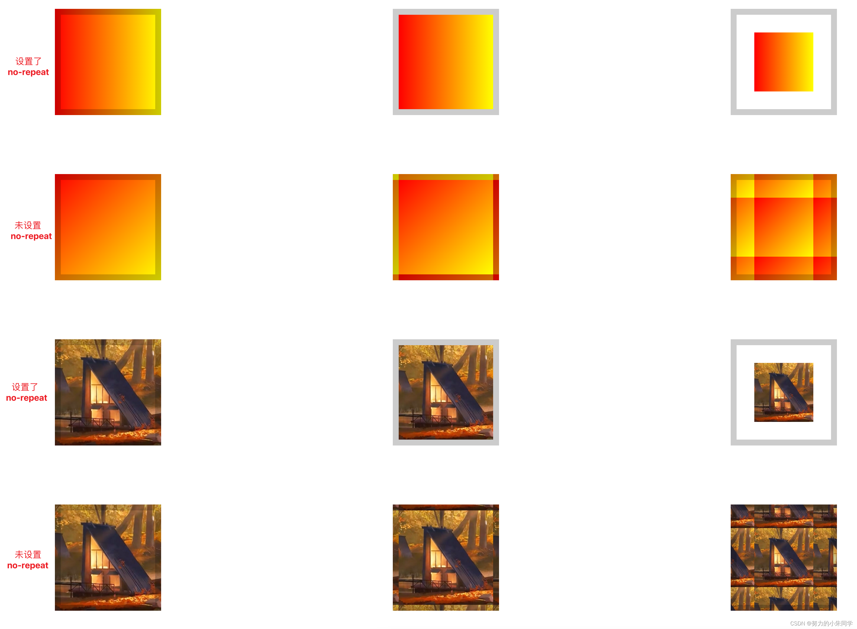
七、background-clip(背景的绘制区域)
1、纯色背景
该属性规定了背景的绘制区域(是否包含padding、border区域),属性值有三种:
border-box
(默认值,覆盖到边框区域)、
padding-box
(覆盖到padding区域,不包含border)、
content-box
(仅覆盖内容区域,不包含padding和border)。在设置属性值为
border-box
时,如果边框也设置了颜色,那么背景颜色依旧会覆盖边框区域,但是边框颜色会覆盖在背景颜色之上。
案例代码:
<style>.bg{width: 100px;height: 100px;padding: 30px;margin: 100px auto;border: 10px solid rgba(255,255,0,0.2);/* 设置有透明度的边框颜色 便于查看背景覆盖范围 */background-color: yellow;}.bg1{background-clip: border-box;}.bg2{background-clip: padding-box;}.bg3{background-clip: content-box;}</style><divstyle="display: flex;align-items: center;justify-content: center;"><divclass="bg bg1"></div><divclass="bg bg2"></div><divclass="bg bg3"></div></div>
展示效果:
2、图片背景(渐变背景)
该属性应用在图片背景和渐变背景时 ,属性表现效果一致,因为渐变背景的原理也是生成一张图片渲染到背景上。当设置属性值为
padding-box
或
content-box
时,其属性效果与纯色背景的效果类同,只会覆盖指定区域。但是设置属性值为border-box时,情况却是有所变化(头秃),此时背景并不会一张图像完全覆盖在
border-box
包含的区域,而是一张图像只覆盖在
padding-box
区域,这是因为我们设置了
background-size: 100% 100%;
使背景图片的大小正好覆盖背景区,而背景区
nackground-origin
取默认值
padding-box
,所以此时根据是否设置背景不重复
background-repeat: no-repeat
属性,分别为两种情况:
① 未设置
background-repeat: no-repeat
:因为背景图像占据了整个
padding-box
区域,所以此时背景图像会在border区域开始重复,超出部分被截取。当然边框本身的颜色
border-color
会覆盖在背景之上,如果边框颜色存在透明度,那会将两种颜色叠加,呈现出叠加后的颜色。
② 设置了
background-repeat: no-repeat
:四个
border
区域不渲染背景图像,呈现空白,盒子整体表现效果与设置属性值为
padding-box
相同。
案例代码:
<style>.bg{width: 100px;height: 100px;padding: 30px;margin: 100px auto;border: 10px solid rgba(0,0,0,0.2);/* 设置边框颜色为黑色 透明度 0.2 */background-size: 100% 100%;/* 设置图片拉伸铺满背景区 方便对照 */}.bg5{border-color: transparent;/* 设置边框透明 避免干扰观察 */background-clip: border-box;background-image:linear-gradient(to bottom right, red, yellow);}.bg5-2{background-clip: padding-box;background-image:linear-gradient(to bottom right, red, yellow);}.bg5-3{background-clip: content-box;background-image:linear-gradient(to bottom right, red, yellow);}.bg6{border-color: transparent;/* 设置边框透明 避免干扰观察 */background-image:url(./image/img.png);background-clip: border-box;}.bg6-2{background-image:url(./image/img.png);background-clip: padding-box;}.bg6-3{background-image:url(./image/img.png);background-clip: content-box;}.bg7{background-image:url(./image/img.png);background-clip: border-box;background-repeat: no-repeat;}.bg7-2{background-image:url(./image/img.png);background-clip: padding-box;background-repeat: no-repeat;}.bg7-3{background-image:url(./image/img.png);background-clip: content-box;background-repeat: no-repeat;}</style><divstyle="display: flex;align-items: center;justify-content: center;"><divclass="bg bg5"></div><divclass="bg bg5-2"></div><divclass="bg bg5-3"></div></div><divstyle="display: flex;align-items: center;justify-content: center;"><divclass="bg bg6"></div><divclass="bg bg6-2"></div><divclass="bg bg6-3"></div></div><divstyle="display: flex;align-items: center;justify-content: center;"><divclass="bg bg7"></div><divclass="bg bg7-2"></div><divclass="bg bg7-3"></div></div>
效果展示:
3、新属性值:text
该属性表示设置背景的渲染区域为元素内文字区域,背景被裁剪渲染到文字上,成为文字的前景色,同时需要设置文字颜色为
transparent
-透明,才能看出效果。可以用来实现一些艺术字的效果,但目前该属性值在浏览器上的支持性不是很好。
案例代码:
<style>.bg{width: 100px;height: 100px;padding: 30px;margin: 50px auto;color: transparent;/* 文字颜色透明 */}/* 纯色背景 */.bg1{background-color: red;background-clip: text;-webkit-background-clip: text;}/* 渐变背景 */.bg2{background-image:linear-gradient(to right, red, yellow);background-clip: text;-webkit-background-clip: text;}/* 图片背景 */.bg3{background-image:url(./image/img.png);background-clip: text;-webkit-background-clip: text;}</style><divstyle="display: flex;align-items: center;justify-content: center;"><divclass="bg bg1">
      这里是文字,背景只会渲染在文字上
    </div><divclass="bg bg2">
      这里是文字,背景只会渲染在文字上
    </div><divclass="bg bg3">
      这里是文字,背景只会渲染在文字上
    </div></div>
展示效果:

八、background-origin(背景图像的定位区域、背景区)
1、纯色背景
该属性用于设置背景图像的定位属性
background-position
设置的背景渲染起点是相对于哪个区域,也就是设定元素的背景区,
background-position
默认值为
0% 0%
(左上角为起点),属性值有三种:
border-box
(从边框区域开始)、
padding-box
(默认值,从padding区域开始,不包含border)、
content-box
(从内容区域开始,不包含padding和border)。
在设置背景为纯色时,设置属性值为任意值,其表现结果都一致,都是相对于
border-box
区域,这是因为此时背景的绘制区域
background-clip
取默认值
border-box
,而且
background-position
属性对背景颜色无效,所以
background-origin
定义的定位区域并不会影响到背景颜色覆盖区域。
如果边框也设置了颜色,那么背景依旧会覆盖边框区域,但是边框颜色会覆盖在背景之上,如果边框颜色存在透明度,那会将两种颜色叠加,呈现出叠加后的颜色。
案例代码:
<style>.bg{width: 100px;height: 100px;padding: 30px;margin: 100px auto;border: 10px solid rgba(0,0,0,0.2);/* 设置边框颜色为黑色 透明度为0.2 */background-color: yellow;}.bg1{background-origin: border-box;}.bg2{background-origin: padding-box;}.bg3{background-origin: content-box;}</style><divclass="bg bg1"></div><divclass="bg bg2"></div><divclass="bg bg3"></div>
展示效果:
2、图片背景(渐变背景)
该属性应用在图片背景和渐变背景时 ,属性表现效果一致,因为渐变背景的原理也是生成一张图片渲染到背景上。当设置属性值为
border-box
时,其属性效果与纯色背景的效果类同,只会覆盖指定区域。但是设置属性值为padding-box和content-box时,情况却是有所变化(头秃),此时背景并不是仅仅完全覆盖在指定区域,而是根据是否设置背景不重复
background-repeat: no-repeat
属性,分别为两种情况:
① 未设置
background-repeat: no-repeat
:此时首先一张背景图像会完全覆盖对应的区域,然后背景图像会在四周空白区域内(
padding-box
对应border区域、
content-box
对应border+padding区域)开始重复,超出部分被截取。当然边框本身的颜色
border-color
会覆盖在背景之上,如果边框颜色存在透明度,那会将两种颜色叠加,呈现出叠加后的颜色。
② 设置了
background-repeat: no-repeat
:背景图像不重复,四周空白区域不渲染背景图像,呈现空白,盒子整体表现效果与设置纯色背景时相同。
案例代码:
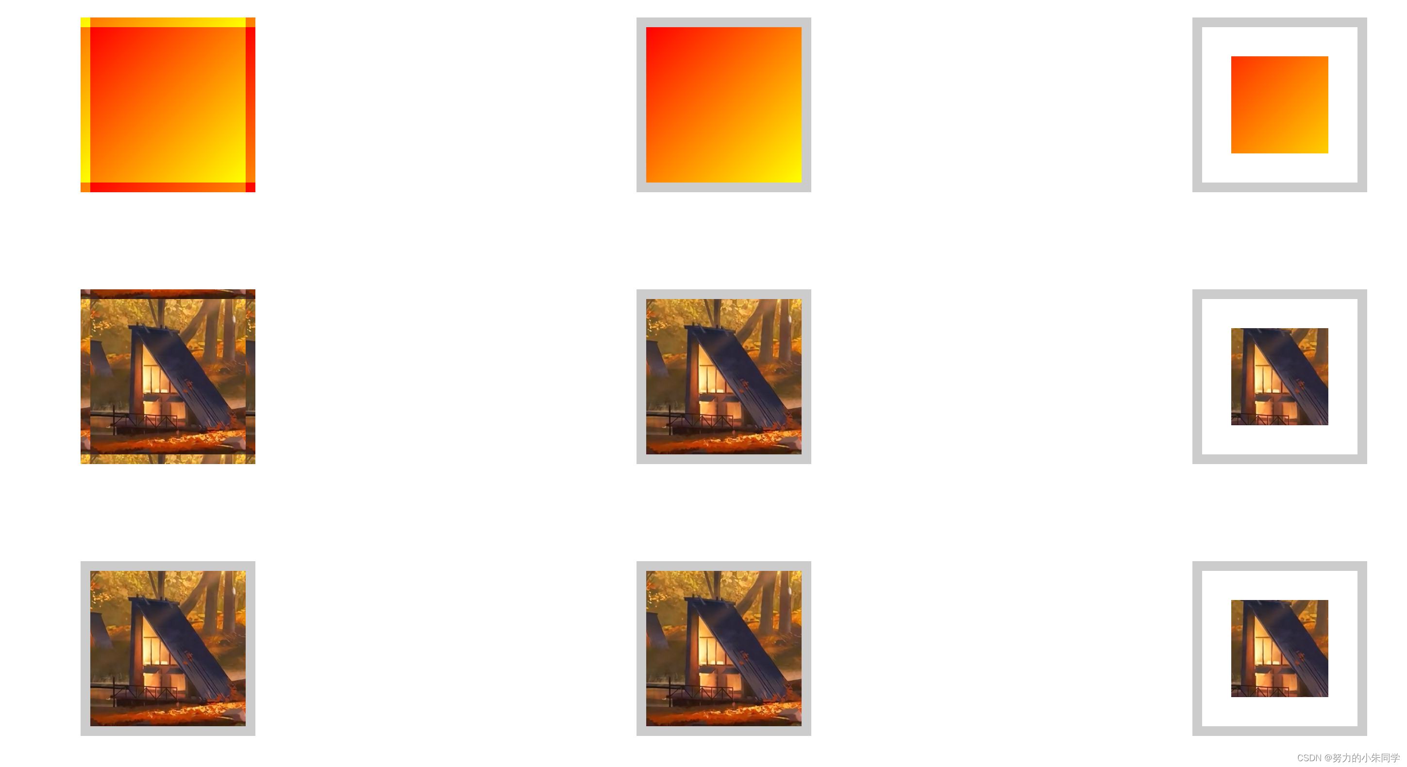
<style>.bg{width: 100px;height: 100px;padding: 30px;margin: 50px auto;border: 10px solid rgba(0, 0, 0, 0.2);/* 设置边框颜色为黑色 透明度为0.2 */background-size: 100% 100%;}.bg4{background-origin: border-box;background-image:linear-gradient(to right, red, yellow);/* 背景设置为渐变 */background-repeat: no-repeat;}.bg4-2{background-origin: padding-box;background-image:linear-gradient(to right, red, yellow);/* 背景设置为渐变 */background-repeat: no-repeat;}.bg4-3{background-origin: content-box;background-image:linear-gradient(to right, red, yellow);/* 背景设置为渐变 */background-repeat: no-repeat;}.bg5{background-origin: border-box;background-image:linear-gradient(to bottom right, red, yellow);/* 背景设置为渐变 */}.bg5-2{background-origin: padding-box;background-image:linear-gradient(to bottom right, red, yellow);/* 背景设置为渐变 */}.bg5-3{background-origin: content-box;background-image:linear-gradient(to bottom right, red, yellow);/* 背景设置为渐变 */}.bg6{background-origin: border-box;background-image:url(./image/img.png);background-repeat: no-repeat;}.bg6-2{background-origin: padding-box;background-image:url(./image/img.png);background-repeat: no-repeat;}.bg6-3{background-origin: content-box;background-image:url(./image/img.png);background-repeat: no-repeat;}.bg7{background-origin: border-box;background-image:url(./image/img.png);}.bg7-2{background-origin: padding-box;background-image:url(./image/img.png);}.bg7-3{background-origin: content-box;background-image:url(./image/img.png);}</style><divstyle="display: flex;align-items: center;justify-content: center;"><divclass="bg bg4"></div><divclass="bg bg4-2"></div><divclass="bg bg4-3"></div></div><divstyle="display: flex;align-items: center;justify-content: center;"><divclass="bg bg5"></div><divclass="bg bg5-2"></div><divclass="bg bg5-3"></div></div><divstyle="display: flex;align-items: center;justify-content: center;"><divclass="bg bg6"></div><divclass="bg bg6-2"></div><divclass="bg bg6-3"></div></div><divstyle="display: flex;align-items: center;justify-content: center;"><divclass="bg bg7"></div><divclass="bg bg7-2"></div><divclass="bg bg7-3"></div></div>
展示效果:
3、 background-clip 和 background-origin 结合使用
学习了上面两条属性的案例代码,你可能会有些疑惑,为什么在未设置背景不重复
background-repeat: no-repeat
时,会出现那么多特殊的情况,令人烦扰,这是因为在上面的案例我们只是将
background-clip
和
background-origin
中的某一条属性单独拿出与
background-repeat
同时使用,没有考虑另外一条属性的影响 ,视野过于狭隘。
那此时我们将
background-clip
、
background-origin
、
background-repeat
三条属性,显性的放到一起,来讨论渲染背景图像时出现的各种情况。
这个三条属性总计能匹配组合出18种情况,按照其特点我们可以总结为三类:
① **当
background-clip
和
background-origin
属性值相同**时:背景的渲染区域与背景区完全重合,此时无论
background-repeat
属性为何值,都不会对页面的展示效果有影响,背景都能完整的渲染到指定区域。
② **当
background-clip
指定区域大于
background-origin
所指定的区域**时:背景的渲染区域大于背景区,那此时
background-repeat
属性就很重要了。首先背景图像会完整的渲染在
background-origin
所指定的区域上,如果此时设置了
background-repeat: no-repeat
属性,那么背景图片不会重复渲染,
background-clip
指定区域中大于
background-origin
所指定的区域那部分区域将会被留白。如果此时设置了
background-repeat: repeat
等背景重复属性,那么背景图片将会重复渲染,
background-clip
指定区域中大于
background-origin
所指定的区域那部分区域将会被重复渲染的背景图片填充,如果存在与边框重叠的情况,那么边框的颜色将会覆盖在背景图片之上。
③ **当
background-clip
指定区域小于
background-origin
所指定的区域**时:背景的渲染区域小于背景区。首先背景图像会完整的渲染在
background-origin
所指定的区域上,然后再根据
background-clip
指定区域进行截取,只保留
background-clip
指定区域内的那部分背景图像,
background-origin
指定区域中大于
background-clip
所指定的区域那部分区域会进行留白,从而导致背景图像显示不全的情况。此时无论
background-repeat
属性为何值,都不会对页面的展示效果有影响。
总结:
background-clip
:决定哪个区域内可以显示背景图片。
background-origin
:决定背景图片从哪个区域内的起点开始渲染。
background-repeat
:决定背景图片在无法充满
background-clip
区域时,是否重复平铺渲染。
案例代码:
<style>.bg{width: 130px;height: 130px;padding: 20px;margin: 50px auto;border: 10px solid rgba(0, 0, 0, 0.2);/* 设置边框颜色为黑色 透明度为0.2 *//* 该属性用来限制图片完全覆盖 避免出现图片溢出的情况 影响对比 对渐变背景无影响 */background-size: 100% 100%;font-size: 12px;}.bg1{background-clip: border-box;background-origin: border-box;background-repeat: no-repeat;background-image:linear-gradient(to right, red, yellow);}.bg1-2{background-clip: border-box;background-origin: border-box;background-repeat: repeat;background-image:linear-gradient(to right, red, yellow);}.bg1-3{background-clip: border-box;background-origin: padding-box;background-repeat: no-repeat;background-image:linear-gradient(to right, red, yellow);}.bg1-4{background-clip: border-box;background-origin: padding-box;background-repeat: repeat;background-image:linear-gradient(to right, red, yellow);}.bg1-5{background-clip: border-box;background-origin: content-box;background-repeat: no-repeat;background-image:linear-gradient(to right, red, yellow);}.bg1-6{background-clip: border-box;background-origin: content-box;background-repeat: repeat;background-image:linear-gradient(to right, red, yellow);}.bg2{background-clip: padding-box;background-origin: border-box;background-repeat: no-repeat;background-image:linear-gradient(to right, red, yellow);}.bg2-2{background-clip: padding-box;background-origin: border-box;background-repeat: repeat;background-image:linear-gradient(to right, red, yellow);}.bg2-3{background-clip: padding-box;background-origin: padding-box;background-repeat: no-repeat;background-image:linear-gradient(to right, red, yellow);}.bg2-4{background-clip: padding-box;background-origin: padding-box;background-repeat: repeat;background-image:linear-gradient(to right, red, yellow);}.bg2-5{background-clip: content-box;background-origin: content-box;background-repeat: no-repeat;background-image:linear-gradient(to right, red, yellow);}.bg2-6{background-clip: content-box;background-origin: content-box;background-repeat: no-repeat;background-image:linear-gradient(to right, red, yellow);}.bg3{background-clip: content-box;background-origin: border-box;background-repeat: no-repeat;background-image:linear-gradient(to right, red, yellow);}.bg3-2{background-clip: content-box;background-origin: border-box;background-repeat: repeat;background-image:linear-gradient(to right, red, yellow);}.bg3-3{background-clip: content-box;background-origin: padding-box;background-repeat: no-repeat;background-image:linear-gradient(to right, red, yellow);}.bg3-4{background-clip: content-box;background-origin: padding-box;background-repeat: repeat;background-image:linear-gradient(to right, red, yellow);}.bg3-5{background-clip: content-box;background-origin: content-box;background-repeat: no-repeat;background-image:linear-gradient(to right, red, yellow);}.bg3-6{background-clip: content-box;background-origin: content-box;background-repeat: repeat;background-image:linear-gradient(to right, red, yellow);}</style><divstyle="display: flex;align-items: center;justify-content: center;"><divclass="bg bg1">
      -clip: border-box;<br>
      -origin: border-box;<br>
      -repeat: no-repeat;<br></div><divclass="bg bg1-2">
      -clip: border-box;<br>
      -origin: border-box;<br>
      -repeat: repeat;<br></div><divclass="bg bg1-3">
      -clip: border-box;<br>
      -origin: padding-box;<br>
      -repeat: no-repeat;<br></div><divclass="bg bg1-4">
      -clip: border-box;<br>
      -origin: padding-box;<br>
      -repeat: repeat;<br></div><divclass="bg bg1-5">
      -clip: border-box;<br>
      -origin: content-box;<br>
      -repeat: no-repeat;<br></div><divclass="bg bg1-6">
      -clip: border-box;<br>
      -origin: content-box;<br>
      -repeat: repeat;<br></div></div><divstyle="display: flex;align-items: center;justify-content: center;"><divclass="bg bg2">
      -clip: padding-box;<br>
      -origin: border-box;<br>
      -repeat: no-repeat;<br></div><divclass="bg bg2-2">
      -clip: padding-box;<br>
      -origin: border-box;<br>
      -repeat: repeat;<br></div><divclass="bg bg2-3">
      -clip: padding-box;<br>
      -origin: padding-box;<br>
      -repeat: no-repeat;<br></div><divclass="bg bg2-4">
      -clip: padding-box;<br>
      -origin: padding-box;<br>
      -repeat: repeat;<br></div><divclass="bg bg2-5">
      -clip: padding-box;<br>
      -origin: content-box;<br>
      -repeat: no-repeat;<br></div><divclass="bg bg2-6">
      -clip: padding-box;<br>
      -origin: content-box;<br>
      -repeat: repeat;<br></div></div><divstyle="display: flex;align-items: center;justify-content: center;"><divclass="bg bg3">
      -clip: content-box;<br>
      -origin: border-box;<br>
      -repeat: no-repeat;<br></div><divclass="bg bg3-2">
      -clip: content-box;<br>
      -origin: border-box;<br>
      -repeat: repeat;<br></div><divclass="bg bg3-3">
      -clip: content-box;<br>
      -origin: padding-box;<br>
      -repeat: no-repeat;<br></div><divclass="bg bg3-4">
      -clip: content-box;<br>
      -origin: padding-box;<br>
      -repeat: repeat;<br></div><divclass="bg bg3-5">
      -clip: content-box;<br>
      -origin: content-box;<br>
      -repeat: no-repeat;<br></div><divclass="bg bg3-6">
      -clip: content-box;<br>
      -origin: content-box;<br>
      -repeat: repeat;<br></div></div>
展示效果:
图片背景:
渐变背景: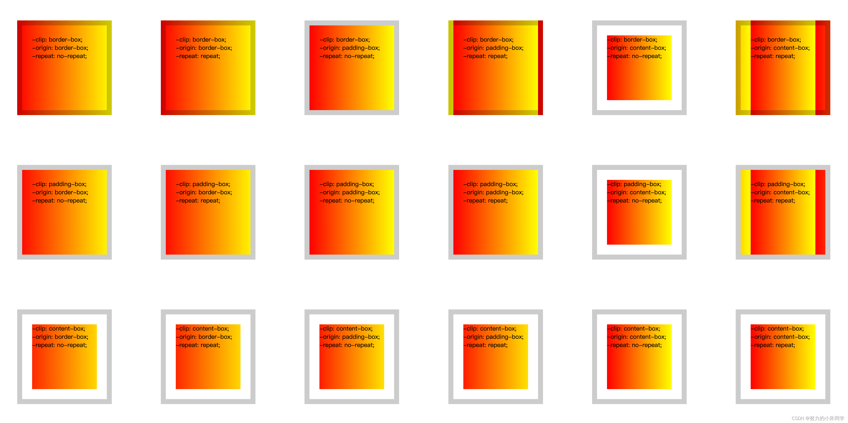
九、background-attachment
该属性用来设置元素的背景图像,相对于当前页面的可视区域(视口)是固定的,还是随着元素滚动而滚动,属性值有三种:
scroll
(默认值,背景相对于元素本身固定)、
fixed
(背景相对于视口固定)、
local
(背景相对于元素的内容固定)。而且要注意该属性与
background-origin
属性有一定的冲突,当该属性值设为
fixed
时,
background-origin
属性将不起作用。
①
scroll
该属性值表示背景图像相对于元素本身固定。
如果此时页面的长度超出可视区域,就会出现滚动条,当页面发生滚动,元素会随页面滚动而滚动,因为背景图像相对于元素本身固定,所以背景图像也会随之滚动。
如果此时元素本身设置了
overflow: scroll;
且元素内容超出了元素盒子大小,那么元素本身就会出现滚动条,当页面不滚动,但元素内容在元素盒子内滚动时,因为元素本身没有滚动,只是元素内容在滚动,所以背景图片不会随之滚动。
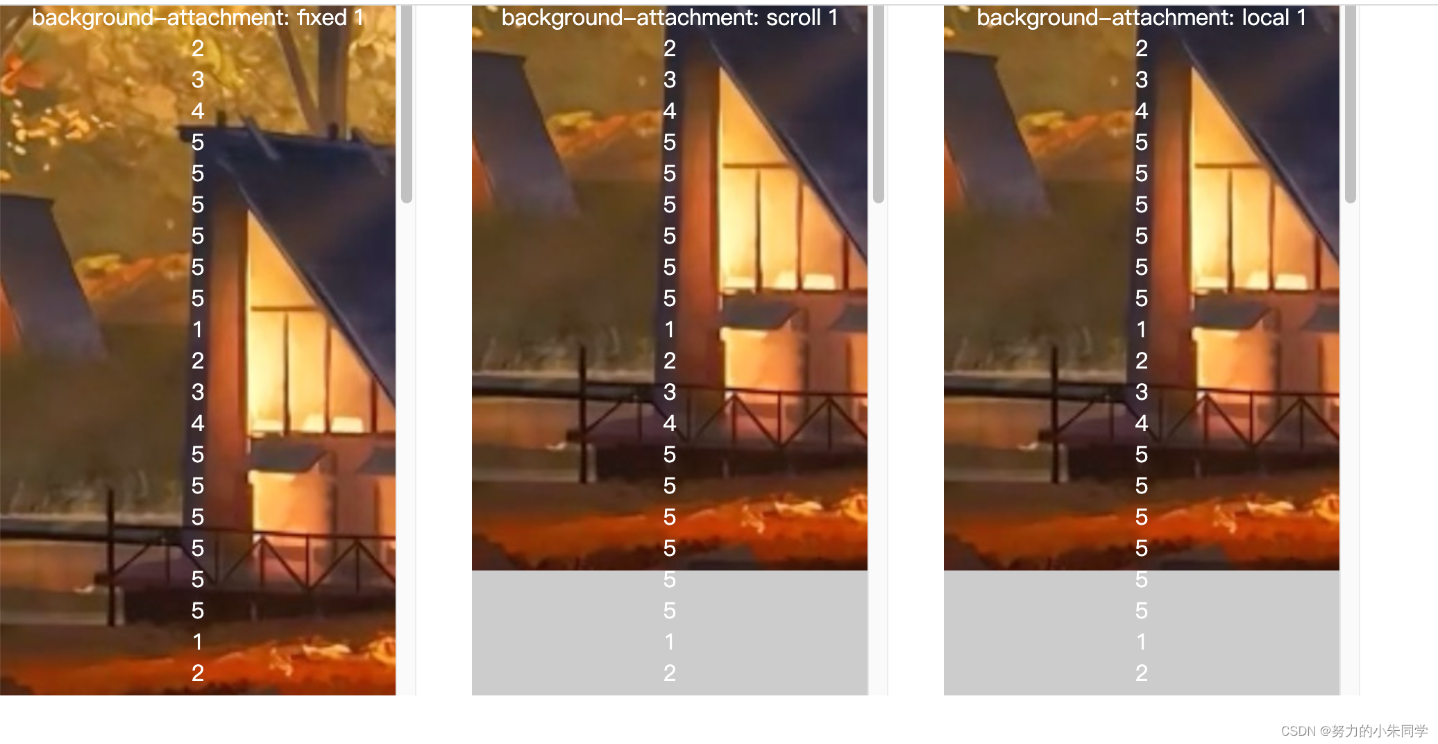
②
fixed
该属性值表示背景图像相对于页面的可视区域固定,设置该属性值时,
background-origin
属性将不起作用,因为此时背景图像的定位区域是页面的可视区域,在不使用
background-position
重新定位起点的默认情况下背景图像的渲染起点就是可视区域的左上角的起点,并且背景图像只会显示元素与背景图像对应重叠的那部分图像区域。也就是说如果元素与背景图像的渲染起点距离很远,与背景图像的渲染区域完全不重叠,那元素中也不会显示出任何背景图像。但我们可以利用该属性给body元素设置整个页面的背景图像。
如果属性值为
fixed
,页面的长度超出可视区域,就会出现滚动条,当页面发生滚动,元素会随页面滚动而滚动,但是因为背景图像是相对于可视区域的固定,所以背景图像不会随之滚动,背景图像的渲染起点不变,依旧显示在元素与背景图像对应重叠的那部分那部分图像区域。
如果属性值为
fixed
,元素本身设置了
overflow: scroll;
且元素内容超出了元素盒子大小,那么元素本身就会出现滚动条,当页面不滚动,但元素内容在元素盒子内滚动时,因为元素本身没有滚动,只是元素内容在滚动,所以背景图片不会随之滚动。
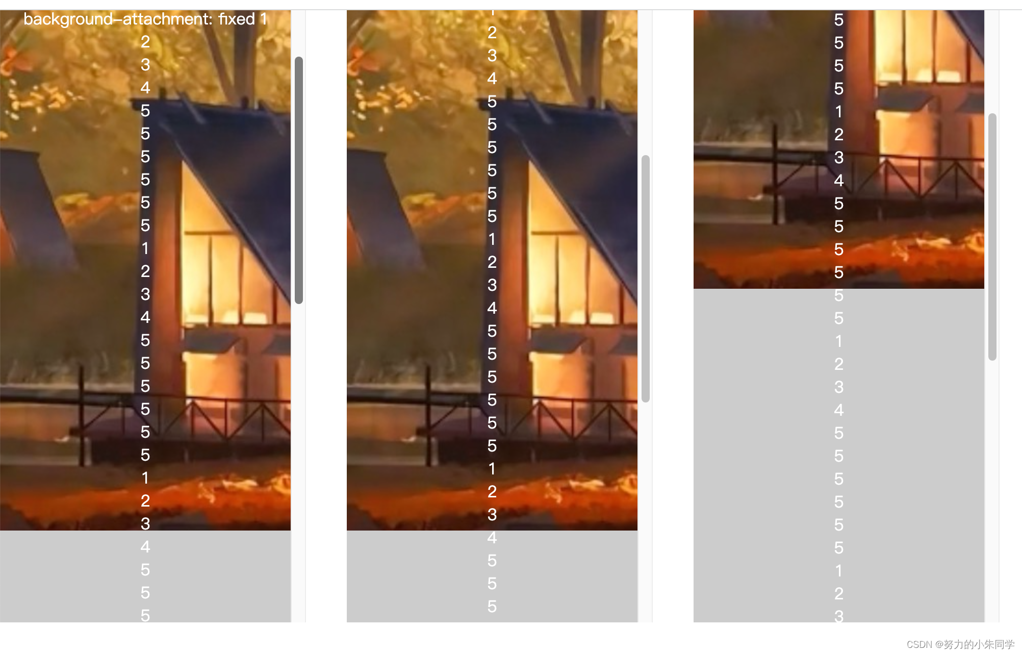
③
local
该属性值表示背景图像相对于元素的内容固定。
如果此时页面的长度超出可视区域,就会出现滚动条,当页面发生滚动,元素会随页面滚动而滚动,元素的内容也是相对于页面滚动了,因为背景图像相对于元素的内容固定,所以背景图像也会随之滚动。
如果此时元素本身设置了
overflow: scroll;
且元素内容超出了元素盒子大小,那么元素本身就会出现滚动条,当页面不滚动,但元素内容在元素盒子内滚动时,背景图片也会随之滚动。
案例代码:
<style>body{margin: 0;padding: 0;}.bg{display: flex;align-items: flex-start;justify-content: flex-start;color: #fff;margin-bottom: 1000px;text-align: center;}.bg1{width: 300px;height: 500px;padding-top: 100px;overflow-y: scroll;background: #ccc url(./image/img.png) no-repeat 0 0;background-attachment: fixed;}.bg2{width: 300px;height: 500px;margin: 0 40px;padding-top: 100px;overflow-y: scroll;background: #ccc url(./image/img.png) no-repeat 0 0;background-attachment: scroll;}.bg3{width: 300px;height: 500px;padding-top: 100px;overflow-y: scroll;background: #ccc url(./image/img.png) no-repeat 0 0;background-attachment: local;}</style><divclass="bg"><divclass="bg1">
      background-attachment: fixed
      1<br>
      2<br>
      3<br>
      4<br>
      5<br><!-- 将上面5行复制10遍 --></div><divclass="bg2">
      background-attachment: scroll
      1<br>
      2<br>
      3<br>
      4<br>
      5<br><!-- 将上面5行复制10遍 -->
      5<br>
      5<br>
      5<br></div><divclass="bg3">
      background-attachment: local
      1<br>
      2<br>
      3<br>
      4<br>
      5<br><!-- 将上面5行复制10遍 --></div></div>
效果展示:
初始状态: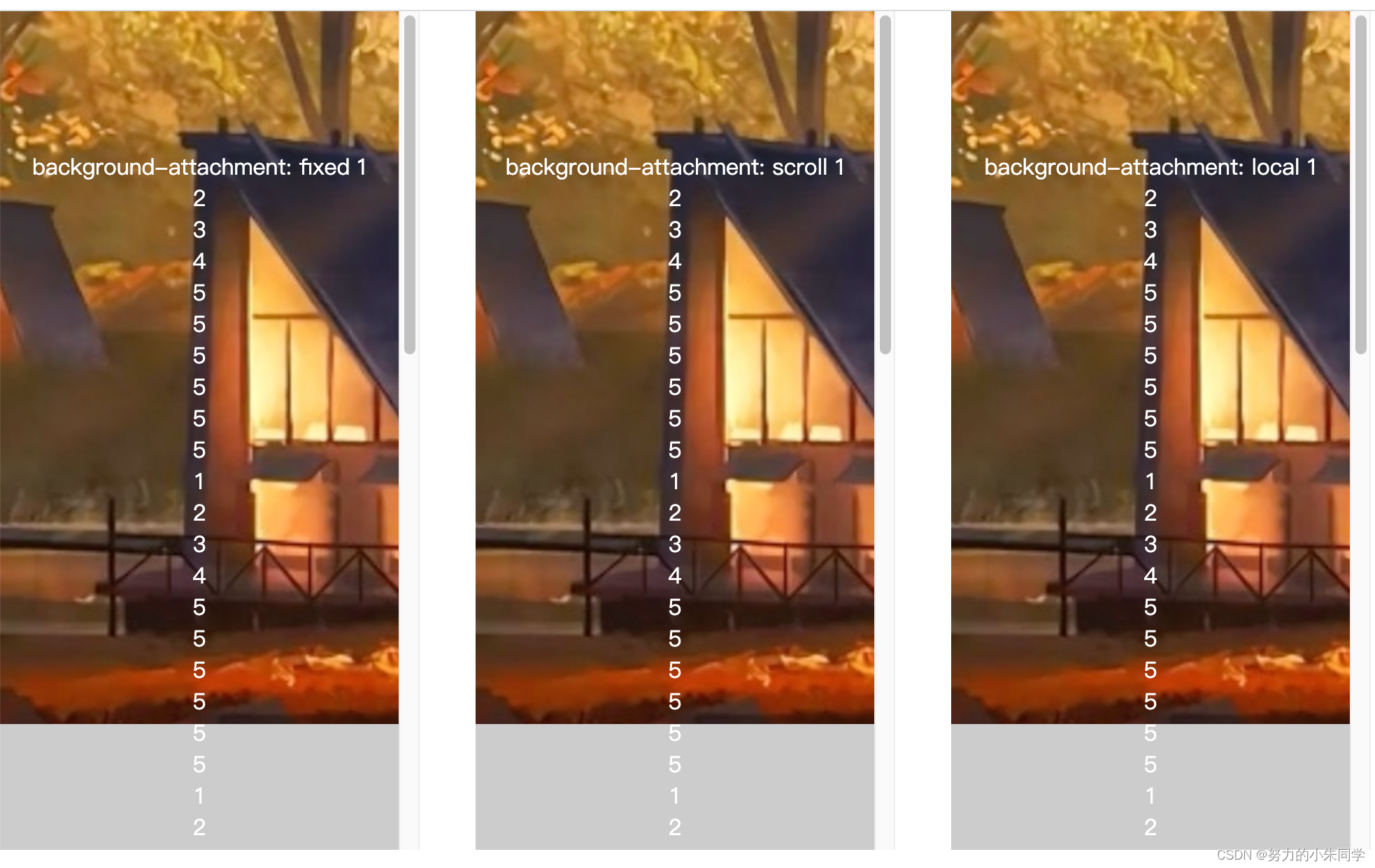
页面滚动,内容不滚动:
fiexd
背景图像位置没变,但与元素盒子的重叠区域变化了,所以元素的背景图像有所变化。
scroll
和
local
背景图像发生了变化,滚动了一部分。
页面不滚动,内容滚动:
scroll
和
fiexd
背景图像没变,但与元素重叠区域也没变。
local
背景图像发生了变化,滚动了一部分。
十、background-blend-mode(背景图层的混合模式)
该属性用来定义元素多个背景图层(背景图像、背景色)之间的混合模式,当图层重叠时,混合模式是计算像素最终颜色值的方法,每种混合模式采用前景和背景的颜色值,执行其计算并返回最终的颜色值。最终的可见层是对混合层中的每个重叠像素执行混合模式计算的结果。
其属性值有:
normal(默认值)
、
multiplay
、
screen
、
overlay
、
darken
、
lighten
、
color-dodge
、
color-burn
、
hard-light
、
soft-light
、
exclusion
、
hue
、
saturation
、
color
、
luminosity
。
由于该属性在实际开发中几乎用不到,所以这个地方就不展开叙述了!(主要是我也没整明白颜色叠加、相乘、反转、相除这些颜色概念,毕竟我只是个臭画页面的。。。)
想要深入了解的可以查看该文档 blend-mode
版权归原作者 努力的小朱同学 所有, 如有侵权,请联系我们删除。