
根据颜色、形状、图标等等设计美观的按钮
使用
type
、
plain
、
round
和
circle
属性来定义 Button 的样式。

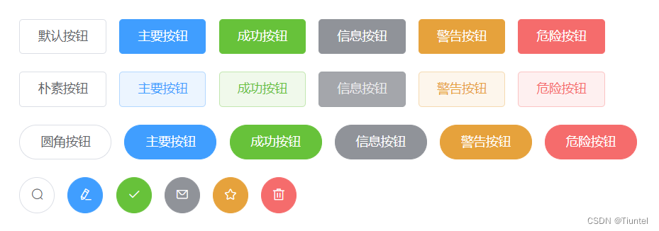
<el-row>
  <el-button>默认按钮</el-button>
  <el-button type="primary">主要按钮</el-button>
  <el-button type="success">成功按钮</el-button>
  <el-button type="info">信息按钮</el-button>
  <el-button type="warning">警告按钮</el-button>
  <el-button type="danger">危险按钮</el-button>
</el-row>

<el-row>
  <el-button plain>朴素按钮</el-button>
  <el-button type="primary" plain>主要按钮</el-button>
  <el-button type="success" plain>成功按钮</el-button>
  <el-button type="info" plain>信息按钮</el-button>
  <el-button type="warning" plain>警告按钮</el-button>
  <el-button type="danger" plain>危险按钮</el-button>
</el-row>

<el-row>
  <el-button round>圆角按钮</el-button>
  <el-button type="primary" round>主要按钮</el-button>
  <el-button type="success" round>成功按钮</el-button>
  <el-button type="info" round>信息按钮</el-button>
  <el-button type="warning" round>警告按钮</el-button>
  <el-button type="danger" round>危险按钮</el-button>
</el-row>
图标按钮
带图标的按钮可增强辨识度(有文字)或节省空间(无文字)

<el-row>
  <el-button icon="el-icon-search" circle></el-button>
  <el-button type="primary" icon="el-icon-edit" circle></el-button>
  <el-button type="success" icon="el-icon-check" circle></el-button>
  <el-button type="info" icon="el-icon-message" circle></el-button>
  <el-button type="warning" icon="el-icon-star-off" circle></el-button>
  <el-button type="danger" icon="el-icon-delete" circle></el-button>
</el-row>
其中,Icon 图标提供了一套常用的图标集合,直接通过设置类名为 el-icon-iconName 来使用即可。例如:
<i class="el-icon-edit"></i>
<i class="el-icon-share"></i>
<i class="el-icon-delete"></i>
<el-button type="primary" icon="el-icon-search">搜索</el-button>
文字按钮
没有边框和背景色的按钮,可以使用
disabled
属性来定义按钮是否可用。
<el-button type="text">文字按钮</el-button>
<el-button type="text" disabled>文字按钮</el-button>
按钮组
使用
<el-button-group>
标签来嵌套按钮

<el-button-group>
  <el-button type="primary" icon="el-icon-arrow-left">上一页</el-button>
  <el-button type="primary">下一页<i class="el-icon-arrow-right el-icon--right"></i></el-button>
</el-button-group>
<el-button-group>
  <el-button type="primary" icon="el-icon-edit"></el-button>
  <el-button type="primary" icon="el-icon-share"></el-button>
  <el-button type="primary" icon="el-icon-delete"></el-button>
</el-button-group>
主要参数
参数说明类型可选值默认值size尺寸stringmedium / small / mini—type类型stringprimary / success / warning / danger / info / text—plain是否朴素按钮boolean—falseround是否圆角按钮boolean—falsecircle是否圆形按钮boolean—falseloading是否加载中状态boolean—falsedisabled是否禁用状态boolean—falseicon图标类名string——autofocus是否默认聚焦boolean—falsenative-type原生 type 属性stringbutton / submit / resetbutton
本文转载自: https://blog.csdn.net/Tiuntel/article/details/128803896
版权归原作者 Tiuntel 所有, 如有侵权,请联系我们删除。
版权归原作者 Tiuntel 所有, 如有侵权,请联系我们删除。