
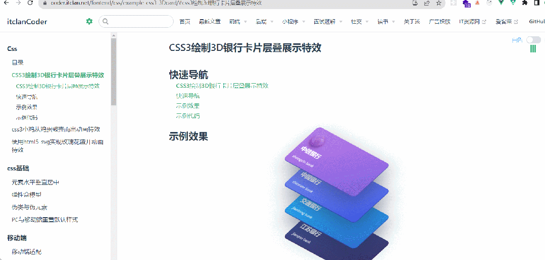
使用纯css3绘制3D银行卡层叠展示特效
具体示例如下
<template>
   <div>
      <div class="tariffCards">
        <div class="economy">
            <img src="../images/css-article-imgs/example-css3D-card/tarcs.png" alt="中信银行" height="74">
            <h3>中信银行</h3>
            <span>zhongxin bank</span>
        </div>
        <div class="premiumeconomy">
            <img src="../images/css-article-imgs/example-css3D-card/tarcs.png" alt="中国银行" height="74">
            <h3>中国银行</h3>
            <span>chinease bank</span>
        </div>
        <div class="business">
            <img src="../images/css-article-imgs/example-css3D-card/tarcs.png" alt="交通银行" height="74">
            <h3>交通银行</h3>
            <span>jiaotong bank</span>
        </div>
        <div class="first">
            <img src="../images/css-article-imgs/example-css3D-card/tarcs.png" alt="江苏银行" height="74">
            <h3>江苏银行</h3>
            <span>jiangsu bank</span>
        </div>
    </div>
   </div>
</template>
<style scoped>
.tariffCards {
  position: absolute;
  top: 50%;
  left: 50%;
  margin: -180px 0 0 -140px;
  user-select: none;
  transform: translate3d(0, 0, 0);
  transform-style: preserve-3d;
}
.tariffCards:after {
  position: absolute;
  bottom: -27px;
  left: 5%;
  content: "";
  width: 65%;
  height: 10px;
  border-radius: 100%;
  background-image: radial-gradient(rgba(34, 50, 84, 0.04), rgba(34, 50, 84, 0));
}
.tariffCards > div {
  position: relative;
  width: 280px;
  height: 140px;
  border-radius: 12px;
  color: white;
  transform: rotateX(45deg) rotateY(-15deg) rotate(45deg);
  transition: all 0.4s ease;
  overflow: hidden;
  cursor: pointer;
}
.tariffCards > div:after {
  position: absolute;
  top: -70px;
  left: 0;
  content: "";
  width: 200%;
  height: 200%;
  background-image: linear-gradient(60deg, rgba(255, 255, 255, 0) 20%, rgba(255, 255, 255, 0.1), rgba(255, 255, 255, 0) 80%);
  transform: translateX(-100%);
}
.tariffCards > div img {
  margin-top: 15px;
  pointer-events: none;
}
.tariffCards > div h3 {
  position: absolute;
  bottom: 28px;
  left: 15px;
  font-size: 18px;
  font-weight: 800;
}
.tariffCards > div span {
  position: absolute;
  font-weight: 700;
  bottom: 15px;
  left: 15px;
  font-size: 12px;
  font-weight: 600;
  opacity: 0.8;
}
.tariffCards > div.economy {
  margin-top: 0;
  z-index: 3;
  background-color: #8063E1;
  background-image: linear-gradient(135deg, #BD7BE8, #8063E1);
  box-shadow: 20px 20px 60px rgba(34, 50, 84, 0.5), 1px 1px 0px 1px #8063E1;
}
.tariffCards > div.premiumeconomy {
  margin-top: -70px;
  z-index: 2;
  background-color: #3F58E3;
  background-image: linear-gradient(135deg, #7F94FC, #3F58E3);
  box-shadow: 20px 20px 60px rgba(34, 50, 84, 0.5), 1px 1px 0px 1px #3F58E3;
}
.tariffCards > div.business {
  margin-top: -70px;
  z-index: 1;
  background-color: #2C6FD1;
  background-image: linear-gradient(135deg, #21BBFE, #2C6FD1);
  box-shadow: 20px 20px 60px rgba(34, 50, 84, 0.5), 1px 1px 0px 1px #2C6FD1;
}
.tariffCards > div.first {
  margin-top: -70px;
  background-color: #352F64;
  background-image: linear-gradient(135deg, #415197, #352F64);
  box-shadow: 5px 5px 60px rgba(34, 50, 84, 0.1), 1px 1px 0px 1px #352F64;
}
.tariffCards > div:hover {
  transform: rotateX(30deg) rotateY(-15deg) rotate(30deg) translate(-25px, 50px);
}
.tariffCards > div:hover:after {
  transform: translateX(100%);
  transition: all 1.2s ease-in-out;
}

</style>
实现这个3D卡片,需要在最外层父级元素添加
transform: translate3d(0, 0, 0);transform-style: preserve-3d
,声明
3D
,结合
css3
中
transform
的变换,平移就可以实现
村民私自搭桥收费被判刑
2023-07-10
聊一下大学几年如何渡过
2023-07-09
聊一聊抑郁症
2023-07-07
PHP中的变量
2023-07-04
了解PHP-入门-环境搭建-集成环境安装
2023-07-03


本文转载自: https://blog.csdn.net/wzc_coder/article/details/131714509
版权归原作者 itclanCoder 所有, 如有侵权,请联系我们删除。
版权归原作者 itclanCoder 所有, 如有侵权,请联系我们删除。