
30个HTML+CSS前端开发案例(完结篇)
flex弹性布局-今日头条首页热门视频栏
代码实现
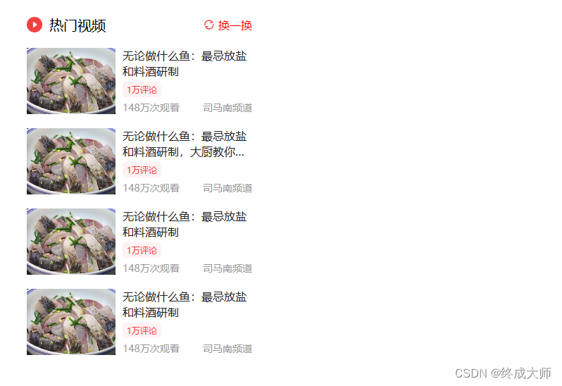
<!DOCTYPEhtml><html><head><metacharset="utf-8"><title>flex弹性布局-今日头条首页热门视频栏</title><styletype="text/css">body{margin: 0;padding: 0;}a{text-decoration: none;}.show-monitor{width: 320px;height: 600px;/* border: 2px solid red; */margin: 50px 0px 0px 50px;}.panel-head{display: flex;/* height: 100px; *//* 解除图标变形 */align-items: center;}.panel-head span.panel-head-title{/* 占满全部空间 */flex-grow: 1;font-size: 20px;margin-left: 10px;}.panel-head .panel-head-sx{font-size: 16px;color: red;margin-left: 5px;}.panel-con{height: 94px;/* background-color: antiquewhite; */margin-top: 20px;display: flex;}.panel-con .panel-con-img{width: 126px;/* 高度自动继承 *//* height: 94px; *//* background-color: aqua; */margin-right: 10px;flex-shrink: 0;}.panel-con .panel-con-img img{width: 100%;height: 100%;/* 裁剪图片 防止变形 */object-fit: cover;}.panel-con .panel-con-txt{/* background-color: aquamarine; *//* 占满剩余空间 */flex-grow: 1;display: flex;flex-direction: column;text-overflow: ellipsis;}.panel-con .panel-con-txt a{font-size: 16px;color: #222;/* 超过44px文字不再显示 */max-height: 44px;overflow: hidden;line-height: 22px;/* 弹性伸缩盒子模型显示 */display: -webkit-box;/* 设置或检索伸缩盒子对象的子元素的排列方式 */-webkit-box-orient: vertical;/* 限制在一个块级元素显示的文本的行数 */-webkit-line-clamp: 2;/* 文本溢出显示省略号 */text-overflow: ellipsis;}.panel-con .panel-con-txt span.like{font-size: 12px;background-color: #fff2f2;color: #f04142;/* 消除占满整行现象 变为内容实际所占宽度*/align-self: flex-start;padding: 3px 6px;border-radius: 5px;margin-top: 5px;}.panel-con .panel-con-txt .desc{font-size: 14px;color: #999;display: flex;justify-content: space-between;margin-top: 5px;}</style></head><body><divclass="show-monitor"><divclass="panel-head"><imgsrc="images/icon-play.png"alt=""width="22"><spanclass="panel-head-title">热门视频</span><imgsrc="images/icon-sx2.png"alt=""width="16"><spanclass="panel-head-sx">换一换</span></div><divclass="panel-con"><divclass="panel-con-img"><ahref=""><imgsrc="images/toutiao-01.jpeg"alt=""></a></div><divclass="panel-con-txt"><ahref="">司马南:中国与俄罗斯的战线</a><spanclass="like">1万评论</span><divclass="desc"><span>148万次观看</span><span>司马南频道</span></div></div></div><divclass="panel-con"><divclass="panel-con-img"><ahref=""><imgsrc="images/toutiao-02.jpeg"alt=""></a></div><divclass="panel-con-txt"><ahref="">无论做什么鱼:最忌放盐和料酒研制,大厨教你绝招.</a><spanclass="like">1万评论</span><divclass="desc"><span>148万次观看</span><span>司马南频道</span></div></div></div><divclass="panel-con"><divclass="panel-con-img"><ahref=""><imgsrc="images/toutiao-03.jpeg"alt=""></a></div><divclass="panel-con-txt"><ahref="">司马南:中国与俄罗斯的战线</a><spanclass="like">1万评论</span><divclass="desc"><span>148万次观看</span><span>司马南频道</span></div></div></div><divclass="panel-con"><divclass="panel-con-img"><ahref=""><imgsrc="images/toutiao-04.jpeg"alt=""></a></div><divclass="panel-con-txt"><ahref="">司马南:中国与俄罗斯的战线</a><spanclass="like">1万评论</span><divclass="desc"><span>148万次观看</span><span>司马南频道</span></div></div></div></div></body></html>
效果
flex弹性布局-微博热搜榜单
代码实现
<!DOCTYPEhtml><html><head><metacharset="utf-8"><title>flex弹性布局-微博热搜榜单</title><styletype="text/css">body{margin: 0;padding: 0;background-color: #f5f5f5;}a{text-decoration: none;}.wbpro-side{width: 240px;/* height: 600px; */background-color: #fff;margin:50px 0 0 50px;padding: 10px 15px;}.wbpro-side .wbpro-side-head{height: 40px;/* background-color: antiquewhite; */display: flex;align-items: center;border-bottom: 1px solid #f9f9f9;cursor: pointer;}.wbpro-side .wbpro-side-head span.title{flex-grow: 1;font-size: 14px;}.wbpro-side .wbpro-side-head span.sx{font-size: 12px;color: #939393;margin-left: 5px;}.wbpro-side .wbpro-side-panel{height: 40px;/* background-color: antiquewhite; */border-bottom: 1px solid #f9f9f9;font-size: 12px;display: flex;}.wbpro-side .wbpro-side-panel a{display: flex;align-items: center;/* background-color: red; */width: 100%;}/* 新闻标题 */.wbpro-side-panel a span.title{flex-grow: 1;color: #333;white-space: nowrap;overflow: hidden;text-overflow: ellipsis;}/* 新闻排名 */.wbpro-side-panel a span.icon{font-size: 16px;font-weight: bold;color: #ff9406;margin-right: 10px;}/* 新闻阅读量 */.wbpro-side-panel .num{color: #939393;/* 防止文字过多压缩阅读量所占的空间 */flex-shrink: 0;}/* 新闻标签 */.wbpro-side-panel .mark{/* background-color: #ff9406; */color: #fff;padding: 2px 4px;border-radius: 5px;margin-left: 5px;}/* 类wbpro-side-panel父元素(wbpro-side)的1-5的子元素,并且子元素样式名需是wbpro-side-panel *//* .wbpro-side-panel:nth-child(-n+5){
                background-color: aqua;
            } */.wbpro-side-panel:nth-child(-n+5) a span.icon{color: red;}/* 自定义颜色 */.bg1{background-color: #ff9406;}.bg2{background-color: pink;}.bg3{background-color: skyblue;}</style></head><body><divclass="wbpro-side"><divclass="wbpro-side-head"><spanclass="title">微博热搜</span><imgsrc="images/icon-sx.png"alt=""><spanclass="sx">点击刷新</span></div><divclass="wbpro-side-panel"><ahref=""><spanclass="icon"><imgsrc="images/icon_top.png"alt=""></span><spanclass="title">新的赶考之路考卷常出常新新的赶考之路考卷常出常新新的赶考之路考卷常出常新</span><spanclass="num">246万</span><spanclass="mark bg1">新</span></a></div><divclass="wbpro-side-panel"><ahref=""><spanclass="icon">2</span><spanclass="title">新的赶考之路考卷常出常新</span><spanclass="num">246万</span><spanclass="mark bg3">新</span></a></div><divclass="wbpro-side-panel"><ahref=""><spanclass="icon">3</span><spanclass="title">新的赶考之路考卷常出常新</span><spanclass="num">246万</span><spanclass="mark bg2">新</span></a></div><divclass="wbpro-side-panel"><ahref=""><spanclass="icon">4</span><spanclass="title">新的赶考之路考卷常出常新</span><spanclass="num">246万</span><spanclass="mark bg3">新</span></a></div><divclass="wbpro-side-panel"><ahref=""><spanclass="icon">5</span><spanclass="title">新的赶考之路考卷常出常新</span><spanclass="num">246万</span><spanclass="mark bg1">新</span></a></div><divclass="wbpro-side-panel"><ahref=""><spanclass="icon">6</span><spanclass="title">新的赶考之路考卷常出常新</span><spanclass="num">246万</span><spanclass="mark bg3">新</span></a></div><divclass="wbpro-side-panel"><ahref=""><spanclass="icon">7</span><spanclass="title">新的赶考之路考卷常出常新</span><spanclass="num">246万</span><spanclass="mark bg2">新</span></a></div><divclass="wbpro-side-panel"><ahref=""><spanclass="icon">8</span><spanclass="title">新的赶考之路考卷常出常新</span><spanclass="num">246万</span><spanclass="mark bg3">新</span></a></div><divclass="wbpro-side-panel"><ahref=""><spanclass="icon">9</span><spanclass="title">新的赶考之路考卷常出常新</span><spanclass="num">246万</span><spanclass="mark bg1">新</span></a></div></div></body></html>
效果

grid网格布局-360图片展示
代码实现
<!DOCTYPEhtml><html><head><metacharset="utf-8"><title>grid网格布局-360图片展示</title><styletype="text/css">body{margin: 0;padding: 0;}.container{width: 100%;/* height: 700px; *//* background-color: aquamarine; */margin-top: 100px;display: grid;/* 行高 */grid-template-rows: 207px 155px 259px;grid-template-columns: 420px 365px 299px 118px 296px;/* 网格居中显示 */justify-content: center;/* 合并单元网格 */grid-template-areas:'a b d d f''a b e h h''a c e h h';/* 行间隙 列间隙 */gap: 3px 3px;}.item:nth-child(1){grid-area: a;}.item:nth-child(2){grid-area: b;}.item:nth-child(3){grid-area: c;}.item:nth-child(4){grid-area: d;}.item:nth-child(5){grid-area: e;}.item:nth-child(6){grid-area: f;background-color: pink;}.item:nth-child(7){grid-area: h;}</style></head><body><divclass="container"><divclass="item"><imgsrc="images/grid-01.jpg"alt=""></div><divclass="item"><imgsrc="images/grid-02.jpg"alt=""></div><divclass="item"><imgsrc="images/grid-03.jpg"alt=""></div><divclass="item"><imgsrc="images/grid-04.jpg"alt=""></div><divclass="item"><imgsrc="images/grid-05.jpg"alt=""></div><divclass="item"></div><divclass="item "><imgsrc="images/grid-06.jpg"alt=""></div></div></body></html>
效果

综合实例-小米商城左侧二级菜单
代码实现
<!DOCTYPEhtml><html><head><metacharset="utf-8"><title>小米商城左侧二级菜单</title><styletype="text/css">body{margin: 0;padding: 0;background-image:linear-gradient(to right, skyblue, #fff);}a{text-decoration: none;}.menu{width: 230px;height: 420px;padding: 20px 0;background-color:rgba(0, 0, 0, 0.5);margin: 50px 0 0 50px;position: relative;}.menu .item{height: 42px;/* border: 1px solid red; */color: #fff;font-size: 14px;line-height: 42px;padding-left: 30px;background:url('images/right-jiantou.png') no-repeat 200px 10px;cursor: pointer;}.menu .item:hover{background-color: #ff6700;background-image:url('images/right-jiantou2.png');}/* 右侧二级菜单 */.menu .item .nav{min-width: 250px;height: 460px;background-color: #fff;border: 1px solid #666;position: absolute;top: 0;left: 100%;box-sizing: border-box;/* 六行单元格平分整个区域 */display: grid;grid-template-rows:repeat(6, 1fr);grid-template-columns: 250px;/* 排列方式设置为先列后行 */grid-auto-flow: column;/* 设置隐式网格宽度 */grid-auto-columns: 250px;padding: 20px;/* 初始默认隐藏 */display: none;}.item .nav a{/* border: 1px solid red; */color: #000;display: flex;/* 垂直方向居中对齐,防止随父元素高度而被拉伸 */align-items: center;}.item .nav a img{margin-right: 10px;}.item .nav a:hover{color: #ff6700;}.item:hover .nav{display: grid;}</style></head><body><divclass="menu"><divclass="item">手机
                <divclass="nav"><ahref=""><imgsrc="images/grid-mi-01.webp"alt=""width="40">黑鲨5 Pro</a><ahref=""><imgsrc="images/grid-mi-02.webp"alt=""width="40">黑鲨5</a><ahref=""><imgsrc="images/grid-mi-03.webp"alt=""width="40">Redmi 10A</a><ahref=""><imgsrc="images/grid-mi-04.webp"alt=""width="40">Redmi K50 Pro</a><ahref=""><imgsrc="images/grid-mi-05.webp"alt=""width="40">Redmi K40S</a><ahref=""><imgsrc="images/grid-mi-06.webp"alt=""width="40">黑鲨5 Pro</a><ahref=""><imgsrc="images/grid-mi-07.webp"alt=""width="40">黑鲨5</a><ahref=""><imgsrc="images/grid-mi-08.webp"alt=""width="40">Redmi 10A</a><ahref=""><imgsrc="images/grid-mi-09.webp"alt=""width="40">Redmi K50 Pro</a><ahref=""><imgsrc="images/grid-mi-05.webp"alt=""width="40">Redmi K40S</a></div></div><divclass="item">电视
                <divclass="nav"><ahref=""><imgsrc="images/grid-mi-01.webp"alt=""width="40">黑鲨5 Pro</a><ahref=""><imgsrc="images/grid-mi-02.webp"alt=""width="40">黑鲨5</a><ahref=""><imgsrc="images/grid-mi-03.webp"alt=""width="40">Redmi 10A</a><ahref=""><imgsrc="images/grid-mi-04.webp"alt=""width="40">Redmi K50 Pro</a><ahref=""><imgsrc="images/grid-mi-05.webp"alt=""width="40">Redmi K40S</a><ahref=""><imgsrc="images/grid-mi-06.webp"alt=""width="40">黑鲨5 Pro</a><ahref=""><imgsrc="images/grid-mi-07.webp"alt=""width="40">黑鲨5</a><ahref=""><imgsrc="images/grid-mi-08.webp"alt=""width="40">Redmi 10A</a><ahref=""><imgsrc="images/grid-mi-09.webp"alt=""width="40">Redmi K50 Pro</a><ahref=""><imgsrc="images/grid-mi-05.webp"alt=""width="40">Redmi K40S</a><ahref=""><imgsrc="images/grid-mi-09.webp"alt=""width="40">Redmi K50 Pro</a><ahref=""><imgsrc="images/grid-mi-05.webp"alt=""width="40">Redmi K40S</a></div></div><divclass="item">笔记本 平板
                <divclass="nav"><ahref=""><imgsrc="images/grid-mi-01.webp"alt=""width="40">黑鲨5 Pro</a><ahref=""><imgsrc="images/grid-mi-02.webp"alt=""width="40">黑鲨5</a><ahref=""><imgsrc="images/grid-mi-03.webp"alt=""width="40">Redmi 10A</a><ahref=""><imgsrc="images/grid-mi-04.webp"alt=""width="40">Redmi K50 Pro</a><ahref=""><imgsrc="images/grid-mi-05.webp"alt=""width="40">Redmi K40S</a><ahref=""><imgsrc="images/grid-mi-07.webp"alt=""width="40">黑鲨5</a><ahref=""><imgsrc="images/grid-mi-08.webp"alt=""width="40">Redmi 10A</a><ahref=""><imgsrc="images/grid-mi-09.webp"alt=""width="40">Redmi K50 Pro</a><ahref=""><imgsrc="images/grid-mi-05.webp"alt=""width="40">Redmi K40S</a><ahref=""><imgsrc="images/grid-mi-01.webp"alt=""width="40">黑鲨5 Pro</a><ahref=""><imgsrc="images/grid-mi-02.webp"alt=""width="40">黑鲨5</a><ahref=""><imgsrc="images/grid-mi-03.webp"alt=""width="40">Redmi 10A</a><ahref=""><imgsrc="images/grid-mi-04.webp"alt=""width="40">Redmi K50 Pro</a><ahref=""><imgsrc="images/grid-mi-05.webp"alt=""width="40">Redmi K40S</a><ahref=""><imgsrc="images/grid-mi-06.webp"alt=""width="40">黑鲨5 Pro</a><ahref=""><imgsrc="images/grid-mi-07.webp"alt=""width="40">黑鲨5</a><ahref=""><imgsrc="images/grid-mi-08.webp"alt=""width="40">Redmi 10A</a><ahref=""><imgsrc="images/grid-mi-09.webp"alt=""width="40">Redmi K50 Pro</a><ahref=""><imgsrc="images/grid-mi-05.webp"alt=""width="40">Redmi K40S</a></div></div><divclass="item">家电</div><divclass="item">出行 穿戴</div><divclass="item">智能 路由器</div><divclass="item">电源 配件</div><divclass="item">健康 儿童</div><divclass="item">耳机 音箱</div><divclass="item">生活 箱包</div></div></body></html>
效果

资源包
相关代码及其图片素材,持续更新中。。。
本文转载自: https://blog.csdn.net/pipihan21/article/details/129020636
版权归原作者 终成大师 所有, 如有侵权,请联系我们删除。
版权归原作者 终成大师 所有, 如有侵权,请联系我们删除。