
checkbox这个控件大家都不陌生,直接在xml文件里加个控件就可以了
<CheckBox
    android:id="@+id/check_image"
    android:layout_width="wrap_content"
    android:layout_height="wrap_content"/>
无非就是改变复选框颜色大小,但原生UI效果不一定能满足我们设计师要求,需要自定义样式
步骤如下:
首先需要用android:button="@null"把原生复选框隐藏起来
然后准备两张 点击前后效果图
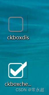
在res的drawable下建立一个shape文件 用来定义选中跟取消不同状态效果图
<?xml version="1.0" encoding="utf-8"?>
<selector xmlns:android="http://schemas.android.com/apk/res/android">
    <item android:drawable="@drawable/ckboxchecked"
        android:state_checked="true" />
    <item android:drawable="@drawable/ckboxdis" />
</selector>
我们还可以定义渐变色
<!--    <item android:state_checked="true">-->
<!--        <shape>-->
<!--            <gradient android:startColor="#FFFFFF" android:endColor="#000000"/>-->
<!--        </shape>-->
<!--    </item>-->
<!--    <item>-->
<!--        <shape>-->
<!--            <gradient android:startColor="#000000" android:endColor="#FFFFFF" android:angle="-90"/>-->
<!--        </shape>-->
<!--    </item>-->
最后在定义控件时引用这个文件
<CheckBox
    android:id="@+id/check_image"
    android:layout_width="wrap_content"
    android:layout_height="wrap_content"
    android:button="@null"
    android:background="@drawable/checkbox_shape" />
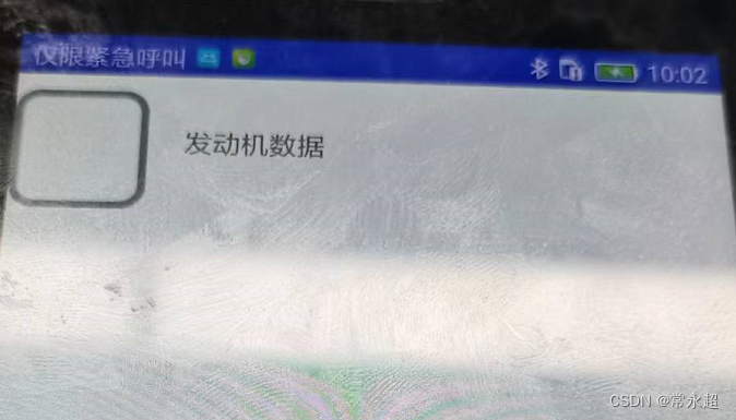
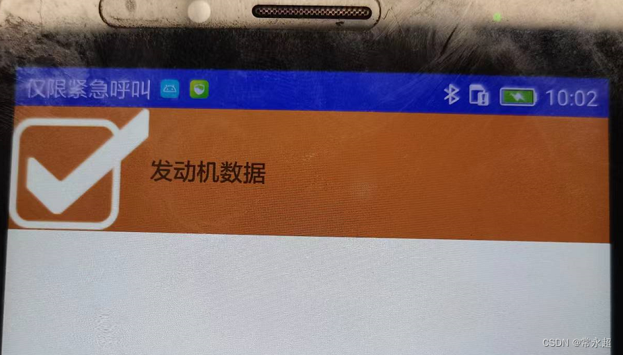
我这里复选框后边有个文本框 点击时候整个条目要变色 完整代码如下
<LinearLayout
    android:id="@+id/item"
    android:layout_width="match_parent"
    android:layout_height="wrap_content"
    android:orientation="horizontal">
    <CheckBox
        android:id="@+id/check_image"
        android:layout_width="wrap_content"
        android:layout_height="wrap_content"
        android:button="@null"
        android:background="@drawable/checkbox_shape" />
    <TextView
        android:id="@+id/text"
        android:layout_width="wrap_content"
        android:layout_height="wrap_content"
        android:layout_gravity="center"
        android:text="发动机数据"></TextView>
</LinearLayout>
我这里是在fragment使用的对应Java代码如下
private LinearLayout linearLayout;
private CheckBox checkBox;
private int  checkout= 0;
@Override
@Nullable
public View onCreateView(LayoutInflater inflater,
                         @Nullable ViewGroup container, @Nullable Bundle savedInstanceState) {
    // TODO Auto-generated method stub
    View view = inflater.inflate(R.layout.one_fragment, container, false);
    linearLayout = view.findViewById(R.id.item);
    checkBox = view.findViewById(R.id.check_image);
    checkBox.setOnCheckedChangeListener(new CompoundButton.OnCheckedChangeListener() {
        @Override
        public void onCheckedChanged(CompoundButton buttonView, boolean isChecked) {
            if (isChecked) {
                linearLayout.setBackgroundResource(R.color.Copper);
                checkout = 1;
            } else {
                linearLayout.setBackgroundResource(R.color.white);
                checkout = 0;
            }
        }
    });
    return view;
}
效果图如下
本文转载自: https://blog.csdn.net/weixin_54723630/article/details/126240914
版权归原作者 常永超 所有, 如有侵权,请联系我们删除。
版权归原作者 常永超 所有, 如有侵权,请联系我们删除。