
本文将带领读者通过一个完整的Echarts画图示例项目,演示如何结合后端技术(使用Spring Boot框架)和前端技术(使用Vue.js或React框架)来实现数据可视化。我们将实现折线图、饼图和柱状图三种常见的数据展示方式,通过具体的代码和步骤让读者掌握从零开始搭建项目到展示图表的全过程。
开发环境
后端
SpringBoot 2.6.13
Mybatis-Plus 3.4.3
前端
原生JavaScript
前期准备
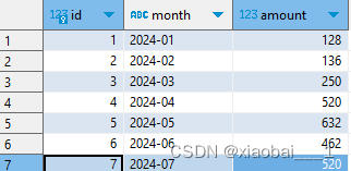
数据库创建语句
CREATE TABLE sales_data (
    id INT AUTO_INCREMENT PRIMARY KEY,
    month VARCHAR(7) NOT NULL,
    amount DECIMAL(10, 2) NOT NULL
);
具体实现
实体类
@Data
@TableName("sales_data")
public class SalesRecord {

    @TableId(type = IdType.AUTO)
    private Long id;

    private String month;

    private Double amount;
}
Mapper层
@Mapper
public interface SalesRecordMapper extends BaseMapper<SalesRecord> {
    // 自定义查询方法,根据月份范围查询销售记录
    @Select("SELECT * FROM sales_data WHERE month BETWEEN #{startMonth} AND #{endMonth}")
    List<SalesRecord> findByMonthBetween(@Param("startMonth") String startMonth, @Param("endMonth") String endMonth);
}
Service层
public interface SalesRecordService {
    List<SalesRecord> getAllSalesRecords();
    List<SalesRecord> getSalesRecordsByMonthRange(String startMonth, String endMonth);
}
Impl层
@Service
public class SalesRecordServiceImpl extends ServiceImpl<SalesRecordMapper, SalesRecord> implements SalesRecordService {

    @Resource
    private SalesRecordMapper salesRecordMapper;

    @Override
    public List<SalesRecord> getAllSalesRecords() {
        return list();
    }

    @Override
    public List<SalesRecord> getSalesRecordsByMonthRange(String startMonth, String endMonth) {
        // 实现根据月份范围查询的逻辑,使用 repository 或者自定义 SQL 查询数据库
        return salesRecordMapper.findByMonthBetween(startMonth, endMonth);
    }
}
Controller层
@RestController
@RequestMapping("/api/sales")
public class SalesRecordController {

    private final SalesRecordService salesRecordService;

    @Autowired
    public SalesRecordController(SalesRecordService salesRecordService) {
        this.salesRecordService = salesRecordService;
    }

    @GetMapping("/records")
    public List<SalesRecord> getAllSalesRecords() {
        return salesRecordService.getAllSalesRecords();
    }

    @GetMapping("/recordsByMonthRange")
    public List<SalesRecord> getSalesRecordsByMonthRange(
            @RequestParam("startMonth") String startMonth,
            @RequestParam("endMonth") String endMonth) {
        return salesRecordService.getSalesRecordsByMonthRange(startMonth, endMonth);
    }

}
前端页面
创建路径:src/main/resources/static/sales_bar_chart.html
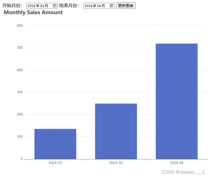
柱形图(包含按照日期分页)
<!DOCTYPE html>
<html lang="en">
<head>
  <meta charset="UTF-8">
  <title>Sales Data Visualization</title>
  <!-- 引入 ECharts -->
  <script src="https://cdn.jsdelivr.net/npm/echarts/dist/echarts.min.js"></script>
  <!-- 引入 jQuery -->
  <script src="https://ajax.googleapis.com/ajax/libs/jquery/3.5.1/jquery.min.js"></script>
</head>
<body>
<!-- 时间范围选择表单 -->
<label for="startMonth">开始月份:</label>
<input type="month" id="startMonth" name="startMonth">
<label for="endMonth">结束月份:</label>
<input type="month" id="endMonth" name="endMonth">
<button onclick="updateChart()">更新图表</button>

<!-- 图表展示 -->
<div id="chart" style="width: 800px; height: 600px;"></div>

<script>
  // 初始化页面时渲染默认图表
  renderDefaultChart();

  // 渲染默认图表
  function renderDefaultChart() {
    var xhr = new XMLHttpRequest();
    xhr.open('GET', 'http://localhost:8099/api/sales/records');
    xhr.onload = function () {
      if (xhr.status === 200) {
        var salesData = JSON.parse(xhr.responseText);
        renderChart(salesData);
      } else {
        console.error('Failed to fetch sales data:', xhr.statusText);
      }
    };
    xhr.onerror = function () {
      console.error('Request failed.');
    };
    xhr.send();
  }

  // 更新图表函数,根据用户选择的时间范围发送请求
  function updateChart() {
    var startMonth = document.getElementById('startMonth').value;
    var endMonth = document.getElementById('endMonth').value;

    var xhr = new XMLHttpRequest();
    xhr.open('GET', `http://localhost:8099/api/sales/recordsByMonthRange?startMonth=${startMonth}&endMonth=${endMonth}`);
    xhr.onload = function () {
      if (xhr.status === 200) {
        var salesData = JSON.parse(xhr.responseText);
        renderChart(salesData);
      } else {
        console.error('Failed to fetch sales data:', xhr.statusText);
      }
    };
    xhr.onerror = function () {
      console.error('Request failed.');
    };
    xhr.send();
  }

  // 渲染 ECharts 图表
  function renderChart(data) {
    var chart = echarts.init(document.getElementById('chart'));

    var months = data.map(function (item) {
      return item.month;
    });
    var amounts = data.map(function (item) {
      return item.amount;
    });

    var option = {
      title: {
        text: 'Monthly Sales Amount'
      },
      tooltip: {},
      xAxis: {
        data: months
      },
      yAxis: {},
      series: [{
        name: 'Sales Amount',
        type: 'bar',
        data: amounts
      }]
    };

    chart.setOption(option);
  }
</script>
</body>
</html>
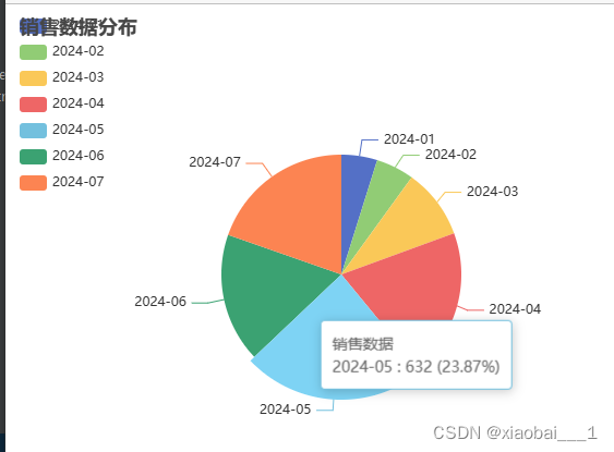
饼图
创建路径:src/main/resources/static/pie-chart-ajax.html
<!DOCTYPE html>
<html lang="en">
<head>
  <meta charset="UTF-8">
  <title>Sales Data Pie Chart</title>
  <!-- 引入 ECharts -->
  <script src="https://cdn.jsdelivr.net/npm/echarts/dist/echarts.min.js"></script>
</head>
<body>
<!-- 定义一个具有一定尺寸的 div,用于渲染图表 -->
<div id="pieChart" style="width: 600px; height: 400px;"></div>

<script>
  // 使用 AJAX 请求后端数据
  var xhr = new XMLHttpRequest();
  xhr.open('GET', 'http://localhost:8099/api/sales/records'); // 修改为实际的后端 API 路径
  xhr.onload = function () {
    if (xhr.status === 200) {
      var salesData = JSON.parse(xhr.responseText);
      renderPieChart(salesData);
    } else {
      console.error('Failed to fetch sales data:', xhr.statusText);
    }
  };
  xhr.onerror = function () {
    console.error('Request failed.');
  };
  xhr.send();

  // 渲染 ECharts 饼图
  function renderPieChart(data) {
    var pieChart = echarts.init(document.getElementById('pieChart'));

    // 构建饼图所需的数据格式
    var pieData = data.map(function(item) {
      return {
        name: item.month,
        value: item.amount
      };
    });

    // 配置饼图的选项
    var option = {
      title: {
        text: '销售数据分布'
      },
      tooltip: {
        trigger: 'item',
        formatter: '{a} <br/>{b} : {c} ({d}%)'
      },
      legend: {
        orient: 'vertical',
        left: 'left',
        data: data.map(function(item) { return item.month; }) // 设置图例数据
      },
      series: [
        {
          name: '销售数据',
          type: 'pie',
          radius: '55%',
          center: ['50%', '60%'],
          data: pieData // 使用从后端获取的数据
        }
      ]
    };

    // 使用配置项设置图表
    pieChart.setOption(option);
  }
</script>
</body>
</html>
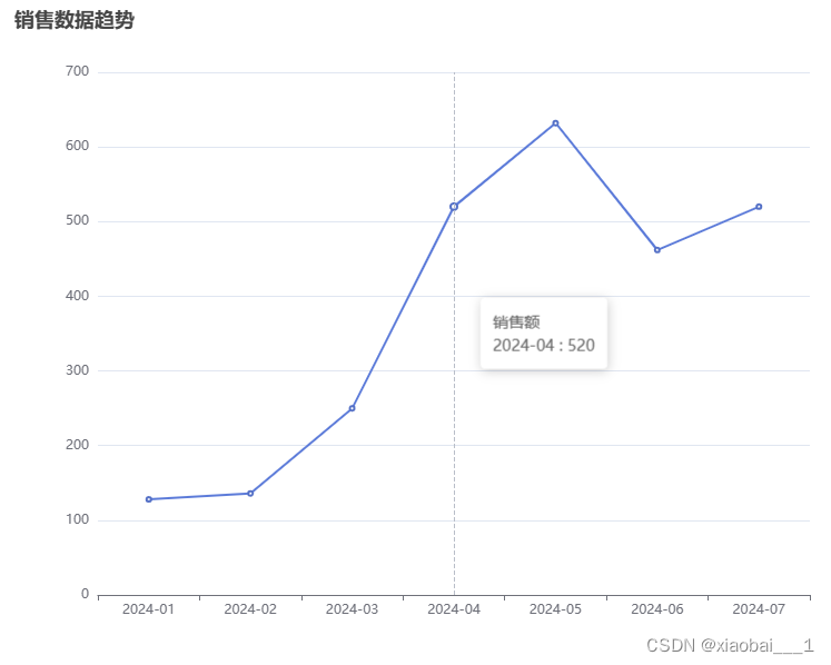
折线图
创建路径:src/main/resources/static/sales_long_chart.html
<!DOCTYPE html>
<html lang="en">
<head>
    <meta charset="UTF-8">
    <title>Sales Data Line Chart</title>
    <!-- 引入 ECharts -->
    <script src="https://cdn.jsdelivr.net/npm/echarts/dist/echarts.min.js"></script>
    <!-- 引入 jQuery -->
    <script src="https://ajax.googleapis.com/ajax/libs/jquery/3.5.1/jquery.min.js"></script>
</head>
<body>
<!-- 定义一个具有一定尺寸的 div,用于渲染图表 -->
<div id="lineChart" style="width: 800px; height: 600px;"></div>

<script>
    // 使用 AJAX 请求后端数据
    var xhr = new XMLHttpRequest();
    xhr.open('GET', 'http://localhost:8099/api/sales/records'); // 修改为实际的后端 API 路径
    xhr.onload = function () {
        if (xhr.status === 200) {
            var salesData = JSON.parse(xhr.responseText);
            renderLineChart(salesData);
        } else {
            console.error('Failed to fetch sales data:', xhr.statusText);
        }
    };
    xhr.onerror = function () {
        console.error('Request failed.');
    };
    xhr.send();

    // 渲染 ECharts 折线图
    function renderLineChart(data) {
        var lineChart = echarts.init(document.getElementById('lineChart'));

        // 构建折线图所需的数据格式
        var xAxisData = data.map(function(item) {
            return item.month;
        });
        var seriesData = data.map(function(item) {
            return item.amount;
        });

        // 配置折线图的选项
        var option = {
            title: {
                text: '销售数据趋势'
            },
            tooltip: {
                trigger: 'axis',
                formatter: '{a} <br/>{b} : {c}'
            },
            xAxis: {
                type: 'category',
                data: xAxisData // 设置 X 轴数据
            },
            yAxis: {
                type: 'value'
            },
            series: [{
                name: '销售额',
                type: 'line',
                data: seriesData // 设置折线图数据
            }]
        };

        // 使用配置项设置图表
        lineChart.setOption(option);
    }
</script>
</body>
</html>
 希望本文对你有所帮助。如果你有任何疑问或建议,欢迎在评论区留言讨论。Happy coding!
本文转载自: https://blog.csdn.net/m0_59166601/article/details/140045250
版权归原作者 xiaobai___1 所有, 如有侵权,请联系我们删除。
版权归原作者 xiaobai___1 所有, 如有侵权,请联系我们删除。