
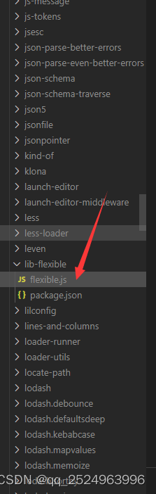
首先是要安装
npm install lib-flexible --save
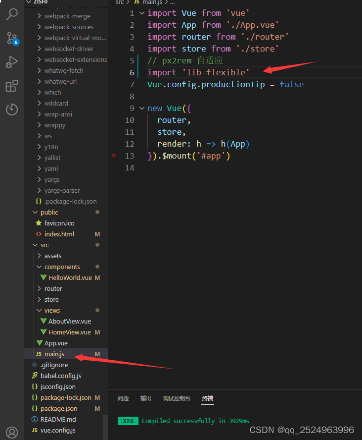
然后在 修改
这个根据设计稿的大小来计算 这个是 把屏幕设计成24份 1920/24 80px=1rem
    function refreshRem(){
        var width = docEl.getBoundingClientRect().width;
        if (width / dpr > 1920) {
            width = 1920 * dpr;
        }
        var rem = width / 24;
        docEl.style.fontSize = rem + 'px';
        flexible.rem = win.rem = rem;
    }
一定要引入啊
// px2rem 自适应
import 'lib-flexible'
然后在软件中安装插件
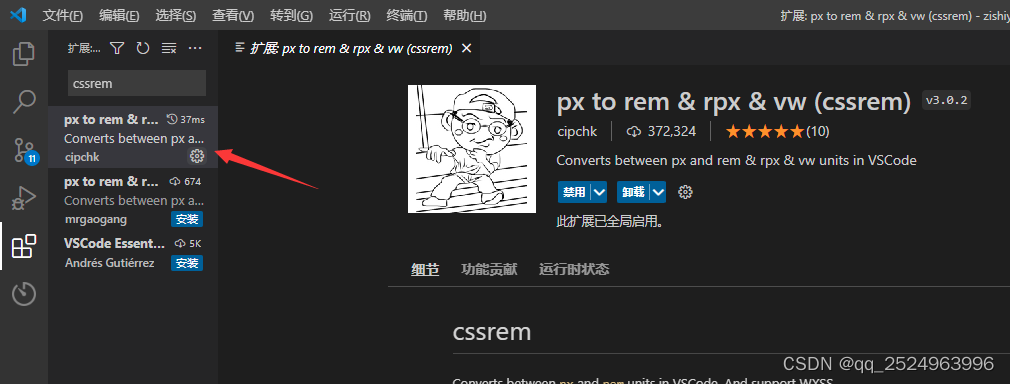
随后在设置中
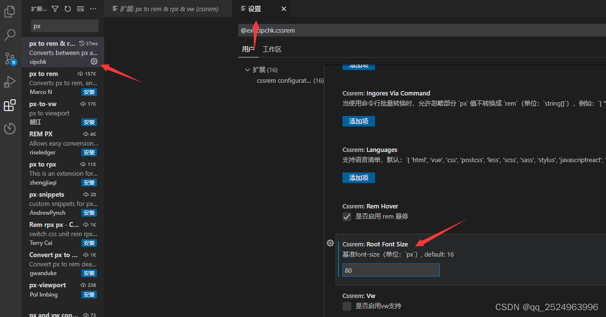
这个 80 是 上面设计稿出来的结果 根据自己的需要来写啊
第二种是 v-scale-screen
首先是 安装
根据自己的vue版本 来安装不同的 v-scale-screen的版本
vue2请使用1.x版本、vue2请使用1.x版本、vue2请使用1.x版本,重要的事情说三遍
注:使用时请将
body样式设置为
overflow: hidden;注:使用时请将
body样式设置为
overflow: hidden;注:使用时请将
body样式设置为
overflow: hidden;例如 安装: 我安装的是 vue2 的啊
npm i v-scale-screen@1.0.2
使用
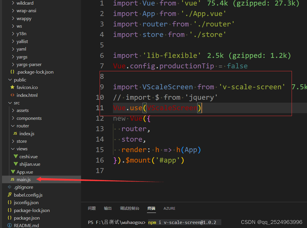
// main.js
import Vue from "vue";
import VScaleScreen from 'v-scale-screen'

Vue.use(VScaleScreen)
上面是代码可以直接复制 下面是图片
使用的地方如下
<template>
    <!-- width="1920" height="1080" 可写可不写额 -->
  <v-scale-screen  fullScreen width="1920" height="1080"   >
    <div class="a">
      <div class="c"></div>
    </div>
    <div class="b"></div>
  </v-scale-screen>
</template>

<script>

export default {
  data() {
    return {

    };
  },
  mounted() {
  },
  methods: {},
};
</script>
<style lang="less" scoped>
.a {
  width: 540px;
  height: 540px;
  background-color: red;
  display: flex;
  justify-content: center;
  align-items: center;
}
.b {
  width: 540px;
  height: 540px;
  background-color: rgb(24, 20, 228);
}
.c {
  width: 400px;
  height: 200px;
  background: rebeccapurple;
}
</style>
api:
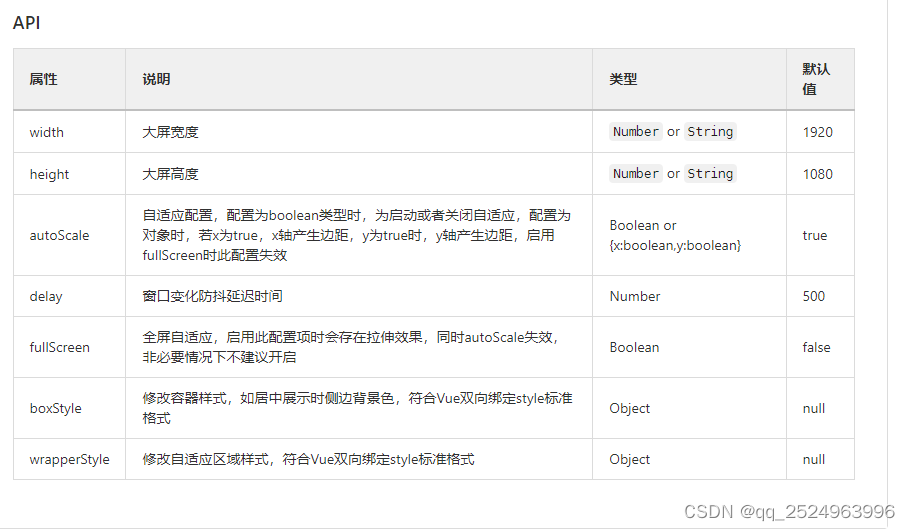
最重要的一点 记得这个标签
  <v-scale-screen >
    <div class="a">
      <div class="c"></div>
    </div>
    <div class="b"></div>
  </v-scale-screen>
另外还是有样式的调整 在公共的位置
* {
  margin: 0;
  padding: 0;
}
body {
  overflow: hidden;
}
.screen-box {
  background: #fff !important;
}
.screen-wrapper{
  margin: 0 !important;
}
具体的位置在

再页面上的显示效果
100%

50%
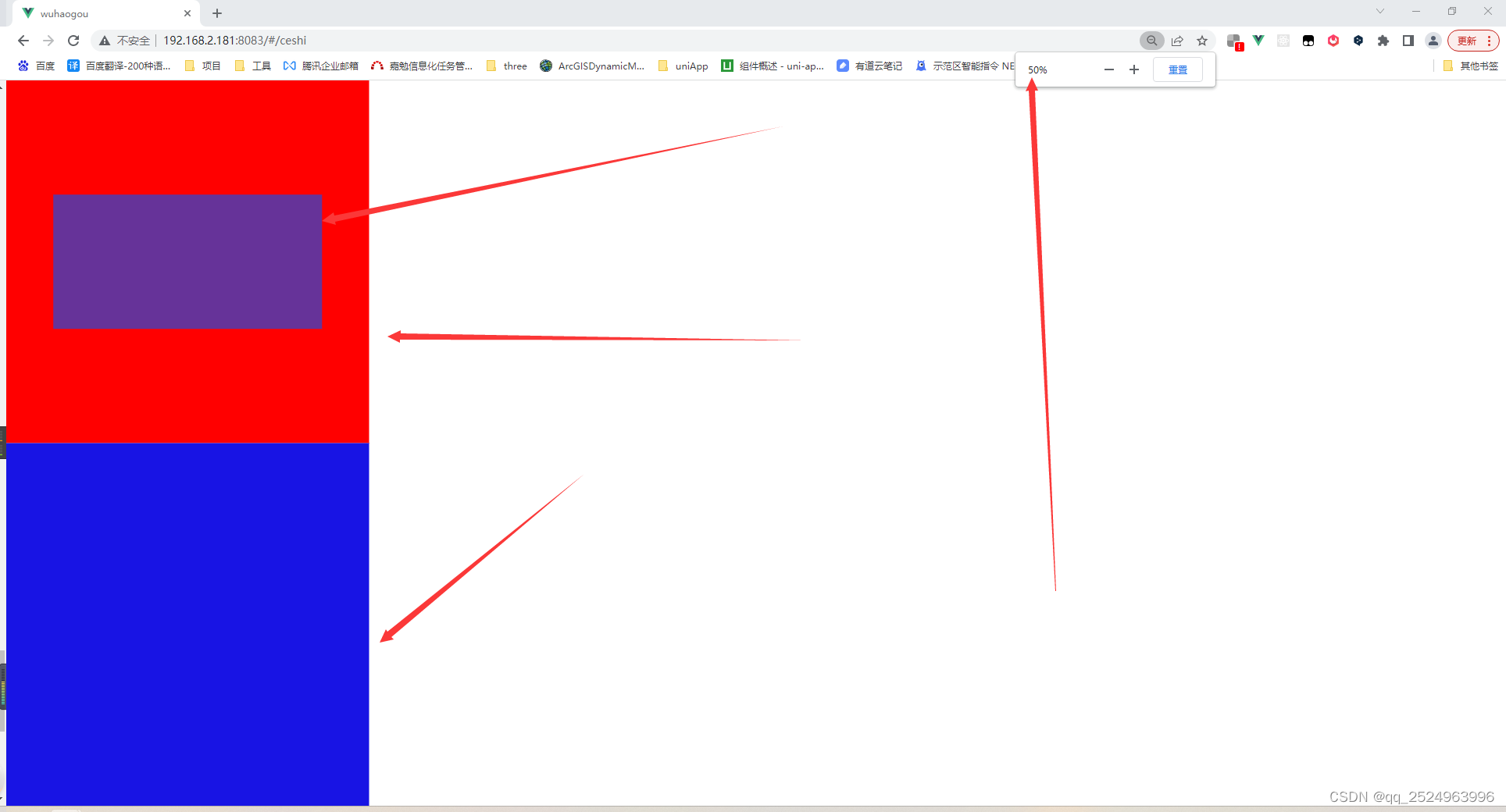
125%

vue3的用法
Vue3
我们在vue3中以组件方式导出
<template>
  <v-scale-screen width="1920" height="1080">
    <div>
      <v-chart>....</v-chart>
      <v-chart>....</v-chart>
      <v-chart>....</v-chart>
      <v-chart>....</v-chart>
      <v-chart>....</v-chart>
    </div>
  </v-scale-screen>
</template>

<script>
import { defineComponent } from "vue"
import VScaleScreen from 'v-scale-screen'

export default defineComponent({
  name:'Demo',
  components:{
    VScaleScreen
  }
})
</script>
注:使用时请将
body样式设置为
overflow: hidden;注:使用时请将
body样式设置为
overflow: hidden;注:使用时请将
body样式设置为
overflow: hidden;用法:npm install v-scale-screen # or yarn add v-scale-screen
新增屏幕适配 GitHub - hangjob/flexible-pc: rem布局 ,16:9的比列,适配1440px 以上的所有大屏幕GitHub - hangjob/flexible-pc: rem布局 ,16:9的比列,适配1440px 以上的所有大屏幕
本文转载自: https://blog.csdn.net/qq_44161703/article/details/127562669
版权归原作者 qq_2524963996 所有, 如有侵权,请联系我们删除。
版权归原作者 qq_2524963996 所有, 如有侵权,请联系我们删除。