
毛玻璃效果简介
它的主要特征就是半透明的背景,以及阴影和边框。
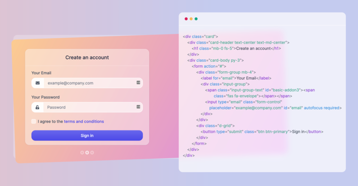
同时还要为背景加上模糊效果,使得背景之后的元素根据自身内容产生漂亮的“变形”效果,示例:
代码实现
首先,创建一个 HTML 文件,写入如下内容:
<!DOCTYPE html>
<html lang="en">
<head>
  <meta charset="UTF-8">
  <meta http-equiv="X-UA-Compatible" content="IE=edge">
  <meta name="viewport" content="width=device-width, initial-scale=1.0">
  <title>Glassmorphism effect</title>
</head>
<body>
    <!-- code goes here -->
</body>
</html>
为
body
标签添加一些样式,并使用鲜艳的颜色和渐变作为背景:
body {
  padding: 4.5rem;
  margin: 0;
  background: #edc0bf;
  background: linear-gradient(90deg, #edc0bf 0,#c4caef 58%);
  font-family: 'Inter', sans-serif;
}
现在基本的标签和样式做好了,接下来在
body
标签里创建一个卡片元素:
<div class="card">
    <h3 class="card-title">Glassmorphism is awesome</h3>
    <p>A modern CSS UI library based on the glassmorphism design principles that will help you quickly design and build beautiful websites and applications.</p>
    <a href="https://ui.glass">Read more</a>
</div>
添加样式
.card {
  width: 400px;
  height: auto;
  padding: 2rem;
  border-radius: 1rem;
}

.card-title {
  margin-top: 0;
  margin-bottom: .5rem;
  font-size: 1.2rem;
}

p, a {
  font-size: 1rem;
}

a {
  color: #4d4ae8;
  text-decoration: none;
}
你要做的只是设置一个半透明背景颜色,并使用
backdrop-filter
属性设置模糊效果。在
.card
元素的样式中加入以下 CSS:
.card {
    /* other styles */
    background: rgba(255, 255, 255, .7);
    -webkit-backdrop-filter: blur(10px);
    backdrop-filter: blur(10px);
}
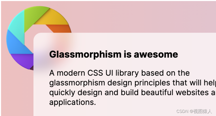
后方没有形状时的效果
让我们使用
img
标签在
body
起始标签之后加入一个形状图片:
<img class="shape" src="https://s3.us-east-2.amazonaws.com/ui.glass/shape.svg" alt="">
并为
.shape
元素添加以下样式,将其定位在页面的合适位置:
.shape {
  position: absolute;
  width: 150px;
  top: .5rem;
  left: .5rem;
}
效果如下图所示:
完整代码html和css代码如下:
glass.html
<!DOCTYPE html>
<html lang="en">
<head>
  <meta charset="UTF-8">
  <meta http-equiv="X-UA-Compatible" content="IE=edge">
  <meta name="viewport" content="width=device-width, initial-scale=1.0">
 <link rel="stylesheet" type="text/css" href="glass.css">
  <title>Glassmorphism effect</title>
</head>
<body>
  <img class="shape" src="https://s3.us-east-2.amazonaws.com/ui.glass/shape.svg" alt="">
    <!-- code goes here -->
<div class="card">
    <h3 class="card-title">Glassmorphism is awesome</h3>
    <p>A modern CSS UI library based on the glassmorphism design principles that will help you quickly design and build beautiful websites and applications.</p>
    <a href="https://www.baidu.com">Read more</a>
</div>
</body>
</html>
glass.css:
body {
  padding: 4.5rem;
  margin: 0;
  background: #edc0bf;
  background: linear-gradient(90deg, #edc0bf 0,#c4caef 58%);
  font-family: 'Inter', sans-serif;
}

.card {
  width: 400px;
  height: auto;
  padding: 2rem;
  border-radius: 1rem;
  background: rgba(255, 255, 255, .7);
 webkit-backdrop-filter: blur(10px);
 backdrop-filter: blur(10px);
}

.card-title {
  margin-top: 0;
  margin-bottom: .5rem;
  font-size: 1.2rem;
}

p, a {
  font-size: 1rem;
}

a {
  color: #4d4ae8;
  text-decoration: none;
}

.shape {
  position: absolute;
  width: 150px;
  top: .5rem;
  left: .5rem;
}
本文转载自: https://blog.csdn.net/hulinhulin/article/details/132428711
版权归原作者 视图猿人 所有, 如有侵权,请联系我们删除。
版权归原作者 视图猿人 所有, 如有侵权,请联系我们删除。