
随着技术的发展,开发的复杂度也越来越高,传统开发方式将一个系统做成了整块应用,经常出现的情况就是一个小小的改动或者一个小功能的增加可能会引起整体逻辑的修改,造成牵一发而动全身。通过组件化开发,可以有效实现单独开发,单独维护,而且他们之间可以随意的进行组合。大大提升开发效率低,降低维护成本。
组件化对于任何一个业务场景复杂的前端应用以及经过多次迭代之后的产品来说都是必经之路。组件化要做的不仅仅是表面上看到的模块拆分解耦,其背后还有很多工作来支撑组件化的进行,例如结合业务特性的模块拆分策略、模块间的交互方式和构建系统等等 。
本文给大家介绍的组件是:
前端vue可以左右滚动的切换的tabs tabs选项卡 滑动动画效果 自动宽度,
阅读全文下载完整组件代码请关注微信公众号: 前端组件开发

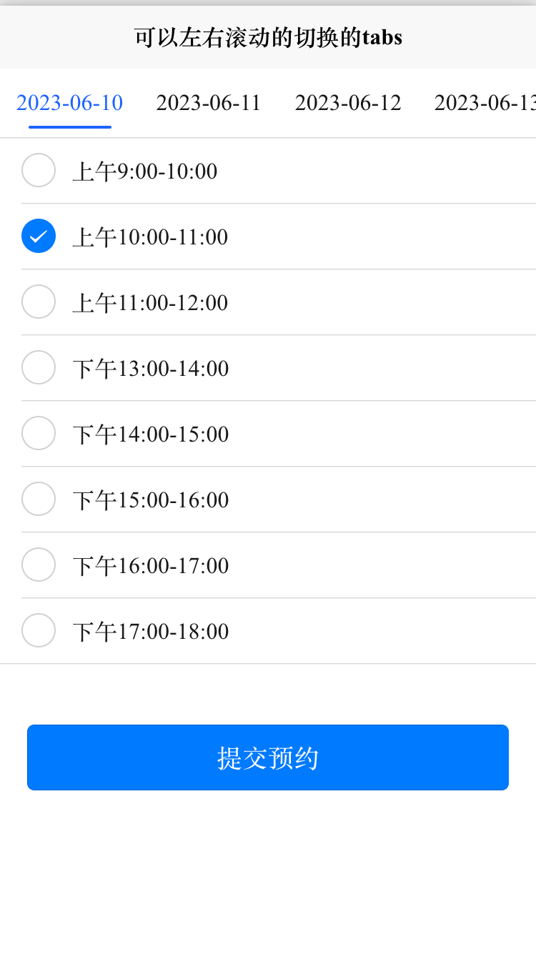
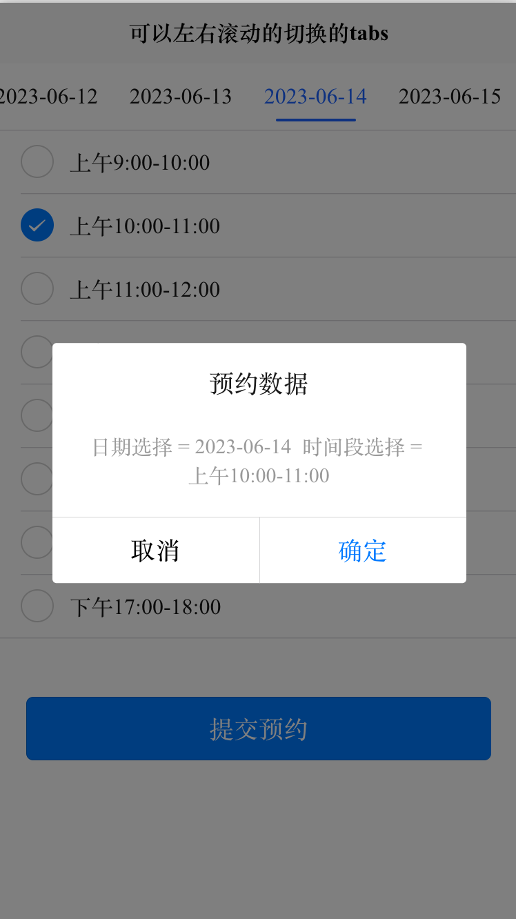
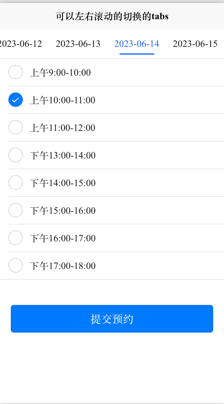
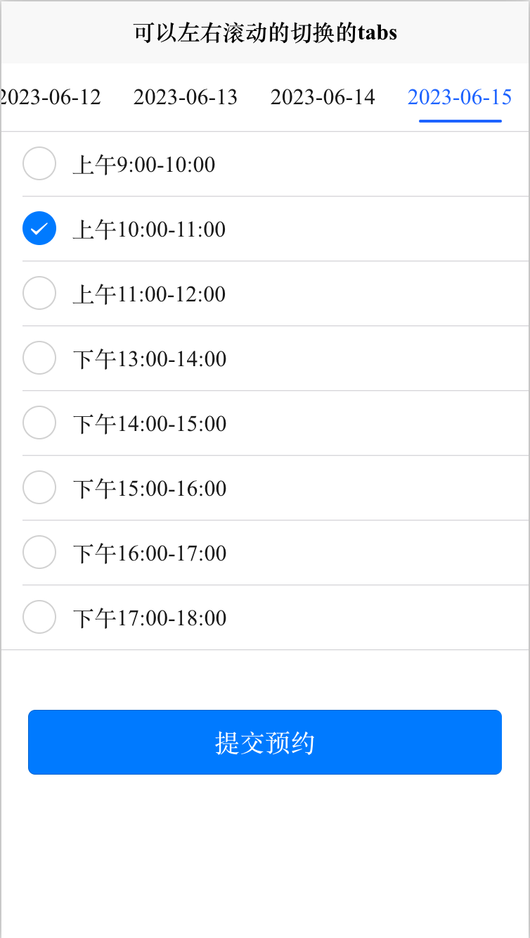
效果图如下:
使用方法
> swiperTabList: ["2023-06-10","2023-06-11","2023-06-12","2023-06-13","2023-06-14","2023-06-15"], //导航列表
>
> swiperTabIdx: 0,
>
> swiperColor: '#161616', //导航栏字体未选中前颜色
>
> swiperCurrentColor: '#1D63FF', //选中当前导航栏字体颜色
>
> curSwiperWidth: '26%', //当前导航的宽度 % upx rpx px  (导航超出可左右滑动 )
>
> curSwiperHeight: 96, //当前导航的高度度 rpx px
>
> curSwiperLineShow: true, //是否显示导航栏的线条 (线条距离标题太近的话可自行修改.swiperLine的css)
>
> curSwiperLineActiveBg: '#1D63FF', //当前选中的导航栏线条颜色
>
> curSwiperLineActiveWidth: '60%', //当前选中的导航栏线条的宽度 upx rpx px
>
> curSwiperLineActiveHeight: '2px', //当前选中的导航栏线条的高度度 upx rpx px
>
> <!--组件-->
>
> <ccSwiperTabs :swiperTabList='swiperTabList' :swiperTabIdx='swiperTabIdx'
>
> :curSwiperWidth='curSwiperWidth' :curSwiperHeight='curSwiperHeight' :swiperColor='swiperColor'
>
> :swiperCurrentColor='swiperCurrentColor' :curSwiperLineShow="curSwiperLineShow"
>
> :curSwiperLineActiveWidth="curSwiperLineActiveWidth" :curSwiperLineActiveHeight="curSwiperLineActiveHeight"
>
> :curSwiperLineActiveBg="curSwiperLineActiveBg"
>
> @change="CurrentTab">
>
> </ccSwiperTabs>
HTML代码部分
> <template>
>
> <view class="content">
>
> <!--组件-->
>
> <ccSwiperTabs :swiperTabList='swiperTabList' :swiperTabIdx='swiperTabIdx'
>
> :curSwiperWidth='curSwiperWidth' :curSwiperHeight='curSwiperHeight' :swiperColor='swiperColor'
>
> :swiperCurrentColor='swiperCurrentColor' :curSwiperLineShow="curSwiperLineShow"
>
> :curSwiperLineActiveWidth="curSwiperLineActiveWidth" :curSwiperLineActiveHeight="curSwiperLineActiveHeight"
>
> :curSwiperLineActiveBg="curSwiperLineActiveBg"
>
> @change="CurrentTab">
>
> </ccSwiperTabs>
>
> <!-- radioData:单选数据 curIndex:当前选择序列 @change:单选事件 -->
>
> <ccRadioView :radioData="items" :curIndex="current" @change="radioChange"></ccRadioView>
>
> <button class="submitBtn" type="primary" @click="submitAppointment">提交预约</button>
>
> </view>
>
> </template>
JS代码 (引入组件 填充数据)
> <script>
>
> import ccSwiperTabs from '../../components/ccSwiperTabs.vue'
>
> import ccRadioView from '../../components/ccRadioView.vue'
>
> export default {
>
> components: {
>
> ccSwiperTabs,
>
> ccRadioView
>
> },
>
> data() {
>
> return {
>
> swiperTabList: ["2023-06-10","2023-06-11","2023-06-12","2023-06-13","2023-06-14","2023-06-15"], //导航列表
>
> swiperTabIdx: 0,
>
> swiperColor: '#161616', //导航栏字体未选中前颜色
>
> swiperCurrentColor: '#1D63FF', //选中当前导航栏字体颜色
>
> curSwiperWidth: '26%', //当前导航的宽度 % upx rpx px  (导航超出可左右滑动 )
>
> curSwiperHeight: 96, //当前导航的高度度 rpx px
>
> curSwiperLineShow: true, //是否显示导航栏的线条 (线条距离标题太近的话可自行修改.swiperLine的css)
>
> curSwiperLineActiveBg: '#1D63FF', //当前选中的导航栏线条颜色
>
> curSwiperLineActiveWidth: '60%', //当前选中的导航栏线条的宽度 upx rpx px
>
> curSwiperLineActiveHeight: '2px', //当前选中的导航栏线条的高度度 upx rpx px
>
> items: [{
>
> value: '1',
>
> name: '上午9:00-10:00'
>
> },
>
> {
>
> value: '2',
>
> name: '上午10:00-11:00',
>
> checked: ''
>
> },
>
> {
>
> value: '3',
>
> name: '上午11:00-12:00',
>
> },
>
> {
>
> value: '4',
>
> name: '下午13:00-14:00',
>
> },
>
> {
>
> value: '5',
>
> name: '下午14:00-15:00',
>
> },
>
> {
>
> value: '6',
>
> name: '下午15:00-16:00',
>
> },
>
> {
>
> value: '7',
>
> name: '下午16:00-17:00',
>
> },
>
> {
>
> value: '8',
>
> name: '下午17:00-18:00',
>
> },
>
> ],
>
> current: 0,
>
> }
>
> },
>
> onLoad() {
>
> },
>
> methods: {
>
> submitAppointment(){
>
> uni.showModal({
>
> title:'预约数据',
>
> content:"日期选择 = " + this.swiperTabList[this.swiperTabIdx] + "  时间段选择 = " + this.items[this.current].name
>
> })
>
> },
>
> //tab点击事件 自行完善需要的代码
>
> CurrentTab: function(index, item) {
>
> this.swiperTabIdx = index;
>
> console.log('日期选择' + item + '\n序列' + index)
>
> },
>
> radioChange: function(evt) {
>
> for (let i = 0; i < this.items.length; i++) {
>
> if (this.items[i].value === evt.target.value) {
>
> this.current = i;
>
> break;
>
> }
>
> }
>
> },
>
> }
>
> }
>
> </script>
CSS
> <style>
>
> .content {
>
> display: flex;
>
> flex-direction: column;
>
> }
>
> .submitBtn {
>
> width: 90%;
>
> margin-top: 86rpx;
>
> }
>
> </style>
本文转载自: https://blog.csdn.net/chenchuang0128/article/details/131171620
版权归原作者 前端组件开发 所有, 如有侵权,请联系我们删除。
版权归原作者 前端组件开发 所有, 如有侵权,请联系我们删除。